ART NOUVEAU AND FLAT DESIGN HYBRID BRIDGE 2
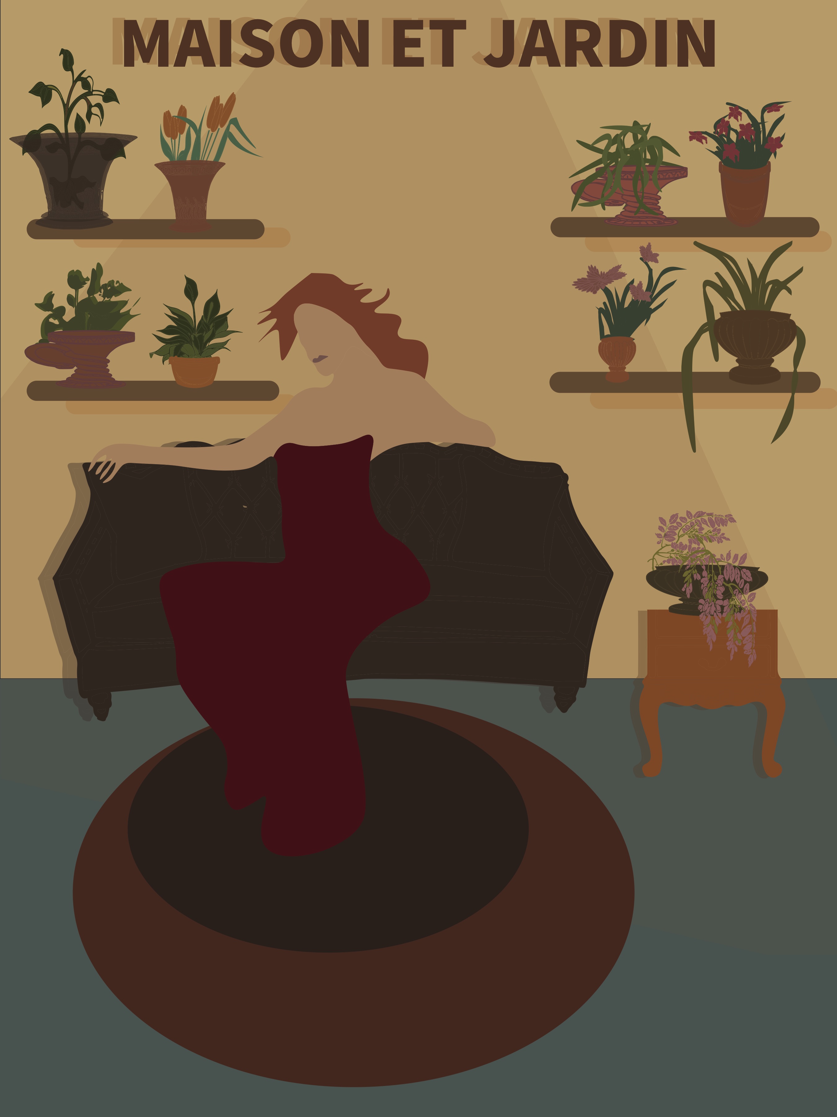
HYBRID COLLABRATIVE POSTER

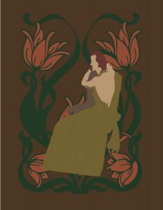
PARTNER GIF

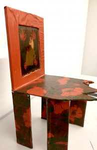
CHAIR FOR MY PORTION OF HYBRID

CRITIQUE NOTES
poster in middle – (done by both)
- missing a border or a pattern
- enough elements that they coexist equally/good hybridization
- font could be more elaborate — feels like an average sans serif font
- text stands alone by itself/doesn’t flow with where it’s placed
- framed the figure nicely
- color choices create a choppy feeling
- rly good elements — are they meshing well together?
gif
- interesting way of modernizing
- text incorporated into the design
- framing of the middle = successful
chair
- literally frames the art style it’s emulating
- flatness goes with flat design
- really nice hybridization
- decoration heavily influenced by art nouveau
- chair itself heavily influenced by flat design
- bold and risky
- impressive to make furniture that has to do with flat design
all three
- seems like they really considered what they would do to hybridize successfully