
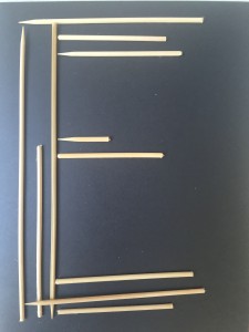

Experimenting with it, and after some feedback I realized the letters would look clearer and have a stronger effect if the sticks were pulled closer and avoiding the exaggeration in sizes between each stick:


When the whole alphabet was finished and the pictures of every letter where took, we worked with them in and Illustrator. At first it was quite challenging and it meant countless tries to figure everything out. However, I did enjoy using these programs and my alphabet once edited, turned out a lot better than I expected since my first impression with the bamboo skewers.
- Photoshop version (scaling the letters, image adjustments, etc.)

2. Illustrator (image trace, expanding, fill coloring to delete the background..)