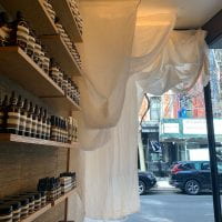
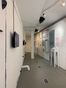
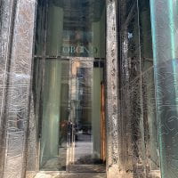
Aesop Nolita
400 pages of NewYork Times Newspaper
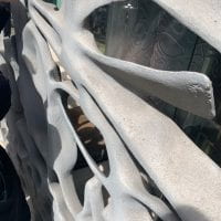
concrete
wood
White Drapery
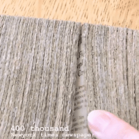
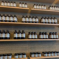
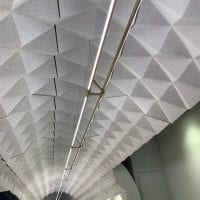
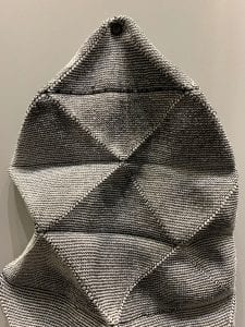
Newspaper– Stacks of Newspapers are mounted on a cardboard piece on the back, and are mounted on the walls around the shelves, apparent movement vertically. Some pieces are cut short to fit the small space between shelves, suggesting that it’s horizontally adjustable. Vertically, I think they’re about the same for every one but I think it could be adjustable also, of the amount of newspaper stacked.
Wood shelves – the newspaper stacks are put around the wood shelves, bright brown color.
The light brown colored wood material for the shelf and the counter area is a well-controlled contrast for the specs made from compressed typography from the newspapers. From afar, you can’t even tell that the material is made from the stacked newspaper but a unified horizontal line and vertical irregular black pattern.
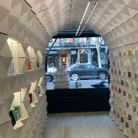
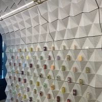
Claus Porto, 230 Elizabeth St
Materials :
1. Cork (Portuguese Material- Medium Brown Color,
+ sustainable, makes less or no waste, molds
-Brittle
2. Marble Stone
3. Wood
4. Brick Walls
Cork– Cork structure is molded into geometric structures that add up and surrounds the shopping area like a dome. The geometric pattern is arranged as decorative purposes but also another tweak of the pattern along with the actual material adds enough surface to hold individual soap bars for display. There are empty spaces where candles or perfumes are displayed with spotlighting which shows how the material was constructed with thought into shapes to create these hollow spaces.
The cork material is painted in white, giving it an illlusion of a material that isn’t obviously cork to the eye. And cork, being a Portuguese material, from trees harvested from Portugal, which adds on to the company’s character, being a Portuguese soap/parfumery brand. The only thing about them is that they’re brittle, but it’s a big sustainable material because it creates no waste as it is a molding material.
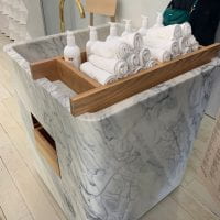
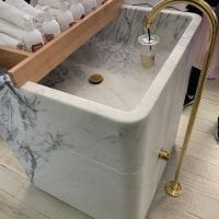
Marble Stone – Sink
A chunk of marble stone sanded down into hollow spaces for storage and sink area. Smooth and soft edges, added with golden brass/metal material for the tab and sinkhole, and wooden shelving for towels.
As the surrounding walls are covered with the cork material, using this as a single structure located in the center of the hall was a great choice and the material itself is a structure you cut down from.
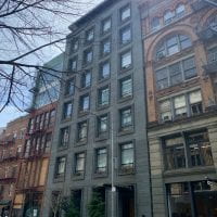
Storefront for Art and Architecture
Materials
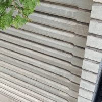
Concrete – engineered precast concrete panels outside
Fastened thin material
Prada

Zebra Wood
Corrigated Plastic
Chloroplast (Walls)
Sillicone?
Zebra wood – It’s characterized by its stripes similar to ones of a zebra, and is found in central America. It wears off easily,
Chloroplast – placed against the walls and ceiling, the translucent finish giving a general glow of the industrial light put against them. The vertical linear squares give it a different checkered soft brushed feeling of industrial light where if it wasn’t vertically sectioned out in squares, it would just give a smooth glow.

(a photo from instagram to best show the lined glow)
Apple

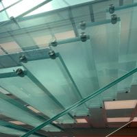
Tempered Laminated Glass sheets
Sand stone/ Lime Stone
Aluminum (columns- Matte finish)
Camper
Lacquer finish
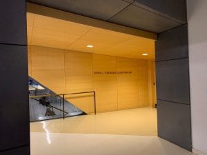
290 Mulberry St
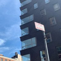

Brick constrcution
Cast Concrete Brick
Cememt – no morter – concrete binding
10 Bond St
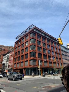
Terracotta Ceramic glazed
40 Bond
Polish stainless steel
Cast glass
Metal
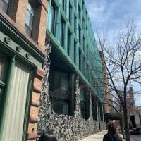
41 Bond


Blue Stone – cut differently (soft smooth, bumpy rough)


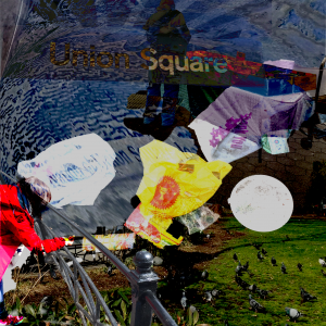
 (Example of the bags- quite different from ordinary plastic bags. More flimsy and thin)


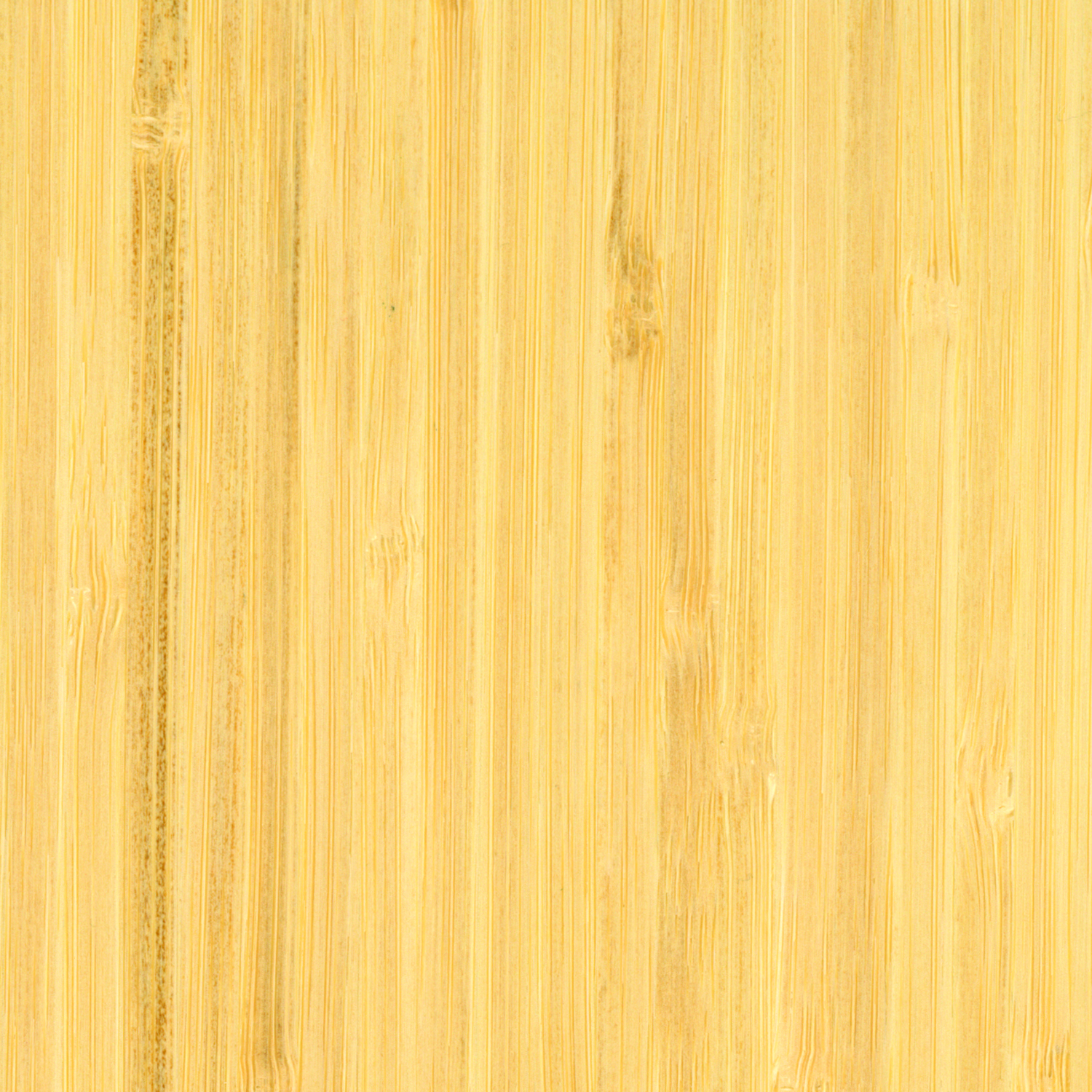


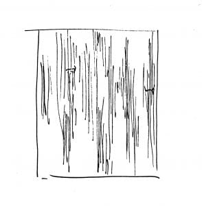 (bamboo wood up close has very thin vertical lines)
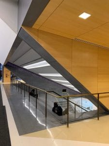
 The Humming Room (2012)