After my class I was walking to studio with a friend of mine talking about the environment and climate change. She casually laughed and said “Miri, think about the polar bears!”
One thing that pops into my mind when someone says something about polar bear is Coca Cola. The world’s favorite brand of coke, with the distinct red and white logo with polar bears. There’s many sayings about how this polar bear came to place. The first printed commercial with these polar bears appeared in France in 1922. And when Ken Stewart was asked to create a commercial for coca cola, while he was in the movie theater drinking coke, he thought of how his dog resembled polar bears. Funny enough, that’s how the polar bears came to be. Since then, Coca Cola’s iconic mascot became the white polar bears.
Maybe then, polar bears weren’t in danger. Coincidentally these polar bears set as mascots have become another useful strategy for the company to promote awareness of climate change.
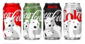
These are some pictures of bottles and cans of coca cola, featuring these polar bears.

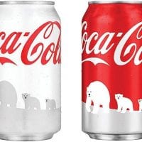
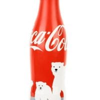
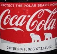
You can see that their design is very simple, clean, very friendly looking white polar bears. I’m guessing that their strategy was increasing more awareness of these animals. In my opinion, polar bears aren’t animals we see in our daily lives used as brand logos or made in plushies for kids to play with. Usually, they’re more available in souvenir shops in zoos or aquariums(?). And they aren’t animals we are able to see and have many interactions with it. So just by Coke portraying these animals on their soda cans increases tremendously in this interaction and awareness of these animals with the society.
Other than this, Coca Cola has been doing a lot of interesting advertising with hands-on interaction with customers buying these drinks. For example, the Christmas ribbon bottle created a big interest in people all over Asia with its first launch in Japan.
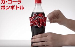
I was one of the people that bought a coke for this experience while I was in Japan, and honestly the “science” behind this wasn’t special at all, and I was even disappointed in it because it didn’t work that smoothly. But this small mechanic behind this label and this idea of a ribbon which signifies a symbol of gifting just warms people’s hearts and makes them happy.
Therefore, I wanted to create a label advertisement using the same idea of shifting a bit the labeling. I created these four designs which are off of the original 4 designs on coke cans already. I tried to keep it as less vulgar as possible, that drags people’s attention and hooks them into finding out what is wrong with the design and keep an eye on them.
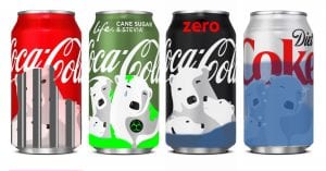
The first can design beforehand had a group of three happy polar bears. I created bar-like structures to indicate their situation of being trapped, indicating that they don’t have the freedom as all animals should.
The second design before-hand incorporated the polar bear’s shadows coming out from a coke bottle which I turned into a fume tunnel intoxicating the air. I got the motif of the toxic green color from the bottle itself. The green substance is drooled on to the polar bears and their face expression shows discomfort, sadness and the tears from gas. The toxic sign is also added to indicate that.
In the third design, beforehand showed a female figure (supposedly the mother due to the eyelashes) hugging two young polar bears. I converted their expressions into worrying sad expressions and put water rising onto the little ones.
And lastly, I took the whole can which had a happy family of polar bears smiling, converted their expressions into frowning in order to hold their breath due to them being trapped underwater.
Out of all four, the most successful design idea would be the third and the fourth. But I’d pick the third because it has a somewhat heartwarming motif (mother and children) and the idea of water level rising slowly to kill them. I dont think they’re too vulgar to be selling in the streets and it pulls the perfect amount of curiosity out of the buyers.