Process:
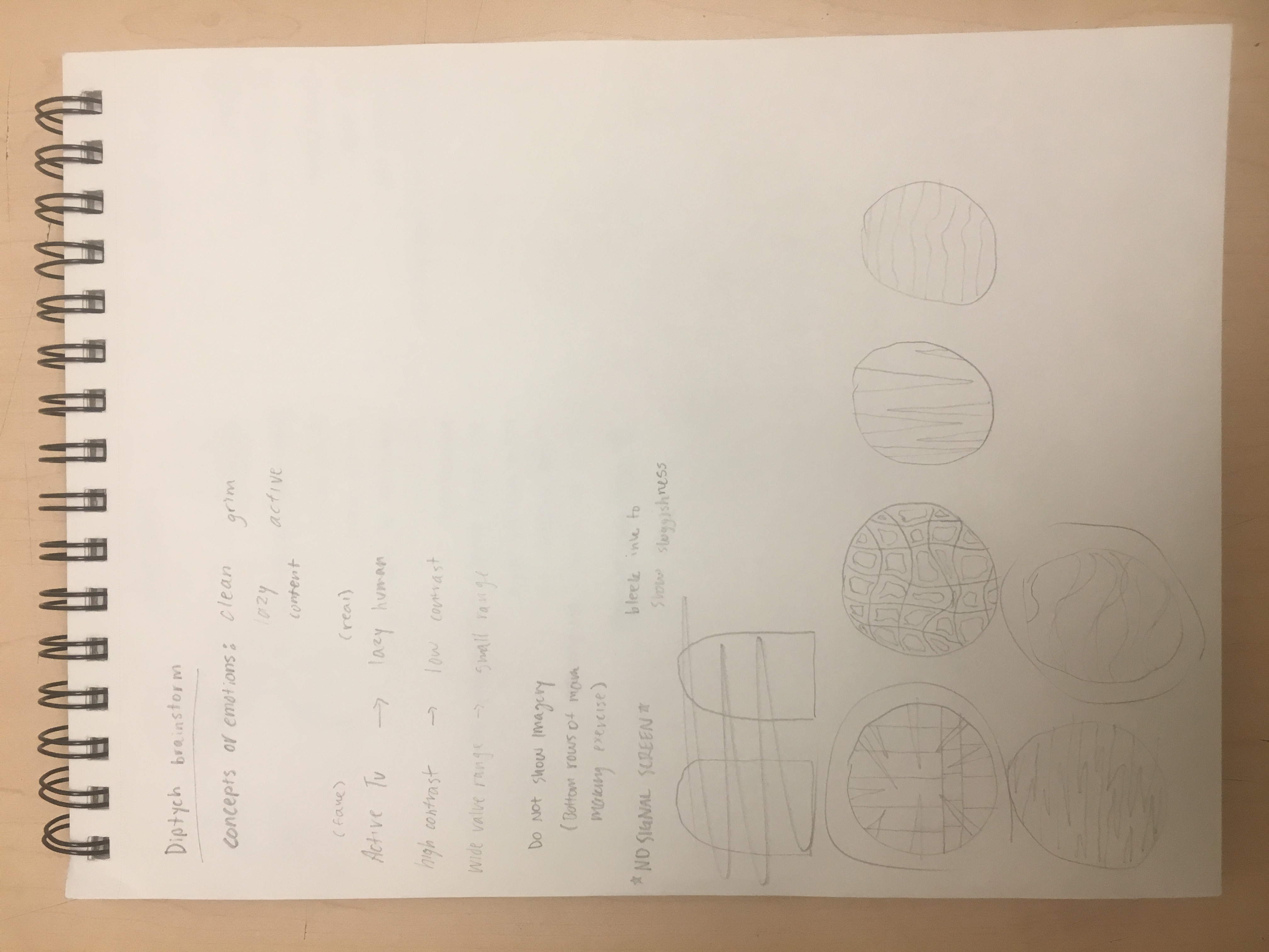
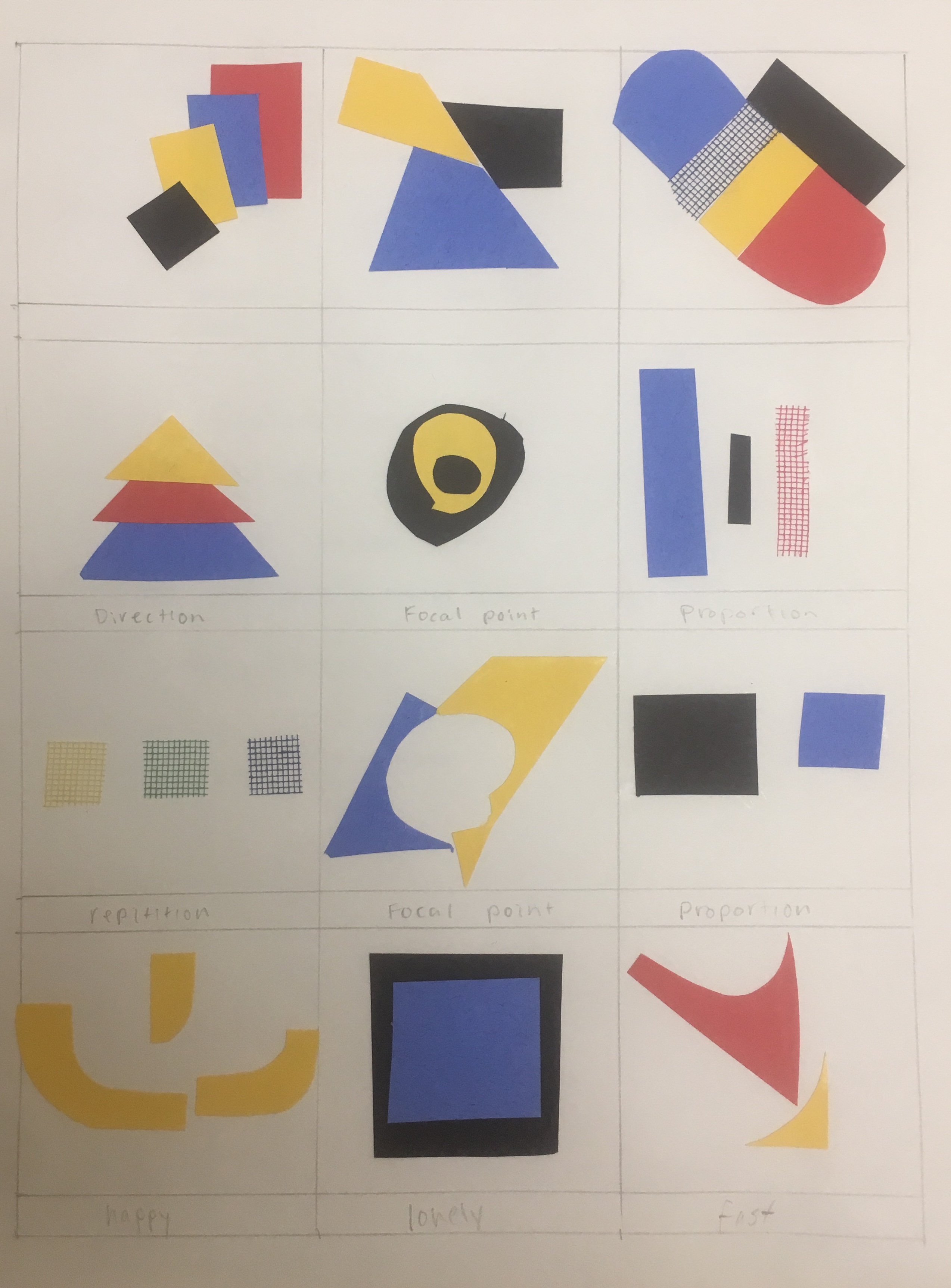
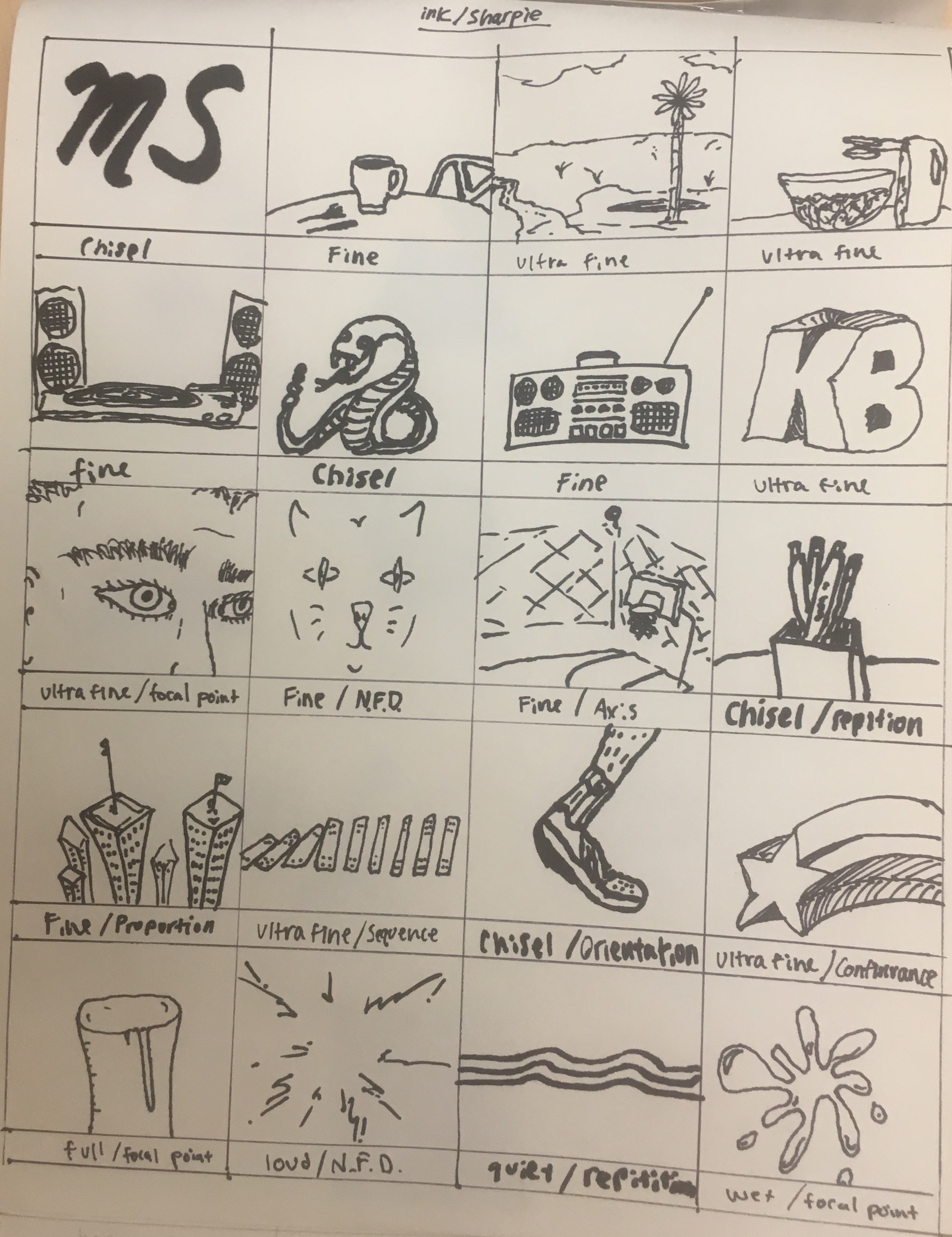
The mark making process was one that took longer than I would have thought. I enjoyed pencil significantly more than charcoal because most of the drawing I do is in pencil and charcoal is a messy medium I typically avoid. I was unsure of exactly what to draw, so I drew the first things that came to mind without hesitation. As I progressed to ink, I was more comfortable with the exercise but it still took longer than expected. I experimented with angles of the thick Sharpie and the thinness of the smallest one. The last page using collage was my favorite because it brought more life to the exercise by using color. I had a limited amount of resources to choose from, so I kept the color scheme simple which I ended up liking a lot. It inspired me to use collaging in my final diptych piece and I found cutting and pasting more entertaining than only using a pencil or pen.

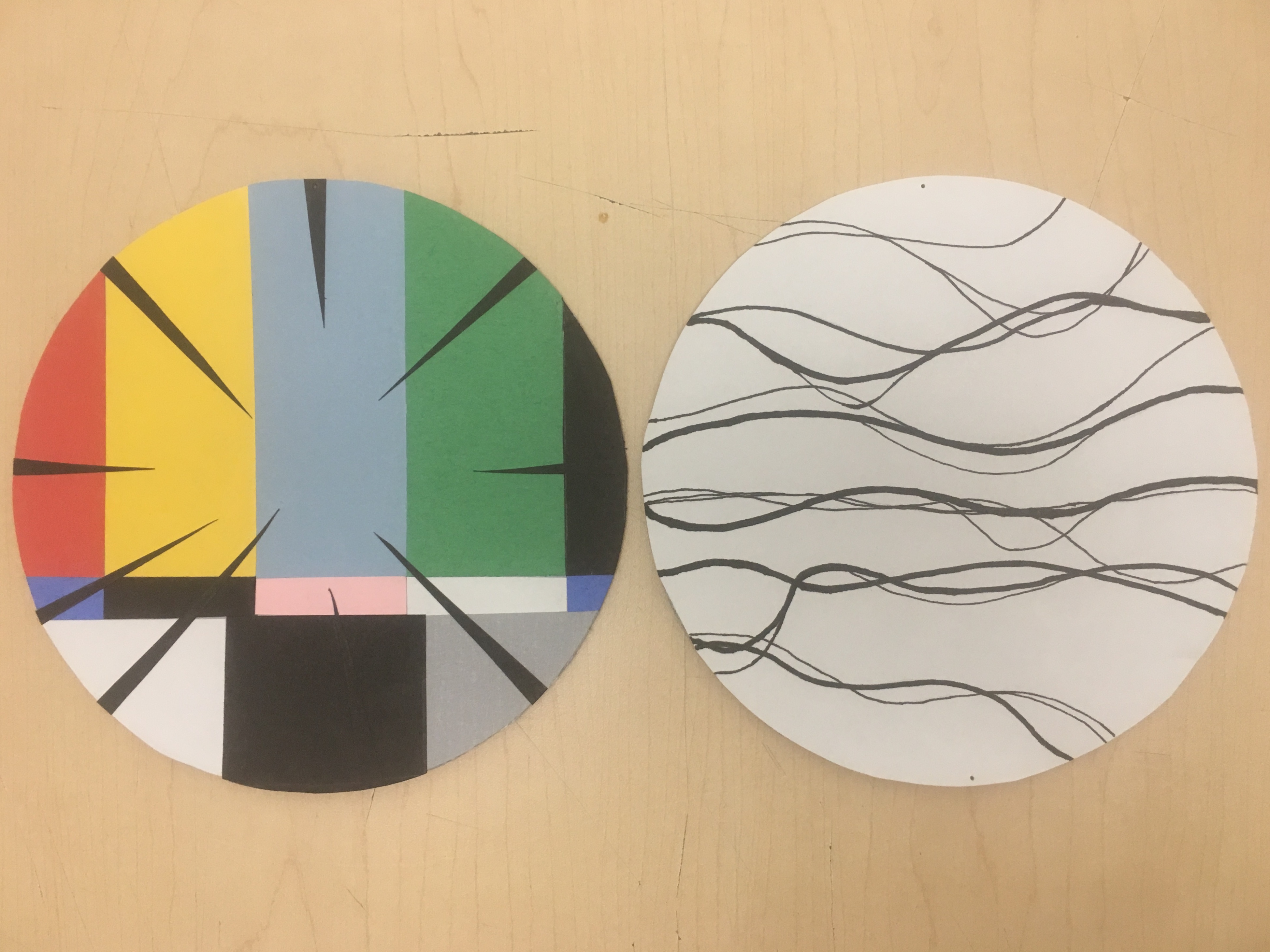
My panels are showing the dichotomy of real and virtual life that takes place during video gaming. I was initially interested in all the action that takes place within the video game itself and the lacking liveliness of the player in their physically tangible life. In other words, there is a lot of action, fantasy, and excitement that goes on in the virtual world while many times there is not much going on in that moment of the player’s real life. I chose the two concepts (action versus laziness) to delve deeper into what playing video games really symbolizes and to show it in an indirect way. I came to this idea thinking about my friends from home who are avid gamers and even got me hooked on a new game called “Fortnite.” I thought back to the wasted time we spent indoors over the break and felt this was a great opportunity to incorporate my personal life into my work. Although the two concepts are opposites, they work together and rely on each other. This relationship could not exist without a mostly stationary player and an active and stimulating television screen.
On the first panel, I indicated a television, action, and the repetition of gaming by using sharp lines, repetitive shapes, and a high contrast of colors. The colors and these sharp shapes signify television, intensity, and even time. For the other panel, I suggested laziness which was a tougher concept to execute. I used horizontal, droopy, and oscillating ink lines to imply the rudimentary behavior that one assumes while gaming. Most times, a gamer will be sitting, barely moving, and are mesmerized by the complexity of what is before their eyes. The panel implies a lost sense of time as well as a soothing and repetitious aura. The two panels alone imply their concepts, but together, it is hard to understand what they evoke as a whole. I used design elements such as color and value to show the difference in the two concepts to separate their meanings and implications. Pulling from the mark making grids, I used simple lines to show laziness and kept the panel black and white to imply the general bored feeling and laziness that comes with gaming. I was also inspired by my classmates’ examples of color use, when I considered how to depict my concept.
Final Product: Diptych