The Conversational Human Figure

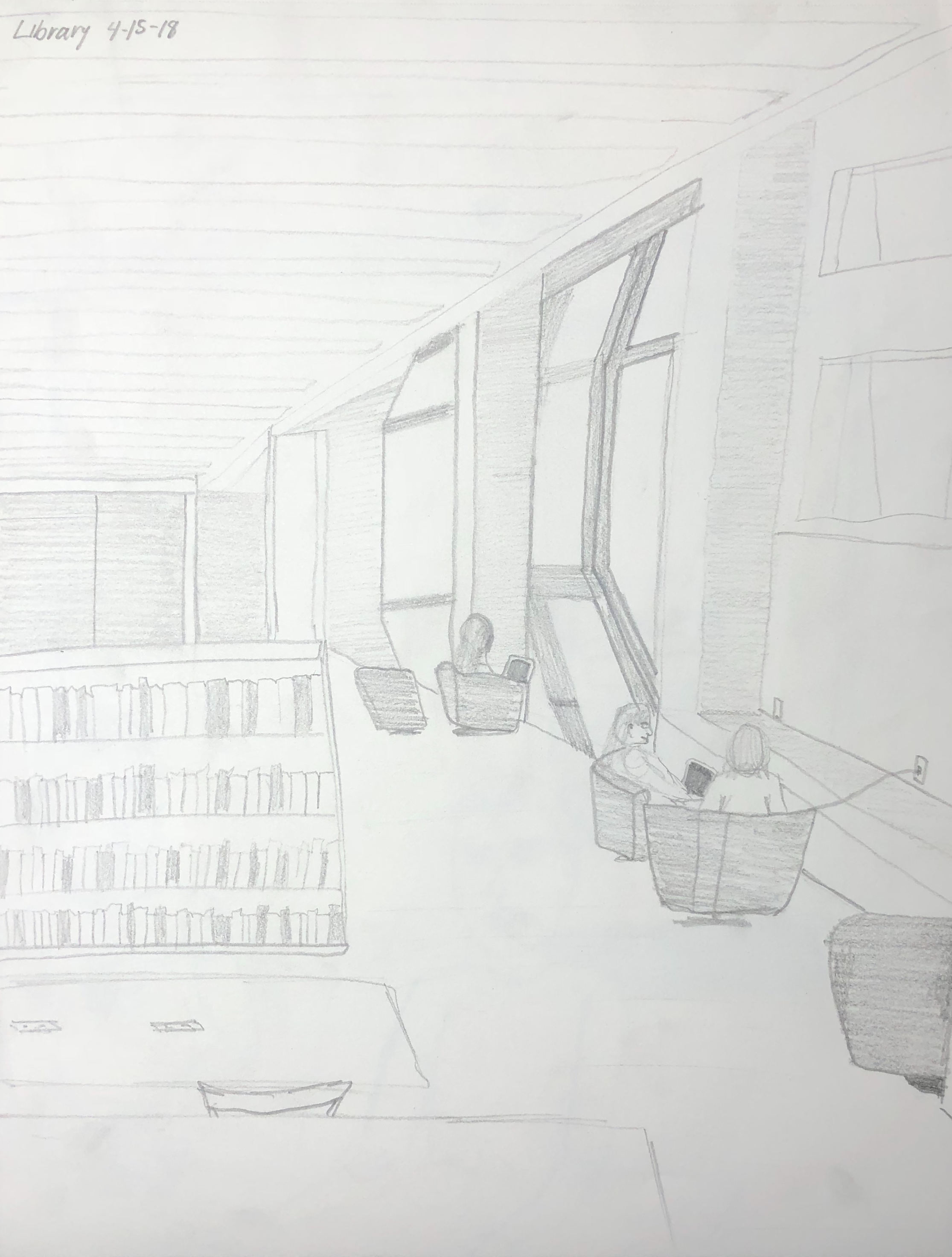
I studied the human figure through using charcoal and ink drawings, painting, and sketching in class. We first started with the study of the hand in pencil.

This slideshow requires JavaScript.

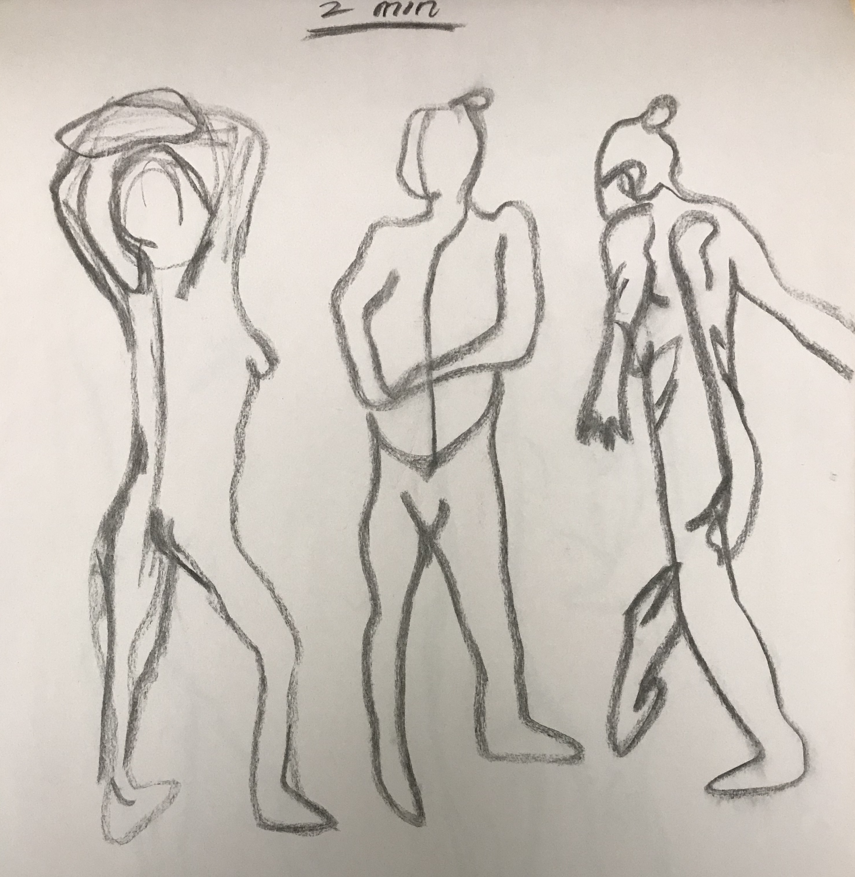
We then did charcoal gesture drawings and progressed to practicing with Sharpie. I completed the figure in 30 seconds, one minute, two minutes and then more lengthy amounts of time. This was where I began to understand the proportions of the body more clearly as I had several attempts at drawing the live models.

This slideshow requires JavaScript.

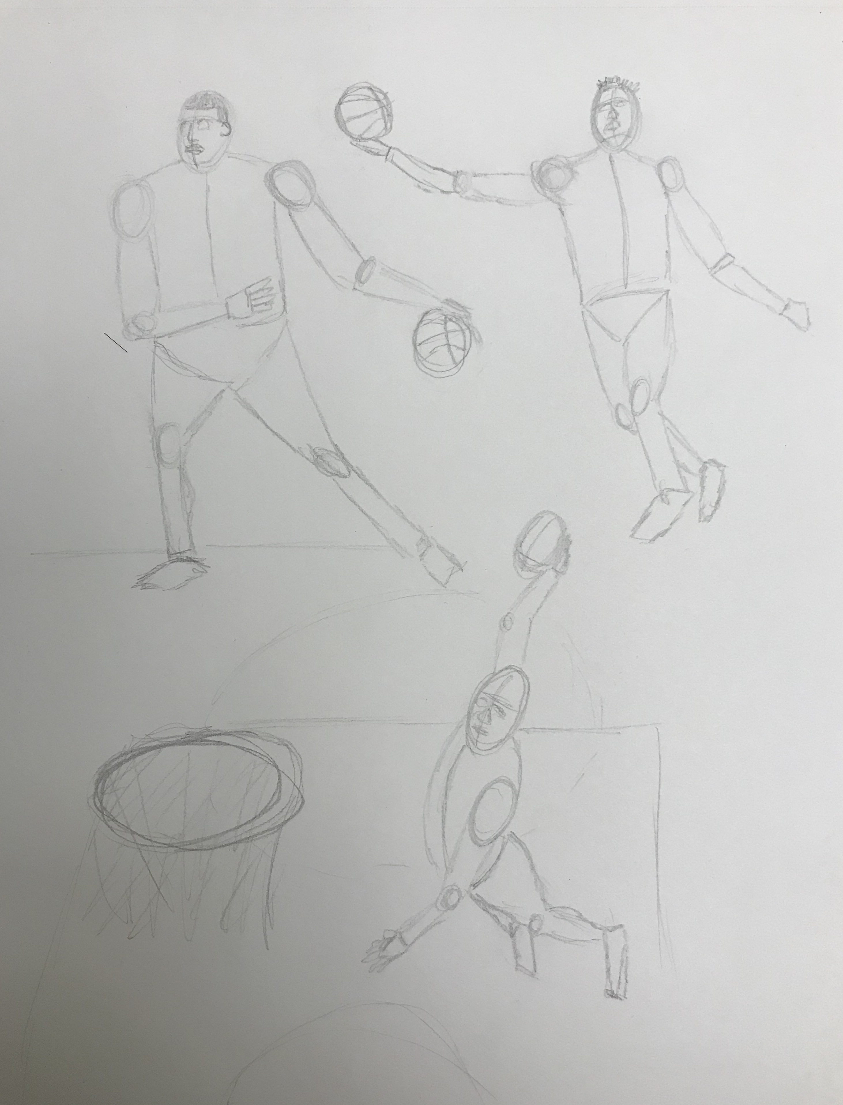
I studied NBA players to draw the human form in geometric shapes.

pencil, April 10, 2018

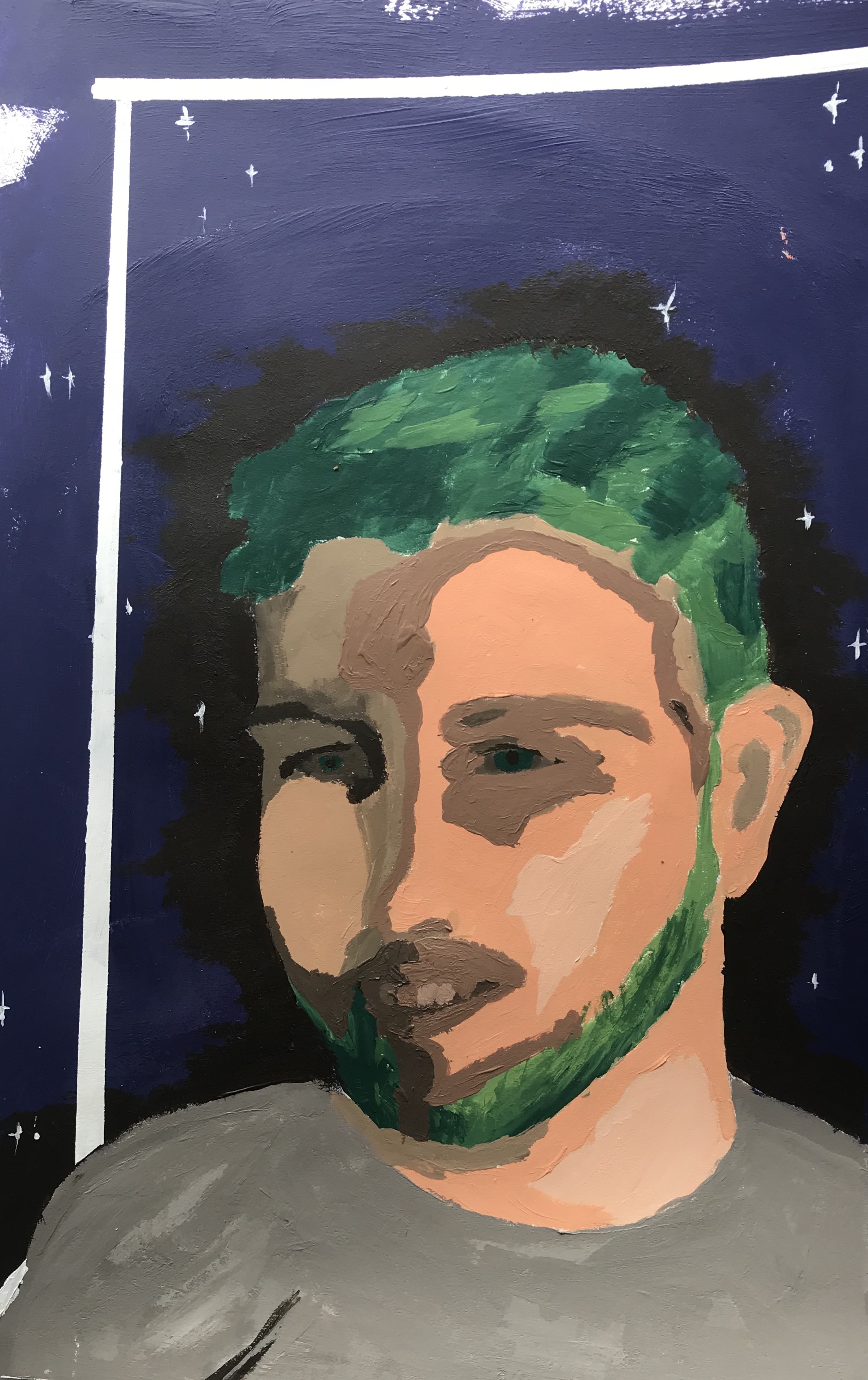
Soon after, the class then shifted to painting the human form. I painted a self portrait after not painting in four years.

Acrylic paint, April 4, 2018

We still practiced under a stopwatch while warming up to paint, and jumped right into painting live models.

This slideshow requires JavaScript.

I had to explore the use of colors more deeply when using acrylic paint to depict the human body. It took many layers of paint and the correct shades to define features of the body and was challenging yet interesting and fun.

This slideshow requires JavaScript.

We concluded our painting section of class with a two day painting of the same live model. This one was a big step in our process and I experimented the most out of the whole section.

Acrylic, april 18, 2018

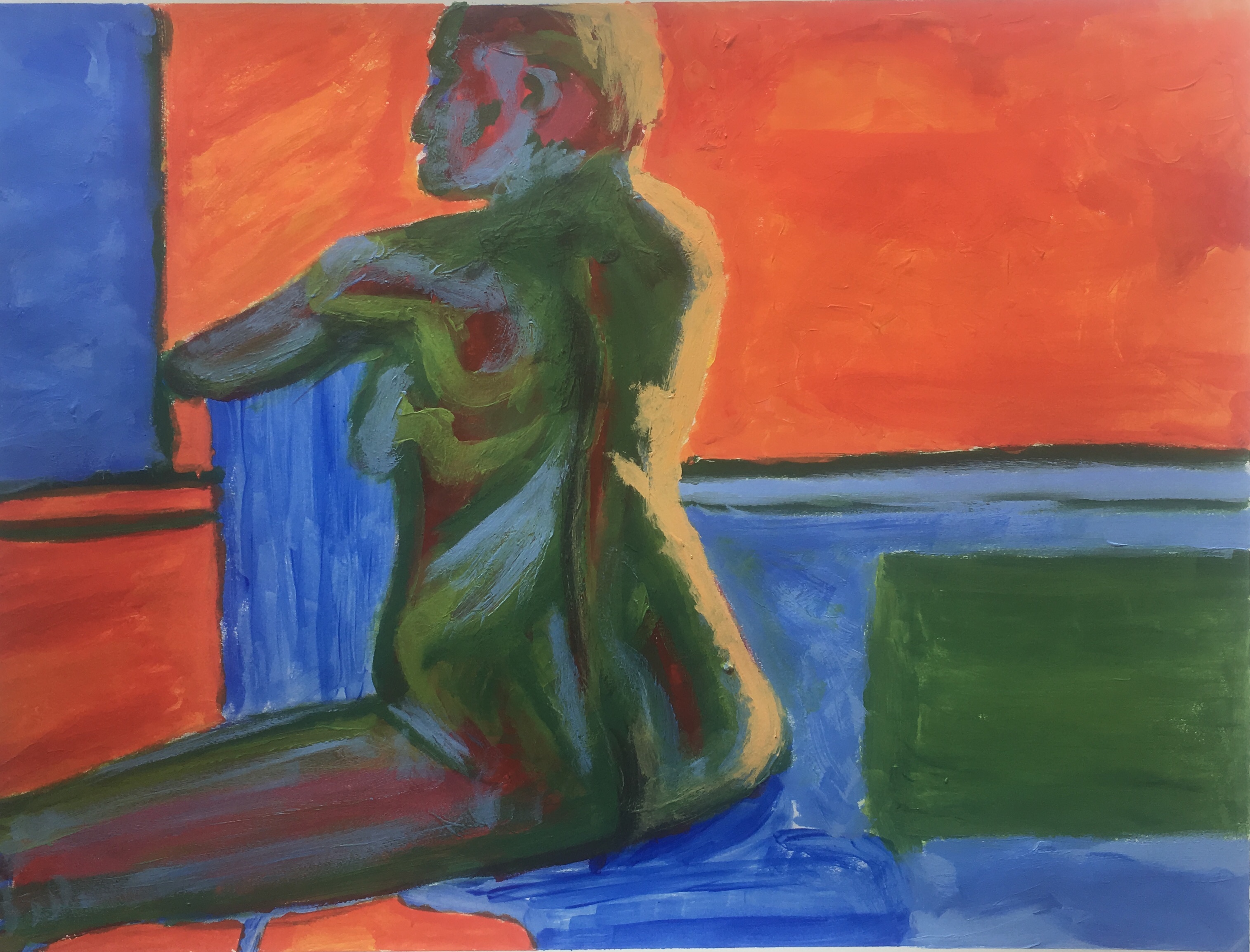
This was the most challenging assignment we had in this medium as we had a lot of time to complete it. It is difficult to call a piece finished, and although I feel like I could work on this piece further to better it, i had to step away from it. Understanding the human form is essential not only to the fashion and product industries, but it is important to understand it in life as a whole. Studying the body but not in a biological way has been more interesting and forms a basis of understanding the way the body is constructed.

Interior and Exterior Space

Exterior two point perspective

At the corner of Park ave. and 17th Street

Exterior two point perspective

At the corner of Delancey and Orchard

Exterior one point perspective

East 10th street, between Second and Third Avenues

Exterior one point perspective

Second Avenue and Seventh Street

Interior one point perspective

Dorm common area

Interior two point perspective

Pret A Manger on 12th street and Broadway

Interior two point perspective

Cure Thrift Store on 12th Street

Interior one point perspective

Cure Thrift Store on 12th Street

Let’s Get Digital

First we chose a painting we liked from our visit to the Met and drew a still life drawing.

The Course of Empire: Destruction by Thomas Cole (1833-1836) Oil on canvas
Wall tag
Line Drawing
3 thumbnail sketches

Next, I made a version using both in Photoshop.

Collage

And an iteration of my line drawing using the painting’s color palette.

Fill and brush
Color palette

And lastly one using the gradient effect.

Combination

Reflection:

After using Photoshop, I realized I could have made my line drawing more simple with less lines. Doing this would have helped me fill the entirety of my drawing in the Photoshop exercises as it was hard to fill each small white area. The first assignment was to fill my line drawing with collaging the painting of my choice was a good refresher on how to use layers and layer masks but it was troublesome at first to follow the necessary steps in order. The practice helped nail in the process necessary to fill the image’s white space to the best of my ability.

The second part of the assignment to create a color palette was new to me but taught me how to make perfect squares, make swatches, use the eyedropper tool and paint bucket tool, and shift between different Photoshop tabs a lot easier. I liked how that iteration of my drawing came out because the magic wand tool picked up interesting sections that I could make a tie dye effect with using the rich colors from the painting. Although I would have rathered more distinct lines and areas to be filled, I was pleased with the final product as it’s aesthetic made me think of myself and especially my dad, who wear tie dyes often.

Lastly, I made a version of my line drawing using collaging and the gradient effect from the color palette of the painting. I got to play with value and shading using the gradient effect which I feel is a practical tool for later projects and was relatively easy to use. This version was the most visually pleasing because the value scale was most cohesive and clean looking. By this time, I had become more comfortable using the tools and felt confident in each thing I did to complete the assignment.


Mark Making Pages

Process:

The mark making process was one that took longer than I would have thought. I enjoyed pencil significantly more than charcoal because most of the drawing I do is in pencil and charcoal is a messy medium I typically avoid. I was unsure of exactly what to draw, so I drew the first things that came to mind without hesitation. As I progressed to ink, I was more comfortable with the exercise but it still took longer than expected. I experimented with angles of the thick Sharpie and the thinness of the smallest one. The last page using collage was my favorite because it brought more life to the exercise by using color. I had a limited amount of resources to choose from, so I kept the color scheme simple which I ended up liking a lot. It inspired me to use collaging in my final diptych piece and I found cutting and pasting more entertaining than only using a pencil or pen.

Pencil and charcoal
Ink
Collage

My panels are showing the dichotomy of real and virtual life that takes place during video gaming. I was initially interested in all the action that takes place within the video game itself and the lacking liveliness of the player in their physically tangible life. In other words, there is a lot of action, fantasy, and excitement that goes on in the virtual world while many times there is not much going on in that moment of the player’s real life. I chose the two concepts (action versus laziness) to delve deeper into what playing video games really symbolizes and to show it in an indirect way. I came to this idea thinking about my friends from home who are avid gamers and even got me hooked on a new game called “Fortnite.” I thought back to the wasted time we spent indoors over the break and felt this was a great opportunity to incorporate my personal life into my work. Although the two concepts are opposites, they work together and rely on each other. This relationship could not exist without a mostly stationary player and an active and stimulating television screen.

On the first panel, I indicated a television, action, and the repetition of gaming by using sharp lines, repetitive shapes, and a high contrast of colors. The colors and these sharp shapes signify television, intensity, and even time. For the other panel, I suggested laziness which was a tougher concept to execute. I used horizontal, droopy, and oscillating ink lines to imply the rudimentary behavior that one assumes while gaming. Most times, a gamer will be sitting, barely moving, and are mesmerized by the complexity of what is before their eyes. The panel implies a lost sense of time as well as a soothing and repetitious aura. The two panels alone imply their concepts, but together, it is hard to understand what they evoke as a whole. I used design elements such as color and value to show the difference in the two concepts to separate their meanings and implications. Pulling from the mark making grids, I used simple lines to show laziness and kept the panel black and white to imply the general bored feeling and laziness that comes with gaming. I was also inspired by my classmates’ examples of color use, when I considered how to depict my concept.


Final Product: Diptych

The Dichotomy of Gaming: Action versus Reality
Brainstorms and sketches

Drawing/Imaging Written Reflection (1-24-18)

Featured Image:

Photographed by Frederick Ardley.

The diversity of images I see in my head come from traveling the world. Above is a picture of London, where I went when I was twelve. The city exposed me to magnificent art, extraordinary architecture, and a luxurious history. The following summer I went to South Africa, Botswana, and Zambia and experienced something very new to me. I admired the handmade goods, wildlife, and food and pull inspiration from both of these places. That year was a pivotal moment in which I solidified an interest in creativity because I had been exposed to so many beautiful things then.

I plan to approach this class with an open mind to all ideas and concepts. I hope to not only sharpen my skills, but to more clearly understand light, matter, and and color. Being interested in fashion design and management, I plan to apply as much as I can from this class to whatever I do in that industry. At the moment, I am most interested in honing my illustrative approach and quality. Parsons is unique in that they teach applicable practices that can help us students succeed before we even graduate. Although it was tough to decide, I came to Parsons aiming to succeed during my college years rather than have fun at a state school and wait to succeed after. I plan to learn as much as possible from both my teacher and classmates to make this goal possible.