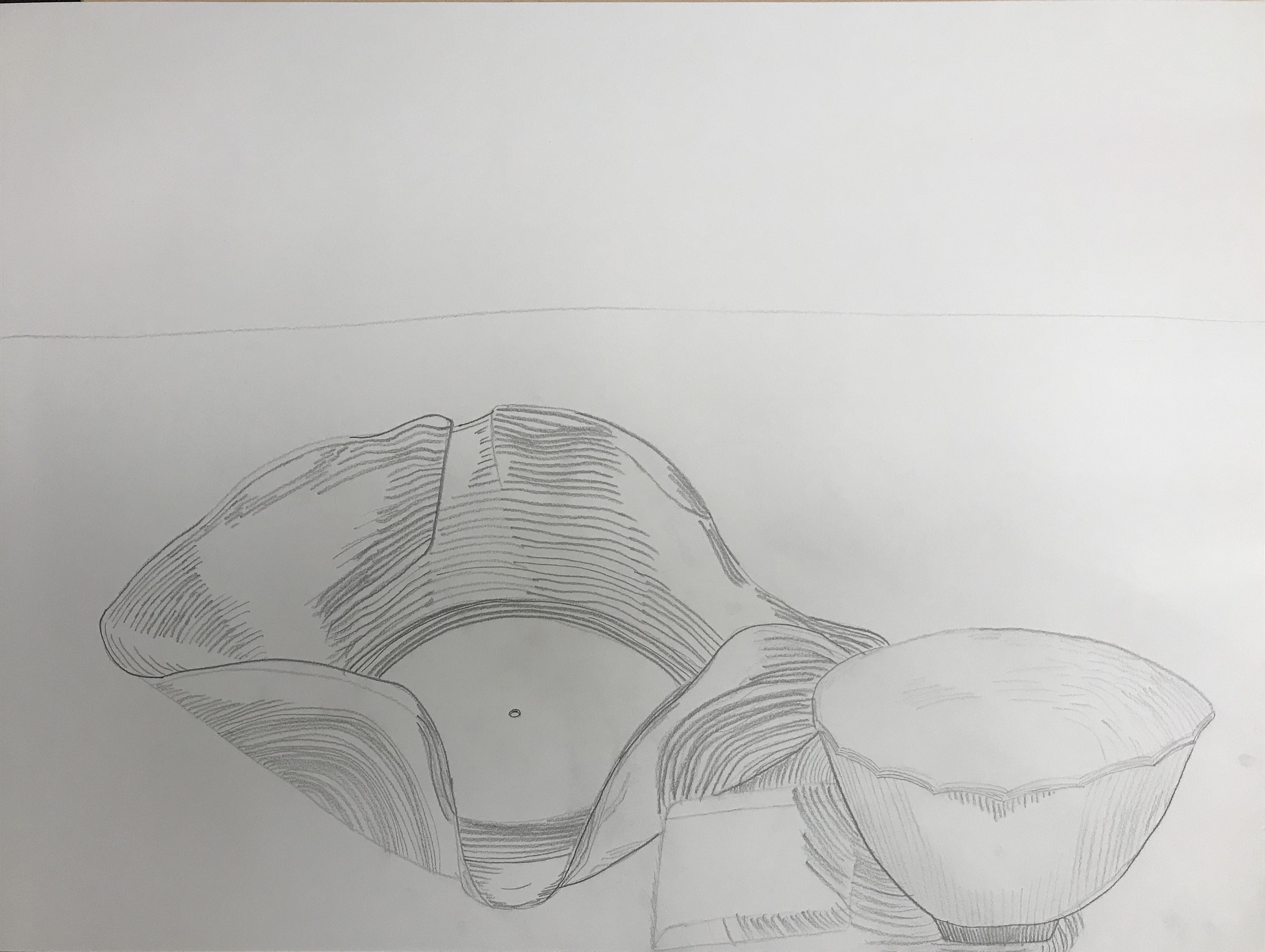
First we chose a painting we liked from our visit to the Met and drew a still life drawing.
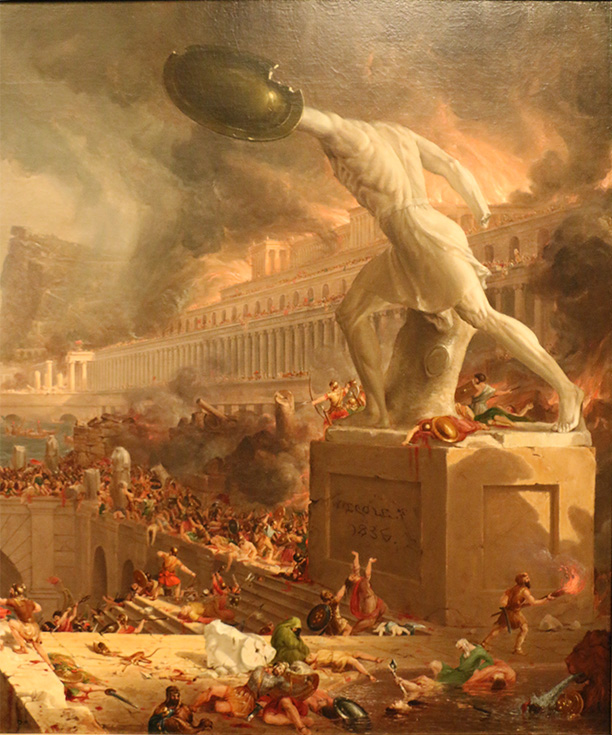
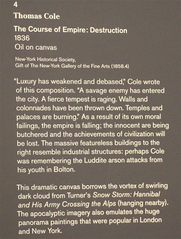
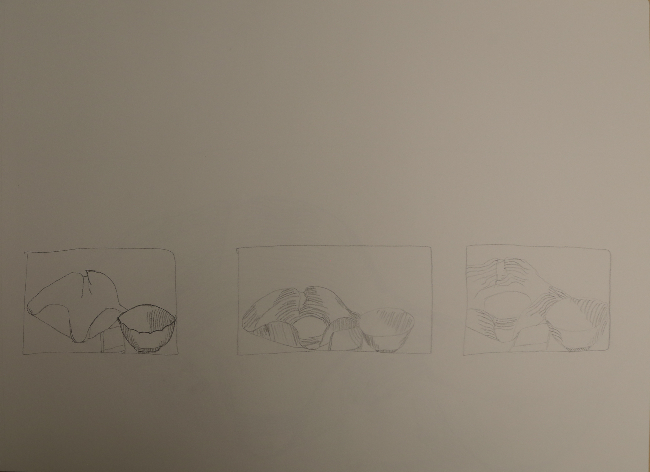
The Course of Empire: Destruction by Thomas Cole (1833-1836) Oil on canvasWall tagLine Drawing3 thumbnail sketches
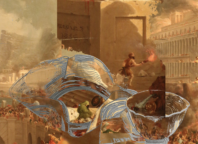
Next, I made a version using both in Photoshop.
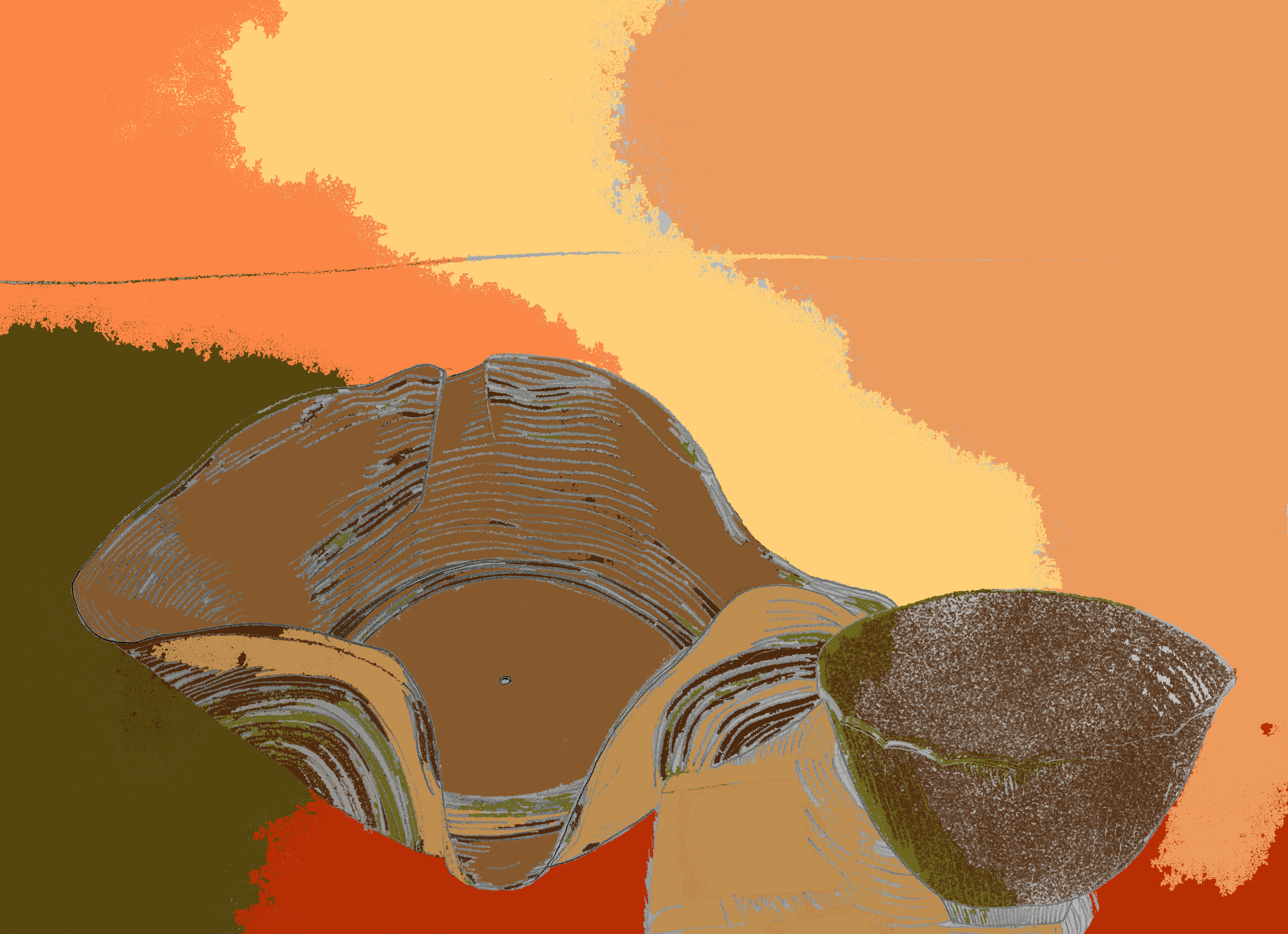
Collage
And an iteration of my line drawing using the painting’s color palette.
Fill and brushColor palette
And lastly one using the gradient effect.
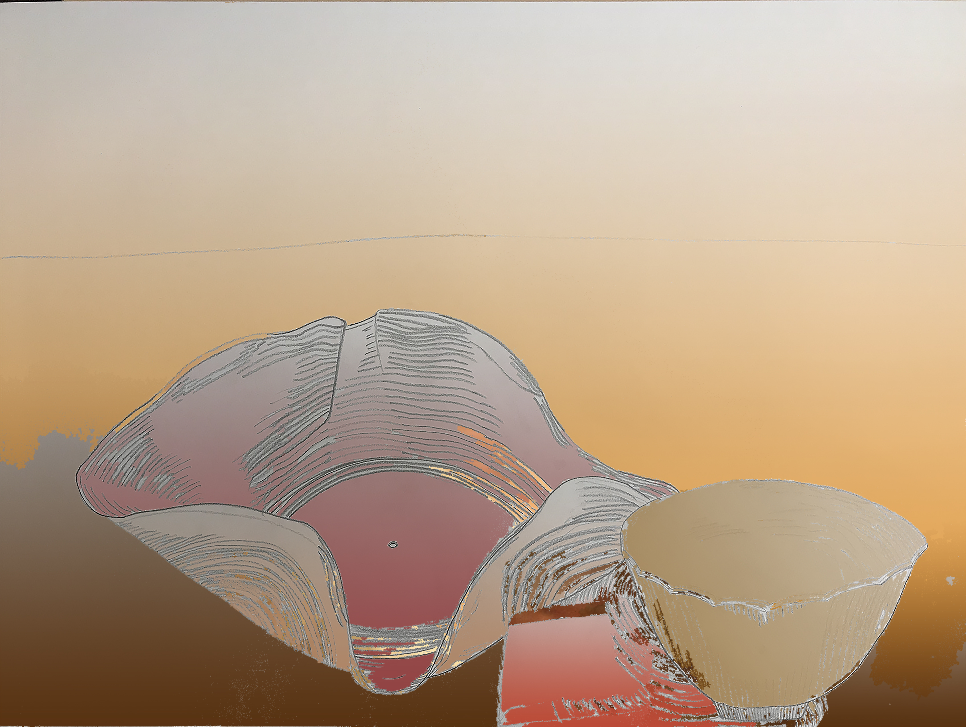
Combination
Reflection:
After using Photoshop, I realized I could have made my line drawing more simple with less lines. Doing this would have helped me fill the entirety of my drawing in the Photoshop exercises as it was hard to fill each small white area. The first assignment was to fill my line drawing with collaging the painting of my choice was a good refresher on how to use layers and layer masks but it was troublesome at first to follow the necessary steps in order. The practice helped nail in the process necessary to fill the image’s white space to the best of my ability.
The second part of the assignment to create a color palette was new to me but taught me how to make perfect squares, make swatches, use the eyedropper tool and paint bucket tool, and shift between different Photoshop tabs a lot easier. I liked how that iteration of my drawing came out because the magic wand tool picked up interesting sections that I could make a tie dye effect with using the rich colors from the painting. Although I would have rathered more distinct lines and areas to be filled, I was pleased with the final product as it’s aesthetic made me think of myself and especially my dad, who wear tie dyes often.
Lastly, I made a version of my line drawing using collaging and the gradient effect from the color palette of the painting. I got to play with value and shading using the gradient effect which I feel is a practical tool for later projects and was relatively easy to use. This version was the most visually pleasing because the value scale was most cohesive and clean looking. By this time, I had become more comfortable using the tools and felt confident in each thing I did to complete the assignment.