For my final project I chose The Senses: Design Beyond Vision exhibition. Within the category of senses I focused on hearing and how to visually depict sound. I think that having to make an image to define a sound is super interesting. Three Album or Record Covers caught my interest: Sound and Color by Mario Hugo, Persuasive Percussion by Joseph Albers, and the Diagonal Records by Russell Haswell.
Sound and Color by Mario Hugo
Two squares side by side in a spread format. There are skinny horizontal dark lines that run diagonally across both square. The intersect and form what optically looks like the corner of a wall. It almost looks like a photograph of telephone wires. It has a tie dye effect of light aqua blue, orange, and Purple thick stipes running vertically through the squares. All the elements create the sense of a lot of movement but at the same time stillness and harmony. I think it was included in the exhibition because you get a good sense of how the music behind the album will feel just based on the image that has been given to us.
Persuasive Percussion by Joseph Albers
A square format with an all off-white background. There are equally medium sized black dots lined neatly across the square in an offset pattern who eventually fill the whole bottom of the square. PERSUASIVE PERCUSSION is typed small and spaced out across the very top of the square in an outlined Serif font. The pattern of the dots reminds me of an analog clock or some kind of coded message like morse code. It is some kind of language that is manipulating if that makes any sense. I believe it was included in the exhibition because it also evokes an idea of what the music behind the record might sound like; something maybe pressing and with a pattern.
Diagonal Records by Russell Haswell
This Record cover is one of 7 that incorporates abstract shapes and typography. The front has a bright yellow background with large deep coral colored shapes filling the square. There are a few off-white four pointed stars as well and a horizontal off-white stripe across the center with the songs typed in black on it. The back simply has one large four pointed off-white star in the center and the leftover tab of the horizontal stripe from the front. These Record covers are included in the exhibition for a very similar reason as my other two choices. It is nicely summed up by the Artist Guy Featherstone, “I’d examine the music and try to work out, almost through a process of synesthesia really, what does that sound ‘feel’ like? What does it look like? And it’s not just the sound, it’s the ‘experience’ of listening to that music. How can I visualize that sonic terrain?”
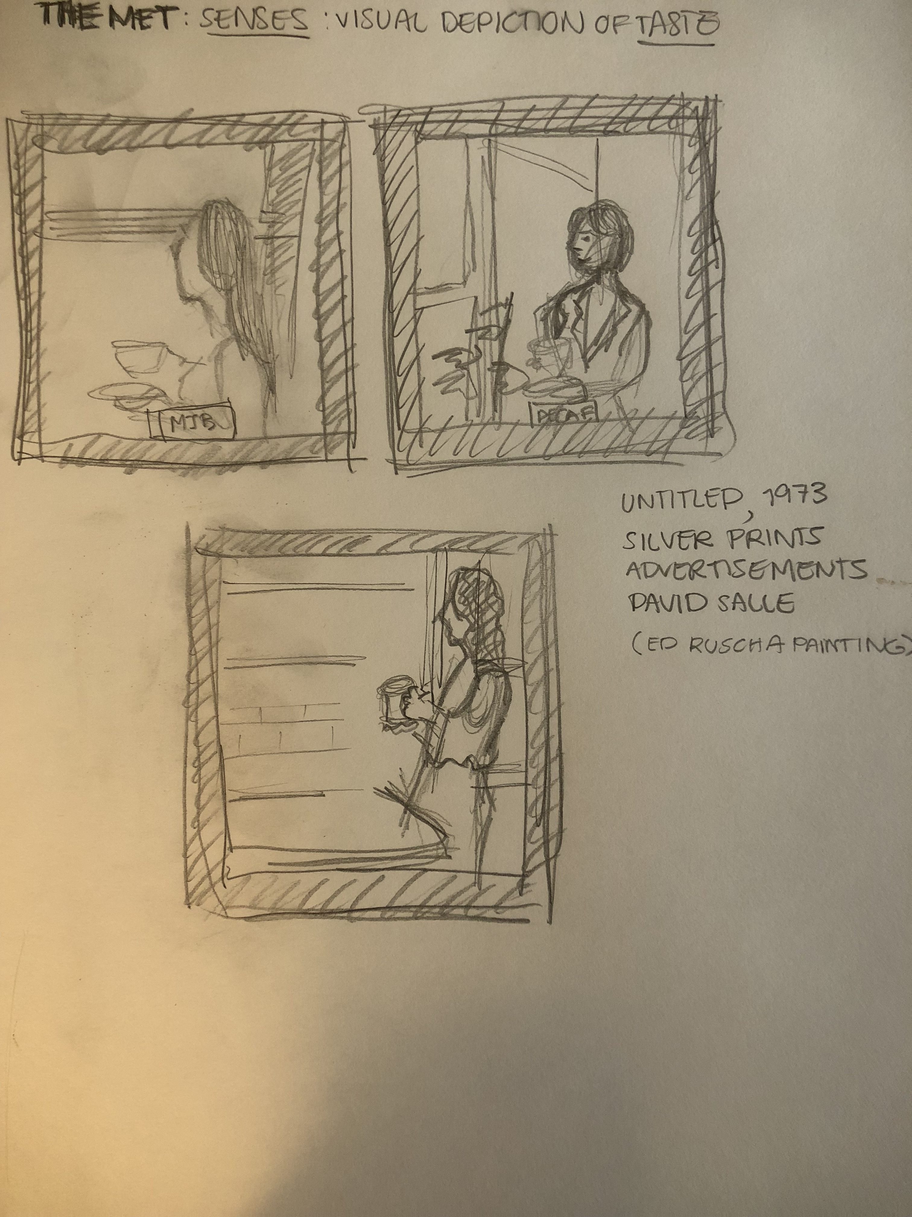
At the MET I chose three sense pieces that focused however, on the sense of taste.
They are three square images for the same campaign. Each shows, in black and white, a woman standing by a window holding a coffee cup and staring into the distance. At the bottom of each composition there is a small in color rectangle with the type of coffee that the respective woman is drinking. Each Image although similar feels very different based upon the exact position of the woman in her room, the different types of women, their different cups, and different environments. This would fit into the Senses exhibit at the Cooper Hewitt because they like the album covers achieve creating a feeling one might have while experiencing the product.