Alex W. – Allan Sekula “Fish Story”

images-1

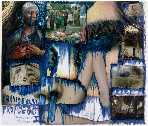
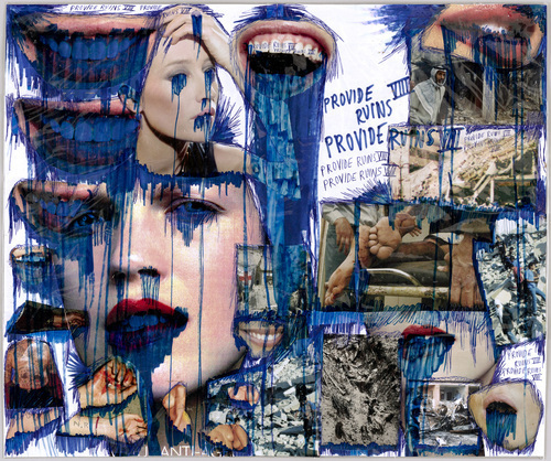
Allan Sekula (1951-2013) is an American photographer, writer, and filmmaker. Most of his work explored capitalism, global economy, and wealth indifference. Sekula’s seven-part photographic work,  is made up of seven chapters, 150 color photographs, and twenty six text panels.

The first chapter that is showing at MOMA shows the important role of the ocean in the modern global economy. Sekula takes images from the world’s port cities, the pictures are a mix of moments in that are depict unemployment and destruction in the old industrial powers, the pursuit of cheap labor, and the work of seafaring.

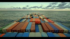
The picture above to me is breath taking. It’s power and insightful with simplicity. One contrast that I really like is how the seafare industry is so big, but in the picture the cargo ship is all alone with nothing but sky and water in the distance. It’s as if cargo ship is invisible to the world even though it connects the world together. I personally haven’t put thought into how the global is connect and this project has made me think a lot about the world and how big it is. I also thought the endless horizon could be a metaphor for how the seafare industry is endless or even limitless. I can never rape my head around limitlessness. It’s hard to conceptualize something that’s endless with no boundries, and I really like that. My brain works really hard to understand, even though most times I don’t come to a good conclusion and that’s intriguing; A quality many good photos have. In my personal work I like to shoot something that has a lot meaning. Sekula does just that and that’s why it was my favorite.


Cai Guo-Qiang. Borrowing Your Enemy’s Arrows. 1998

CRI_315798

This piece can be admired in the current MoMA exhibition Scenes for a New Heritage: Contemporary Art from the Collection. The core of the installation is a wooden fisher boat, which the artist found near his studio. He was inspired to create the artwork by an old Chinese legend from the 3rd century: A brilliant strategist, who is fighting against the Chinese army with less powerful forces, deceives his enemy the by leaving behind an unmanned boat, which leads the army into shooting it with their arrows. Later, the strategist and his men use their enemy’s weapons to conquer them.

This piece of art immediately drew my attention due to its magnitude and position. Hanging from the ceiling in the middle of the room, it has a very striking effect on the viewer. In addition to that, the arrows penetrating the boat and the waving Chinese flag at the stern cleverly suggest a myth behind this installation. I chose this artwork because of its powerful story. I interpreted it as the might of the mind over violence, which gives the weak the chance to obtain victory over the mighty.

(Untitled)

image


Not much was said about this piece. I hadn’t heard Anja comment on the work and the tag under it had nothing to add. The name of the piece being ‘Unstable Talismanic Rendering 27’ only added to its quality of ambiguous elusiveness. None of its colors being to bright or direct adds a character to the work. It’s textures give the art a shape and an obvious direction that led me to linger behind the group and observe it for a little while longer. Kerstin Brätsch created the ‘rendering’ in 2014.

Julia Bender Moma Critique

BN-HJ656_NYMODE_J_20150312160145

The artwork “Gamepieces” at Moma by Nalini Malani (2003/2009) stood out to me for a number of reasons. First, when first walking into the room a type of siren call was heard being played on a loop. This sound effect really added to the experience of walking into the room and immediately changed my sense of what the piece was supposed to demonstrate. The next thing I noticed was that instead of traditionally just standing in front of the piece, I was able to walk under the spinning chandeliers into the piece to get a different perspective. By being able to do this, I could interpreted the chandelier’s black/grey projection onto the wall, but I was also able to view it from the back where I focused on the colors painted on them. I loved the way that silhouettes of people were presented on the wall when they walked in front of the projection, because I think that those shadows can be interpreted as a part of the piece. The last thing I noticed about this piece was the block of blue at the top of the picture, and the harsher red being projected onto the bottom half. The blue was intended to give that upper half a more calm and relaxed feel, while the bottom half was intense and represented violence. I especially loved this piece because it isn’t necessarily straight forward like some other artworks ,therefor almost everyone viewing it has a different interpretation on it’s meaning.


MoMa report-Ella

image


This piece by Sharon Hayes is called “Everything Else Has Failed! Don’t You Think It’s Time For Love?”, done in 2007. This piece includes 5 frames each with a different illustration but every frame includes the same message. In addition it has a five-channel audio installation which plays numerous love letters read by Hayes herself.

I chose this piece because I’m very much a romantic and I think the message is very strong, the sound installation is especially a powerful tool in enveloping the audience in the piece as well as adding a personal and emotional appeal. Hayes often references “war”, but does not say which one, and the phrases sound as though they could be coming from a rejected lover’s diary. This piece conveys the message of love but it is much more than that, it is describing war and social change in the world. Every letter starts off with phrases like “My dear lover” or “My sweet lover”, but goes on to explain in detail how helpless and harsh it is to live in a time of war and destruction. Hayes addresses the relationship between war, politics and love in a powerful and enrapturing way in this sound installation.


Provide Ruins IV (Isabel Conesa)

Thomas Hirschhorn
Provide Ruins IV
2003

First of all, I chose this art work because it was appealing to my eyes since I first saw it. I feel like it can have a lot of meanings and that it’s a simple piece but creative. And since we live in a world where social media surrounds us and is constantly developing, I think it is a very good idea to express the risks and vulnerability of advertisements and commerce. Thomas Hirschhorn is known for the everyday material he uses in his works like cardboard, cellophane, and duct tape. In my opinion, his method of engaging with society with collages and combining images is original and creative.

This art work shows a collage of images taken from newspapers or magazines of war-torn buildings and victims of war with the faces of fashion models, all overlaid with blue ink that pretends to be tears or blood. The work’s title, Provide Ruins, mimics the names the military and the media bestowed on war operations, such as Desert Shield and Restore Hope.


6f5790ffe6fc0bb6aa7bda0c31e5ce3d CRI_142121

MoMA report – Vicky

Memorial, Luis Camnitzer 2009

memorial

This artwork is called memorial. It is done by a Uruguayan artist called Luis Camnitzer in 2009. The artwork is a series of phone book pages framed right next two each other on two white walls.  At the beginning I thought they were just phone book pages, but after the curator told us the meaning I saw it in a completely different way.

Camnitzer decided to do an art piece that honored the  victims of the military dictatorship of his country. So he took phonebook pages and erased the number of those who disappeared on this incident. This was my favorite artwork in the exhibition because in my country we are also going through a military dictatorship and a lot of people are dying and disappearing because of our government. I think that it is a very creative and unique way to represent those who disappeared or died for their country.


MoMA Report – Lionel

IMG_1489       IMG_1485

This art installation, created in 2002, is called Lament of the Images and is by Alfredo Jaar, a Chilean artist.

The first part of this installation involves walking through a dark tunnel. On the wall three backlit panels reveal information about events and images in the public domain. You walk forward, turn a corner, and then it is dark. The only light looks like daylight and falls in at the very end, through a doorway. You walk the length of the hallway and turn in the doorway, and you are blinded. What stands there is a large dark room with nothing but a big bright white screen. You are momentarily blinded by its brightness, since just a second ago, your eyes were accustomed to the darkness of the hallway.

The three panels of text in the first hallway each tell about an important event, as well as the absence of images of that event. I interpreted that the large bright screen represents the amount of pictures that exist, especially in today’s society.  Most people are taking pictures many times a day with their smartphones. Photography is very accessible in this day and age; all phones have them built in. Since the artist believes that if one tries to see all of the pictures in the world, one will see a bright blinding light. It is impossible to see every single picture; they blend together into something representative of events that they stand for.


Assignment (extra credit) MoMA Visit Report

MoMA Visit Report

Due Friday, July 10

Write a short report (1 page) on your favorite art work that you encountered in the Scenes for a New Heritage exhibit. Make sure you include the title of the work, artists name, and the year it was produced. This report is your personal critique, giving us more insight about the meaning and the technique of the work, and explaining why you liked that work in particular. Post to our site and add it to the “MoMA Report” category.