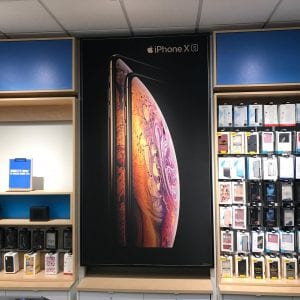
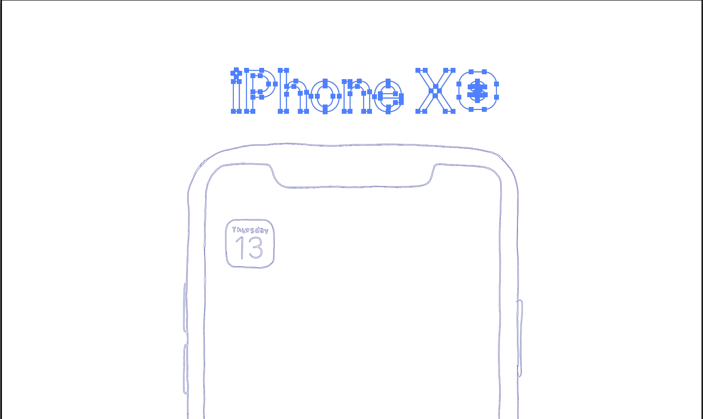
The most quote that I agree in the video was that we are living in the publicity. Every in the morning, while I go to work or school, I can see a variety of advertisement. In the subway, walking on the street, school board and etc. The poster that I always and often possible to see is the iPhone poster. It was promoting the gold frame iPhone on a black background. Then they have shown the picture of the planet. Lines what they used on the poster is curved that gives the audience a soft image. By using the black color, the poster looks rich and deep. Also, using variety mix color for the planet, it looks to emphasize the color vividness. The gold frame on the black background looks clearly. The material of the poster was a matte poster, so it does not have much reflection of lights. Fonts were what Apple always used on their poster. Even if they did not put the iPhone on the top of the poster, I would know it is from Apple by fonts. I choose three sectors.
Original: At&t
Original: Anyone who wants to purchase a phone
Original: On the Wall
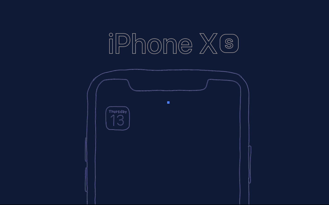
For the redesign of the advertisement, I chose an advertisement design for three different sectors of design. Which mean the target audience is different for each poster. However, the common theme of the sign emphasized simplicity. Simplicity is the company preference since that was established. Then used a soft matte pastel tone of color to gives a soft image. Why I choose that color was, my opinion of new york city colors are desaturated, dark and busy. Thus, I thought if I used soft color, it possible to catch more audiences eyes.


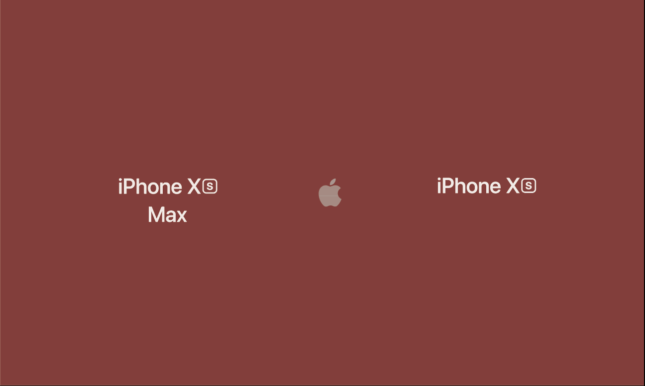
New: Street
New: Who wants to purchase the phone but did not know anything about iPhone XS
New: On the wall of the building
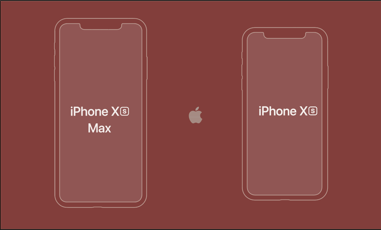
First one, when I look at the original poster, I could see they try to advertise two types of devices. However, I recognize because I know what is the iPhone is. Likewise, I want to show the difference between these two phones. The most significant difference was size. Because I want to emphasize the specification, I put symmetrical and shows the size differences.
New: Street
New: The other phone users
New: On the wall of the building
Second design inspired by Apple advertisement in 1995. It was about the Apple PDA Newton. The advertisement has shown that they are possible to draw on PDA. I thought about in my young age, when I have to draw mobile phone, I always draw the folder design phone. I thought about nowadays, kids have lots of design reference because of technology development. I wanted to put metaphorical theme that nowadays the kids have to draw they are drawing iPhone. The target audience of the design was

The third design I inspired from NYC subway. There are lots of tiles are at each station of MTA. Sometimes even the station title made with tiles. I redesign the advertisement for the title theme. For this one, I brought out the original image to give an illustrating feeling, but it was very changed to give to gives a minimal sense. Therefore, I track the image for the poster. However, I did not like that much. Later, I should learn more technic for the illustrator.
New: MTA Station
New: Subway passenger
New: on the tile