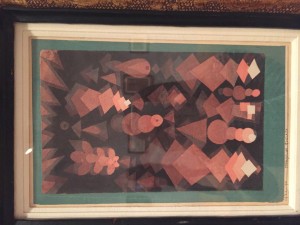
- Suspended Fruit, 1921.Water color and graphite on paper mounted on green paper mounted on cardboard. The Berggruen Klee Collection. 1984 (1934.315.27)
I fell in love with the overlapping techniques of this artwork. The use of overlapping made it seem like the 2D work was turned into a 3D work that when I went closer to take a look at it, I felt like the middle part was deeper into it than the surroundings. I would defiantly want to try this technique out on our next project.
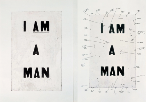
2. Glen Ligon, Condition Report (dispych), 2000, silksreen on Iris print
This was my favorite artwork that was displayed in one of the Parsons buildings. When I took a quick look at it, I thought it was too simple and it did not have much meaning to it until I went closer and compared the two next to each other. This artist focused on the imperfections of art — labling the cracks, pencil marks and etc.
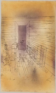
3. Paul Klee: Ghost Chamber with the tall Door (New Version), 1925
Sprayed and brushed watercolor and transferred printing ink on paper, bordered with gouache and ink, mounted on cardboard
What I like about this media is that, it look like Klee mixed two medias together: pen and ink and acrylic paint. I love the technique that used, using soft colors for the negative space and using solid lines for the foreground of the image. The use of the pen strokes create a sharper look.
4. Annette Lemieux, Artificial Heart on Sleeve, 1990, gelatin silver print
This image has a focal point but it seems that the artist was trying to explain more than what is painted in the middle. The way the artist represented this makes us think outside the box. I love the dotted technique she used which makes it look like stiches.
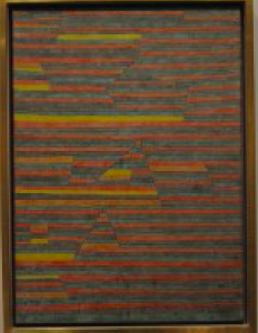
5. Paul Klee: Monuments at G., 1929
Gypsum and watercolor on canvas
The Berggruen Klee Collection, 1984 (1984,315.51)
If you look at it closely, he only uses a certain number of colors and paints the artwork in a pattern. What is cool and interesting about this piece is that he adds movements through the few color that he uses. This is defiantly one of the techniques I would love to try for our upcoming projects — all though I wish he chose a different color scheme as these colors seem too warm and dark.


