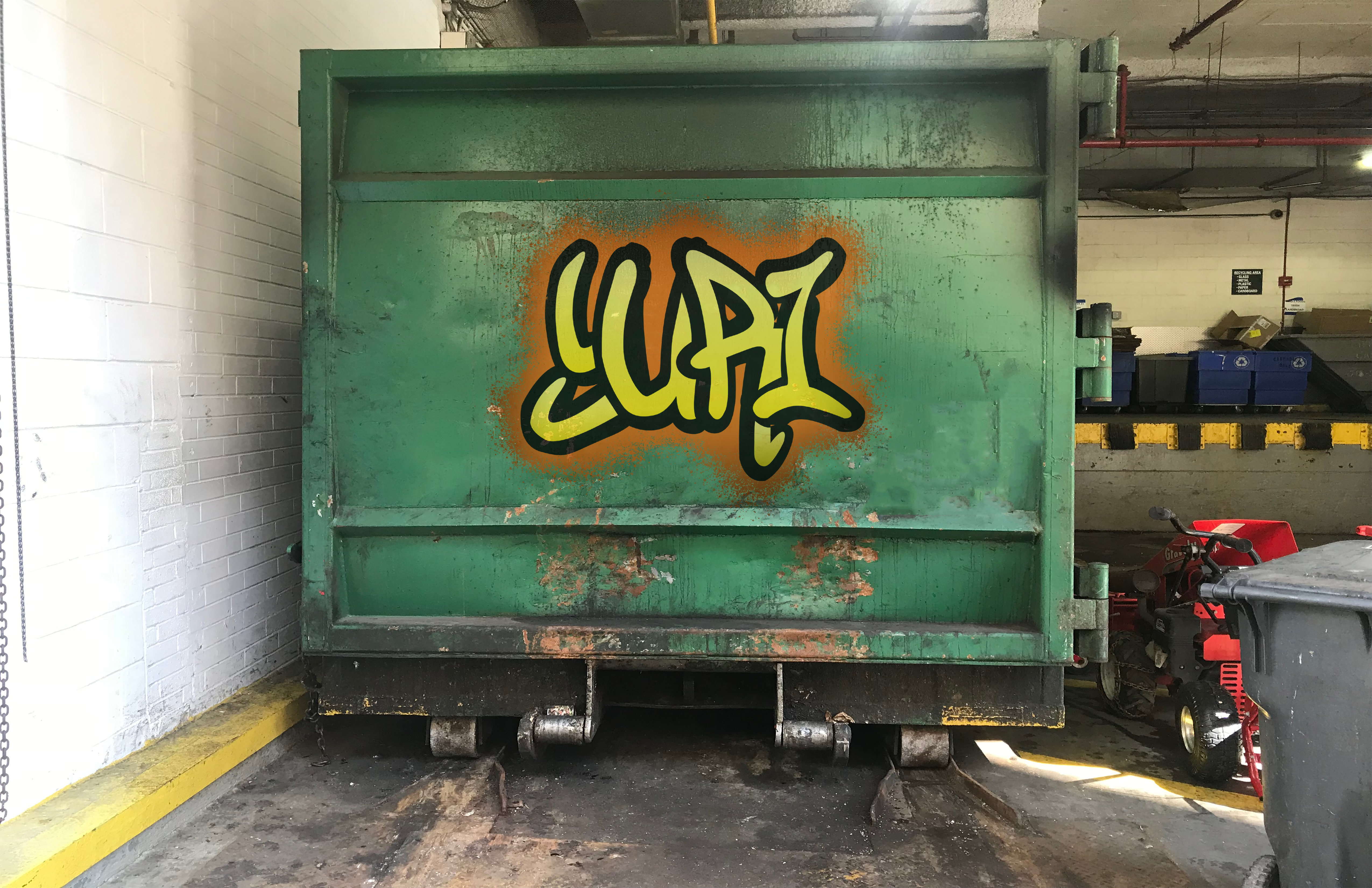
Moving onto typography, our next project was to create our own graffiti on a real life background. We were informed to design our own name with a sharpie or pen to brainstorm our ideas. I was intrigued by the bold overlaying shadows on the examples that our professor showed us. Through this inspiration, I overlapped the letters in my name to create a unified feeling.

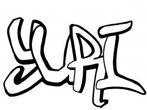
After I created my own hand-drawn design, I scanned my drawing to illustrator and set my drawing as a template. I used a pen tool to re-draw the imperfections and flaws I found on my drawing. I then filled my letters with warm tone colors with black outlines to look more like graffiti letters. Additionally, I used a paint brush tool to also make the letters look like it was spray painted.

After refining my graffiti on illustrator, I took photos of different backgrounds and settings on the streets to make the final artwork more realistic.
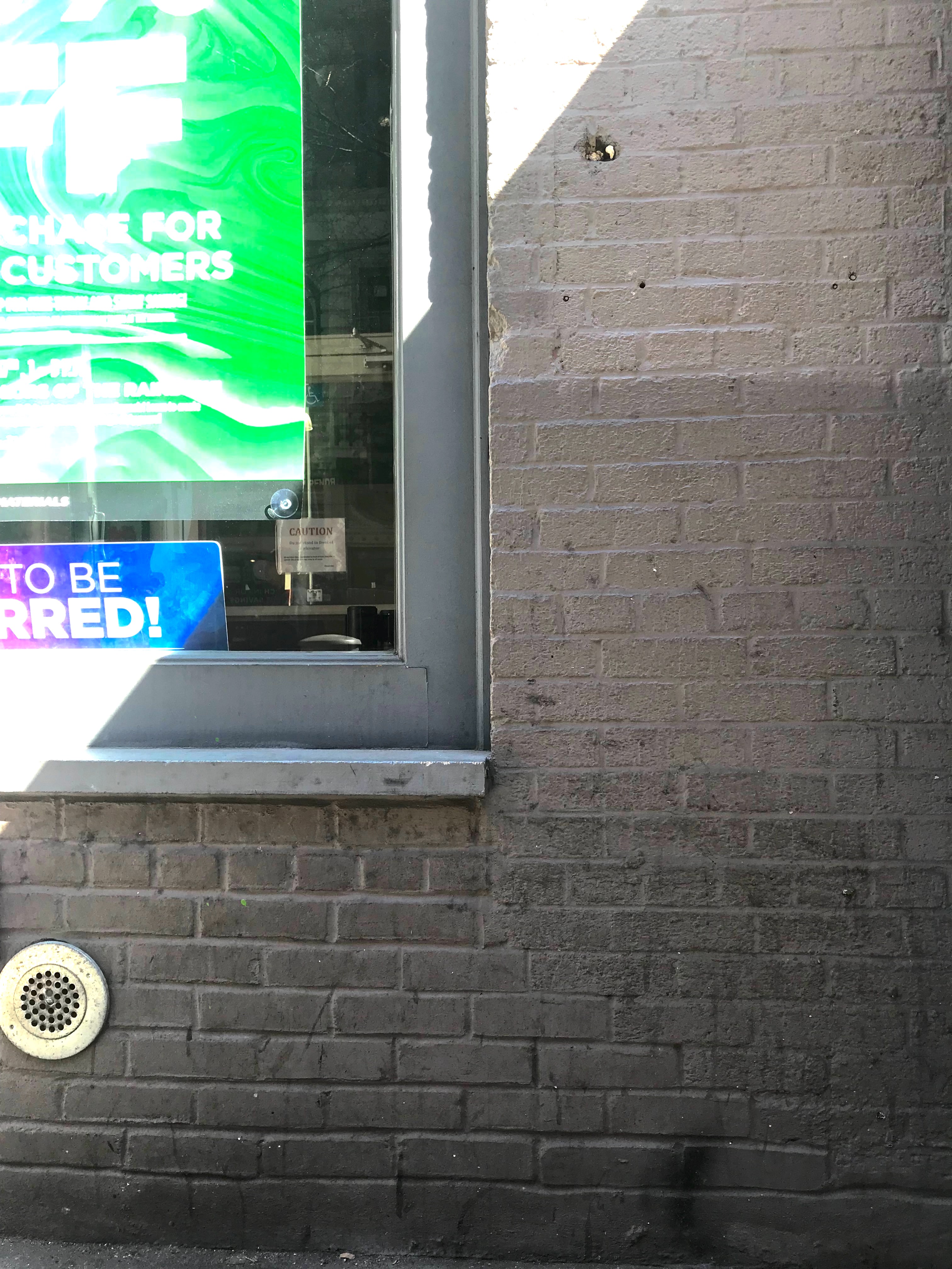
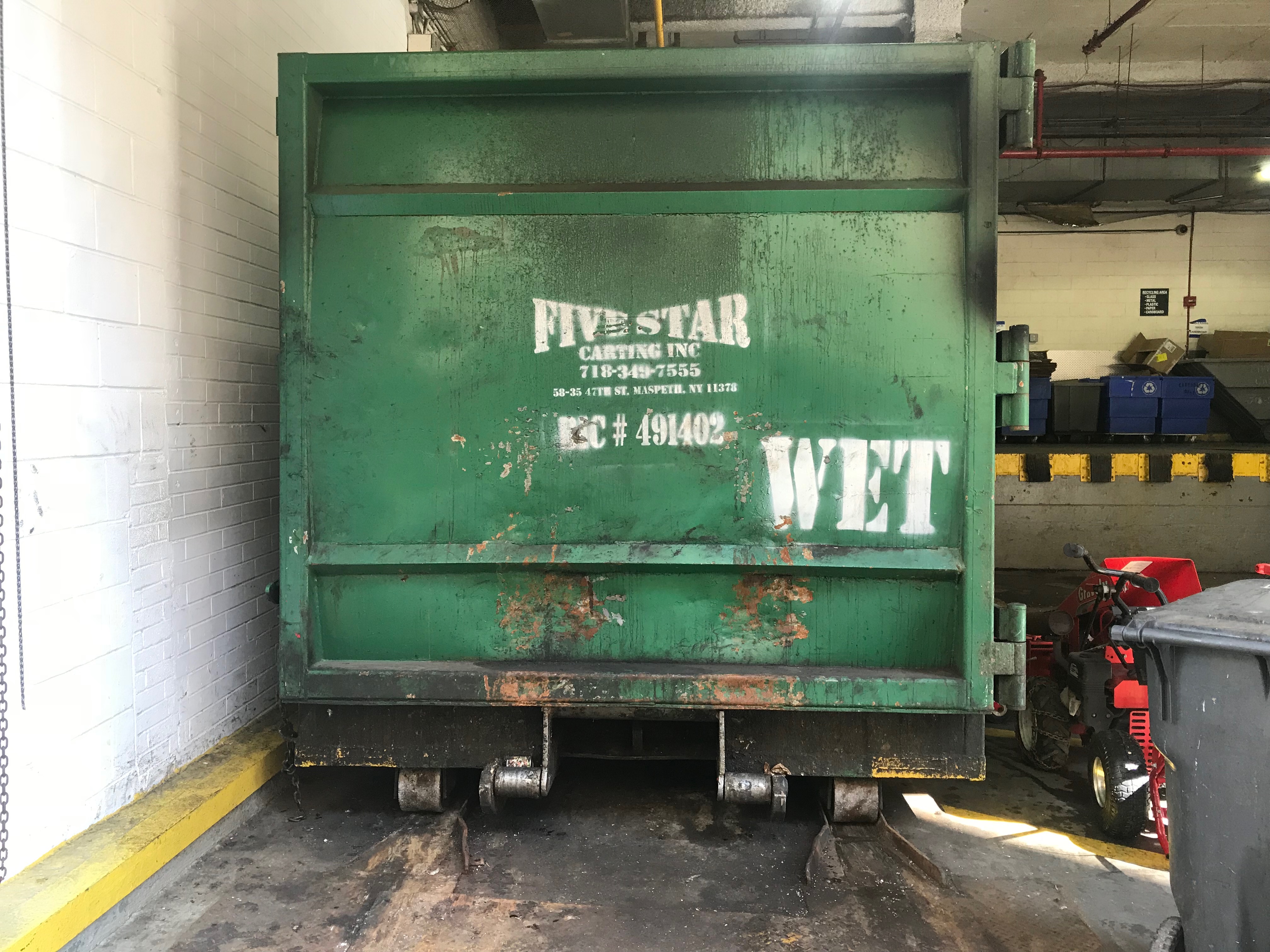


I then added my graffiti design onto both images to compare which image suited better for the final artwork. As a result, I decided to use the first image because I thought space and the white graffiti next to my name would enhance the realism effect. As part of the editing process, I used the perspective and distortion tool make the graffiti appear more realistic as well as the opacity level and the shadow tint tool on photoshop.
Final Documentation