Courses
This is the parent category of all of the years and individual courses represented in your learning portfolio.
This is the parent category of all of the years and individual courses represented in your learning portfolio.
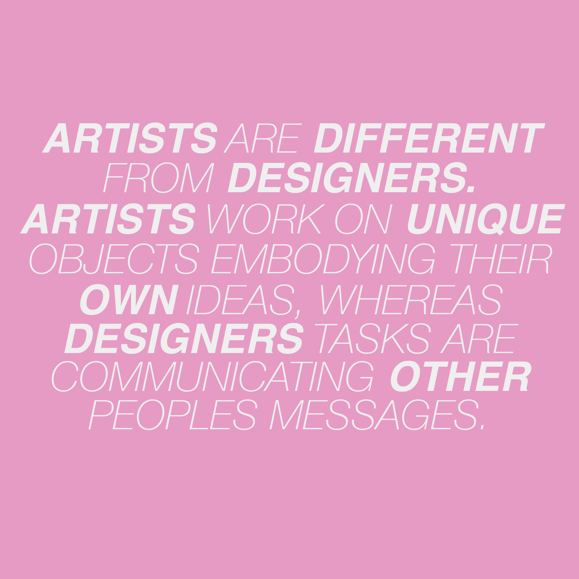
I started out with graphic design, primarily using Adobe Photoshop and Illustrator to make graphics for people who requested calendars or icons or backgrounds on Twitter in freshman year of high school. The requests came from fanbase accounts. I didn’t have any classes on these programs or the rules of graphic design until I built my own interest and my curiosity for it. I’ve always been into traditional mediums of art as a hobby, drawing, painting, collaging and even photography if that counts. When I started out as more of an artist less of a designer, my project directives were more subjective and reflective on my identity. I left India at a young age and I’ve always found myself integrating my culture into my work, from a slightly outside perspective. I would say my culture doesn’t consciously affect my personal art and definitely not my graphic design. When it comes to my personal art of drawing & painting & photography I love portraiture.
Now I stick to 2D visuals eg: posters/banners/invites/
I’m going into Branding/ Digital Experience hopefully. I hope to be able to incorporate creativity and design thinking beyond visuals. I think it contributes a huge part of the world, we are all always on our phones or laptops searching for something on whatever site we’re on, and if the design is pleasing and effective it makes the experience of that search seamless.
Allens Questions:
– Who/What asked you to make the Twitter icons and posts?
 Write Up:
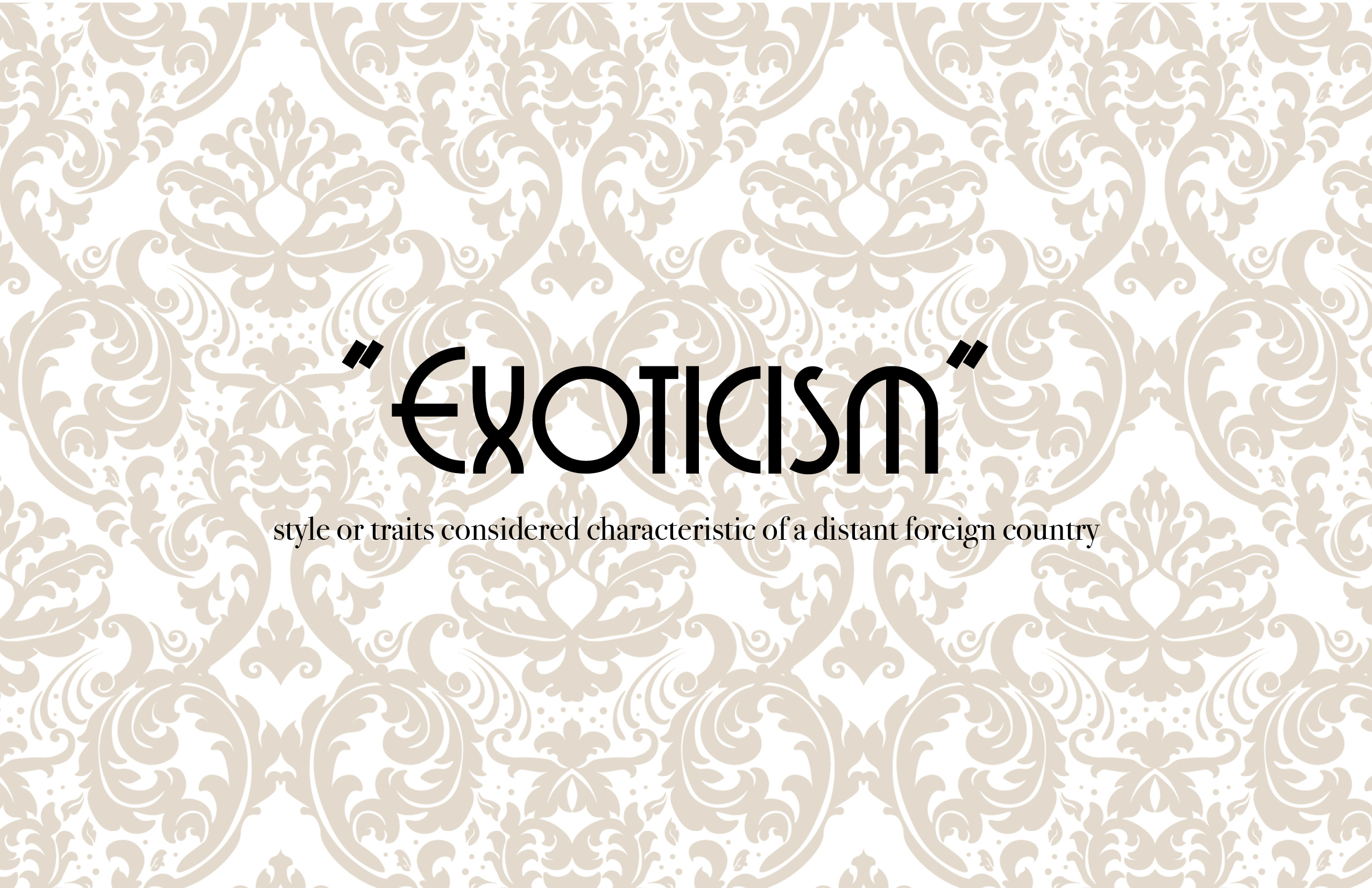
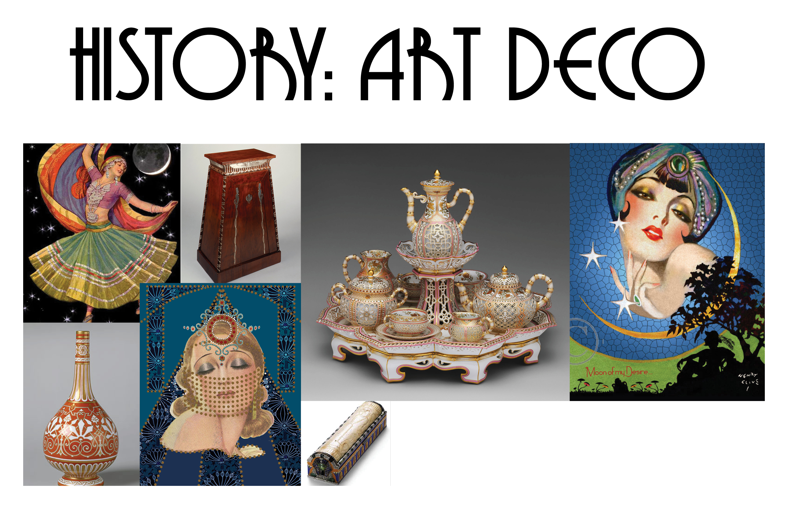
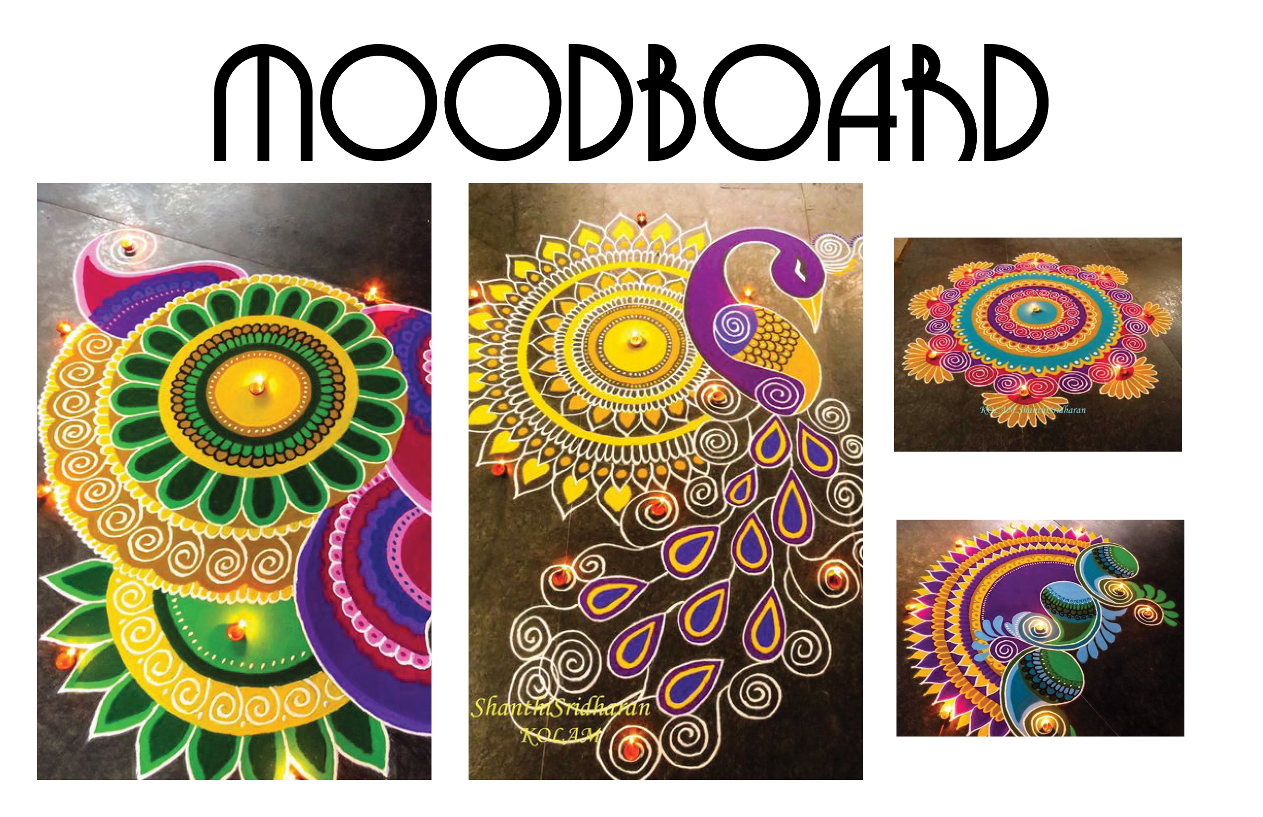
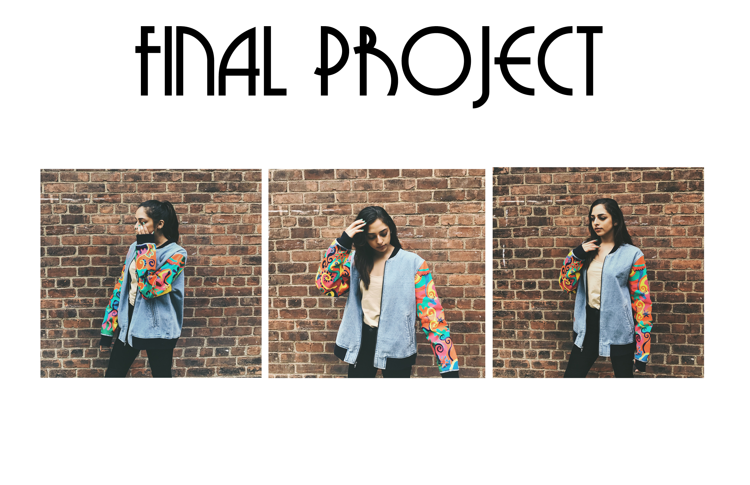
Recently an annual famous festival took place in Los Angeles, called Coachella. Infamous for a lot of culturally appropriated “festival wear.” Many outfits are “inspired” by distant foreign countries and cultures, most commonly Native American, Middle-Eastern, Indian, and Southeast Asian. This whole concept when the western world gets “inspiration” from other countries and cultures reminded me a lot about the “exoticism” period in the Art Deco movement. “Exoticism” by definition is style or traits considered characteristic of a distant foreign country. “Cultural appropriation” is when members of a dominant group exploit the culture of a less privileged group of people, usually with little understanding of the history, reasoning, and traditions behind the culture. Both cultural appropriation and exoticism in my opinion devalue the richness of a culture and exploit it for fashion and decoration. During the Art Deco period, we saw objects like a Sarcophagus Vanity Case which has obvious Egyptian influence, and dressing tables and vases inspired by African tribal art. “Exoticism” was stimulated by trade with the East in the 16th and 17th century. England also had imperial control over China, India, Africa and the Pacific. Inspiration was also drawn from Islamic ceramics, Indian textiles and Japanese prints. Everyone was fascinated by these “exotic” cultures and their cultural items had become a “trend.” I chose to transform a standard western item into an art piece inspired by Rangoli designs from Hindu culture. These brightly colored designs are traditionally made on the floor outside the entrance to your house with powders. Rangoli is a form of welcoming guests and different deities into the house. It is also believed that with Rangoli, you are inviting all the gods to visit your home and give the blessings, there are many stories in Hindu mythology in which rangoli is created to welcome Gods like Lord Ram, Goddess Lakshmi, and Lord Krishna. There are many more designs that are drawn by women like a peacock, many free-form images, flowers; religious icons, etc. The main motive of creating Rangoli designs is that it brings good luck. However, these designs are made with no gaps in between, as it believed that an incomplete Rangoli would attract evil spirits. I chose not just any standard item, but oversized denim jackets have definitely been an on-going trend in this type of weather.
A lot of the creators of the Art Deco period designed individually crafted and limited-editions and the jacket I painted is also individually crafted and cannot be mass produced. Art Deco was also known for its decorative style, quite a lot of ornamentation on their items. And thats what I did, I added ornamentation and patterns on this jacket.
As a person of Indian decent, I understand the culture and the meaning behind the traditional Rangoli design, so I feel like I’m allowed to use it as inspiration and even though it is frustrating to see all these culturally appropriated items everywhere, I believe that if one is inspired by art and culture that is not their own which I have to admit can’t be helped, they should be proactive and learn everything about it before using it to benefit superficial aesthetic purposes.
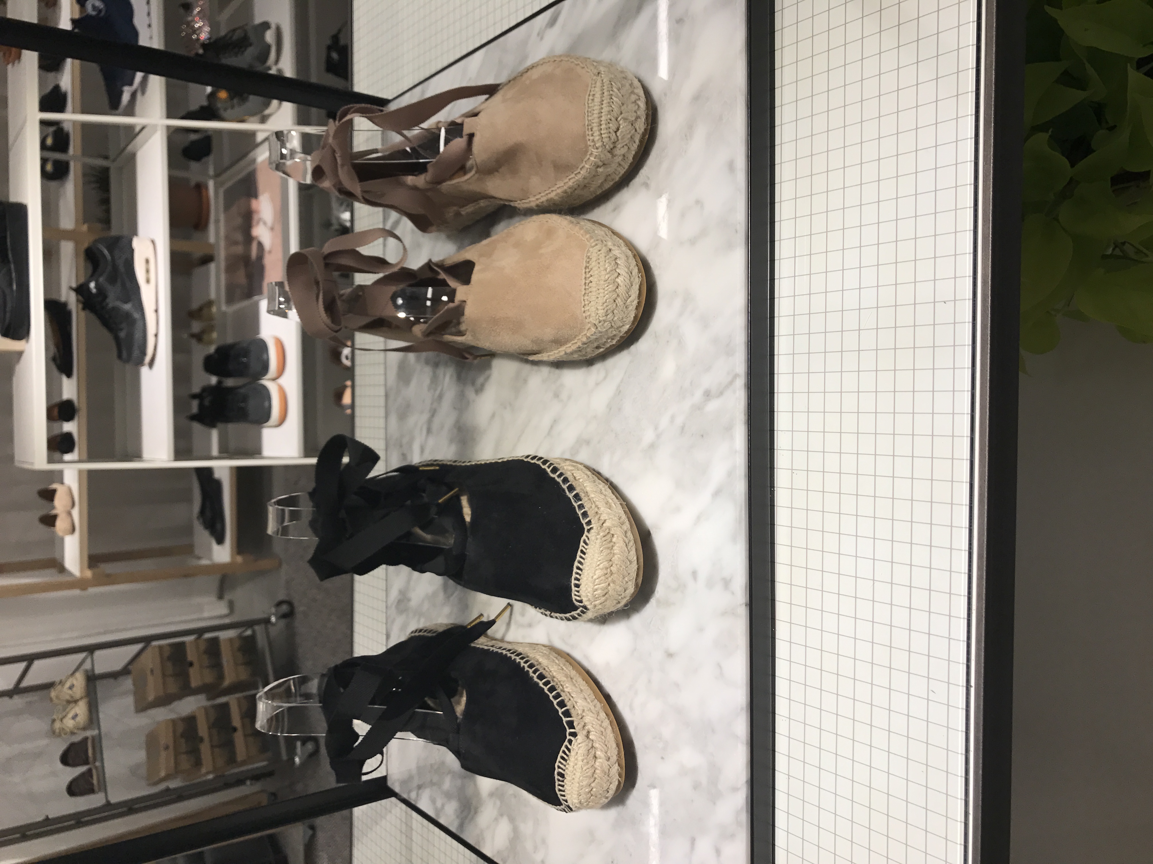
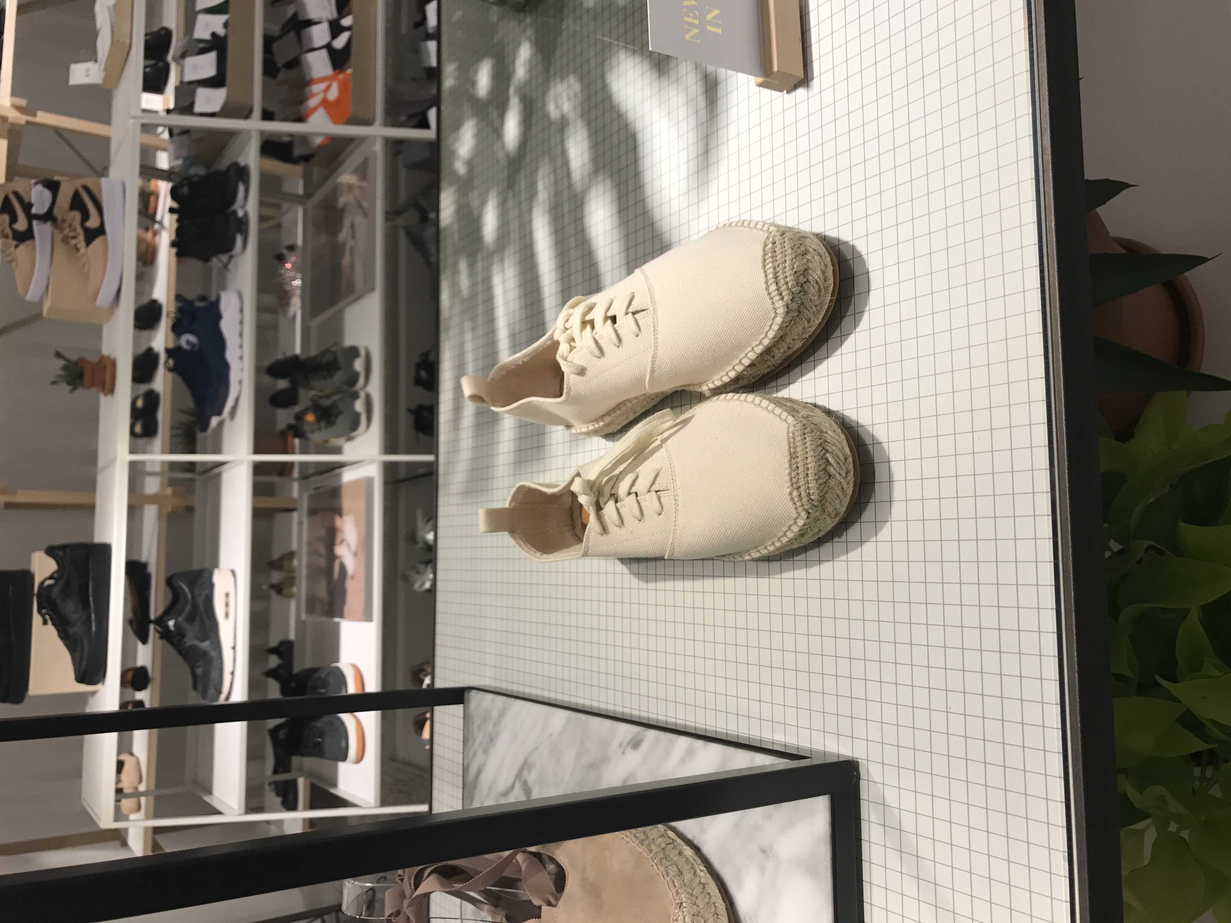
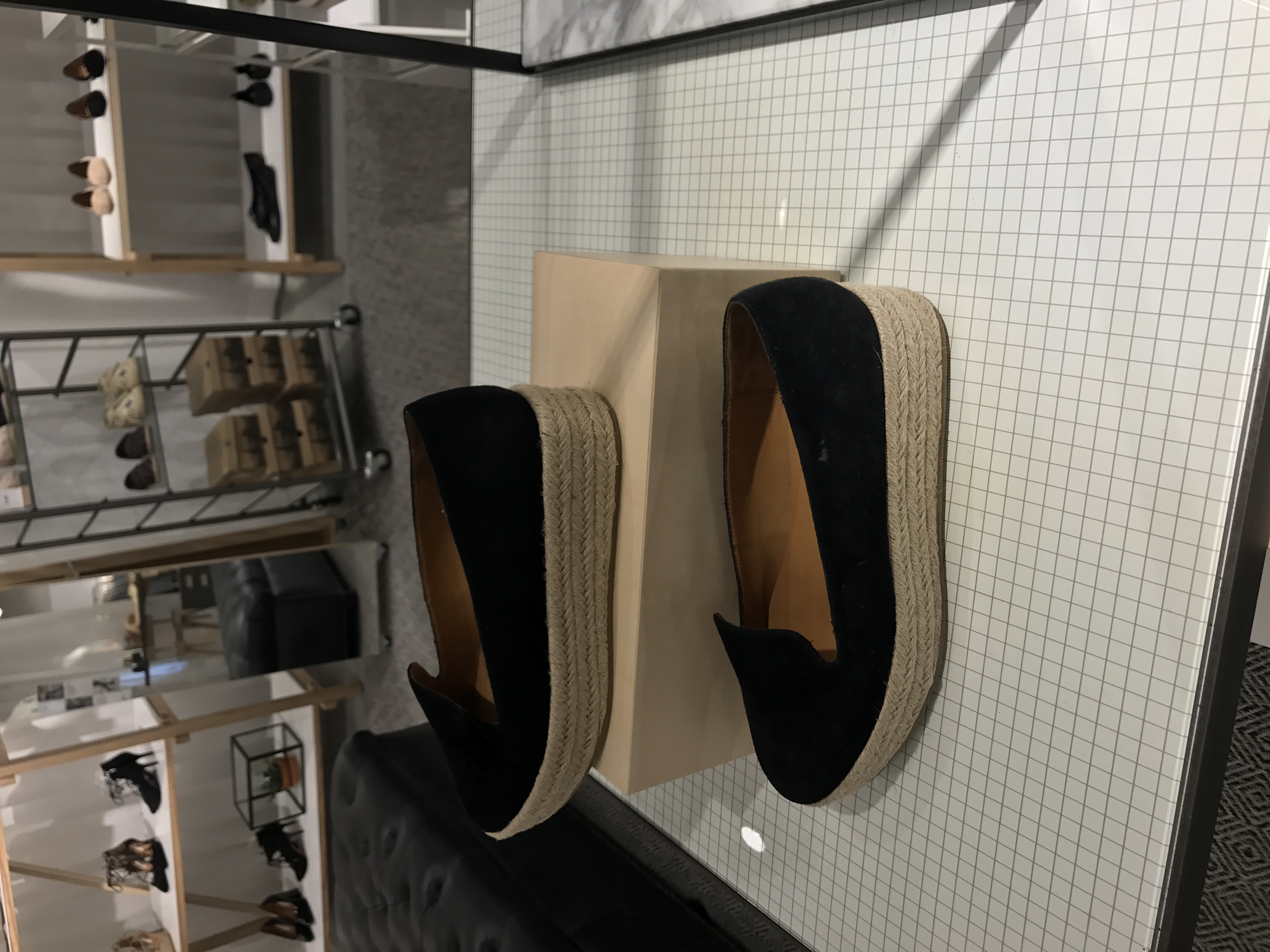
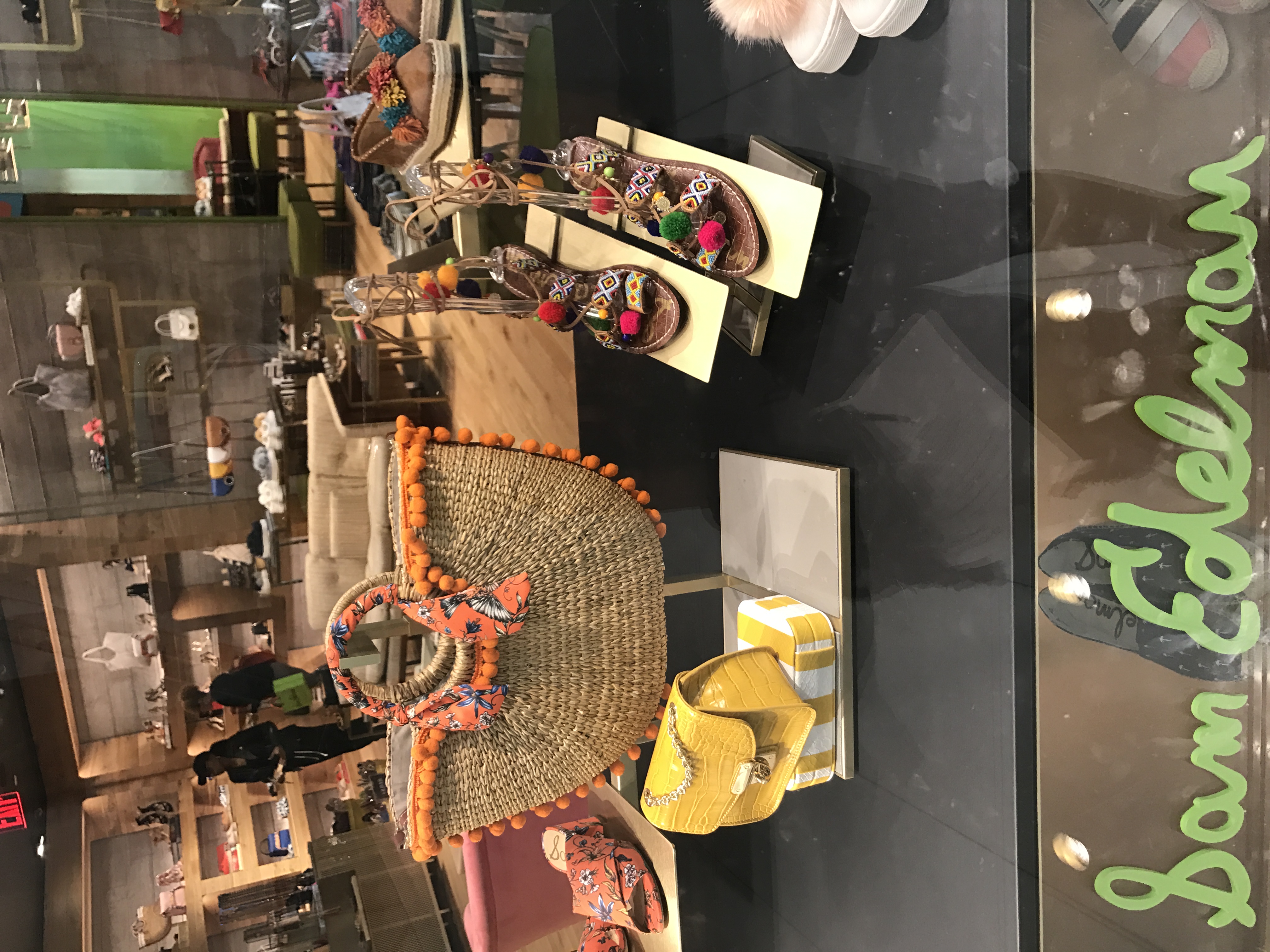
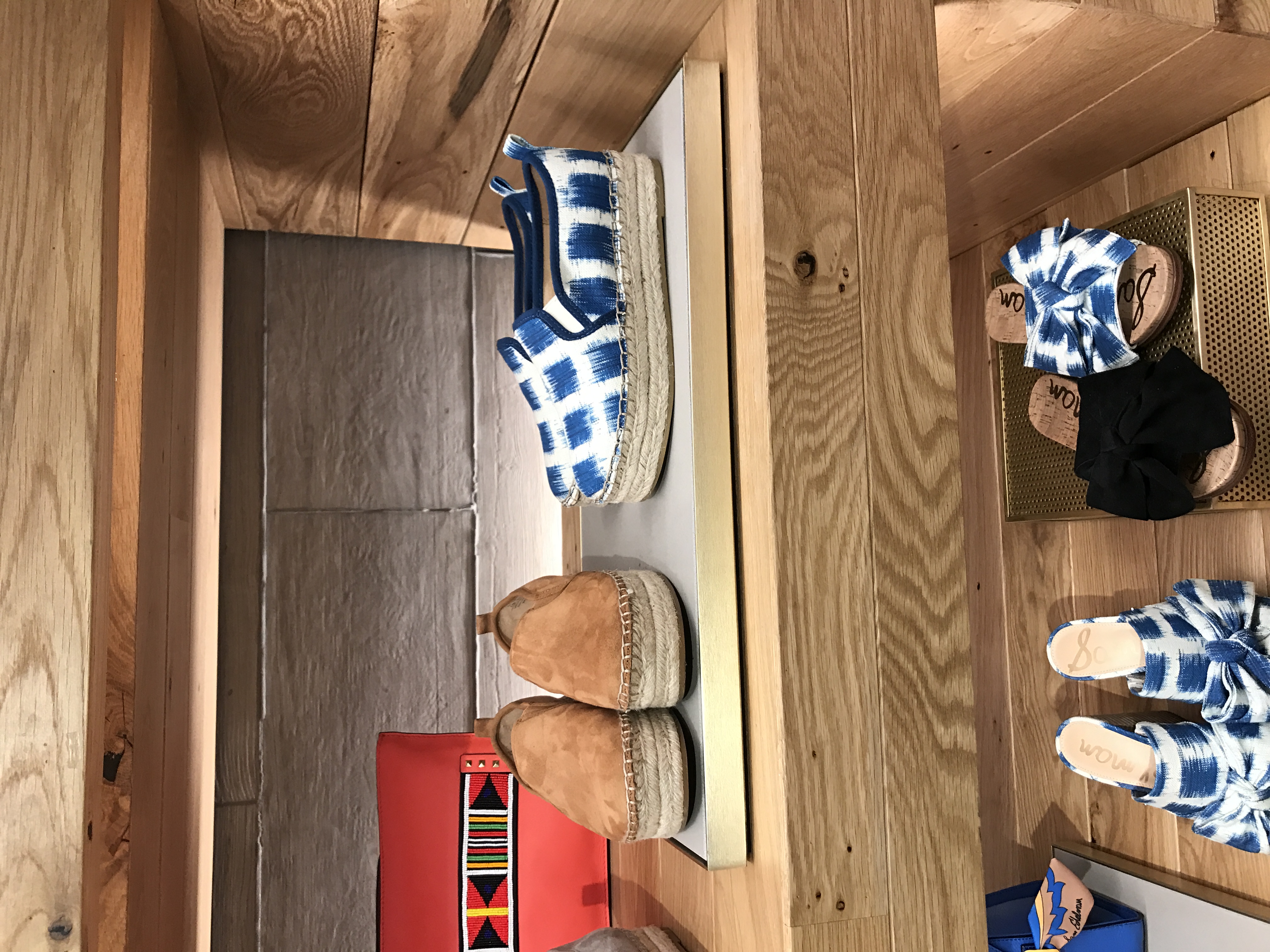
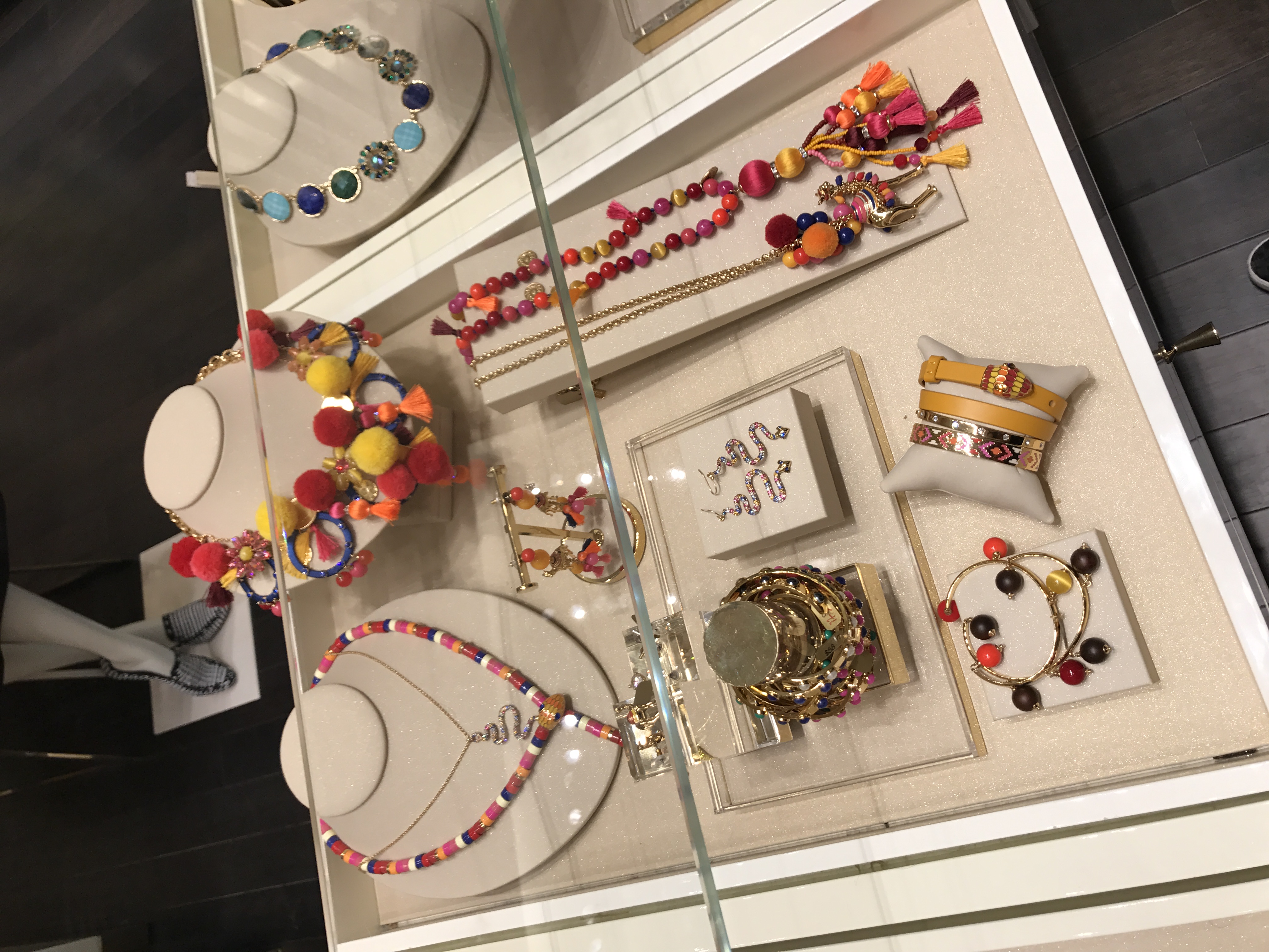
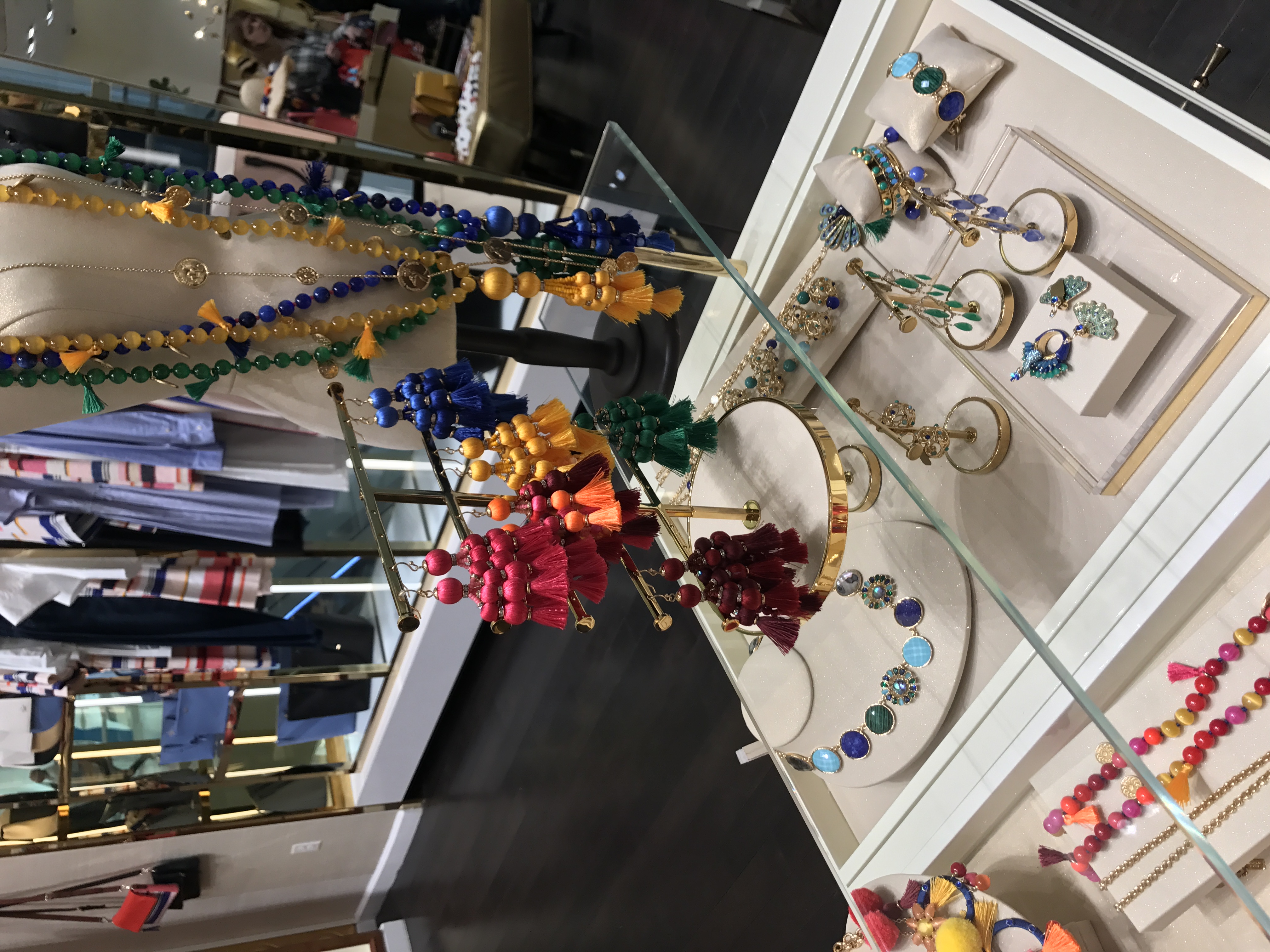
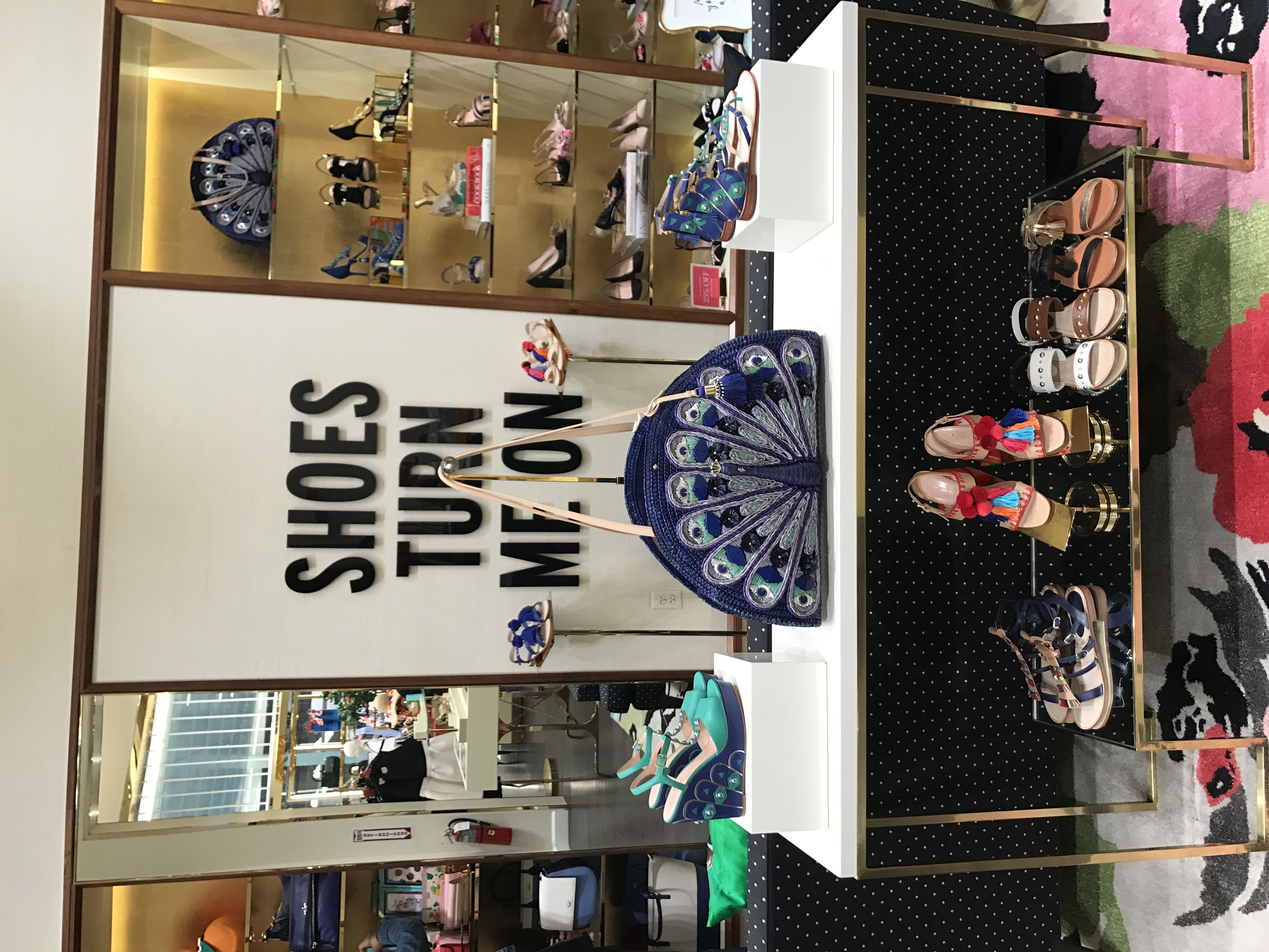
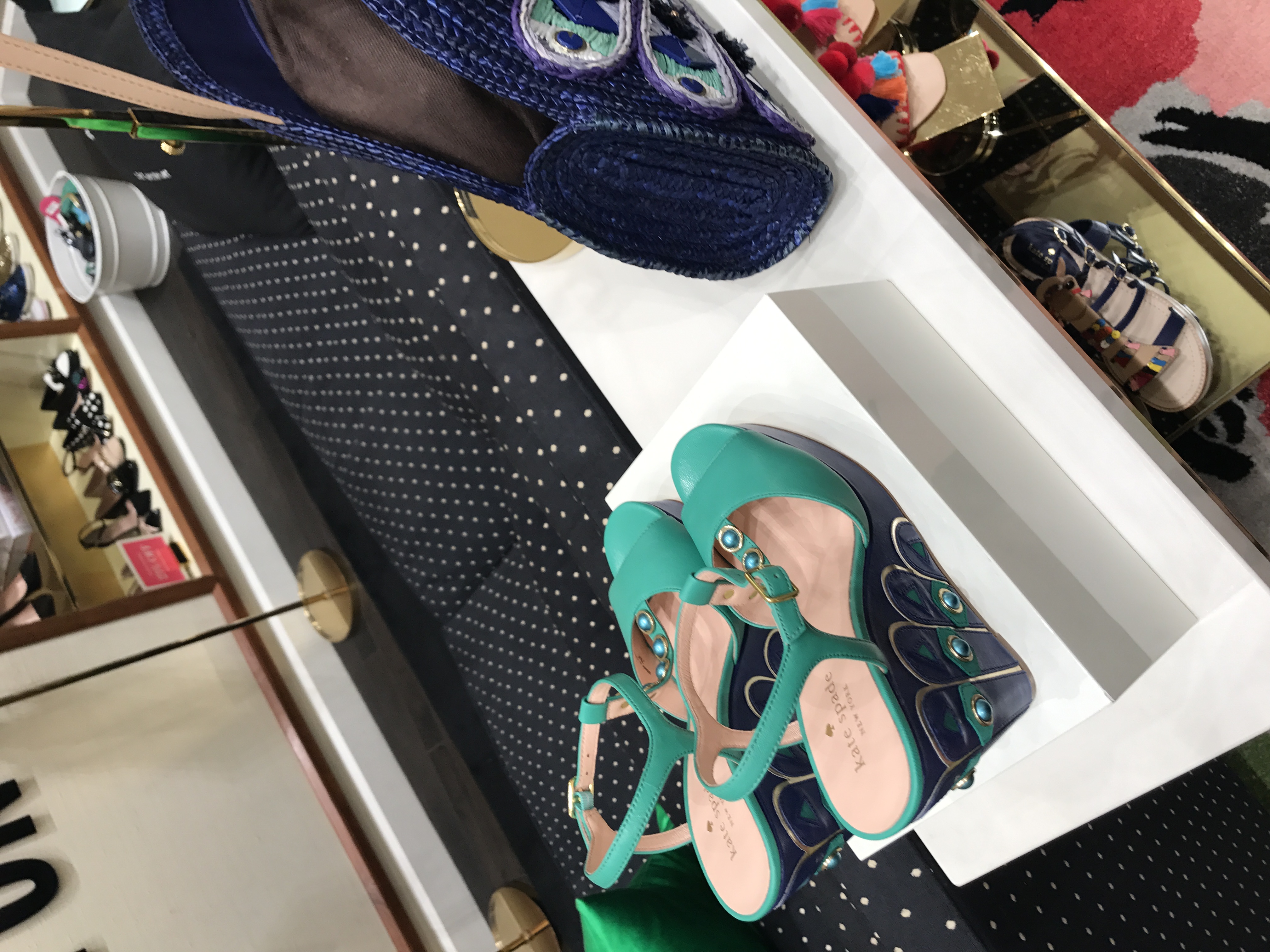
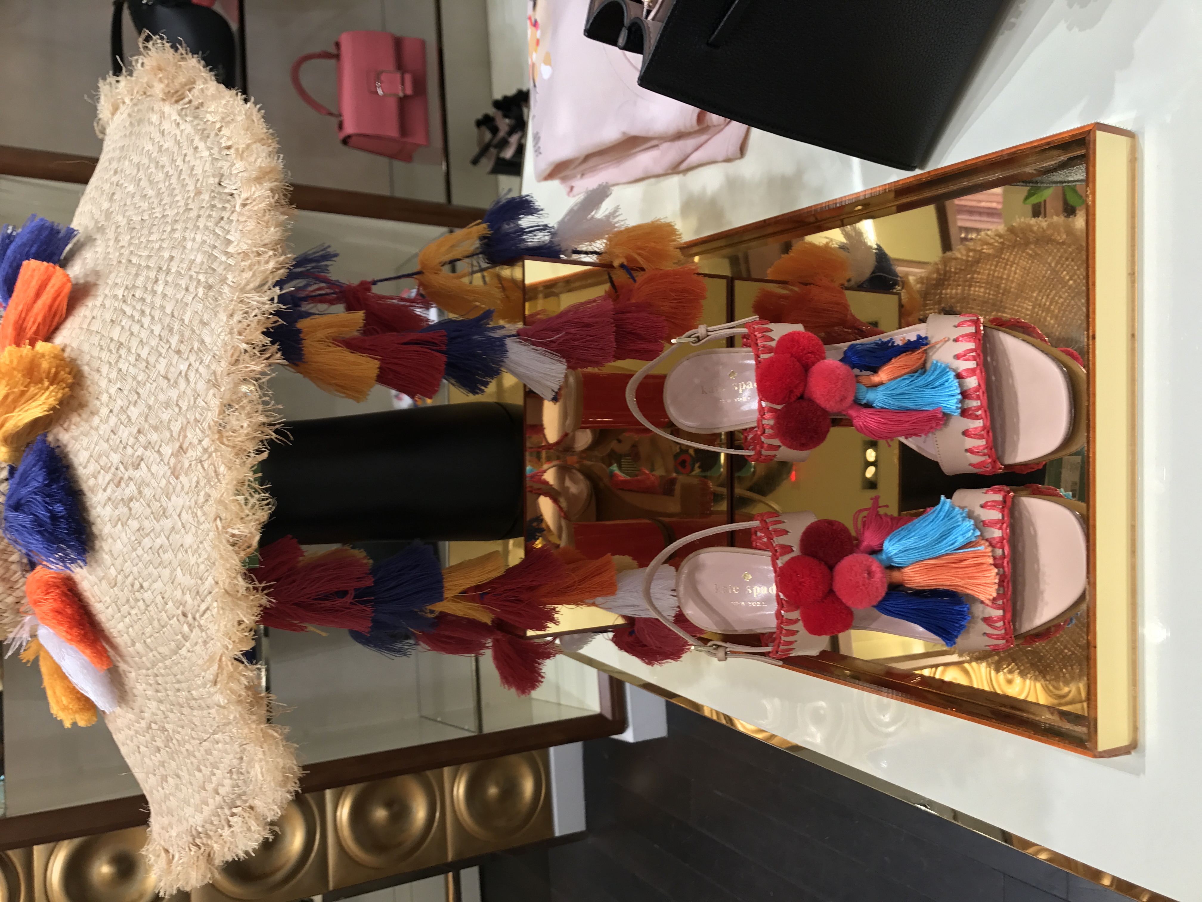
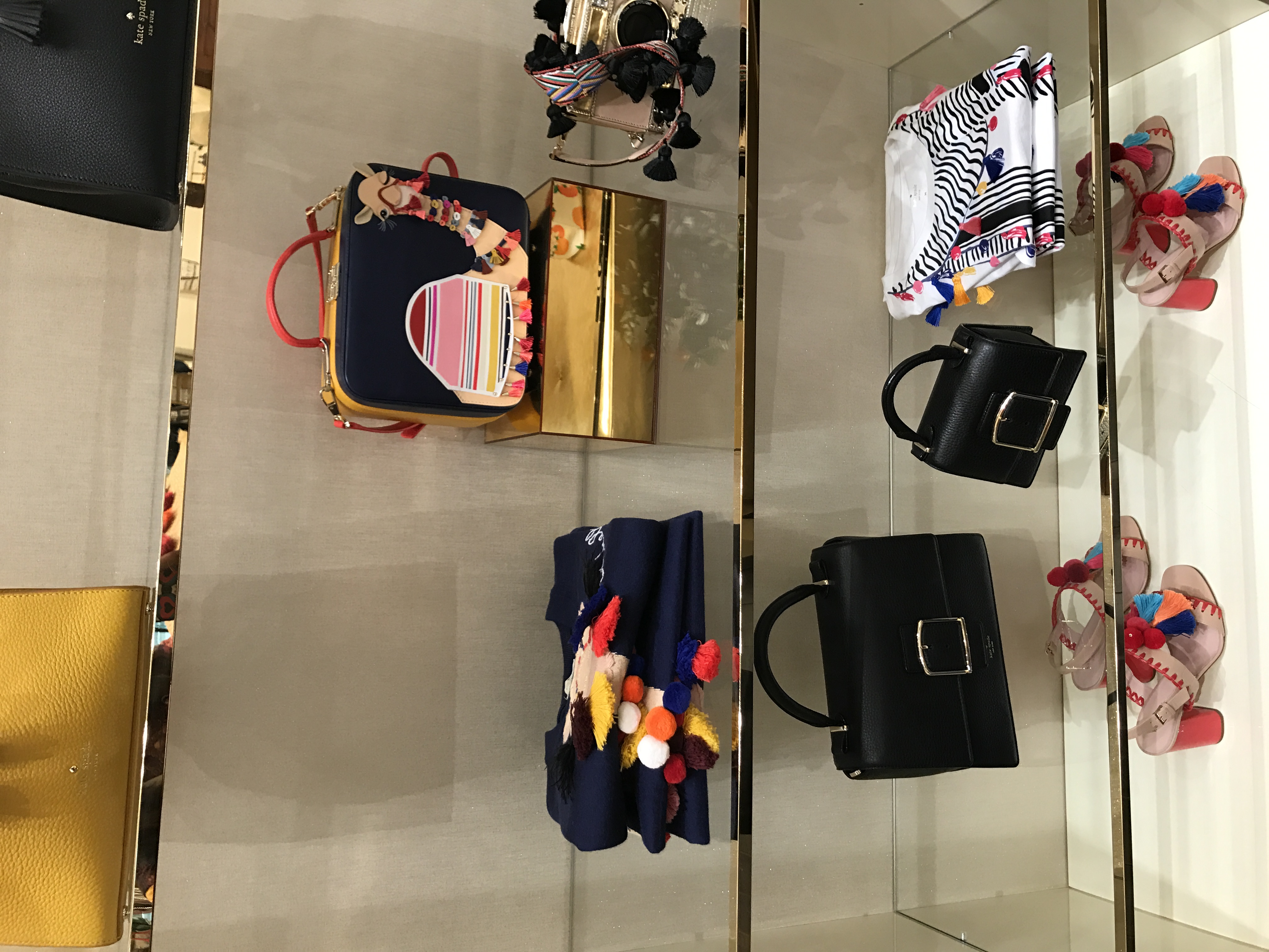
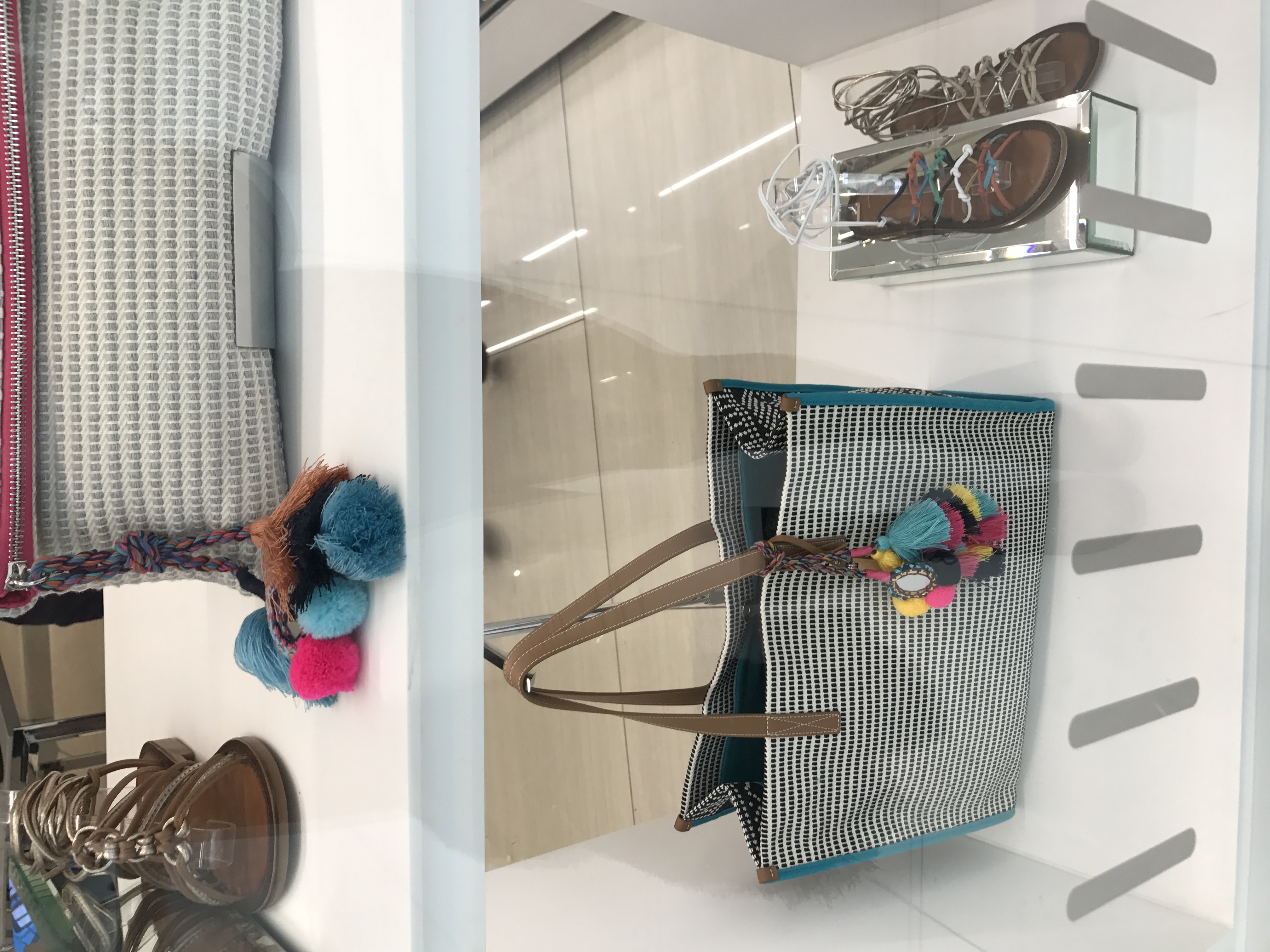
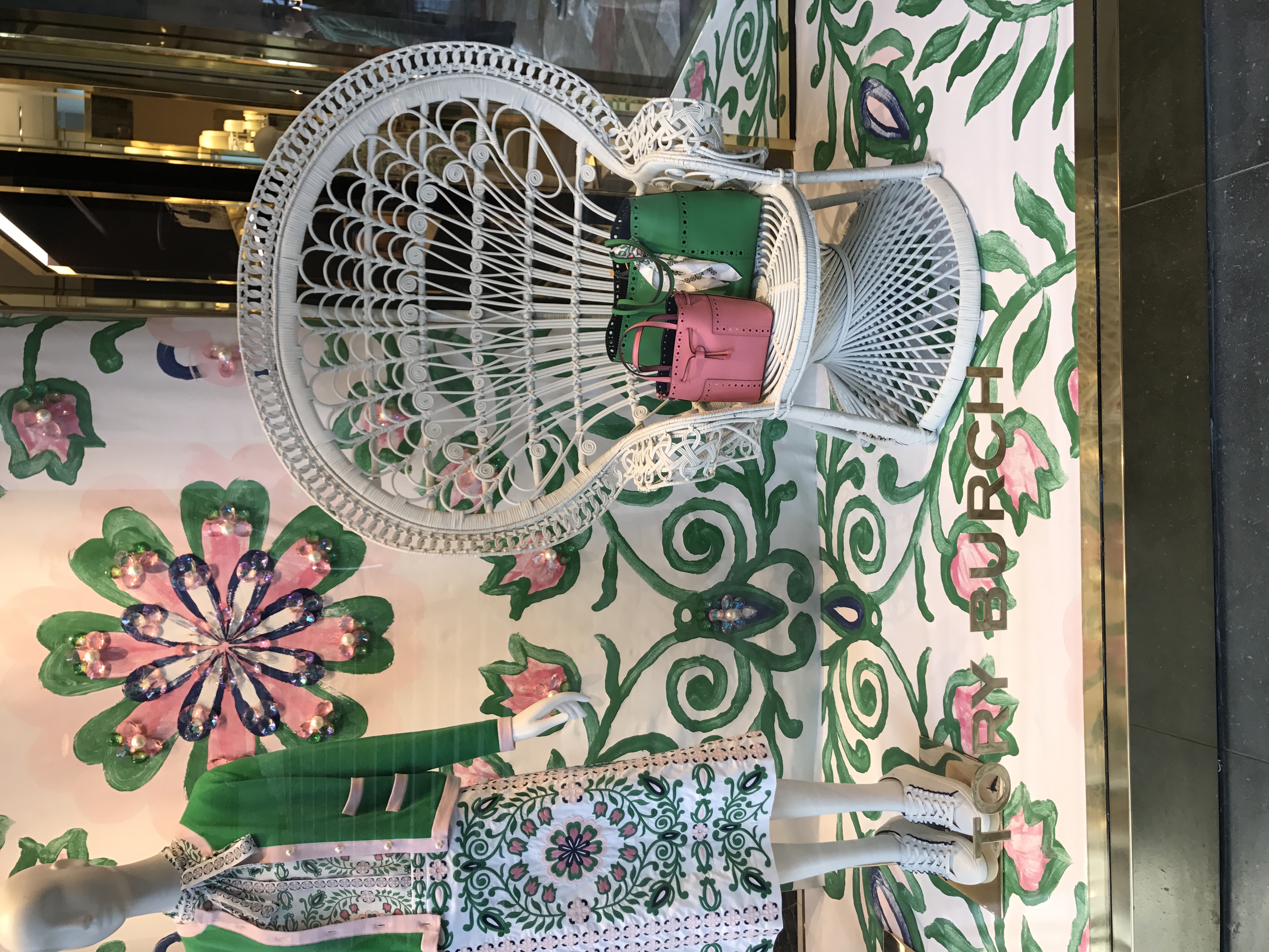
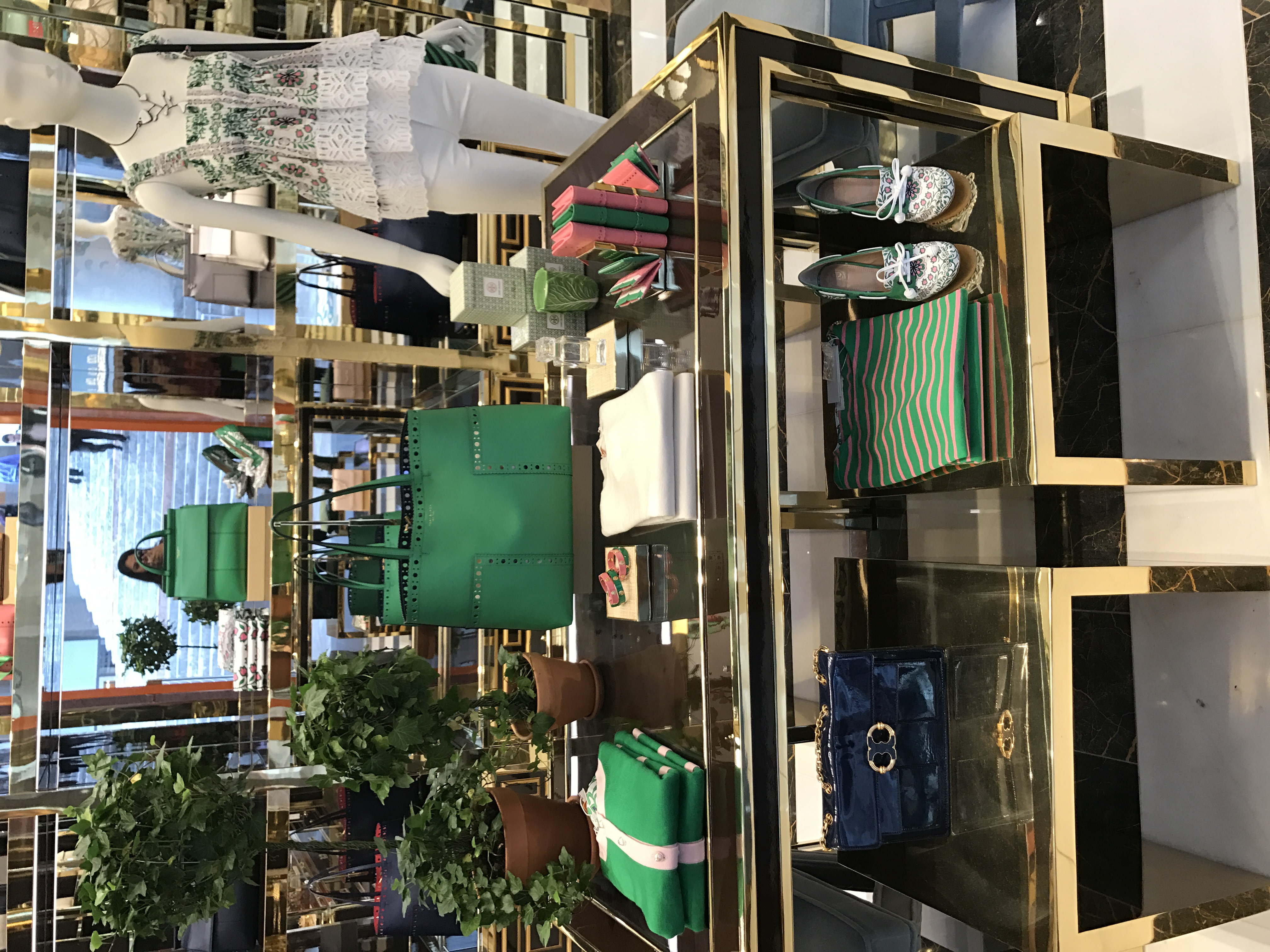
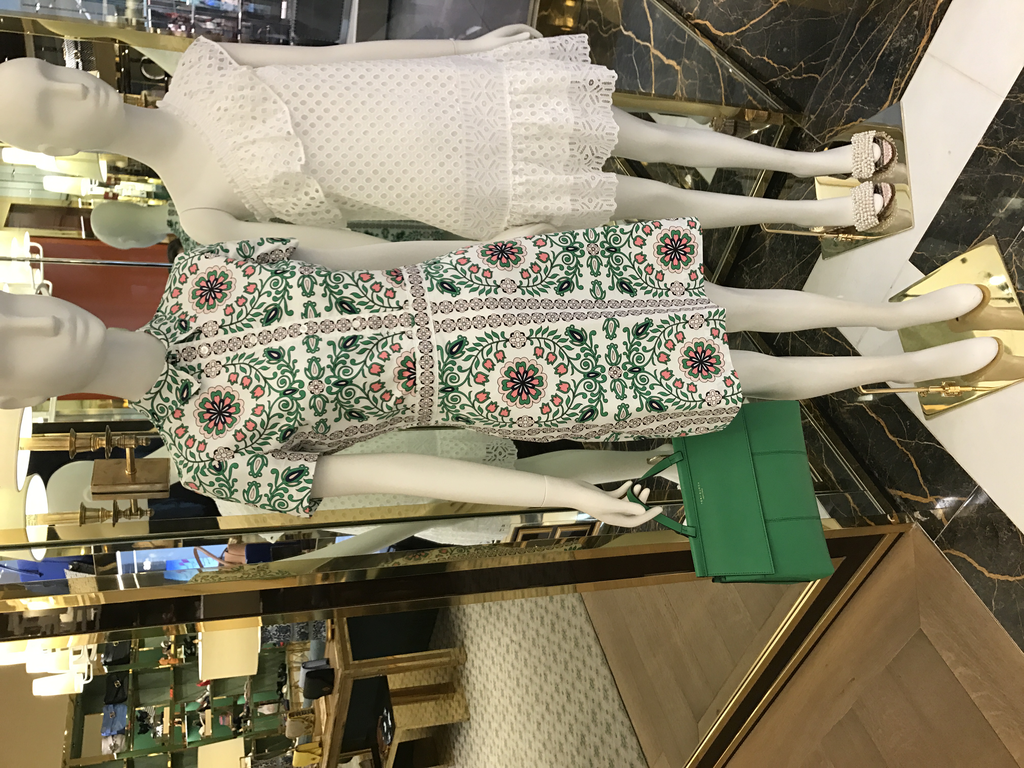
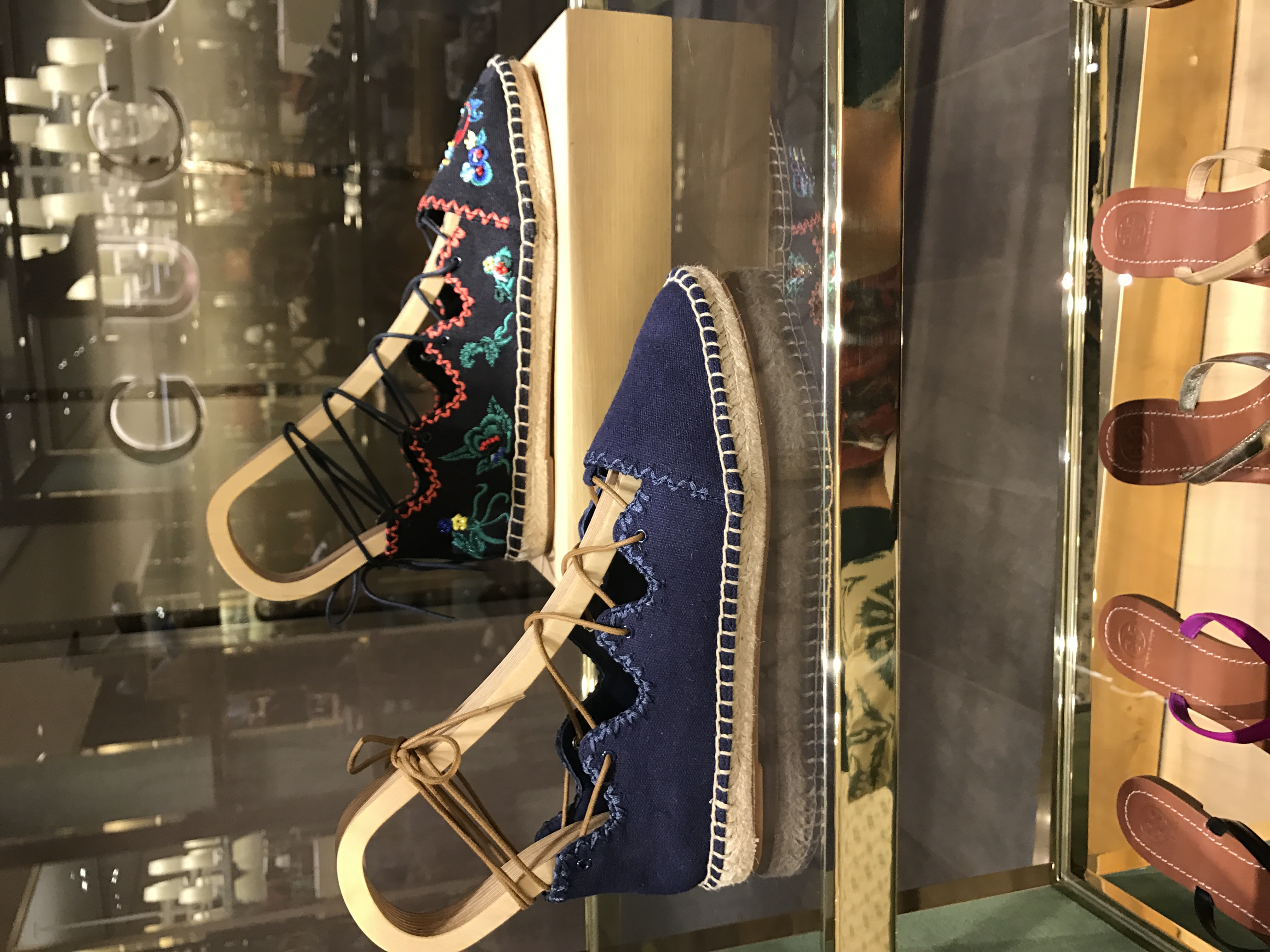
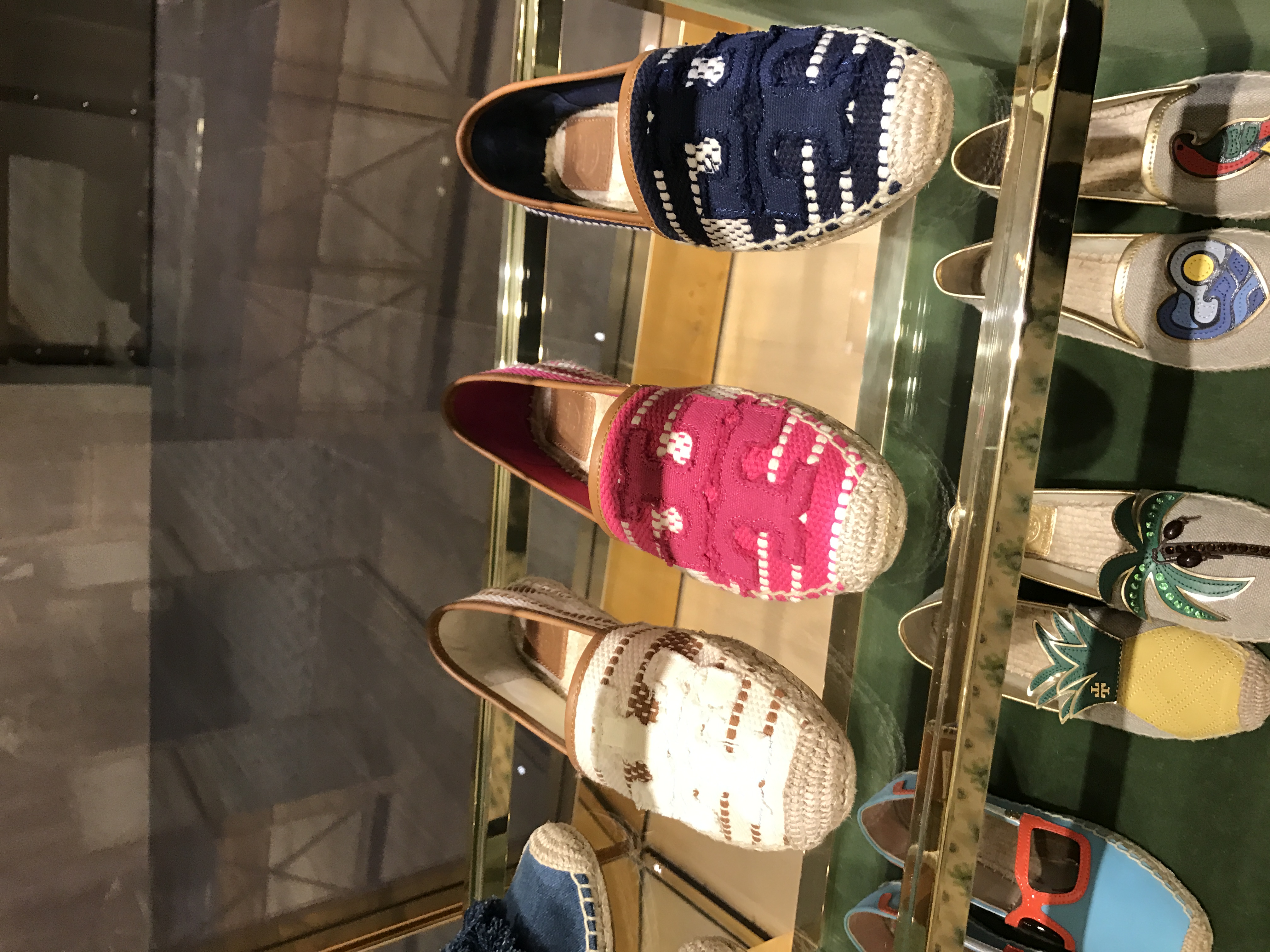
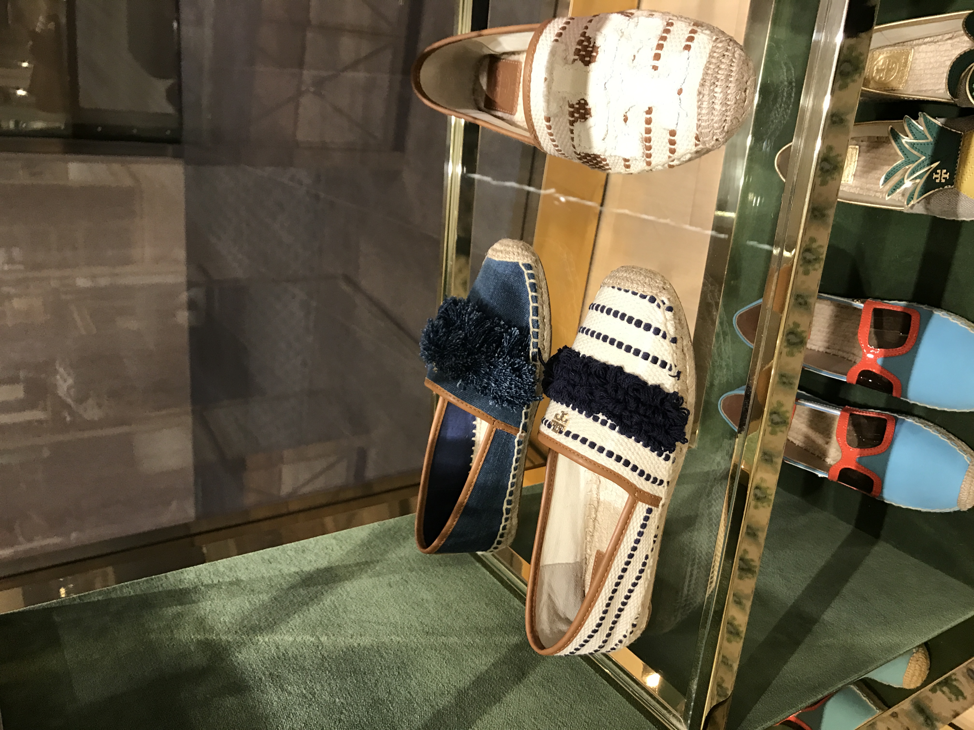
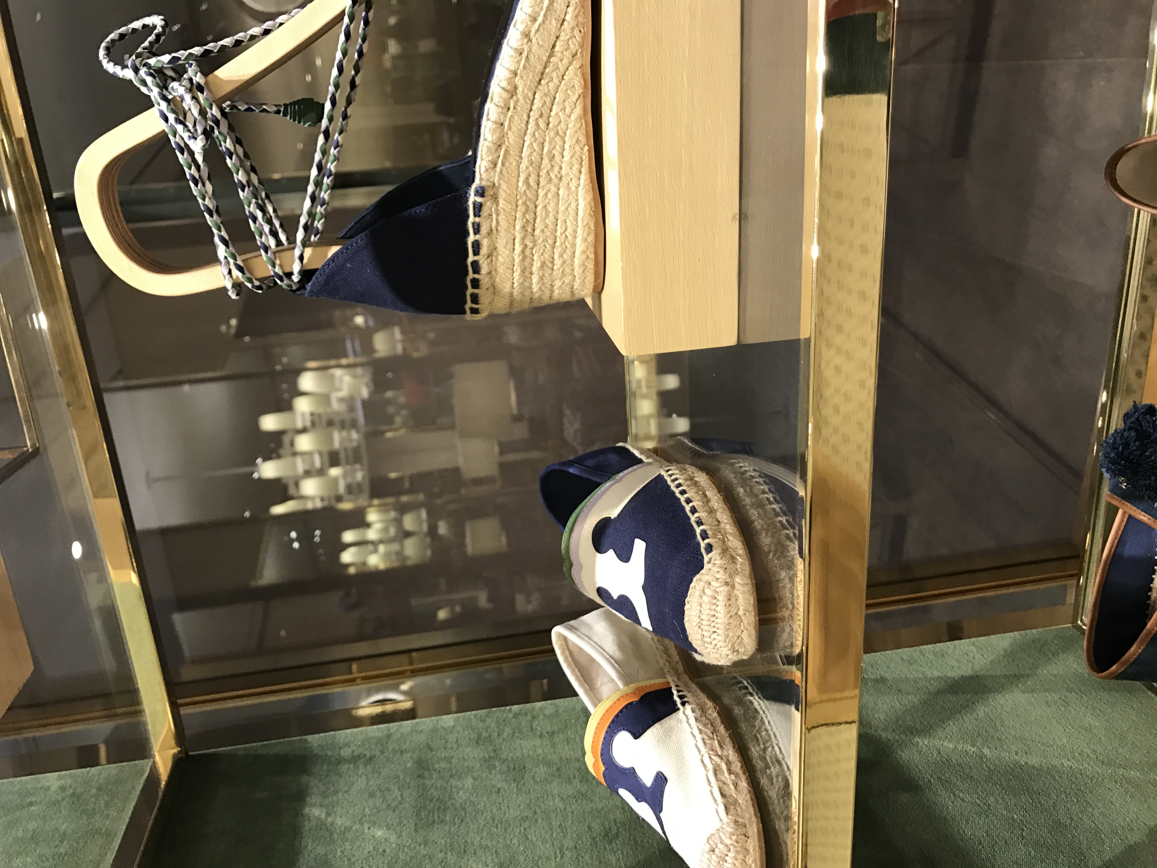
Walking through the Oculus, the stores I looked at were Another Story, Sam Edelman, Kate Spade, Vince Camuto, and Tory Burch. A couple of trends I spotted were jute platform bottoms for shoes. This trend spread across almost all the stores. Another trend that was very prominent across all stores were these little fluffy balls brightly colored, on shoes, on bags, on jewelry even on some sweaters (in Kate Spade) they came in different sizes depending on what item they were on. Another theme that wasn’t prominent amongst all stores but I noticed it first at Kate Spade, there was a very obvious peacock theme going on amongst products however with Tory Burch, I first noticed the white washed peacock chair in the window and it was interesting because I intern at Jimmy Choo for Visual Merchandising and we had a peacock chair in a natural finish delivered for our Madison store. Back to Tory Burch, the peacock theme was less obvious here in my opinion it was more about the color scheme. As the weather becomes warmer, we can definitely see the silouette of desired clothing becoming looser as skirts start to span out and dresses are a bit wider and don’t cling to your body.


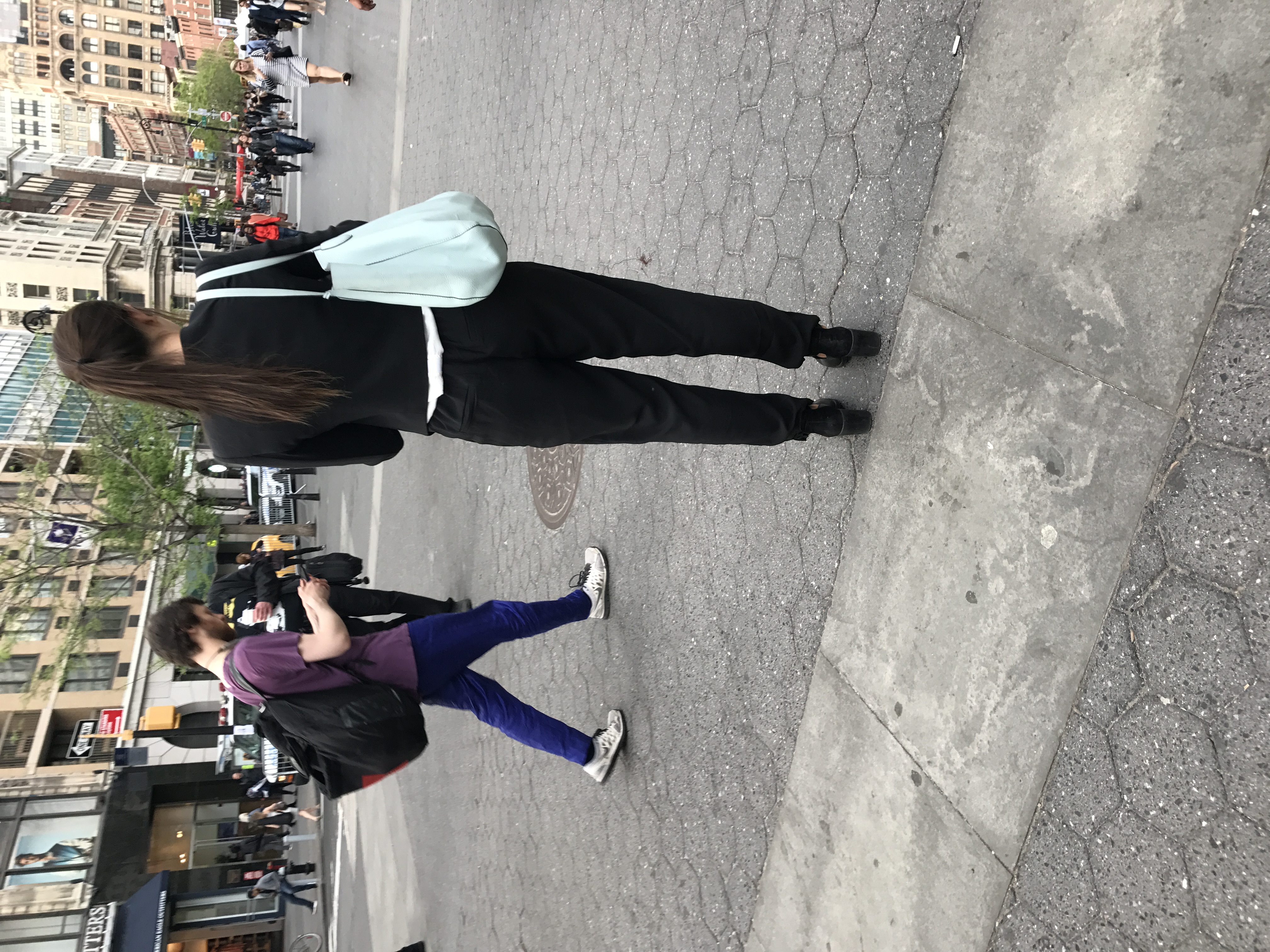 The question I decided to ask was “Why are “New Yorkers” associated with wearing all-black?” I made a survey on SurveyMonkey asking the following questions of where people see this trend in New York and basically describing the typical person they see who follows this trend and why they believe it is a trend in New York. Location wise, it was so diverse so its safe to say there isn’t a specific area in the city where people are known for wearing all-black but its just a general consensus, some people said Greenwich Village, Soho, Korea town, Lower East Side, West Village all the answers were varied. The answers are to why are also extremely varied, theres isn’t one specific reason. I got answers that said that all-black is trendy, casual, comfortable, classic, minimalistic, luxurious, low key, mature, artsy, high-fashion, goth. I think the best statement I received when I asked a participant on the street was that “a New Yorker has to look chic whether its for brunch or a night out and an all-black outfit does that for them.” An interesting question that I asked was if they believed that this “trend” would continue into the summer 60% of people said this trend it would and 40% said no. In conclusion I believe that New Yorkers are associated for wearing all-black because of all the adjectives people gave above, as a diverse population of people we have artistic, working people, minimalists whoever the people are at the end of the day, New Yorkers are chic. All-black is a convenient way for us to look chic at all times of the day whether its for brunch or night out or for work. We are put-together people and obsessed with efficiency and an all-black look is a safe choice that accomplishes all of the above. “it’s easy, it’s comfortable and it looks good.”
Survey: https://www.surveymonkey.com/r/YZN6YTQ
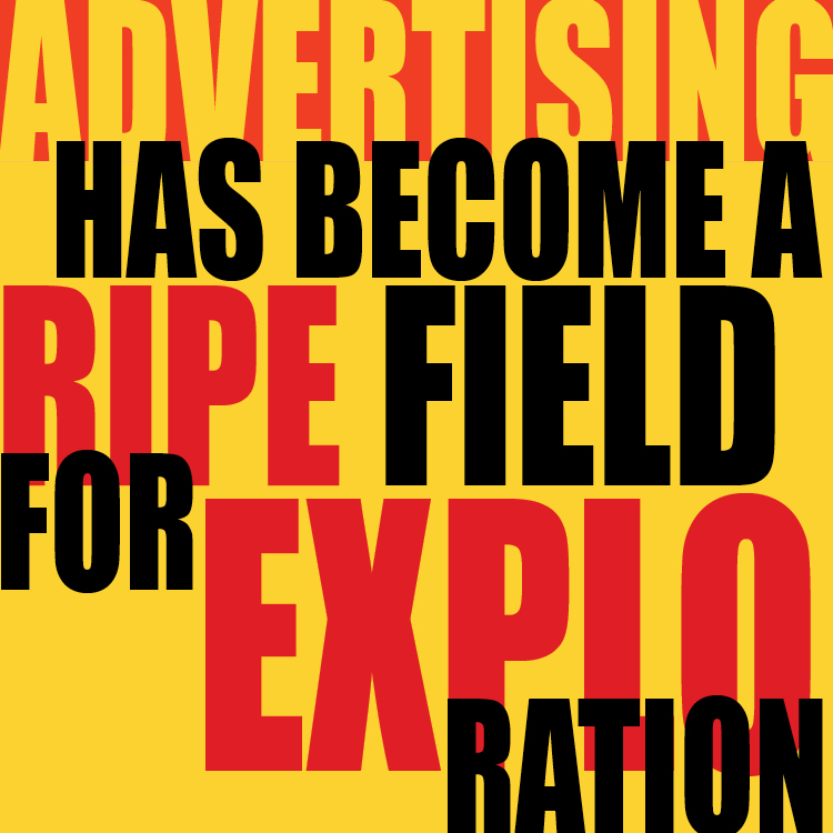
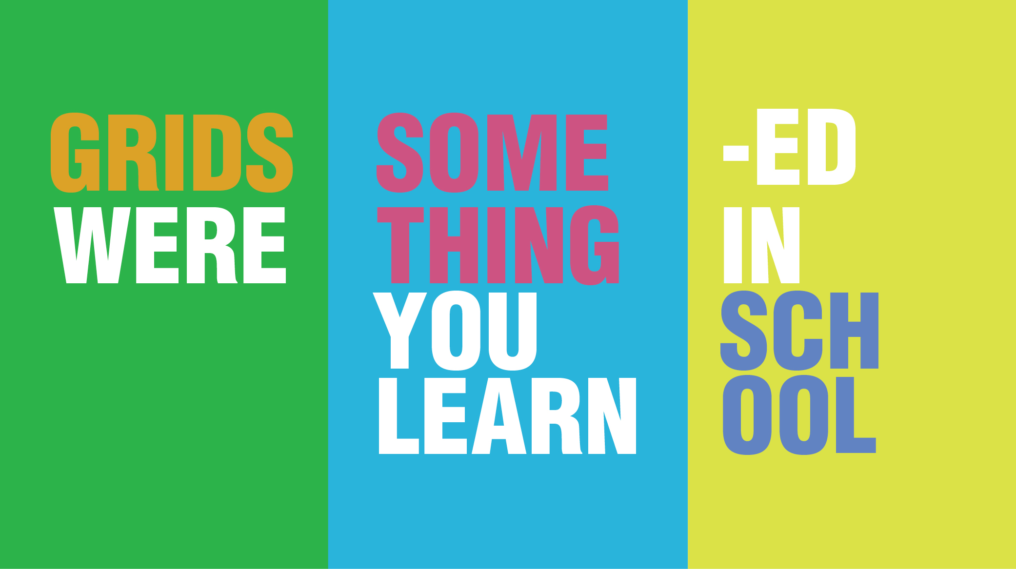
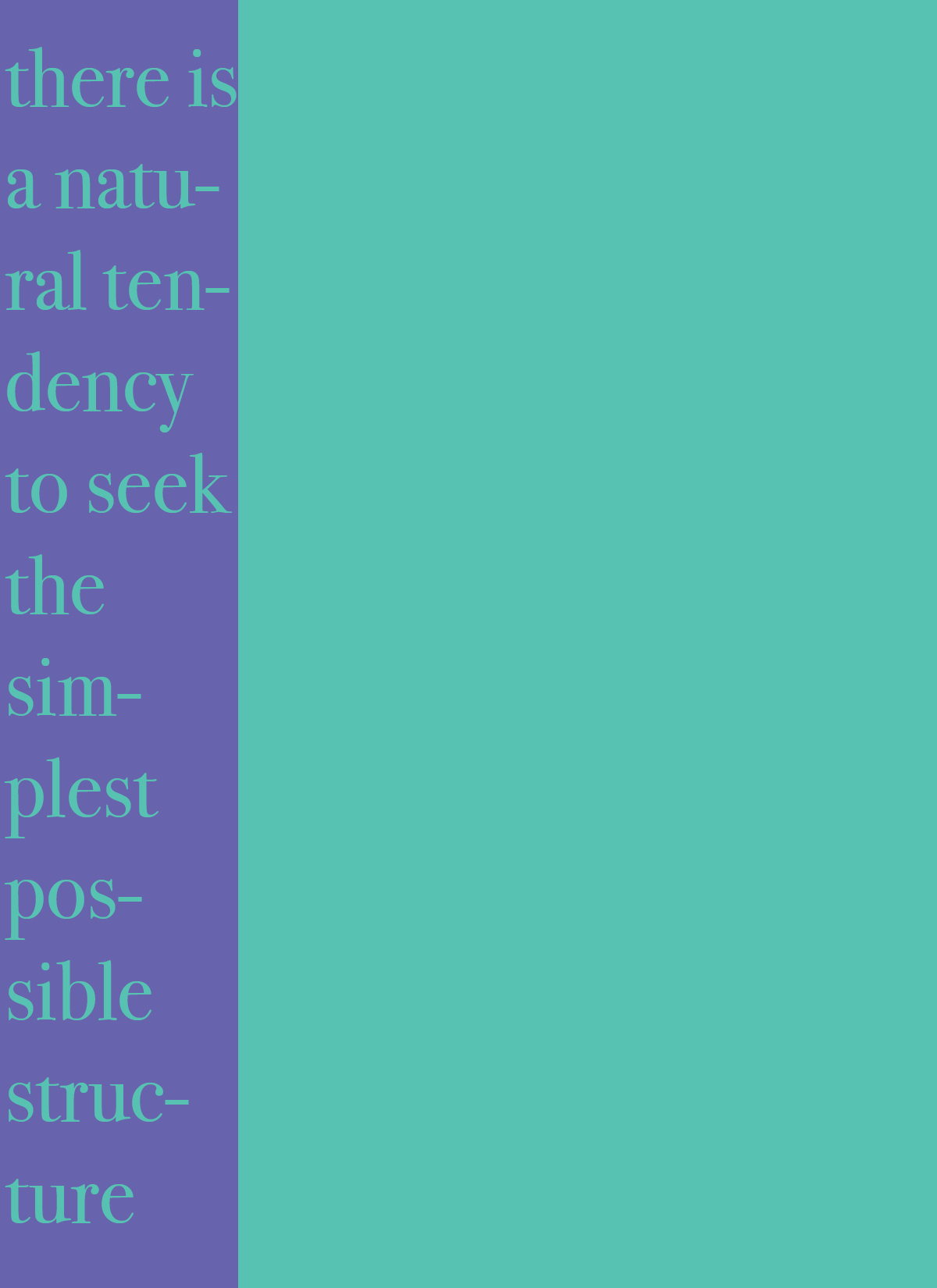
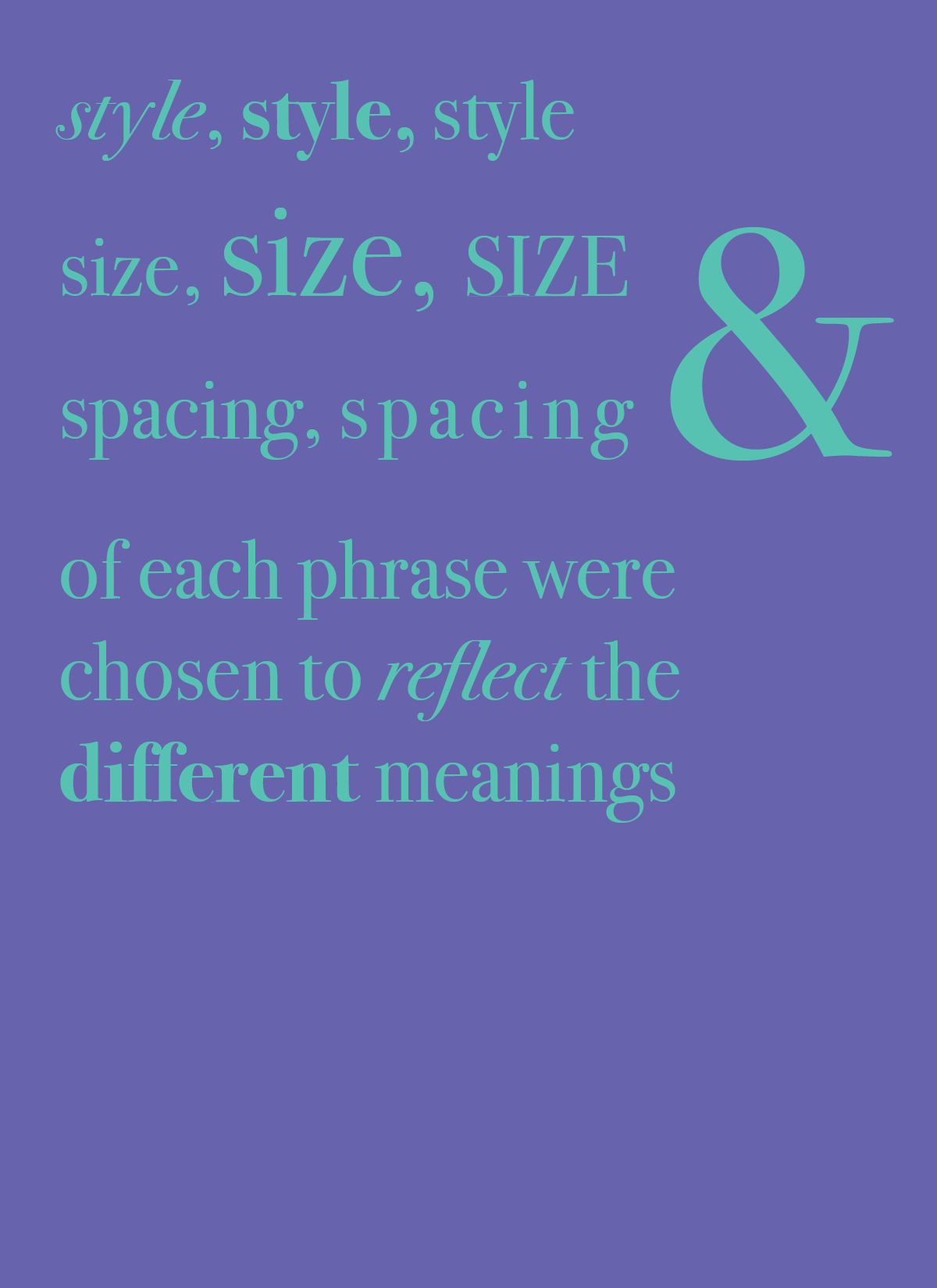
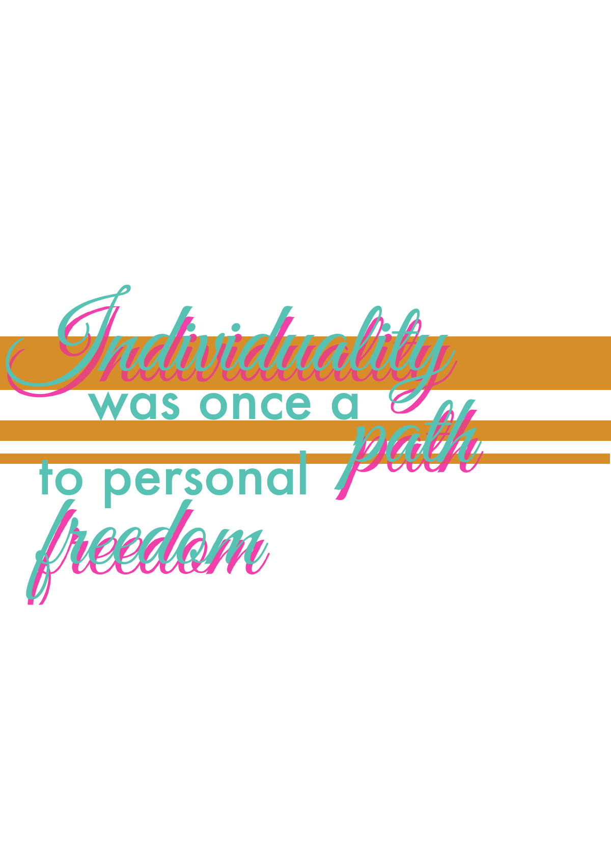
I would say this week I combined a bunch of experimentations I did in the past weeks and put it all together, colors, layouts, and shape experimentation. Definitely a lot of usage of white text and how background colors/shapes can help accentuate the form.


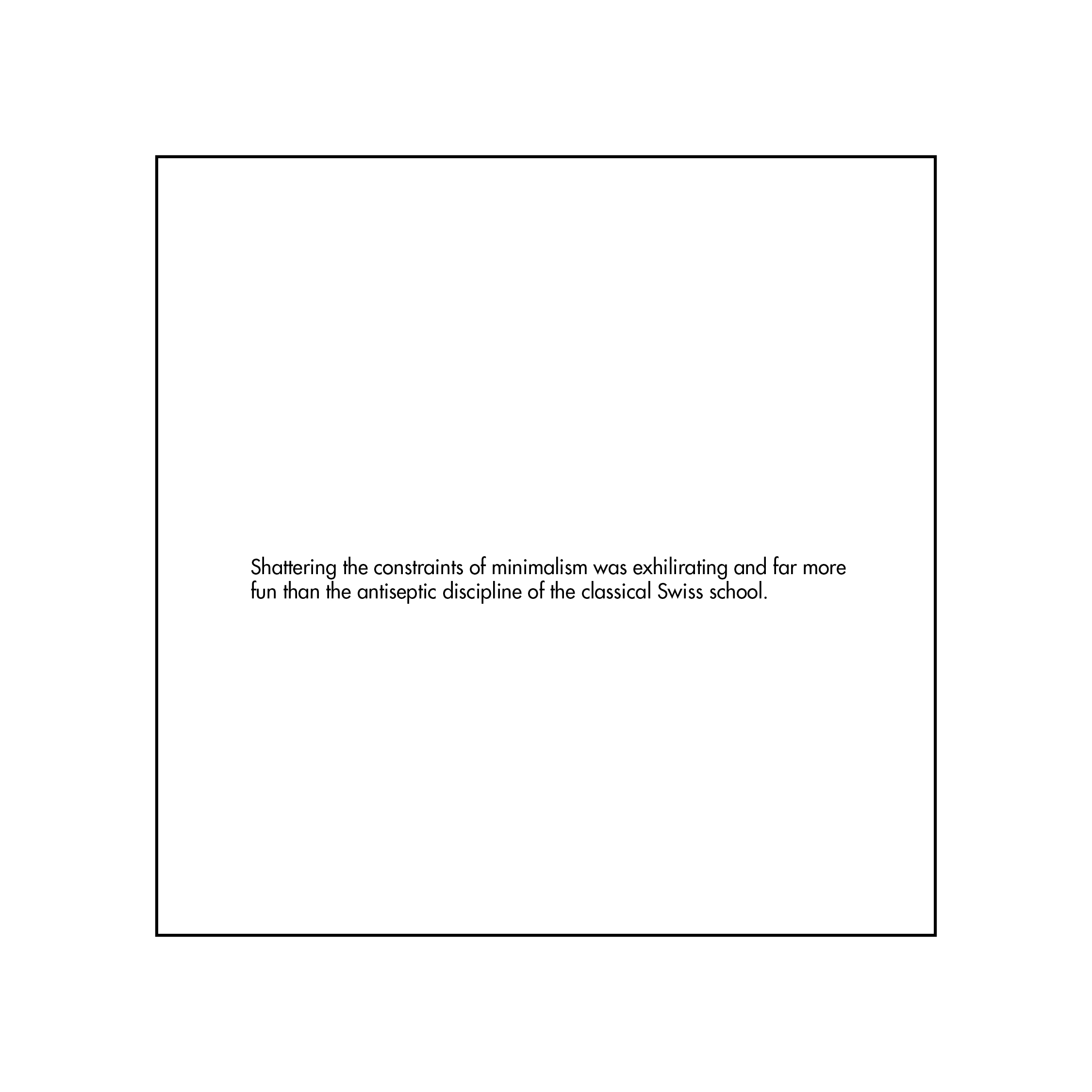
This week I decided to experiment with shapes and how they can just add an interesting visual element in the background.
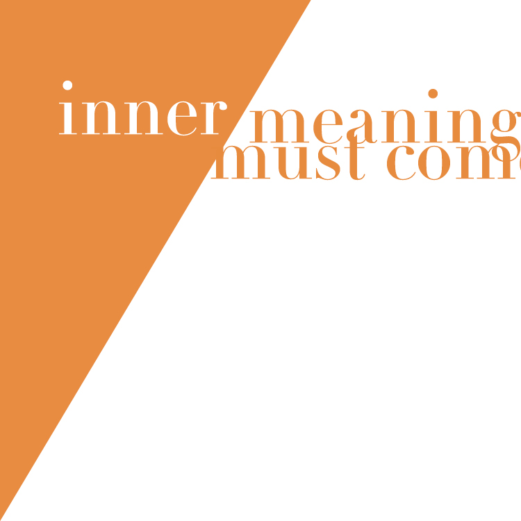
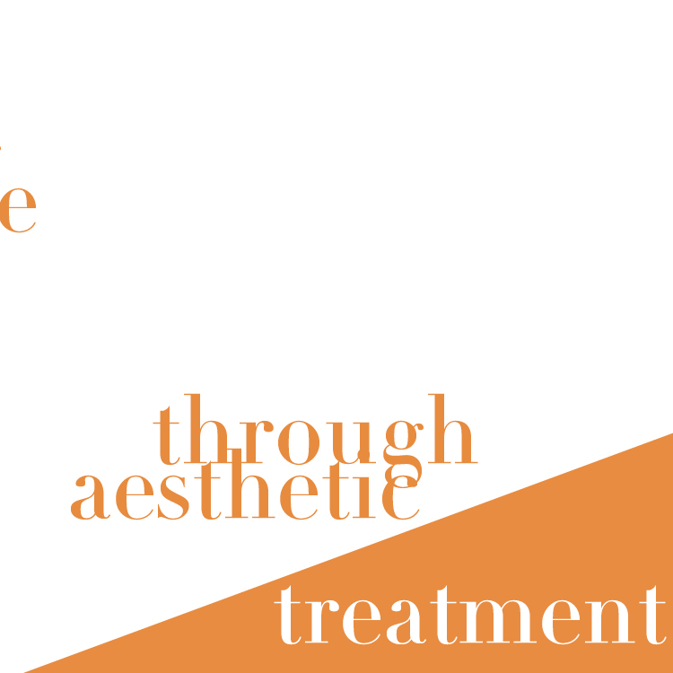
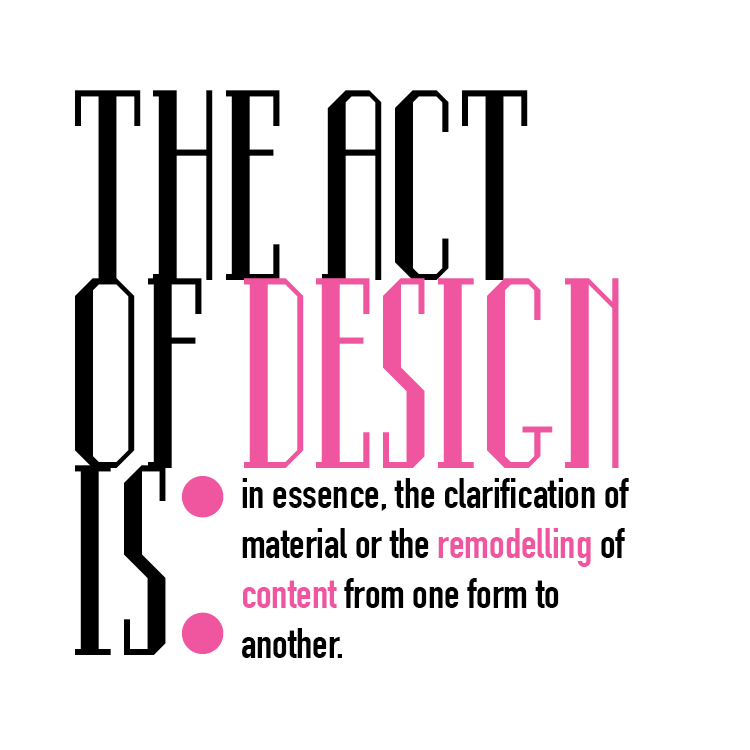
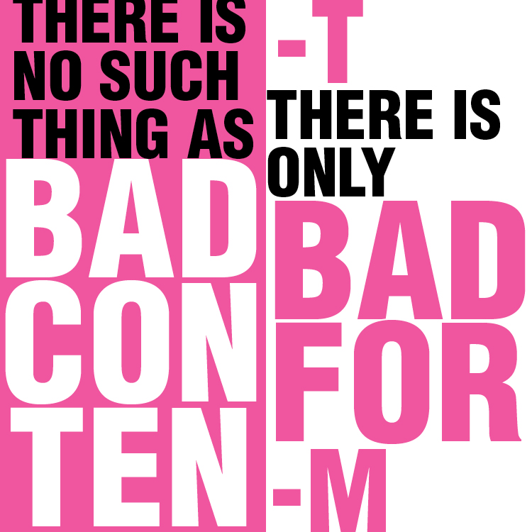
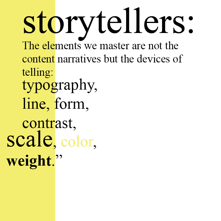

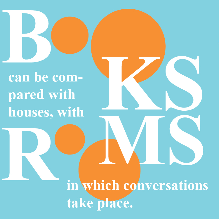
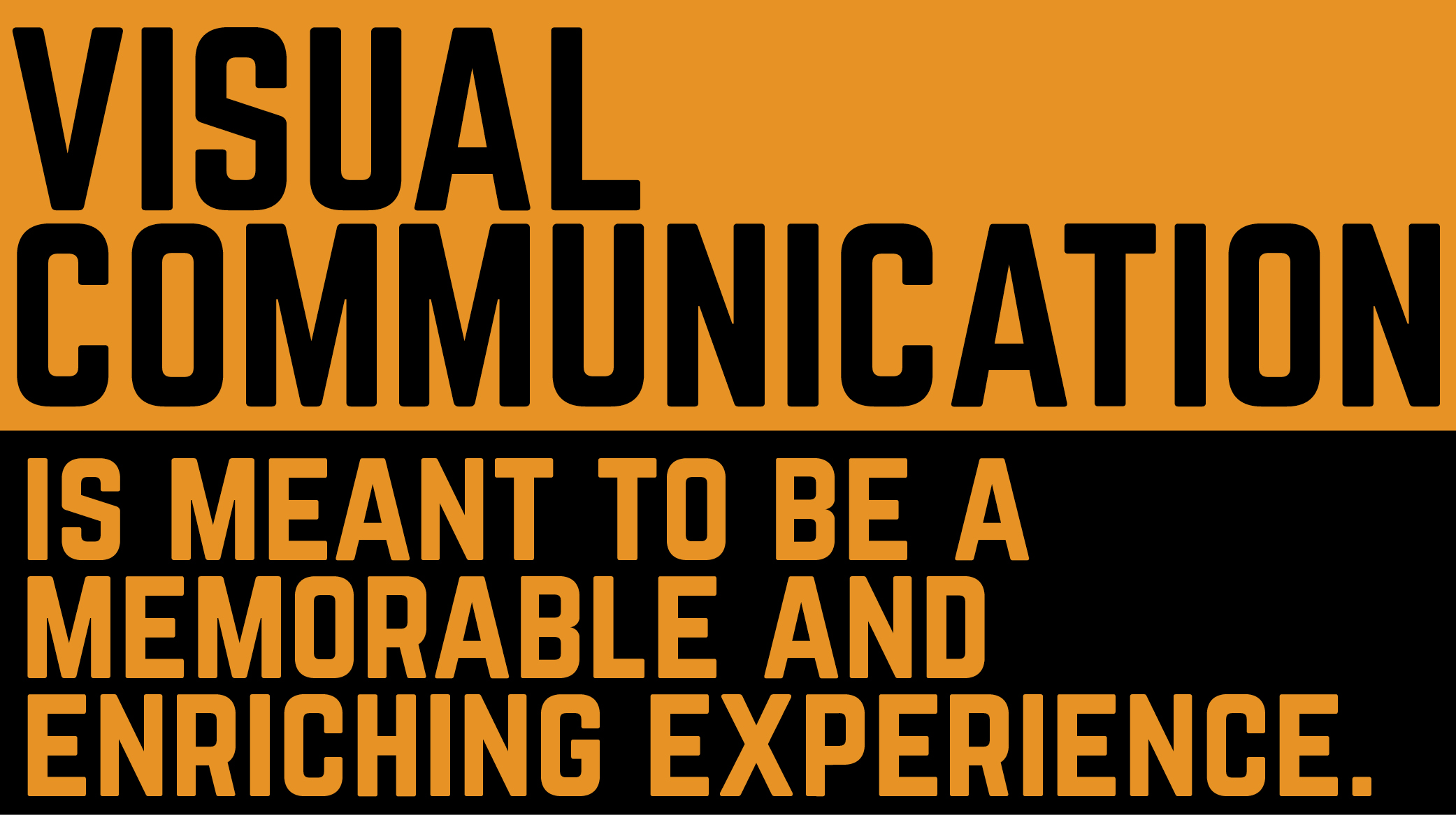
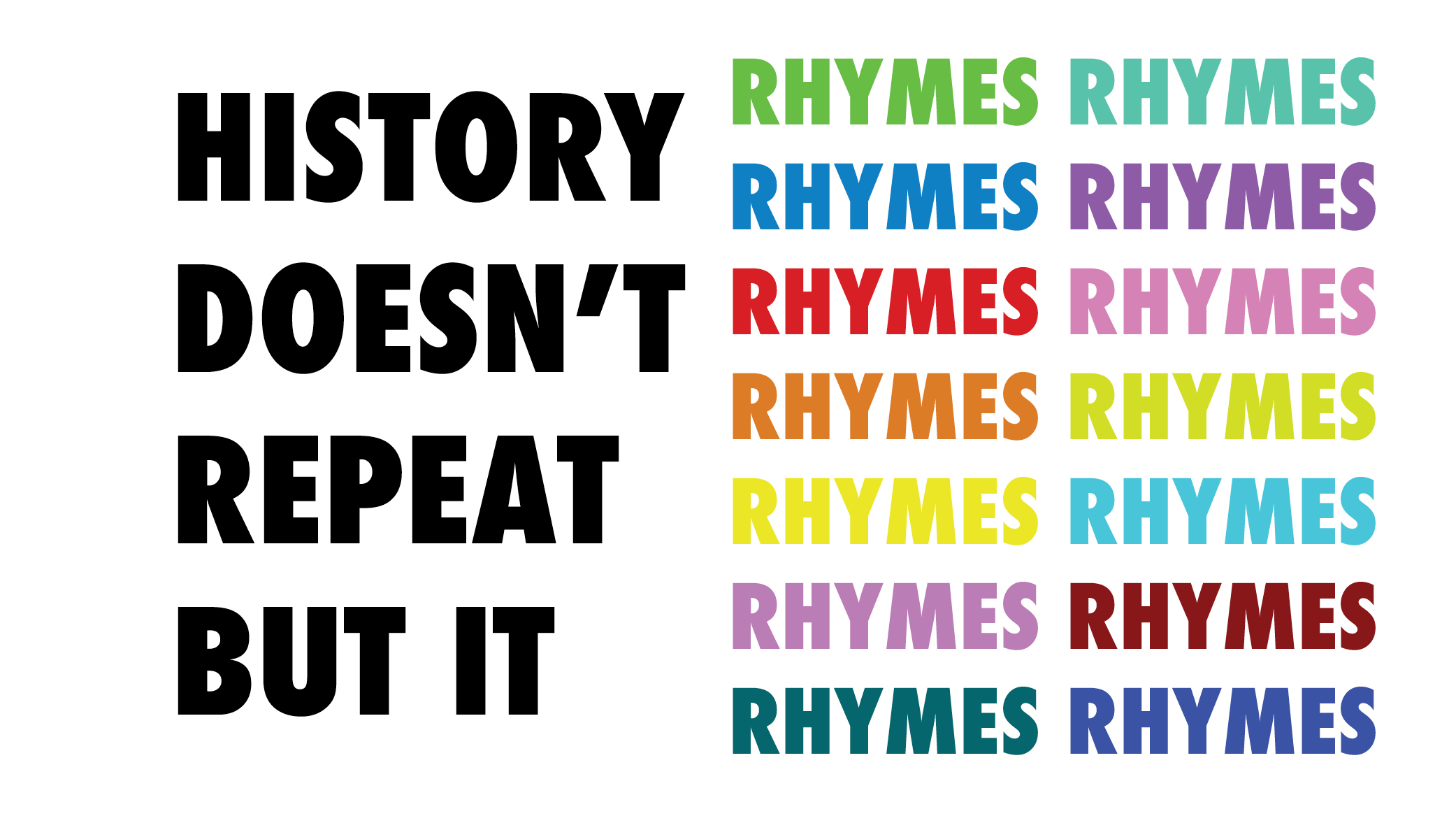
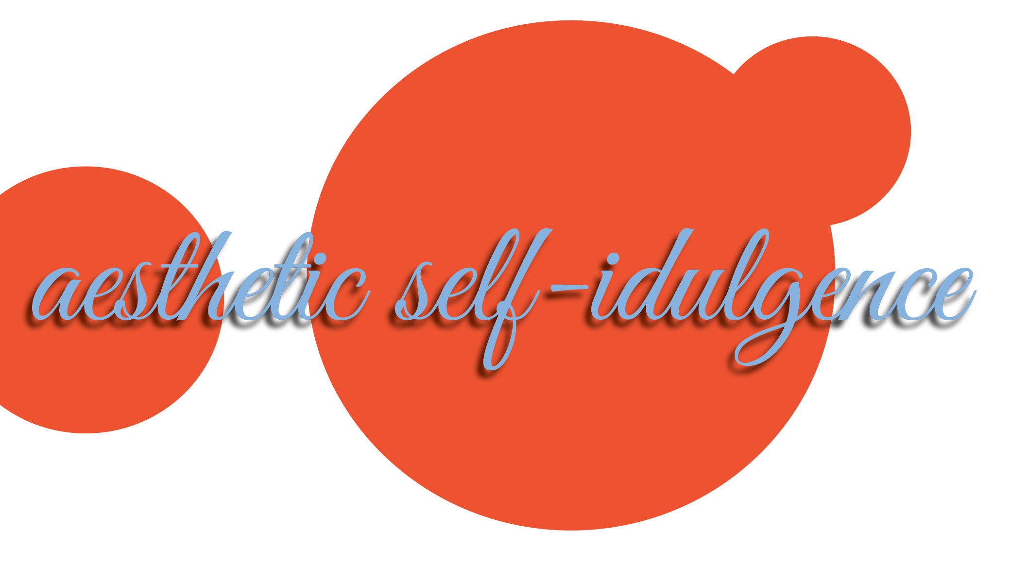
This week, I again went for the experimentation with each quote. The first response hinting to the Supreme branding, however the others are just experimentation with color and layouts. Definitely a lot of circle shape incorporation this week.
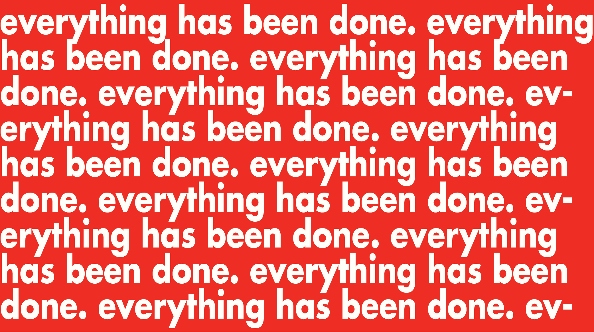

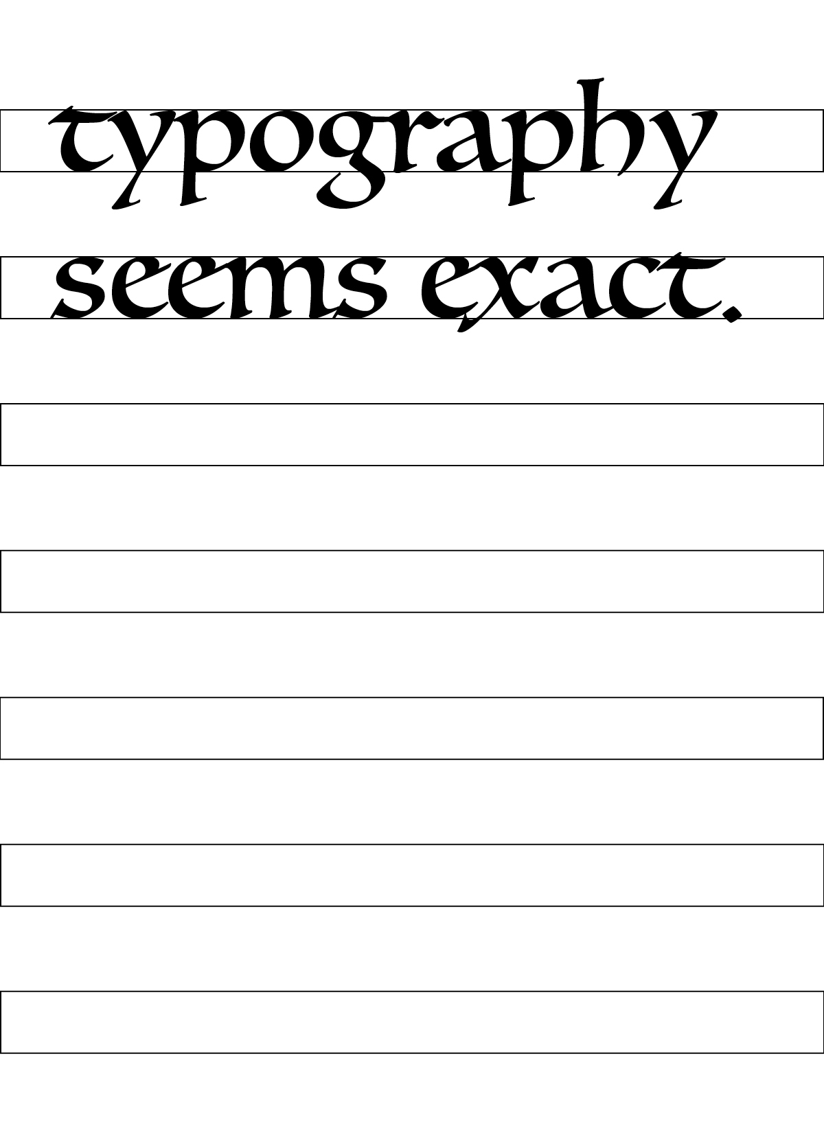
Continuing my design objectives from last week, this week is also very random and just an experimentation with each individual response.

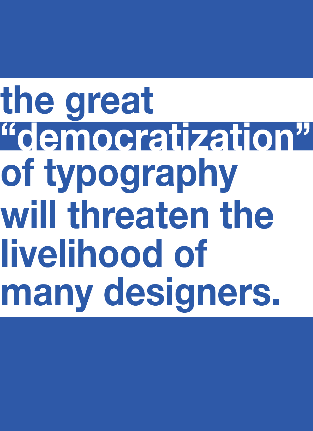
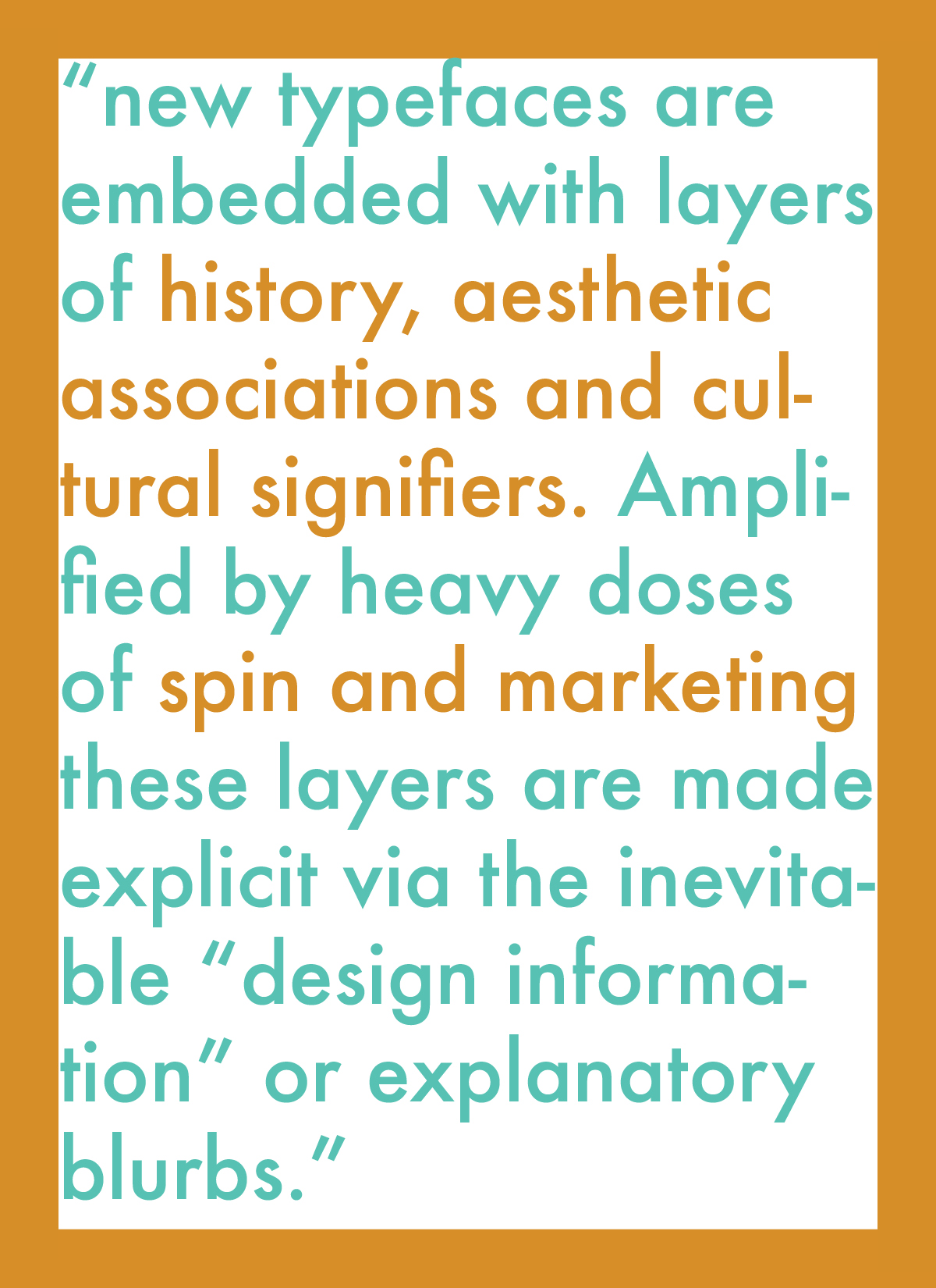

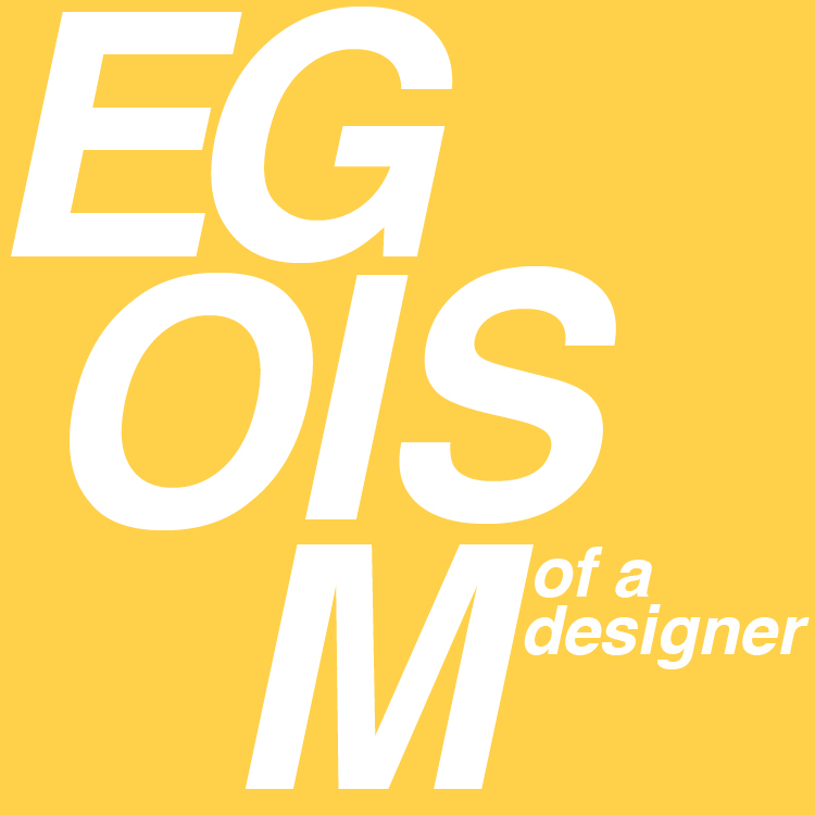
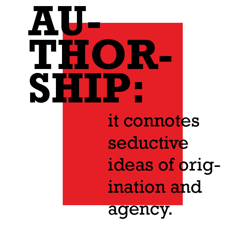
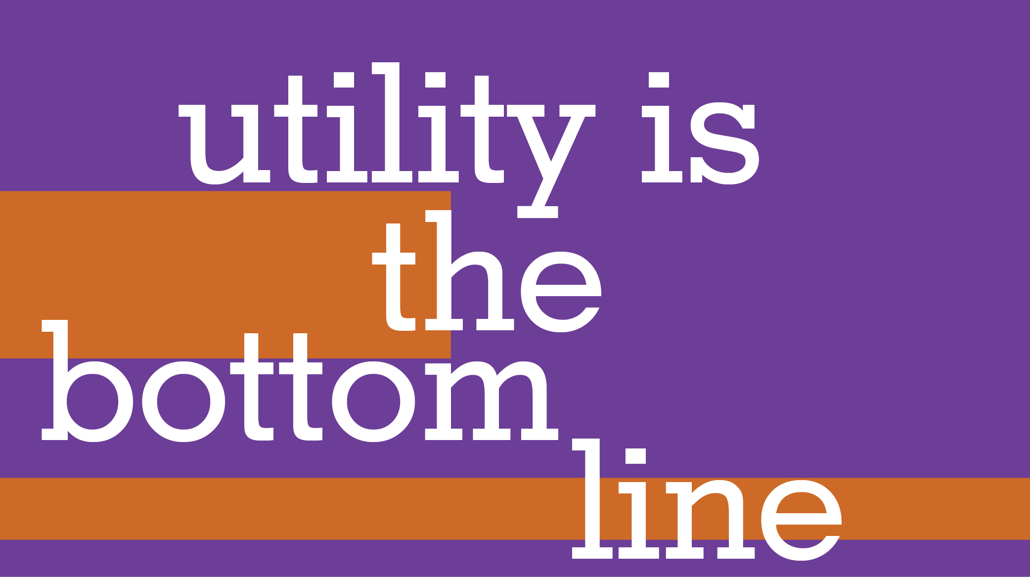
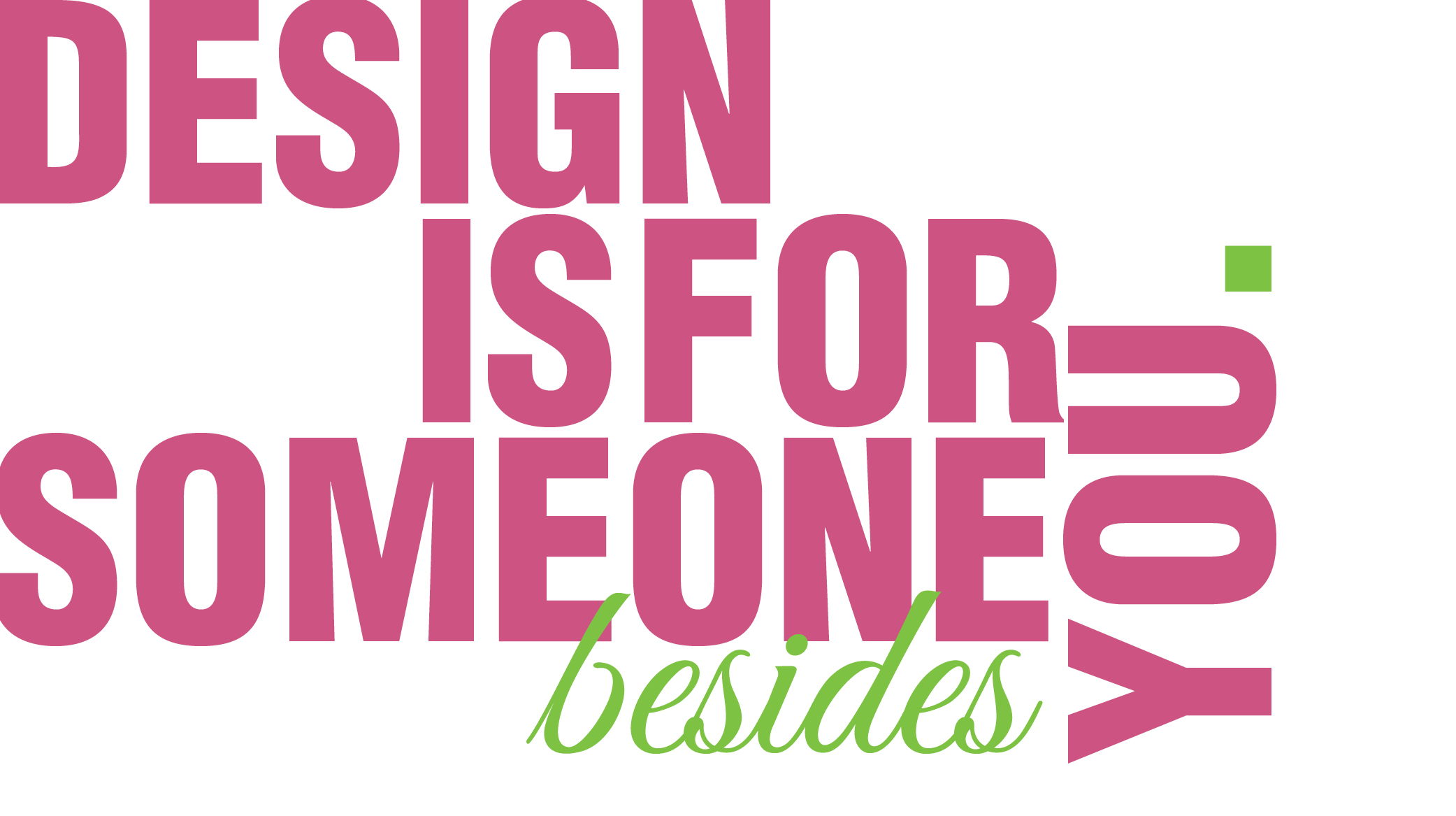
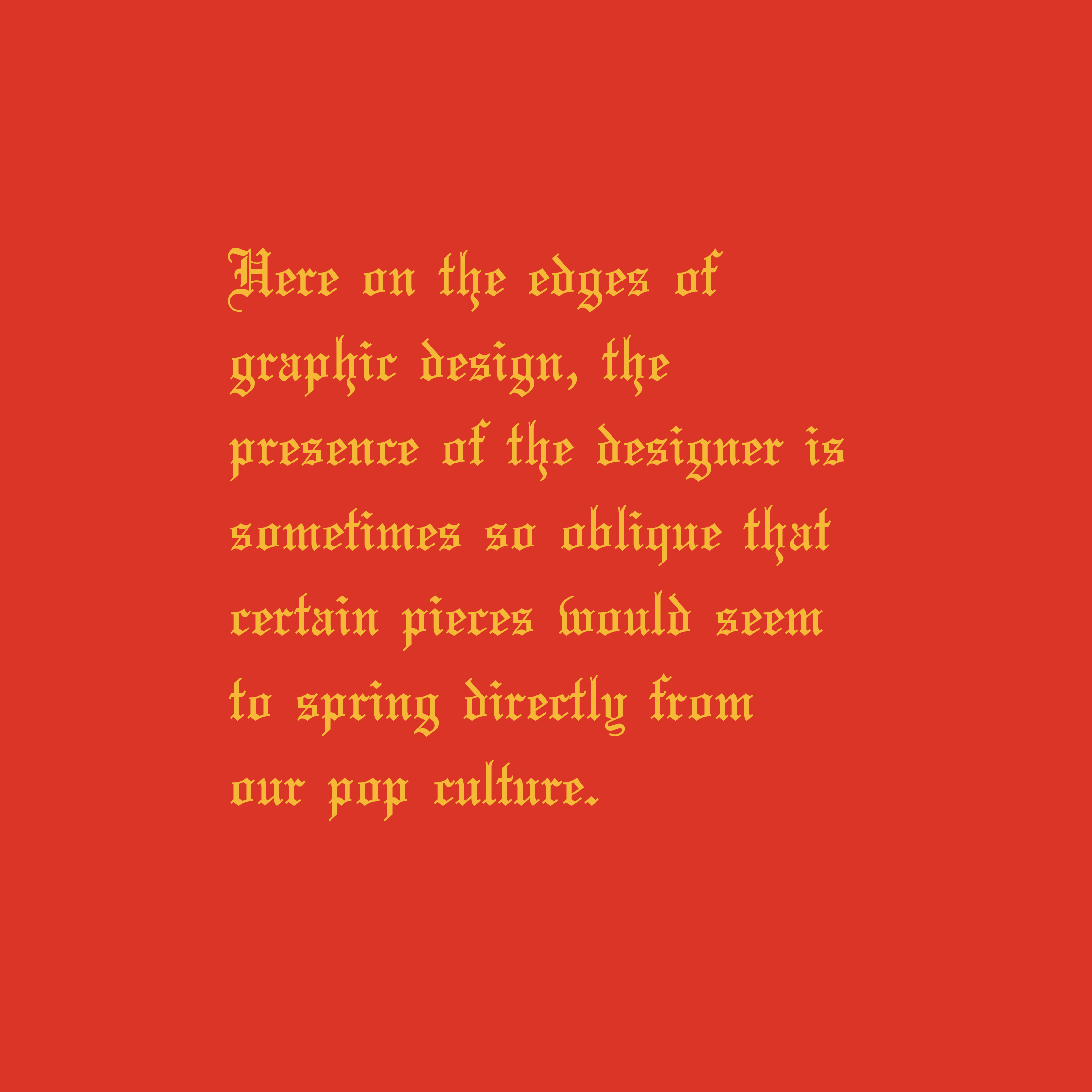
I’m not really sure how to summarize my design objectives for this week, I was honestly just experimenting with the quotes and each response is its own individual graphic. I tried to make references through my graphics relating to the quote, like the second response is a hint to the YEEZY typography and the third response looks like the Terminal feature on the computer.
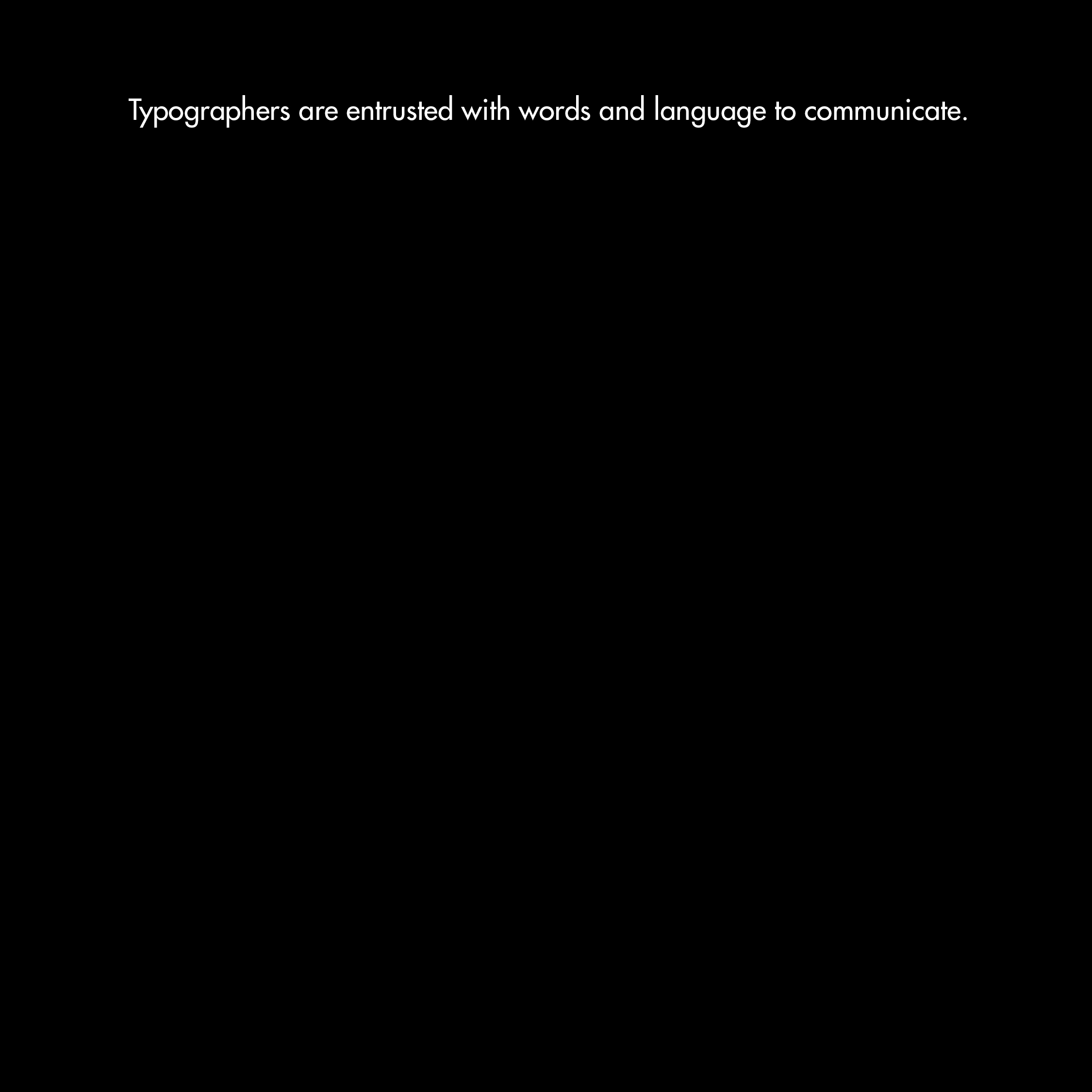
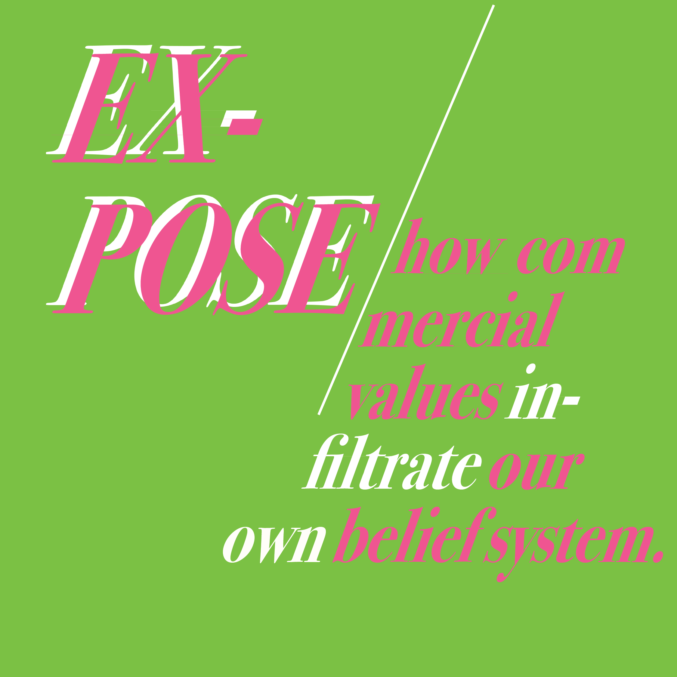
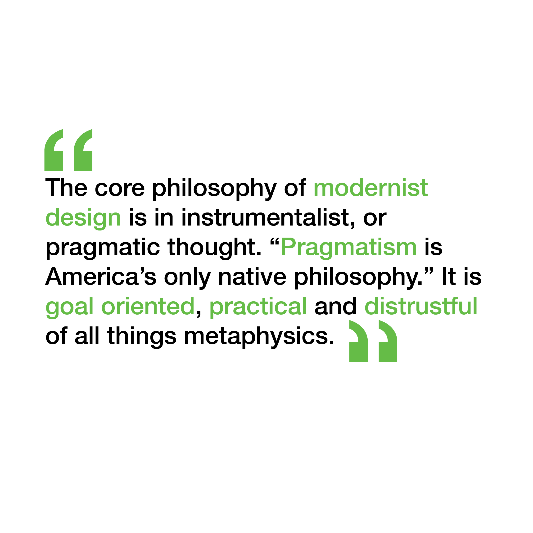
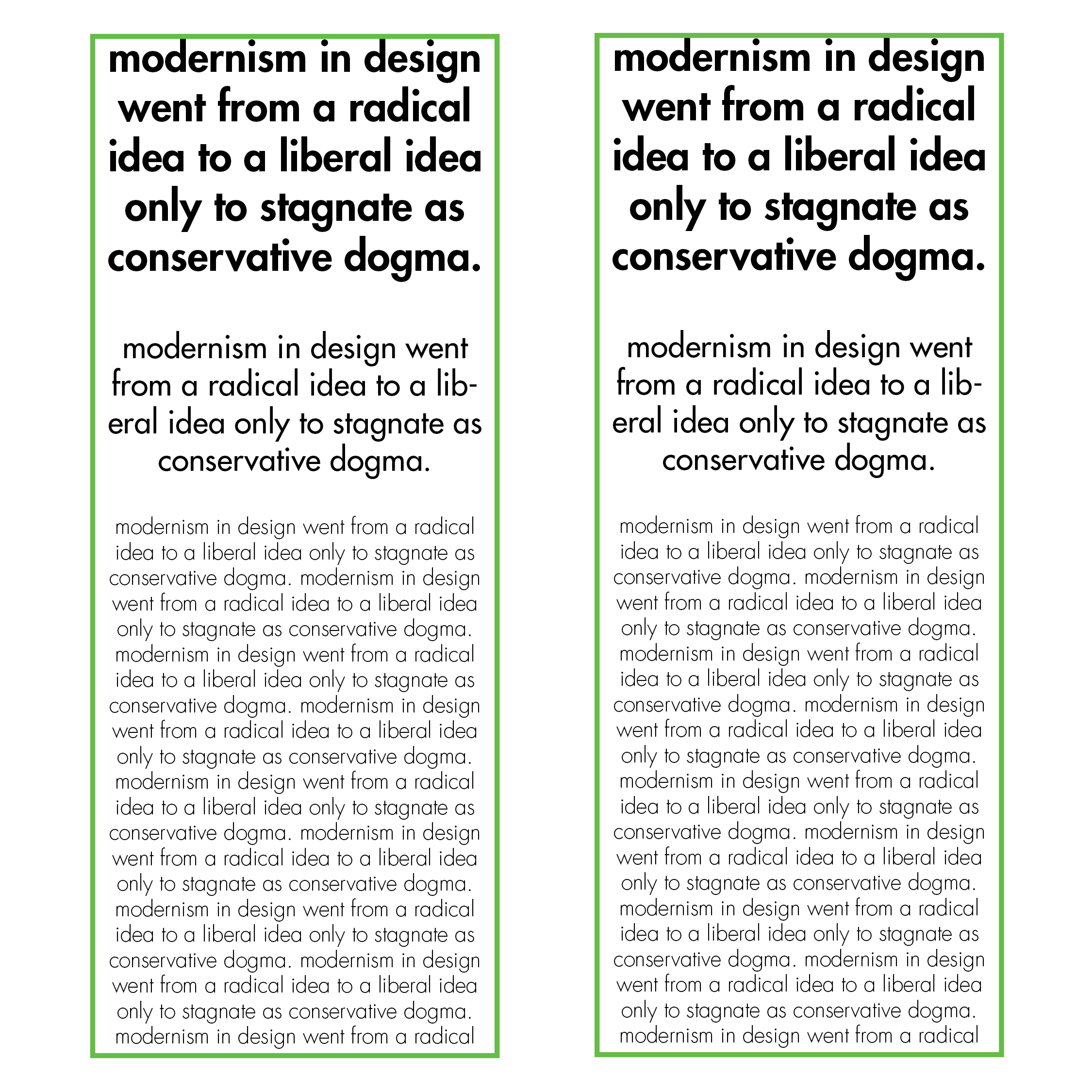
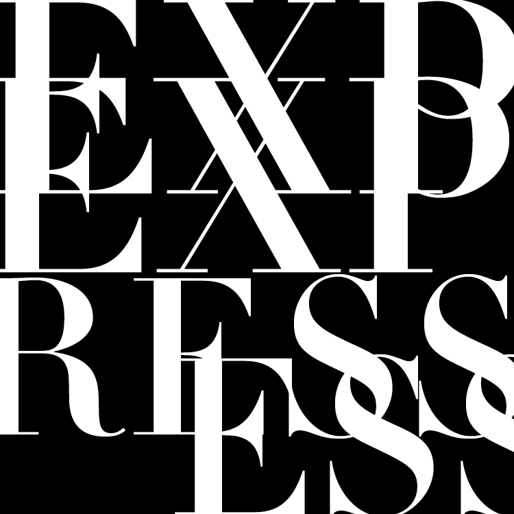
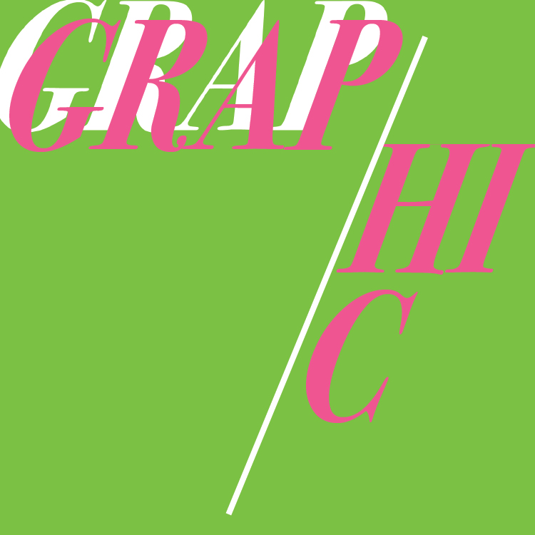
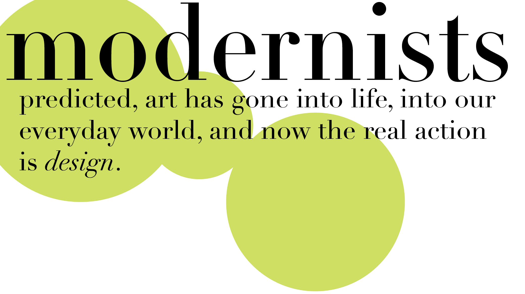
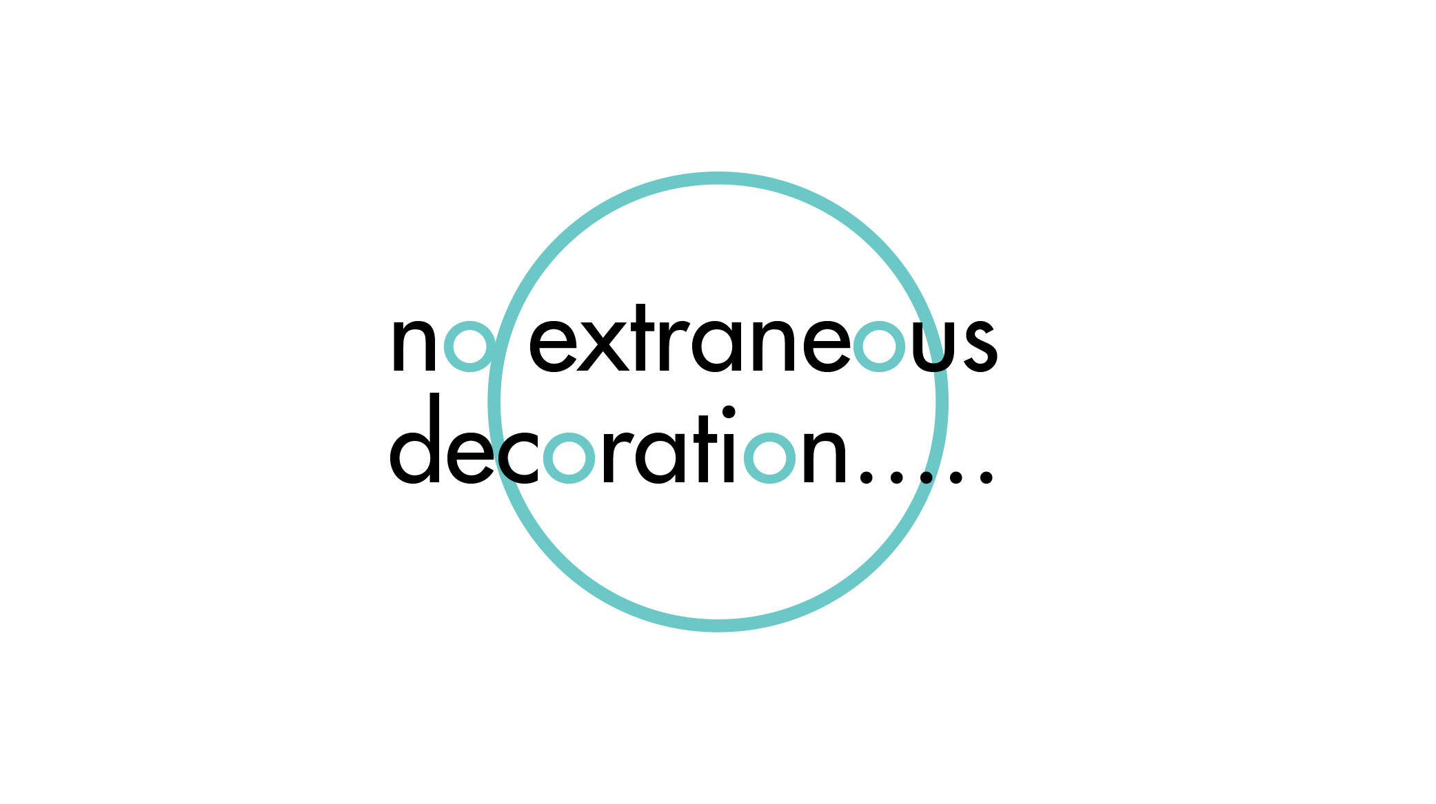
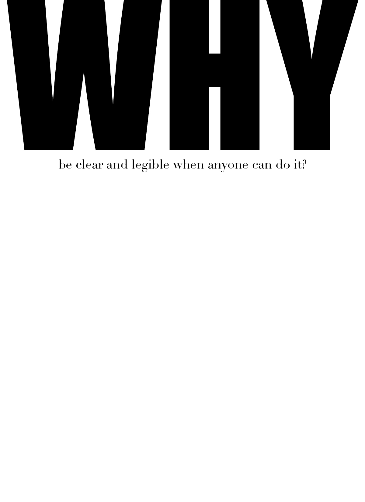
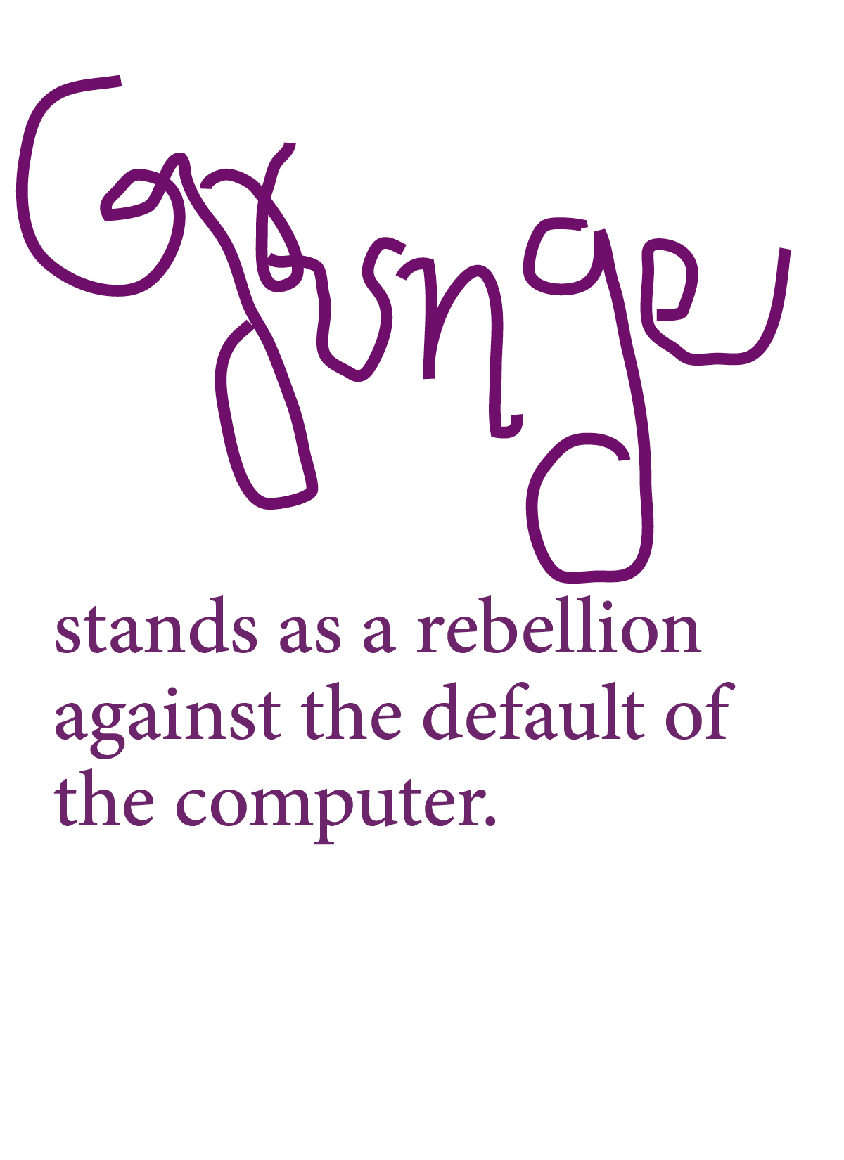
I was definitely feeling green this week, there isnt much color experimentation here. The quotes are portrayed quite literally as to what they mean. There is some graphic experimentation in the “Expose” quote.