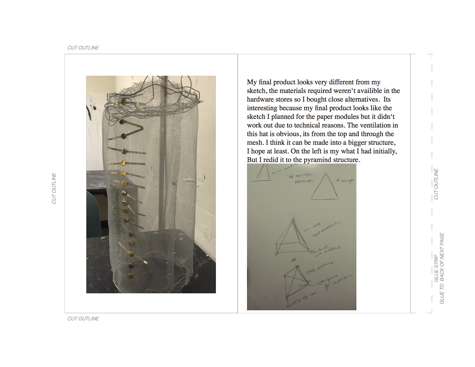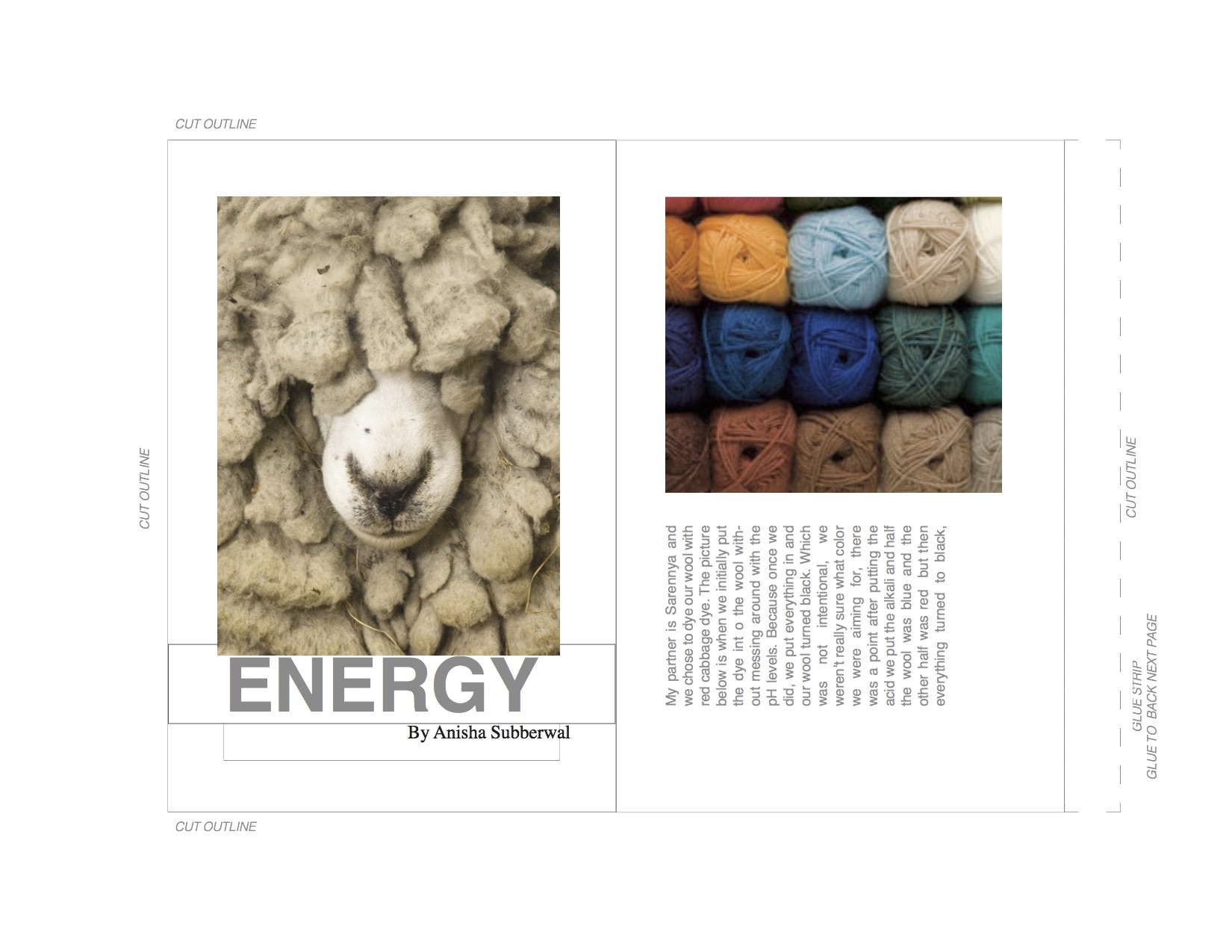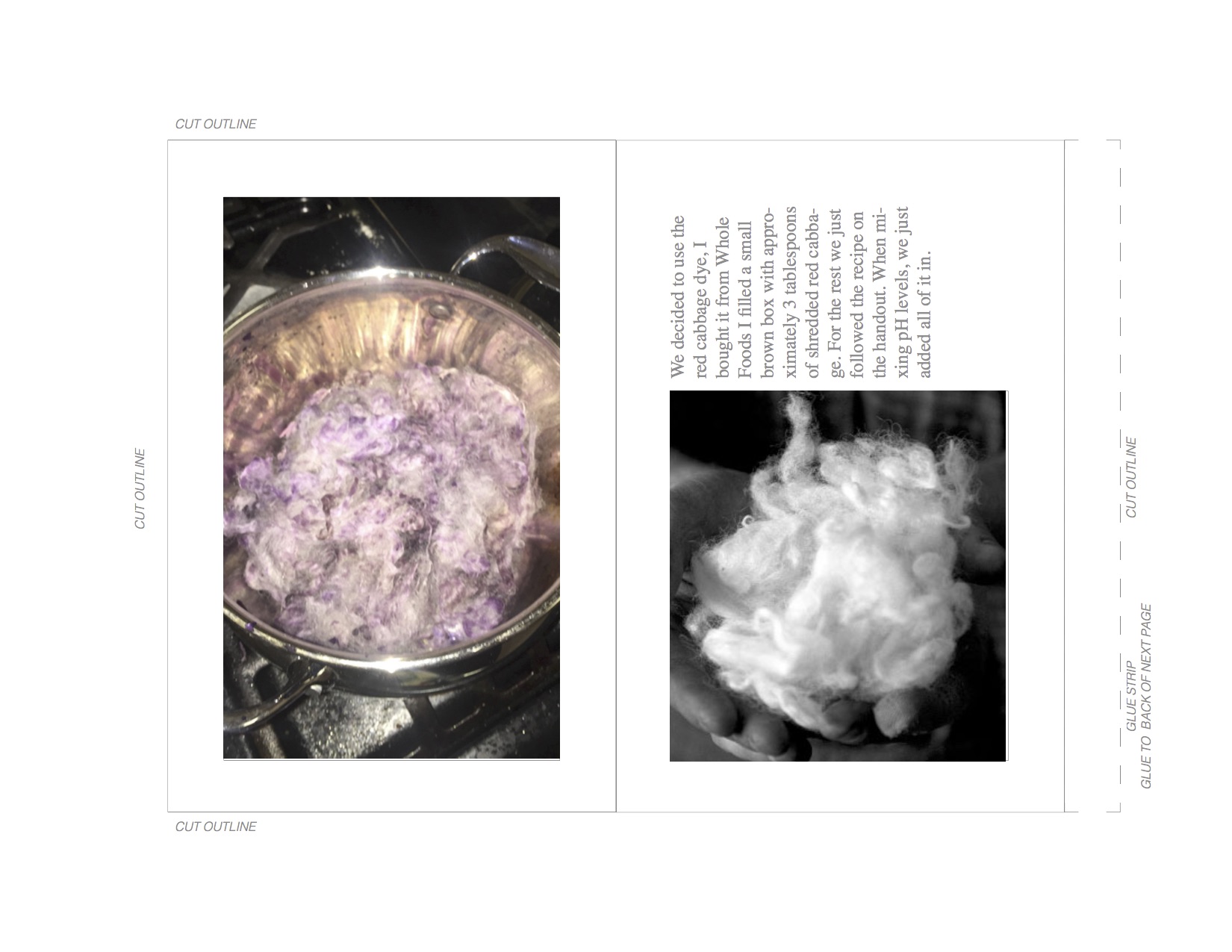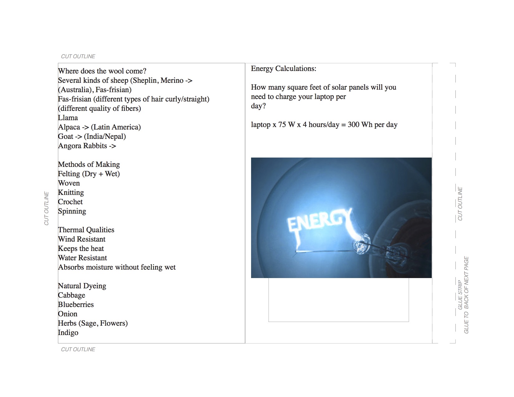
Reading Response 3
How do they play with the viewer or their audience? Post 6 image examples of this work to the class site.
What does the visual message mean?
What associations does the viewer have with the object?
Quantitative analysis is based on mathematical principles, in particular statistical methods of surveying and interrogating data. The designer can place visual forms to compare the range of positive and negative responses from a target audience.
I want to interview my target audience with a set of questions to find out what their emotional responses are to each topic I want to address. My sample sizing will range from all body types, to various ages in the spectrum. I’m designing for this group of people so I should know what they’re thinking.
Noah Neiman
Before he found his way into the gym, Noah Neiman, co-founder of Rumble Boxing, was on a different path entirely.
“Blame it on the blasting hip-hop beats, or the crazy-high energy of the instructors (and your fellow boxers), but Rumble has easily become a favorite amongst NYC’s very dense population of boutique fitness studios and one-of-a-kind gyms. Just five weeks into its grand opening last fall, Rumble was already bringing in over 3,000 customers a week, a kind of success that – as far as we know – is pretty unprecedented in the world of fitness.”
“I mean, our idea was really to create a studio that was kind of a gym, but also not a gym. And we’ve definitely done that. So as you walk in, it’s kind of like a lounge-type space where people just hang out. I mean this is the kind of thing where people come sometimes like 30 minutes early to a class just to chill here.”
“At Rumble, it’s really more of a community and an experience. People love to hang out before class, or after class, and that’s really what I love about it. We sell fun. We sell a fun experience. You happen to get a great workout, but that’s a byproduct.”
“We’re like the anti-gym. We’re the happy hour.”
Not sure if he could be qualified as a designer in the classic terms but he designed a company that became exponentially successful overnight. I’m inspired by his thought process of anti-gym and selling an experience, I believe this is what my clientele wants and to see him successfully design a studio that addresses some of my goals makes him a designer that is inspiring for my thesis.
R/GA
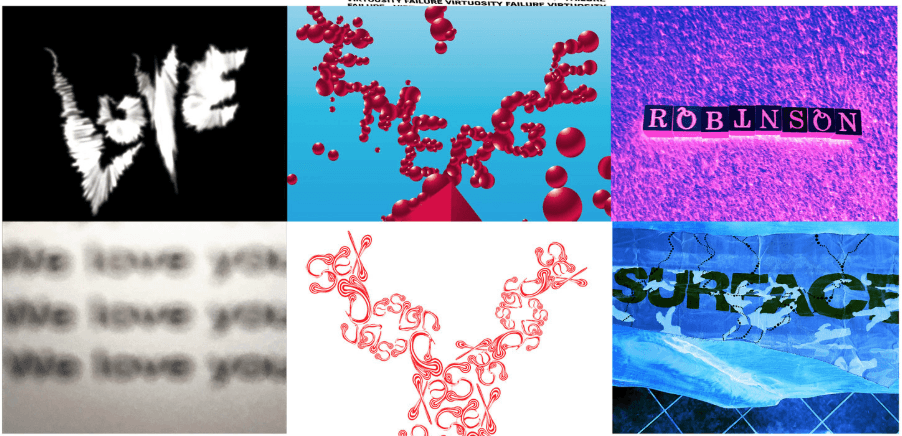
R/GA is one of the most successful advertising agencies. They create advertising and marketing products based in technology and design. It’s an interactive agency. Some of their notable creative work was with be flying into the screen.
Superman (1978) The opening title sequence for Superman by visually enhancing each name so it appears to be flying into the screen.
Nike+
An online brand platform that gives runners a tool to record, track and share their running data. Connects runners to an online community and shows their progress over time.
“Nike is pushing the boundaries of experience design in many ways, from thinking about its experiential retail with new stores to bringing the consumer closer to the brand by releasing services such as Nike On Demand,” says Una Walsh, Group Executive Creative Director, Experience Design, R/GA. “Those aren’t really about interfaces; they’re more about that connection between consumer and brand.”
Looking at such a big corporation for inspiration is difficult because they have plenty of resources and the man power to create such cool products. But nevertheless the innovation and the design process are still to look towards for inspiration as a goal to achieve.
Michael Robinson
Michael is a professor at Parsons and has his own studio in Brooklyn focused on building community through meaningful design work for brands, cultural institutions, universities, fashion and etc. He has so many categories for creations from Brand Creation to logos and traditional graphics and everything that entails, to video/animation, virtual reality, consulting and installation even.
In particular I like the experimentation with typography under the Logo and Identity Design category. Lots of colors, lots of dynamic work. Very experimental in the sense that nothing looks the same, but there is a style to it however.
He is my Identity Design professor and I’m learning a lot in that class. He refers to his process and his work often when describing how to go about certain projects or challenges. Even though my intention of my project is very corporate I want to ensure that there is a great deal of experimentation and graphic design involved. He uses the key concept of Rhetoric throughout his work with typography. I see Irony, Antithesis, Hyperbole throughout the typography experimentation.
Reading Response 2
Part 1
“Abstraction for me is, getting rid of everything that is not helping make my point.”
“Take a topic and squeeze the hell out of it.”
“The moment i give too much decision making to the user, it takes away from the surprise. The user wants something exciting.”
“How can you ask me to win the lottery, under pressure with a gun?”
I think I have a great work life balance. Unfortunately or fortunately I think I sometimes merge them together. I multi-task often, just focusing on my design work can lead me to procrastinate or be at a standstill for ideas so I like to keep my mind active. Sometimes I work with friends or go for coffee, changing the scene, the environment and sometimes a collaborative effort from my colleagues or my friends also keeps my mind stimulated and focused.
I’m trying to get good at the design thinking behind each project. Understanding why I make certain moves in typography, graphics, colors, layouts instead of just opting for what looks nice. Abstraction in the sense that I want the user to know what the design represents but not giving away all the information. So I want to go more into the research aspect, and the documentation behind each artwork/design.
I’m reinventing my image making process by focusing my efforts on the research aspect more than I ever have. I’ve always been into the final product but I want to take it back to the process and still come up with a good final product.
Authenticity in design to me is usually some sort of originality, I guess we live in a world where all ideas are taken from existing ideas and the past. “Talent borrows, genius steals” One of my teachers says this in class and I guess authenticity can also be just something that gets the point across. A design or artwork that may have a greater meaning or purpose behind it, could also represent authenticity.
“Some people love it, some people don’t. Thats life.”
I want my work to tap into emotion because essentially that is what branding does. Or thats the whole point of successful branding. I’m not sure if my normal design work is made with the intent of tapping into emotion necessarily but good design work always comes with a positive customer experience.
Part 2
- Brandless Pop Up Exhibition in Milk Studios
“Brandless was brought to life on July 11, 2017 with the intention of making better stuff accessible and affordable for more people. Our mission is deeply rooted in quality, transparency, and community-driven values. Better stuff, fewer dollars. It’s that simple.”
I feel like this exhibition is interesting because this company sells a vast range of products all for only $3 but the way they go by “brandless” almost ironically creates its own brand because the colors/type/aesthetics are all consistent. My thesis will show how important branding is and this is a good case study exhibit.


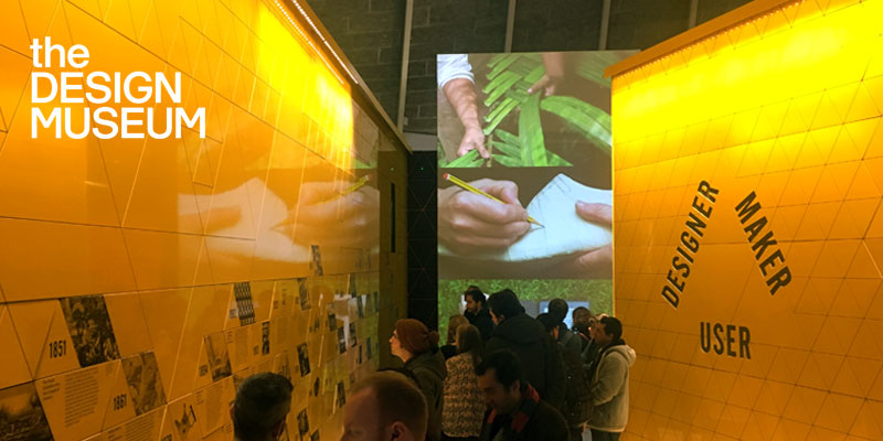
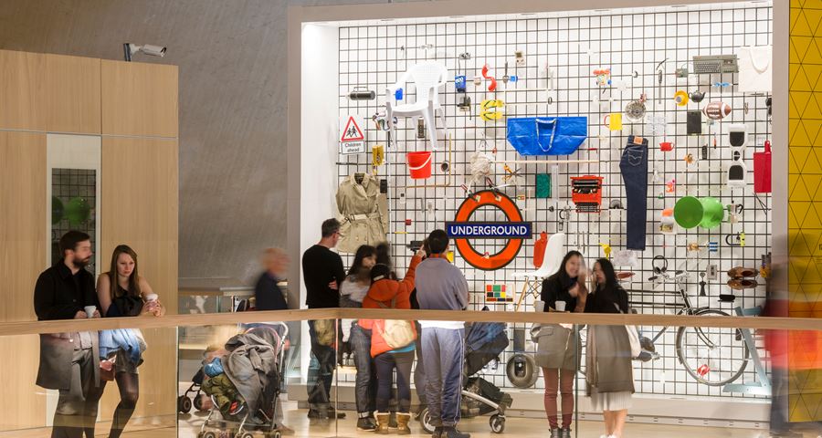
2. Designer Maker User: The Design Museum in London
Designer Maker User is an introduction to the museum’s collection, looking at the development of modern design through these three interconnected roles.
Designer Maker User features almost 1000 items of twentieth and twenty-first century design viewed through the angles of the designer, manufacturer and user, including a crowdsourced wall. The exhibition covers a broad range of design disciplines, from architecture and engineering, to the digital world, fashion and graphics. Designer Maker User features a bold, colourful and engaging display designed by Studio Myerscough, with digital interactives by Studio Kin.
I like the concept of Designer Maker User. I feel like my thesis corresponds with the importance of Designer and User at least and there is a significant relationship there that is a huge part of the design process. This exhibition covers a huge variety of fields, I would be most interested in the digital world and graphics aspect for my thesis.
3. Why Exhibit
The only active apparel and athleisure trade show – where fitness meets fashion.
The Active Collective was started in 2014 as a sub-category on the floor of our well-known Swim Collective Trade Show. In early 2015, Active Collective launched as its own show in Southern California, and has since been crowned as the only trade show specializing in active and athleisure fashion. The show features fitness events during show days, as well as events for manufacturers to mix and mingle with buyers and media.
Showcasing over 120 brands, the Active Collective has featured a wide range of products from the fitness fashion marketplace including active performance, active fashion, accessories, and footwear. Don’t miss out on the industry’s leading active fashion and athleisure trade show, occurring twice annually in Southern California, and twice annually in New York City.
Ultimately my thesis is not just about branding but branding specifically in the fitness sector. A huge part of what makes a company popular if relevant is the fashion. I think athleisure is a huge part of the rise in this industry and making it the trend it is today. So going to this expo you would be able to compare all these different companies and brands, see the similarities to recognize whats popular and trending and what makes each one stand out on its own.

Week 6 Reading Responses
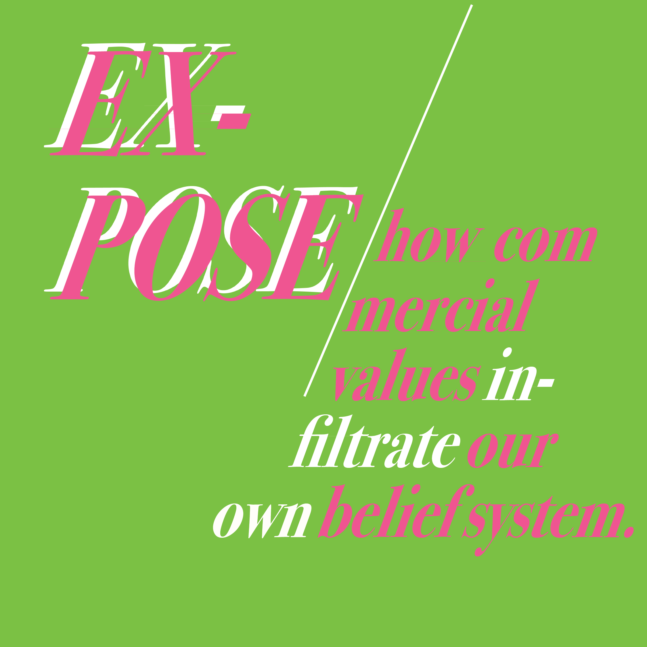
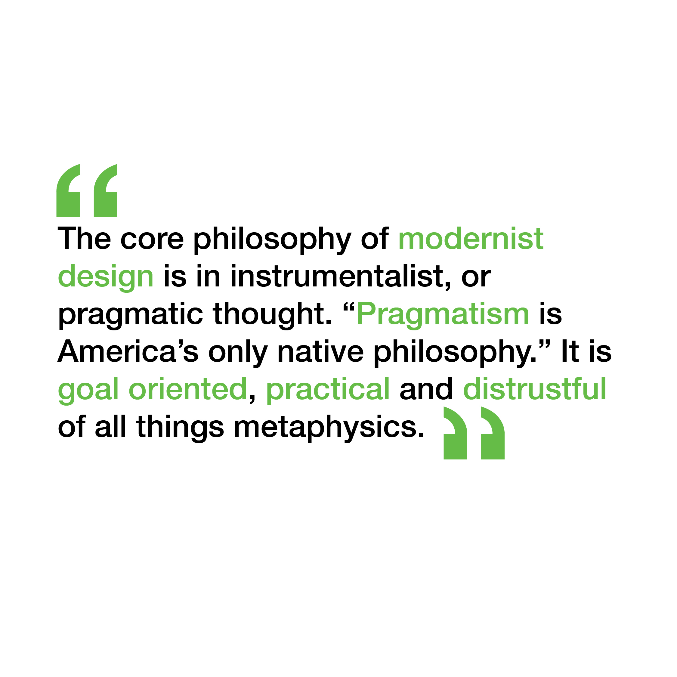
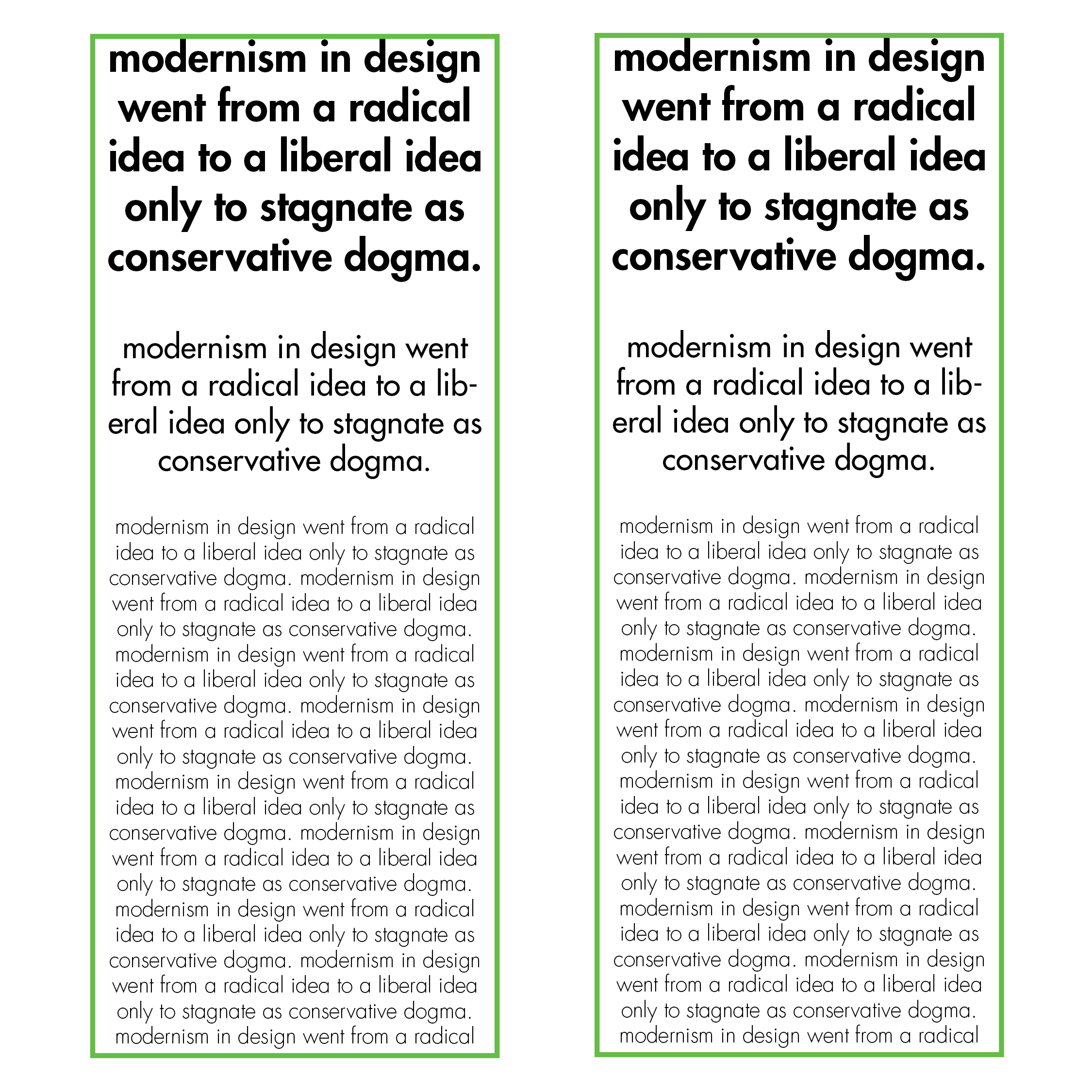
I was definitely feeling green this week, there isnt much color experimentation here. The quotes are portrayed quite literally as to what they mean. There is some graphic experimentation in the “Expose” quote.

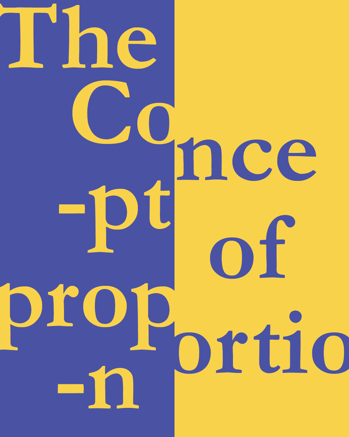
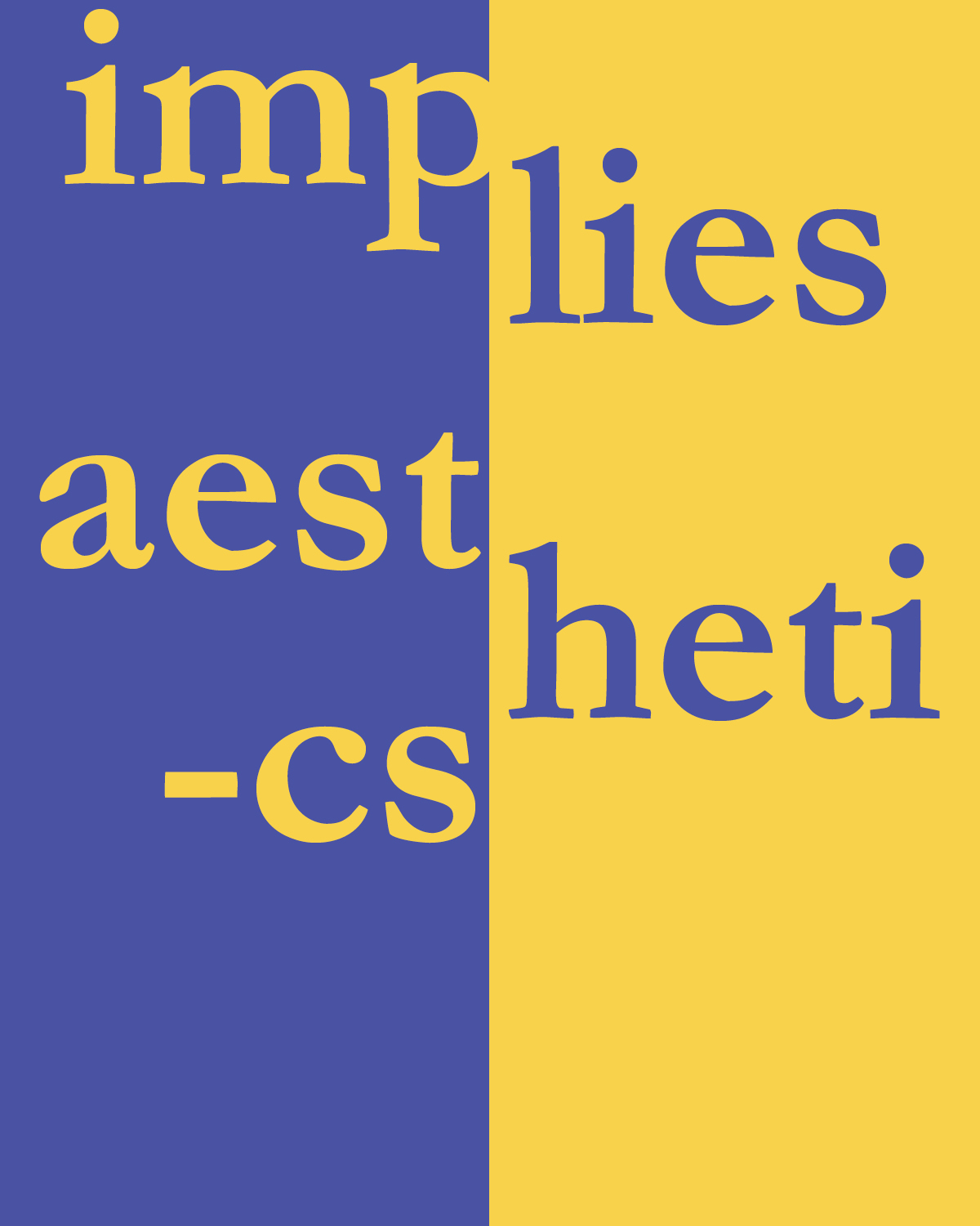
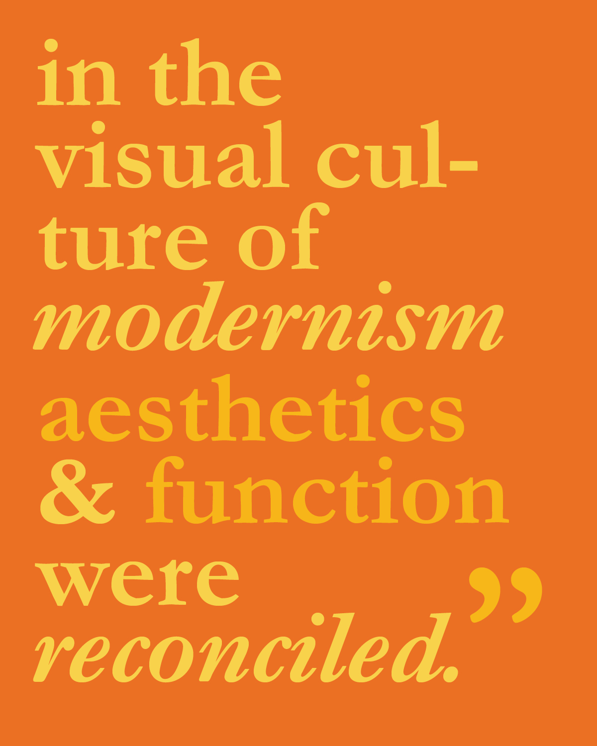
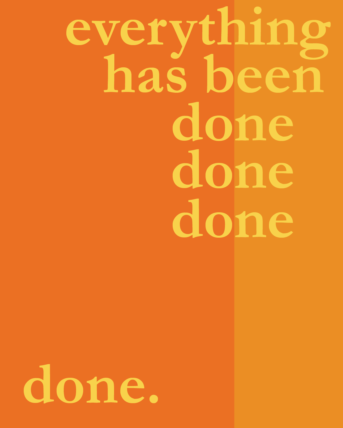
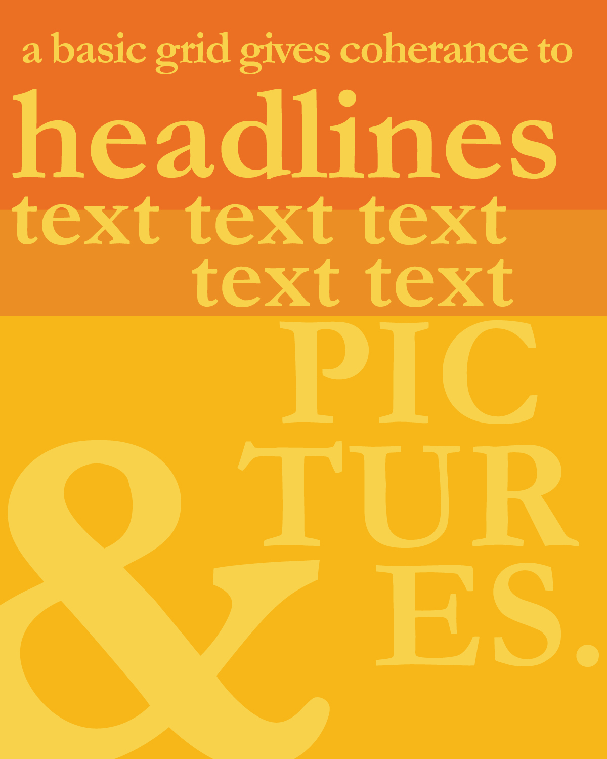
Week 2 Reading Responses
I chose a color story for this weeks reading responses blue, yellows, and oranges because they make interesting contrasting layouts. I decided to experiment specifically on splitting the page in different interesting ways. Through obvious columns and rows, and some splitting through the use of typography.

Style Tribe: Festival Crazed
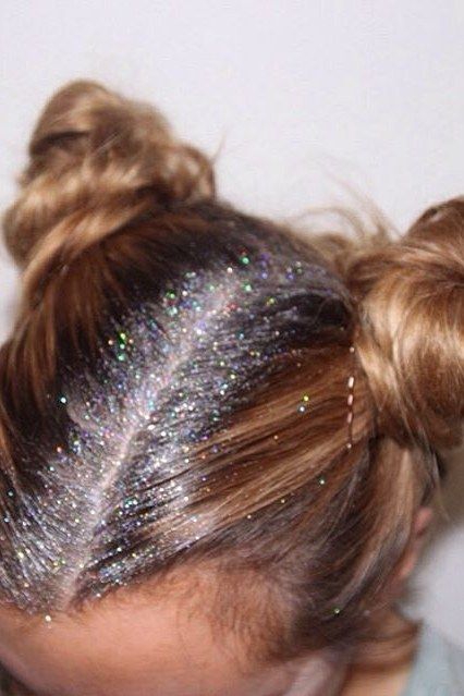
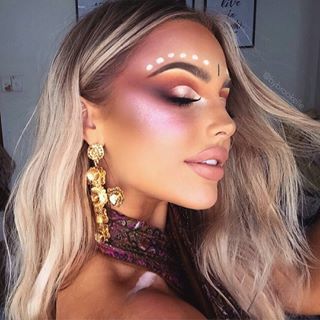
 Celebrities are very influential in this trend when they attend Coachella; Coachella is known for having a huge celebrity crowd not just movie stars but a vast array, musicians, models, youtube personalities. I hesitate to say “basic white girl” adoption but I feel like thats what comes to mind when one thinks about who adopts these trends. This style tribe is definitely influenced by contemporary events, it’s currently festival season. With Ultra, Lolapalooza and Coachella coming up, each slightly different in style due to the music differences but there are aspects that go across all festivals. Ultra is more about bright colors because of Electronic music and Lolapalooza and Coachella are more bohemian vibes however based off the current trends of colored glitter and gems, beauty looks are currently quite similar for all festivals. The glitter trend goes beyond just the face, we now see this trend for the hair and the body. Glitter roots are currently very in. Last year, flash tattoos were definitely the accessory that was trending around this time, now its more about glitter and highlight and colorful gems. A very unicorn ethereal look. Makeup is also used to achieve this look. Also a current popular accessory for these festivals are body chains, not just simple ones but ones that resemble clothing.
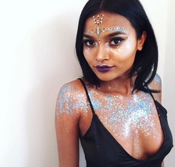
Midterm Project Trend Spotted: Trousers
Research:
1930’s: Trousers were considered practical for working women. Trousers were some sort of sexual power symbol as man so it came as a complete shock to see women in trousers. Pants became okay for girls to wear in the 19th century in ranches because they were practical for riding horses and working. After the first world war, women got a taste of what it felt like to be outside the sitting room and in the workforce. From that moment on women started to slowly fight for space in the public sphere, where they could manage their own funds, have a say in politics and economy, and be in charge of their own bodies.
1960’s-1970’s:
This was when designer pants became fashionable among ordinary women.Still not considered okay for office work or school until the 1970’s. In the fifties, young ”rebellious” women has started wearing jeans.
According to Vogue, Coco Chanel had these women in mind when she designed, which led her to create her own version of the two piece suit. “She designed sophisticated clothes that were elegant yet, comfortable. The symbol of this ideal is the two piece suit, which Coco created taking inspiration directly from the suits of her lovers,” Vogue writer Sara Bimbi explained.
Women need to fight back and prove themselves in a working environment. Gender equality is still an issue we face today and it just became more prevalent after Trump winning presidency. Women’s March Protests and public outrage to new political laws being enforced on issues such as abortion and female healthcare.
In my opinion I think this trend is still rising, I would say its at its early stages right now. As the protesting slowly dies down and the anger reflected in the street marches and the protest wear and protest signs gets translated into a more subtle response and in an everyday work environment. For now, I think this trend doesn’t necessarily apply to women in the work place, any woman who feels empowered within themselves. We’ve been seeing a general change in silhouette generally speaking through more baggy clothes and baggy jeans. Trousers are just more sophisticated.
Fashion Change Theory in Pop Culture
 A pop culture trend that has been booming recently in our society is “feminism.” The recent political election instigated this concept to become a “trend” so to speak, as we see the masses in protests wearing slogans and phrases standing up for their rights. Our efforts to protect our rights as women and protect our equality is reflected in the fashion industry today. As a feminist I have mixed feelings labelling this as a “trend” just because then maybe we start to divert away from the real meaning and purpose of the word and the movement and it just becomes something thats “fashionable” and “cool.” However, it is the current issue and as a result the fashion industry will respond to what society is facing.
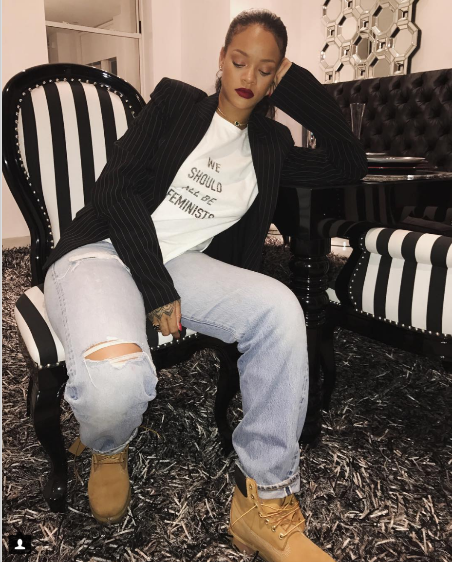
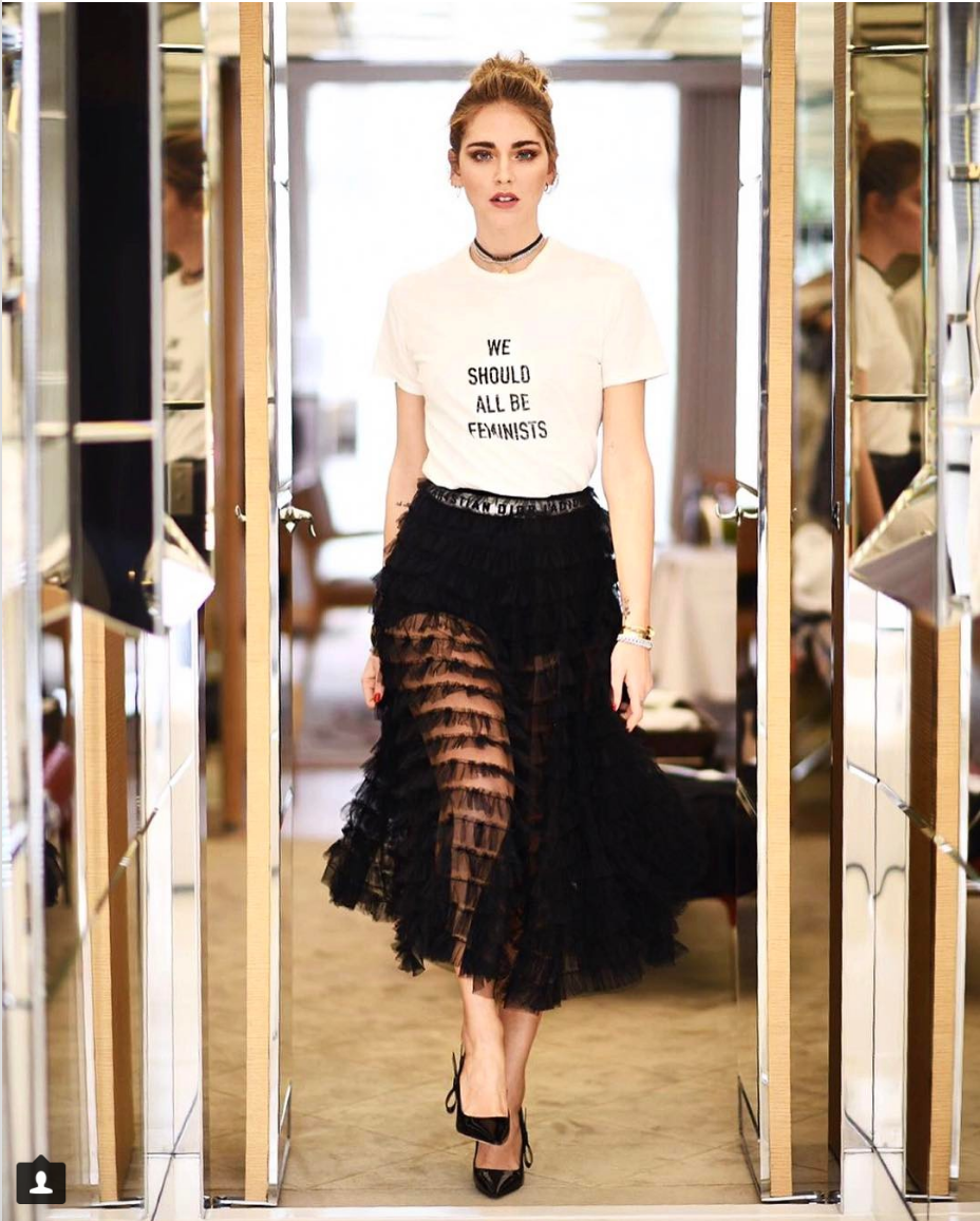
At this years New York Fashion Week, Dior designer Maria Grazia Chiuri debuted a shirt that had “We Should All Be Feminists” which has been seen worn on pop culture icon Rihanna and a known feminist spokesperson at the Women’s March and actress Natalie Portman. Another high-end designer who promoted feminism through his collection was Prabal Gurung who debuted a collection of with messages that said “The Future Is Female” and “Neverthless She Persisted.”
This years political election prompted many celebrities to speak up about their political stances, whether it was through their performances, presence in protests, campaigning with the political candidates or through their social media. Famous examples that come to mind would be Lady Gaga, Beyonce and Jay Z, Katy Perry, Amy Poehler and Tina Fey, honestly so many celebrities from musicians to actors to models. Vogue also published an article stating their political opinion, which is extremely rare for a magazine especially one with such prestige. In my opinion, I think these celebrities speaking out had an indirect influence over the trend of “feminism,” I think they prompted their fans and raised awareness and encouraged others to partake in protests and stand up for everyones rights that were in jeopardy which not only meant women rights, but LGBTQ, immigrants and human rights in general.
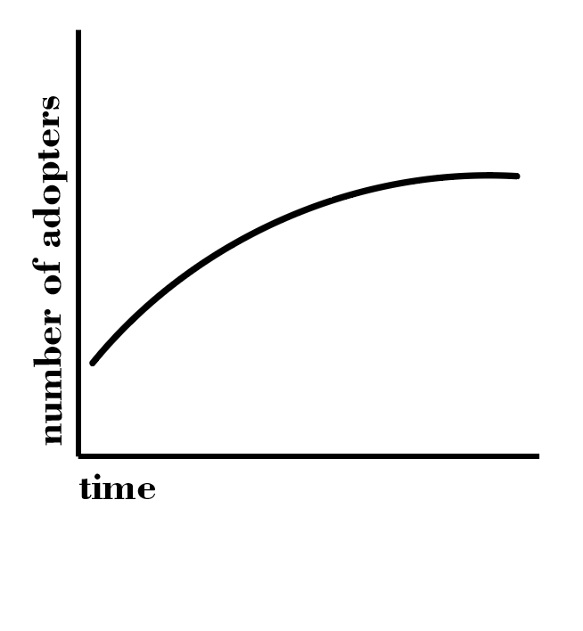
Through the protests we see “pussy hats” and protest slogans and protest wear and I think that is really what had a direct influence on high-end brands to debut these T-Shirts with feminist sayings. I would say the Trickle-Across Theory would be most applicable to this trend. It wasn’t a matter of the elite introducing this fashion trend, it was due to the social situation and how the masses were reacting. It is also not a Trickle Up Theory just because the elite were simultaneously partaking in the public reaction and protests. We see the protests and the “normal” people with all these feminist slogans and protest signs, we see celebrities speaking up and wearing these feminist slogans and then we see them debuted in Fashion Week by high-end brands, and now there are going to be readily available T-Shirts at our fast fashion stores. I made a graph that resembles a “classic” fashion trend because I believe that “feminism” is a concept that has been going strong for years now and it has recently picked up even more due to current events, but it cannot be a concept that just fades away like a fad because it will always be a pressing issue.
Annotated Bibliography
Greenbaum, Hilary, and Dana Rubinstein. “Who Made That Mason Jar?” April 27, 2012. Accessed October 5, 2016. http://www.nytimes.com/2012/04/29/magazine/who-made-that-mason-jar.html.
This source talks about the initial thought process behind the design and makes a comparison to the usage now because this article was written recently. It also talks a bit about what makes this object a collectible now and so it briefly talks about the design aesthetics.
Special Jars of the Past. PDF. Hearthmark LLC D/b/a Jarden Home Brands, 2007.
I found this pdf file from the Jarden Home Brands website, it talks about everything related to the mason jar, the history, the material, the name, the value, all the different types of jars. All the information is pertaining to the Ball brand jar, which is the main manufacturer of mason jars.
Goldstein, Jessica, ed. “Behind The Spectacular Rise Of The Mason Jar.” Think Progress, August 19, 2014. Accessed October 5, 2016. https://thinkprogress.org/behind-the-spectacular-rise-of-the-mason-jar-823c56da6a79#.srs78qfow.
This article sites countless other sources which will also be helpful in finding out the coming of the trend aspect of the mason jar. She talks about peoples preferences when it comes to the design, gives some statistics on the trend aspect like
what age group
what percentage of people transform the object
how popular it really is etc.
It even shows some creative examples used today. Essentially talks about what makes it popular and the current culture of the mason jar.
Lindsey, Bill. “Food Bottles.” Food Bottles. January 8, 2016. Accessed October 05, 2016. http://www.sha.org/bottle/food.htm.
I’m not a 100% sure whether I will use this site. Its from the Society of Historical Archaeology and it goes into extreme depths of the design and structure of the mason jar and really studies and analyzes why everything is the way it is. From the thickness of the glass, to the seal, to how the lid screws etc etc. Extremely detailed explanations here.