Week 11 Reading Responses
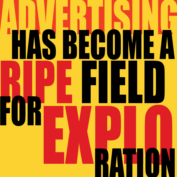
I would say this week I combined a bunch of experimentations I did in the past weeks and put it all together, colors, layouts, and shape experimentation. Definitely a lot of usage of white text and how background colors/shapes can help accentuate the form.


Week 10 Reading Responses
This week I decided to experiment with shapes and how they can just add an interesting visual element in the background.


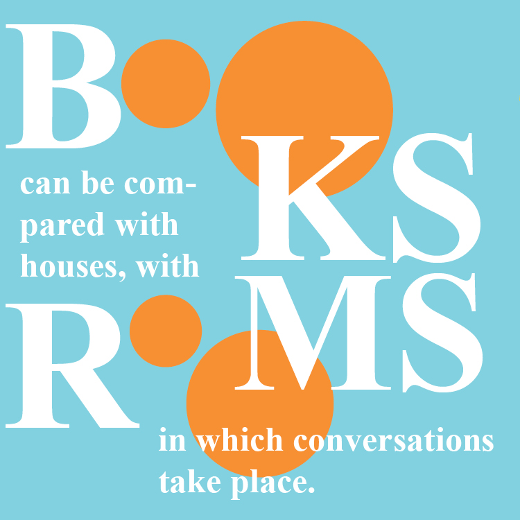
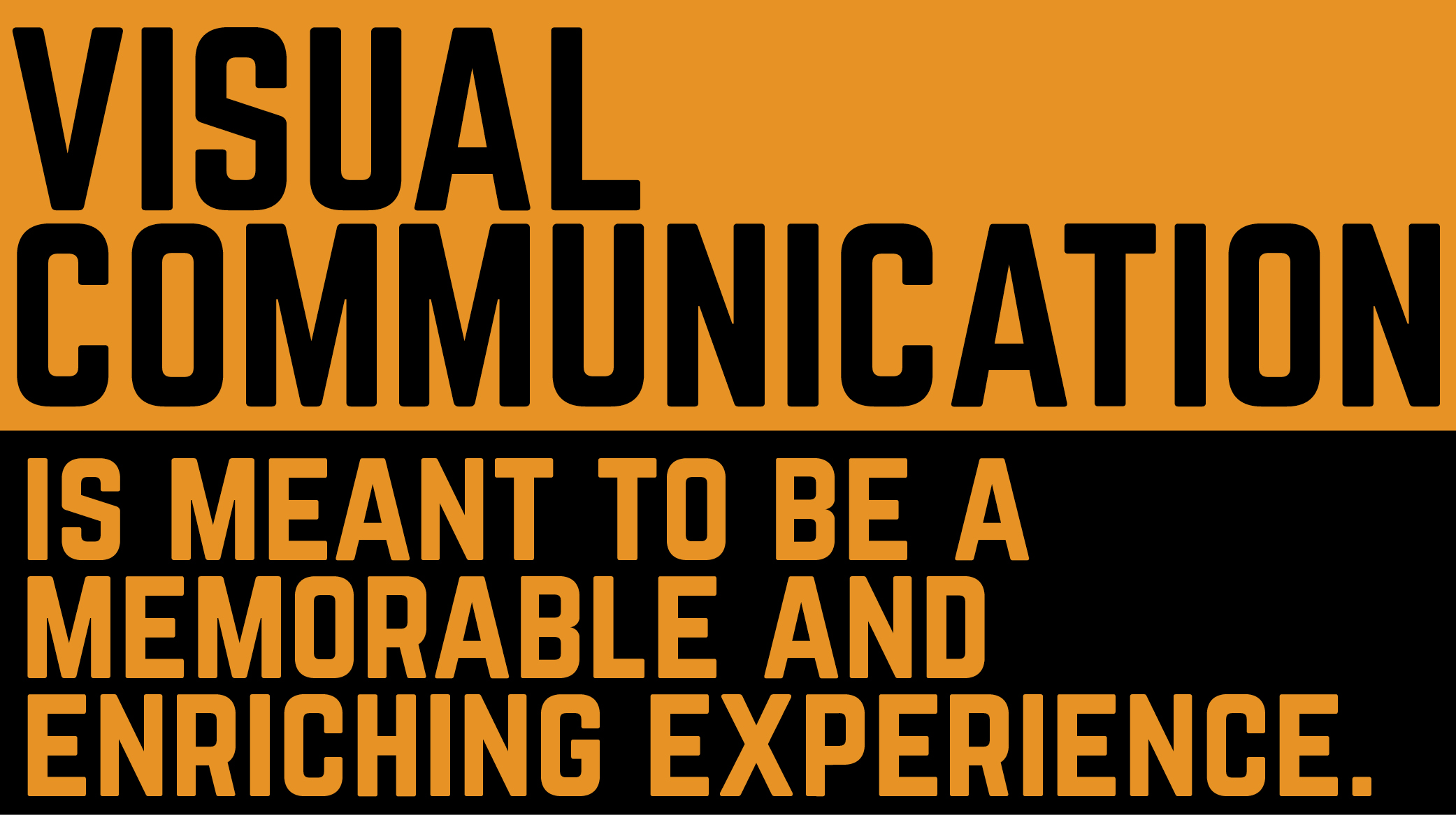
Week 9 Reading Responses
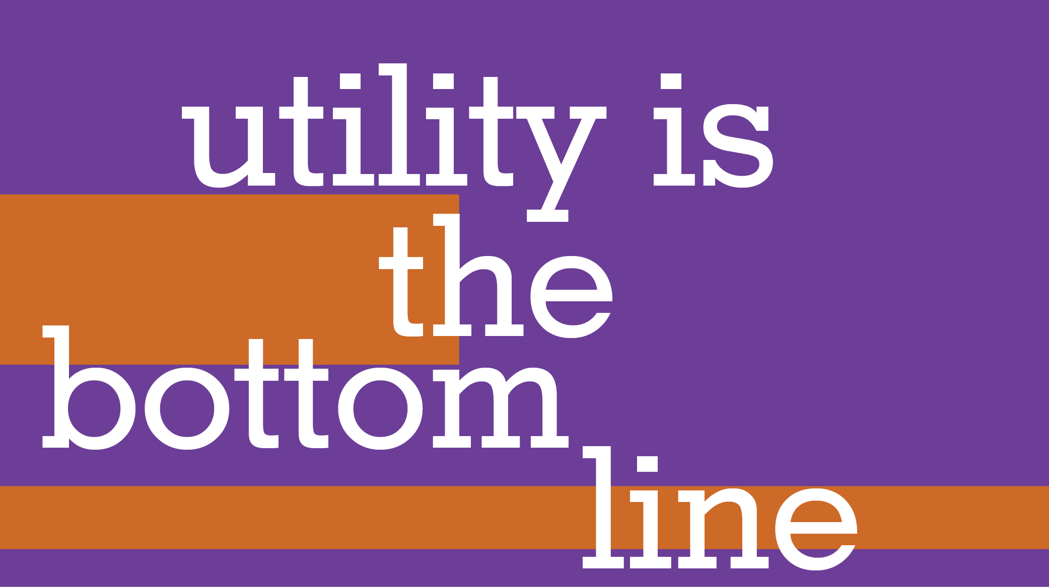
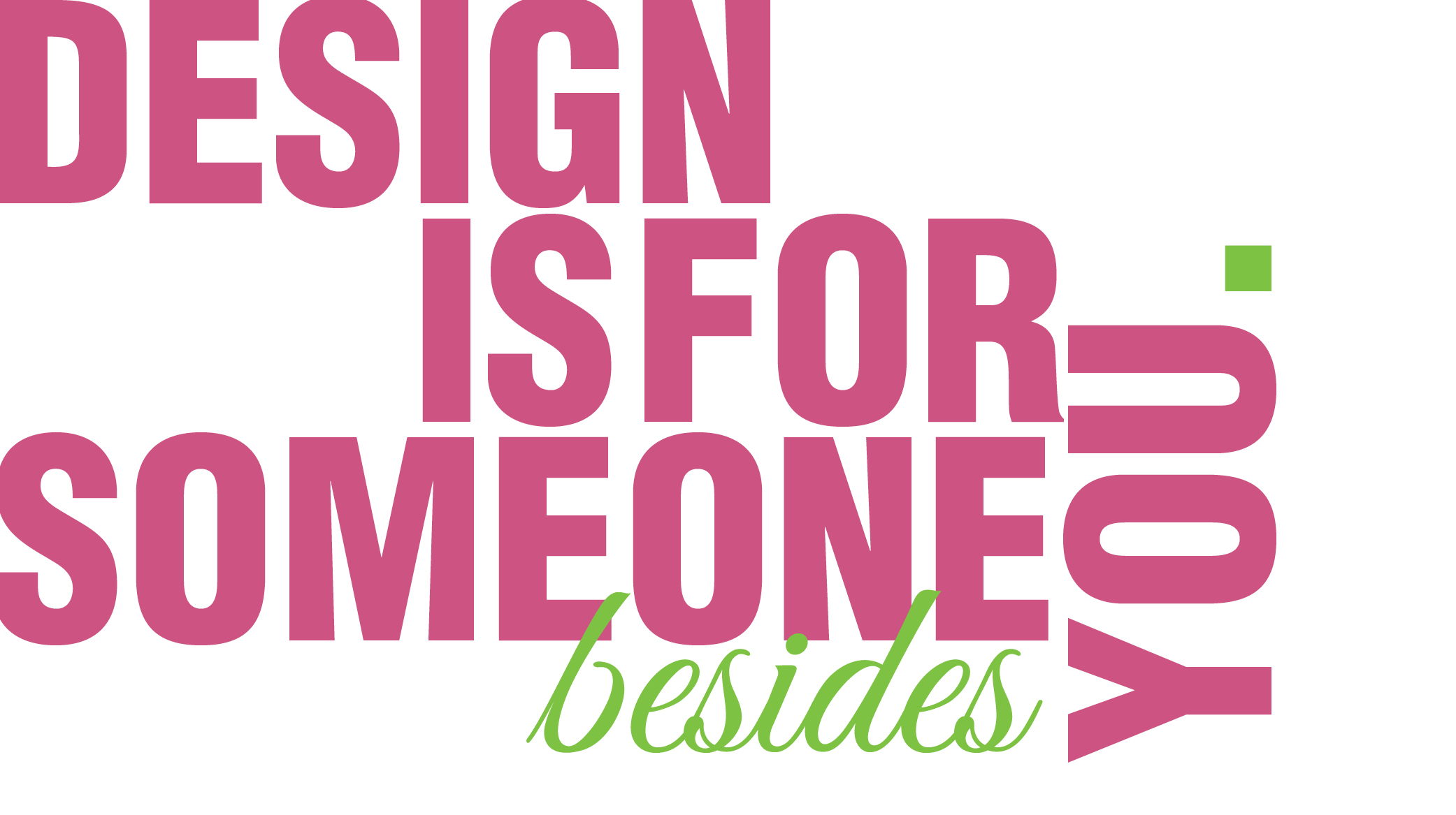
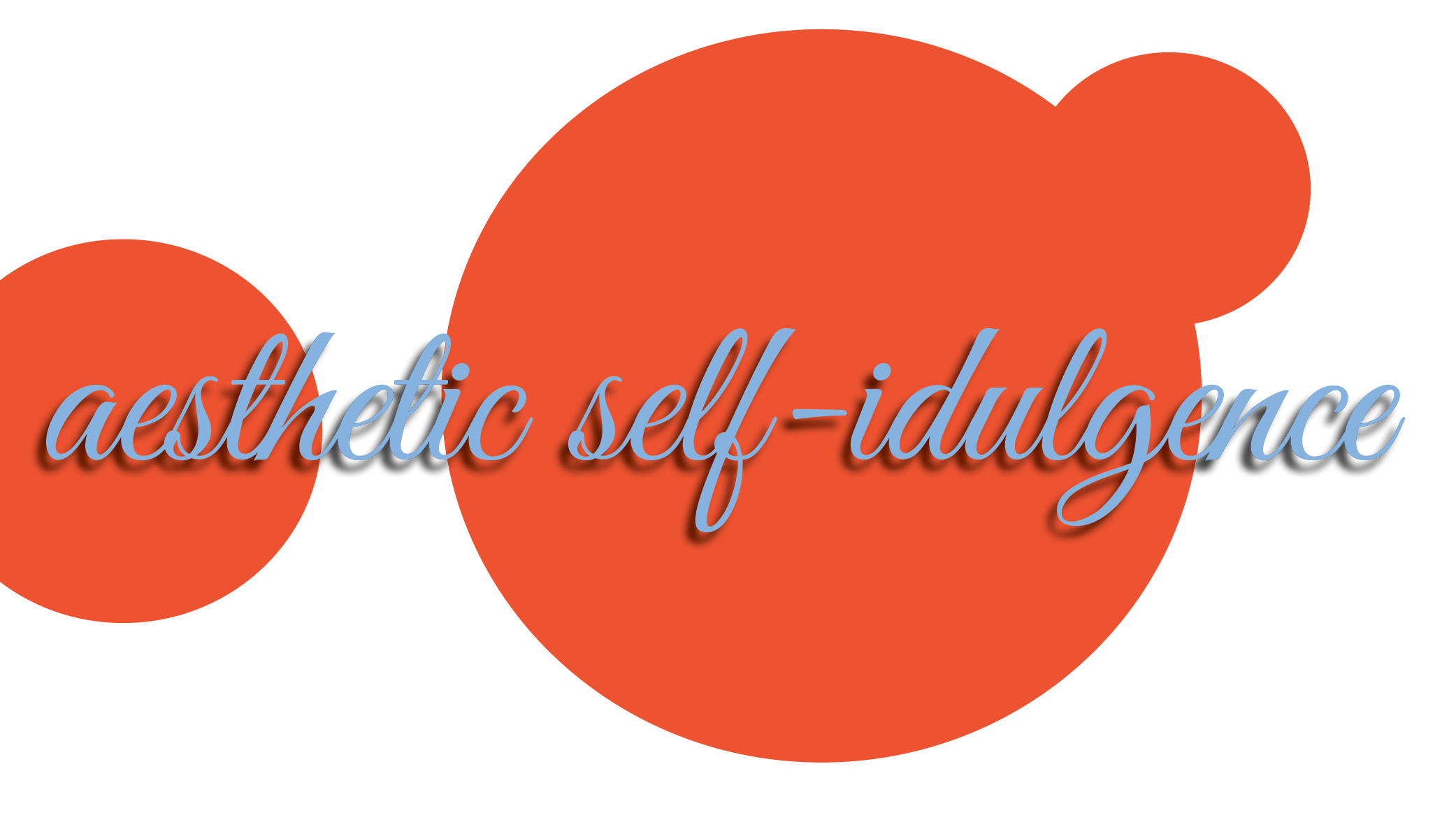
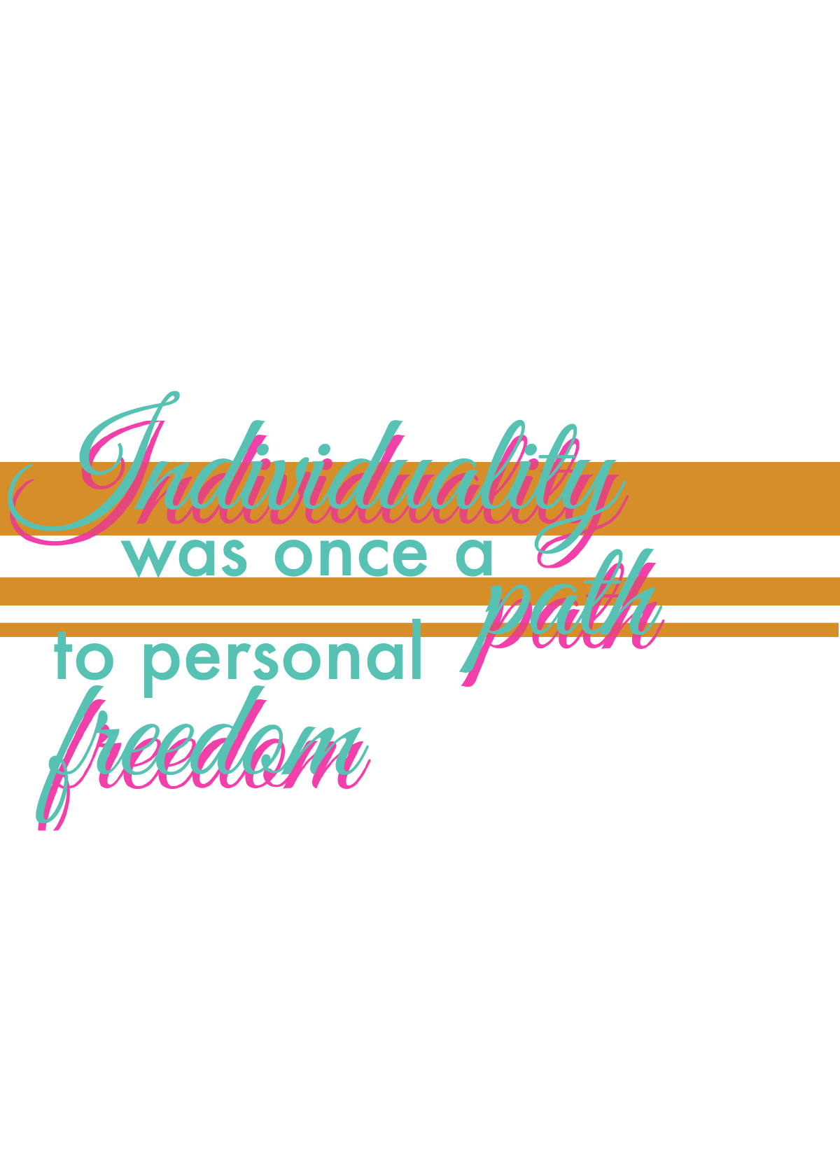
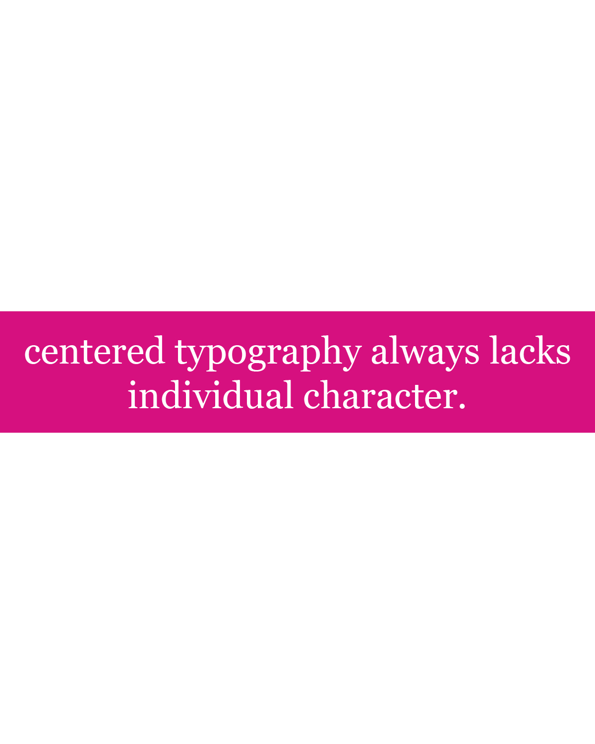
This week, I again went for the experimentation with each quote. The first response hinting to the Supreme branding, however the others are just experimentation with color and layouts. Definitely a lot of circle shape incorporation this week.
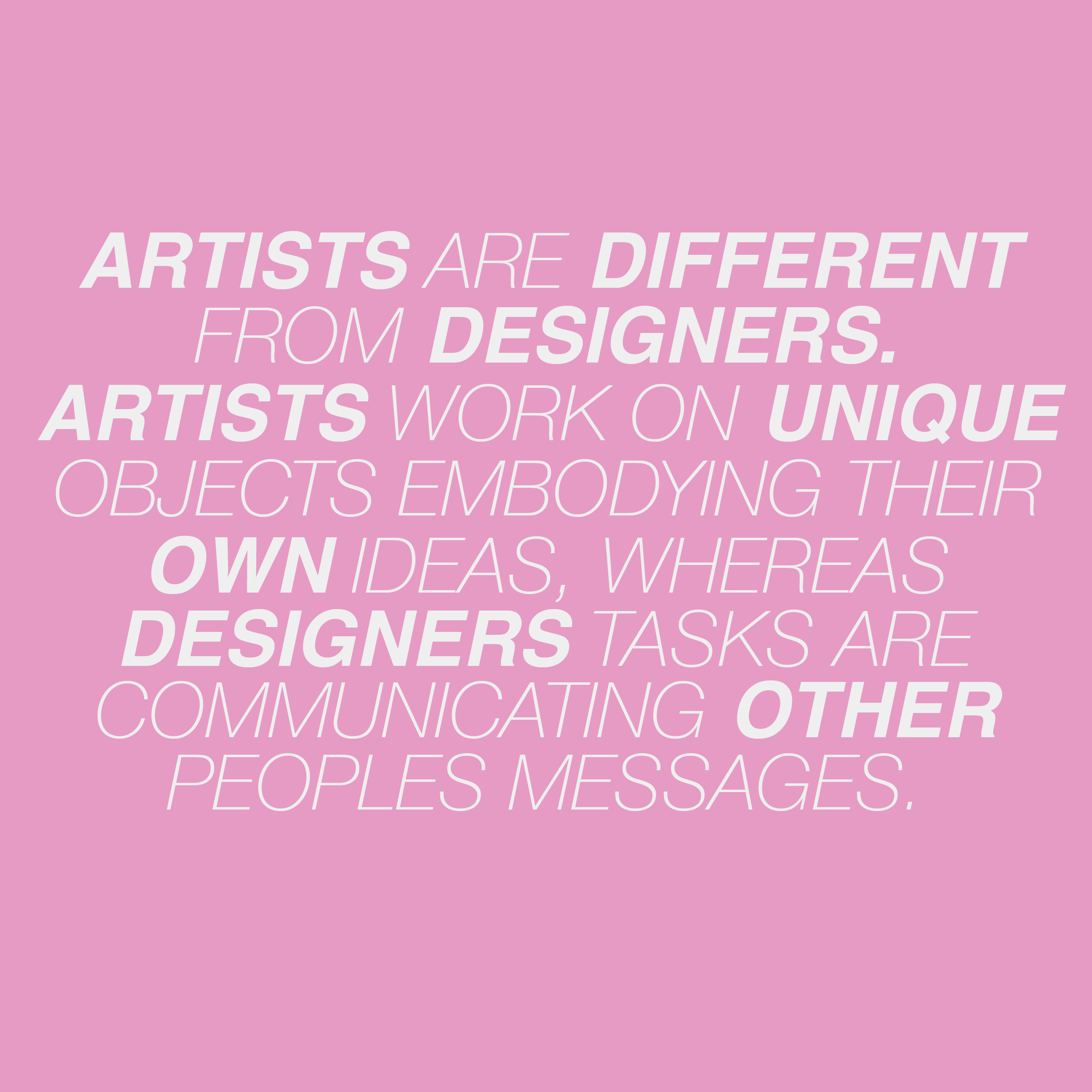
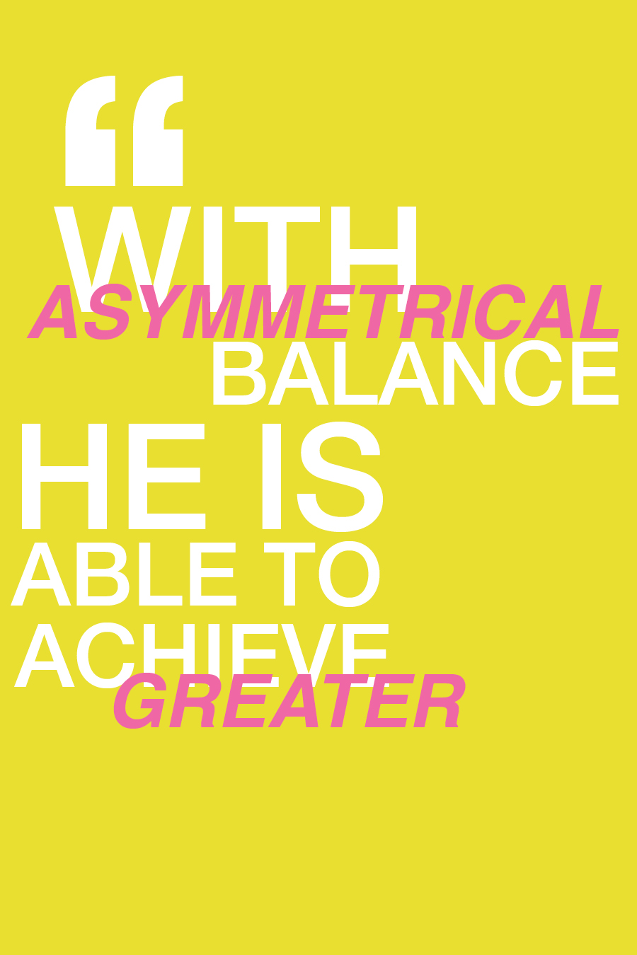
Week 8 Reading Responses
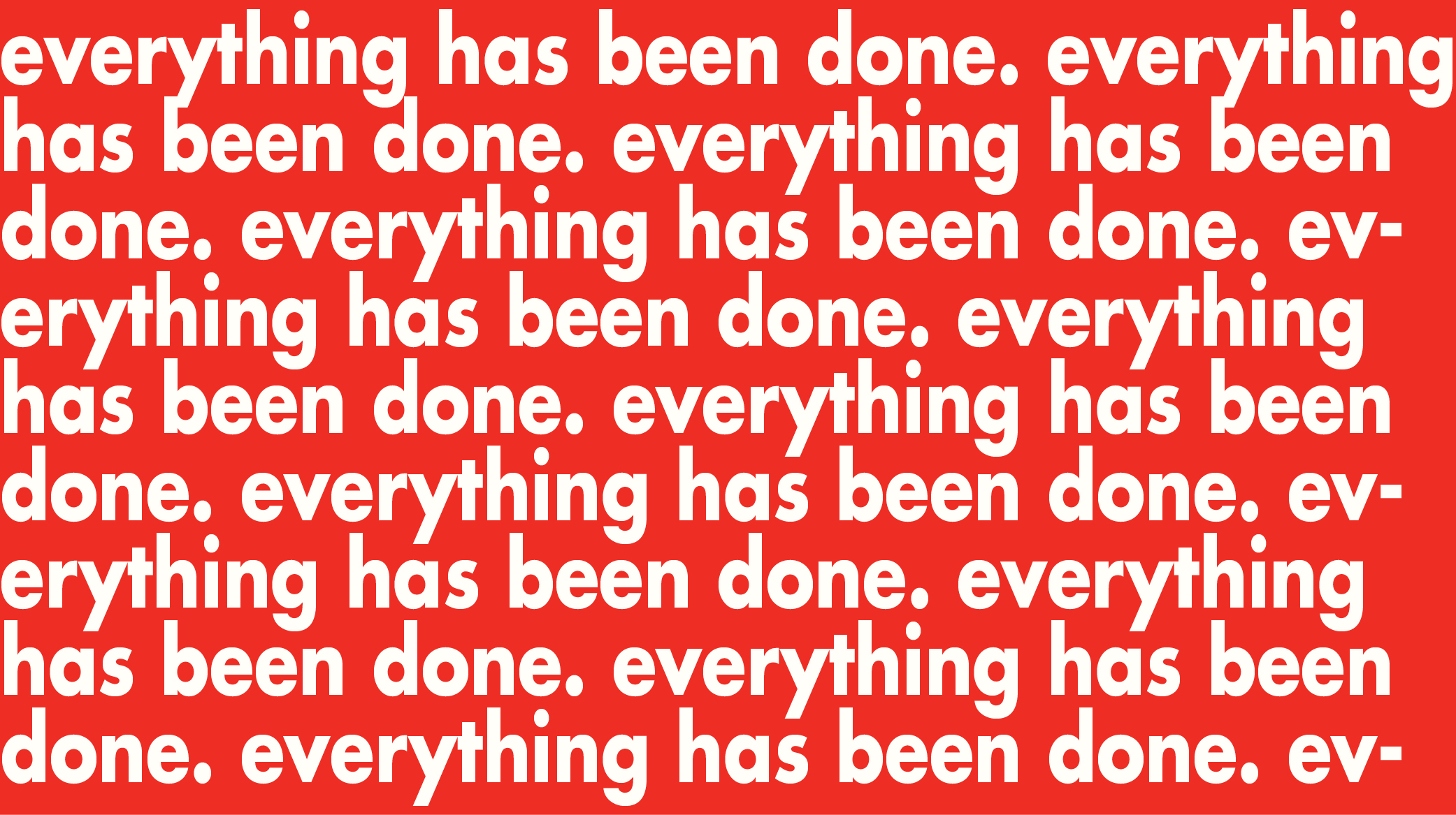
Continuing my design objectives from last week, this week is also very random and just an experimentation with each individual response.


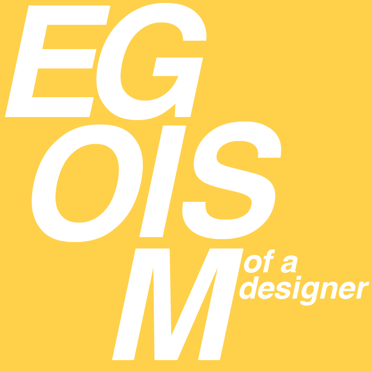
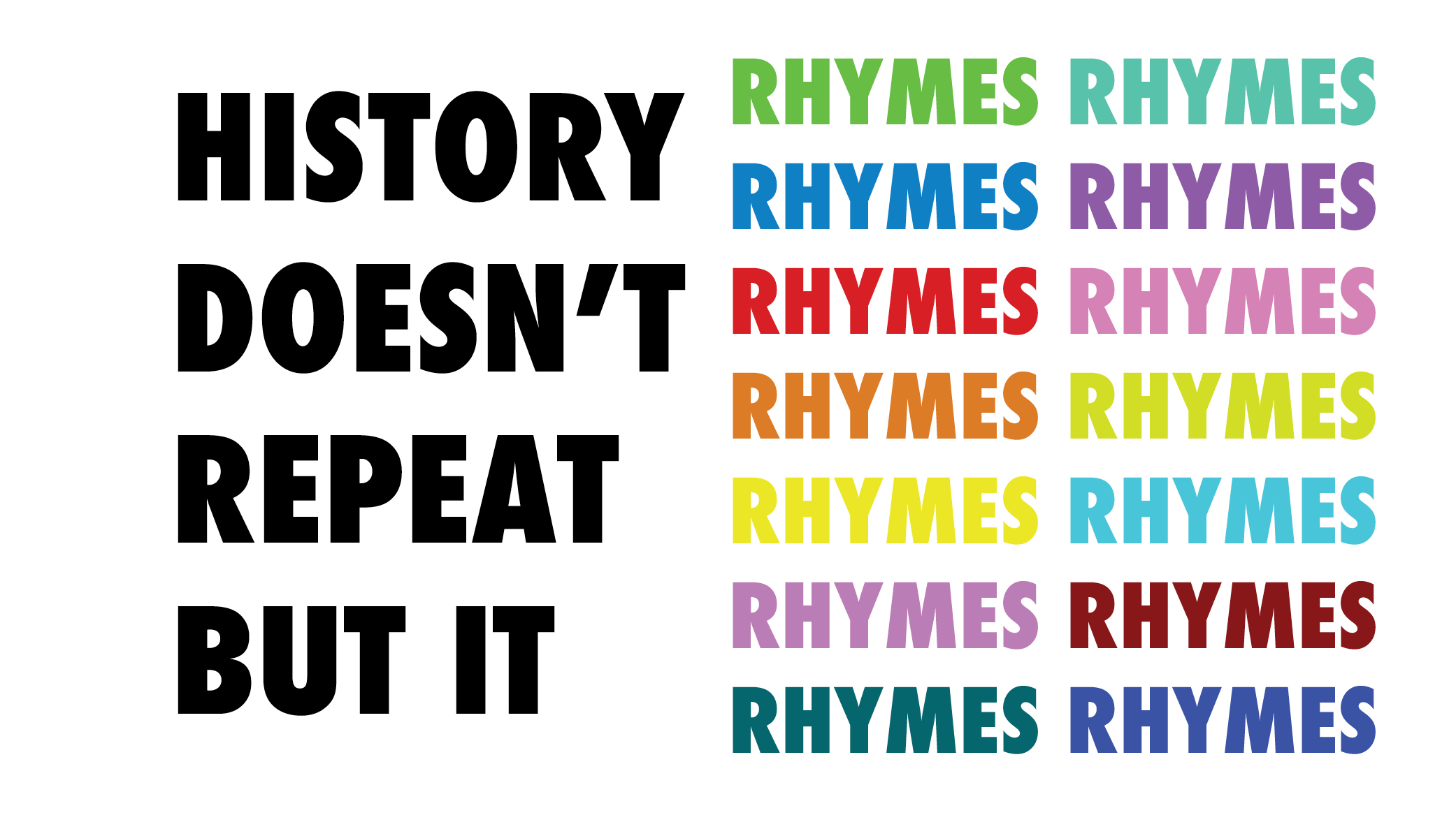
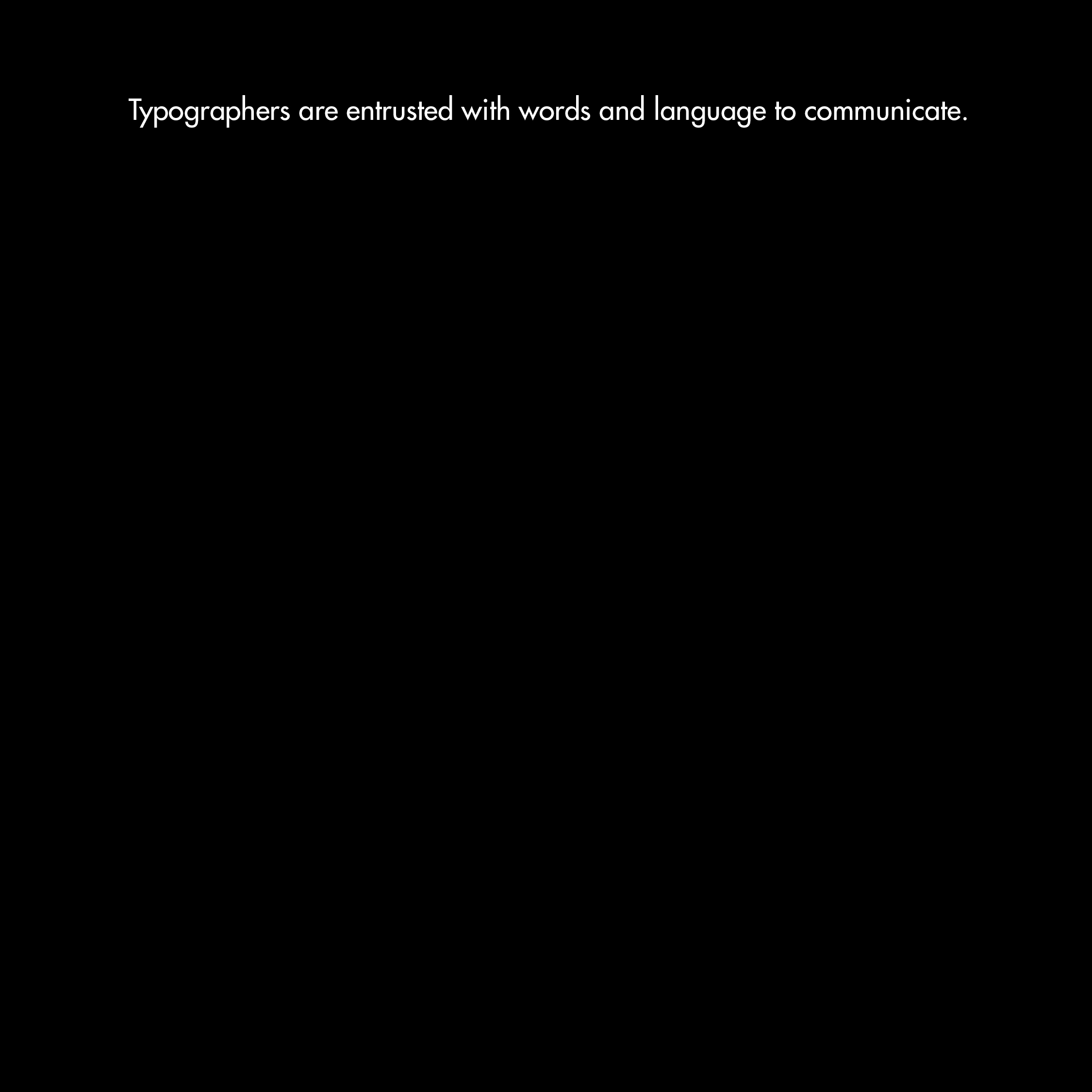
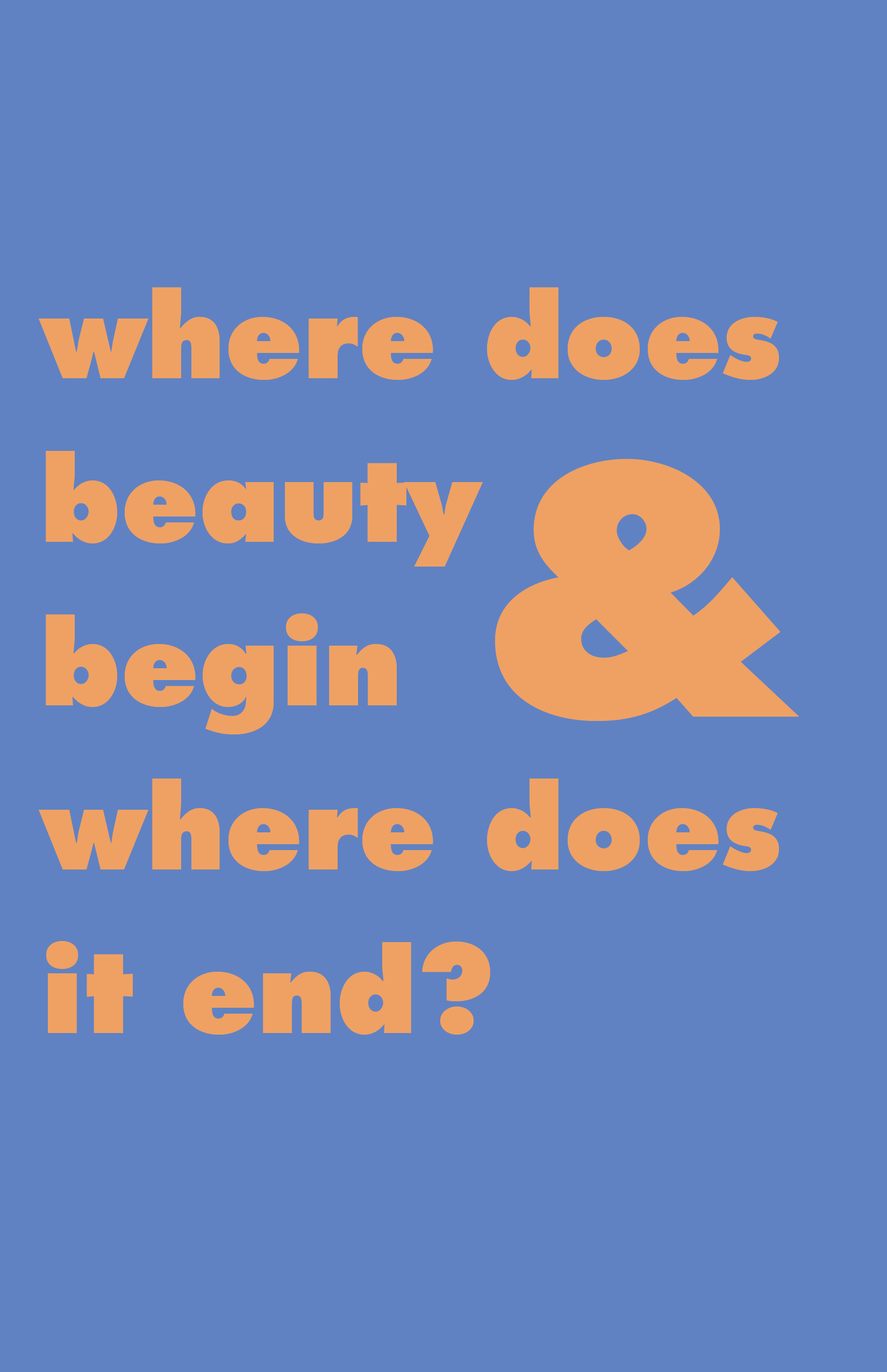
Week 7 Reading Responses
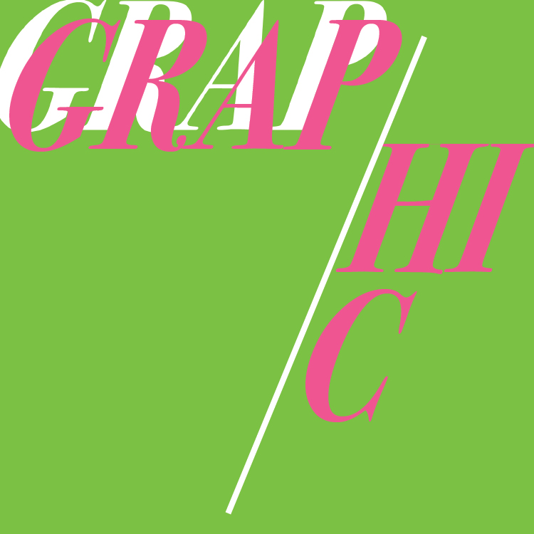
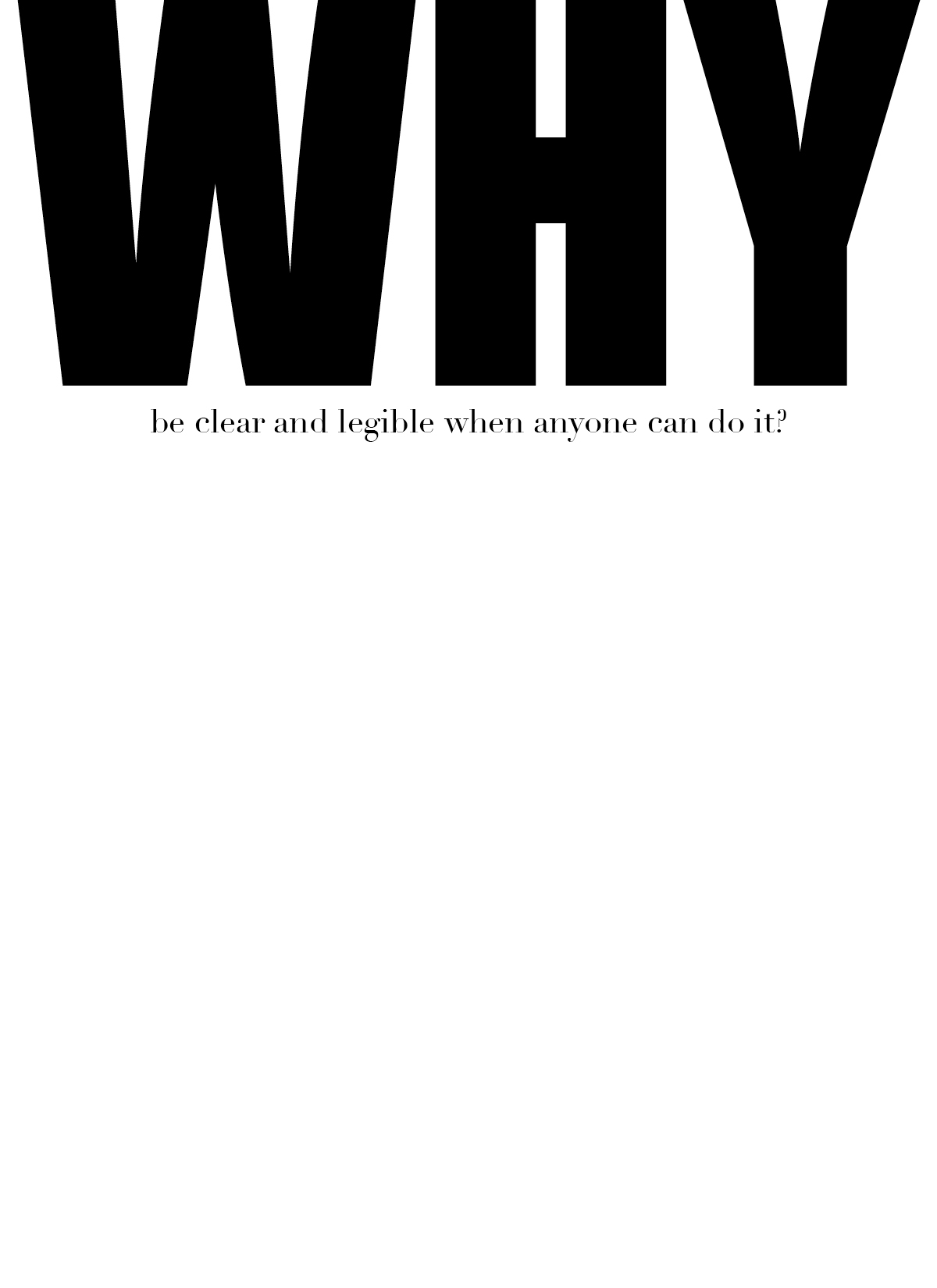
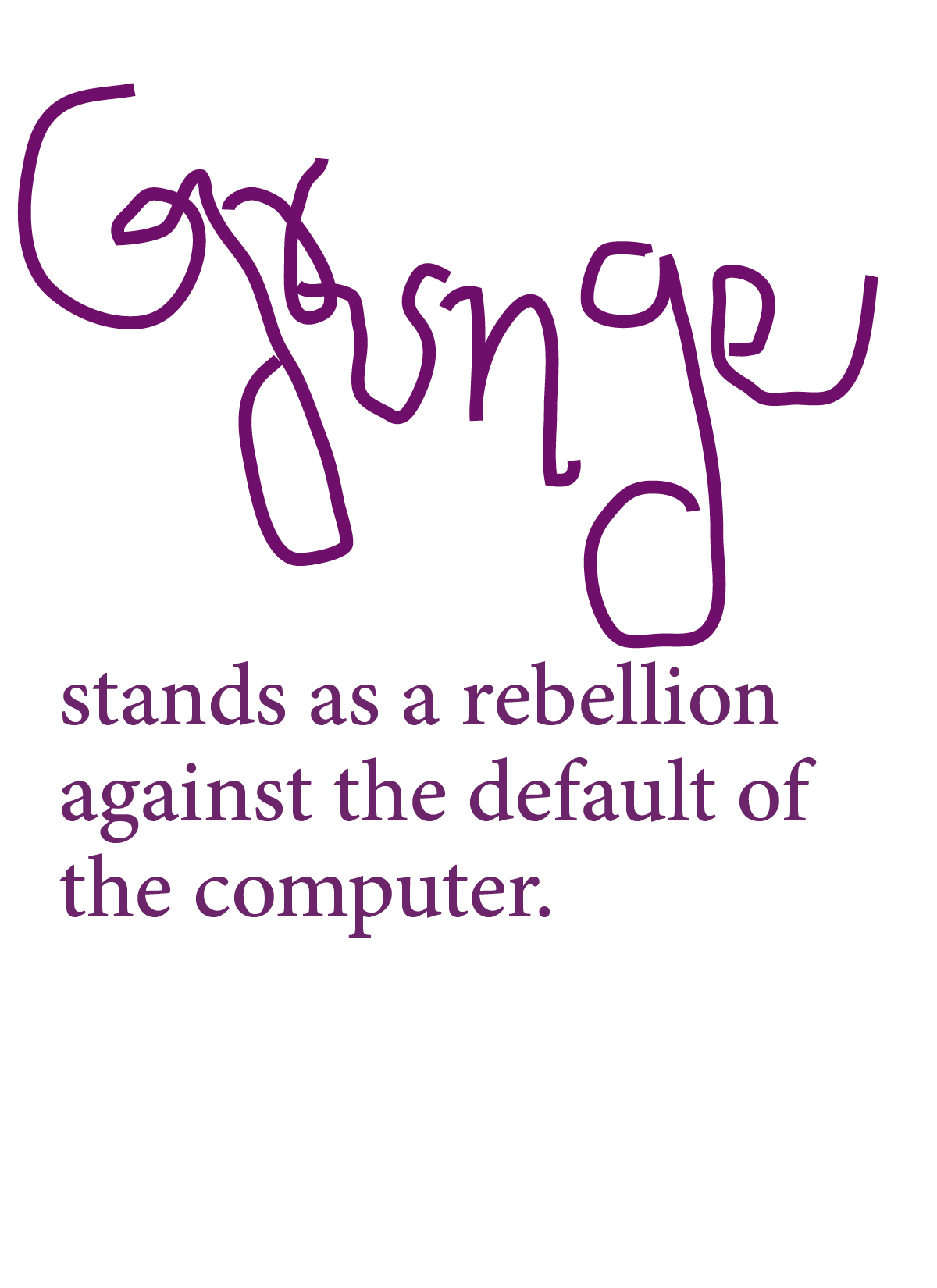
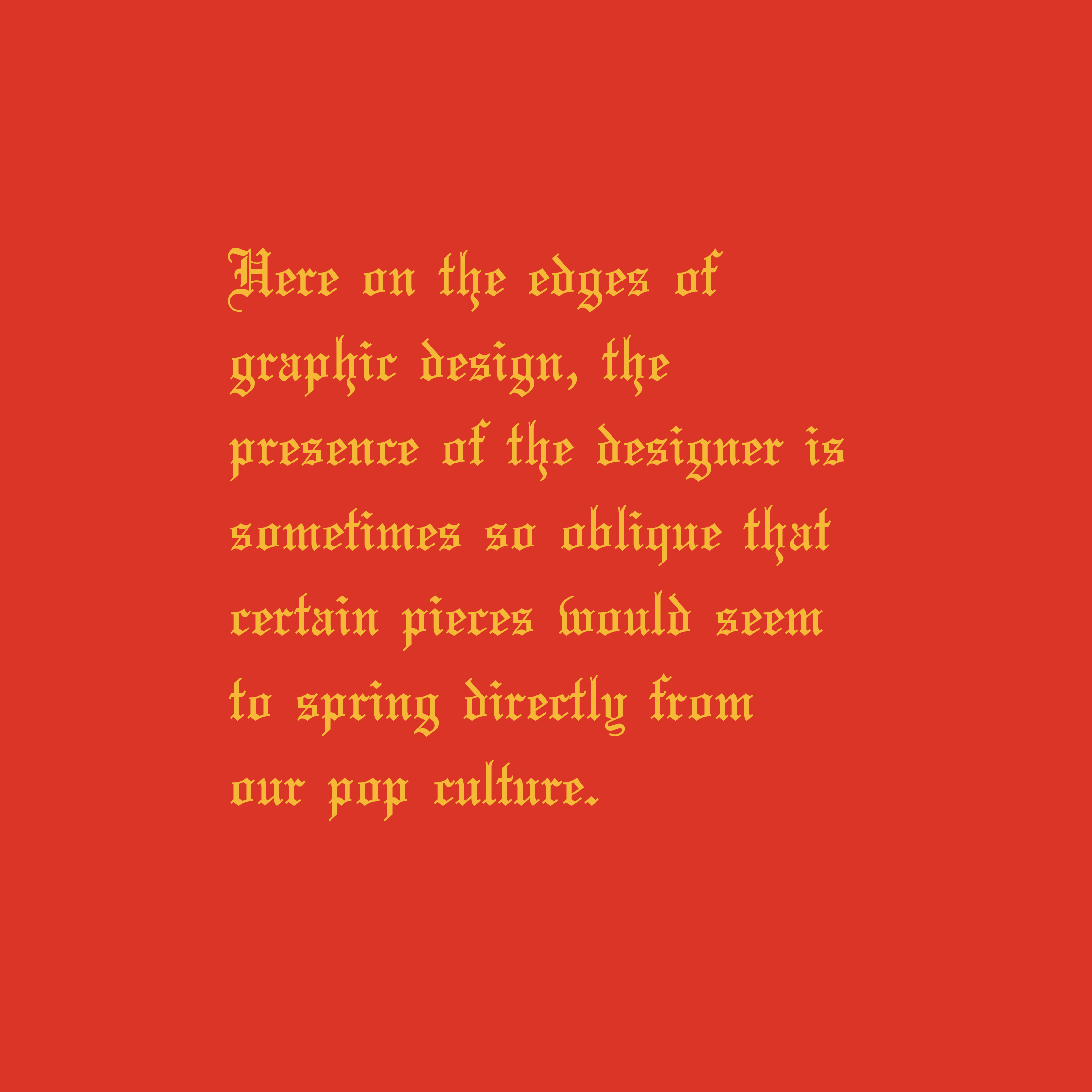
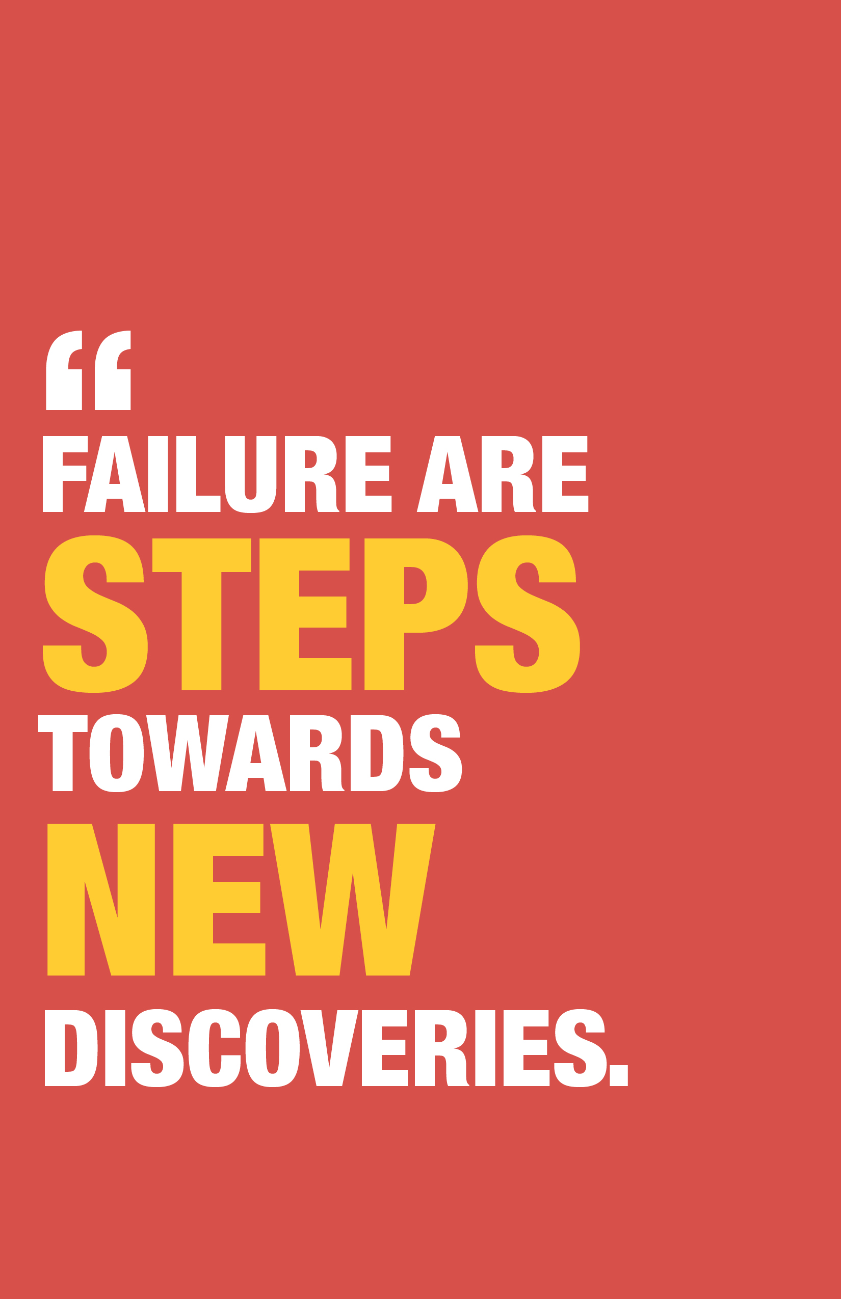
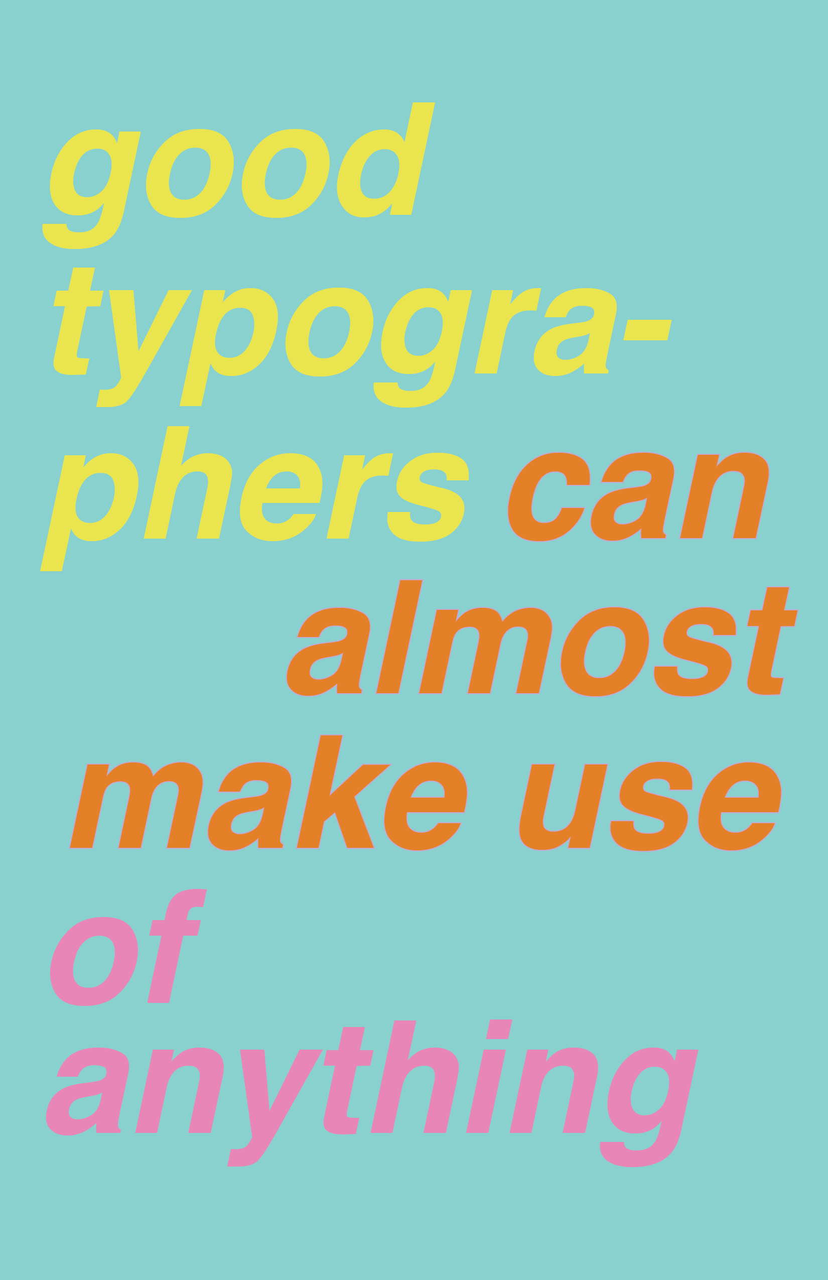
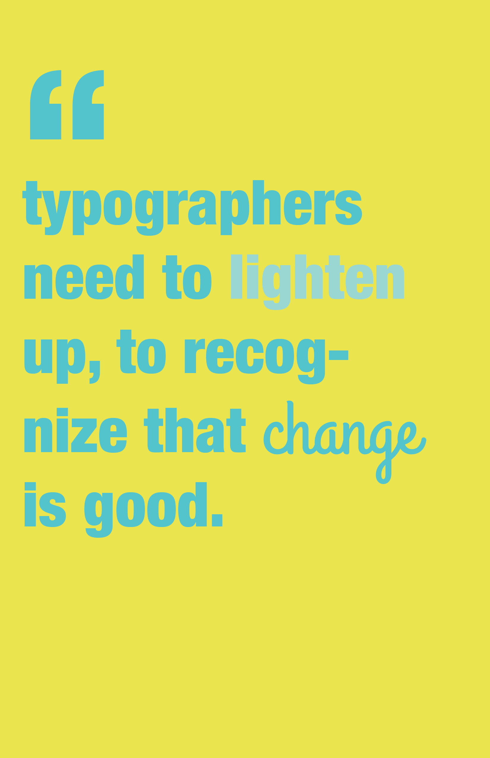
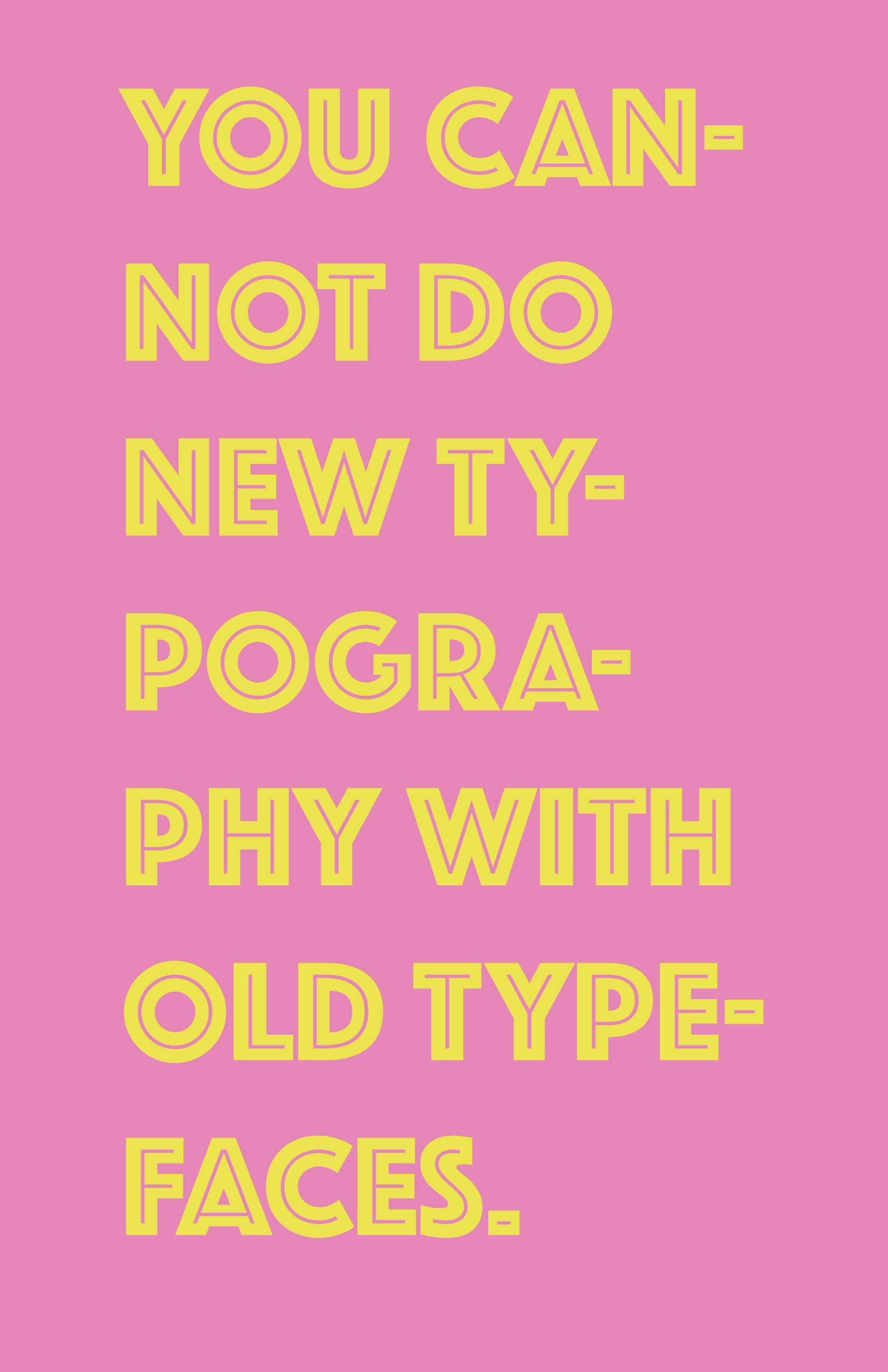
I’m not really sure how to summarize my design objectives for this week, I was honestly just experimenting with the quotes and each response is its own individual graphic. I tried to make references through my graphics relating to the quote, like the second response is a hint to the YEEZY typography and the third response looks like the Terminal feature on the computer.
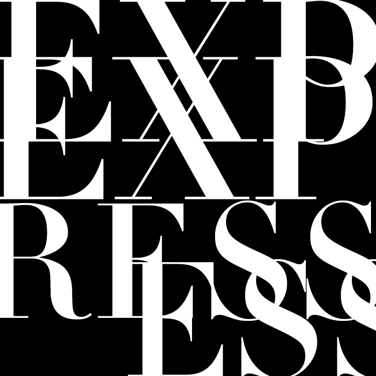
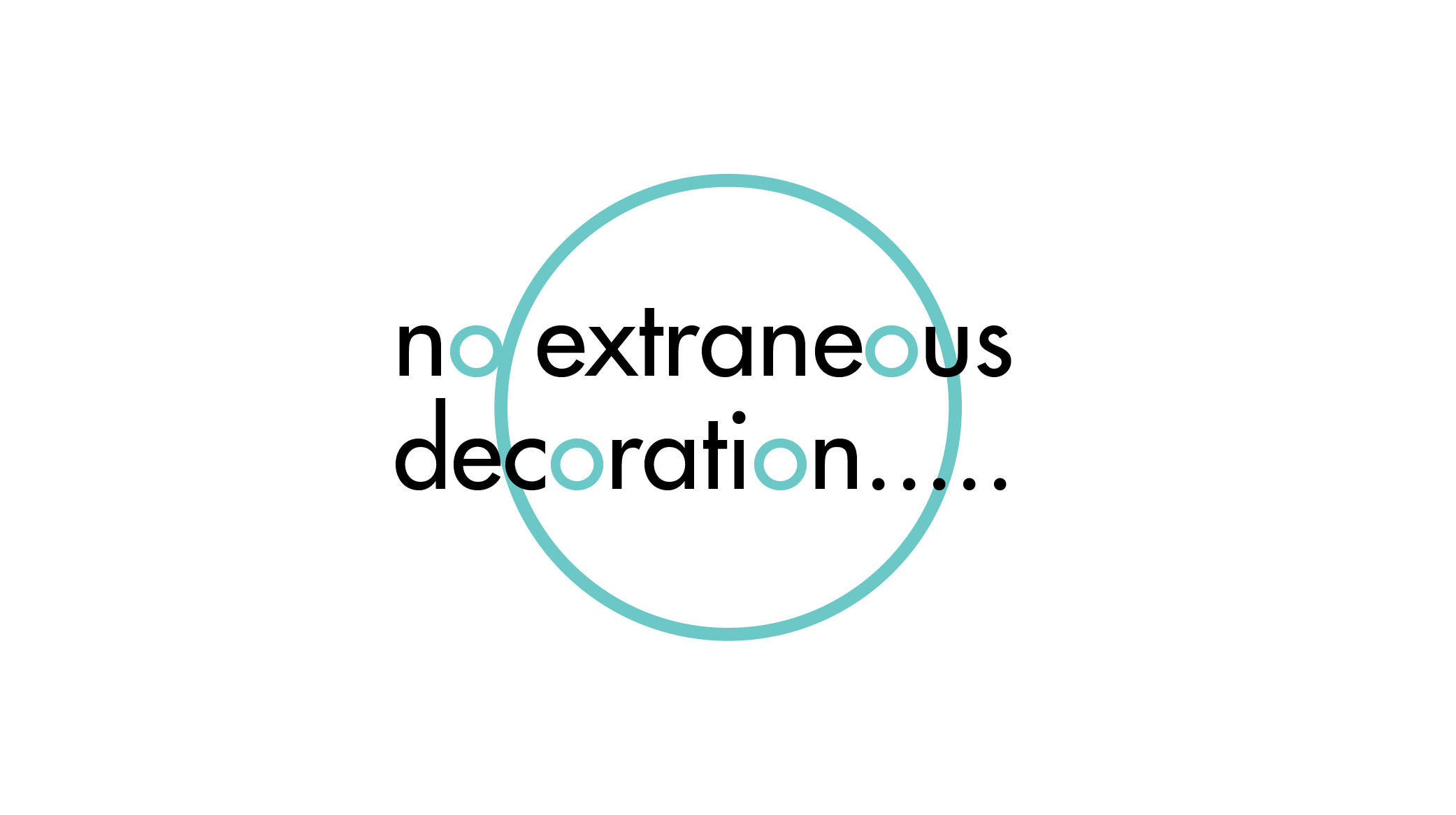
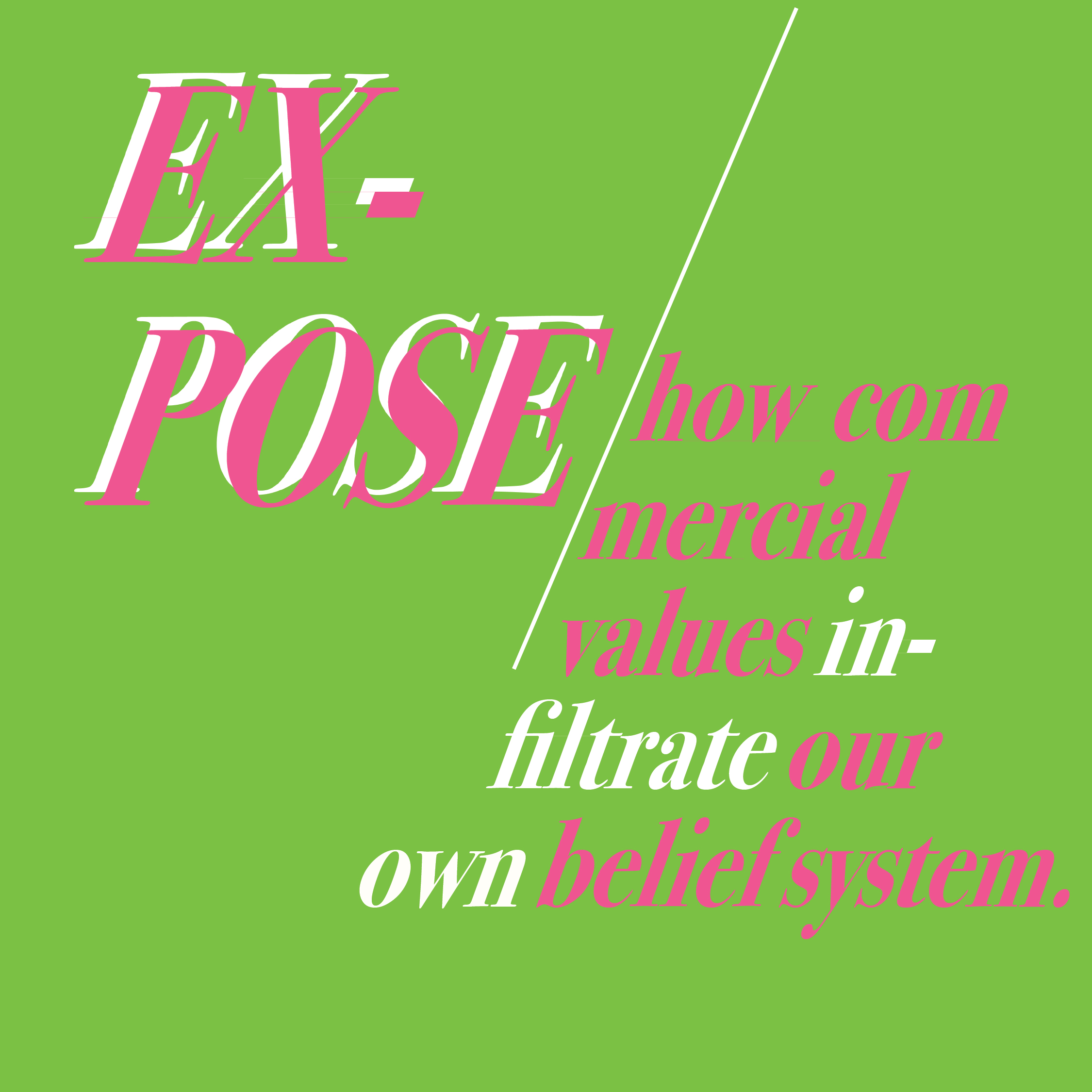
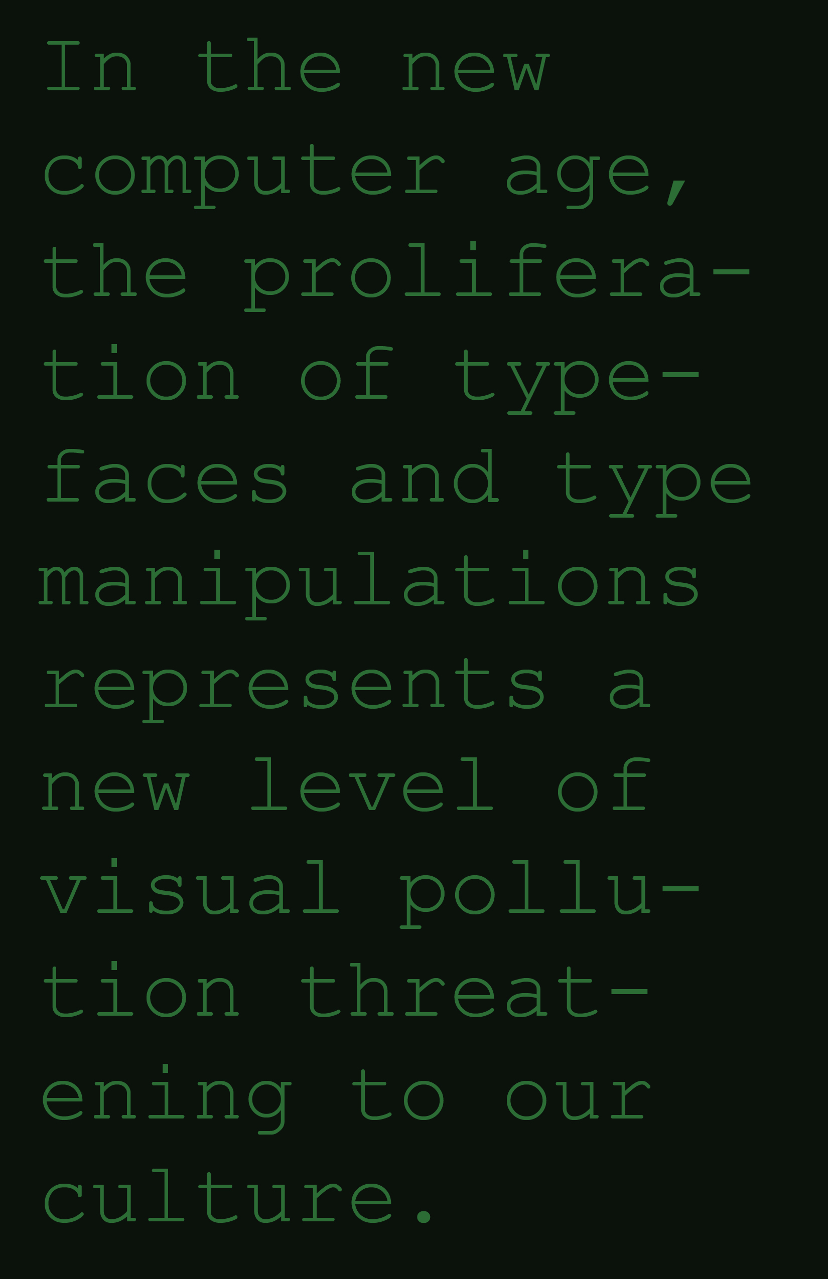
Week 6 Reading Responses
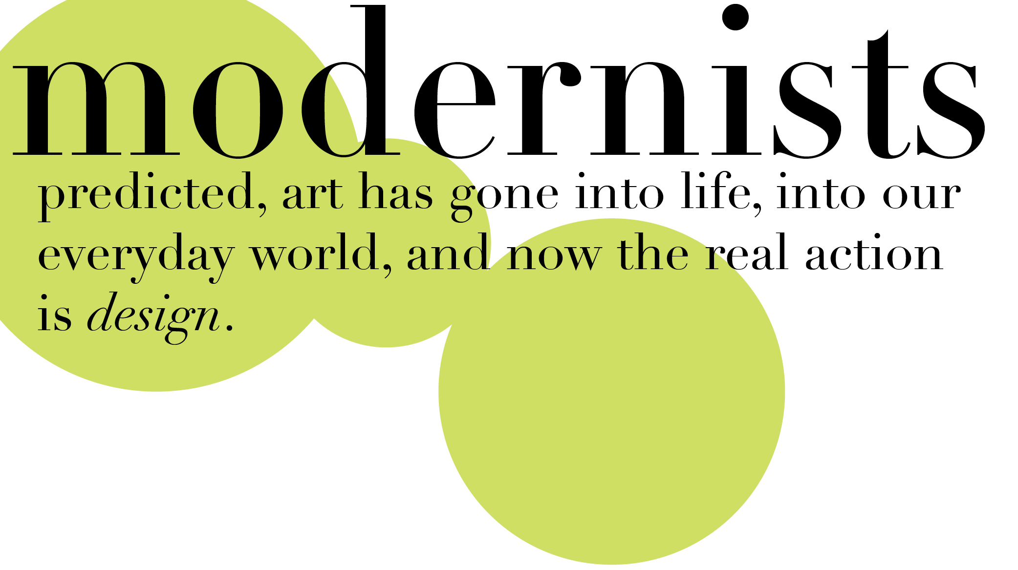
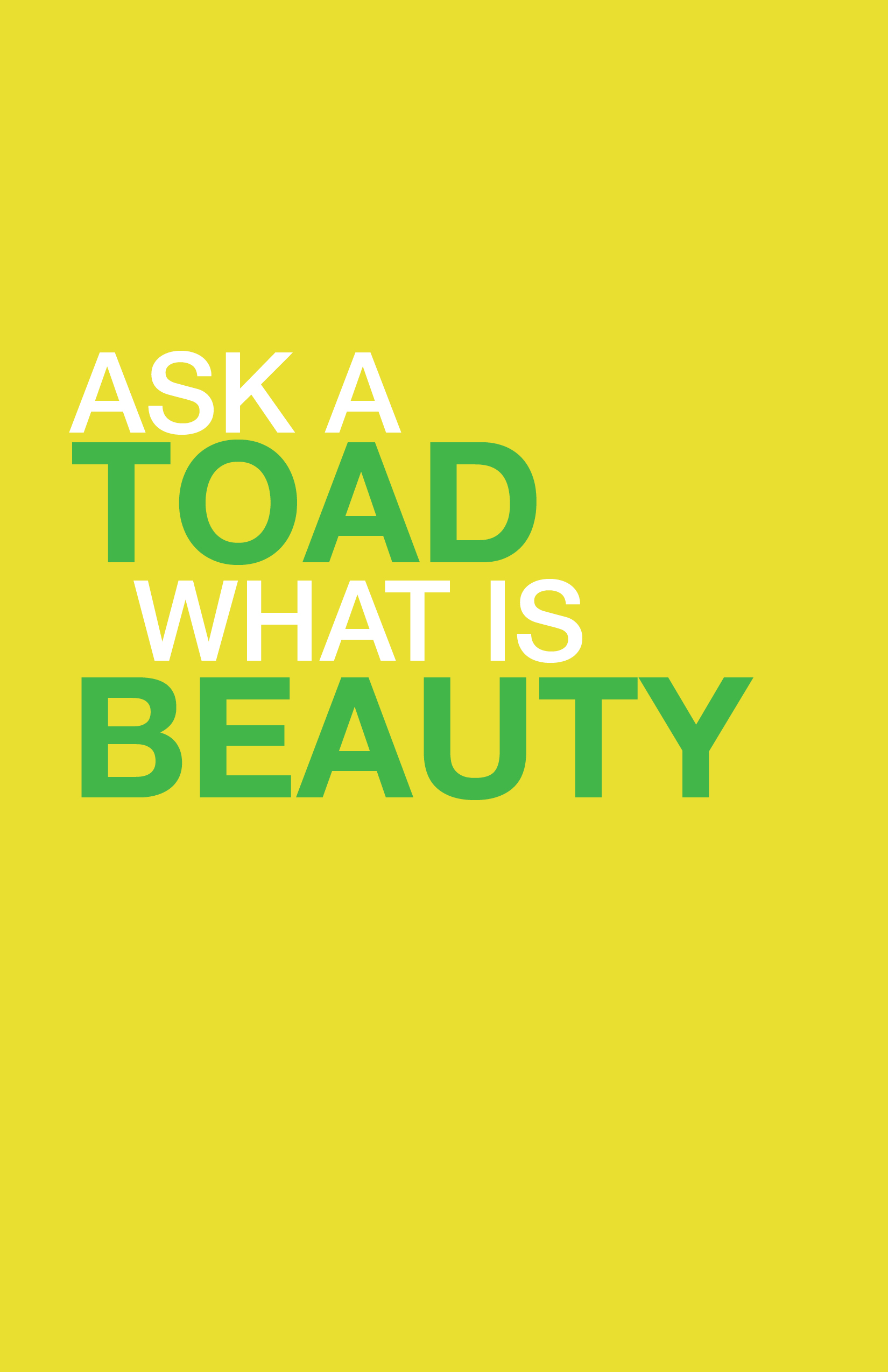
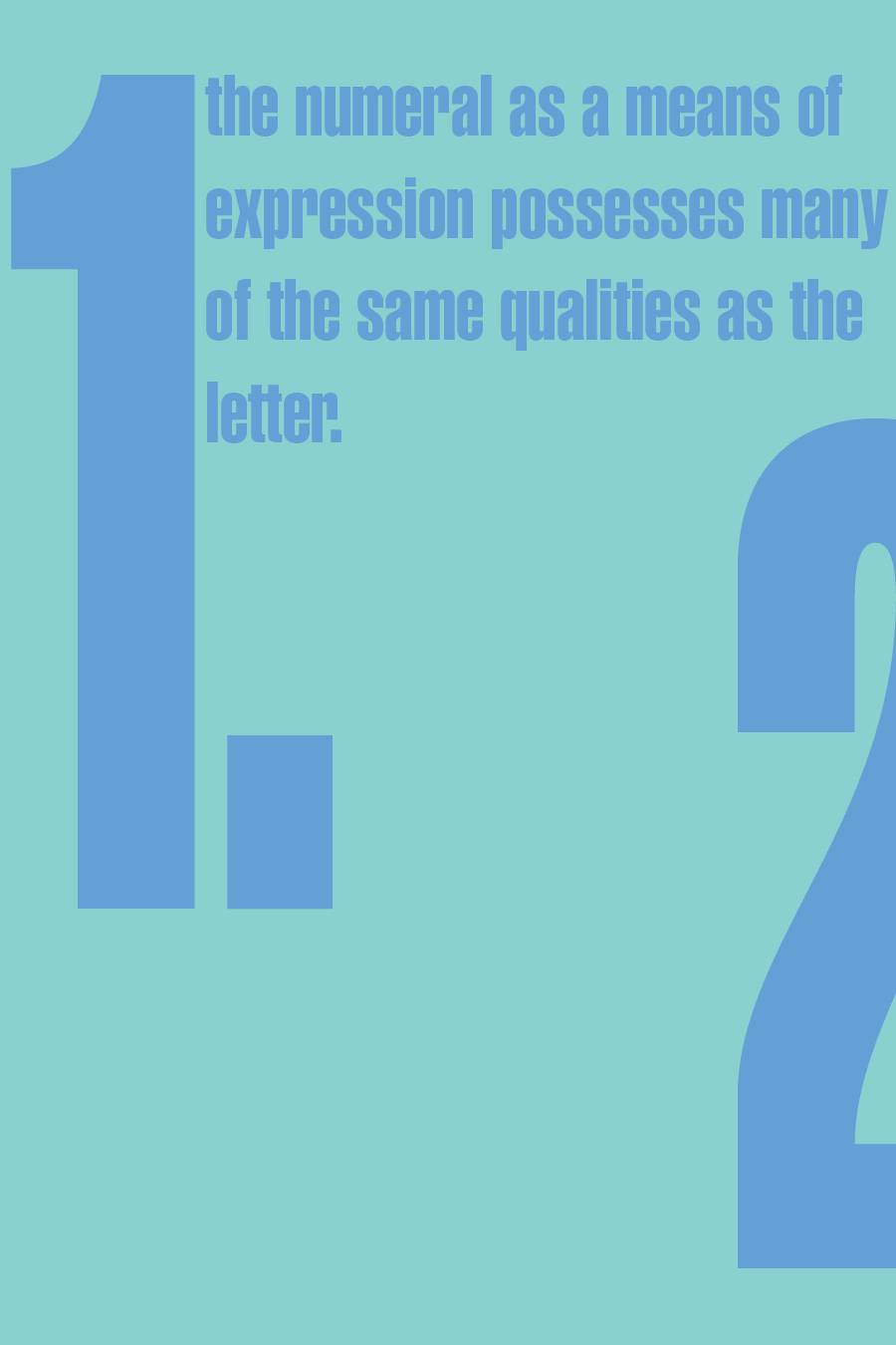
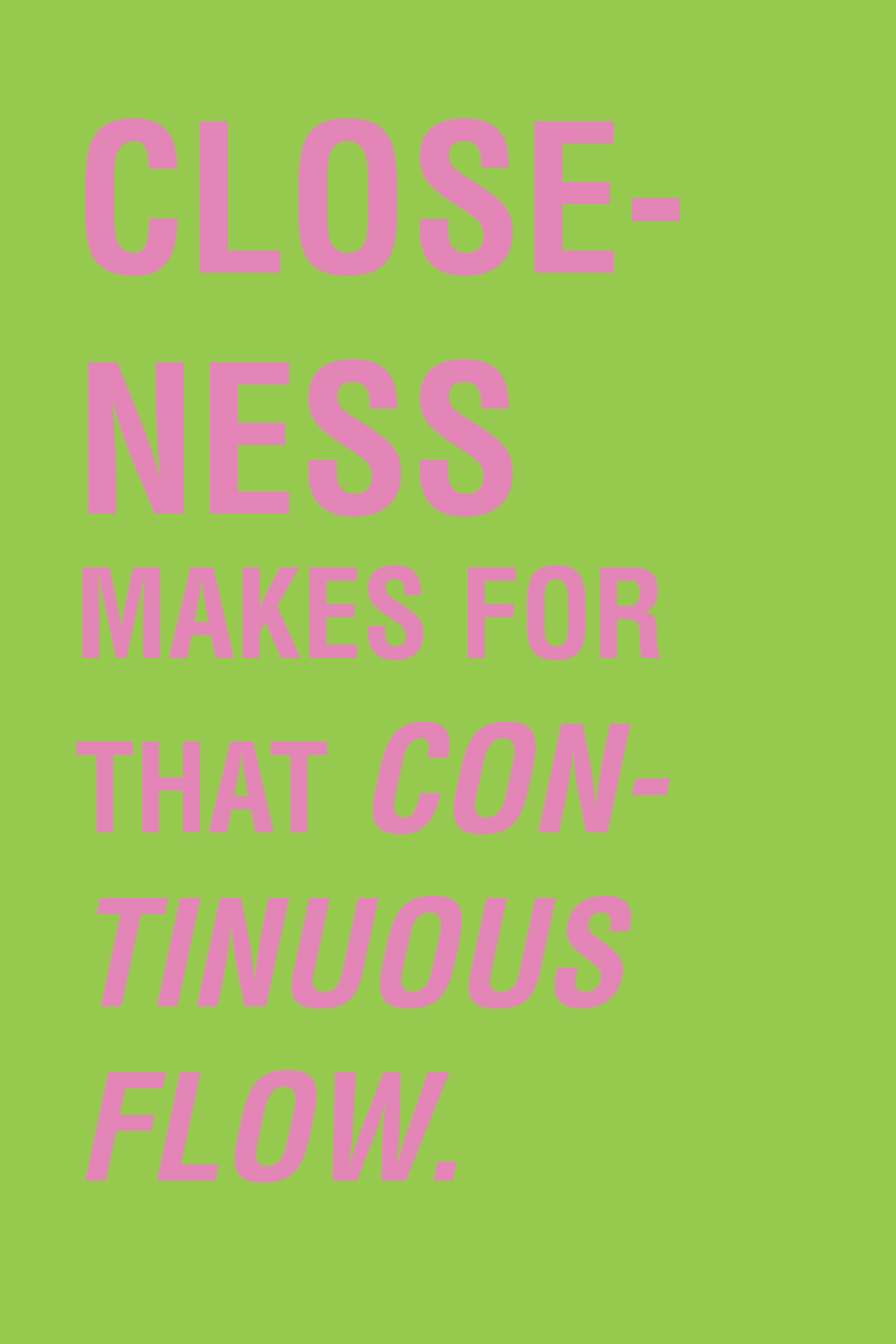
I was definitely feeling green this week, there isnt much color experimentation here. The quotes are portrayed quite literally as to what they mean. There is some graphic experimentation in the “Expose” quote.

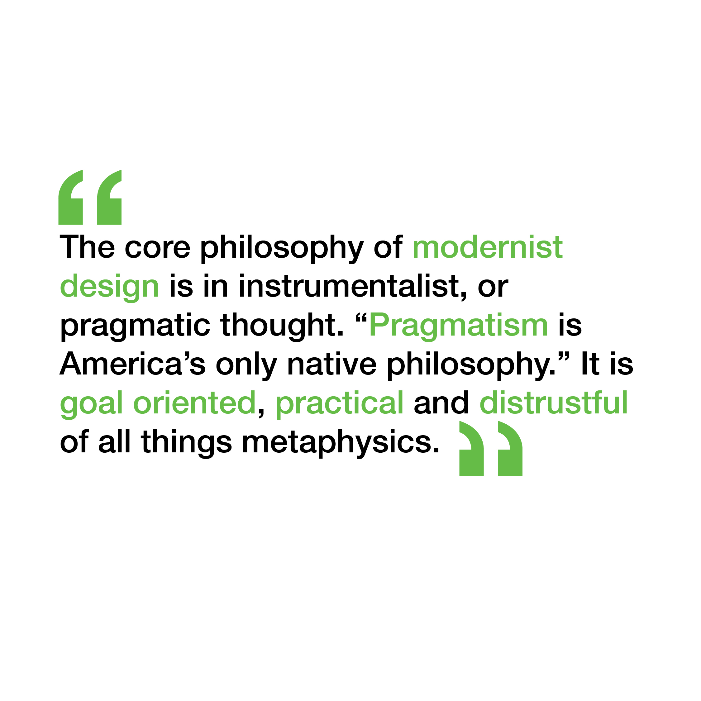
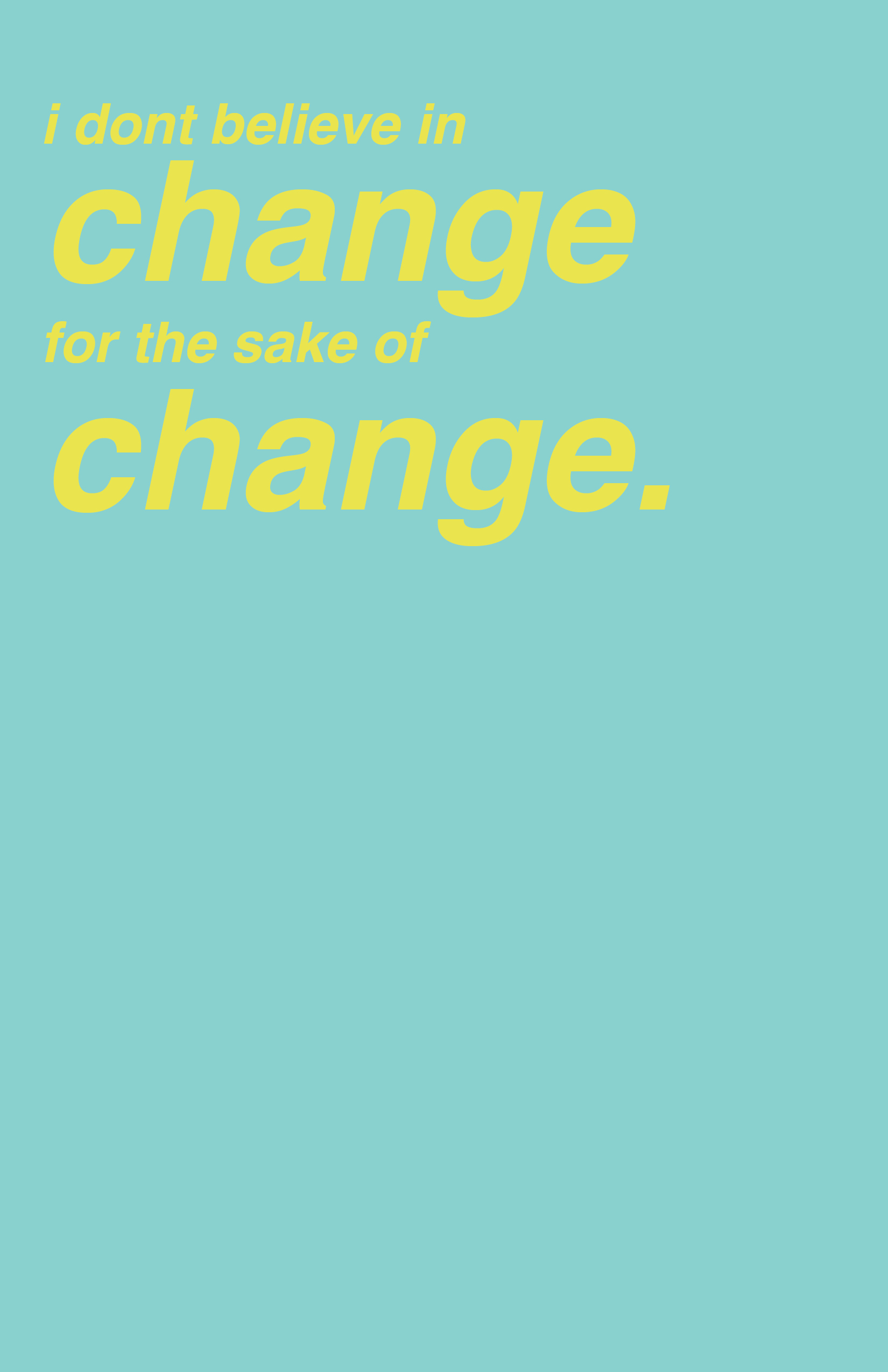
Week 5 Reading Responses
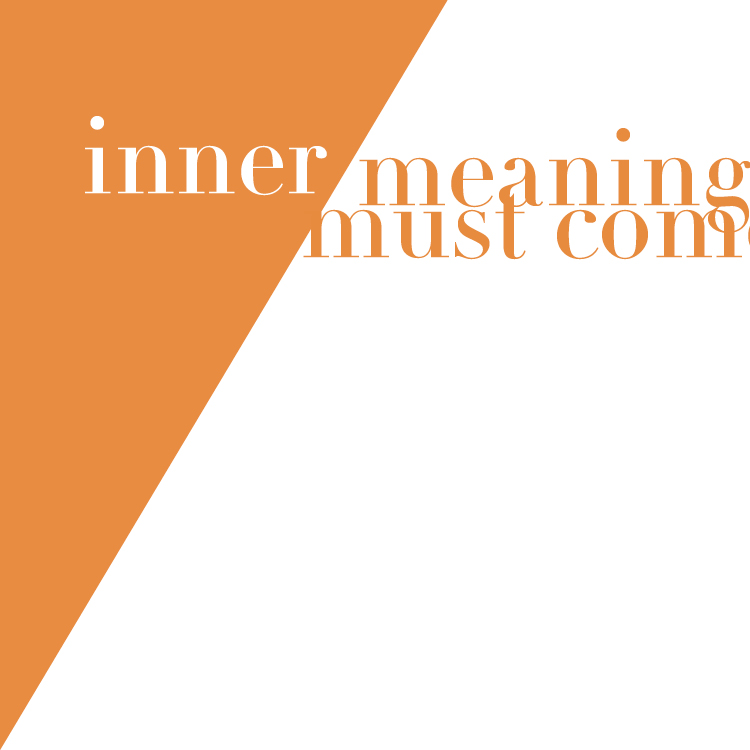
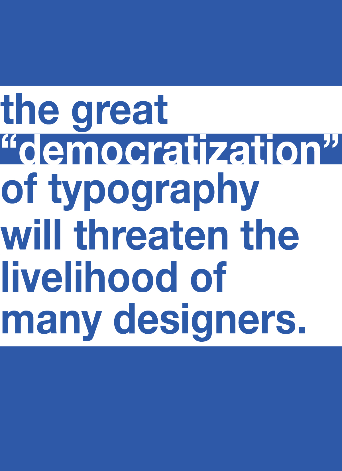
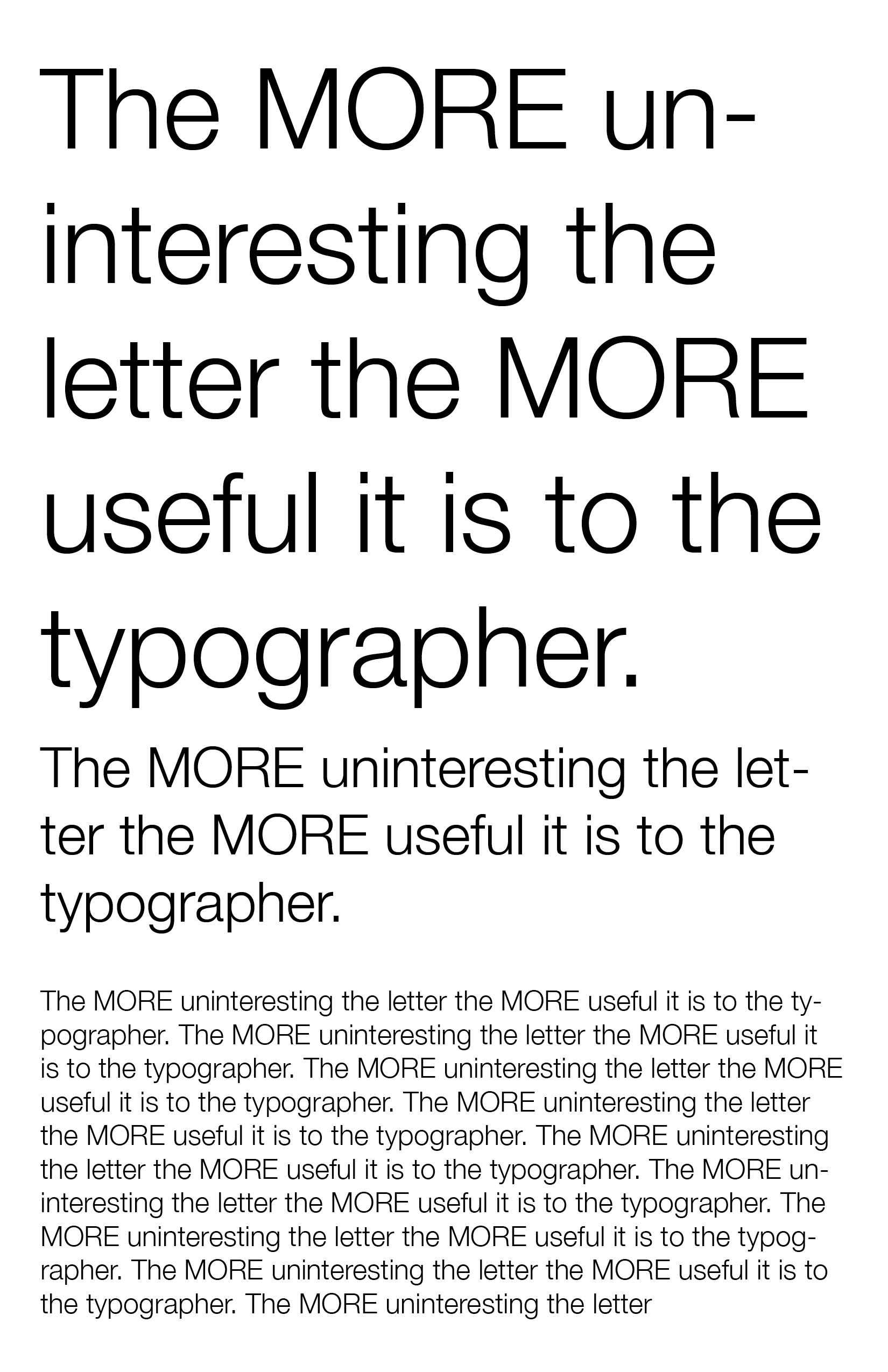
This week I continued with ways to show what the quote means without any aid of imagery, just through the use of type and color and layout. I continued with the usage of some colors from my previous reading responses.
Week 4 Reading Responses
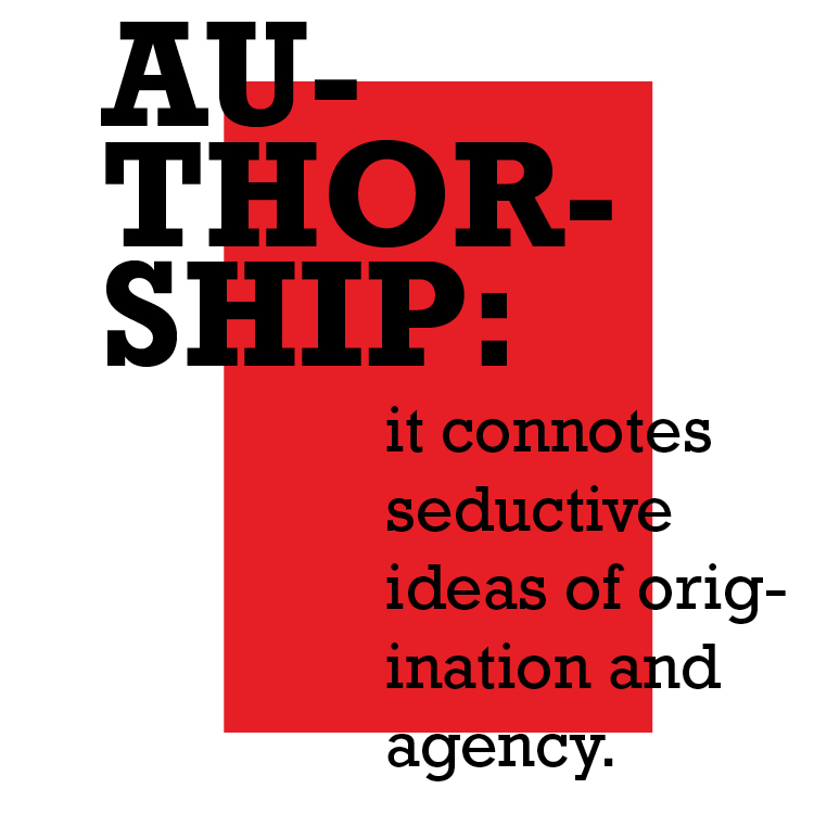
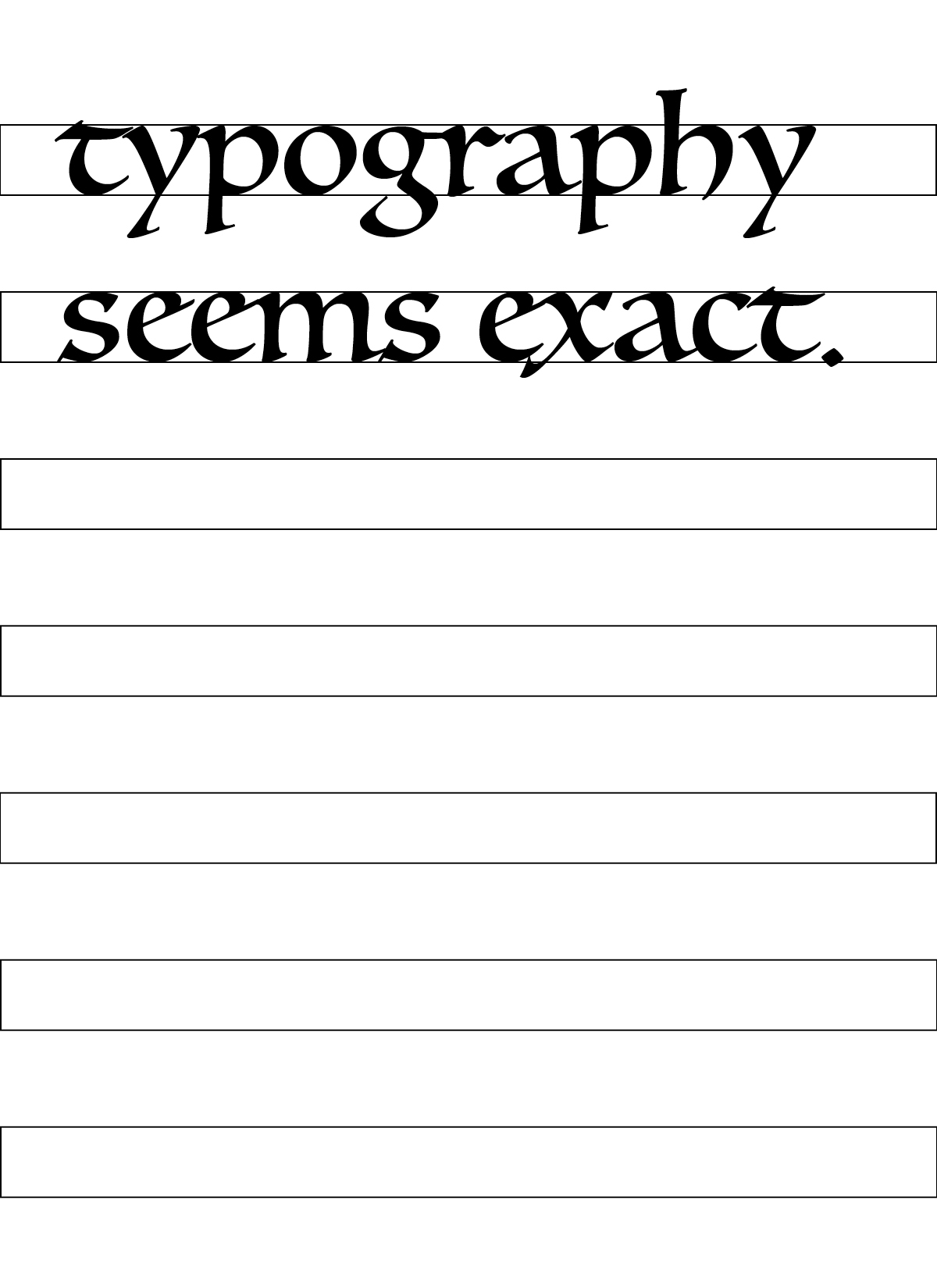
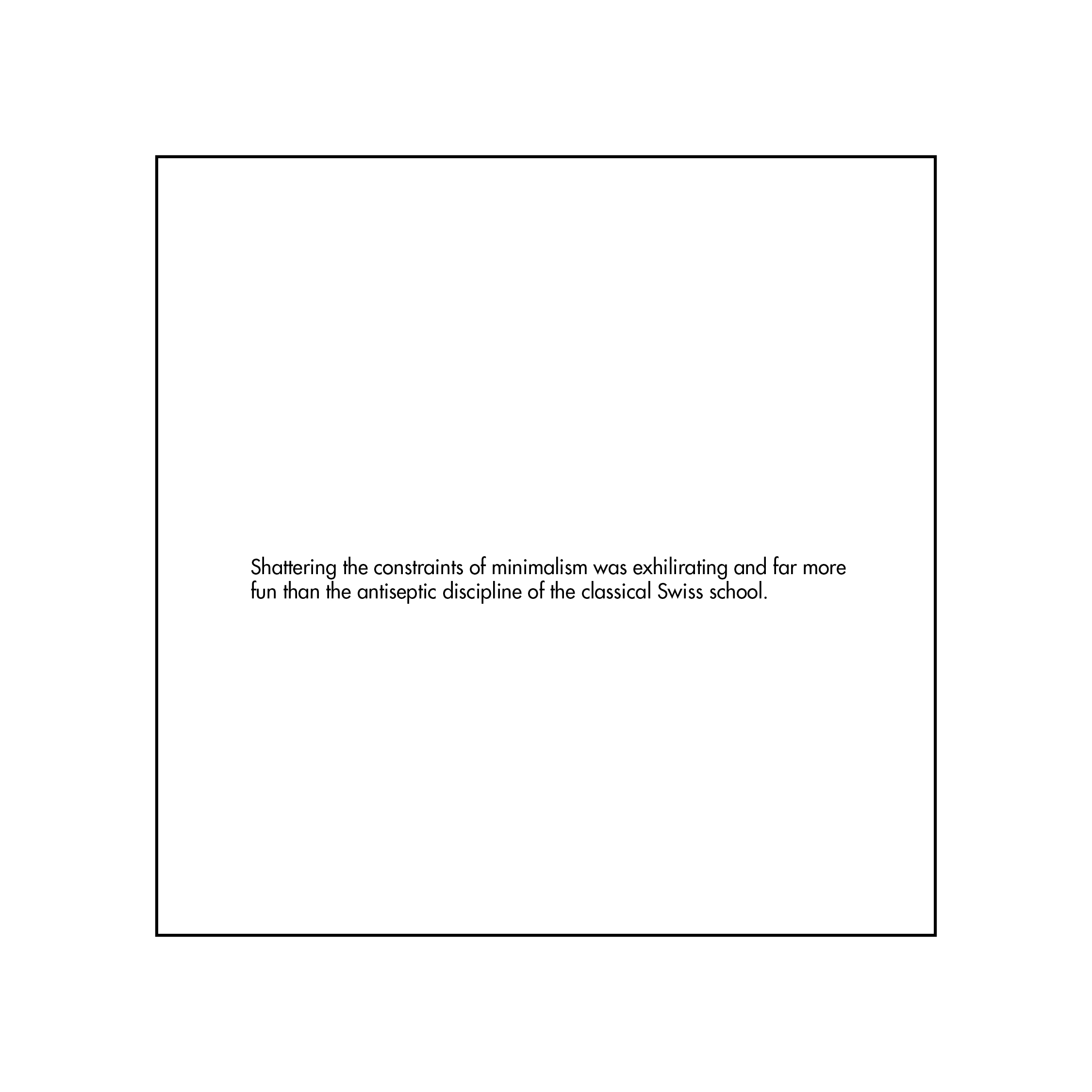
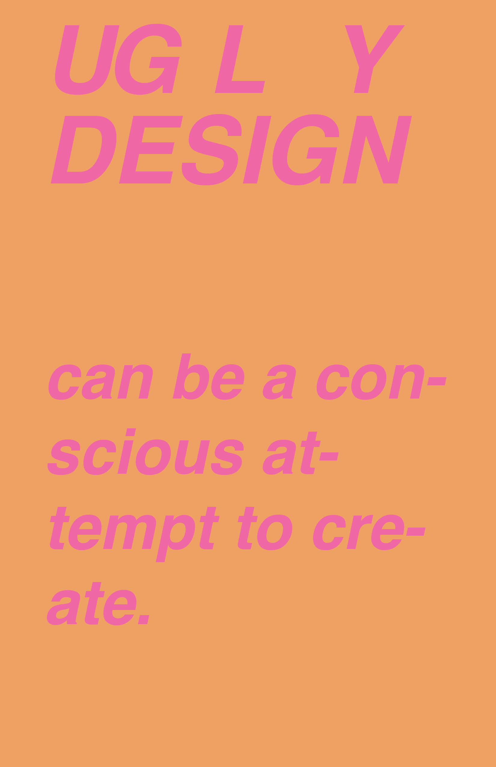
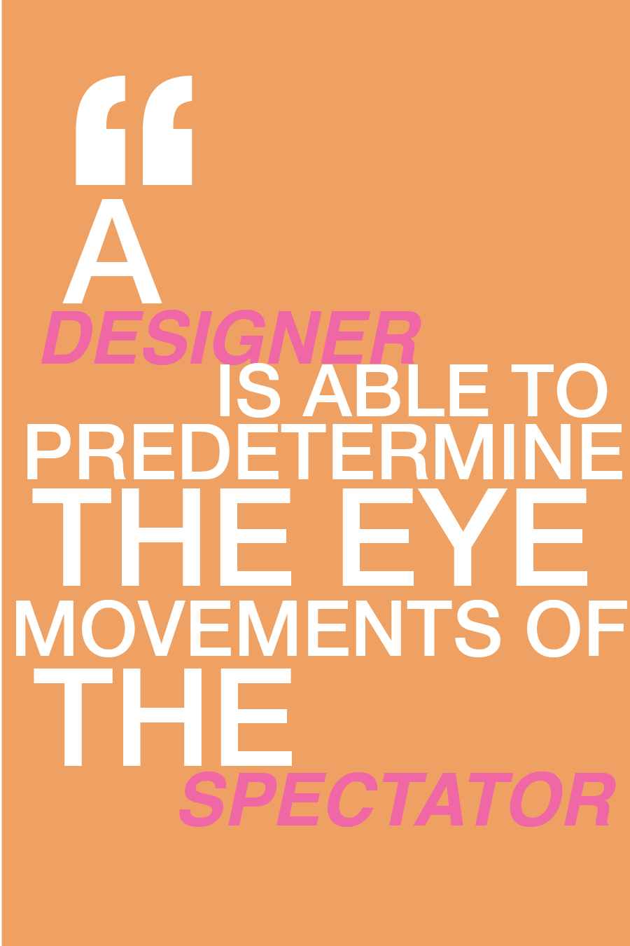
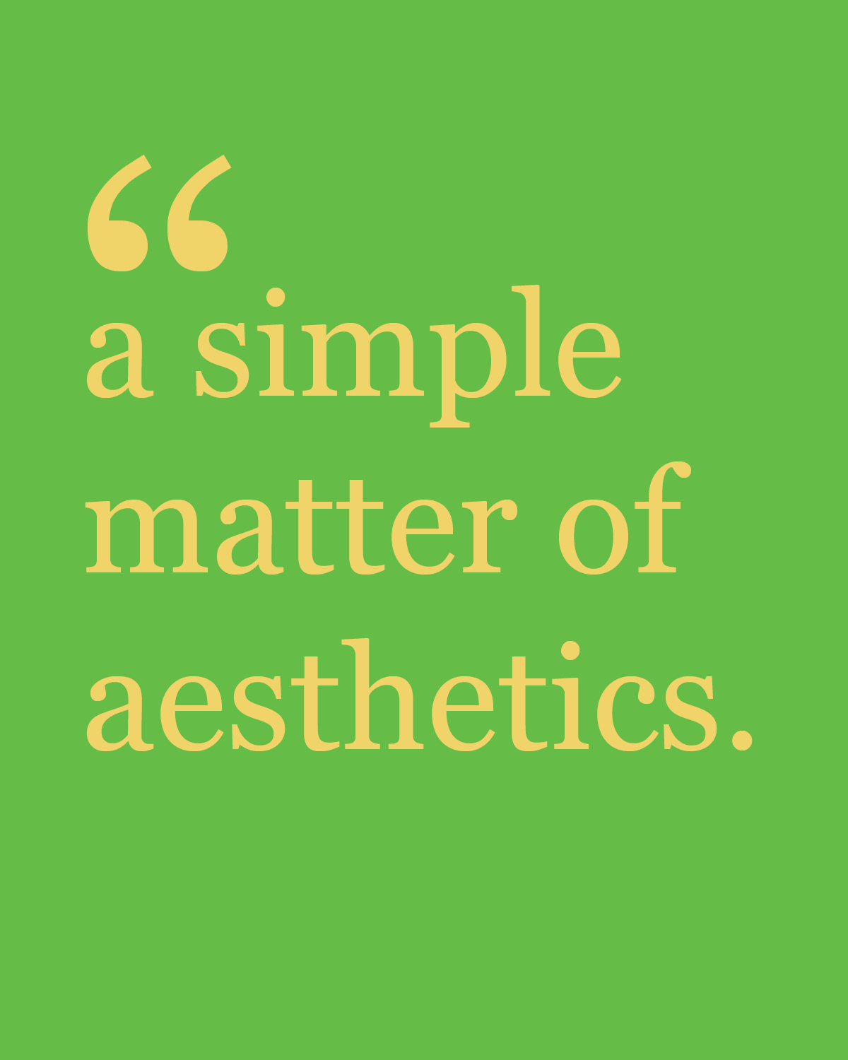
I definitely don’t have a color story for this weeks reading responses. My design intentions were just to experiment with different ways of portraying these quotes. I’ve specifically experimented with the graphic quality of the quotation mark.


Week 3 Reading Responses
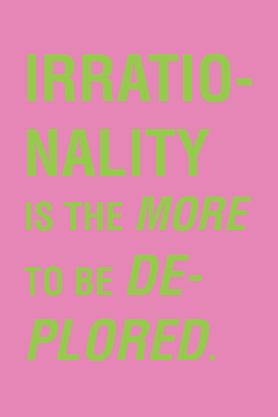
This week I again went with a certain color story, this time more diverse and random. I tried to parallel my design with the meaning of the quote I was showing.


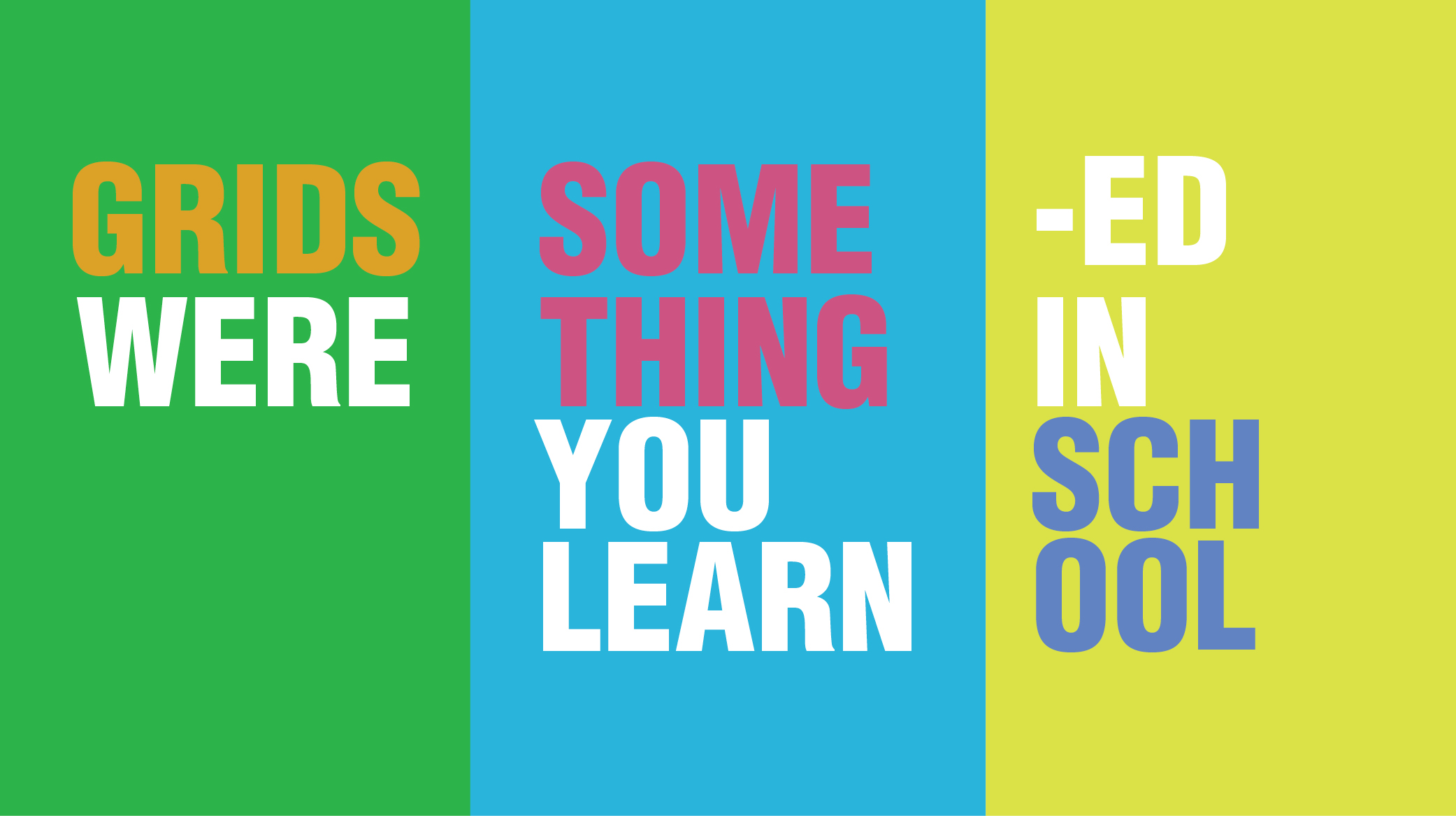
Week 2 Reading Responses
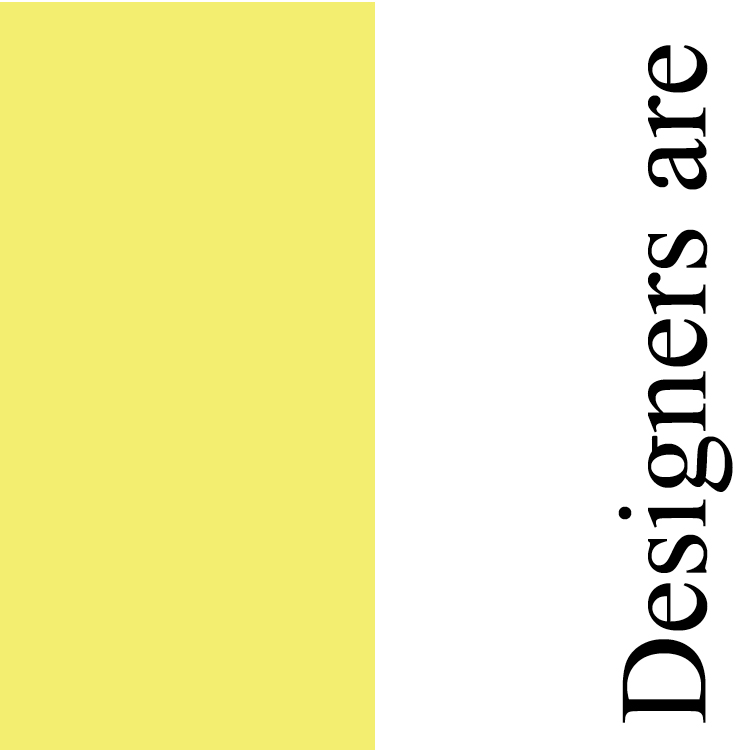
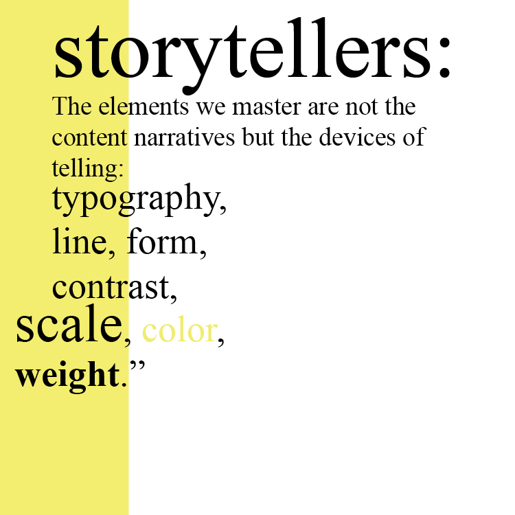
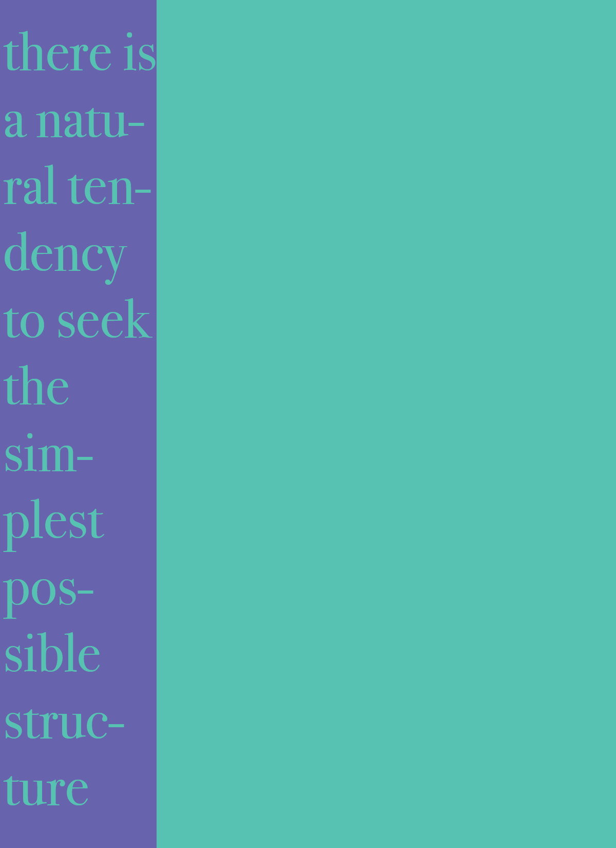
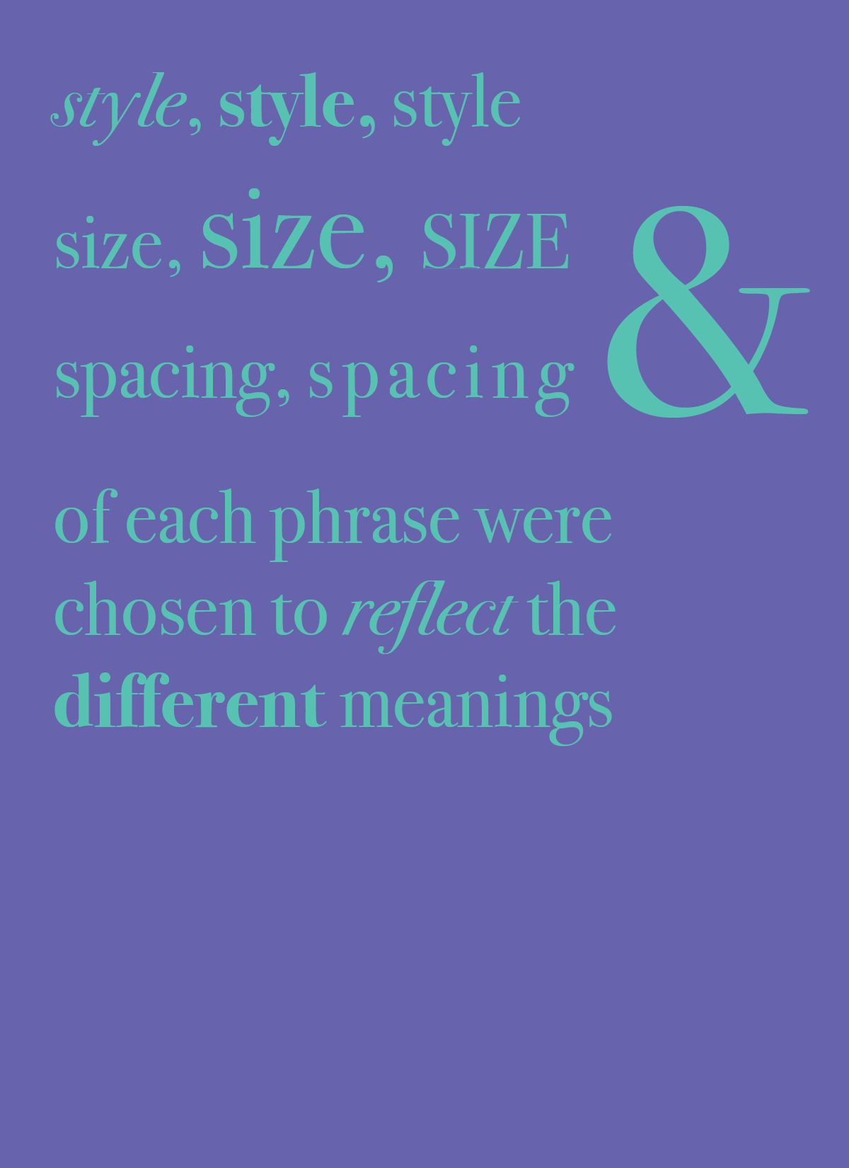
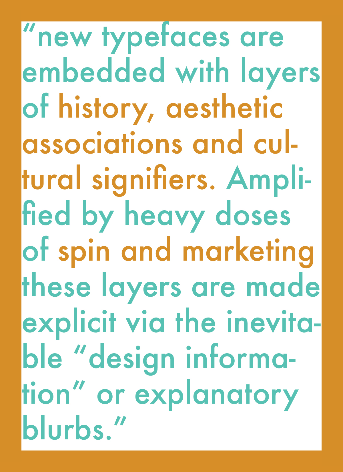
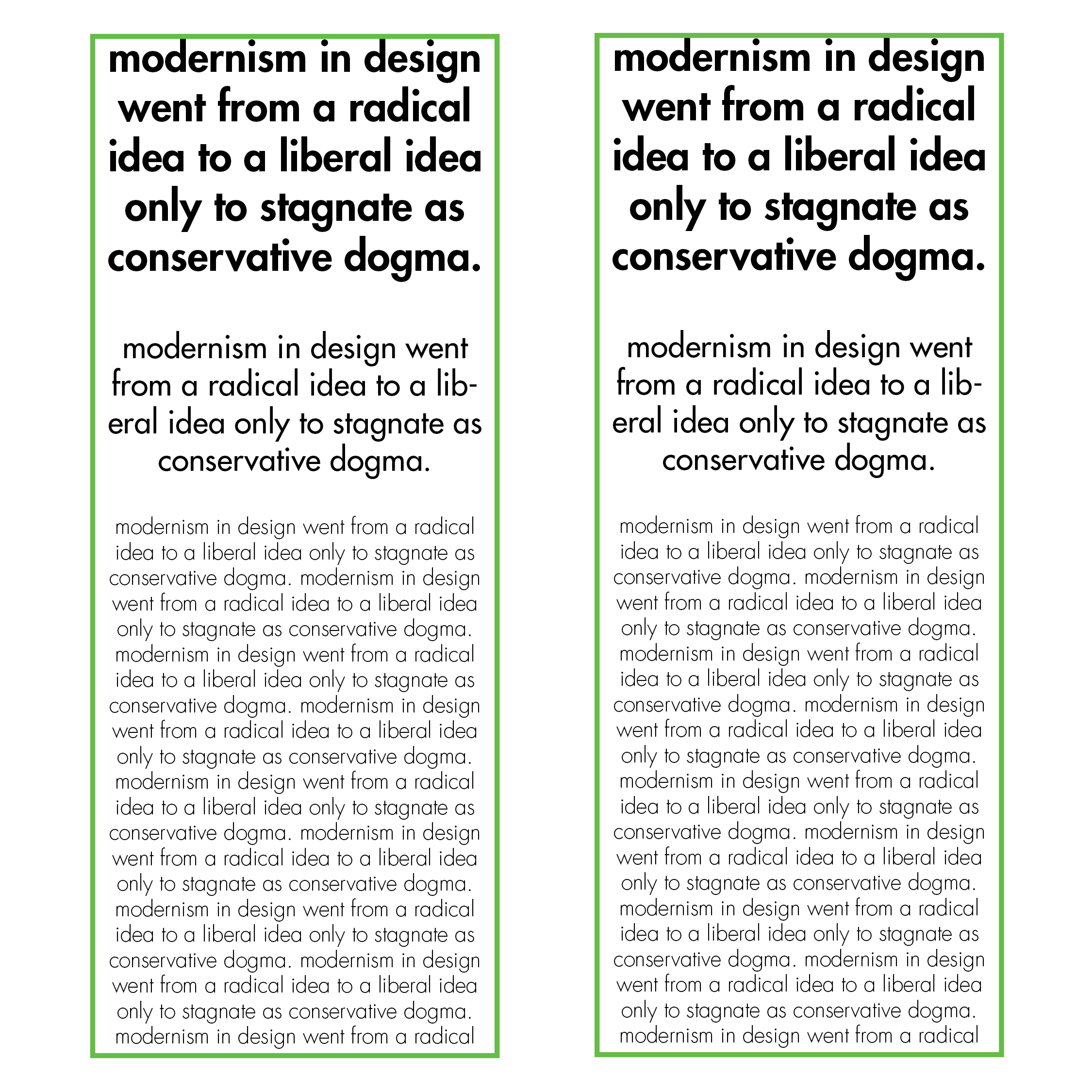
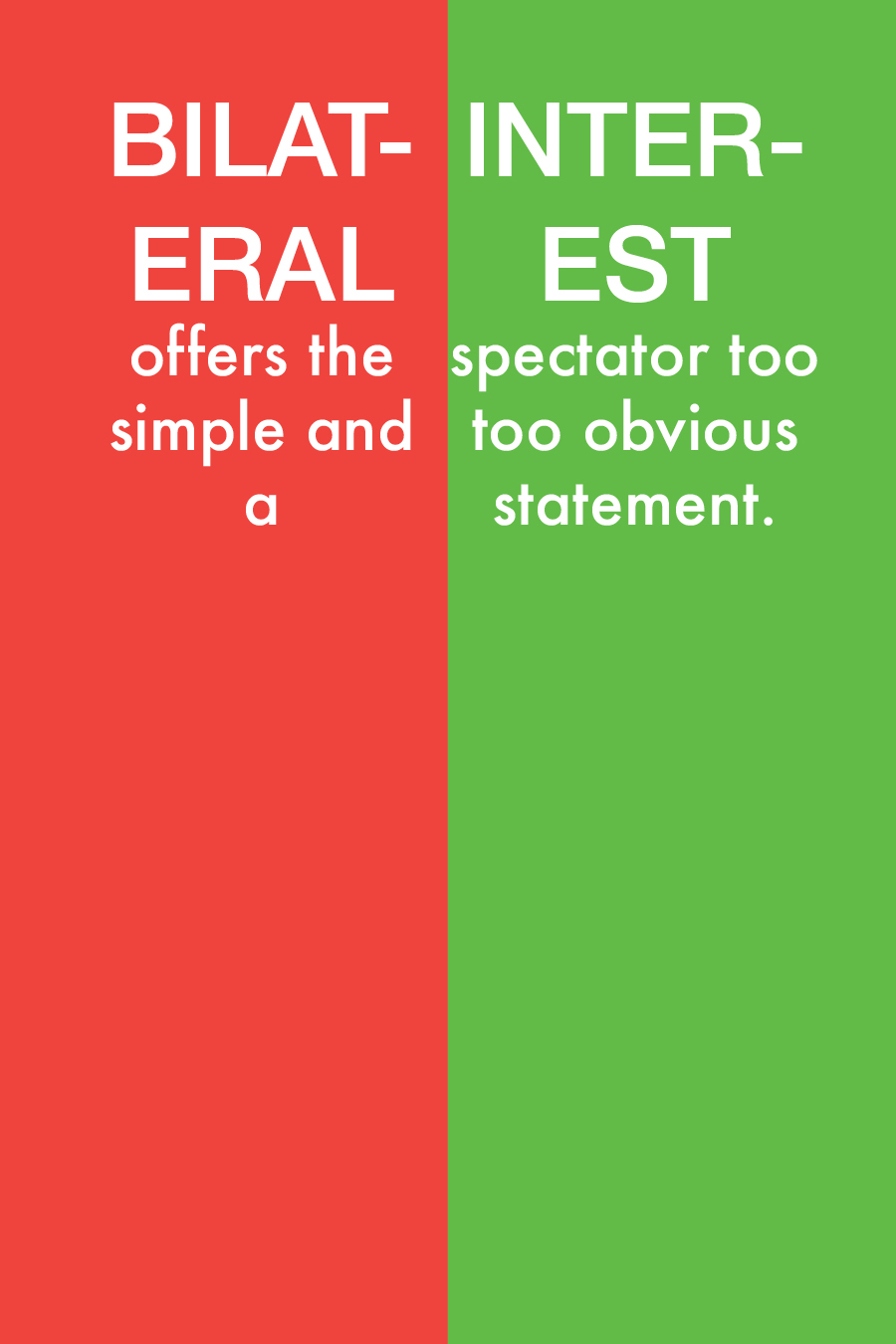
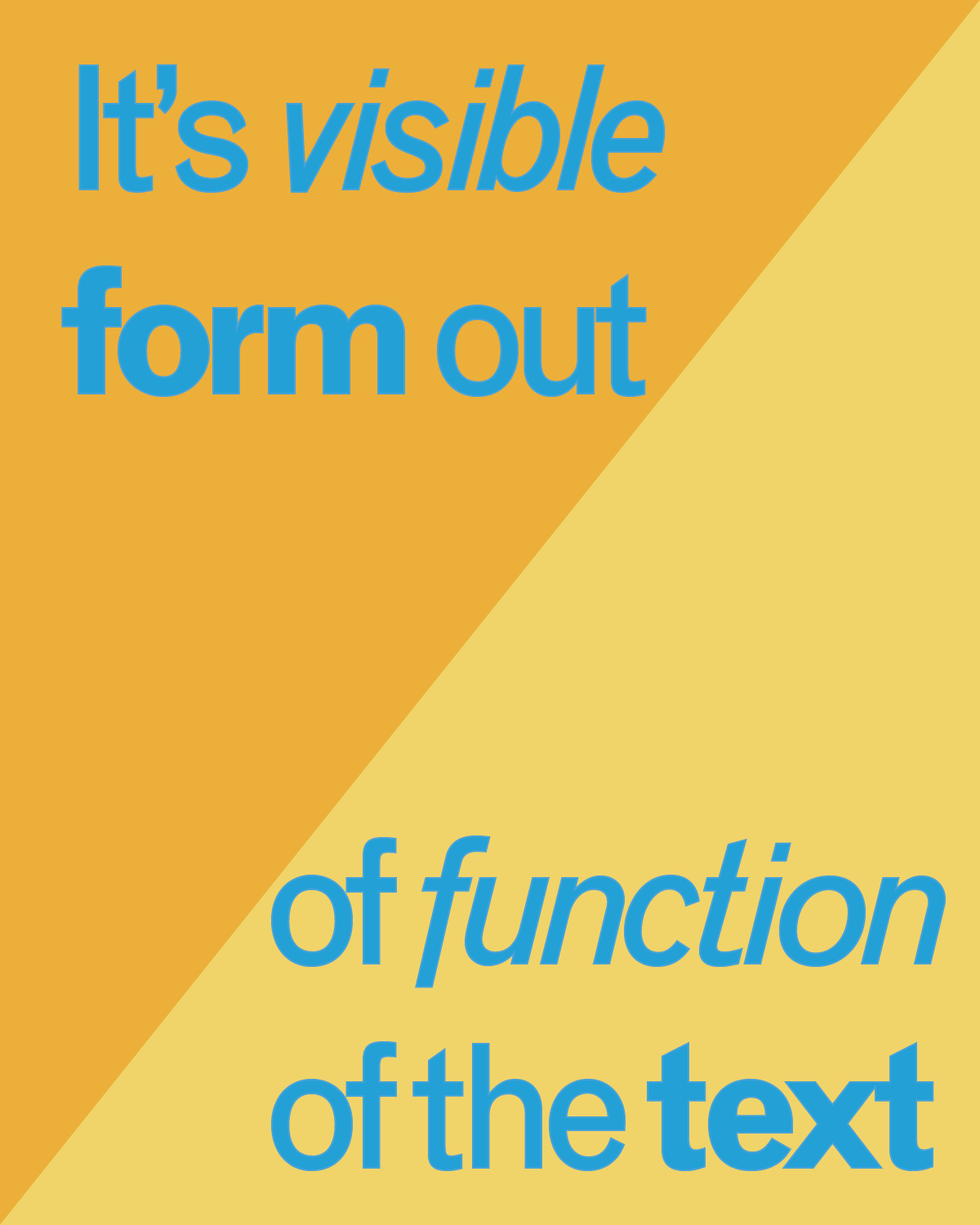
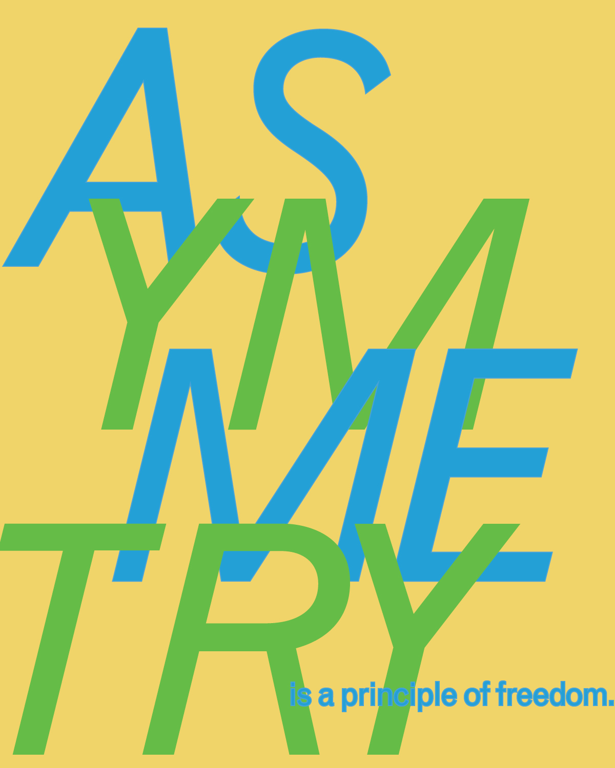
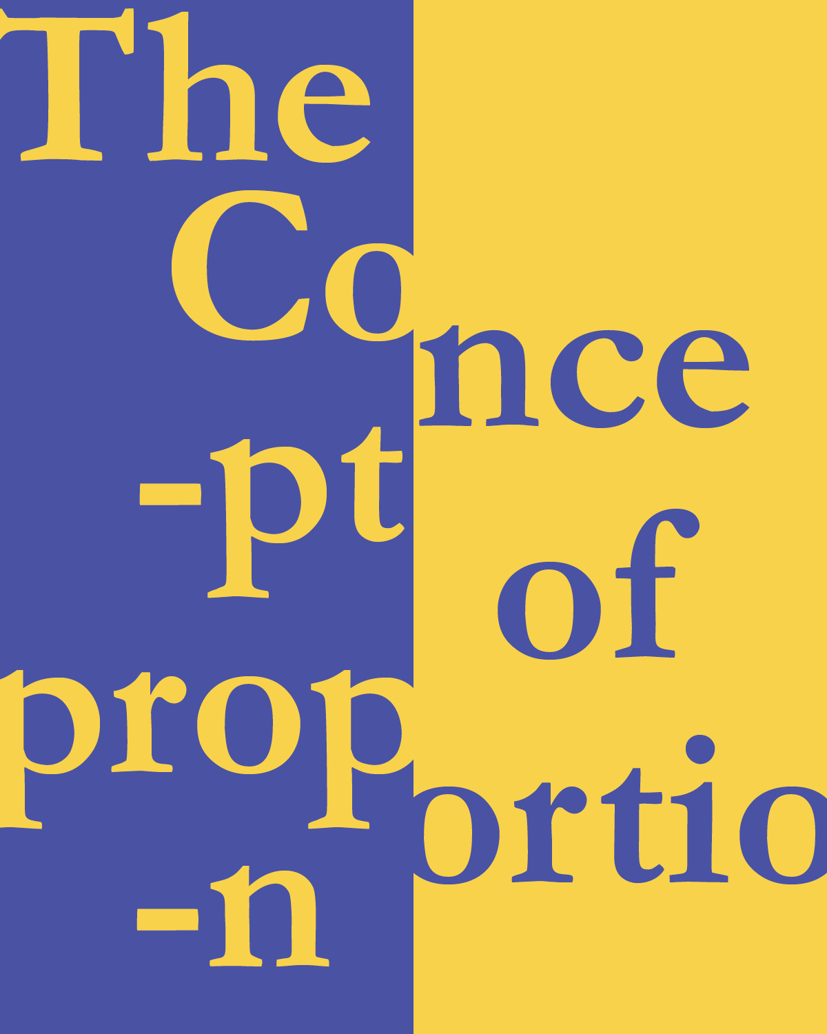
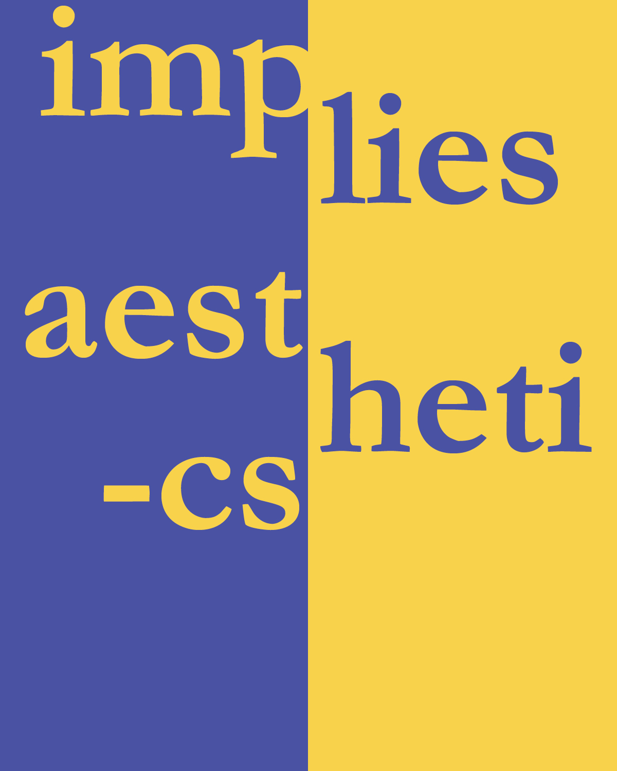
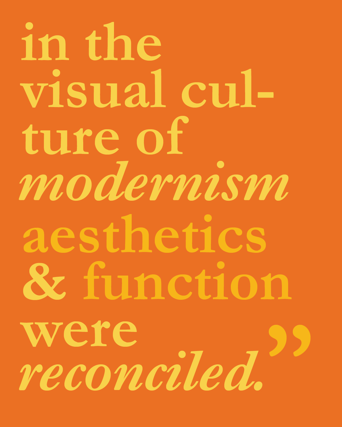
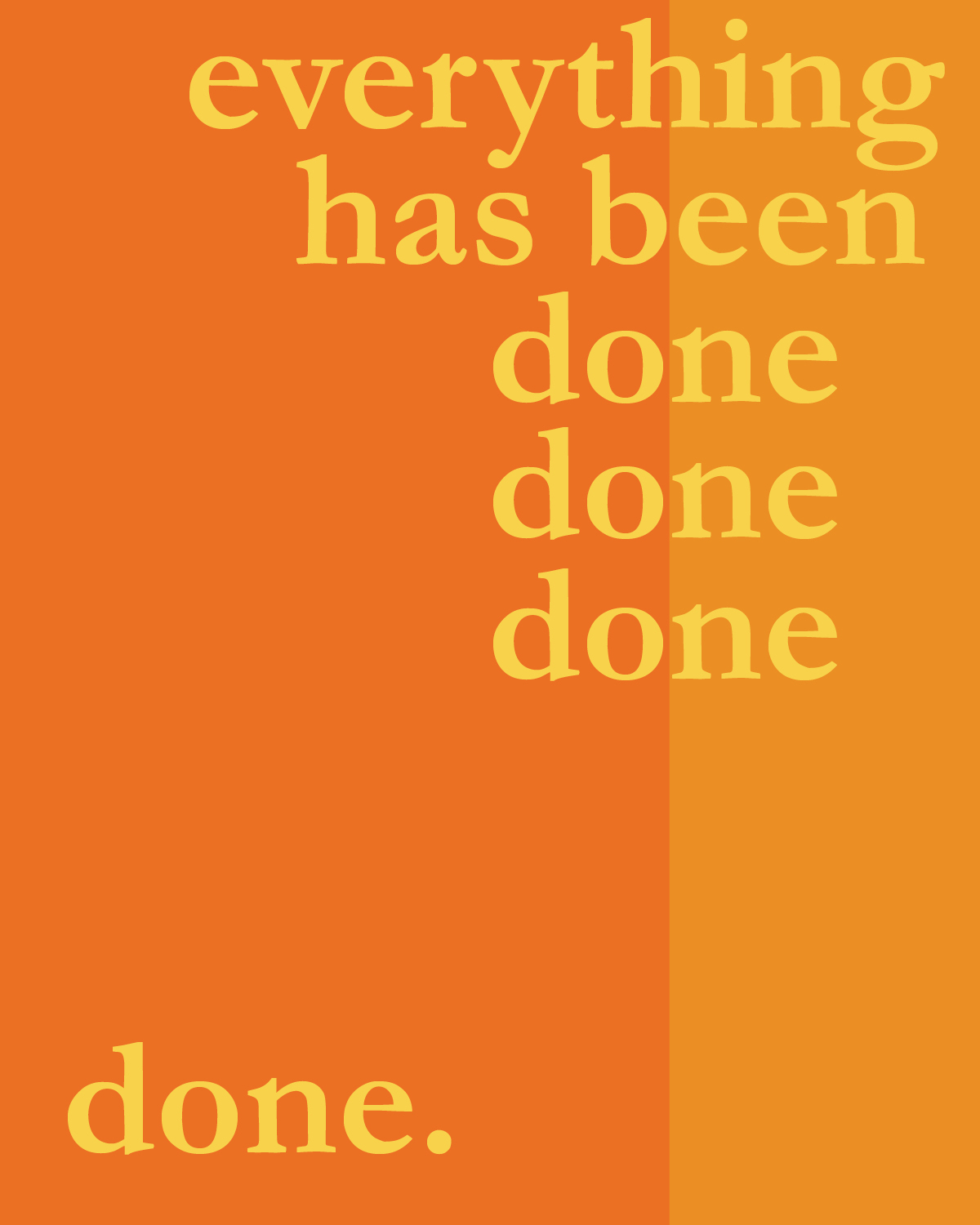
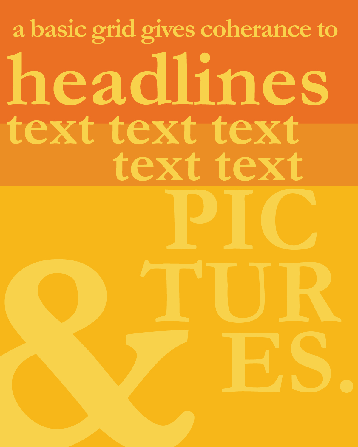
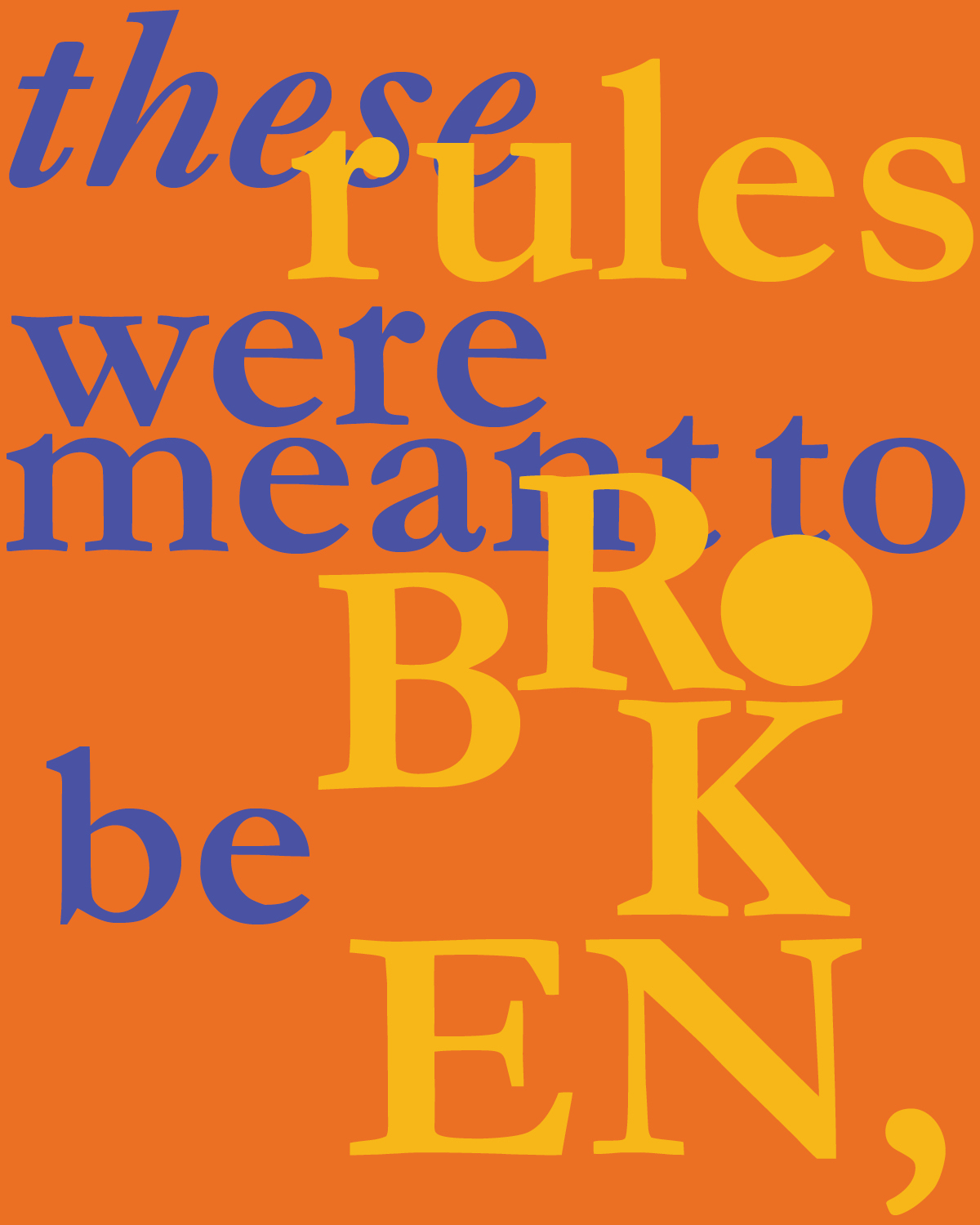
I chose a color story for this weeks reading responses blue, yellows, and oranges because they make interesting contrasting layouts. I decided to experiment specifically on splitting the page in different interesting ways. Through obvious columns and rows, and some splitting through the use of typography.

12