Class – Integrative Studio 1: Shift | Instructor – Demi Adeniran
Click here to view.
This is the parent category of all of the years and individual courses represented in your learning portfolio.
Class – Integrative Studio 1: Shift | Instructor – Demi Adeniran
Click here to view.
Class – Integrative Studio 1: Shift | Instructor – Demi Adeniran
DISCLAIMER: None of the images below are mine; I do not claim to own them. The links to where I found the images will be provided below their respective images.

This map is making the original map of Coney Island more fun. I enjoy the bright colours, they caught my eye. I like that it could orient people if they are lost, but is also pleasing to look at. The map very casual, almost an “unofficial map”. Link: http://m.coneyislandfunguide.com/Map.htm
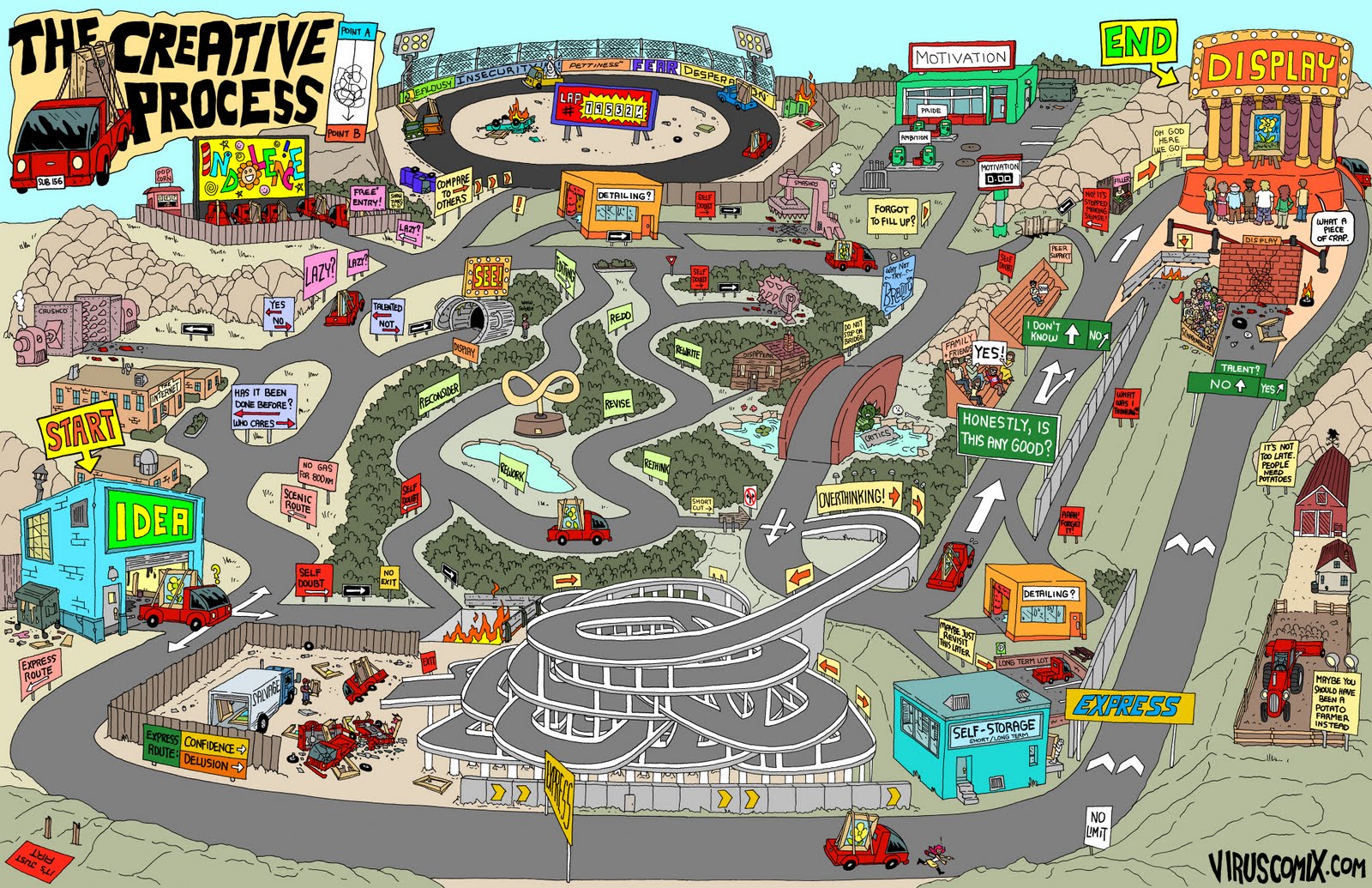
Quite a funny map. I got inspiration from the hard edges here and applied them to my map. However I don’t think the 3D map will work for my High Line project. Link: http://www.viruscomix.com/page523.html

This map reveals to us how scarce our resources are. We need soil to survive on this planet and we (as a society) aren’t taking care of the environment enough. I was inspired by the concept of this map, and hence decided to do my map on the greenery of High Line. Link: http://greenfieldgeography.wikispaces.com/Soil+and+change

Eye-opening and powerful. Inverting the colours creates a powerful contrast from the circle to the rest of the world. Link: https://www.washingtonpost.com/news/worldviews/wp/2013/05/07/map-more-than-half-of-humanity-lives-within-this-circle/

Another fun one with regions highlighted to mark a certain trend in that area (in this case: the amount of red heads). I am using colour to mark my nature like regions in High Line. Link: https://www.reddit.com/r/MapPorn/comments/1d1luy/red_hair_map_of_europe_620x900/
Finally, click here to view my High Line map (best experienced on Adobe Acrobat Pro DC). The map was compiled with the help of photographs I took and satellite images of High Line; all of the work on the map is done by me using the pen tool. I used an image as a template, here is the link: http://thevillager.com/villager_328/highlineplans.html
Class – Integrative Studio 1: Shift | Instructor – Demi Adeniran
Here is the final outcome of my full body portrait:

Class – Time: Metropolis | Instructor – Cooke John, Nina
[NOTE: This is the second part to a two part submission, for part one click here]
For this assignment, we had to create a time map, which, like the previous assignment, is based on the narrative (click here for the narrative). What was different about this assignment, was that we were allowed to use colour.
I wanted the time map to have a rough geographical layout. I decided to add a red tint which would convey how much energy / activeness / level of interest I have in an activity throughout the day. For aesthetics, the red tints go up in intensity gradually.
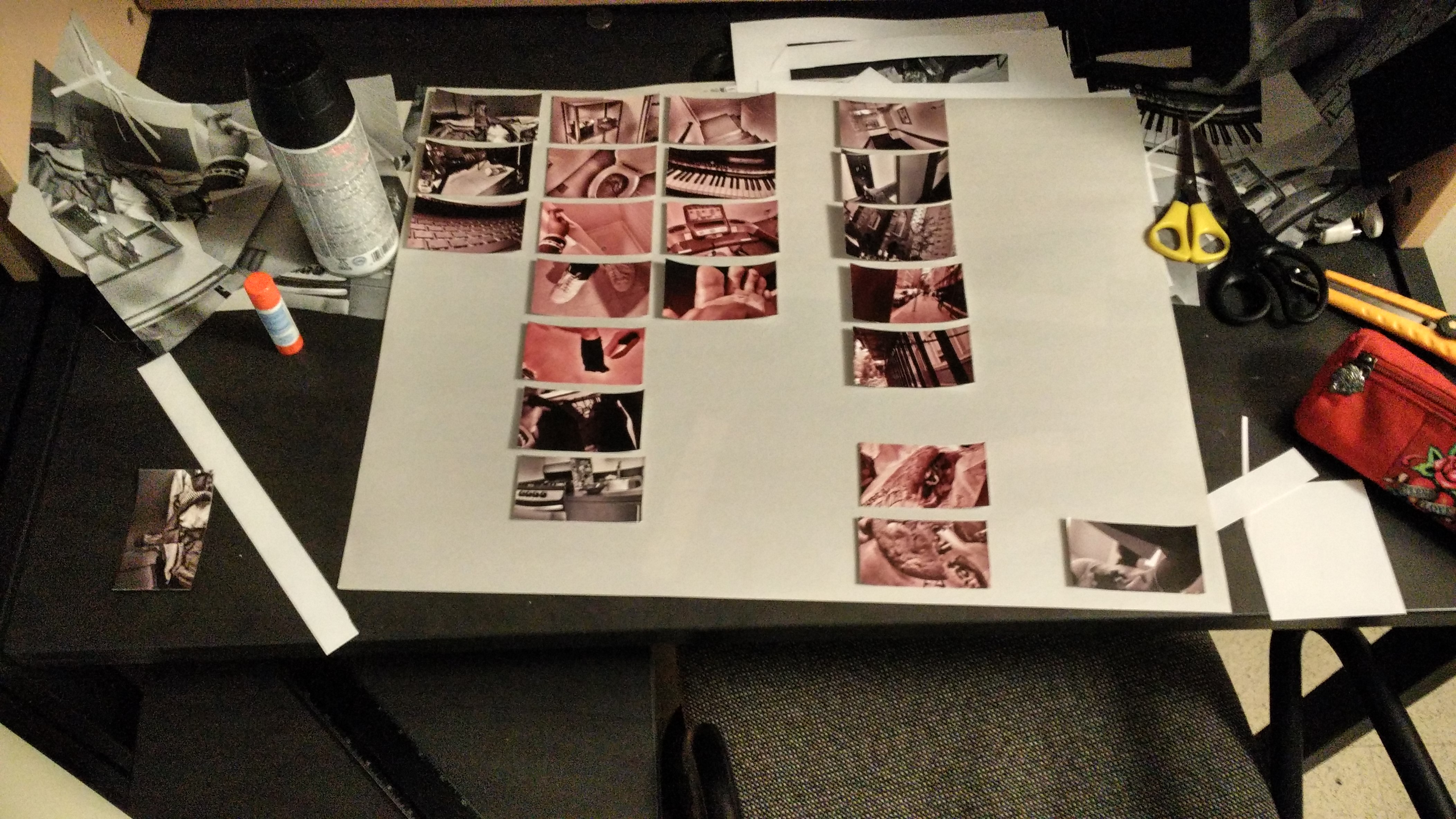
I laid out the images until I was happy with the layout (pardon the background):
And then I pasted them down; Here is the first iteration of my time map (pardon the low quality and the clipping at the edges):
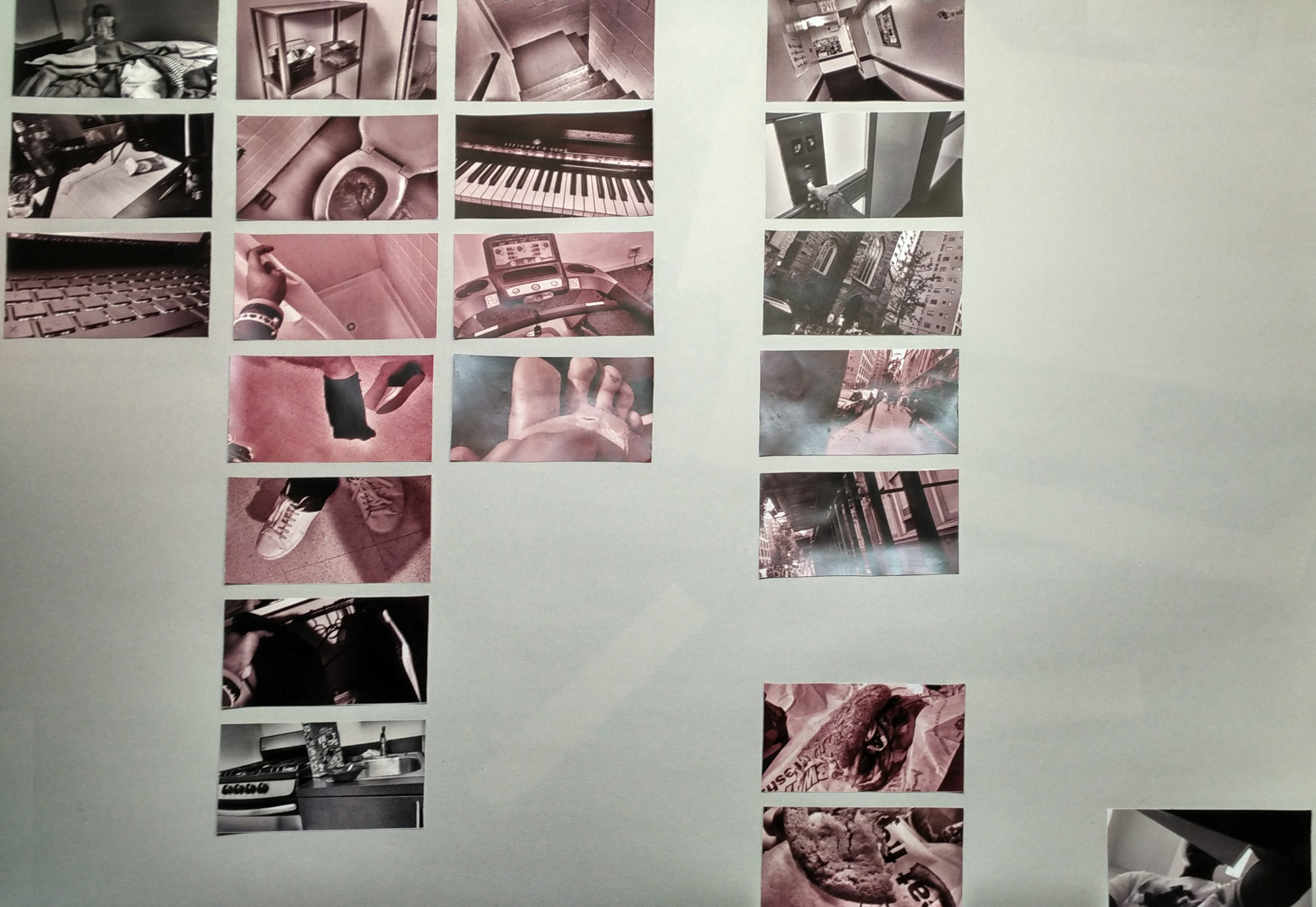
The feedback I received dictated that the gradient of red is going to ease the audience into the red; it might be more effective if a single red picture was amongst the monochrome. I was also asked to consider spreading the time map over two sheets of newsprint (18″ by 24″ x 2).
I decided to remove the gradient and instead only made the pictures that were somewhat stressful in strong red (such as me getting ready in the morning, because it is rushed). I also gave slight colour to the outside shots to add variety, but also to suggest the outside is somewhat stressful.
Here is the second iteration:
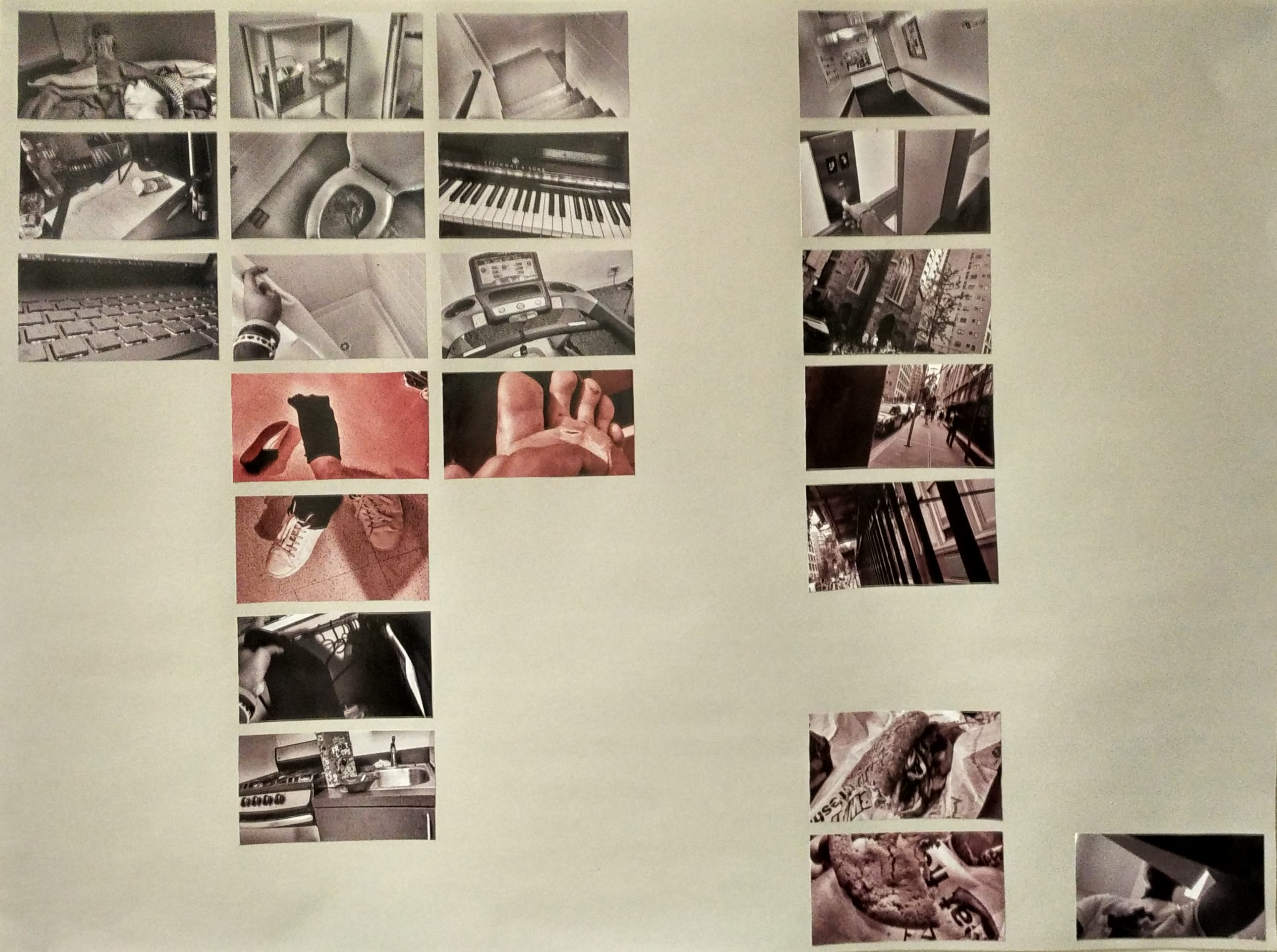
As you can see, only a handful of photos are distinctly red, where as the others are either monochrome or slightly tinted. I believe this iteration was a lot more effective than the last as it is more visually appealing and more impactful.
Class – Time: Metropolis | Instructor – Nina Cooke John
[NOTE: This is the first part to a two part submission, for part two click here]
The assignment was to write a narrative about a single day in my life in NYC, and create a linear progression in time based on the narrative.
My narrative conveyed a certain endless cycle of depression, difficulty adapting to NYC, as well as tolerating activities that aren’t as interesting (click here for the narrative)
Here is the first iteration of my linear map time assignment:
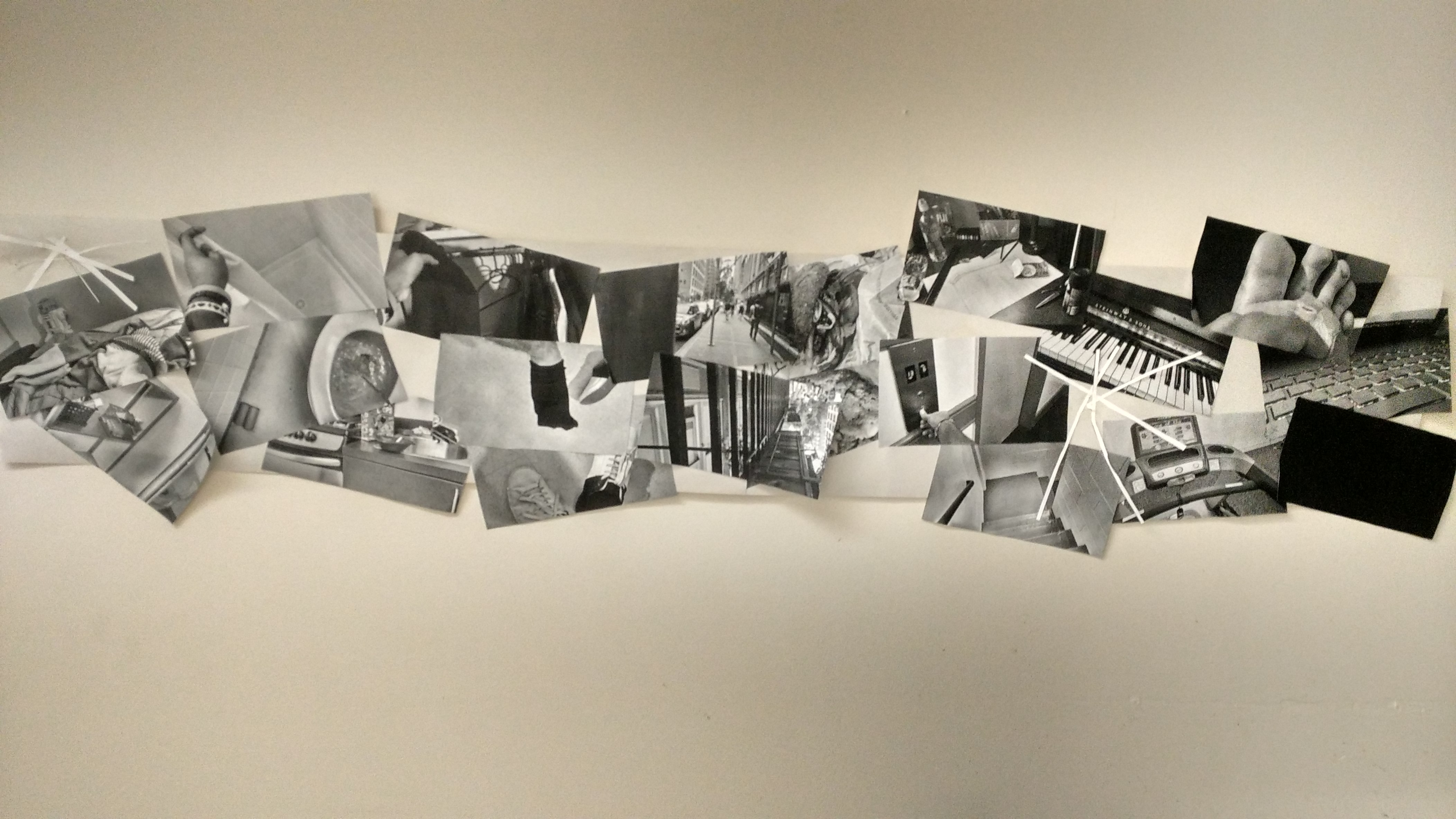
The feedback I got brought to my attention that I haven’t actually achieved the goal I set out to achieve, hence the piece didn’t work.
I agreed with most of the feedback I received; the photos breaking out here aren’t as effective as I first imagined because it seems unplanned and all over the place (not what I had expressed in my narrative).
In addition to that, I mentioned classes being boring in my narrative, yet I had no photos of class, so I had to take another photo or two of a boring classroom scenario.
With the second iteration, I decided to make it cleaner. I had a regular structured progression in time, and then broke out of it only at certain points.
I also added a photo of a selfie I took in class, under the desk, in order to portray a boring class.
Here is the second iteration of my linear map assignment:

I strongly believe the second iteration turned out best (perhaps because there was a lack of planning with my first iteration); the spacing is considered carefully (all the photographs in the same location are overlapping, while there are spaces where the location is different); there is a photo of the class aspect of my narrative (the selfie in the middle, cleverly isolated from the rest of the tasks to hint at boredom); I also reused the first photo of my bed at the end (the first one conveys getting out of bed, while the second on conveys going to bed), I used repetition to convey a looping cycle.
Hello world!