Class – Integrative Studio 1: Shift | Instructor – Demi Adeniran
DISCLAIMER: None of the images below are mine; I do not claim to own them. The links to where I found the images will be provided below their respective images.
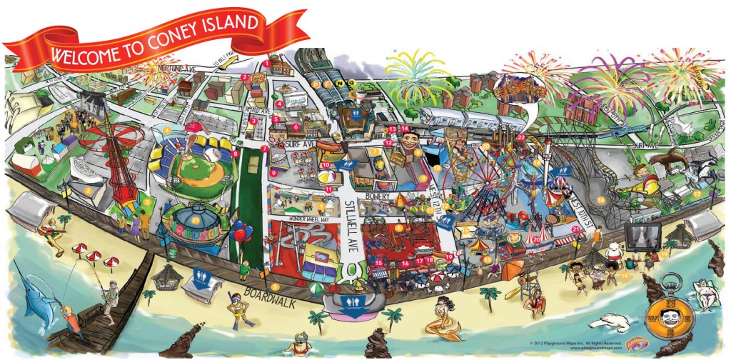
This map is making the original map of Coney Island more fun. I enjoy the bright colours, they caught my eye. I like that it could orient people if they are lost, but is also pleasing to look at. The map very casual, almost an “unofficial map”. Link: http://m.coneyislandfunguide.com/Map.htm
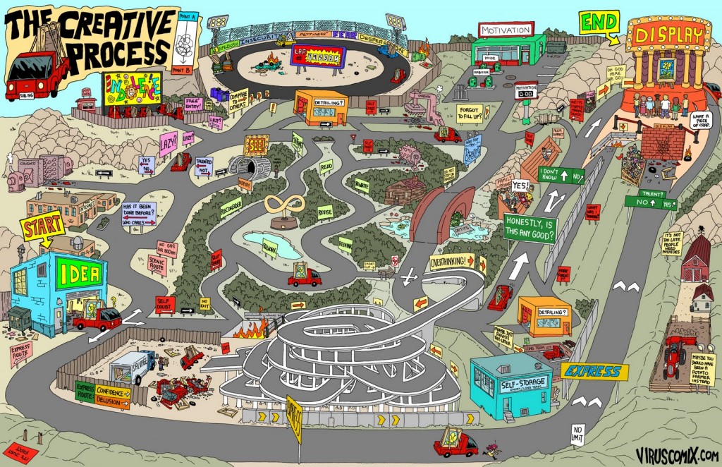
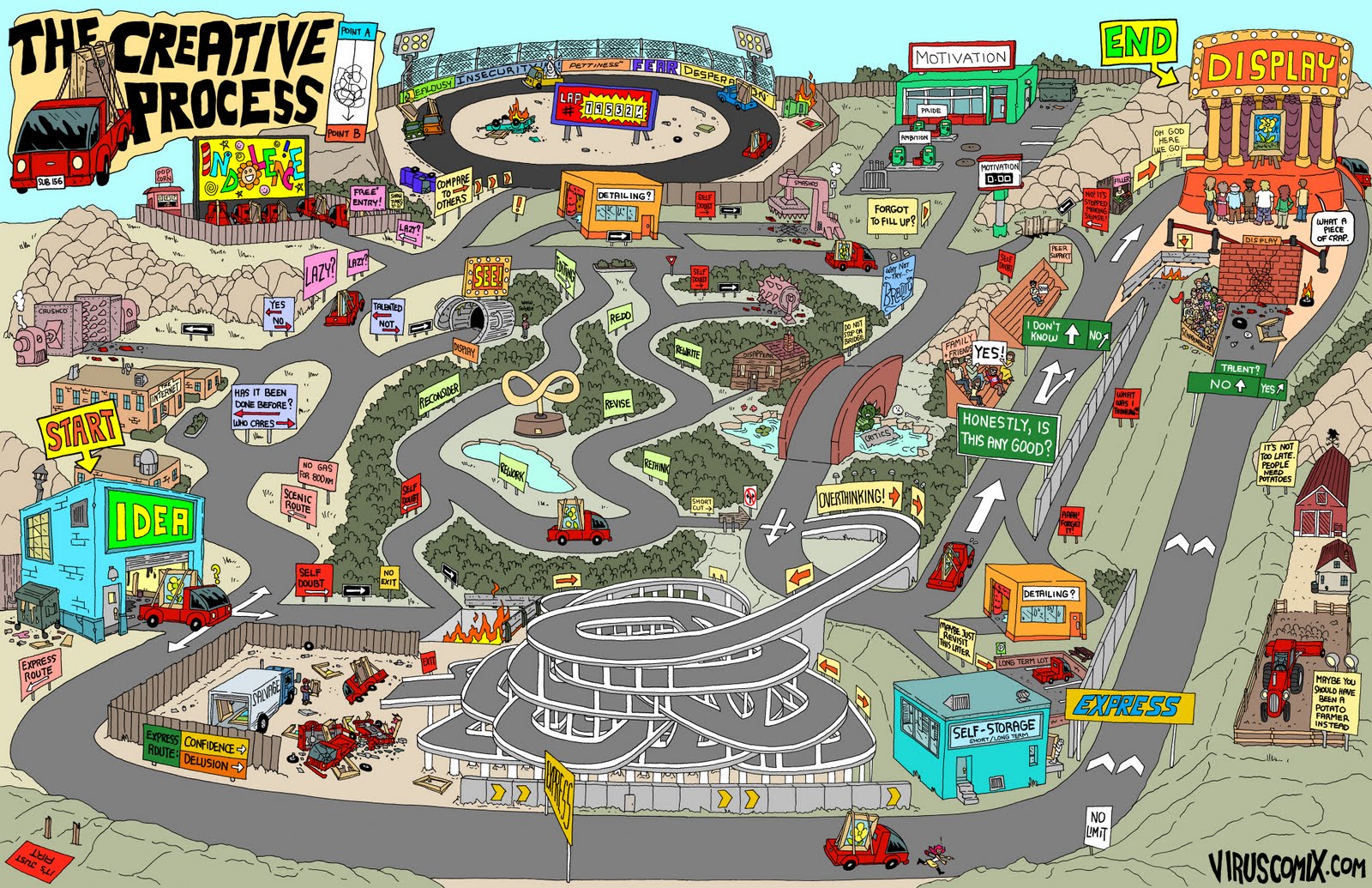
Quite a funny map. I got inspiration from the hard edges here and applied them to my map. However I don’t think the 3D map will work for my High Line project. Link: http://www.viruscomix.com/page523.html

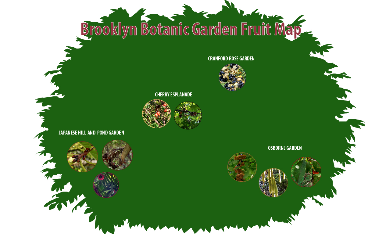
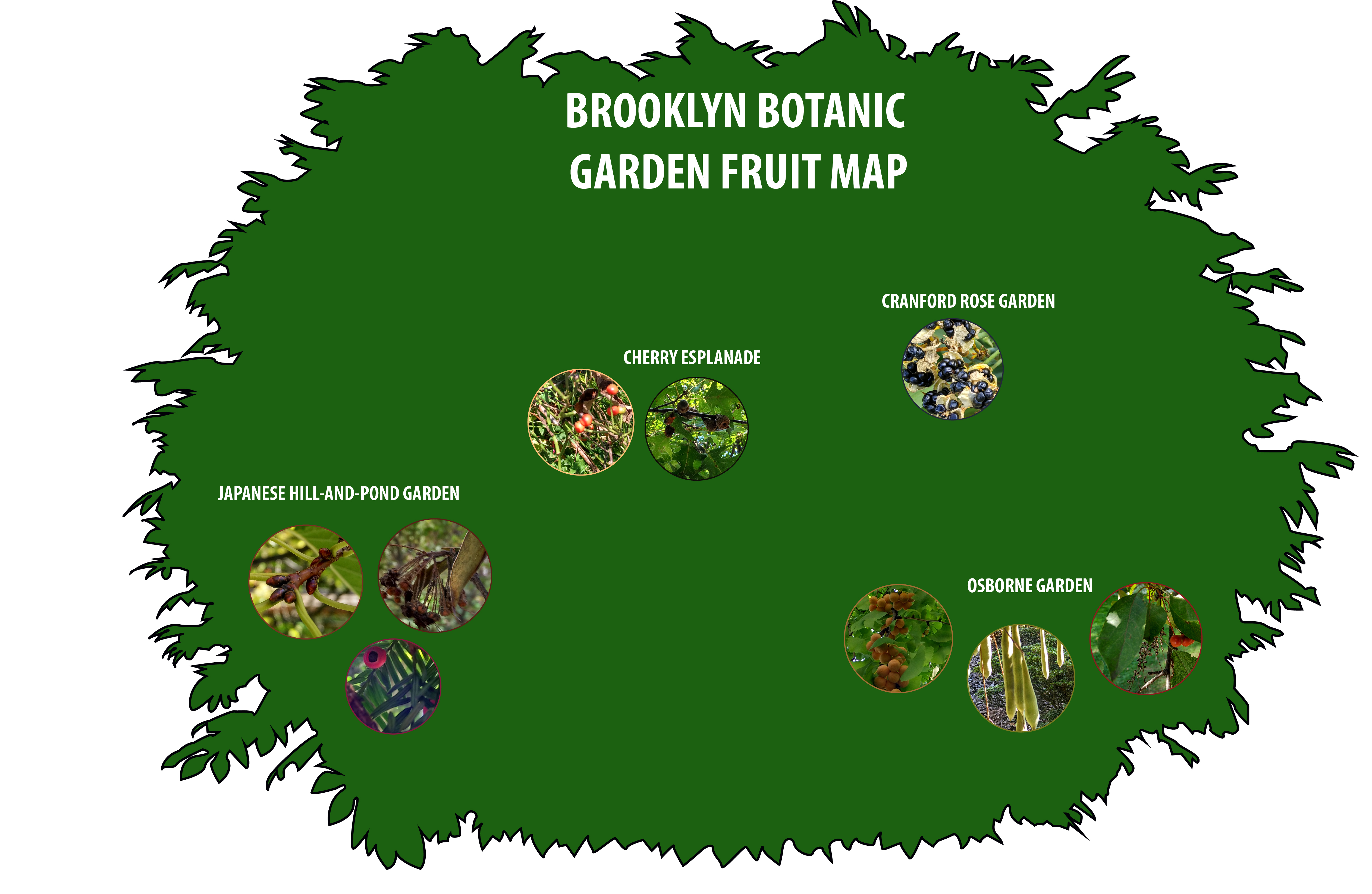
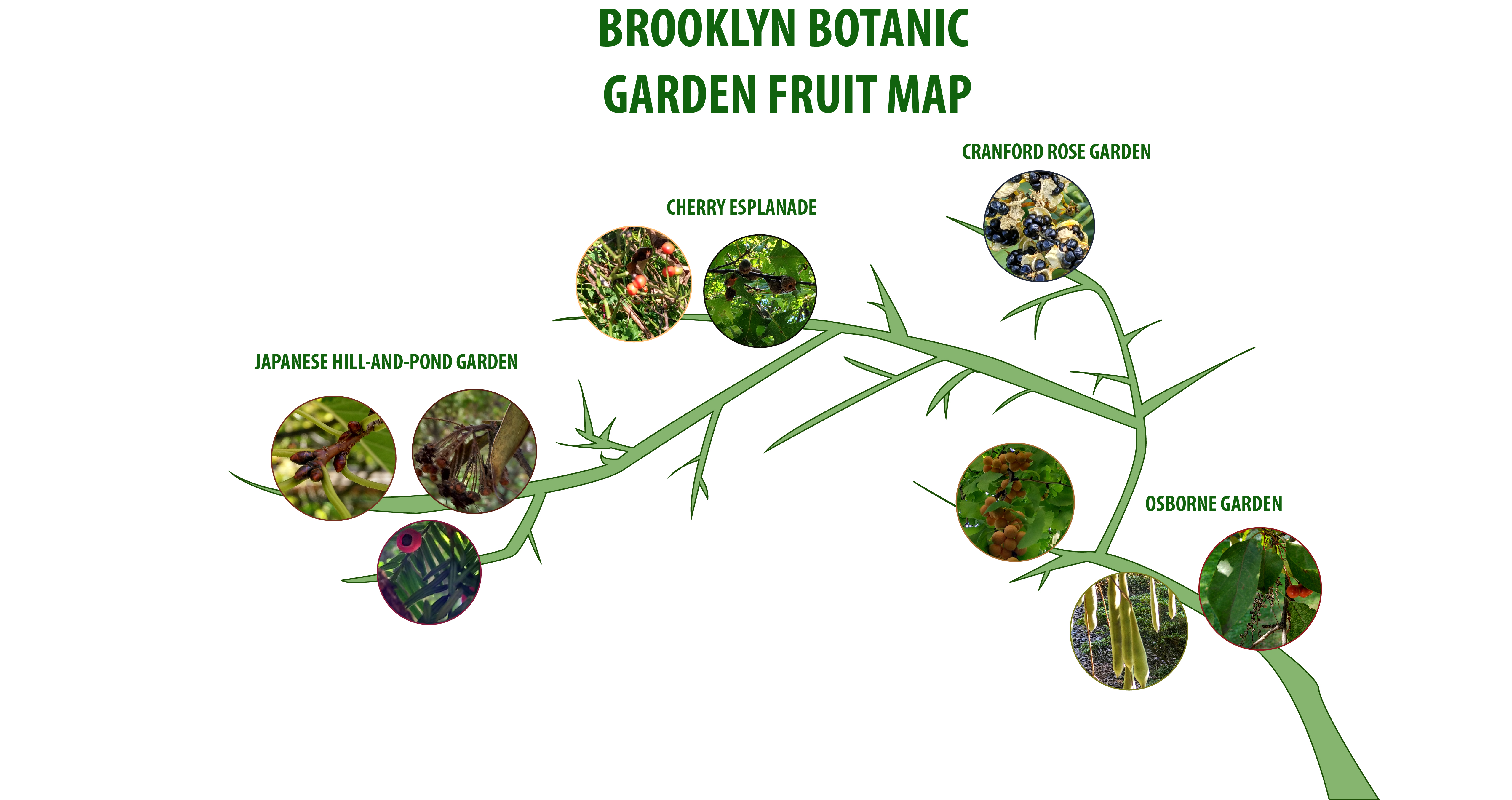
This map reveals to us how scarce our resources are. We need soil to survive on this planet and we (as a society) aren’t taking care of the environment enough. I was inspired by the concept of this map, and hence decided to do my map on the greenery of High Line. Link: http://greenfieldgeography.wikispaces.com/Soil+and+change

Eye-opening and powerful. Inverting the colours creates a powerful contrast from the circle to the rest of the world. Link: https://www.washingtonpost.com/news/worldviews/wp/2013/05/07/map-more-than-half-of-humanity-lives-within-this-circle/

Another fun one with regions highlighted to mark a certain trend in that area (in this case: the amount of red heads). I am using colour to mark my nature like regions in High Line. Link: https://www.reddit.com/r/MapPorn/comments/1d1luy/red_hair_map_of_europe_620x900/
Finally, click here to view my High Line map (best experienced on Adobe Acrobat Pro DC). The map was compiled with the help of photographs I took and satellite images of High Line; all of the work on the map is done by me using the pen tool. I used an image as a template, here is the link: http://thevillager.com/villager_328/highlineplans.html