Highlight 1
The Derive: La Flânerie
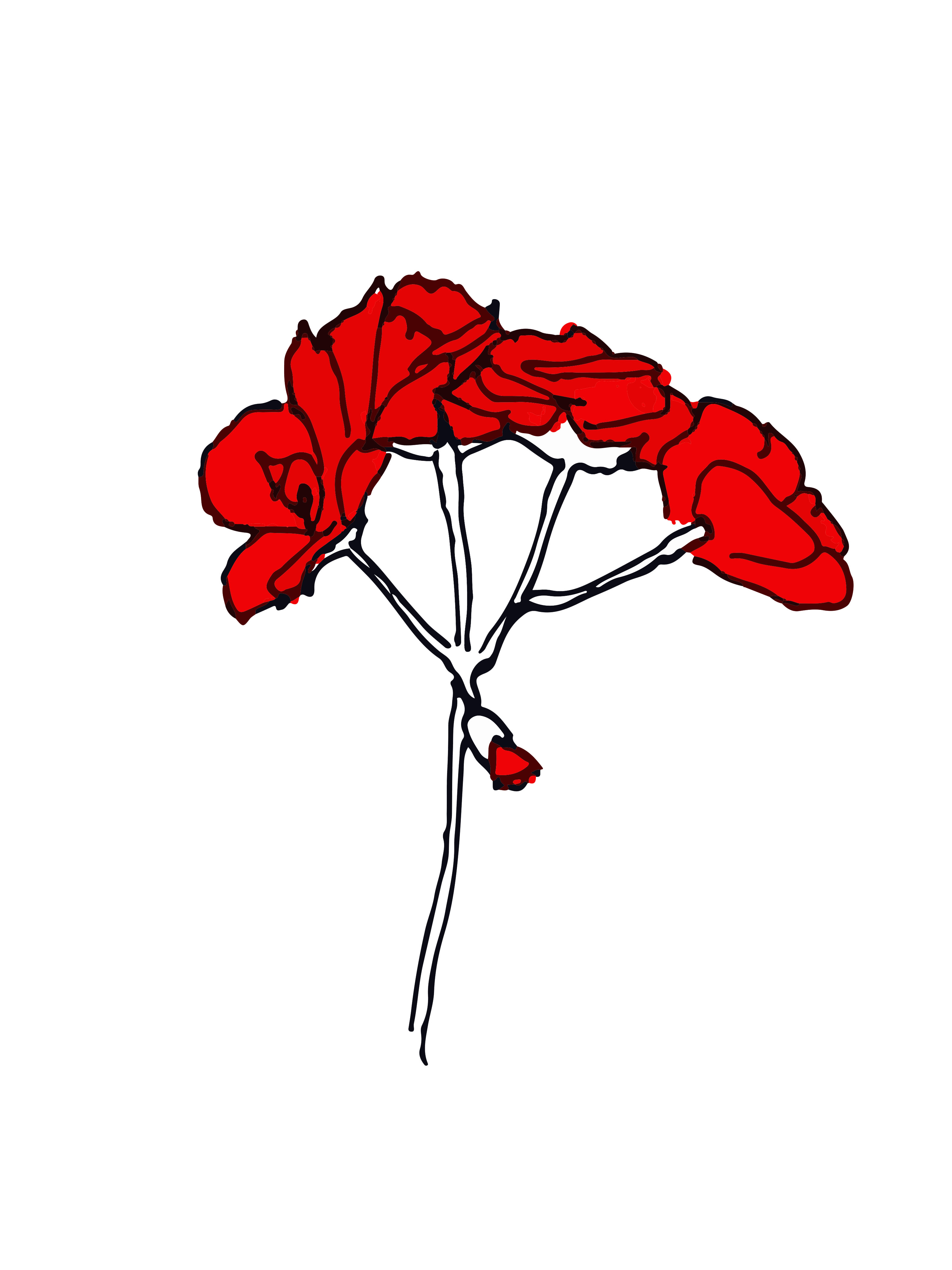
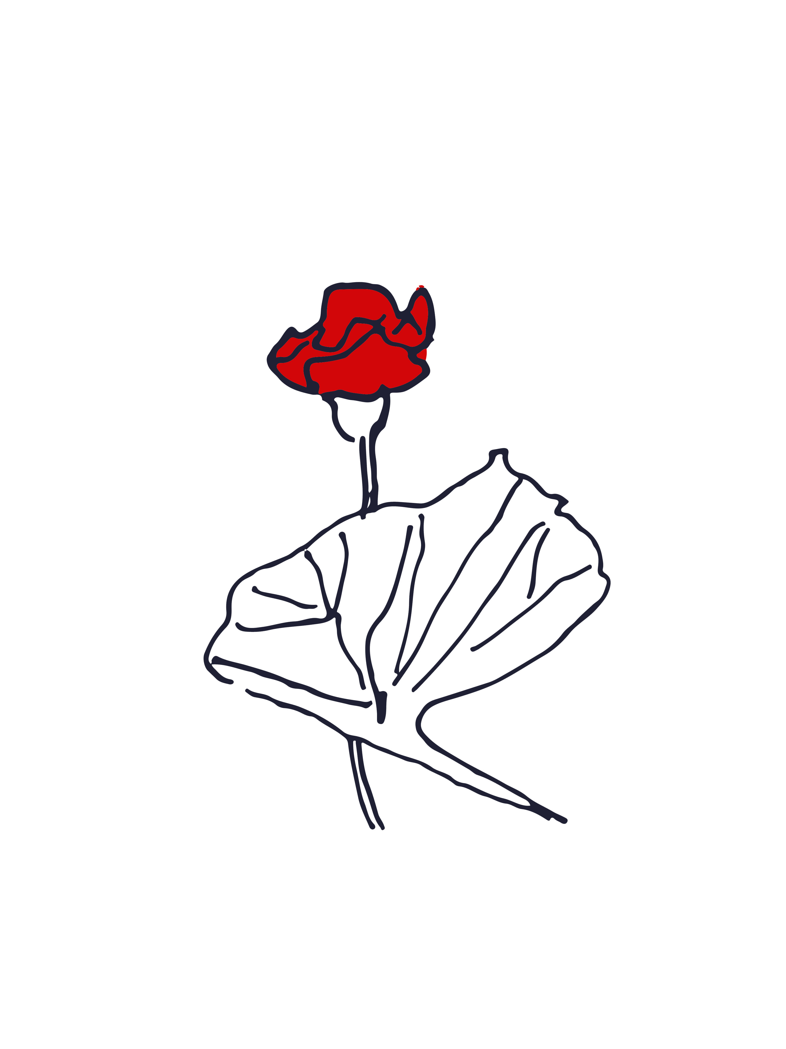
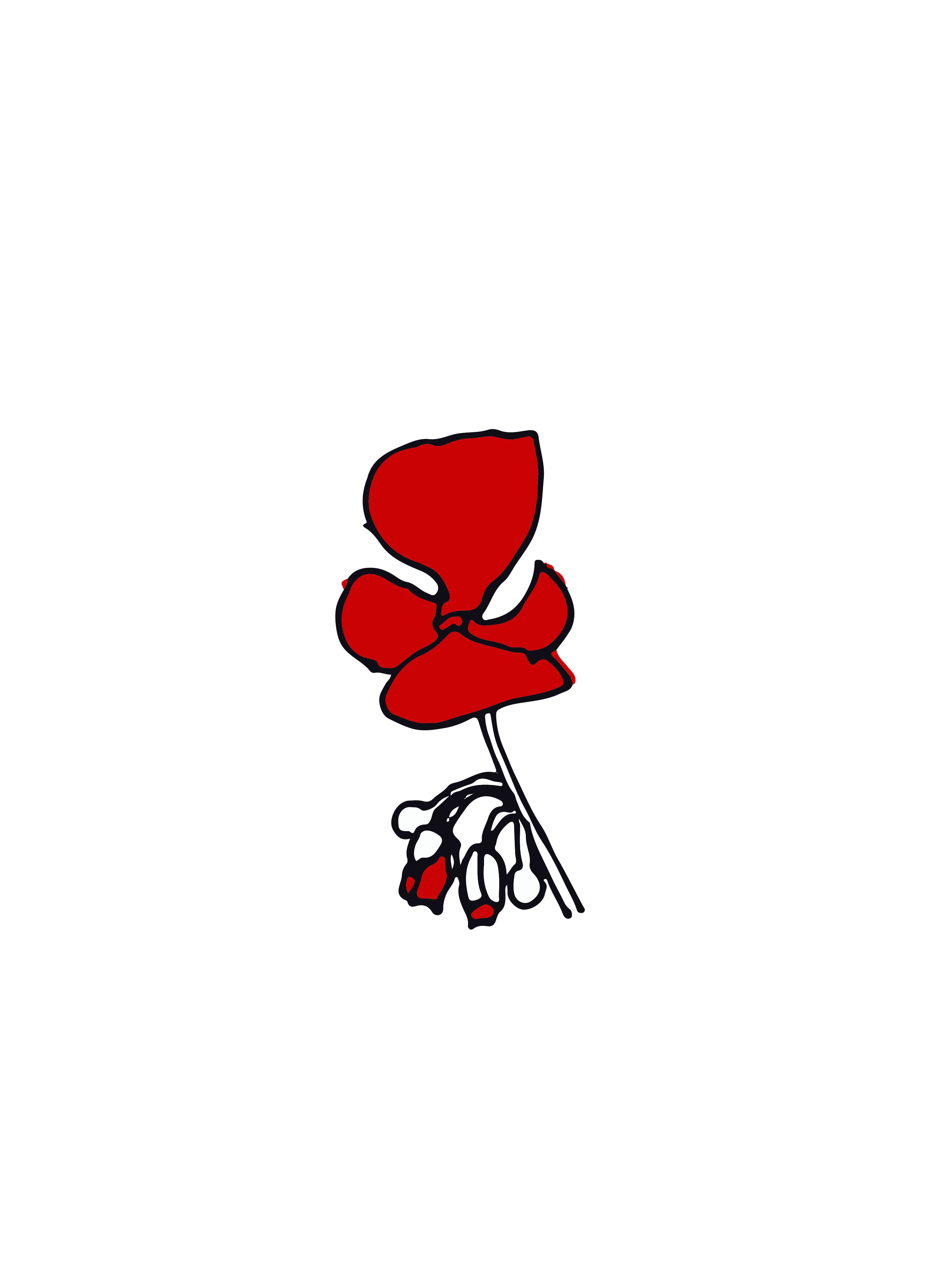
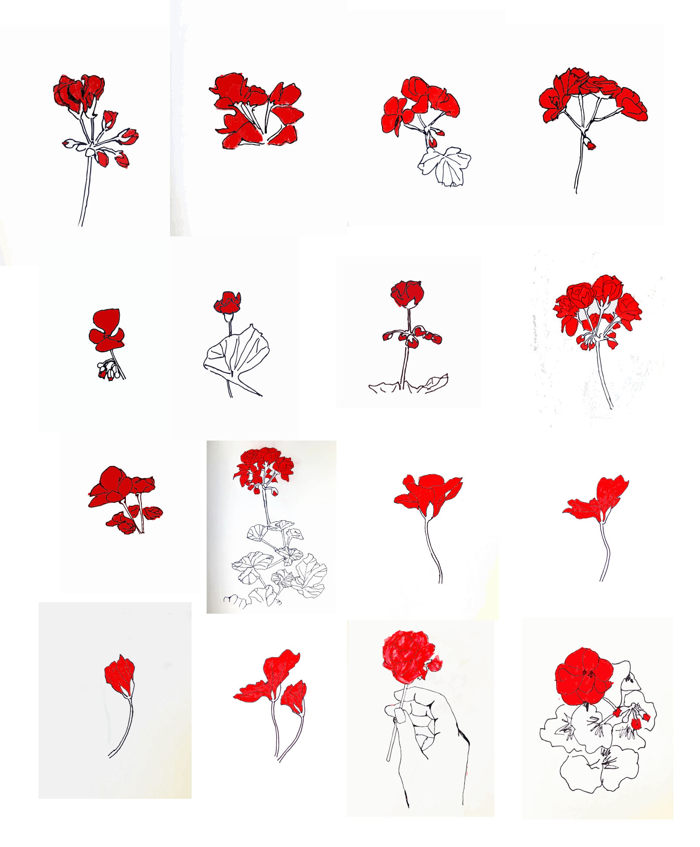
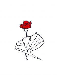
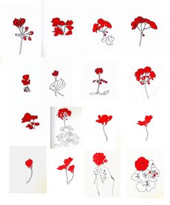
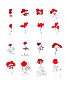
As the first project I chose to visually depict the red flowers on the window boxes of Parisian buildings. I was inspired by my spontaneous walk down Avenue Montaigne, where I was confronted with a plethora of flower-box setups with red flowers. I created a sequential piece, enlivening the flower in a visual sense.


Highlight 2
Retrofuturism: Futuristic Burial Structures
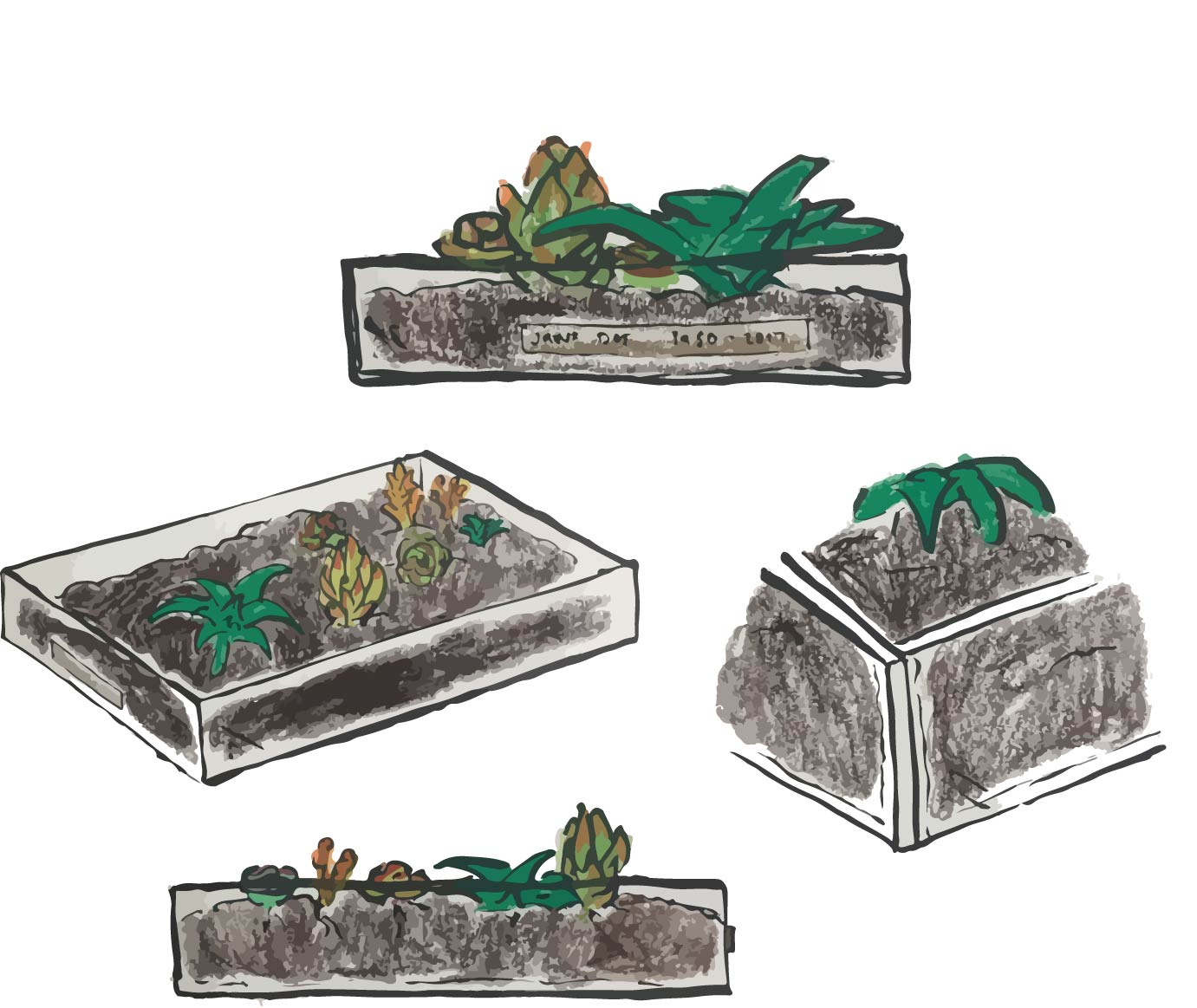
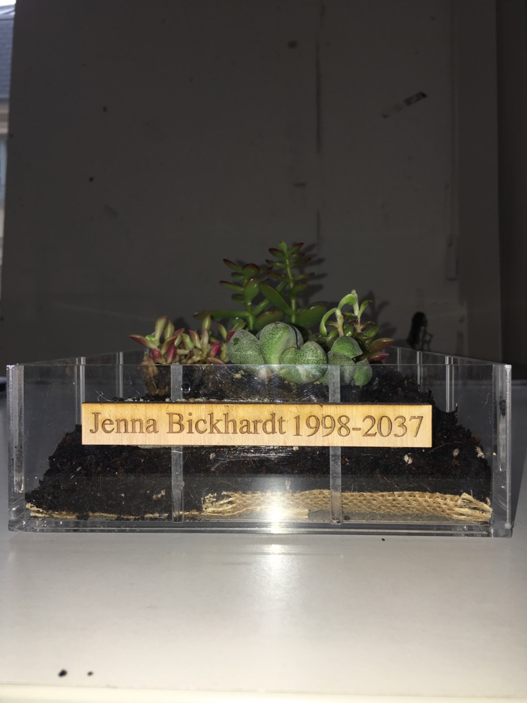
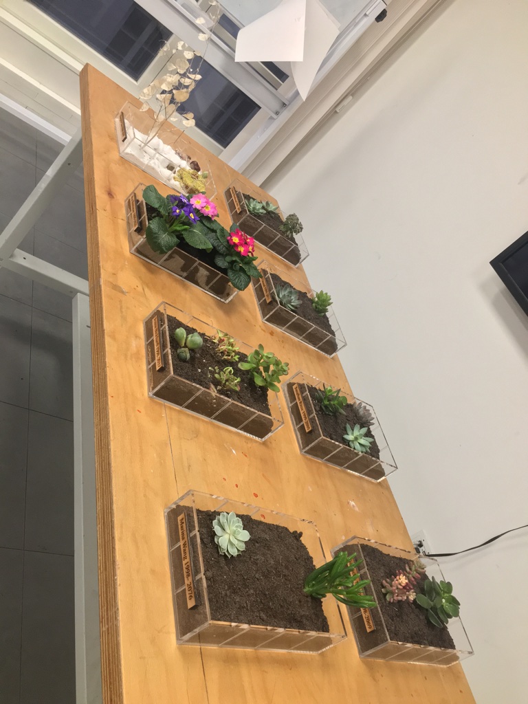
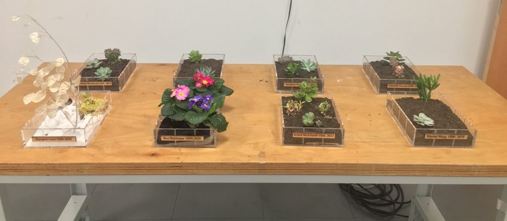
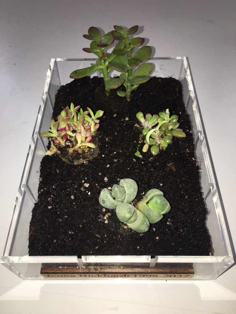
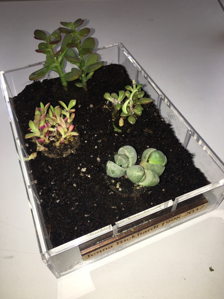
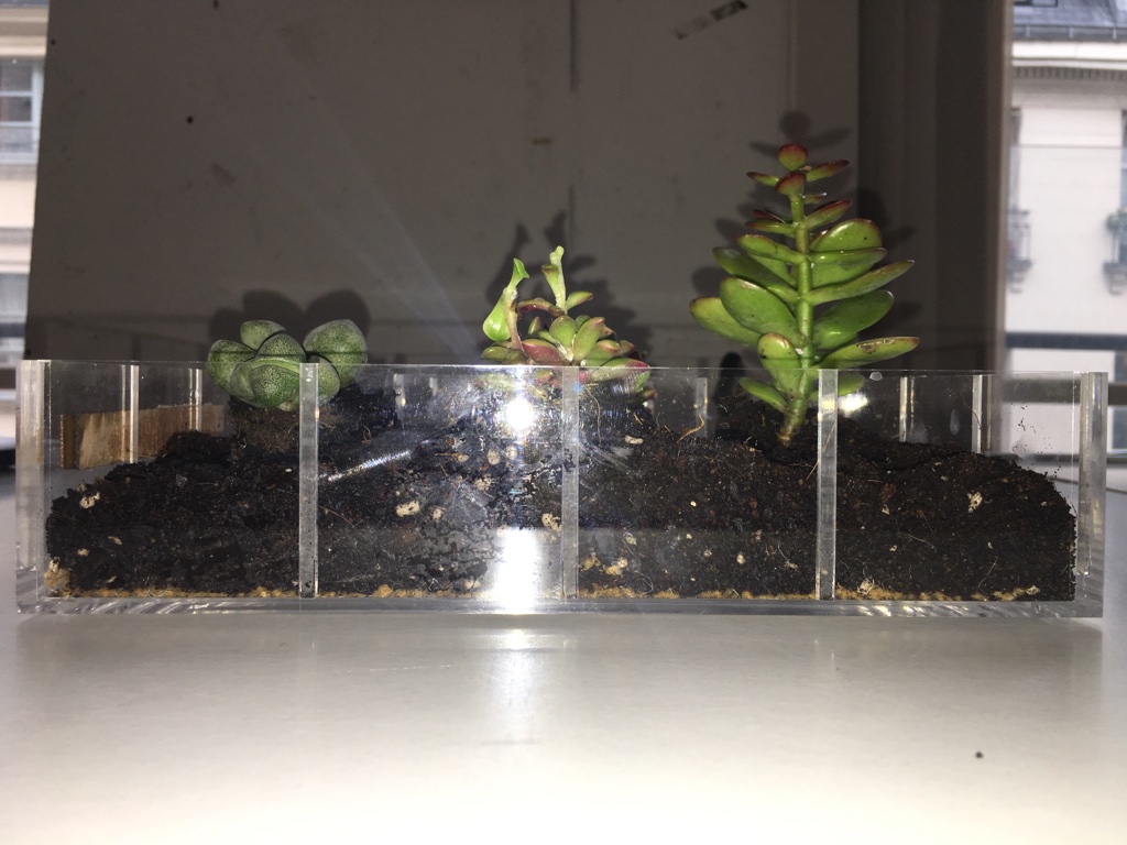
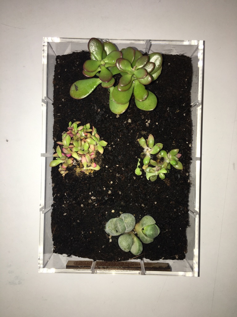
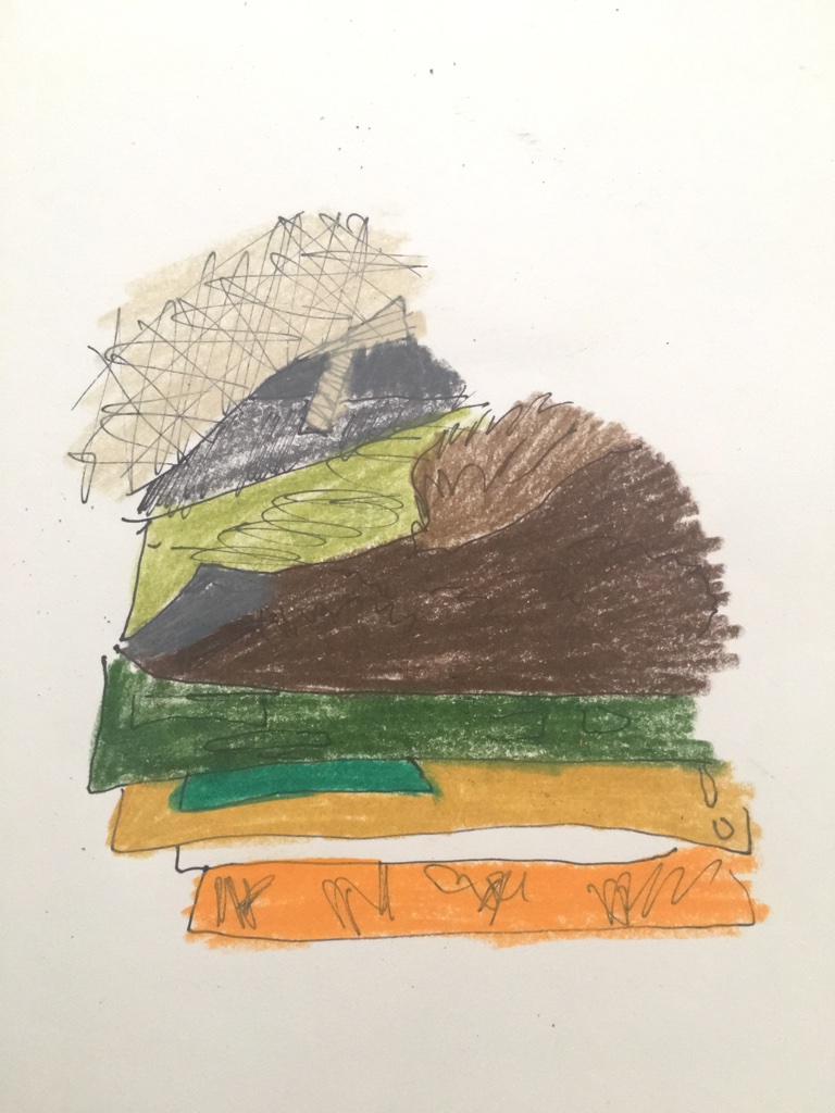
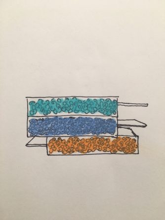
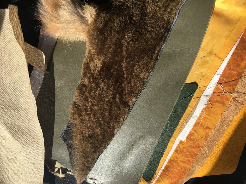
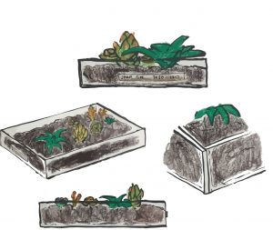
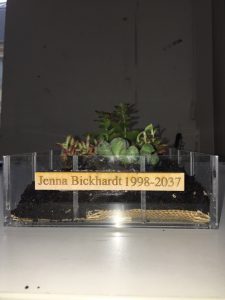
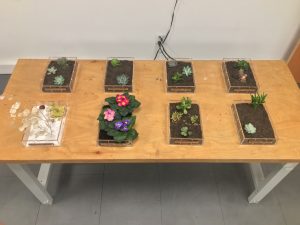
For the first group project, upon our visit to cemetery Pere Lachaise, it became clear that traditional burial methods are wasteful in land, space, and materials. Our initiative was to find an architectural, more eco-friendly design, alternative method to burial sites. We created a set of eight prototypes, for a test layout, consisting of acrylic boxes, burlap fabric, soil, succulents, and wood plating. Hypothetically, the dead person’s ashes would be planted inside these garden boxes, and they could be arranged in either a vertical garden setup or a horizontal landscape area.
Futuristic Burial Structures Market Pitch-uj70vm
Highlight 3
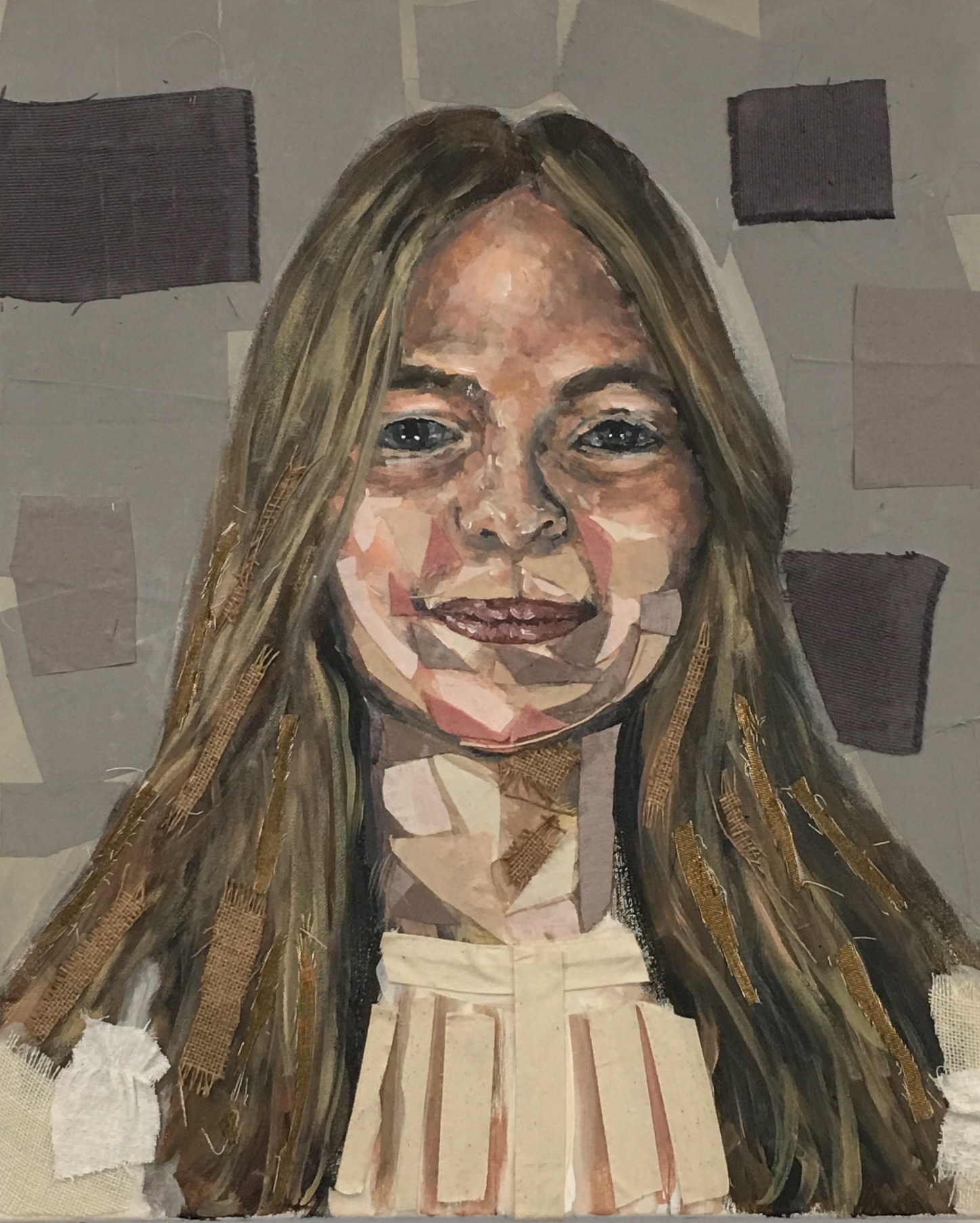
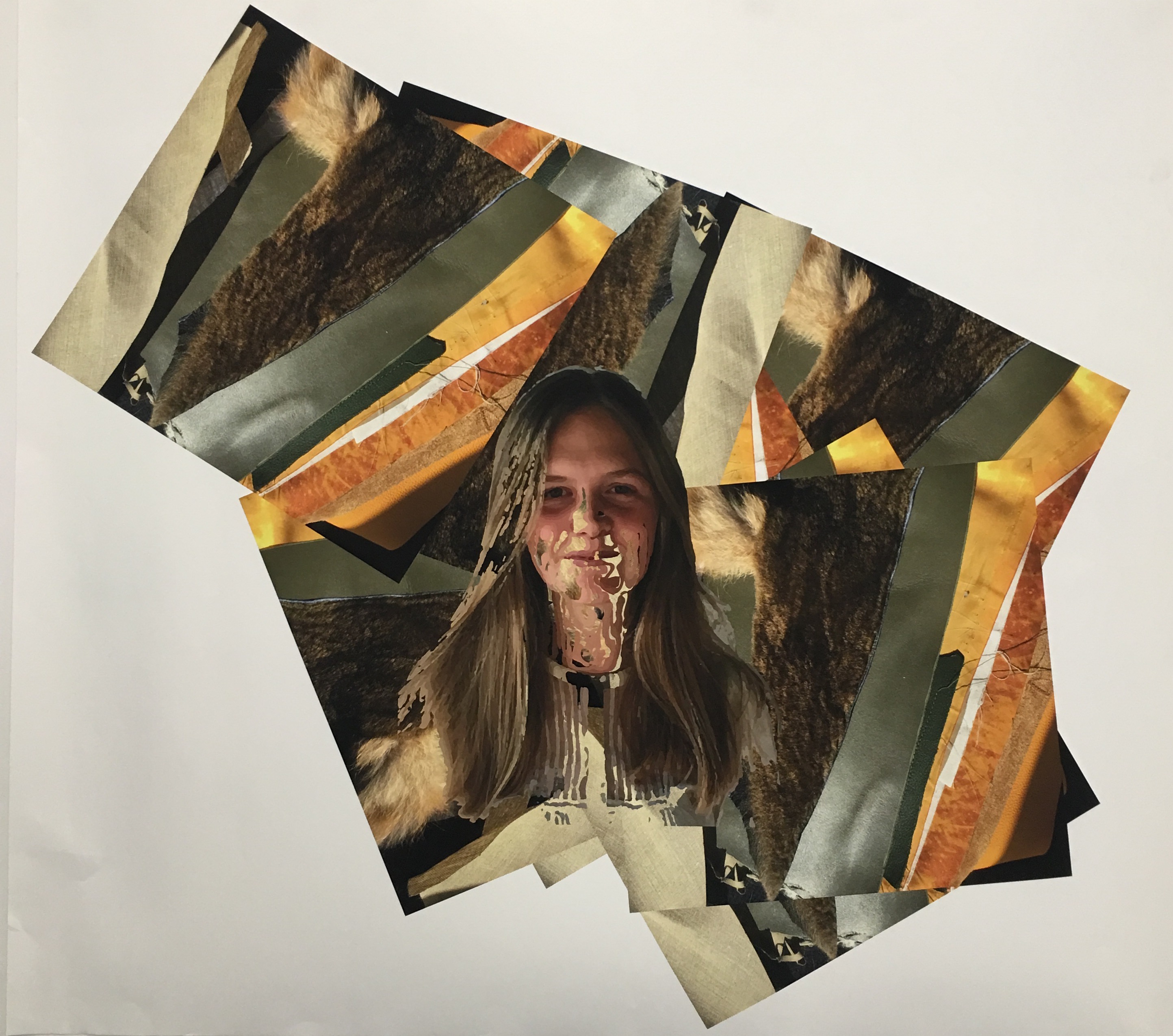
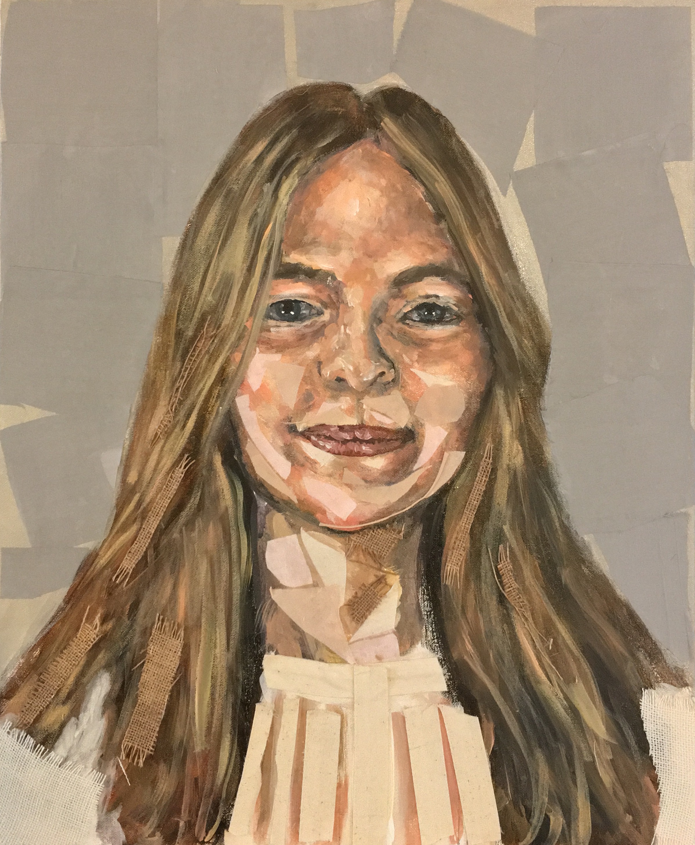
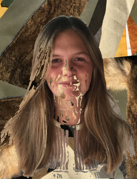
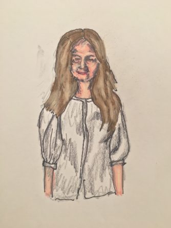
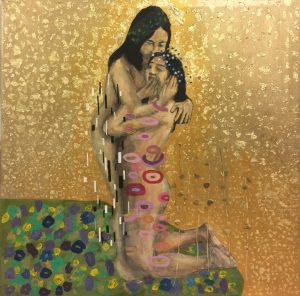
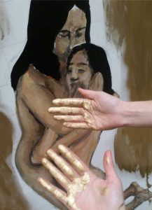
Remake: Remake of Gustav Klimt’s The Kiss
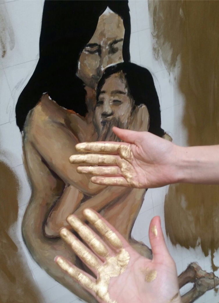
Making a remake of Gustav Klimt proved to be a challenge. Remake was a difficult term to define conceptually. Once we found the direction we wanted to go in, the group proved to be highly cooperative and collaborative. We decided to remake The Kiss representing an idealized relationship more relevant to this time, the relationship one has with himself. We all worked together, each bringing our individual assets, to create a masterpiece of our own, one that still resembles Klimt’s. The process was very time-consuming, with many different adhesive techniques and collaging parts, and I could have never completed it on my own. Moving it as well from Boulevard Haussmann, down Rue Faubourg Saint Honore, all the way to Parsons Paris was an arduous process. It is that fact which represents how collaborative this project truly was, and how successful the piece turned out to be.
The most interesting component of Studio was the environment and aesthetic of the class. The creative process, production, and critiques prevalent in the course closely mimicked that of my high school AP Studio class. I learned, yet even more, that I enjoy and thrive in a Studio occupation environment. I also learned what role I play in a group work context, whether it be a leader in a group of less hard-working students, or just a hard-worker in a group of equally motivated students. This course closely bridged with seminar, and I would like to further explore a personal direction and articulation in a studio position.