The Guggenheim Book

Guggenheimbookfinal

A project completed in two phases, with the first phase producing a typographical book and the second phase using its design with an elaborated form, this book serves as a narrative tour to Frank Lloyd Wright’s iconic museum architecture.  The text comes from letters the architect wrote to the committee during the museum’s initial construction, while the graphics take direct inspiration from visual components of the building, and the design correlates with the dynamic navigation of the rotunda spiral. For example, the first page of the book takes place in the ascending elevator buttons, where the text narrates, “I can see a tall building…” From there the reader descends the spiral structure visually as they would in the museum, noting design forms replicated both inside and outside of the Guggenheim.  The board book is placed inside a wooden ring, alluding to the upper ring of the museum building.

Morning

Morningfinal copy

A graphic book consisting of five spreads tells the story of a morning routine from the viewpoint of a young child.  The images focus on form and color recognition, and serve as a narrative puzzle for an interactive reader.  The first spread shows a window, and the child’s bedroom door, a child’s first perceptions upon waking up in the morning.  In the second spread the reader is then shown the table, with the child’s breakfast bowl atop in the first page, and a zoomed-in view of the contents in the second.  The third and fourth spreads show both the mother and father figures with a focus on their characteristics.  And the story concludes with the dog, the first thing below or at our eye level.  The cover of the book is a wrap-around graphic of its title Morning.  Like the rest of the graphic narrative, the typography of the title is not easily legible, and requires further interaction to reveal its full form.


Memories of Paris

My intention for this project was to create an installation consisting of mobile characters and a wall decal background to immerse the viewer in visual nostalgia, that of my sketches and memories of Paris.  The materials used were vinyl, acrylic, fishing line, and foam board mounting.  The ideal setting for the installation is a white wall gallery space, which provides a neutralized background optimizing the transparency of its pieces.  As well, the mounting may be directly into the ceiling, and the piece should be slightly above eye level of the viewer, forcing them to interact with it imaginatively in the action of looking up.

This was a prototype of the ideal scenario for the installation, in which it would have the wall decals perpendicular in corner space, and the mobile characters would hang at different levels and depths.

These are initial sketches articulating the planned layout, in two variations, highlighting the ability to adapt the piece to its space considering the multiplicity of its parts.

Tactile Tool Animals

The intention of the project Tactile Tools Animals was to approach the pedagogy of animal recognition from an alternative method.  While we are often fed information which is phonetic or color-based for animal identification (for example, A is for Alligator, or a Bear is Black), the tactile qualities of an animals skin is hardly emphasized as an approach.  To do so, I created a set of 14 finger puppets, each composed of a mimicking fur or skin to its corresponding animal.  The puppets are meant to be stored/ displayed in their box, made of acrylic with laser cut engraved text identifying not only the box but the furs and skins on its interior.  With each name sits a sample swatch of the fabric which the name of the animal it matches to.  What was most interesting about the construction process within the pieces was their ability to take their own forms and personalities.  For example, the feathered fabric of the pheasant looks quite cock-like with a sort of pride from the head feathers which defy gravity.

Here are some photos documenting process and sketches including inspiration from the Jim Henson exhibition at the Museum of moving image.


POTE

Hi, my name is Pote.  As the french significance of the term “pote” denotes, I am a friendly companion.  I enjoy grabbing coffee, rolling around in the streets, and even adventuring the underground as long as I am with you.  As a companion I will never leave you side, and my organic form and bright color offer the ultimate source of childish happiness and comfort.  I am light enough to hug and hold, and my four wheel feet keep me mobile to follow you wherever life might take us.  If the city streets ever get crazy my large dimensions (5′ x 4′) can be used to protect you.  And even though there will be many children who want to touch me and squeeze me my two sticker eyes are only focused on you.

For this project my intention was to create a character of rather ambiguous form who would serve as a source of comfort and happiness to its user.  From personal experience the urban jungle is often overwhelming, and in a way of mocking its hustle and bustle I wanted to make something that was completely defunct of any function except friendliness.  The choice of color and form immediately recall cuteness and comfort, further exhibited through tactile experience of plush felt and a soft balloon/ ball body.  The importance of the character’s mobility is to allow the artist to put it in the city context.  The assembly of Pote experienced many complications, as process-documented.


These are 15 initial brainstorming sketches for the character idea.


Pop-up Block; Upper West Side Narrative

My intention was to capture a series of narrative scenes depicting my perceived experience of living in my upper west side neighborhood.  From a very personal perspective, city dwelling is most enjoyable within the radius of my block, West 80th and the surrounding blocks around on the neighboring Columbus and Amsterdam avenues.  Particular things to note about the area include the tight-knit community of young families who are familiar with each other, dogs who have better hair than I, and the plethora of eateries and activities.

When assessing the prompt to create a pop-up book I attributed the term book to a subjective narrative quality, and wanted to create an object which could be read and interacted with whether than paper pages.  To do so I assessed the cube form as a six-sided surface, in which each surface was a page.  Keeping with the rule of threes I determined three separate narratives which would take place in pairs, in which each individual scene, or side of the cube, would consist of three characters.

Within the design of the final surfaces, the three narratives are visually paired by engraving art.  In breakdown; inhabitants including dogs and people are both presented on crosswalk patterns; eateries and activities appear to be on block corners from an aerial square border, and urban architecture consisting of the brownstone buildings and planter boxes and trees line up amongst sidewalks.  Each figure illustration is printed on vinyl cut sticker paper and stuck on the 3/16 acrylic which was the main material for the project.

Marie Antoinette was a Martyr; a series of masks serving as visual explorations of the identity and multi-faceted life of Marie Antoinette

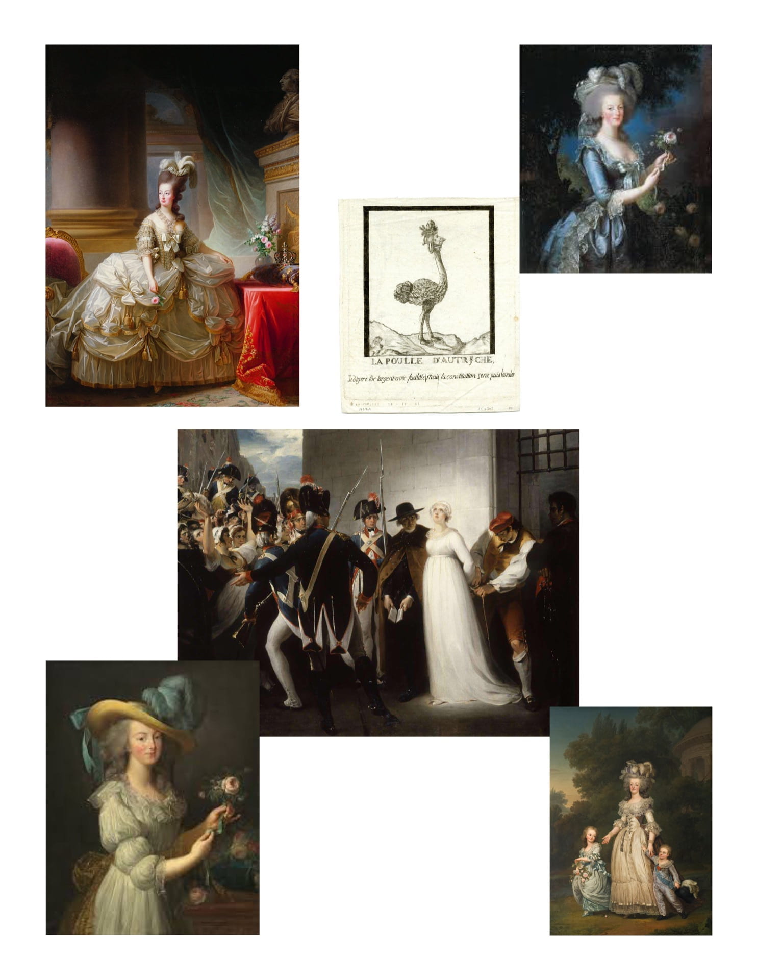
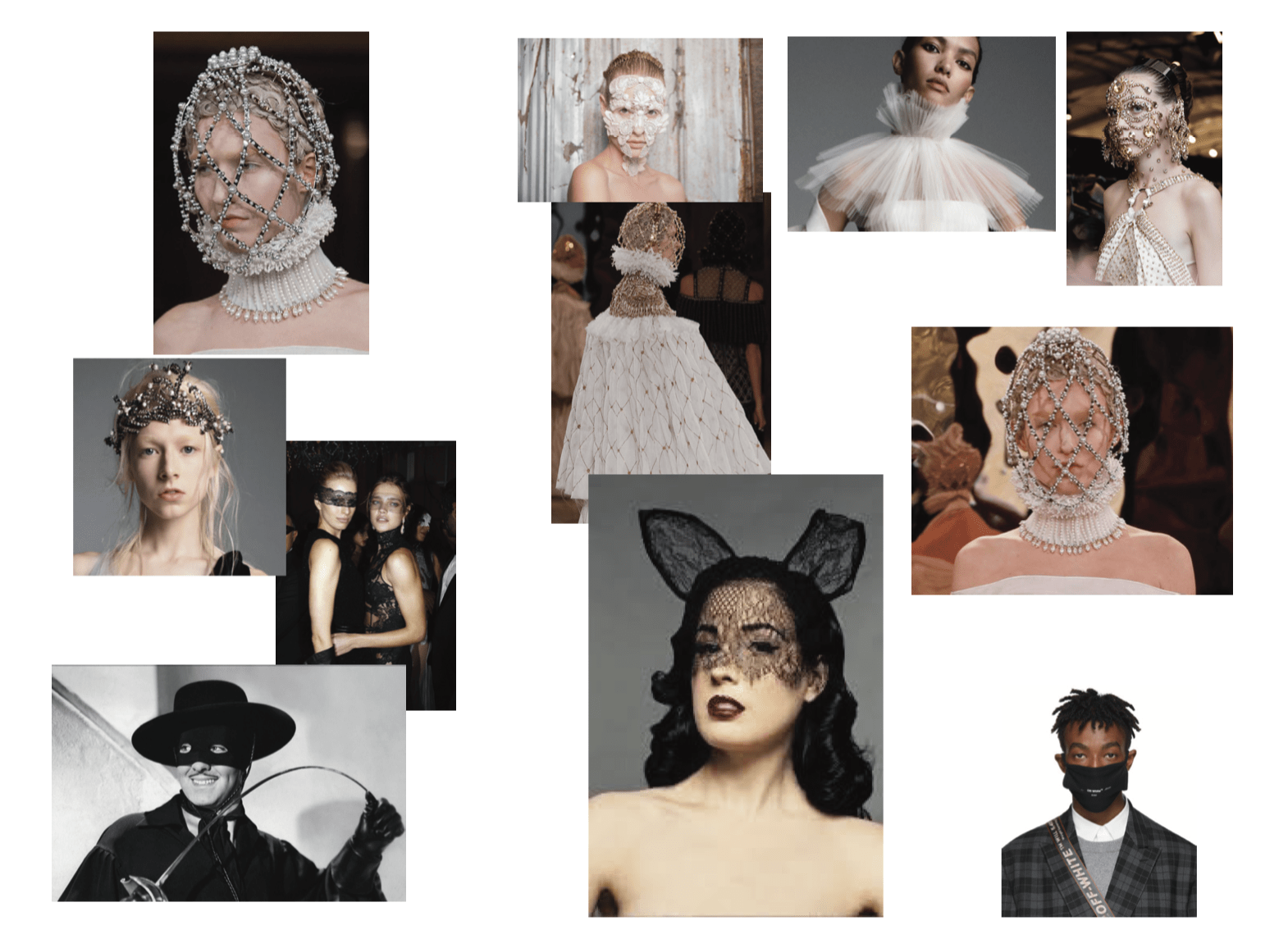
Marie Antoinette is one of the most misunderstood historical figures canonized by society today.  Whether it be moods of misogyny or a distaste for bourgeois class, the Dauphine taken down by the guillotine is never properly credited for the struggle which was her own conflicted existence.  It is for these reasons that when prompted with masks aligning with transformation or identity that I was inspired to look towards the once daughter of Austria, Queen of France.  Marie Antoinette wore her own masks to survive French aristocracy, using her visual reception to be both blessed and hurt by the public and personal perceptions of who she was.  From the moment she married Louis XVI and was pressured into immediate conception, to the date of her execution, Marie Antoinette remains one of the most underestimated martyrs of our time, as her fall was long and gradual and her only faith was in fashion.

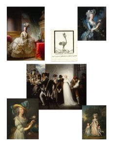
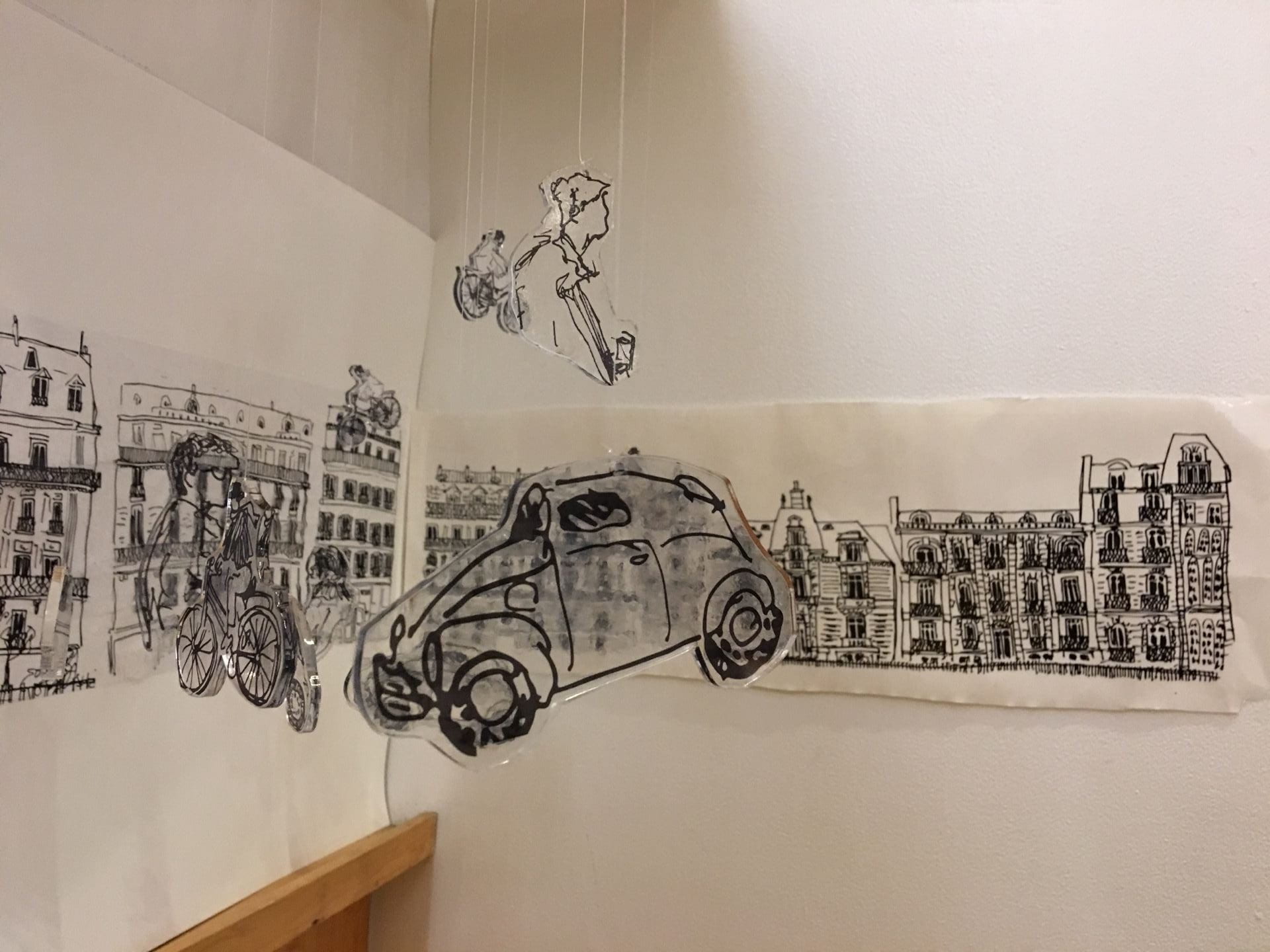
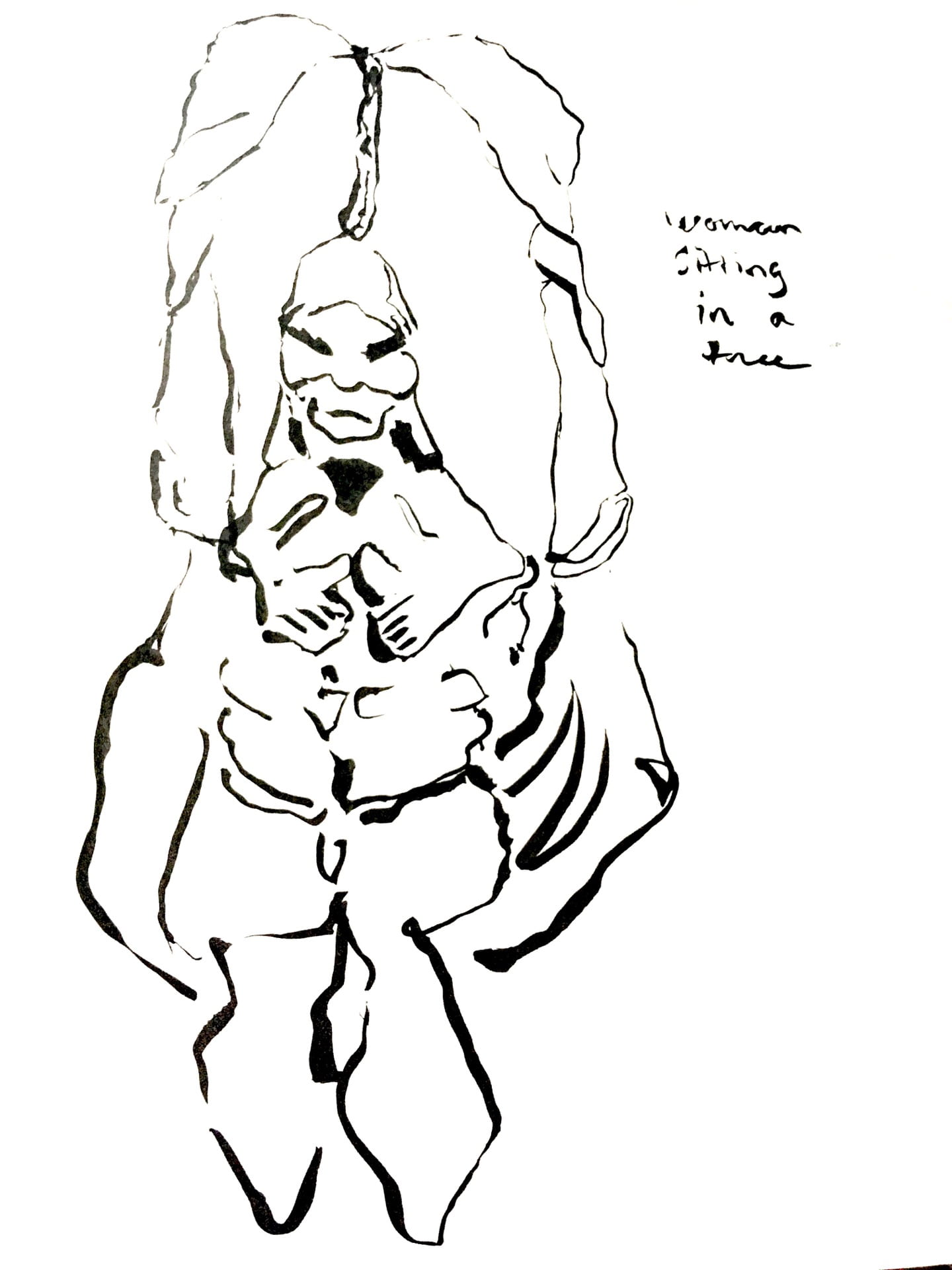
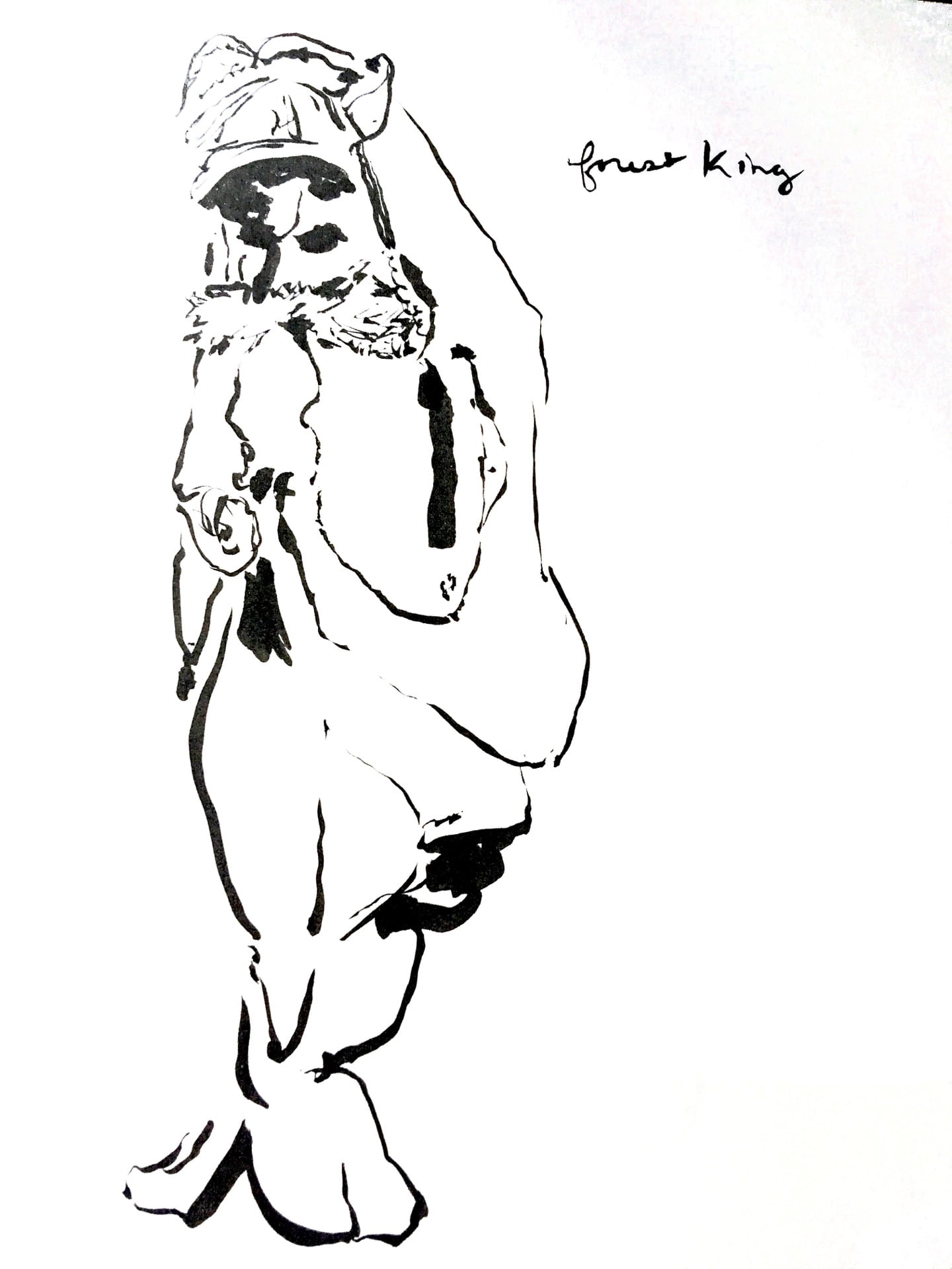
Marie Antoinette, various images; Digital sketch, reflecting initial ideas; Moodboard collage, showing a strong inspiration in fashion aesthetics as well.  These images are what allowed me to choose materials and forms of the masks, denoting what points of Marie Antoinette’s life were to be focused on and which aesthetics were to be followed physically.


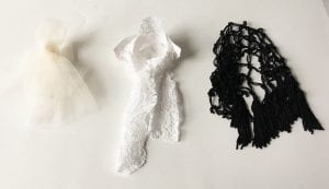
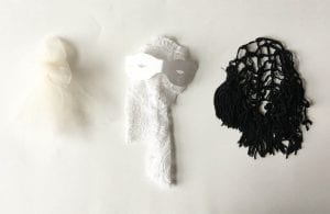
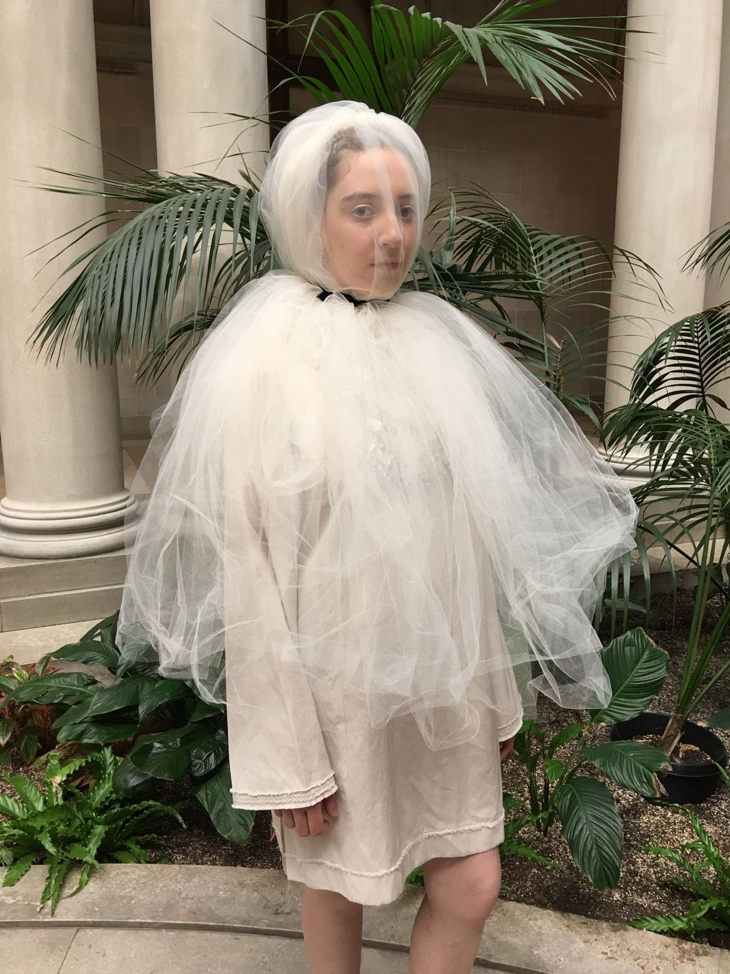
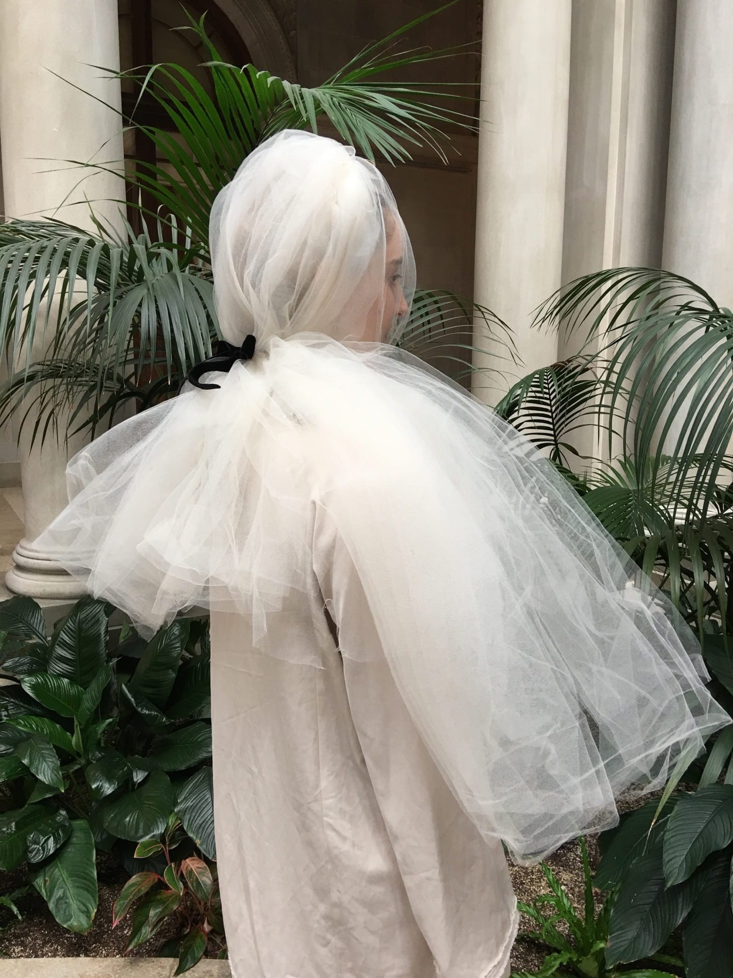
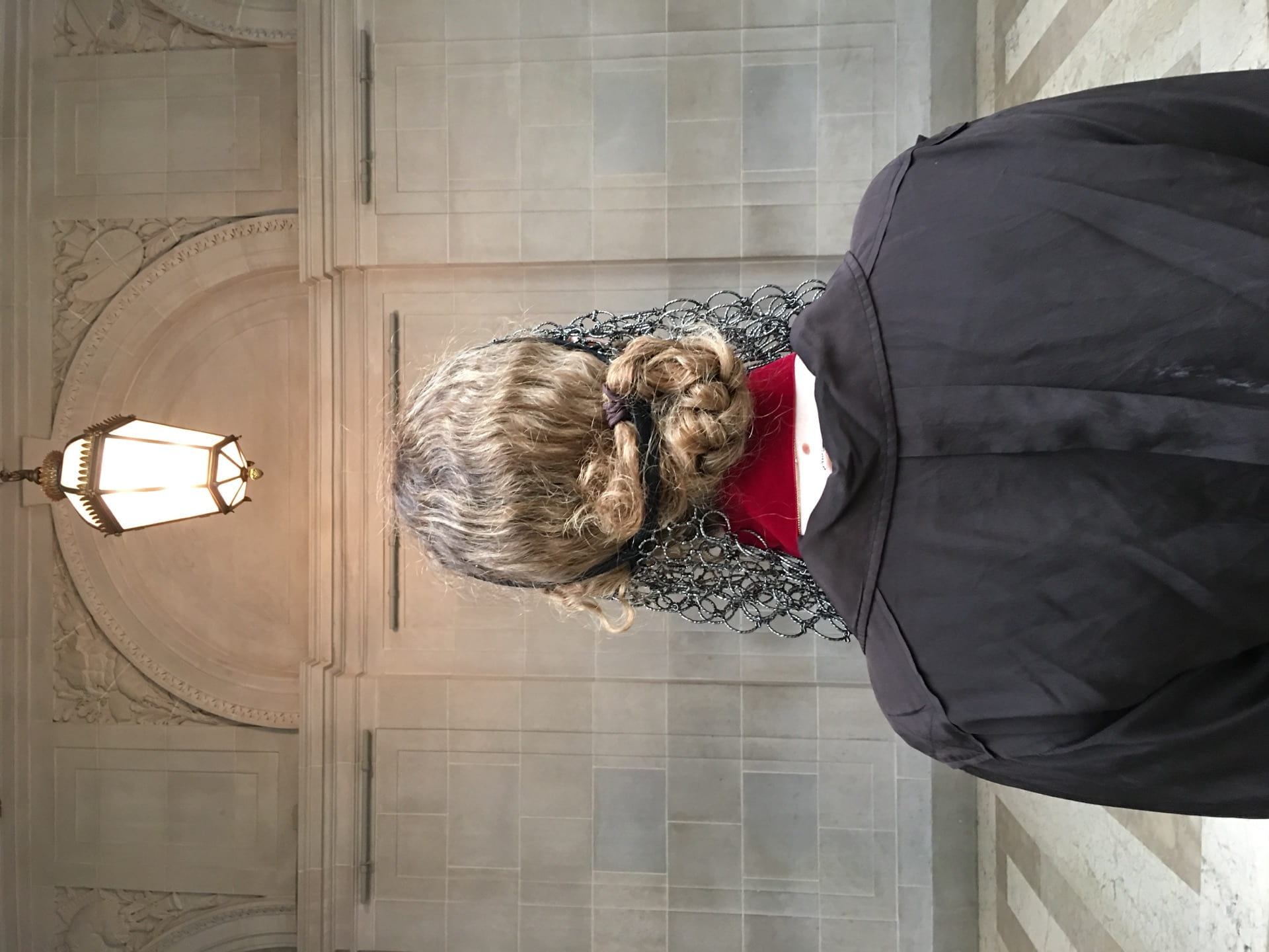
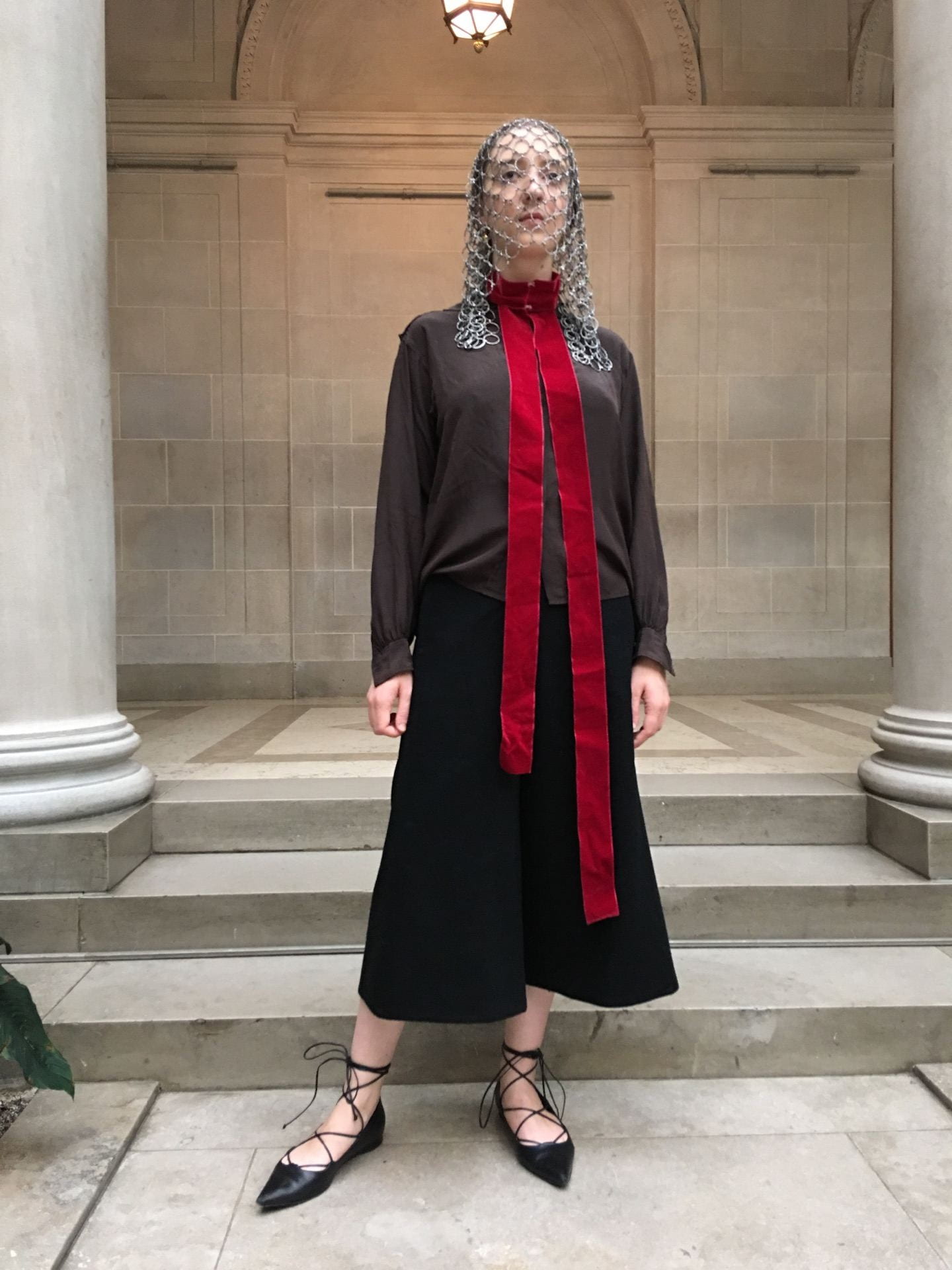
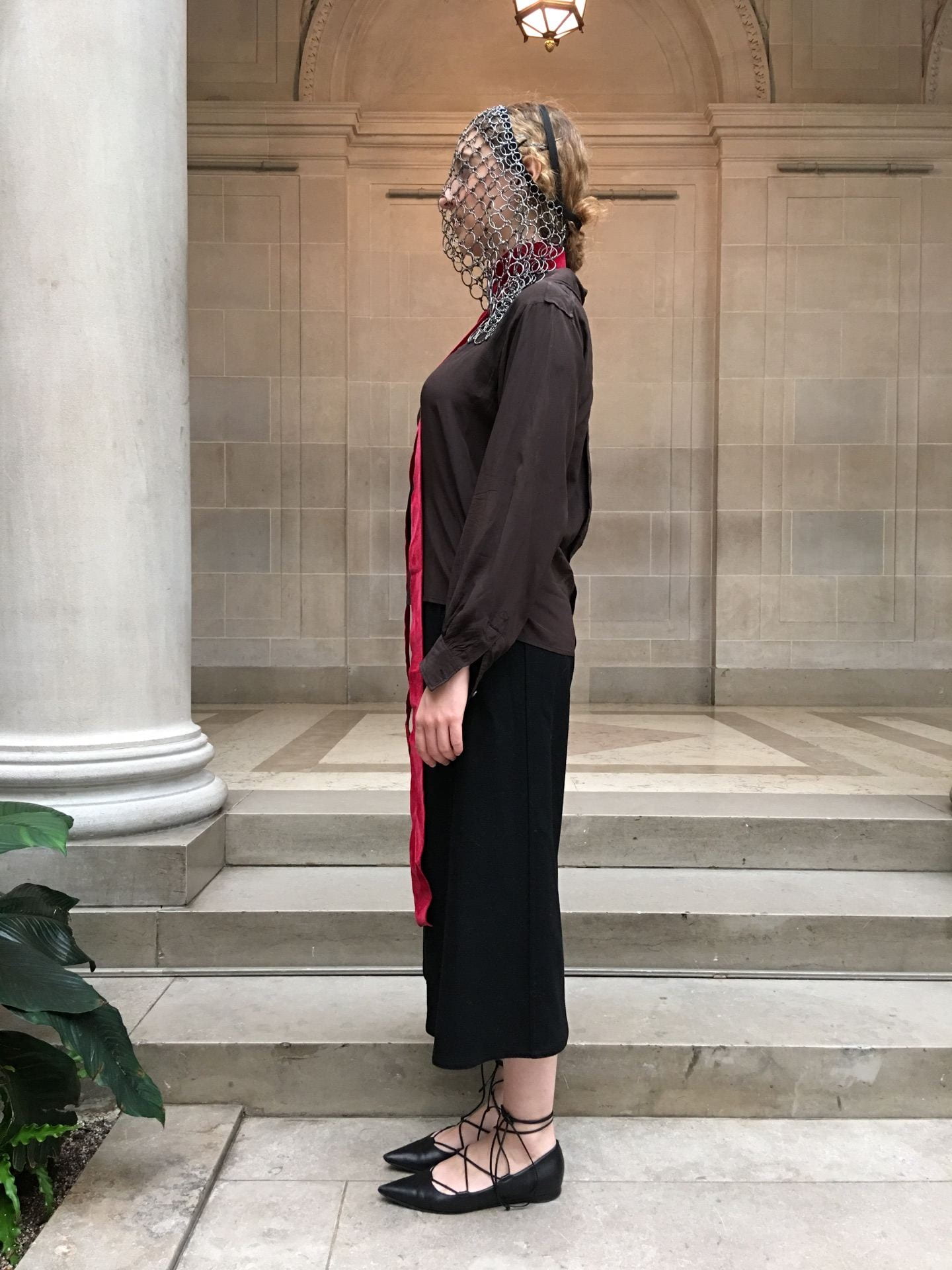
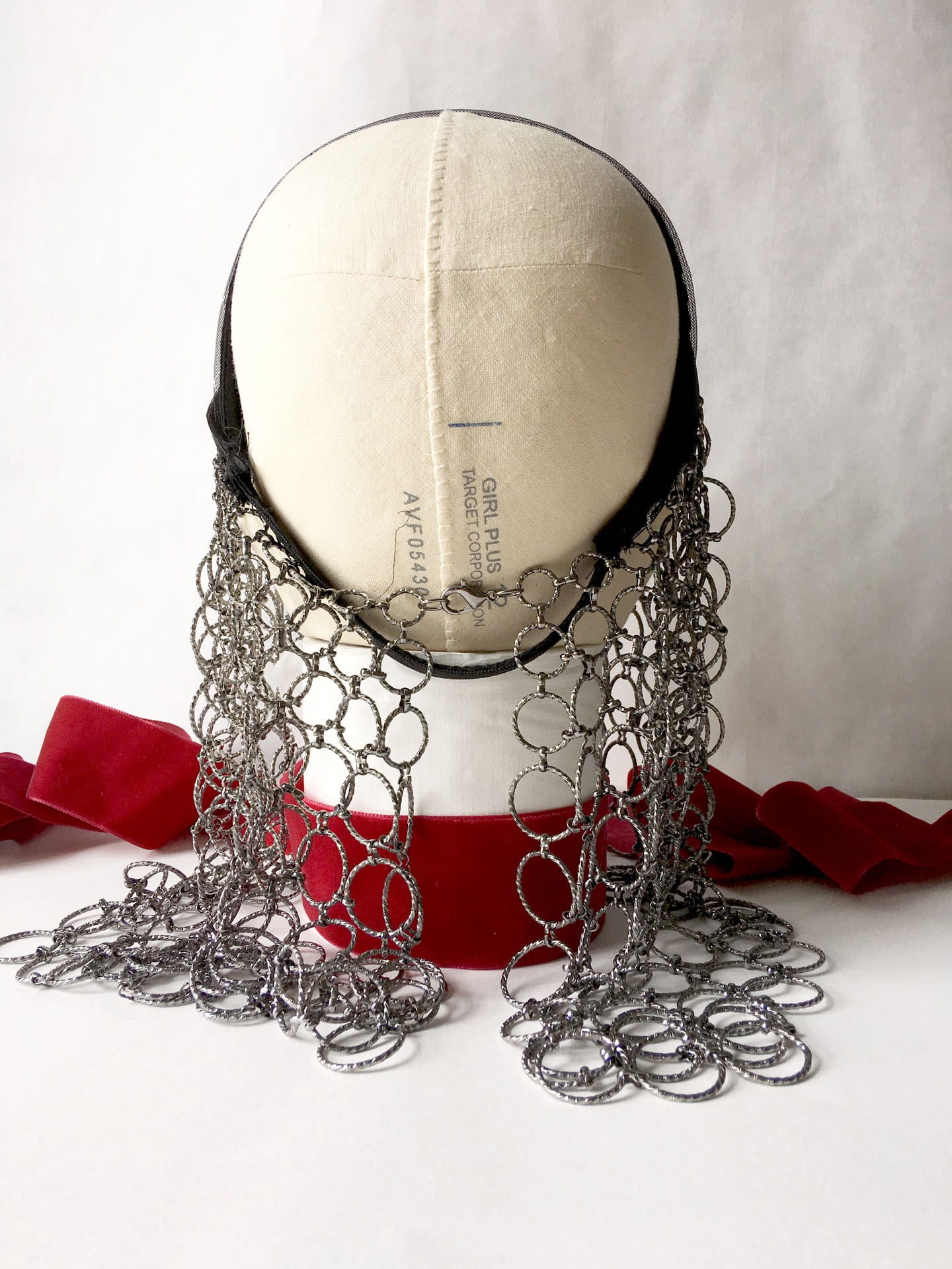
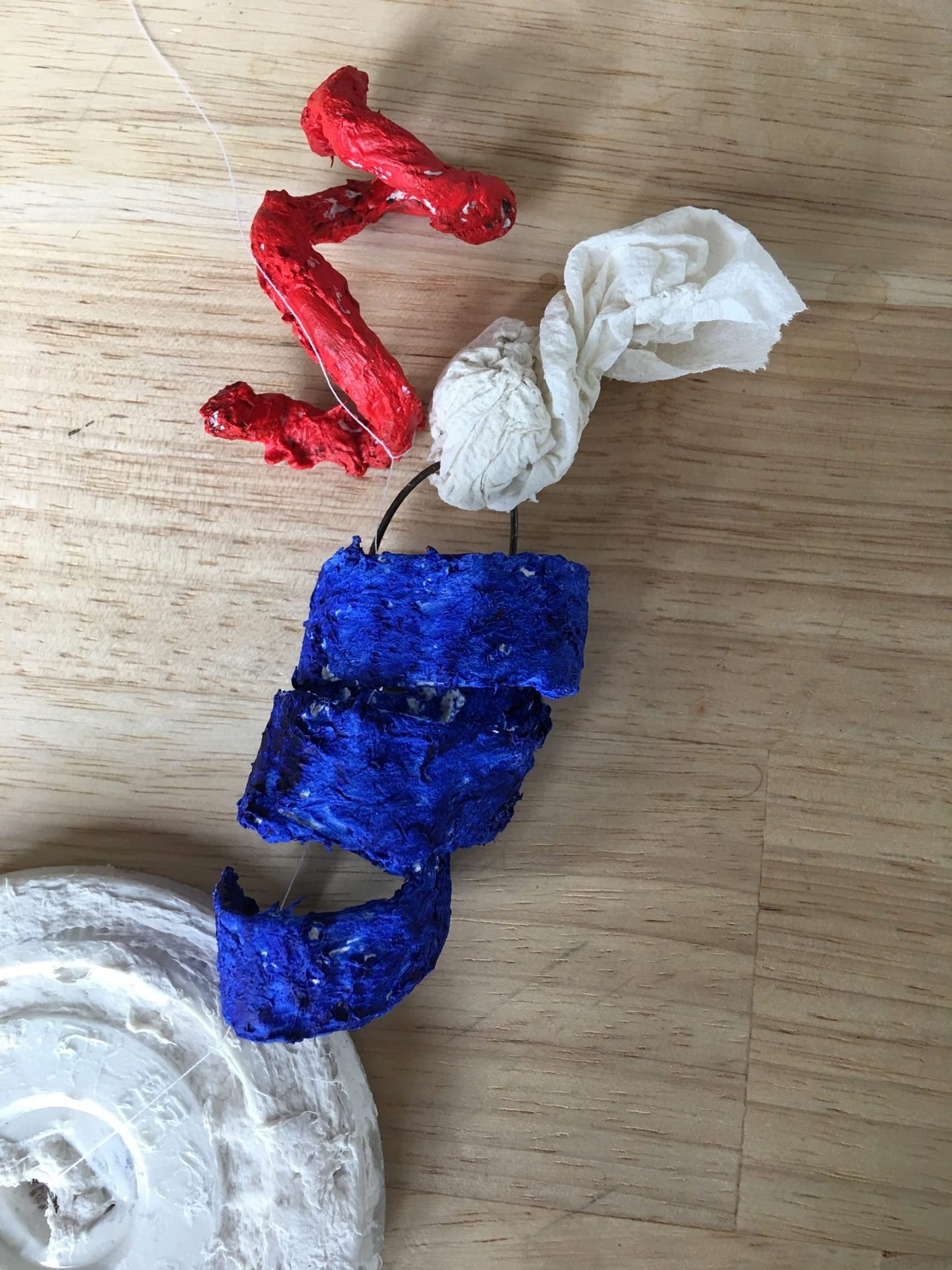
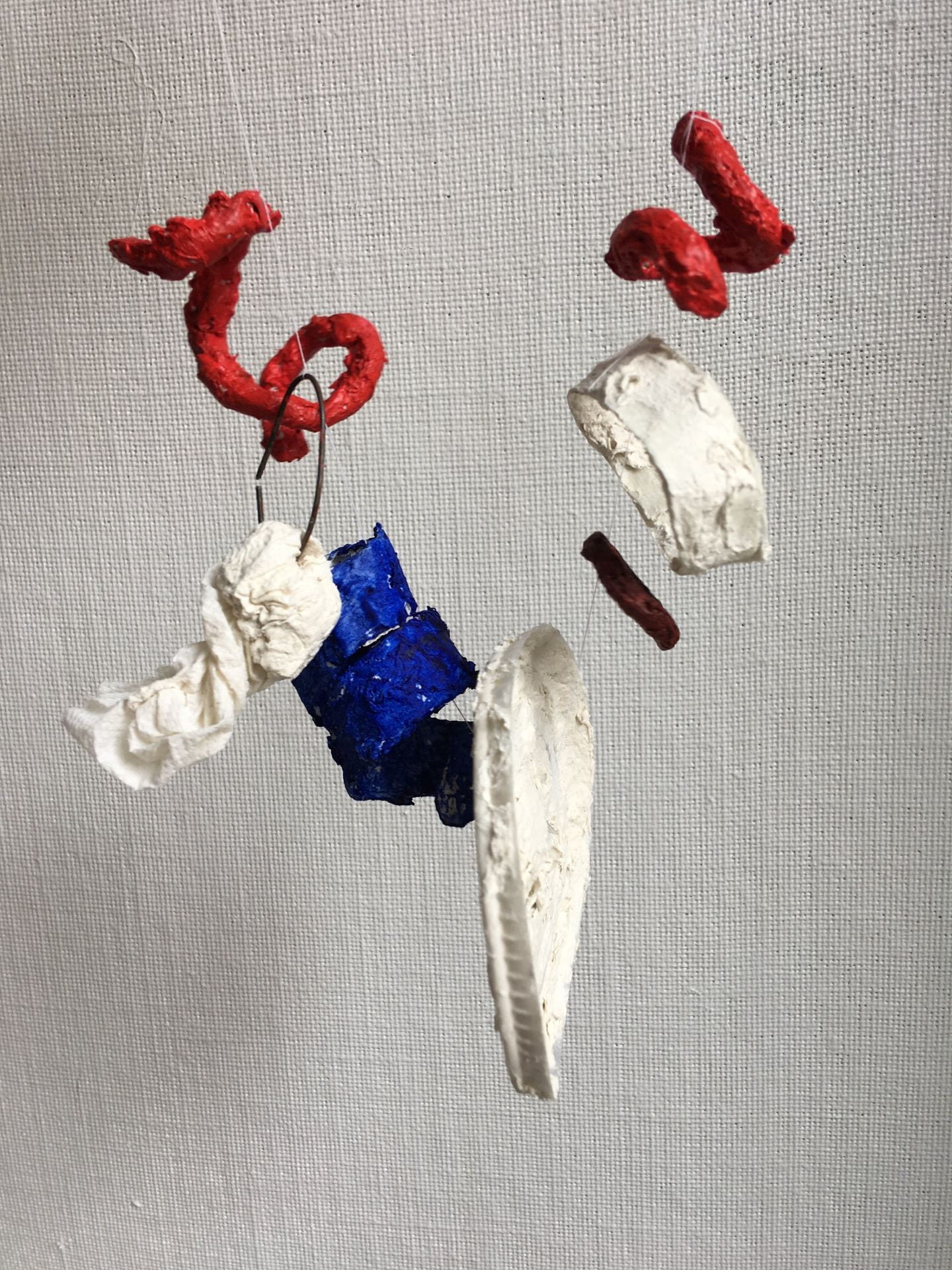
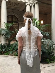
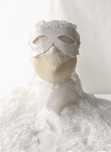
        prototype images, back and front shots

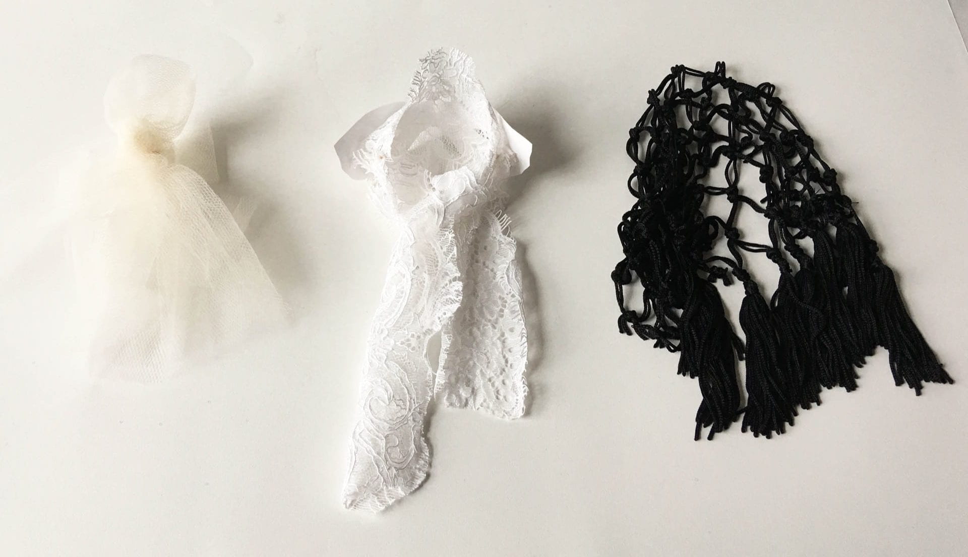
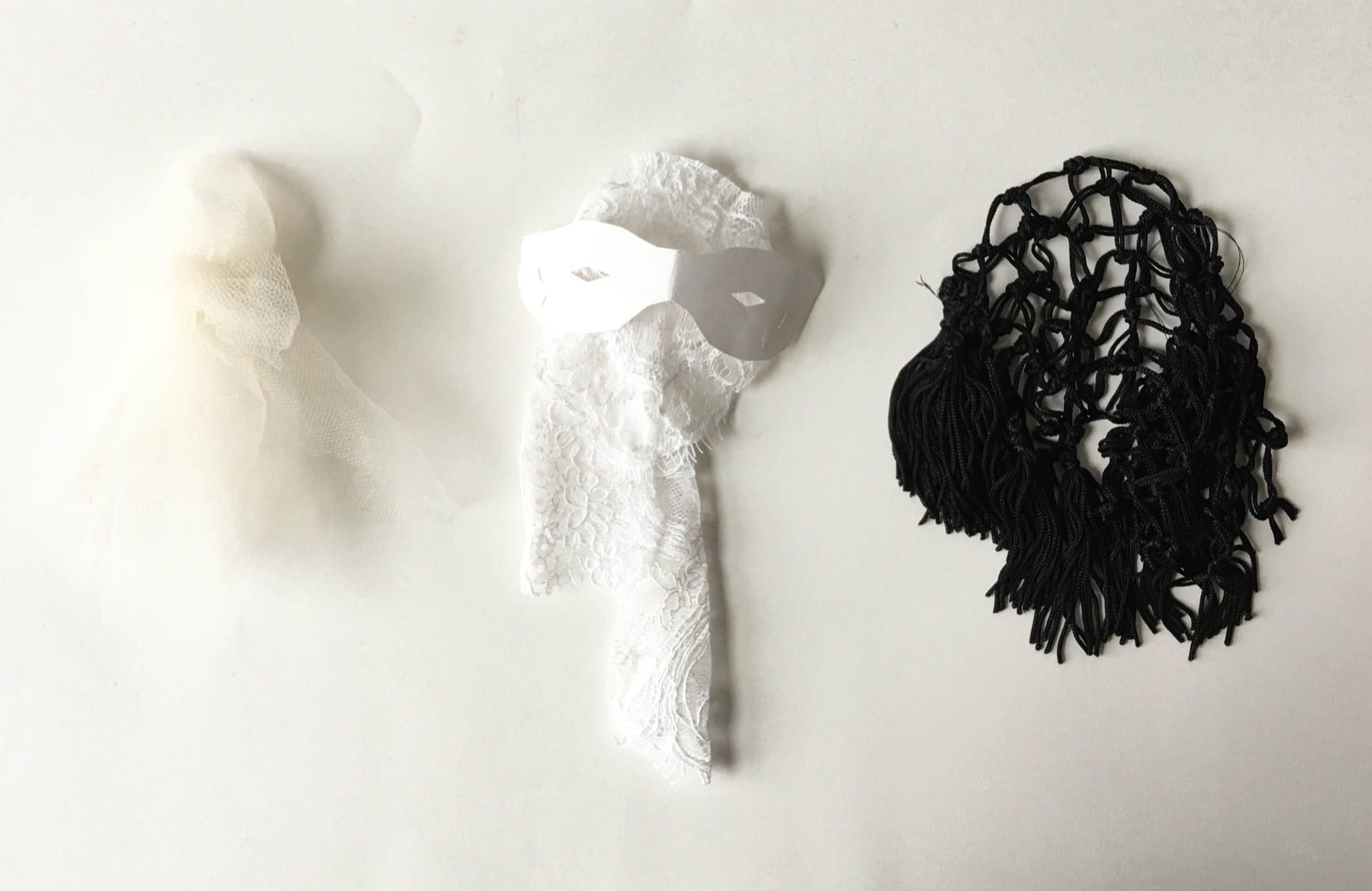
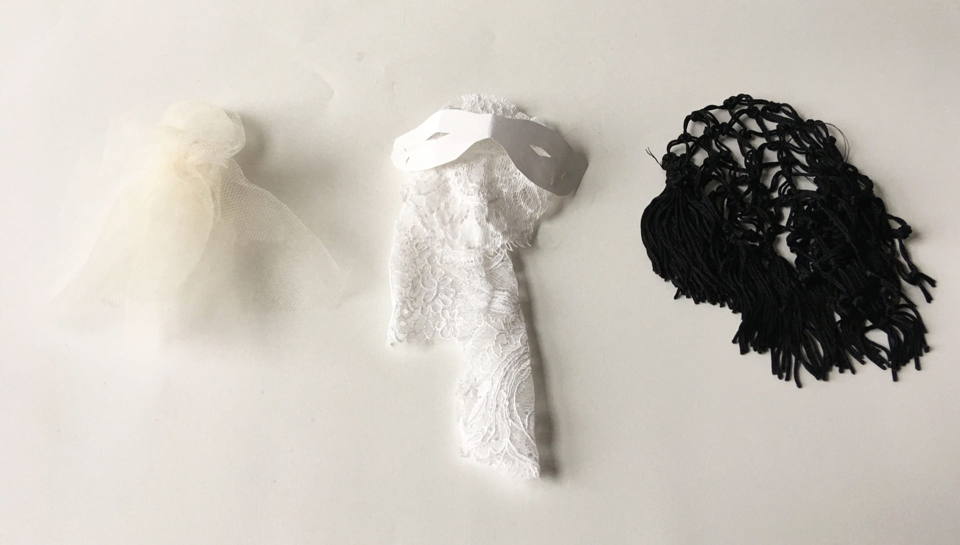
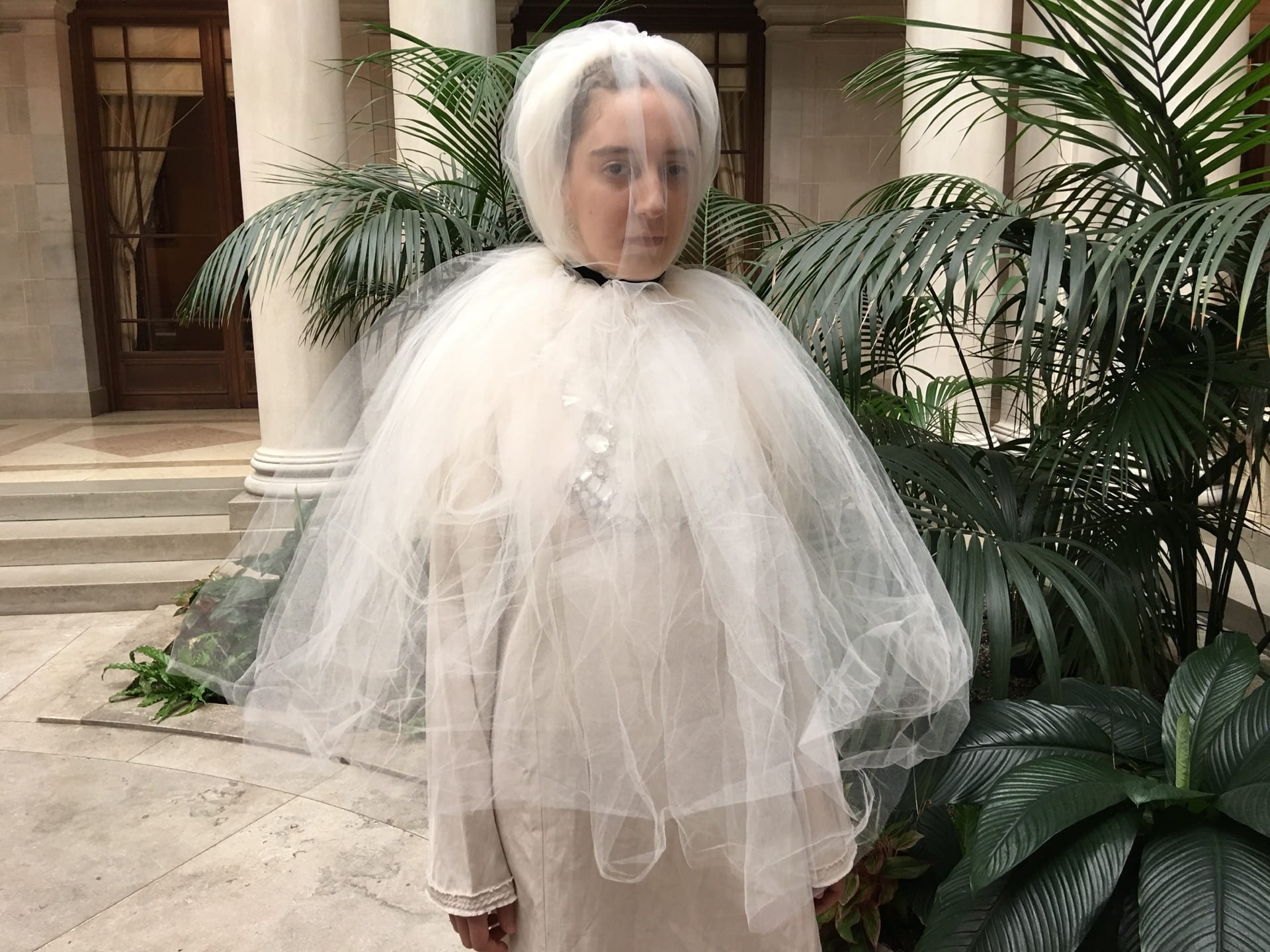
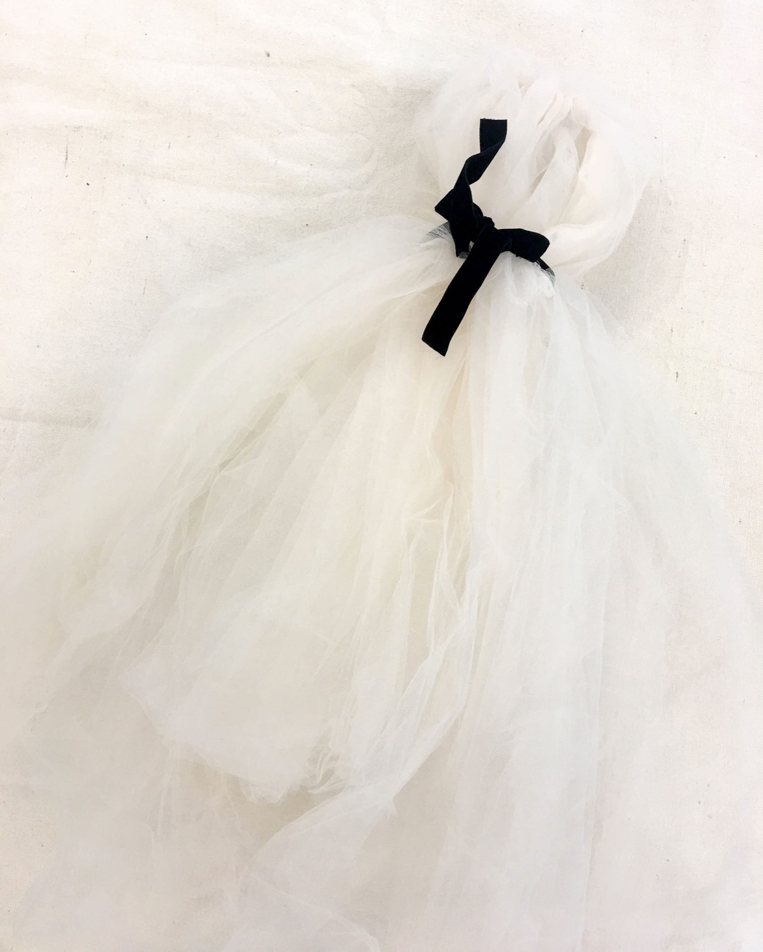
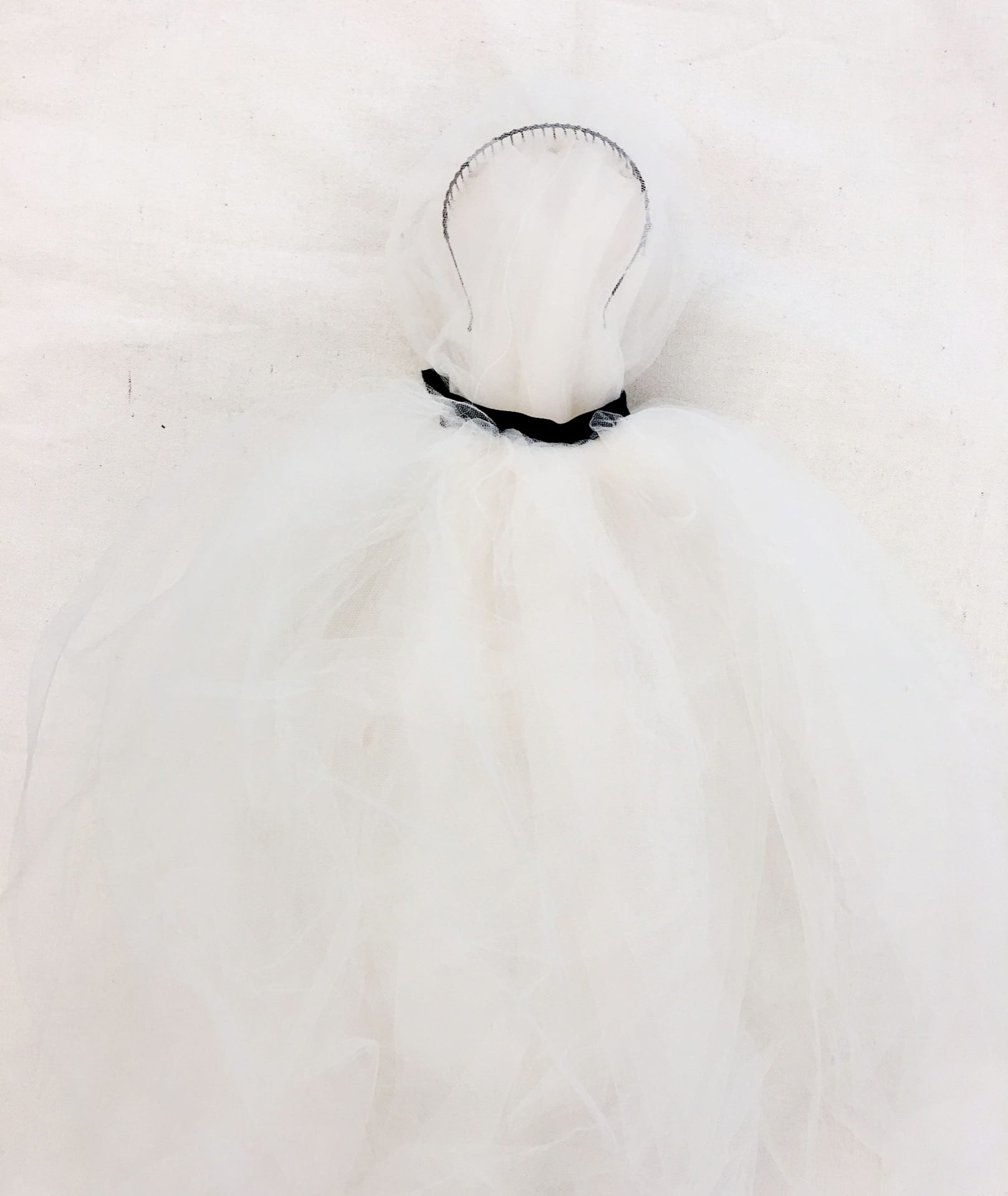
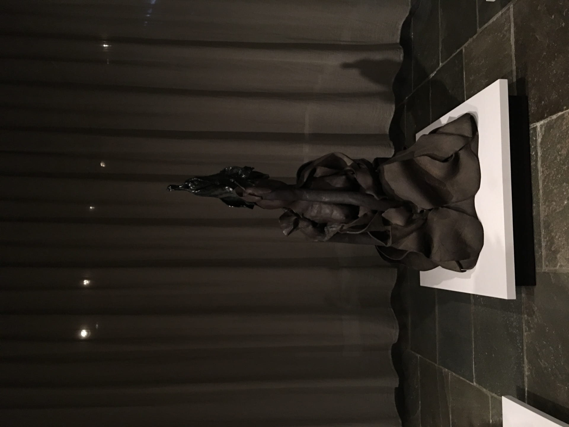
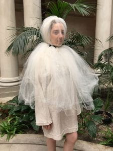
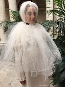
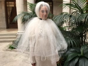
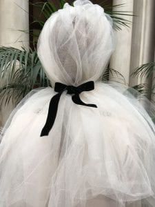
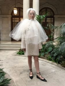
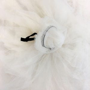
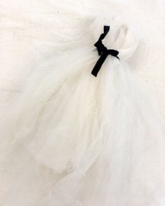
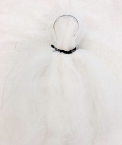
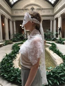
The series consists of a collection of three unique masks.  Each mask represents a different time frame of Marie Antoinette’s life and a different facet of her existence.  The first mask represents the beginning of her end, taking form in an exaggerated bridal veil tied back by a bowed velvet choker.  Viewers have critiqued its suffocating, yet swaddling appearance on its wearer, equating to the mask’s significance within Marie Antoinette’s bonding inescapable wedlock and the child-bearing expectancy which came with it.  It also speaks to the Dauphine’s fleeting youth, as she was only 14 when she became Queen, wife, and to-be-expecting mother.

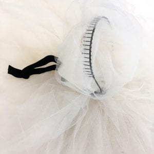
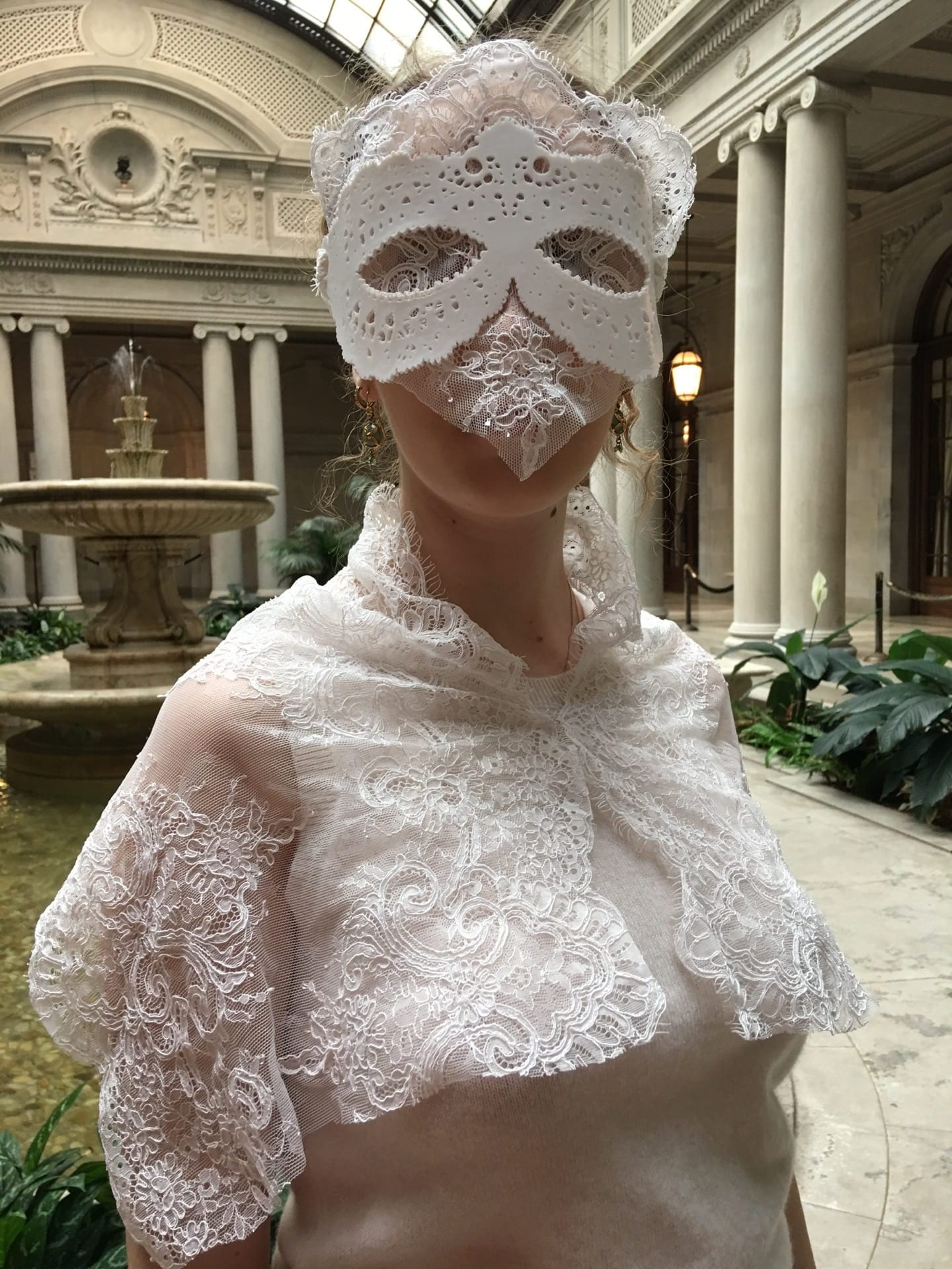
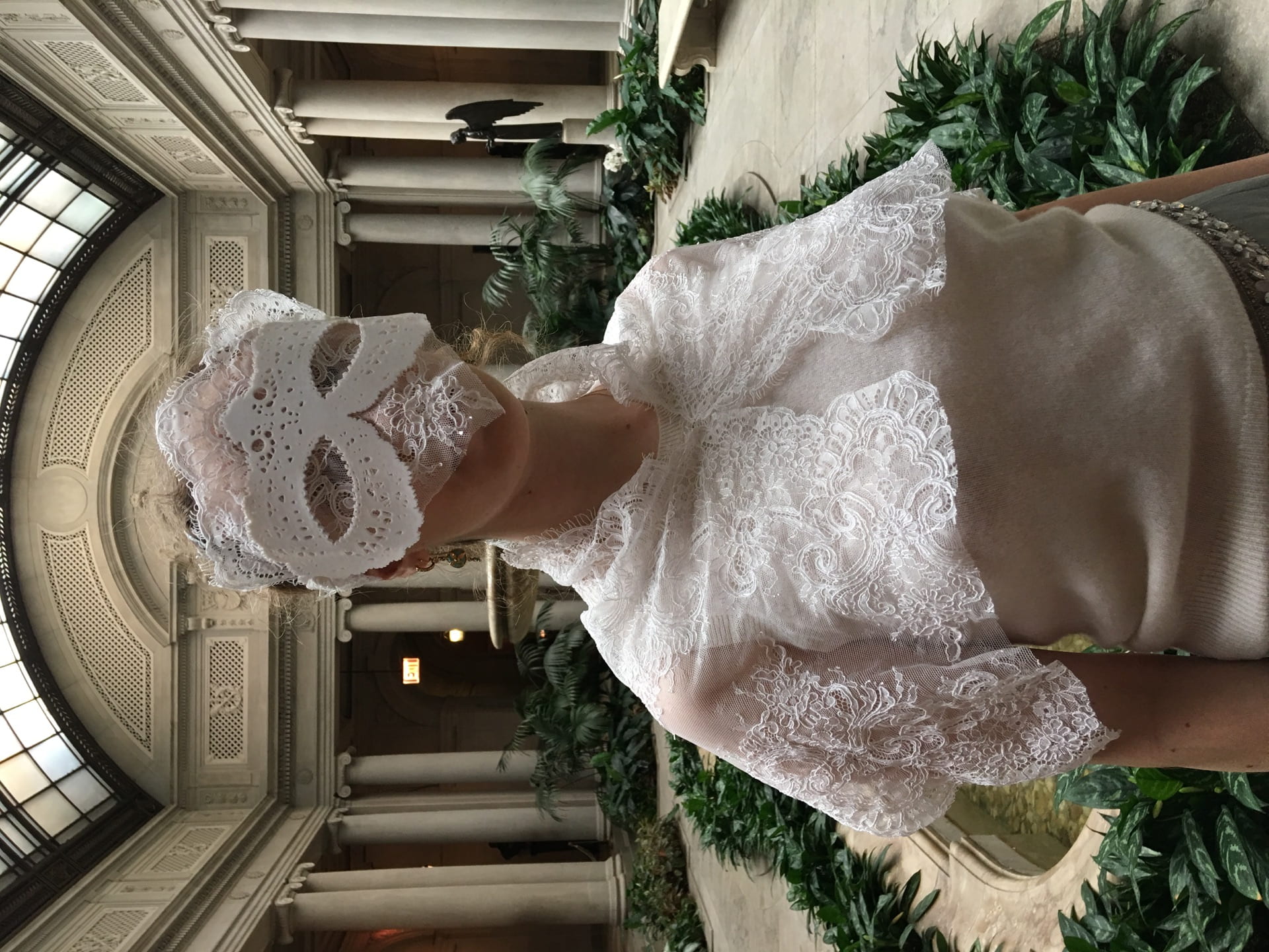
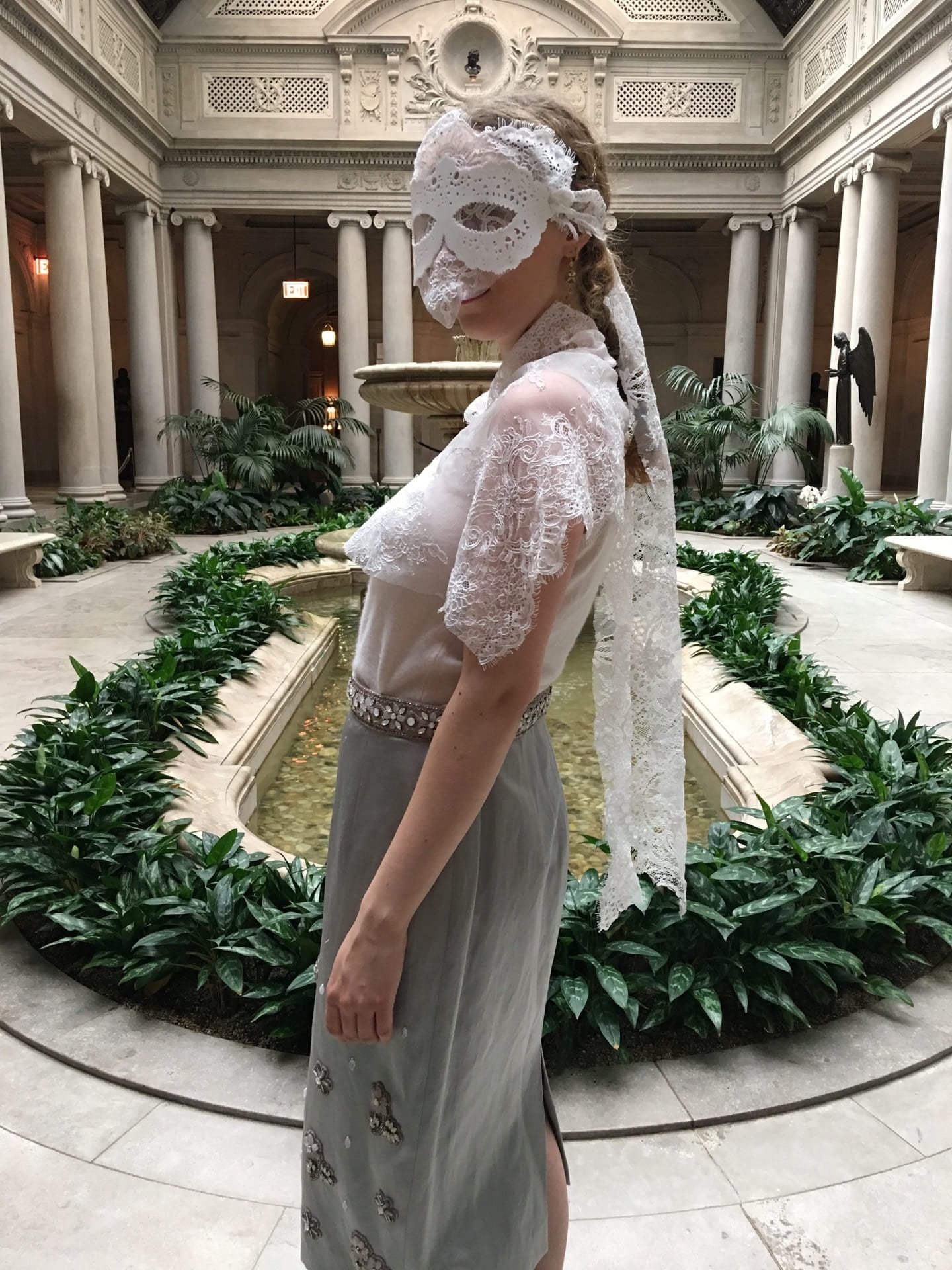
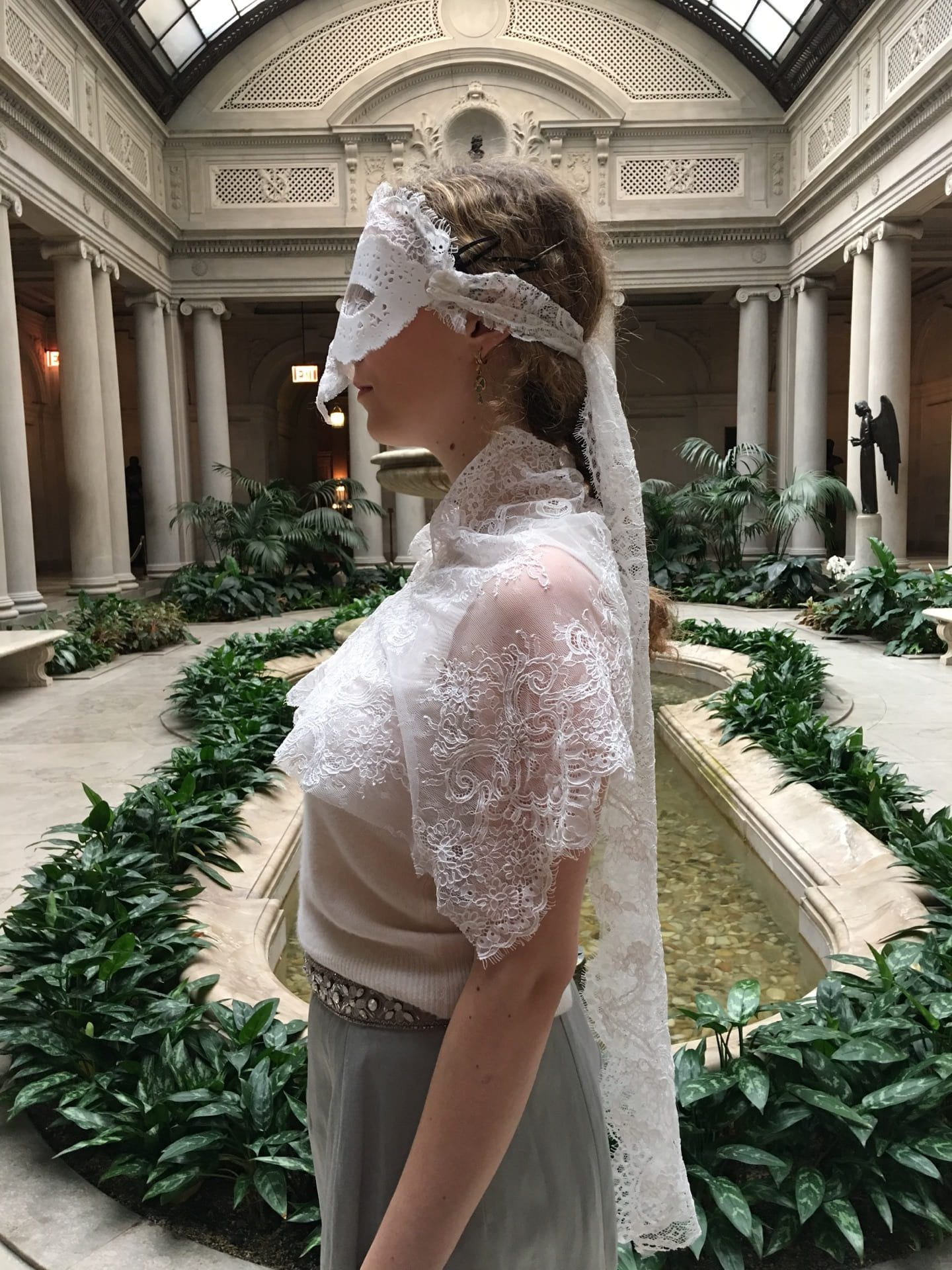
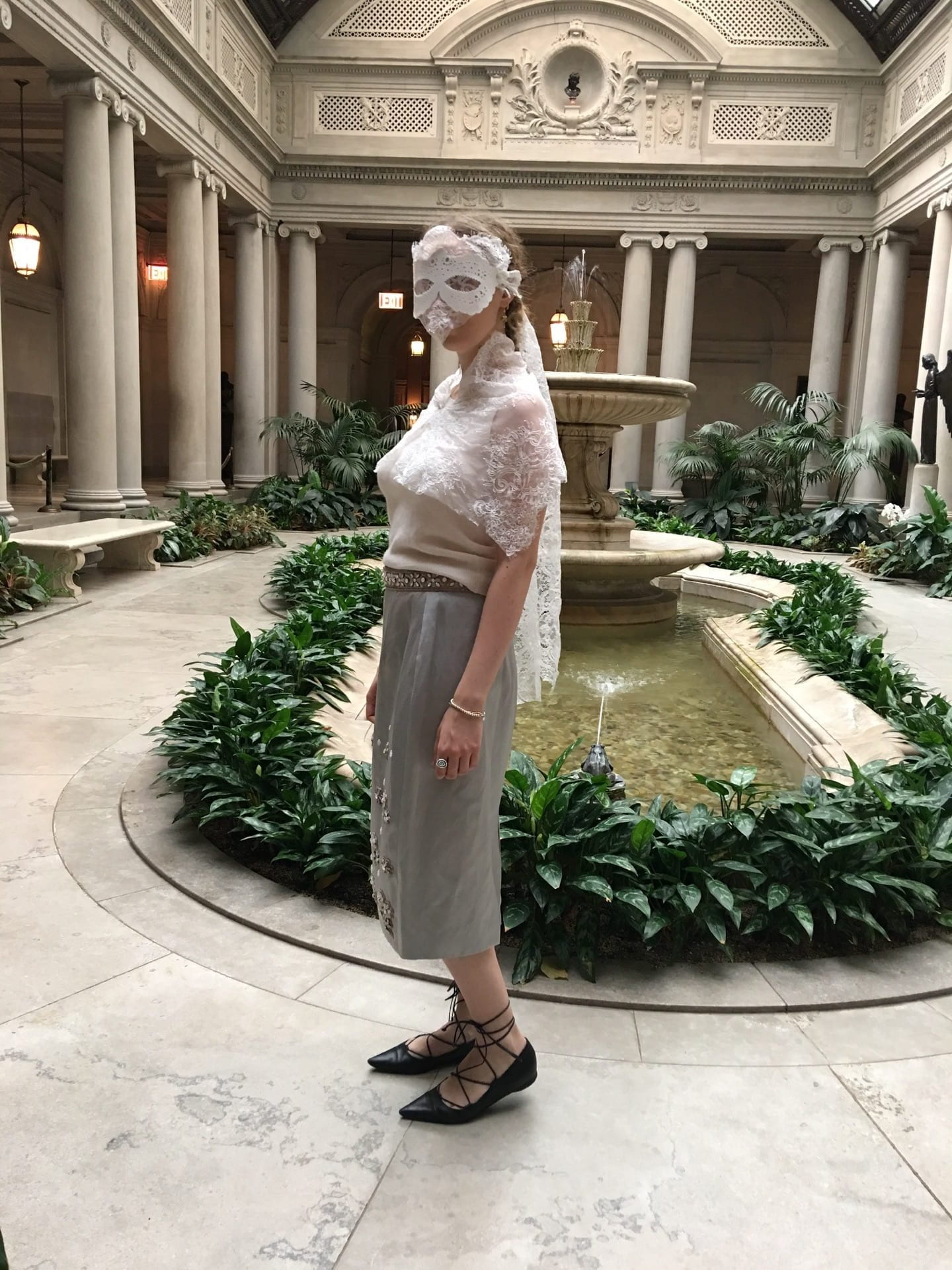
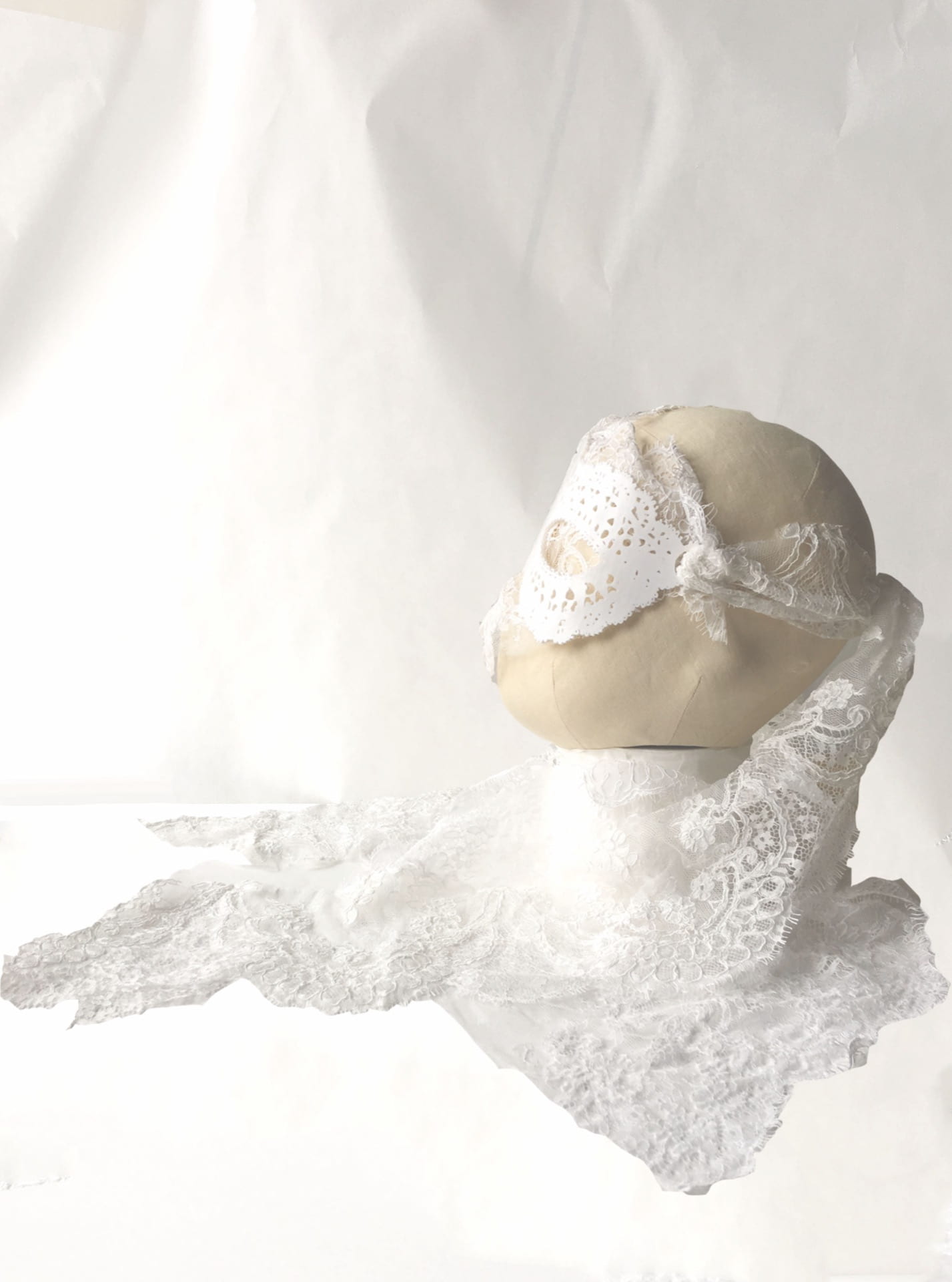
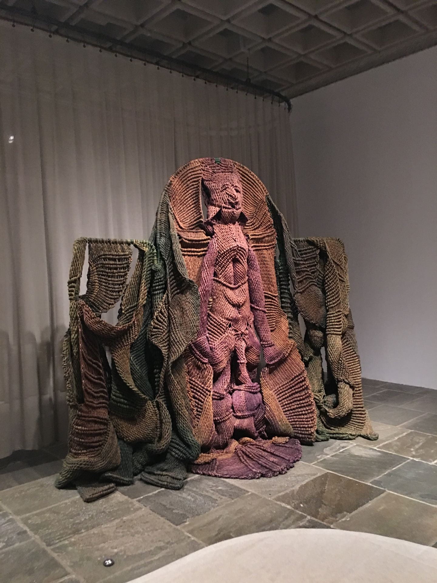
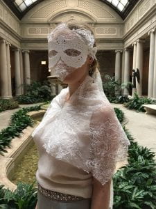
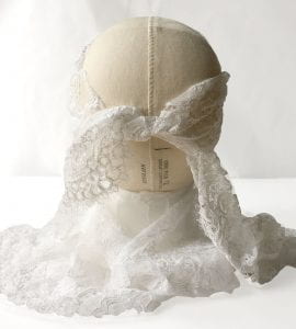
The second mask takes form in a masquerade mask, with the base of the mask 3D-printed off of a lace model in white, and the sash tie of the mask descending to below the hip.  The solid base is then interlaced with lace interfacing, so that the wearer’s features are covered up and no expression is perceived.  This reflects Marie Antoinette’s inability to express herself, and while she threw decadent parties and hid behind a lavish lifestyle, she was often powerless in achieving a stable public image.

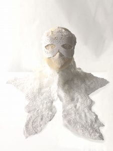
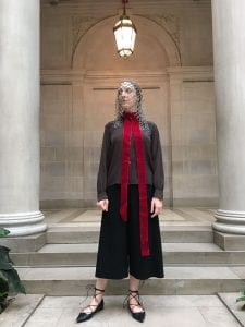
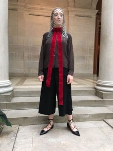
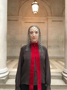
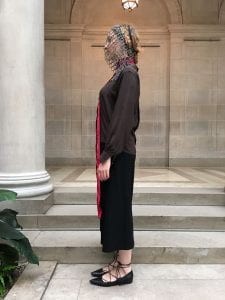
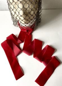
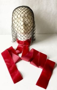
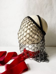
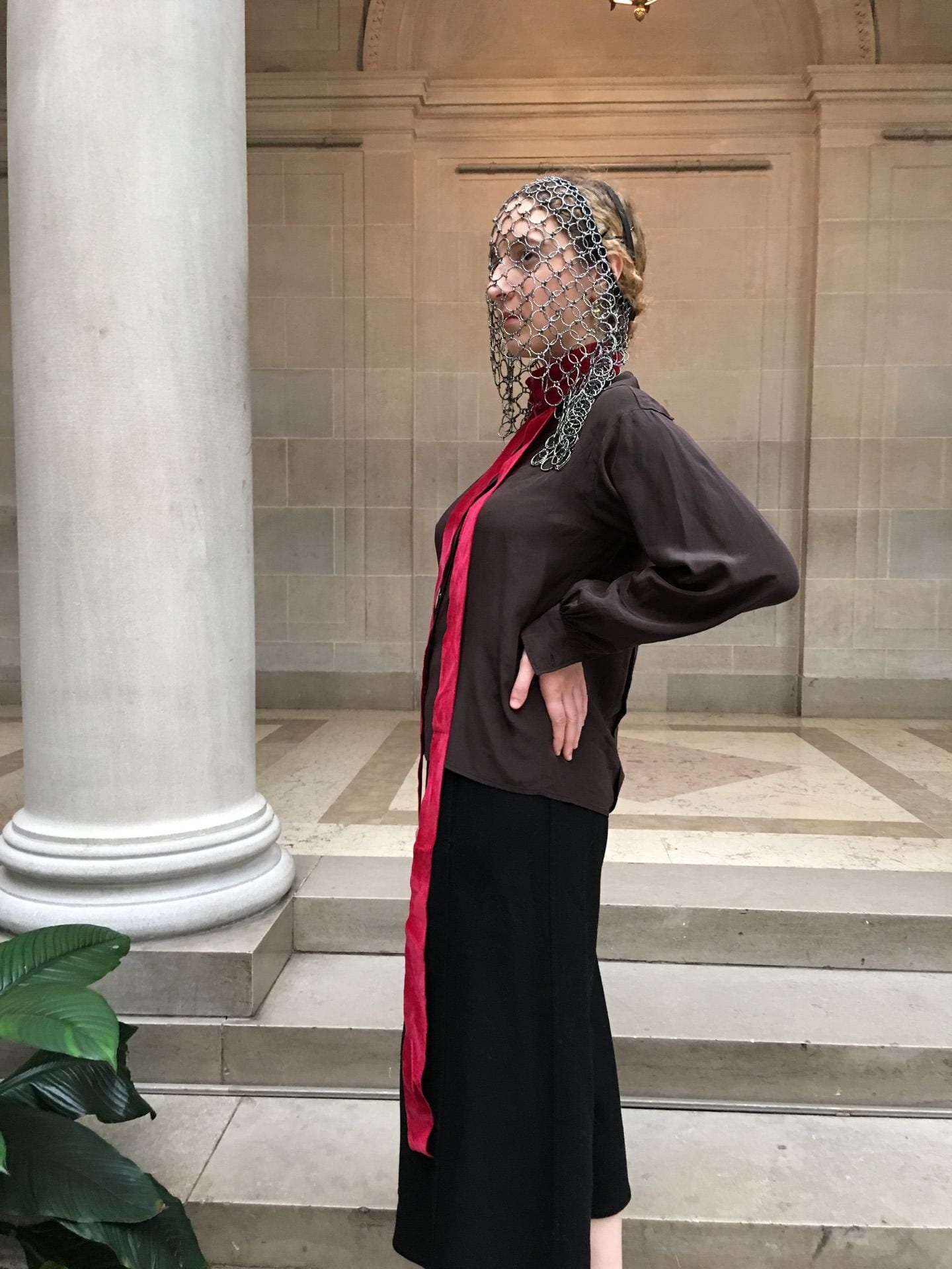
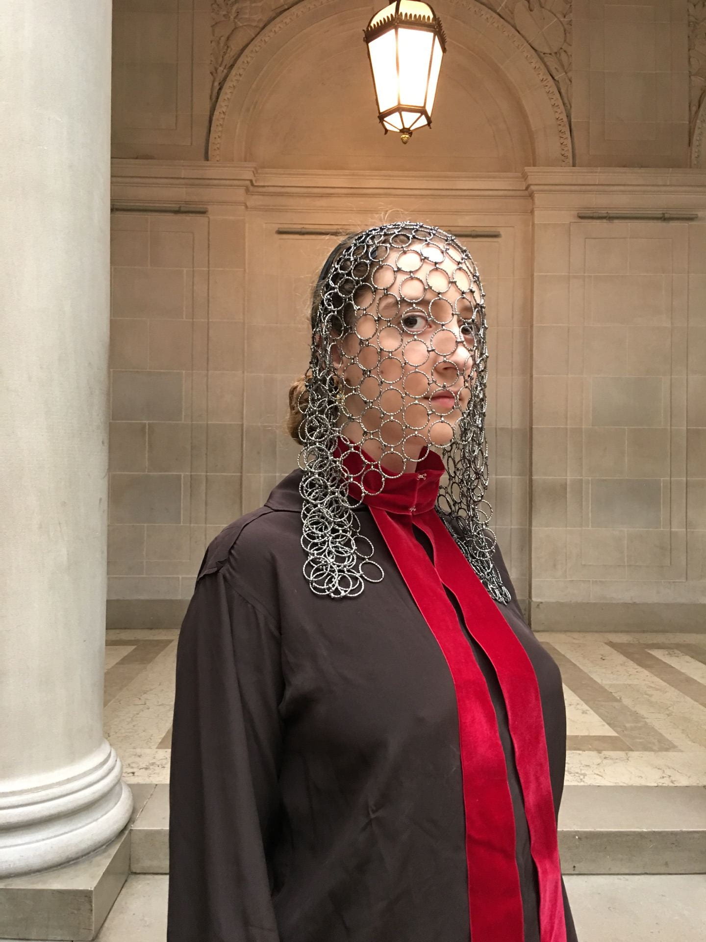
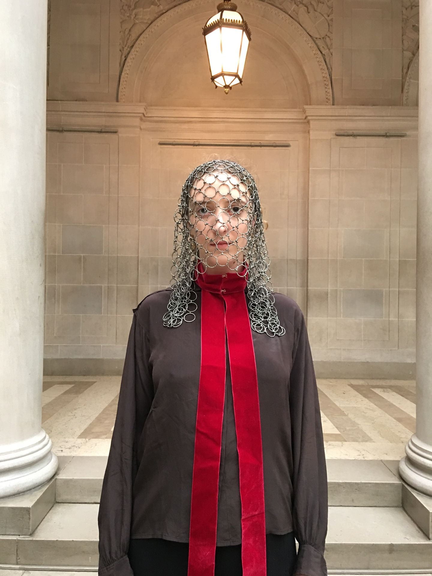
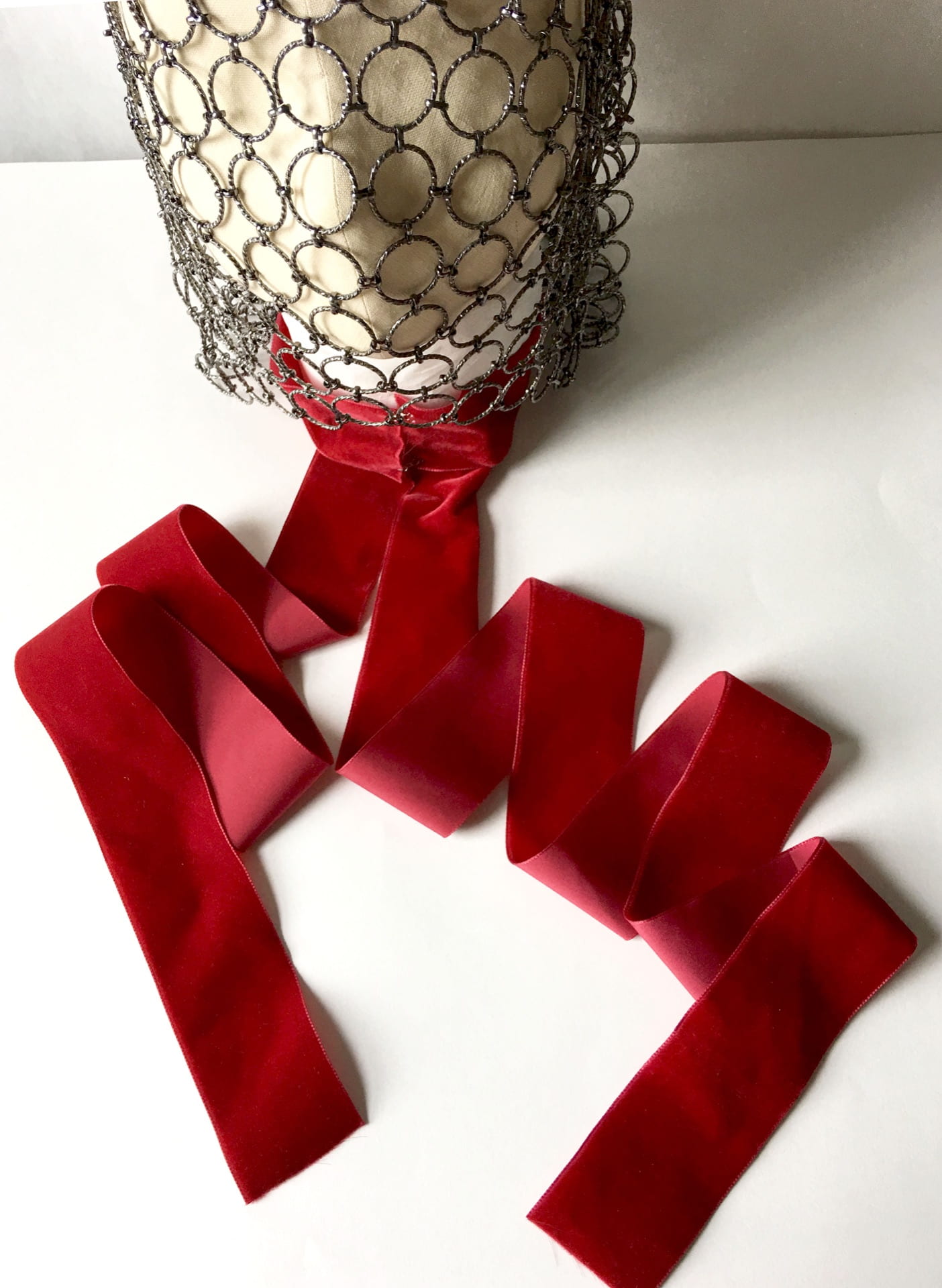
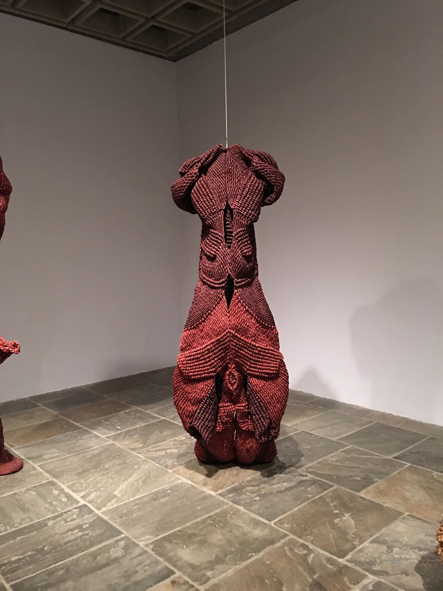
The third and final mask is a mask which represents the tragic resolve of Marie Antoinette’s life.  The chainmail veil is both a cycle conclusion and creation bearing the prison chain of the conciergerie, where the Dauphine stayed in a humble cell until the day of her beheading.  The red velvet collar, which falls asymmetrically near floor-length alludes to the bloodshed of the guillotining.  Marie Antoinette was stripped of all material possessions in the end, and yet Charles Henri Sanson recounts in his family memoir that she remained noble in the face of a seething public, masking once again what one could only imagine as the greatest fear.


Phenomenal Form; an exhibition review of Phenomenal Nature: Mrinalini Mukherjee​

Exhibition review

Phenomenal Form

Mrinlalini Mukerjee was born in Mumbai to artist parents in a post-colonial British India.  Mukerjee was raised with a conscientious relationship to the natural world and received an education at M.S. University in Baroda, where she was taught by one of her father’s students, K. G. Subramanyan. This education allowed Mukerjee to root herself in Indian craft tradition, while also introducing her to her unique medium of fiber. Mukerjee would use this fiber to knot great sculptural works of steadily increasing scale and phenomenal form. Later Mukerjee’s modern methods would expand across other mediums, such as ceramic and bronze, while the forms of her sculptures remained deeply rooted in representations of nature, deities, and sexual imagery.

 On the third floor of the Met Breur, ​Phenomenal Nature: Mrinalini Mukherjee​, presents a collection of the artist’s works in a chronological timeline exploring the different phases of her artistic career. The pieces are displayed on an organically winding floorplan path, in a dimly lit environment which spotlights the art. Floor to ceiling curtains both separate and unite the different sections aligning with the different time periods of Mukerjee’s works. The exhibition begins with Mukerjee’s earlier on fiber works in the 1970s, with the first ​Squirrel​ and ​Waterfallbeing the more two-dimensional of all the pieces. It progresses quickly into Mukerjee’s larger scale knotted fiber figures, towering deities and anthropomorphic forms included. The latter half of the exhibition and space focuses on Mukerjee’s later works in the nineties and post 2000s, of ceramic and bronze mediums as well. Consecutively and continuously the artist’s drawn inspiration from Indian tradition, her admiration for nature, and themes of sexual tension are present.

Mukerjee’s work has an evokes what it means to be experimental and expressive, with her newfound sculptural medium being used to narrate figural stories. Her fiber kings and goddesses tower over the viewer, with the shadows they create lying close to the spirituality that inspired the artist herself. Mukerjee’s dying of the fibers further emphasizes the forms within the character’s brightly colored bodies. Her tradition based subject matter plays well amongst other sexual innuendos in her work. The evolution of her career is also well-represented in the exhibition, as you can see the artist’s early beginnings in her fiber work, to her final bronze sculptural pieces. This exhibition compares to the Sheila Hicks exhibition presented at the Centre Pompidou last year. Hicks and Mukerjee share the method of taking a textile based craft to create imposing large-scale forms.

Mrinlalini Mukerjee​ is seen as a modern/ contemporary artist responsible for 3-dimensional creations ​rooted in representations of nature, deities, and sexual imagery. The artist’s background and education inspired Mukerjee to put a craft emphasis on her work and also developed a clear manifesto. In this exhibition the viewer watches the artistic career of Mukerjee play out as we traverse across decades and mediums. That which remains constant is the phenomenal form of the artist’s creations.

 Sketch 2: Van Raja (King of the Forest, 1981 fiber


Sketch 1:  Vanshri (Woman and tree), 1994 fiber. 

Night Bloom III 1999-2000 ceramic


Yogini (Female Seeker) 1986 fiber

Van Raja II (King of the Forest) (1991-94) fiber


Paper Clay Experimentations

For my paper clay experimentations I created a series of small sculptural forms, which I then connected by thread to make a necklace of consecutive relation.  I was challenged by the texture of the medium when it came to decorating the pieces with acrylic paint.  At the same time this texture adds a certain structure to the form which ought to be preserved.  The drying process was also lengthy because I had enclosed the pieces inside a Tupperware container- the lack of fresh air inhibited the drying process.  In summary paper clay is a time-consuming, but enjoyable medium to be used in a hands-on approach.