Bridge 5: Relfection

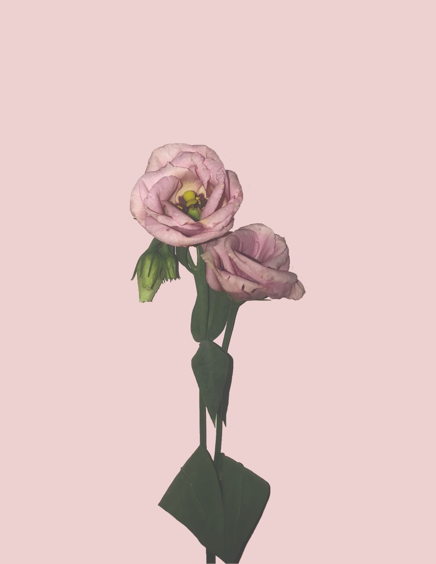
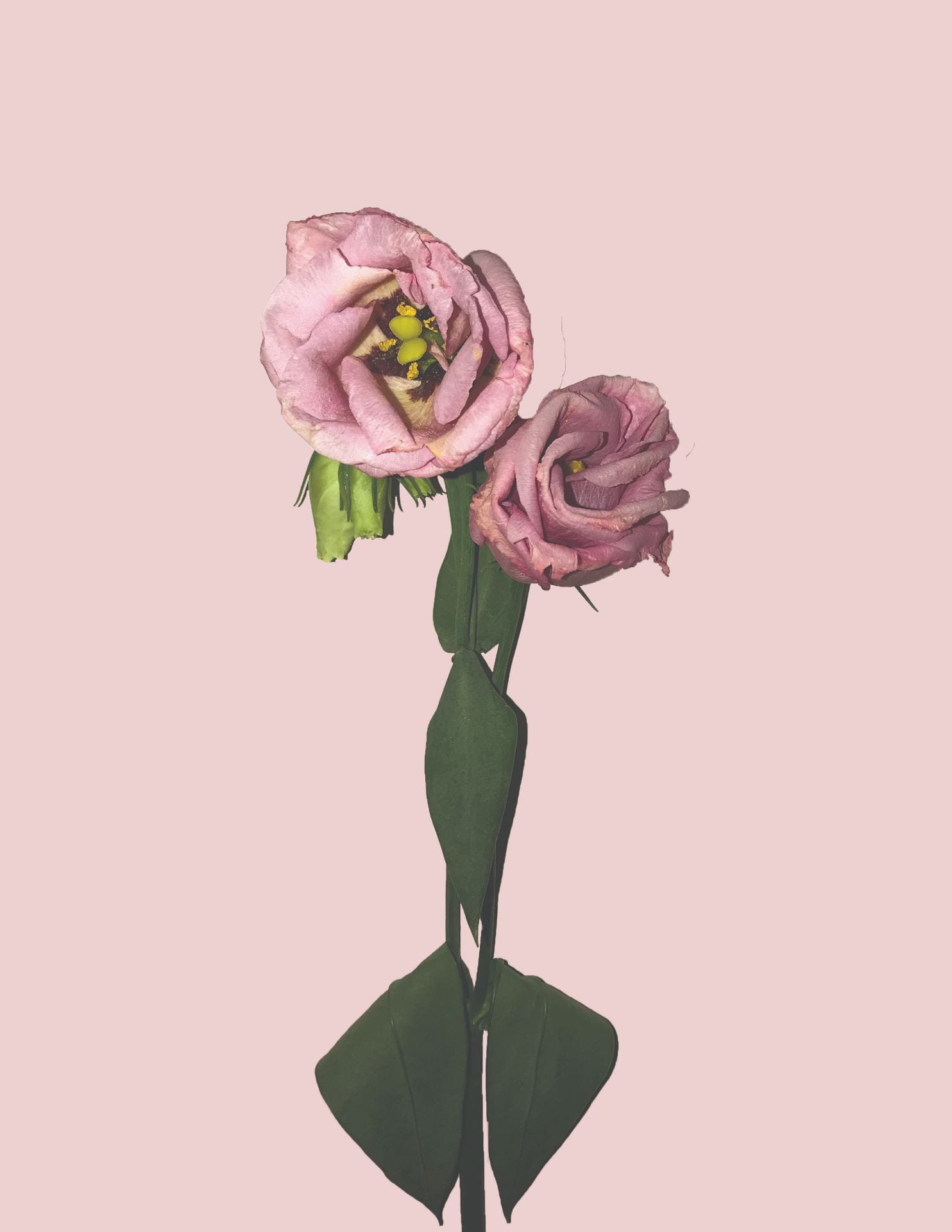
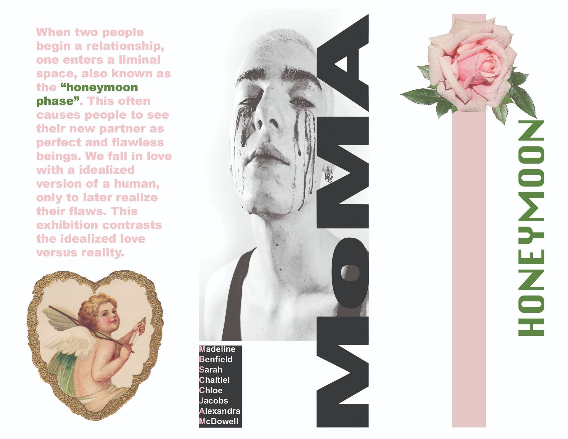
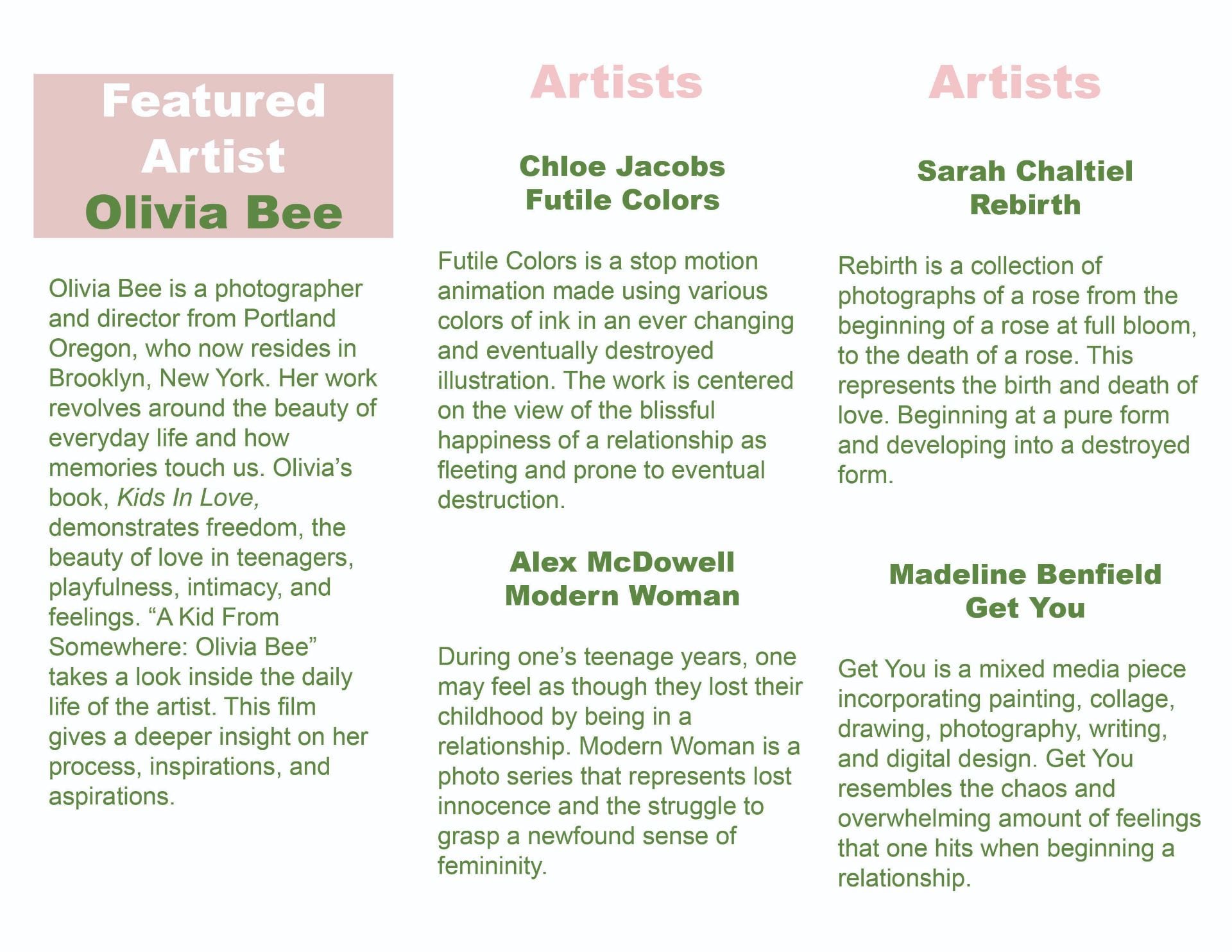
My name is Sarah Chaltiel and I am currently a Strategic Design and Management major at Parsons. My interests in committing to Parsons and deciding to come here for college were that I really wanted to pursue a career in fashion, but the business side of fashion such as merchandising and marketing. My views on work and life complement one another by having a balance between both. I believe that you should have a good balance between work and play. If you are too focused on work all the time, this can lead to being depressed and unhappy, but with a good balance between having fun in life and work this can lead to happiness. I believe that life drives work because to be able to enjoy a nice comfortable life, you need to be able to be working and earning a living. Bridge Project 1 has allowed me to engage more with my workview because I am not an artistic craftsy person, and this project challenged me with only being able to use 3 materials: cardboard, paper, and tape. This project really challenged me and although I had to redo and re-submit my project, it really made me think hard and expand my creative thinking senses. Engagement, energy, and joy are all topics that are significant in the learning process and creative process of all projects. Being engaged allows you to really bring yourself into the project physically and mentally and this leads to being energized and this ultimately leads to joy and happiness and being able to fully immerse yourself into the assignment or project and enjoying it to the full extent. I have learned a lot in integrated seminar and integrated studio within all of the bridge projects and they have all pushed me to explore my boundaries and go outside of my comfort zone. The fact that I am a “business” major and not a fine arts major really made me go outside of my box and explore projects on a more creative level. In Bridge 4, the theme for our group project was “honeymoon”. I can relate to this because the honeymoon phase is something that one goes through when they begin a relationship and everything is so perfect and lovey-dovey. I have personally experienced this with my own relationship I am in now, and I can now reflect on the beginning stages of our relationship and I now realize that the honeymoon phase was very much present. All of the bridge projects have been personal and have all related to me in some way, so this made it a lot easier for me to be engaged in the project and fully immerse myself.

Honeymoon: Bridge 4

During Bridge 4 we were instructed to come up with an idea for our own show in a group. We were instructed to create an individual piece as well as collaborative work.

My Idea For the Show:

Title of the show: New York Neighborhood

Theme of the show: For my idea, I thought it would be interesting to do a show about the good and bad of New York. While walking around this show in the background there would be a soundscape of the sounds of New York playing in the background such as cars honking, sirens, people talking, people walking, etc. As you walk around the show there would be different little pop-ups of different neighborhoods such as the ones explored in our Bridge 3 Project. Each pop-up would take the viewer through a journey of that neighborhood from different famous places in each neighborhood to the history and to small details such as famous foods. As you walk through the show and through the different neighborhoods of New York you would explore the past history, the present, and the overall vibe of each neighborhood.

A site/venue: I think a good venue for this would be a pop-up in Soho because I believe that it is a very iconic part of New York.


The Idea That We Used:

Honeymoon

Our When two people begin a relationship, one enters a liminal space, also known as the “honeymoon phase”. This often causes people to see their new partner as perfect and flawless beings. We fall in love with a idealized version of a human, only to later realize their flaws. This exhibition contrasts the idealized love versus reality.

For my piece I created a 5 picture series of a flower. The reason I chose to take photos of flowers was because flowers represent something very pure and I feel as though the beginning of a relationship is very pure and innocent because one might not know the other person as well as they think they do. I named this piece “Rebirth” because I wanted it to represent the phases of a relationship and the cycle of relationships in general. The first photo starts off as a flower at full bloom representing the start of a relationship where everything seems to be perfect, but as the photos go on, the flower begins to decay and this represents the stages of a relationship where the flaws of each person start to come out and the relationship slowly starts to decay. The time lapse represents the idea that relationships come and go and that its an ongoing cycle that repeats itself.

I began this project by going to a little flower shop and picking out a flower that I liked. I then propped the flower up against the wall. I started to take pictures of the flower for the next few days until the flower started to die. I then brought all of the pictures into photoshop and used the direct selection tool to select just the flower. Then I created a new file with a light pink background and inserted the flower into that. I then repeated the same process with all 5 pictures.

REBIRTH

Phase 1:

Phase 2:

Phase 3:

Phase 4:

Phase 5:


The collaborative work that I created was the pamphlet. I had the role as the graphic designer. For the theme of my pamphlet, I wanted to keep it pretty minimalistic with colors such as pink, green, and white. Creating this pamphlet was really fun and I liked exploring with all the fonts and colors and ideas with pictures and small details. This also challenged myself to work with editing apps such as photoshop and illustrator.

First Draft of Pamphlet:


Final Pamphlet:

Our final presentation/show was time based so we decided to have all of the art pieces projected onto the blank walls. Each piece was brightly lit up and was easily seen. The beginning of the show started with the “Honeymoon short film” and while this was playing, each of the art pieces showed up on each of the projectors and once the video was over all of the screens turned black again. After the video was over, we projected our art pieces and began to describe them.

Drawing/Imaging: Type As Image Poster

For this project, I decided to choose Mac Miller as the artist. I liked this quote because I can relate to it a lot and it is good advice. I decided to start off my using the pen tool and creating an outline/silhouette of Mac Miller’s face. I also decided to put the words nothing and everything going up and down his face because I feel as though those are the two most important words in this quote.

Bridge 4 Part 1: History of Space Draft

Sarah Chaltiel

Sarah Montague

Integrated Seminar: Fake

20 November 2018


Honeymoon: Issues/Controversies With The MOMA


The Museum of Modern Art (MOMA) located in New York is one of the most influential museums in the modernist art movement. The MOMA first opened on November 7th, 1929 but was later expanded and remodeled. Throughout the years the MOMA has undergone several expansions and have been critiqued by many for their decisions to do so. MOMA revealed their plans to renovate the museum in 2014 with expectations to destroy the American Folk Art Museum. The director of the museum, Glenn Lowry, had plans to create a glass wall which would ultimately expand the museum and allow for free entry to the entire first floor. The spark of controversy came from the idea to demolish the American Folk Art Museum. Their plan was to introduce a performance based art gallery within the American Folk Art Museum. After this backlash from the public, the MOMA decided to replan their expansion to not upset others. The architect working to create this expansion was Elizabeth Diller and her design studio Diller Scofidio + Renfro. Diller Scofidio + Renfro have worked on many famous sights and architecture such as The High Line and The Lincoln Center for the Performing Arts. After revising plans, the MOMA along with Diller Scofidio + Renfro, made the decision to connect galleries within the American Folk Art Museum, in a residential tower, as well as the already existing MOMA. With these extensions, the MOMA would expand to 744,000 square feet which is 17% than the previous building.


Works Cited


“Ever-Growing MoMA Splits Its Controversial Expansion Plans into Three Phases.”

Archpaper.com, 27 Sept. 2016,

archpaper.com/2016/01/ever-growing-moma-splits-controversial-expansion-plans-three-p

hases/.


Helmore, Edward. “Struggle for the Soul of New York Art as Critics Accuse Moma of Selling

Out.” The Guardian, Guardian News and Media, 26 Apr. 2014,

www.theguardian.com/world/2014/apr/26/moma-new-york-battle-for-soul-of-art.

Bridge Project 3: Integrated Studio

In Bridge Project 3, my team explored the different neighborhoods within in the Gramercy/Flatiron district. We wanted to include sounds such as the food carts, the wait button to cross the sidewalk, bicycles, people talking, and horns honking . Our soundscape is mean to focus on hearing rather than visuals and to do so it is meant to be listened to in a quiet, dark room to get the full experience of actually being in the Gramercy/Flatiron district. Our thought process began by walking all around the neighborhood and trying to get a feel of what noises we started to hear frequently. Next, we began to record our sounds. Once we had all of our sounds recorded, we moved on to creating our piece. We began by going back to our sounds and listening to all of them again to get an idea of how we wanted to piece everything together, without it sounds too hectic and unorganized. Once we had an idea of how we wanted to piece together the sounds, we started placing them together one by one, and overlapping some of the sounds to create a harmonized soundscape. Overall,  this soundscape represents the rhythm and the sounds of the people in New York City.

Drawing/Imaging: Color Pattern

To start off this project, I began by picking out a pattern/print. I chose a Celtic pattern because of my mother’s Irish roots. After finding this, I put the print into illustrator and began to make shapes that outlined this.

After finishing my own shapes and creating the pattern, I put it into a separate document and copied and pasted the same pattern 9 times throughout the paper. After doing this, I selected three different colors : red orange, blue green, and blue. I used a split compliment to color in my patterns.

The final piece turned out as so.

Drawing and Imaging Project 5: City As Canvas

I started this project by creating a sketch of what I wanted my graffiti name to look like. After getting feedback in class I went back and created my final drawing and also added color. Next, I scanned my drawing and put it into illustrator and used the pen tool to trace the outline of the name. Next, I added color to the illustrator file. We then put our names on a place in the city, I chose a bench in the High Line.