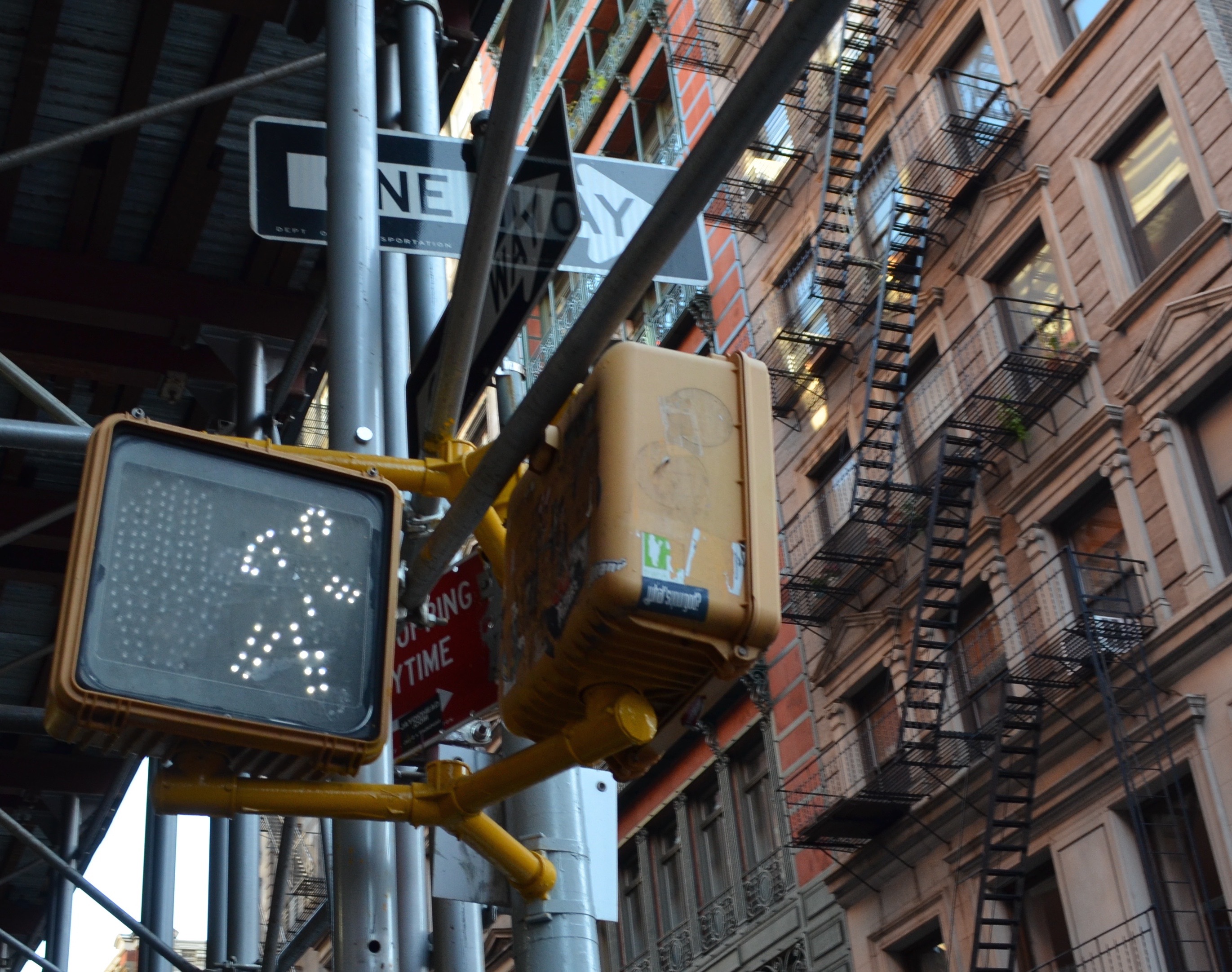
The Design of the Pedestrian Signal
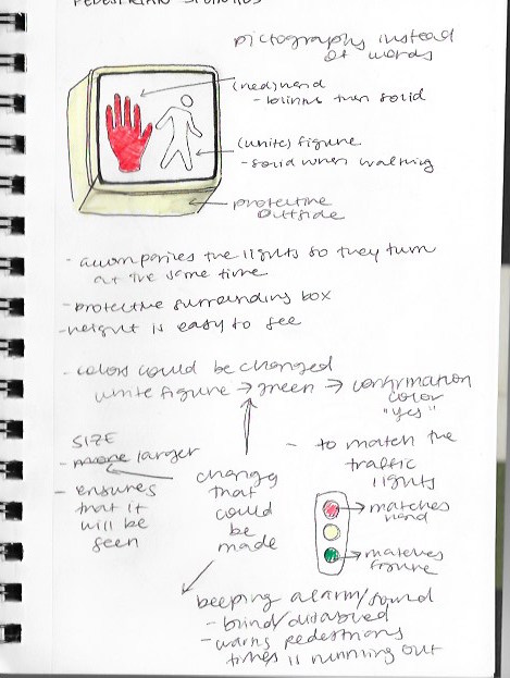
New Yorkers are known for ignoring the helpful suggestion of the “walk” and “do not walk” symbols that flash in their face while crossing the street. The overall design of this object is simple with two alternating pictographs that appear, a red hand and a white walking figure, depending on if it is safe to cross the street or not. The protective case surrounding the signal ensures it is protected and especially in New York isn’t covered by sort of debris due to the weather. The height of the signal is high enough to be noticed but low enough to be read. No matter what “kind” of New York City one lives in, as mentioned in E.B White’s essay Here is New York, each and everyone encounters these signals on an everyday basis.
Some problems designers faced might have included deciding which colors, symbols, shape and height of the signal. Designers had to have considered and contemplated much of the design because with the wrong size, height, symbols etc. the signal would not be noticeable or give off the right message. They had to have researched different pictographs in order to choose two that are universal enough to understood by anyone. The older signs used to say the words “walk” and “don’t walk” and were replaced with pictographs that express when to walk and not to walk. They would also had to have to made technical adjustments to the signals to make sure the timing of the signals aligned exactly with the timing of the traffic lights because a majority of people rely more on the signal than looking into the actual street for themselves. I don’t think there is much need to redesign this object especially since its revised version does its job efficiently.
If I were to adjust these signals I would expand the scale of the signals to ensure they are noticed. The addition of a beeping alarm, especially when the red hand appears, will make sure pedestrians are aware that their time to cross is running out. While the beeping may seem annoying this would serve as a subtle warning and to ensure their safety. Additionally I would change the color of the walking figure from white to green. Green would not only match the traffic light color but green is also a universal color of confirmation. The red color of the hand is perfect for it’s meaning, serving as a caution signal, matching the red traffic light that means stop. Therefore it would make more sense to have the walking figure also reflect the traffic light.
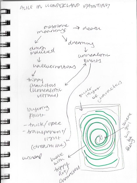
In the previous semester I created a large-scale painting. Because of its large scale I had to plan out what I would paint and how, in order to not waste time and to properly express my ideas on the canvas. The assignment was to create a piece based off of an essay inspired by a fairytale. I chose Alice in Wonderland and researched a lot about the old versions and meanings behind the stories.
Before creating this piece I tested different painting styles in order to get the look and feel I intended to create. I got inspiration from not only the original version of Alice in Wonderland but from other versions and different articles about it. I was prompted to research in order to fully understand the context of the story and learn more about the meanings. Without this research I wouldn’t have been able to truly understand the story or create a piece that accurately referenced Alice in Wonderland.