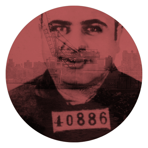
I decided to keep this design simple with the intent to focus on solely the images.
The logo design depicts two images – the first is Capone’s notorious mugshot overlaid out the shipping docks of Red Hook. I wanted to include both to create focal points that would easily be noticed. The red hue was intended to create a more aggressive looking aesthetic and was meant to signify blood in a way that was not over the top.
