The Good, The Bad, The Ugly movie’s Graveyard Standoff Scene
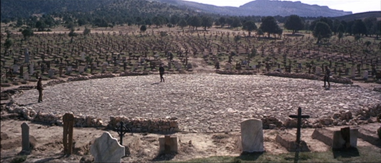
The graveyard standoff scene in The Good, The Bad, The Ugly, with its vast landscape rows of crosses and stone same height, differing slightly from each other, outline the circle where the standoff takes place. The overwhelming number of crosses give a resemblance to the human body or spectators watching, standing as still as the three men surrounded. After minutes of viewing the still, the crosses soon begin to blur out of attention, maybe because the similarities, somewhat like the trees in the background, we grow tired of looking at the same image over and over. The alleys created by the crosses bleed out of the circle forming rays similar to the ones creating stretched out shadows from the sun. Also, the amount of gravesites helps put importance and emphasis on light differing imagery and shapes, such as the crumbling walls and the three men still standing still. The camera is placed near the fourth spot where no man stands but would make sense if one did. Even with overcrowding, the landscape still seems to fit its intended purpose of desertedness. No one is alive to see this duel, so who recounts the results of what seems to be cataclysmic event.
Henry Darger’s Two Girls and a Dog Sitting in a Garden
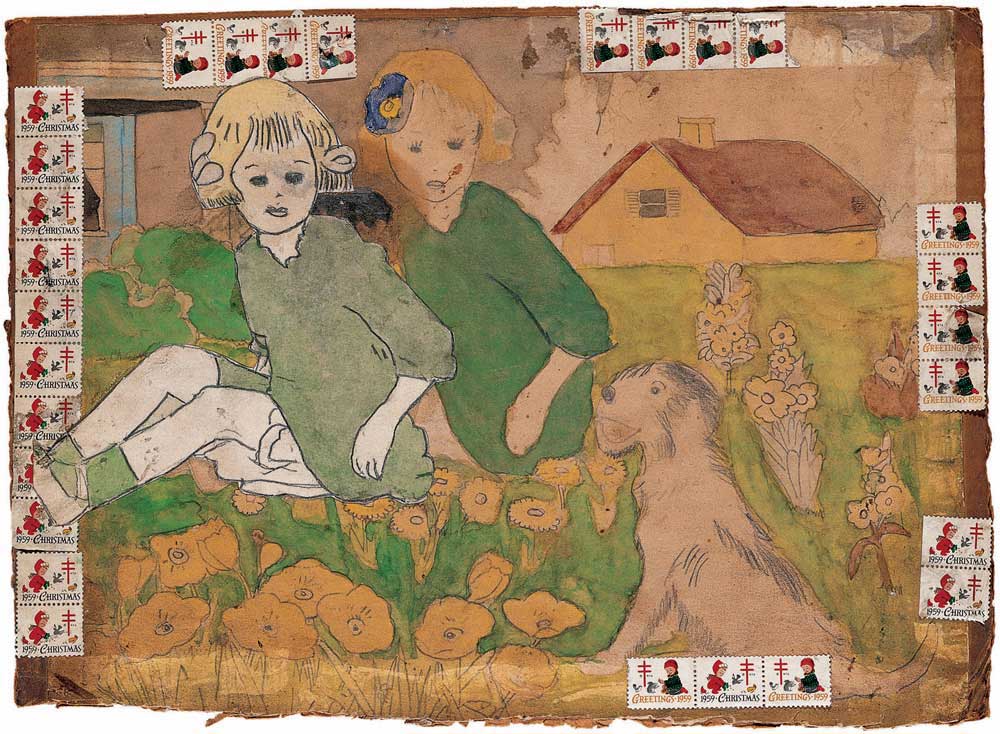
The two girls are based off one, probably traced or copied in a slightly different manner, one sporting a bow and the other sporting a flower in their hair. One girl almost seems tacked on due to her darker outline and whiter white than the rest of the drawing. The detailed girl seems to overlap the “frame”, which is segmented around the drawing with Season’s Greetings postage stamps of children. Maybe this detailed girl is not part of that world, being able to protrude out of the setting that she is in. However, the dog’s eyes seem to notice her rather than the flower girl who looks unsettled as the dog is not looking to her. But this could be due to the dog being in a very flat perspective. The frame consists of repeated imagery as well, using the same two stamps. The segmented frame supports that idea, breaking two distinct worlds because of lack of any rules and consistency. However, the lightly colored outline of previous stamps, perhaps, that filled those segments, most likely unintentionally. The frame of multiple children play along in the landscape with the only multiples in the picture being flowers.
Roxy Music Album Cover, “For Your Pleasure”
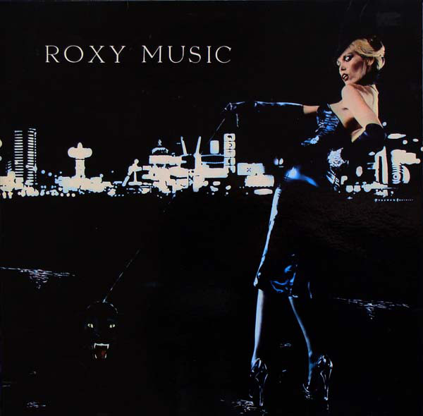
Another landscape with almost a pasted on woman, who based on her dress, which shines like vinyl, makes her personality almost feel rubber, superficial, stereotypical American view of beauty. With panther on leash, we only see the eyes and teeth, but we can fill in the blanks. The body seems to blend into the foreground, making the threat seem bigger than realistically possible. But then again, who would have a panther on a leash? Your eyes travel diagonally, darting back from panther to woman, focusing more on facial features, maybe due to dress and gloves reflecting the city lights in the background. This diagonal movement seems like a violent movement, almost like a slash or a hack. The choice of having the buildings sit on top of blackness, gives the illusion of the woman and panther being on the same playing field – a larger than life personality. It looks as though it has just rained, with shimmering streams under her heels, which are pointed and fierce, like the panther’s teeth.
Billy Bengston’s Eighty Eight
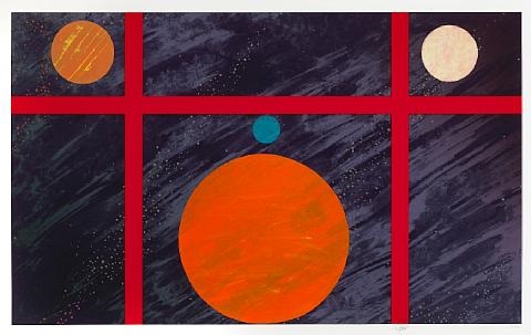
A red grid division separates four circles, each a different color and texture. Texture of the circles reminiscent of surface of planets as well as replicating the direction of the background, seemingly even and unified. The background seems to transcend the borders but not overlapping them. The diagonal brush strokes are accompanied by dots in similar direction, giving the effect of stars or distant planets far away. The brush strokes seem to have evolved from one corner, making it seem as though there is a horizon somewhere and these might be inconsistencies in the sky, early morning or night. The red grid is somewhat the panes of windows, but it seems unnatural for that to be a possibility or an event where the planets seem to align in an equally weighted composition, with two of the planets being of the same size. The only shape missing seems to be a definite triangle, however the circles create an open border that turns the corners into their own parts, but I could be overlooking the brushstrokes of the background, while diagonal, also have a slight curvature creating a cylinder or dome in which these planets reside. The more I look at it, the larger circle does not create a triangle, but more of an arch and the smallest planet on top sits at the middle of this arch, like a keystone.
Ed Ruscha’s Burning Standard
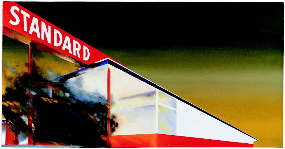
The Standard station goes through what seems to be spaghettification with a perspective similar to a train coming by. Also, you stare upwards, giving the building an illusion of grand importance. The fire is only shown with a few dashes of flames, but is mainly consisted of black smog and bleeding color from the station itself, giving off a powder texture. Because of the elongated station’s position, we are able to see the picture in two split diagonal pieces. The upside down upward triangle of the frame is hazed with yellow and green tones that gradiate into a black, what seems to be sky. Not sure if it is dawn or dusk. It seems strangely stranded. If the fire took place at the gas station, if there was no one to see it, would it have even happened? The black smog seems to communicate that the fire has been going on for some time and is dying down. No one was there to put it out, so it put itself out.
Mike Kelley’s Kandor Exhibition

Light seeps upward highlighting the structures above. The architecture is structurally simple with basic shapes, however they also could be interpreted as stalagmites protruding. Behind are containers from, I guess, made of glass, that are also lit from underneath, but there is nothing in them. The lids on top of the containers suggest that something is either held or cordoned. The lighting of the jars, with greens, purples, red, and oranges, reflect off the glass, creating orbs and vertical reflections of the buildings, giving the illusion that a toxic gas is trapped inside. The multiple containers also make their pedestals seem like an experiment table of a mad scientist, making model cities to hold tiny people and preserve life in a glass jar. The city seemed dusty as though blown with pigment or candy-coated, making sure that nobody believes this is not fantasy.
Henri Matisse’s Swimming Pool
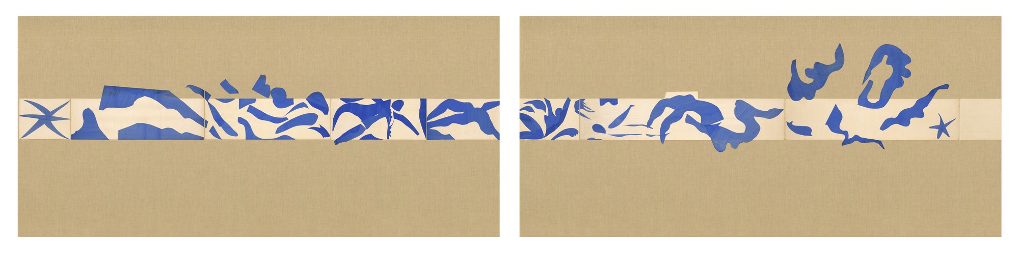
It’s hard to discern whether or not you’re looking at a human figure or that your mind is putting together connections that aren’t really there. The use of paper helps bring out strange abnormalties of the human body such as weird head placement, thin waists, large legs, elongated arms, which create a tumbling sensation. Most of the paper is condensed into one strip of the burlap background and is elongated as if it was a landscape, the condensed figures trapped in the horizon. However, some of these pieces break those boundaries towards the end as if gates were open or walls breached. The frame has become non-existent. The use of monochrome blue helps these subjective connections. If one were to walk past, they too would be tumbling down the chute that all the shapes inhabit. The paper moves with you just as if it was water.