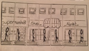
When I first started sketching ideas for the Multiple Images project I had different directions. The first one is shown in the picture below on the top; I thought of keeping the same background, having the same person in different places which shows that this person is moving, and each picture has this person in different position and place. However, it didn’t quiet show the idea of the transitional place, so I went to the second idea, which is shown in the picture on the bottom. The idea is the view of a person’s back in the foreground, who’s walking in the hall towards the door until he goes to the other point outside the building. I liked the idea so I decided to use it in the same transitional space I used in the One Image Transional Space. I made boxes and wrote down the names of the files. I also thought of using Adobe Photoshop and Illustrator to draw figures in motion to to show the movement from one floor to another through a staircase since it is my transitional space.
I did what I had to do in Photoshop and In Design, and the first result came out looking like this:
4 images with drawings on them to show the transition, however, the background was very empty, the images were touching, and it kind of looked interrupting to the eyes. I also had an idea of over lapping the images, but I figured they didn’t give it any meaning so I changed it to only touching.
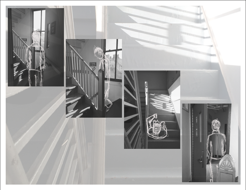
When I went back to it and the second and final draft came out looking like this:
I added a transparant background to the file of stairs to give it a stronger feeling of the space. I left gaps between the images so that it wouldn’t be too interrupting to the eye and make it look more balanced. The layout is gives it a feeling of the staircase and it also shows that the person is going down not up.
The transaction is action to action in the first two images, and the last two images.


