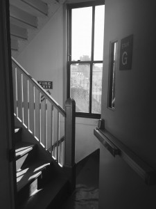
The single frame project was challenging a little, because we had to represent a transitional space in one image only. However, I managed to choose a transitional space, which is the school’s building stairway, since I use it almost everyday to go from a class to another. I went to the space and tried taking many pictures from many different angles, but I honestly had two images in my mind; a top view of the stairs showing the exit door and the light coming from the window, and a view of the stairs, door, window, and window view, from the hallway. The second image I think worked better because it showed where it starts, the hallway, and after entering from the staircase door the stairs go both directions up and down, which shows the transition from one floor to another. I did not use any figures to show the movement, because I think that the stairs that goes both directions and you can’t see the end of them does it all. Also, having a window in the picture with a view and the light coming through it is a big part of the picture. The window and the view shows what’s outside and gives a feeling the picture being taken in a high-rise building, and the stairs going up and down gives a sense of a non stop staircase all the way to the first floor, or maybe the basement.
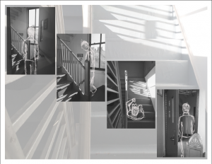
Taking the single frame image transitional space and transforming it into a multiple image was interesting. I had many ideas, but they were all in different transitional spaces. Having to stick with the same space, I went back there and took picture to show the process of the transition from a floor to another. I also decided to add drawings of figures to the images using Adobe Photoshop and Illustrator, to show the movement. I started with a picture of the staircase door, opened, and the drawing was of a figure entering through the door. The second was a close-up to the staircase, with w drawing of a figure that shows the movement of it going downstairs. The third was a top view of the stairs, which I took earlier, but decided to use it because it’s a good picture to show the transition, and it added more meaning to the multiple image project. With that, I added a drawing of a figure facing the way that goes downstairs, to make it clear where it’s going and how the transition is happening. The last picture of the door from the inside of the staircase, showing the hallway, is the opposite of the first picture. It shows the end of the transition, as the figure is drawn to leave to the hallway of the lower level. I decided to lay them out in In Design like the stairs, starting with the first picture from the top left and ending with the last in the bottom right, which also shows the movement from up to down. I added a transparent image on the background of the top view of the stairs, to give it more sense of movement in the stairs.
I learned from these two projects many things. First, I learned how to use Indesign. Second, I learned how to present a single idea in many different ways, of course, the brainstorming ad sketching made it way easier to think of many ways to this. Finally, I learned that the little things in an image matters; like the angle, layout, resolution, sunlight, reflections, shadows, and many more, things that we sometimes don’t pay attention to, but changes a lot in an image.

