The subject is the same transitional space as in the single image project. And now I will be conveying a sense of time and motion through the juxtaposition of multiple images on a single page.
PROCESS:
By understanding Comics Chapter 3 & 4 of the use of transitions, a sense of time, motion and place in individual panels and sequences and a choice of direction or navigation. I comically created my multi-image as well. I tried to show the timeline and the transition of the space by using still image and motion blur.
This is the drawing draft of my scenes on a sheet of bristol paper:
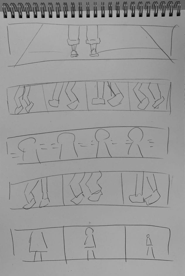
This draft gave me enough information to plan my shotting. I used all the resources I planed. And I was glad that I planed in the first place to make my process more productive.
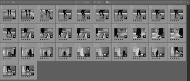
I took around 200 images and narrow them down by rating tool in the Lightroom and alter them into Black & White effect. The reason for using B&W is making the color more harmonious since I took images from a large space which including different light sources (different color tones in the photos).
And then I used InDesign to layout my Multiple Image Project within a 17×22 in. I started by creating a 17×22 inch document. And I chose to use a vertical panel base on the images I took from the transitional space.
DRAFT:

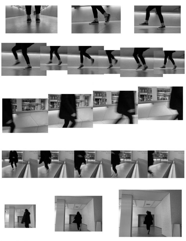
I printed the first draft on the 34 in Plotter, and we did a critique in the class. I didn’t lay out my file well. It’s messy and non-organized which is annoyed to look at it. But I eliminate the images that I wanted to use and the photo effects that I wanted to create.
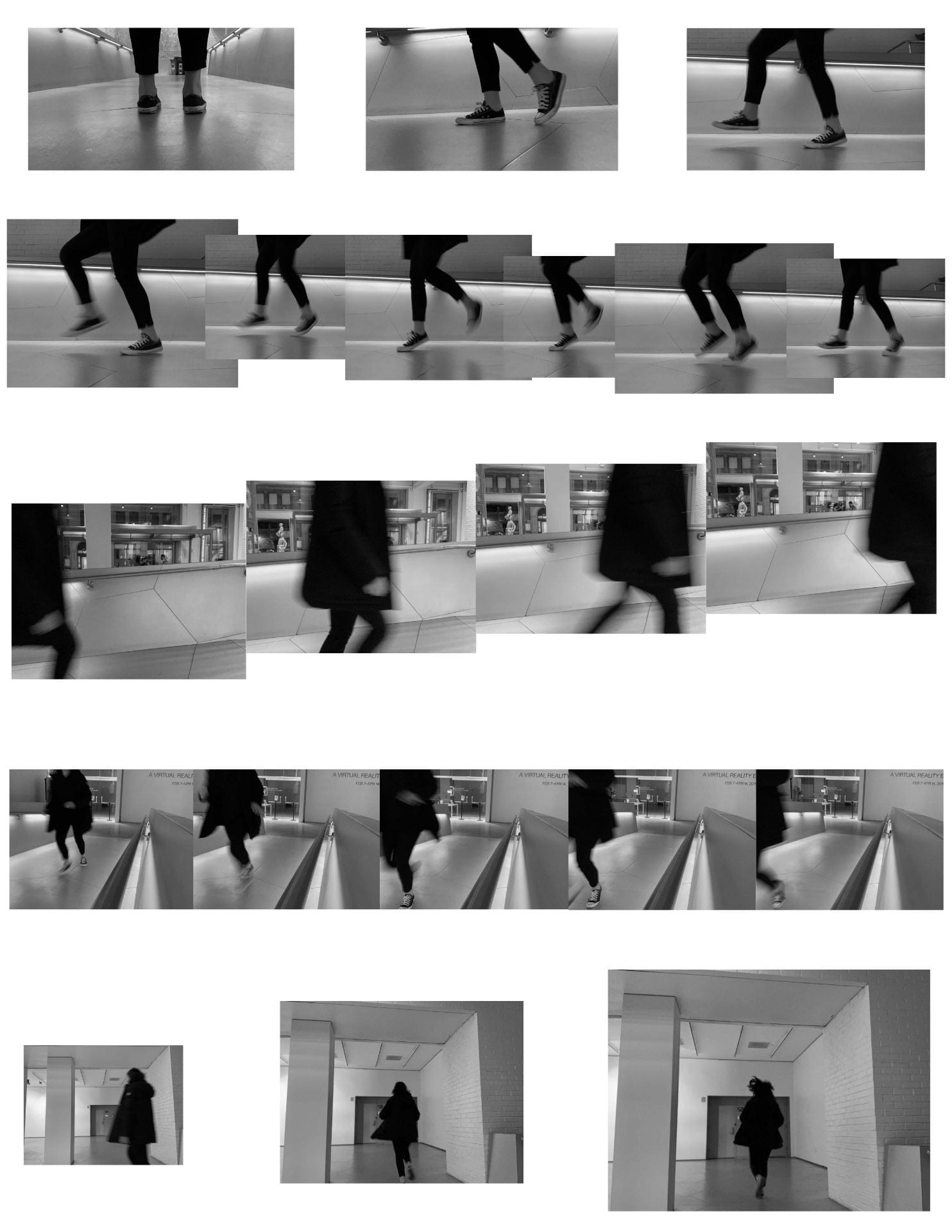
FINAL:
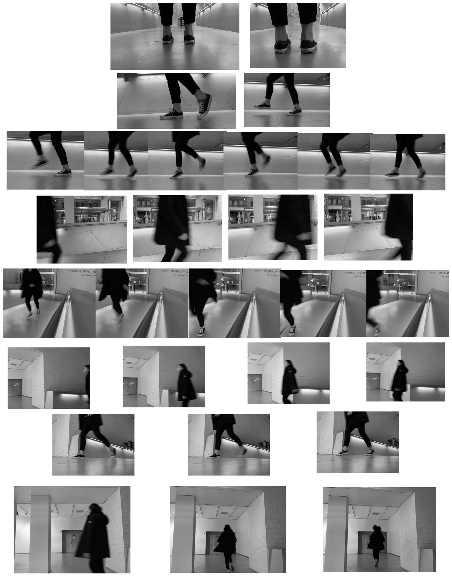
I used Photoplotter to print out the final project. Refer to the color management document for details. And I trimmed it in the Design Lab where I can cut my big printing. And I removed some images that I don’t want to use anymore and redundant to this project. On the first row, I created the still pictures to show the still image and the beginning of the scene. On the second row, I used the blur motion to generate the movement of walking and running as you can see that I used different sizes of images but linked by the steel handles on the images. This idea came from my classmates and I think it’s fascinating and it creates a moving scene. And I used the same technique on the third row as well. I kept the same size images on the fourth row to show same shotting spot and moving figure. Finally, the last row I enlarged three photos from the left to right to create a slower pace compared to the beginning which is at a fast pace. I wanted to slow the motion down and build a fading effect.
REFLECTION:
It’s a challenging assignment which including selecting pictures and layout them in the InDesign. But I am glad that I planned and took a bunch of photos at the beginning which doesn’t make time waste of keep going back and forth for taking pictures. This is the first time I used Plotters to print. I learned how to layout the images well in the InDesign and studied about the Plotter (normal and photoplotter).