

This is the parent category of all courses taken in year 1.

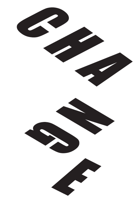

final-climate-change < link to Final infograohic PDF
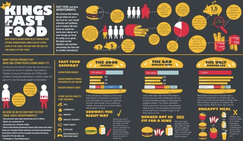
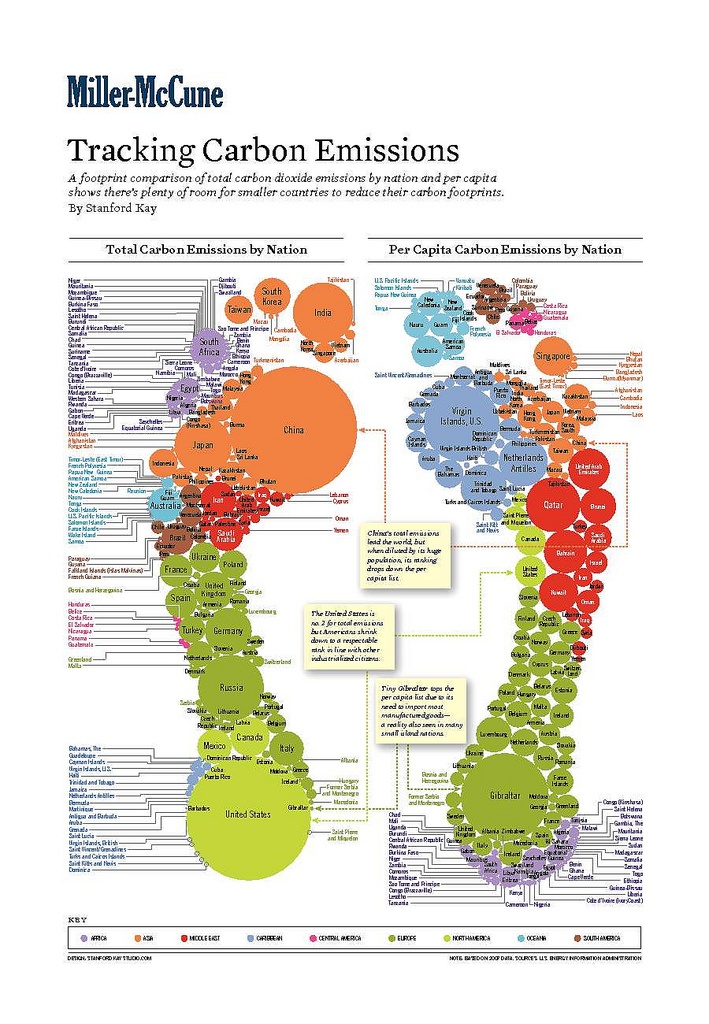

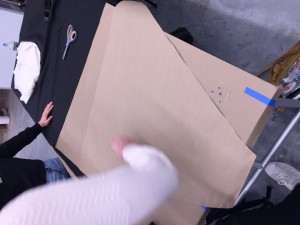
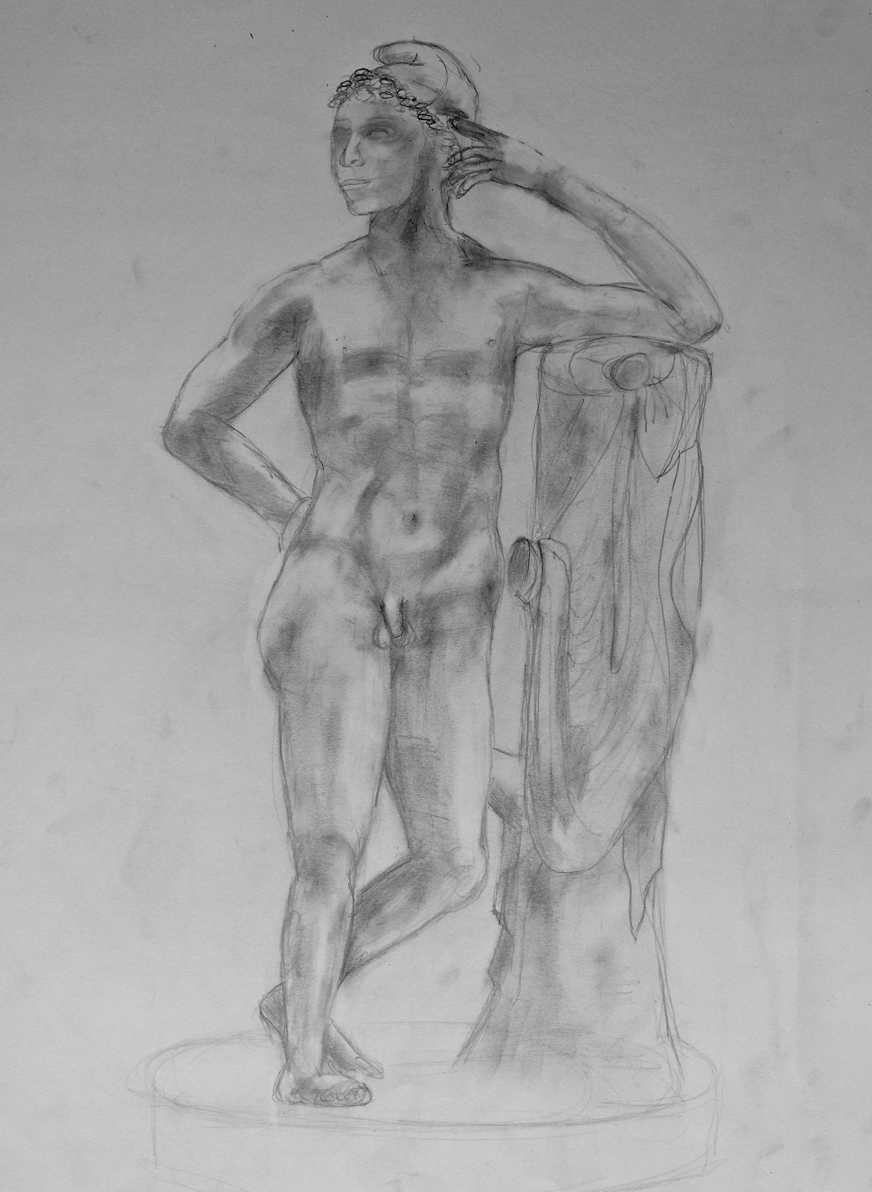
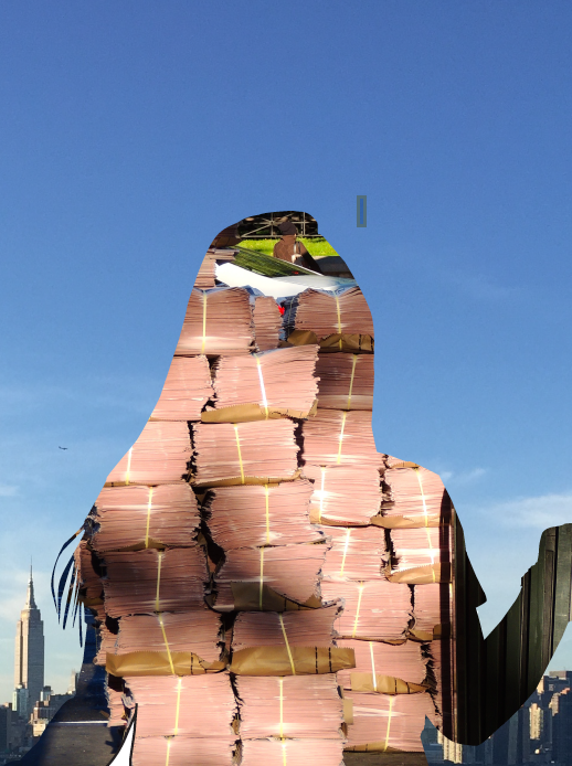
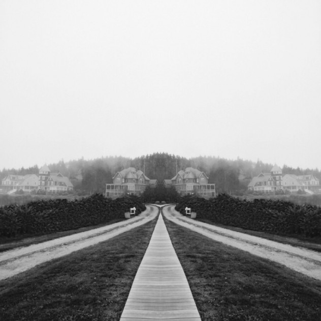
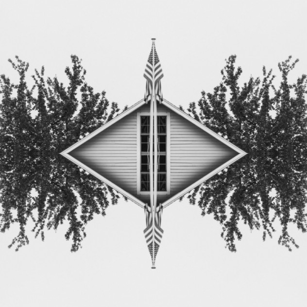
Researched images for info graphic idea. ^
Symbols:
I chose to make symbols that were easy for the viewer to associate with climate change (causes and effects)

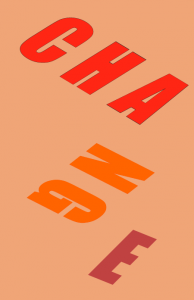
color:
I chose two bright colors that worked well with my concept of temperature. (hot and cold) I changed the opacity of these colors to achieve a range of importance in my infographic.

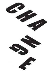
Experimental Type:
simple font that exemplifies the word “change”. The black and white print has a stronger message in comparison to the color print.
I enjoyed this project overall. I liked learning new ways to change font and work with graphic design. It was at first difficult to create a unified composition, where both the font, graphics and data worked together to result in a finalized print. Once I was able to come up with a color pallet and design that flowed nicely, I found the information could be read much clearer.
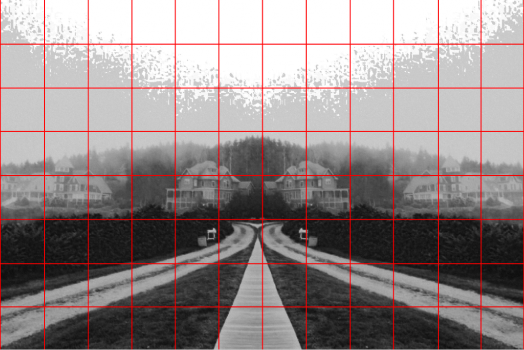
To begin the internal landscape assignment, I took the images I shot and altered them to attain a more abstract composition. After choosing one image to work with, I sized and gridded the image in order to transfer it onto a large piece of drawing paper. I proportionally scaled the grid onto the paper and lightly sketched my composition. When I continued drawing with charcoal I struggled to get refined details in parts of the image that appeared distant. I think I was successful in creating a good value range, but if I could redo this project I would try to perfect the details of my composition.
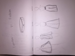
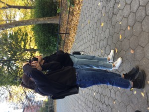
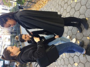
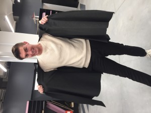
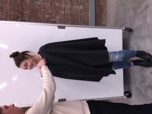
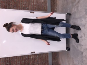
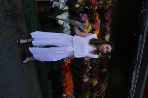
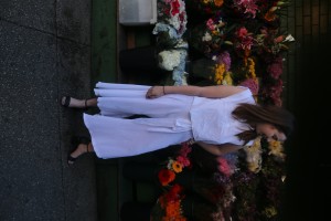
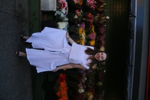
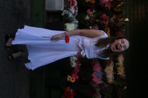
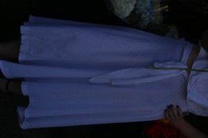
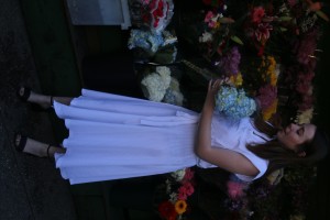
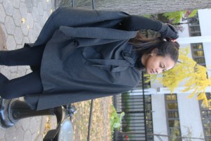
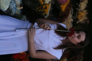
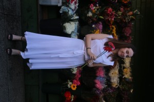
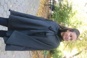
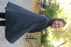
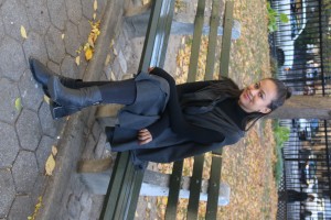
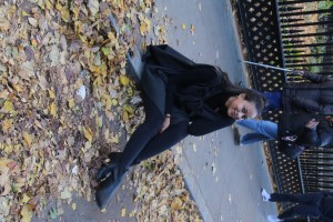
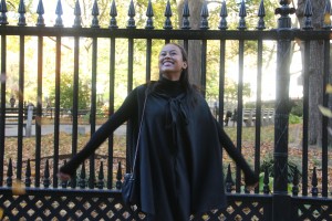
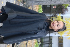
My groups goal was to design a garment that resembles the transformable use of Central Park. When we began discussing ideas for this assignment, we immediately decided we wanted to make some kind of simplified object that could serve more than one purpose for its users. Fashion is an outlet for almost anybody to express themselves. People use clothing in many different ways, and we wanted to create one effortless design that could be altered and manipulated to accommodate the seasonal changes of the east coast. Similarly to the many ways people use Central Park, our garment can be converted into different forms depending on one’s personal style as well as the seasonal changes. Our design can be converted into an overcoat, a vest, a skirt and pants, by simply snapping buttons that we have placed strategically throughout each garment. Central Park represents a diverse range of people of all different cultures, shapes and sizes. We constructed our design to adapt to all different varieties of people. We chose to make the garments neutral colors of grey and white, which will also allow its multi-gender users to pair and match them with almost anything. The garment is also made with giving fabric, in order to stretch and tighten to different sizes.
( These images would not load vertically. I shared a google drive folder with you that has the vertical images. )
https://drive.google.com/drive/folders/0B6erD3cDytbtekFPWGxUQlBRSnM?usp=sharing