1/23/18


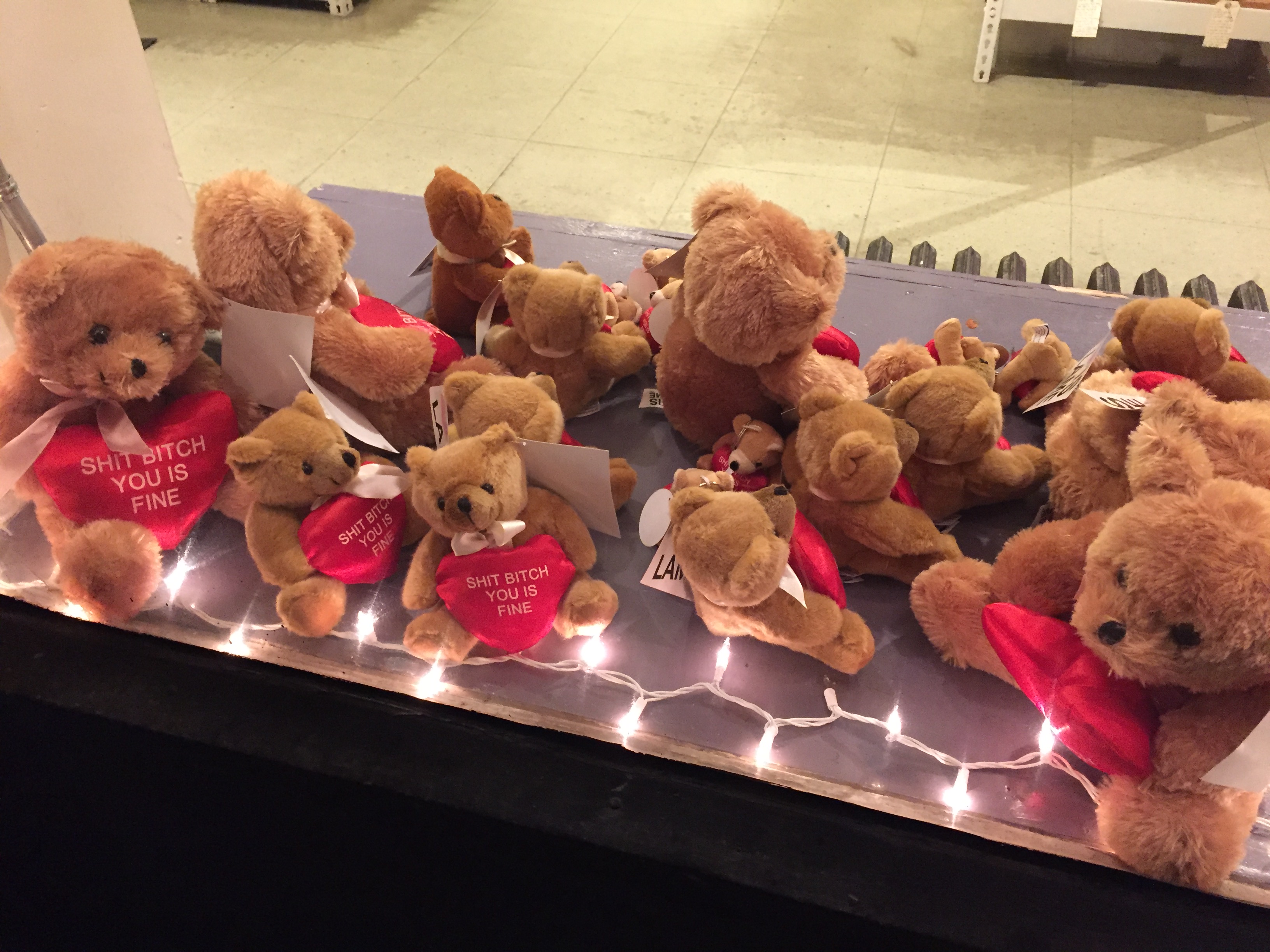
The initial picture of the Valentine’s Day bears was taken outside of a wine shop down the street from my apartment in Williamsburg. I’ve always found Valentine’s Day culture to be visually attractive and have always naturally gravitated towards images related to Valentine’s Day. However I also felt that the window display visually evokes undertones of sadness. The number of bears in the windows (this was only one window) is potentially representative of loneliness. The fact that they are confined behind a glass window and put on display is inherently sad. In analyzing the window display I has several questions: Why are there so many? Where did come from? What does the message on the heart even mean? Why am I humanizing stuffed animals? These questions led me to the response image. The image I’ve chosen for the response was taken at my town’s local zoo. Our polar bear was given a heart shaped block of ice filled with fish as a Valentine’s Day gift. Like the window display, the polar bears gift seems lighthearted and sweet, but when analyzing the image further, the sadness behind this story becomes obvious. Also like the window display, the polar bear is both confined and put on display.
1/24/18


Staircases in Jackson Heights are often utilized as a means of advertisement. For an area with an excessive amount of businesses, advertising and appeal is important. The image on the left is the entrance to a record store while the imagine on the right is an entrance to a gynecologist office. I was initially visually drawn to the image on the left because of the store’s use of signage and media as way to evoke curiosity within the passer-by. While there was a language barrier, I was visually struck by the overwhelming, obnoxious, colorful, multi-media methods of advertising; the images alone provoked my interest in the store. The response for this picture came naturally, as I passed this entrance a few minutes after taking the initial picture. The image on the right is, in contrast with the image on the left, bland, unattractive and visually uninteresting. I soon found out this was the entrance to a gynecologist office. This raised many questions for me: how are establishments advertised differently? What does society tend to embrace and what does society tend to conceal? In what ways do gender/sex politics play a roll in this? – In looking at this juxtaposition there is an obvious concealment of many potentially political themes: sex, gender, health, etc.
1/25/18


The photo of the lost dog poster was taken around the corner from my apartment. I try to take and post a pictures of every lost dog poster I see in hopes someone will find them, so I took this photo without the intention of using it for this assignment. I decided to use it after finding what would become the response photo, only then did I start to analyze the visual elements of each photo. After finding the photo of the dog on craigslist, I was reminded of the lost dog poster. When considering the juxtaposition of the two photos, I was able to make more connections between them: both dogs looked similar and both needed homes; one has a loving family looking for he and another is looking for a loving family. It also made me think of how advertising plays a roll in regards to missing animals as well as missing people. The medium of posters is often used as a means of communicating that something or someone is missing. However, I believe this method is only partially effective, as the message can only reach so far unless it is reproduced on the internet via posting a picture. The platform of Craigslist is a much more effective way of communicating what is missing, as the message can transcend physical space to reach a much larger population of people via the internet.
1/26/18


I’ve always been confused by how Instagram curates my explore page. The photo on the left is a screenshot of my explore page and the response photo is a screenshot of my recently liked photos on Instagram. With this juxtaposition, I wanted to explore the ways in which Instagram curates a user’s explore page based on what they like and what accounts they follow. This use of internet surveillance, or “click-bait”, acts as a method of advertising and consumerism; these systems work to collect a user’s activity and, based on this, compile the various files in a place that the user frequents (i.e. an explore page, a website ad, a Spotify “discovery”playlist, YouTube commercials, Netflix suggestions etc.).
1/27/18


This first picture was taken in a New York gift shop and I was I found it ironic and humorous. I thought the iconography of New York in conversation with the convertible ironic, as New York City is the last place you can carelessly and freely drive a convertible down the street. The response photo I chose for this picture is a picture of New York City traffic because I feel it more accurately represents the city in terms of the driving conditions. The image in the frame is humorously inaccurate, the fun-loving couple seems to be incorrectly pasted into a New York frame when it looks like it should belong in the context of California or a more free-spirt city and was probably not even taken anywhere near New York. The response photo, clearly taken in NYC, shows dozens of taxis in a traffic – a much more real depiction of life in New York. Hardly anyone in the city drives since the subway exists, so the majority of wheels on the rode belong to taxis, buses and bicycles, not convertibles.
1/28/18


The first photo is a coffee sleeve I got while getting my morning coffee at a bodega. The brightly colored image evokes a playfulness and the bold and pop-artesque font lead you to read the message of a somewhat provocative ad. OkCupid paid either the production company of these coffee sleeves or the bodegas themselves in order to get their advertisements into the hands of anyone who orders their coffees throughout the day. However, my response picture is of the coffee sleeve from Starbucks which is simply their iconic logo of the mermaid in green on a brown mundane background. I thought this was really interesting because Starbucks is already such a massive industry that they do not need to outsource their income by having another company put their ads on their cups or their sleeves. Starbucks’ main goal is to grow their internationally famed company and the only ad they need on their products are to enforce their brand over and over.
1/29/18


The photo I chose for today is a vintage Valentine’s Day card from the 1950s my girlfriend gifted to me recently. I love the 1950s style of sketching, particular the sketching used for cards. These cards contain innocent, almost childish, drawings of flowers and hearts. The cards are explicitly non-sexual and uses language such as “sweetheart” and “love bug”. The images are completely hand drawn and are unique to that specific card unless it is reproduced through printing. This photo made me think of the ways in which holiday cards, specifically Valentine’s Day cards, have evolved in their designs and mediums. My response photo is a picture of a current Valentine’s Day card I found on the internet. The formal elements of the card are both similar and different from the 1950s card. The newer card is digital, yet it contains similar images of hearts and flowers. The newer Valentine can be given over various internet platforms (i.e. email, Facebook, etc.) while the 1950s Valentine would have had to have been given by hand or sent through the mail. To me, there is more significance in the 1950’s Valentine; the sender would have had to put labor into getting the card to their desired receiver, or would have to meet face to face to hand it to them, making it a more personal exchange as opposed to the less-personal Facebook notification.