Final Seminar + Studio LP Reflection Post

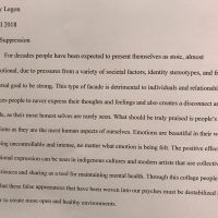
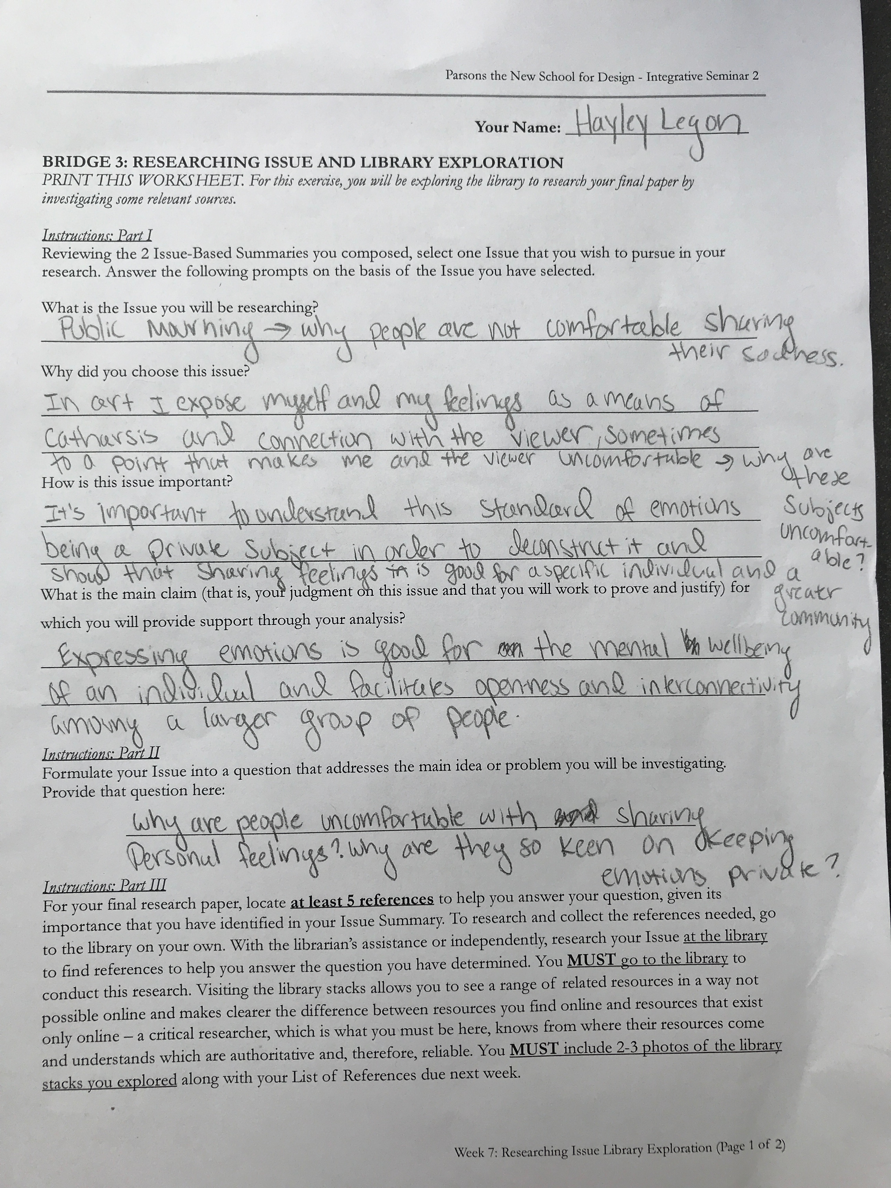
  1. Artist Statement: Group TherapyIn Integrative Studio, I used two different types of mediums, photo based media and sculpture. In the beginning of the year I used photography and film, but began to bridge this type of digital medium with sculpture in the middle of the semester, ending the year by making a hand crafted and constructed diorama. Sculpture has always connected with me, as it gives me an immersive form of expression. I hope to continue working with the medium despite my career path in illustration. Hopefully in years to come I can find ways to merge my two favorite mediums, to make work that is emotionally expressive and still fits in my artistic aesthetic. In Integrative Seminar, I read works for my final that showed the important effects of art on the human mind and society. Throughout seminar, we have discussed matters of how the human mind processes visual information and how these processes have meaning for an individual and society. I would like to further explore how the mind works and what I can discover about myself and my influences through art. Putting these types of discoveries into the world is another type of exploration, as I can see how people relate and react to my work, learning more about me and the world at large. In my work I try to express intense feelings that I find unexplainable, and even uncomfortable, in ways that make people laugh, feel with me, or reflect. I like confronting viewers with feelings that many times are not given attention, so viewers are given a moment of catharsis through my own exposition. Sometimes I mask these intense emotions with humor, to show the lightness of life and also the importance of laughing at yourself. I, Hayley Legon, am from Miami, FL and am currently studying illustration at Parsons School of Design in New York City. As an artist, I am influenced by my generation and how the people around me and I interact with the world through artistic choices, speech, and more.
  2. Seminar Focus: In seminar we read and discussed about the visual information that has purpose and meaning in our lives. We read texts alone, whether it be literature or video, and then had class discusses or exercises that either focused on literal interpretations of the text or reflective questioning. The most important concept I learned in Seminar was that symbols and signs have meaning to human’s only because of the processes the mind undergoes when reacting to said visual information.
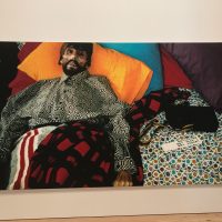
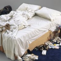
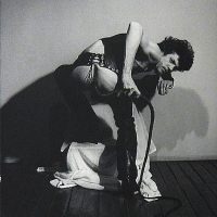
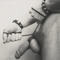
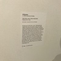
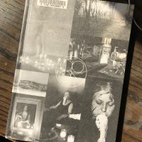
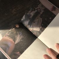
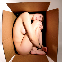
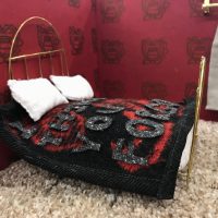
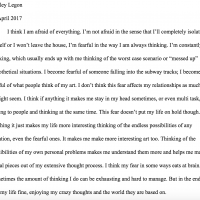
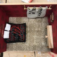
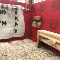
  3. Studio Focus: In studio I experimented with new mediums such as performance art and meticulous sculpture making. Throughout the year I discovered that the exposition of the self is important for my art, but does not require actual imagery of the self to be intense and show my concept. In the beginning of the year, I was not a fan of detailed work, but as this semester has gone on, I have found important meaning in little details and the importance of creating a “feeling” or “vibe” in my work. I found my first set of projects, my diptychs, to be an exposition, but one focused on literal interpretation and aesthetics more than serious meaning. With my final project I have found a new direction to go in with my work: seeking connections with my viewers through the little things that aren’t traditionally given value.
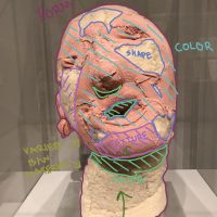
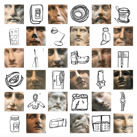
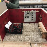
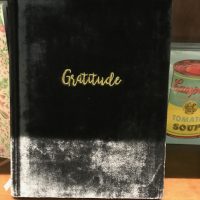
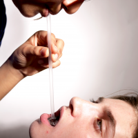
    Bridge 2: Objects Make you Cry, Objects Don’t Mean Shit

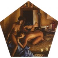
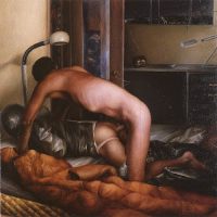
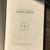
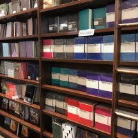
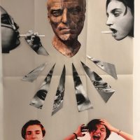
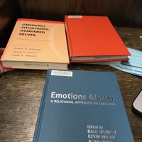
  4. For seminar, I found the key bridge assignment to be Bridge 4, as beginning research and exploring the Whitney Museum helped not only refine my research paper, but also gave me influence for my studio project. For studio, I found the key bridge assignments to be Bridge 2, as the open ended and eclectic assignment helped to get ideas out that would be refined further later in the semester. Bridge 4 was important as going to the Whitney Museum showed me professional examples of the emotions and concepts that I wanted to demonstrate in my final. Bridge 5, was the most important bridge for me as the final helped me to change my artistic practices and make a piece I am incredibly proud of. Monica Majoli, Tracey Emin, and Robert Mapplethorpe were big influences for me when discussing exposition and making imagery that is aesthetically interesting, shocking, and also relatable to the viewer. The Langer text was helpful for understanding the processes of the mind. The conceptual basis for my work this semester was about the importance of sharing emotions and thoughts in order to help one’s own wellbeing, and help the world at large to be more accepting and open. I wanted to make work that demonstrated serious moments for me, while still being relatable to a wider audience. The use of fabrics, woods, and metals for my final studio project was helpful in supporting my concept as the materials were familiar among most people and hold value and memories differently for each viewer.


Integrative Seminar + Studio: Whitney Museum Research

Part 1:

Pieces of Selected Piece:

Part 2:

2a:

  • The details that jumped out at me the most were the colors. Every shape and color was comprised out of little colored dots that created an intensely colorful piece. The look in Felix’s eyes is very specific, it almost breaks the boundary of death and life. The set up of the scene, whether it be slightly staged or not is eccentric, lively, and truly shows the personality of Felix. The little details show the realness of the situation, such as the TV remote or the pack of Marlboro cigarettes to the left. These details show how Felix was just a human like the rest of us.
  • My initial impression was that the photo was staged and that Felix looked as if he had been dead for some time. Learning the realness and immediacy of the piece definitely adds a sense of intensity, and almost disturbing nature to the piece.

2b:

The material used was inkjet on vinyl. The inkjet allowed for the vibrancy of colors and the vinyl allowed for the “professional” and clean aesthetic of the piece as to look at something to be taken seriously.

Part 3:

3a:

  • The materials cohere by making an eye catching piece that looks clean and legitimate. The text in the bottom right corner is subtle but works with the piece as it looks like a time/date stamp on a film/disposable camera.
  • This work related to the other items in the exhibit as it discusses a subject matter that most people try to ignore or erase due to what it reveals about society and the realities of life.

3b.

  • Inkjet printing was developed in the 1950s and mass use of this type of printing started in the 1970s. Vinyl decals were first invented in France around 1750.
  • The time period is important to understand and interpret the work, as during the 90s AIDS was widely disregarded and misunderstood. During this time many famous people were either diagnosed or died for HIV/AIDS.

Part 4:

4a:

  1. What were (and continue to be) the reactions to this piece that exploits such an intensely personal moment?
    • Knowing how people react/ed to the work can help to understand the stigma around HIV/AIDS. This relates to my topics as it discusses how people react to private emotions and scenes in public areas. This work also supports connectivity between the viewer, subject, and the artist (as all are human and experience tragedy) in a way that I would like to explore.
  2. Are all private moments shocking to an outside viewer?
    • This moment is naturally shocking as it includes a man that has died of a painful disease, but is this moment only seen for its shock value, or do viewers truly see the intense sadness of the moment? This helps to understand how the feelings are transmitted through the piece. This relates to my topic as it questions the best way to connect personal emotions with a viewer.
  3. How does the scale affect the impact on the viewer?
    • This piece is of a large size, making the viewer unable to look away and feel as if they were inside this moment. The scale makes it easier for the viewer to look into the eyes of Felix. This relates to my topic as it shows a way to make a viewer totally submerged in a content/emotion.

4b:

4c:

Before “Felix Partz, June 5, 1994”, Bronson worked with both Felix Partz and Jorge Zontal on their underground magazine FILE from 1972-1989. This magazine, with its name a direct mockery of LIFE magazine, was the collectives early involvement with the punk movement and queer issues, such as AIDS activism. Bronson worked on a performance series with fellow artist Peter Hobbs after the death of both of his partners in 1994. The series “Queer Spirits” was a collection of ritualistic performances in five locations (Banff, New Orleans, Winnipeg, Governors Island, and Fire Island) that was emblematic of and included the queer communities of the specific cities.

Bronson through his works FILE, “Felix Partz, June 5, 1994”, and “Queer Spirits” becomes a voice for the suppressed, discriminated, and misunderstood queer community. With his first work FILE with his fellow partners showed a more radical perspective that focused on mass awareness (to the extent that they could) of queer issues. With the work I saw at the Whitney I witnessed a more personal and serious side to Bronson’s queer perspective, showing the reality of HIV/AIDS and demanding awareness of the disease. “Queer Spirits” on the other hand shows Bronson’s spiritual side, observing queer communities and showing them in a more fantastical way, emphasizing connections with nature and the importance of community.

I believe that Whitney chose “Felix Partz, June 5, 1994” for their exhibit because of its disturbing realness and “in your face” protest that the content and size demonstrate. The piece has a necessary harshness that is important for calling attention to serious issues, in this case HIV/AIDS. The piece does the cause and Felix justice on its own, no need for multiples or complicated staging, the stare from Felix’s emaciated face impacts the viewer with the perfect balance of sadness, disgust, and anger.


What is Barnes and Nobles?

One of the first observations I had of the Union Square Barnes and Nobles was the collectible editions of classic books. There was an entire table on the first floor covered in these deep colored, hard covered, and gold accented books, like Wuthering Heights and the complete works of William Shakespeare. This type of rebranding of books, that people do not voluntarily like to read, is an obvious attempt to make these collections more appealing to the customer. At first this could be seen as a good action on the store’s part, as they are trying to make more people excited about classic literature, but in my opinion this seems like an attempt to make people buy things they do not truly need. These collectible edition will most likely go unread, instead being a nice coffee table accessory, or a pretty addition to a bookcase.

Barnes and Nobles also makes other attempts to provoke unnecessary purchases from the customer like with an Illuminated Bible, that has gold lettered words and illustrations, or the wall of Essential Journals, which do not seem essential in actuality.

Barnes and Nobles is just a small piece in the capitalist market America has created. The store might not necessarily want to make these eye-catching, accessory pieces, but in a way they probably must in order to compete in today’s economy. But by doing so, they take away from the credibility of the store and the books too, as they are seen more for their new features rather than their original content.

Photos of Message:

General Observation:

Notes:

-Collectible Editions

-Vinyl

-Nook (where they are displayed takes up a big space in the store, but the nook is supposed to be space efficient)

-Blue and Yellow Wallpaper with Traditional Columns

-Everyone is Silent –> music is playing –> what does the music do ?

-Promoting Website

-Essential Journals –> what does that even mean?

-Marketing Teen Depression

-Movie/TV Covers for Books

-Rebranding Old Books

Project Deconstruction

The project I chose to deconstruct was the final project I did for my senior year art class. In previous assignments, my teacher gave us strict guidelines to follow while constructing our pieces, and as a nice gesture, she decided to give us complete creative freedom for our final project. In the video attached I describe the conceptual framework and emotional process of the piece:

This project was my first one using copic markers. I was in love with their blending abilities and the wide variety of colors available, but I do believe that the material attributed to the many, small, mistakes I had made. If i were to do this project again I would possible do it as a multi-layered screenprint to get saturated and clean colors and lines. I still enjoyed using the markers as I love having the control of doing art completely by hand and hope to use them more in the future.

I believe the conceptual side of this piece I continue to explore, as most to all my pieces center around my own thought processes, ideas, emotions, and memories. I enjoy creating art about myself because I believe that it is cathartic and can help others feel what I feel and have a similar emotional experience.