Objective:
To choose a piece of text (from a book, line of poetry, music, etc.) and create a poster. The name of the writer has to be a part of the poster. Once the poster is done, turn it into a short video.
We were asked to think about the following:
“How are you going to distribute the text? What parts of it stay together—what parts are separated? How do your compositional choices affect the way we read the text? How can you make one part of the text louder, and another softer? How do color choices affect our reading of the text? Is there a focal point? Can you find a sense of balance in the composition using symmetry—or asymmetry?”
Poster:
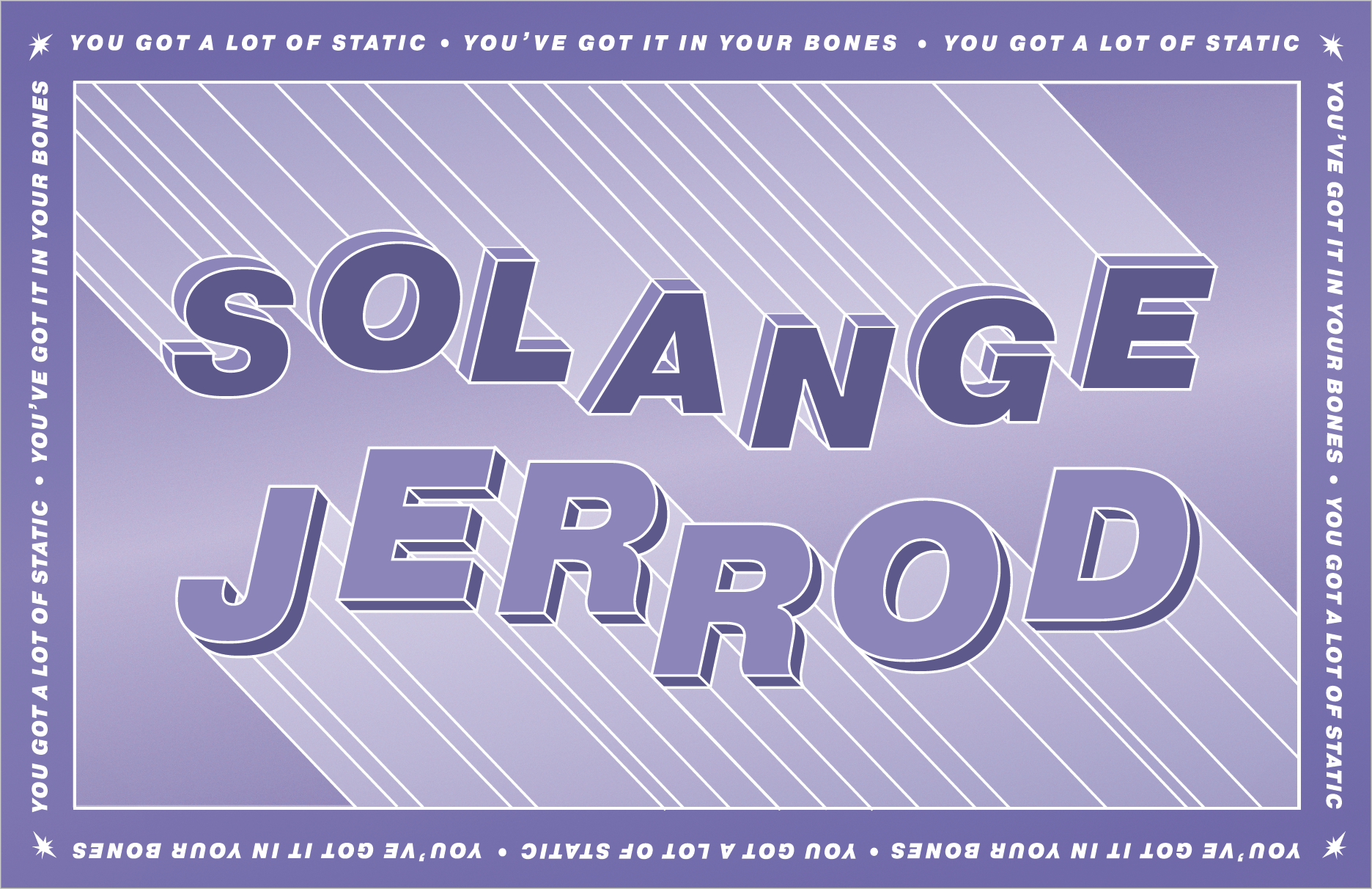
I knew exactly what I wanted to do with this project as the new Solange album had dropped a few months before. Her song “Jerrod” resonated with me and I wanted to create a visual text-based accompaniment to the song. The first aspect I wanted to work with was the title of the song. Similar to the inspirations the Solange pulled from for her visual album film, I used elements of techno-futuristic visuals to produce the following typeface.
The goal was to create a typeface that was simple but due to its 3D nature and composition would be layered and complicated, much like the song itself with its simple lyrics but layered beats and sounds. After our class critique, however, I realized that the composition was too busy. With the inclusion of color and more text, the overall poster would become overworked. As a result, I dropped the font I used previously and replaced it with another.
The next font I chose was Pragmatica, more specifically, its bold and italicized derivative. The reason I chose this font is because of the character it has. The bold and slightly geometric qualities it has mirrored the tones of the original sketch and, by extension, the song. Moreover, we were given a few limitations one of which was color; the reason for this was to put the focus onto the text. For this project, I decided to use a shade of low saturated purple because I felt that this captured the dreamlike tone of the song.
 The Album Cover for Solange “When I Got Home”
After taking the first version to class, It was brought up to me that the poster was flat. The plain background did not add anything to the overall composition. To remedy this, my professor recommended that I played with gradients. Taking this suggestion I added a gradient to the background to match the slanted angle of the title and artist’s name.
I also altered a few more elements to add depth and cohesion. For depth, I added a translucent layer of white to the title and artist in order to separate it from the background. In terms of cohesion, I altered the color of the border to a darker purple so that it could match well with the main two elements. Furthermore, I made the text in the border smaller and white with a small blink of light in each corner.
Video:
The next task was to take the poster and animate it by using the timeline feature of Photoshop. However, before we could start animating the video we had to develop a storyboard to give us a framework for when we began building the video.
In my storyboard, which you can see below, I wanted to focus on the lyrics I chose rather than the name of the song or the singer. The lyrics were “you got a lot of static, you’ve got it in your bones.” To make these words visual I used text but it did not feel like enough. Our professor allowed to incorporate illustrations as long as they did not become the main focus, so I decided to create a little flashing light/star illustration to capture the essence of the lyrics I chose.
Storyboard Page #1
After beginning the video I found that what I wanted was once again overcomplicated and overly time consuming for the allotted time we had. Therefore, I decided to alter the storyboard in order to still achieve the end result but make it more realistic. It resulted in the following video.
Final Video
As you can see I stuck most of the movement to the text to the beat of the song. This allowed it to meld with the track well. Furthermore, the incorporation of the illustration I made into the background doubled its original use as a flashing light into a star. These stars were also a nod to the techno-futuristic and intergalactic motif of the song and Solange’s video.
Reflection:
This assignment was my absolute favorite of the semester. It brought the things I enjoy the most together in a creative and challenging way. Although I did not get to use the type I created, I am most definitely going to expand on it in the future. This is a lucky surprise and shows me that just because I do not do something for a class does not mean that I cannot do it in the future. Moreover, the timeline feature of Photoshop was challenging to work with as I had never used it before. Luckily, I quickly caught on found it to be a very useful program to work with. In all, I definitely felt that I was able to progress as a communication design major and I am very excited to see what lies ahead in the future.


