Expanding Into Space


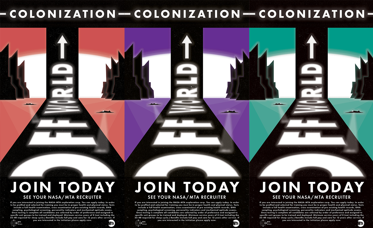
Above you can see my development process from initial sketch to the final triptych installation piece. I was assigned to interpret the prompt of expanding into space and how some aspect of the future might impact ones perception of life on earth. I am very inspired by futuristic, often dystopian science fiction theories and I tend to apply their theoretical concepts into my graphic design. I wanted to implement some of this inspiration into the expansion into space piece. The first step was to create a mood board that culminated all my inspiration into one document. I chose to take from Salvador Dalí because I liked his use of color and overall composition. A lot of his work reminded me what the future in my mind might look like. I also wanted my creation to mimic the old retro style that posters designed in the early 60’s ad 70’s had. After creating the mood board and honing into a specific style and color palette, I started sketching. The sketch you see above is the final version of over 10 other sketches. As I began to experiment and implement new features, I learned what worked and what didn’t. This step is crucial because you save time by keeping your ideas simple and limiting the scale of your work. I came to the conclusion that I preferred the designs that were simpler and aligned more with 1920’s and 30’s graphic design. The geometric shapes, simplistic patterns and use of texture created an atmospheric perception that I wanted to mimic in my final piece. I researched 1930’s dutch graphic design and studied the different techniques and processes. Taking the design digital I began laying out the grid system for the perspective and abstracted a lot of the detail in my original sketch. After building out most of my design I saw the need for texture and patterns. I took construction paper and cut it into squares, mixing and matching the different pieces creating a pattern consisting of multiple textures that could then be scanned in and overlaid onto my document. Above you see the processed pattern texture, inverted and modified by photoshop blending modes. At this point the poster was complete but I was unsure of the color. Red seemed too dystopian and very totalitarian. It reminded me of soviet Russia and the space race. After consulting with my peers I decided to create 2 other versions in different color and present them in a triptych.