


The two pictures above are my shoe design inspired by the Baroque period which is what this entire project is referencing. I thought it would be a good way to incorporate my interest, fashion designing, into this project by looking into shoe designs. This is probably my favourite part of the entire project other than creating the patterns in illustrator.

I have taken the drawing from a figure drawing session and replaced the blank spaces with the prints I designed myself. I found this the most difficult out of all. All my patterns are intricate and can end up being very overwhelming depends on the placement. This image probably took me the most hours to play around with the placement of the prints as well as adjusting the scale of my patterns. I mostly used the fill options to colour the pattern dude with pattern and used a little bit of blob tool to add some finishes to the folds and shadows.

This is the same image as the one above but will colours. For a long time, pink is my favourite colour so I wanted to include it in my colouring book. I also spent quite a bit of time deciding what colour should go into which space. In the end, I decided to have him wear a matching set, and added more interesting textures to the trim. I mostly used fill, and then finally used blob tool to emphasize on the shadow and folds of fabric.

These are the patterns I’ve created inspired by the seven different cultures which include Japanese, Thai, Indian, Native Americans, Russians, Egyptians and lastly Taiwanese. I was originally born in Taiwan and I wanted to have a more personal approach to this project, so I’ve included Taiwanese aboriginal inspired pattern in this project. Although I did not end up using the pattern in any of my images, I am still quite happy with the outcome.

These are the same prints as the ones above but filled in with colours. As I was creating my patterns, I played with the scales of the symbols as well as reflection and rotation. I filled my patterns in with a warmer and more pastel tone to brighten up the mood and introduce a tint of playfulness. I am very happy with how my prints turned out, especially Egyptian and Japanese. I coloured these pattern manually by clicking on individual lines and sections and click the fill option.
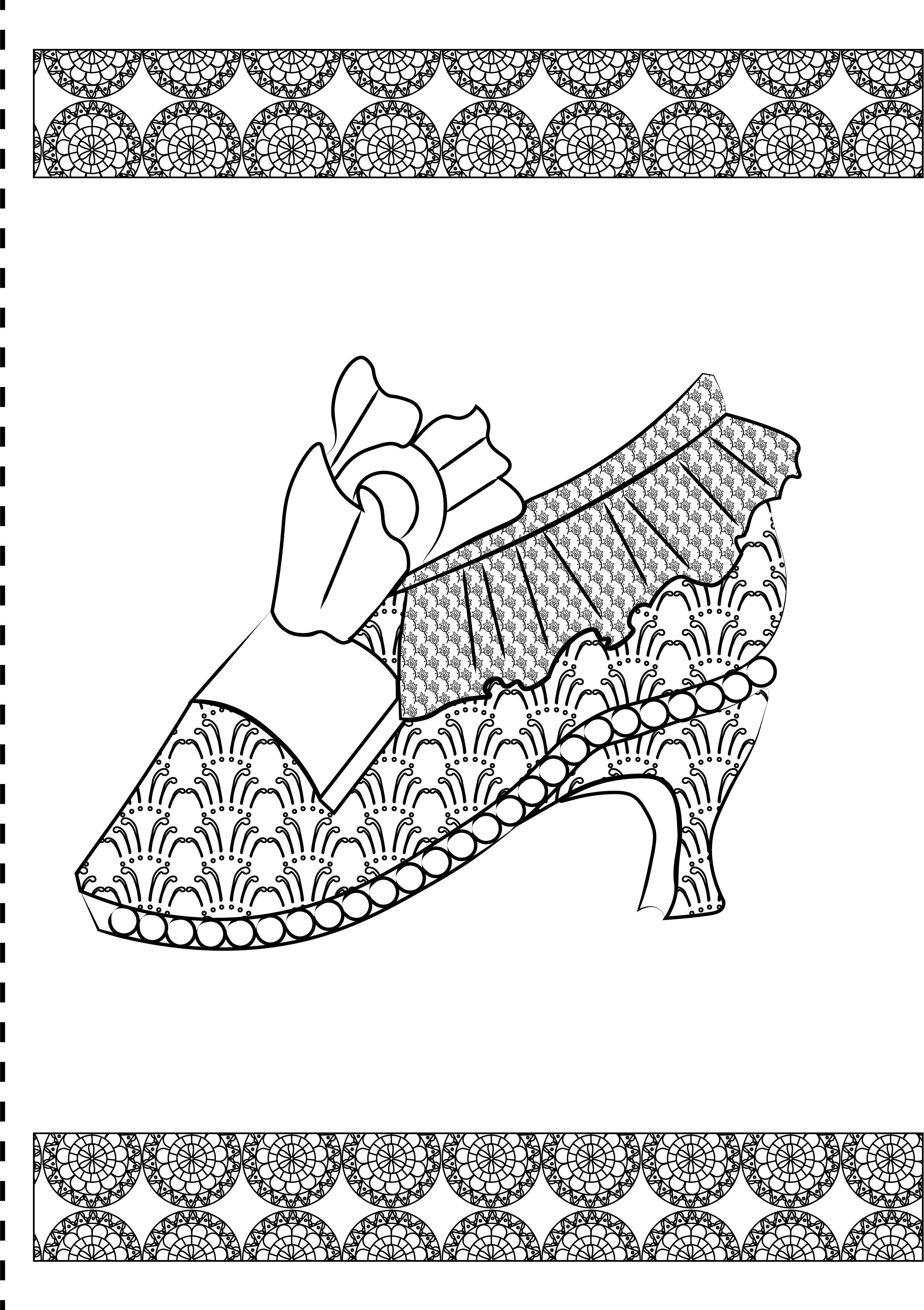
This is what my shoes look like with prints! I added two rolls of prints on the top and bottom of the shoe to add a little more texture so it appears less bland. I played with the line weight with this design to give it a more organic touch.

For this design, I have combined two different prints to create the shadow underneath the shoe. I thought that was pretty successful because the shadow added a nice dimension. I also created a border with the Japanese inspired print.

Last but not lease, I created a mirror image using the same shoe by reflecting the shoe and off set it slightly. Now looking at it, I should have leave more blank spaces for colouring.