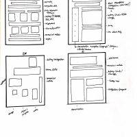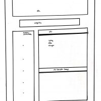
Research:
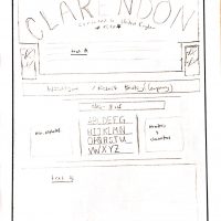
Clarendon
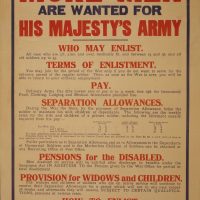
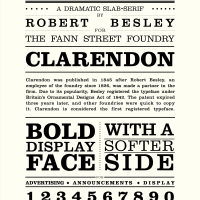
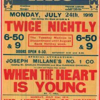
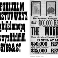
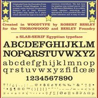
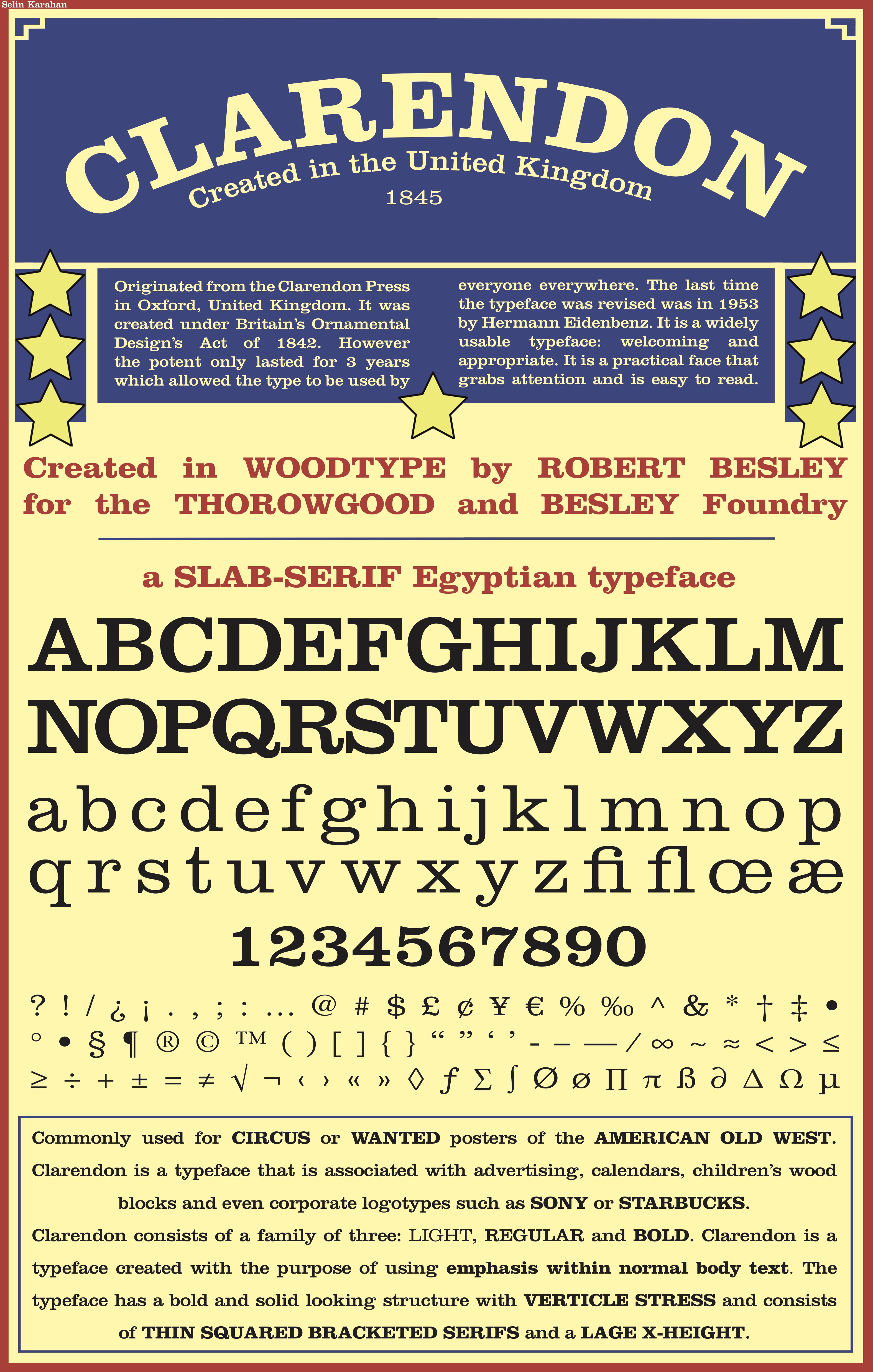
Clarendon is a slab-serif Egyptian typeface inspired by the Antique typeface. It was created in wood type in the United Kingdom in 1845 by Robert Besley for the Besley & Thorowgood Foundry. The name is originated from the Clarendon Press in Oxford. As Clarendon was primarily the first registered typeface under Britain’s Ornamental Designs Act of 1842, the patent only lasted 3 years. This allowed other foundries to copy the face and use it by their own means. Since newspaper production in the 20th century were skyrocketing, Clarendon was revised by Hermann Eidenbenz in 1953. This revision is what Clarendon typeface looks like today. The purpose of creating the Clarendon typeface was to create a simple face that looks appropriate highlighted or emphasized within normal body text. Successfully, Clarendon is recognized to be one of the first typefaces to have used bold for emphasis within body text. Today, the face only consists of a type family of three: light, regular and bold. While Clarendon was a popular face, it was a common choice of type to be used for circus posters and WANTED notices of the American old west.
As compared to other typefaces of its time, I think Clarendon is a very welcoming and warm typeface, very good at grabbing attention and also highly easy to read. Its uses are associated with advertising, books or publications. For example, today I have noticed that it is used for logotypes of brands such as SONY or Starbucks. It can also be seen on calendars, labels or even children’s wood blocks. Although the typeface does not have a lot of contrast in weight of stroke, Clarendon has a bold and solid looking structure with vertical stress. The thin square shaped serifs of Clarendon are bracketed. They are connected to the body of the letters through light curves which allow the type to fit well within an inline of a body and bring out its soft and approachable feel to the audience. The ascenders and descenders of Clarendon are short, whereas the x-height of letters is quite tall. This gives the face a more balanced look.
Bibliography
“Clarendon.” Typedia. 25 Aug 2009.
www.typedia.com/explore/typeface/clarendon/.
Cunningham, Jonathan. “Clarendon.” Meaningful Type. 2017. www.meaningfultype.com/clarendon.html.
Farwell, Stephen. “Clarendon Typeface.” History of Graphic Design. 2017. www.historygraphicdesign.com/industrial-revolution/the-industrial-revolution/340-clarendon-typeface.
NG, David. “For Font Lovers: A Short History of Clarendon.” Popperfont. 11 Oct 2011. www.popperfont.net/2011/10/18/a-short-history-of-the-clarendon-font/.