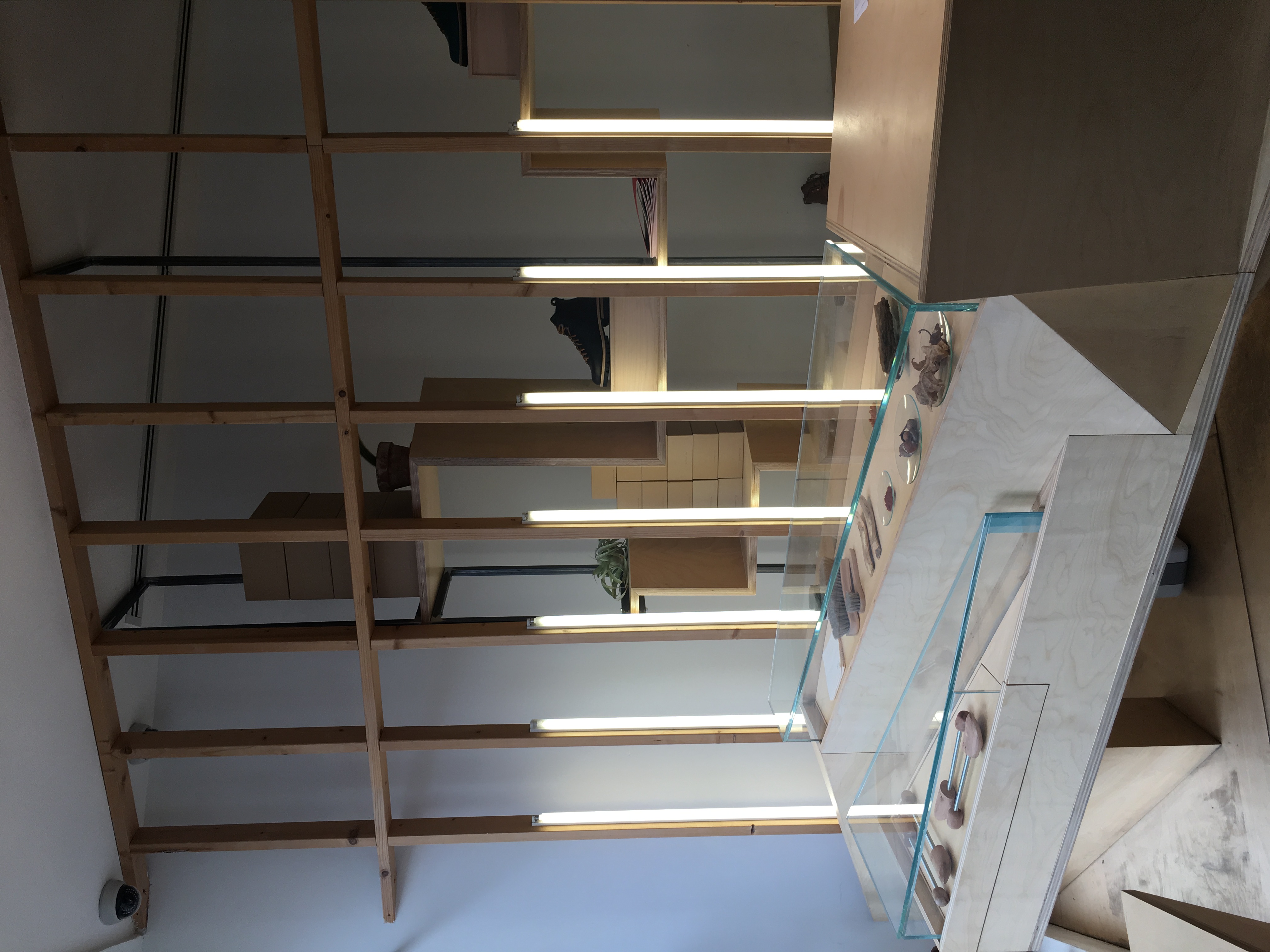
Feit-
Materials used in this interior were different types of plywood, metal, mirrors, and glass. Sheets of plywood were used as flooring, as well as the center shoe display. Wall unites were made of plywood shelves that were meant to look like an interior foundation.
The mirrors behind the wood foundational shelving made the space seem much larger, and because of the nature of the wood it was hard to tell where the actual physical boundaries of the shop were. Because the wood had openings, one was able to look beyond it, and it created a very unique feel to the store. The space itself was very small, but the geometries made it appear much larger.
The materials used gave a very raw vibe. When first walking in, the store was very impressive and unique. All of the structural elements were very cohesive, and the aesthetic of the wood panels was decorative while being very functional at the same time. The store had a very raw vibe, which was enhanced by being able to see the cuts of the wood, the grain and layers of the plywood, and the wearing of the plywood on the floor.


Apple-
The main material used was glass-on the outside walls as well as the main staircase, which was the focal point. The stairs and railings were made of 5 layers of .5″ thick glass, held together with metal hardware.
The glass staircase was located in the very center of the store, and was the main attraction-everything else was rather plain (cement tile floors, and plain wooden tables). The fact that the steps were glass was very interesting because it is not something found many places.
Overall the whole space was very cohesive-the blue tone of the glass matched with the grey flooring, and the outside windows. It gave a very cool vibe that I think goes really well with the stores purpose, to sell technology and different devices. Because everything was so neutral, it made it very easy for the store to replace the display walls with different images, ensuring that whatever was shown would go well with the space.

Camper-
Materials used here was plastic panels and shelving, mirrors, and aluminum ceiling panels with red and white paint.
The panels that created shelving were used in a very interesting way with the use of colors. When walking into the store, the shelves are hidden by the large red panels, and everything looking in one direction is red, including the ceiling. When looking the other way, everything becomes white, and the shelves and products on the shelves are exposed.
The experience of this space was one I have never seen before. From one angle to the next the store completely transformed and looked like two different spaces. The use of mirrors on the back wall was a very smart choice-because in the mirror it showed only the white side, so looking in the mirror one sees all red up until the mirror starts and in the mirror everything is white. It made the store seem very long and like it continued on.


Prada-
Although we were not allowed to take photos, the Prada store was very interesting. The materials used were metal, concrete, plastic, wood, and mural artwork.
The metal grate shelving were able to move and turn and transform so they could be used and moved in a number of ways very easily. The wood was used to create a large dip in the front half of the store, to be used for displays, and created a play-like feeling to the store. The materials were very raw and gave an industrial vibe.