BRAINSTORMING
Harmonic Conversation: Procreate and Photoshop
When I first began to brainstorm the idea of “harmonic conversation,” and how it would translate visually, I immediately thought of complimentary colors acting as two sides of the conversation. Aside from this, I thought there should be some sort of linear or directional element to symbolize progress and time, since a conversation is an activity of sorts that takes place in a physical space. Aside from this, I decided that there should be two opposing elements that are intertwined, therefore revealing that, though they are different, they are both flowing on the same wavelength. I also decided to add a blurry, flowing, blended form that is barely there in the background to illustrate the harmony in the interaction of two points of view. The jagged lines combined with the softer lines, to me, symbolized a healthy conversation that still contained disagreement without spiraling out of control into an argument.
Resonance: Procreate and Photoshop
When I asked myself how I would visually describe resonance, I thought of a sigh of relief when someone finally understands. I also thought of the satisfying feeling of reading or hearing something that perfectly described something I’ve been unable to put into a cohesive sentence. This often happens with song lyrics or when having conversations with friends about how we’ve been reacting to our first year away from home. Because of the personal aspect, I wanted to draw a portrait that showed relief and had calm colors but some small pops of vibrance to represent the satisfaction element. I also wanted it to be more sketchy and fast-paced because of the initial immediacy that comes with when I hear something that resonates with me. I used the yellow lines to represent the actual sigh itself, and wanted it to look almost electric to match the idea of finally finding clarity in a feeling or thought that I couldn’t previously describe accurately.
MOCKUPS
PROPOSAL
CONCEPT
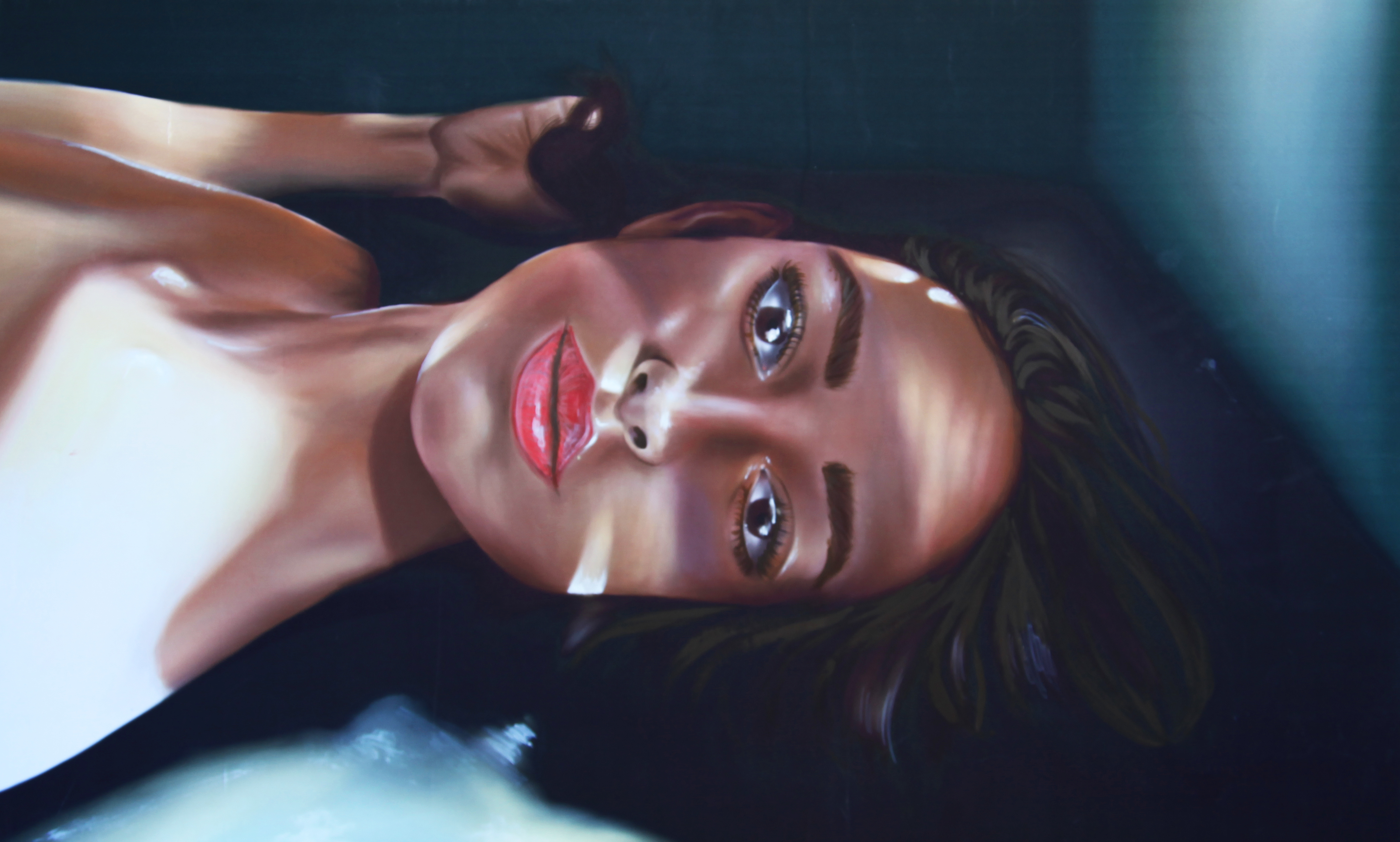
The subject is lying on the floor in a space that implies a window where the audience is. Different shadows and areas of light are projected into her face as she stares at the viewer. I’ve been researching biracialism in my seminar class and this piece is directly inspired by the quote “society often picks his identity for him, and regardless of the person picking, they always choose a labeling identity that is opposite of their own.” I essentially want to make a piece that is critical of using certain people as a blank slate that others project their own meaning onto, regardless of their original state.
PROCEDURE
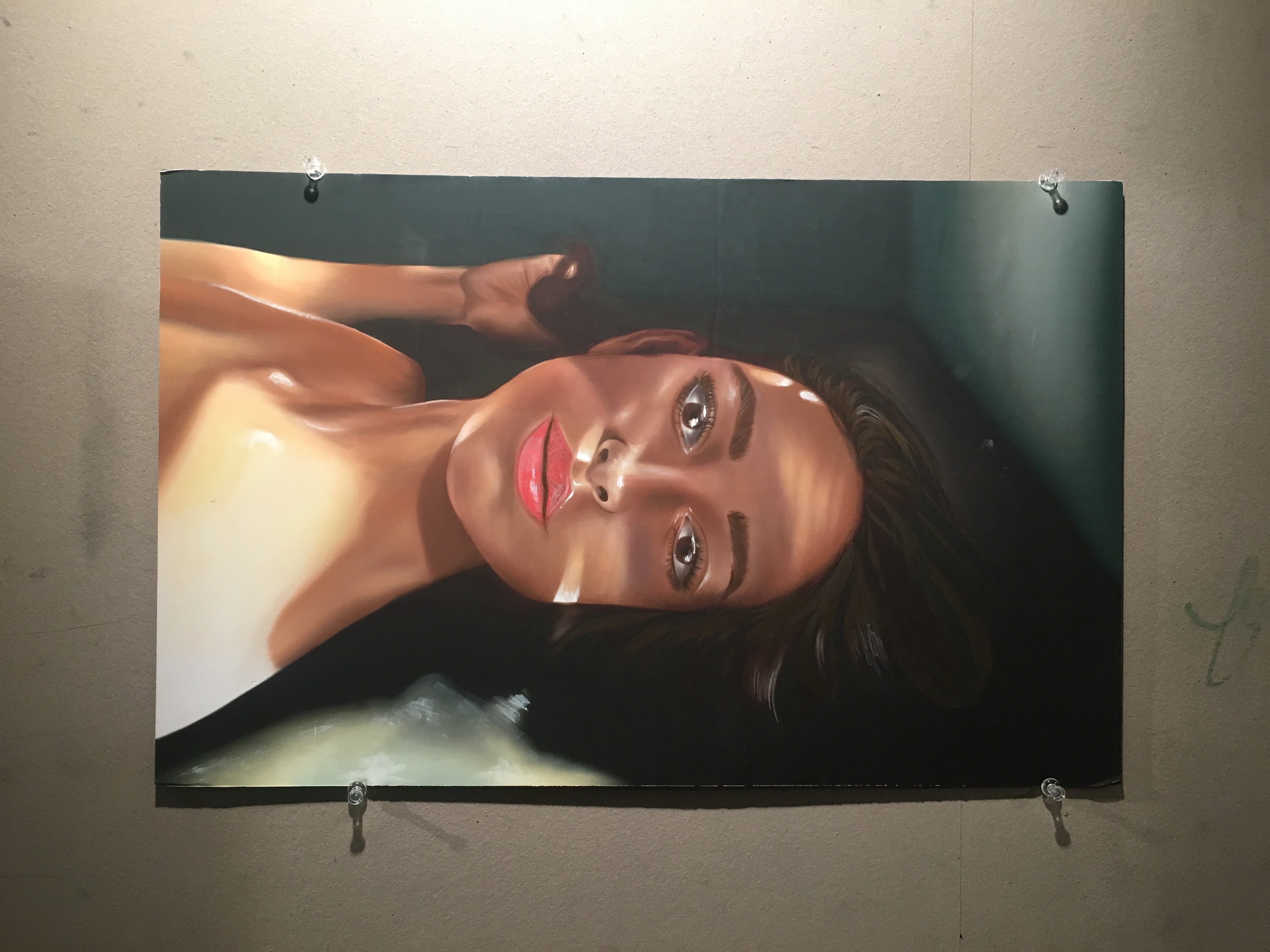
I’ll begin with the illustrator mockup and paint on top of it in Procreate on my iPad to create dark and light values. Then, I will print it and mount it onto foam core to make it more sturdy and presentable. Finally, I will paint some small details on top of the printout in acrylic.
IMAGERY
There’s a woman in a small, isolated “viewing” room— almost like a box at a museum. Different light values are cast upon her to the point where it’s difficult to tell which section is her original color.
MATERIAL/METHODS OF ANALOG AND DIGITAL INTEGRATION
In order to avoid a harsh look, I will only be using the digital illustrator element as a template that I will paint on top of and ultimately obscure. In response to a comment on the walls looking very architectural, I will soften those lines and make the colors warmer to achieve a more organic look.
COLOR APPLICATION
As mentioned above, I’ll use skin tones and dark greens to achieve a warm, organic look because of the fluid and personal nature of the subject. Because of the quality of the printout from the plotters, the darkest blacks of the piece looked more green than they were intended to, which ended up working well with the color scheme.
REFERENCES/SOURCES/CITATIONS
The original image is of me, and the quote is from an academic journal that I found when researching for my seminar paper.
Perkins, Rhea. “Life in Duality: Biracial Identity Development.” Race, Gender & Class 21, no. ½ (2014): 211-219.
PROGRESS
-
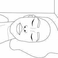
- Illustrator File
-
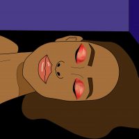
- Photoshop Mockup
-
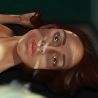
- Step 3: Digitally Painted
Progress Reflection
This project was really interesting, and I found it difficult to tackle something that was outside of my comfort zone. Likeness is something I find very difficult in portraiture, but I think I’m definitely making progress in drawing features accurately. Doing the illustrator file first to draw on top of made my idea of a self portrait much more achievable. To create the illustrator file, I used the pen tool and an image of myself as the template. Adding in the colors in photoshop was very fun because it allowed me to define the colors I wanted to use, and ensured that I didn’t do the same red-yellow combination that I tend to lean towards.
FINAL PROJECT
Final Reflection
Overall, I found that this method of acrylic painting on top of a digital work was successful and I hope to try it more in the future. There are definitely limitations to drawing digitally, and this combination includes convenience of technology and the organic nature of analog work. For example, I did the lips, eyelashes, and eyebrows in acrylic because there was no way to get those soft strokes that I was after on my iPad or on illustrator. I was also able to intensify the highlights in paint, which ended up making the painting much stronger since it gave me a fuller value range.
Poetic Statement
I am not white, nor am I black, nor am I half of anything. I am different and that is okay. Race is fluid sometimes and that is just fine. I am not an oreo, a zebra, an outsider, a try-hard or exotic. I am Lisa Paravano, Italian Somali, and I am definitely not your blank screen.