I took this photo in the Disney spring resort in Orlando. This post is a bus schedule on the hotel’s wall. I think this schedule’s graphic design uses a clear hierarchy principle. In the schedule, all information is organizing with an order; the primary class information using the orange color to label, and those details words are flowing with the orange color words, we can easily find the affiliation of this information and will not feel confused with the relation of this information. This schedule makes the excellent reading experience to customers.
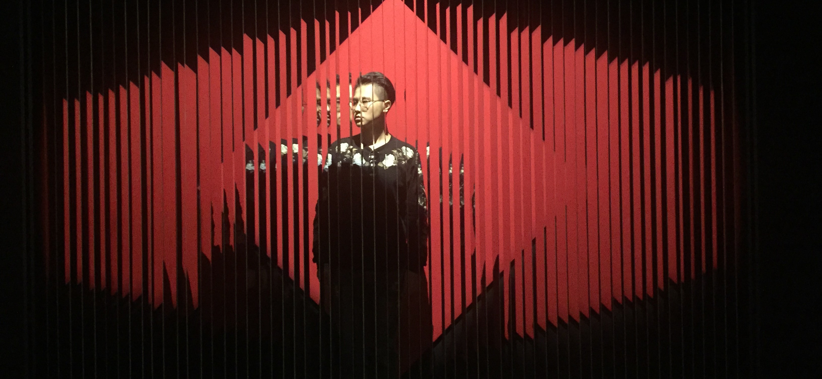
I took this picture in the Miami modern art museum. We can see the author use the grids principle to create a really strong sense of space. He attracts our eyes through the different size of grids and the black & white colors. Because the color’s changing, we even can feel the picture is moving, also the big grids on the side and the small grids in the middle form a kind of perspective relation, and it is why this painting looks very three dimensional.
This picture is a sample sale advertisement I got from my email. This advertisement page uses the typical scale principles; it blow up the words of “sample sale” and shows them on almost half of page; it makes people clearly know what the theme of this advertisement is, and it also really attract those people who may be interested in this selling activities.
I want to use the principle of asymmetry and scale for my magazine layout design. Because I plan to put many pictures in my magazine, and I want to point out their function on each page, also I want to attract all the audiences’ attention on those pictures. So on each page, I will leave more space to those pictures and less space for words. For those pictures which have strong meaningful like the national flag or some pictures connecting each topic directly, I may be set aside their layout space as much as possible.


