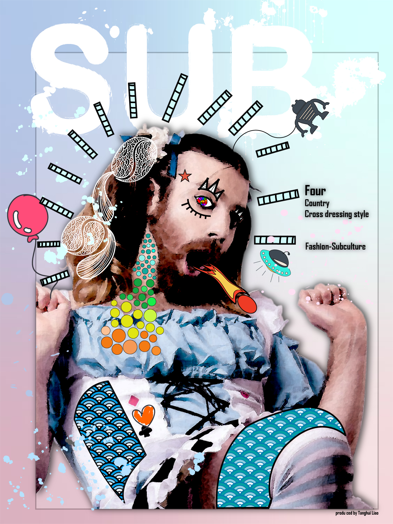
My magazine’s name is “SUB”, which means super unusual beauty. In my Planning, this magazine is for introducing the subculture or everything minority to the customer. This magazine’s goal is for challenging today’s mass culture and provides more possibilities for people who want to improve themselves. My Bridge3 topic”Cross-Dressing” is only the newest theme for this magazine.
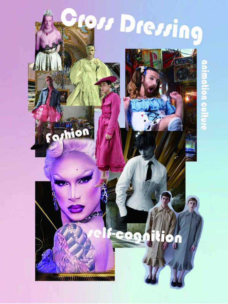
From the mood board, you can see my topic is Cross Dressing; the main colors of this magazine is blue and pink. I want to explain what is cross dressing and I will separately explain how to cross dress influence three different cultures, and how it influences them. I choose three countries for my topic which are France, Japan, and America. France represents fashion culture, Japan represents animation culture, and America represents the dramatic culture. I also want to talk about how cross dressing connects with art in my magazine.
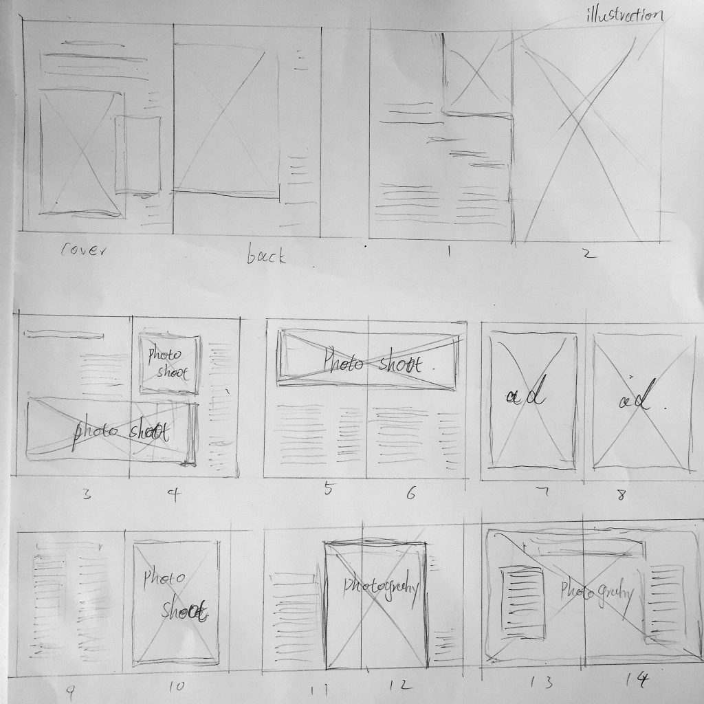
I want to use the principle of asymmetry and scale for my magazine layout design. Because I plan to put many pictures in my magazine, and I want to point out their function on each page, also I want to attract all the audiences’ attention on those pictures. So on each page, I will leave more space to those pictures and less space for words. For those pictures which have strong meaningful like the national flag or some pictures connecting each topic directly, I may be set aside their layout space as much as possible.
Making process of hand writing style words
The hand writing style title is one of the unify element in the magazine. Combine them with the spray texture can make a really good art form. The following pictures is the making process of hand writing style words in illustrator.
The final prototype
Bridge 3 is the most challenging project for me during this semester, but bout also makes me a lot of fun. I learned many layout skill and principle, such as Symmetry/Asymmetry, Scale, Framing, Hierarchy, and Grids. I also learned many ways to doing research, like how to make the mind map and how to deconstruction other’s design work. This magazine is the first magazine I made, and I think I’m dome pretty well.


