This slideshow requires JavaScript.
This slideshow requires JavaScript.
This slideshow requires JavaScript.

With this final piece, I intended on making a composition that draws attention to the plastic materiality of the center, original lamp, and juxtaposes that with twine, a more biodegradable alternative. The two twine sculptures work to hone in on the idea of mass production, versus the nuance seen in hand made things. I wanted to play with the way the center lamp looked– decaying, despite plastic actually lasting nearly a millenia in reality.

The Stone Living Room is a site that is located in my hometown, West Milford, NJ. It’s a grouping of rocks that is located away from some of the designated hiking trails in the area, and who exactly created the “living room” is somewhat of a mystery– there is no confirmed creator (though most speculate that it was just created by some teenagers, however long ago.) It is not located on any official trail, and as a result one has to go off the beaten path to find it. I feel that this location would be perfect for my sculpture, which is meant to capture isolation– I felt very isolated in my hometown, being mixed race, gay, and a democrat– its population its about 92% caucasian (of ~25,000 citizens) and many of the people living there are conservative (the confederate flag is visible all throughout my town, in the windows of pick-up trucks, on people’s hats, in the form of handkerchiefs, bandanas, and as flags at my highschool graduation.) Having this monument in a place that someone has to work to get to, a location that in and of itself is isolated, would bring a deeper and more personal experience to the work itself.

Platonic Solids– I used wire and tabs, thread, and carpet tacks to close these shapes.

The inner mechanism– I actually came up with this mechanism before I came up with the structure of the body extension. Long pieces of string attach to both my finger and the piece of metal. When I bend my finger, the sheet moves downward, and flashes through the slats cut out of the front. When I relax my hand, the sheet metal retracts upward because of the rubber band.
My maquette– This design is warped, due to the time I spent manipulating parts of the design to render it in chipboard. This design is fairly similar to the final product, however as you can see it is in two seperate pieces. I originally intended for part of the project to go all the way up to my shoulder, and leave an open gap for my elbow. This design ultimately had to be tweaked due the easily pliable nature of paper– when I attempted to copy this design vertbatum in chipboard, it was tight and difficult to fit the machanism inside.


Reflection
At the beginning of this assignment, each member of our group was tasked with taking 100 photos (each), while riding the Staten Island Ferry.
When I began my journey on the ferry, I was unsure of what to photograph– would I focus on people? The landscape? The boat itself?
As I explored the ferry, I decided it would be interesting to photograph tourists aboard the vessel, and then move to areas of the boat where communters resided– I wanted to juxtapose these two groups with eachother.
When the members of our group brought our images together, we found that most of us had focused on people, and detail shots of the boat itself. Our original intention was to focus on the interactions between people we saw, and how certain spaces on the boat contributed to those interactions.
Lily’s photographs contained many different signs, which we originally intended to use to show a narritive– a story that brought the viewer through the boat, from boarding to landing in the water at the end. 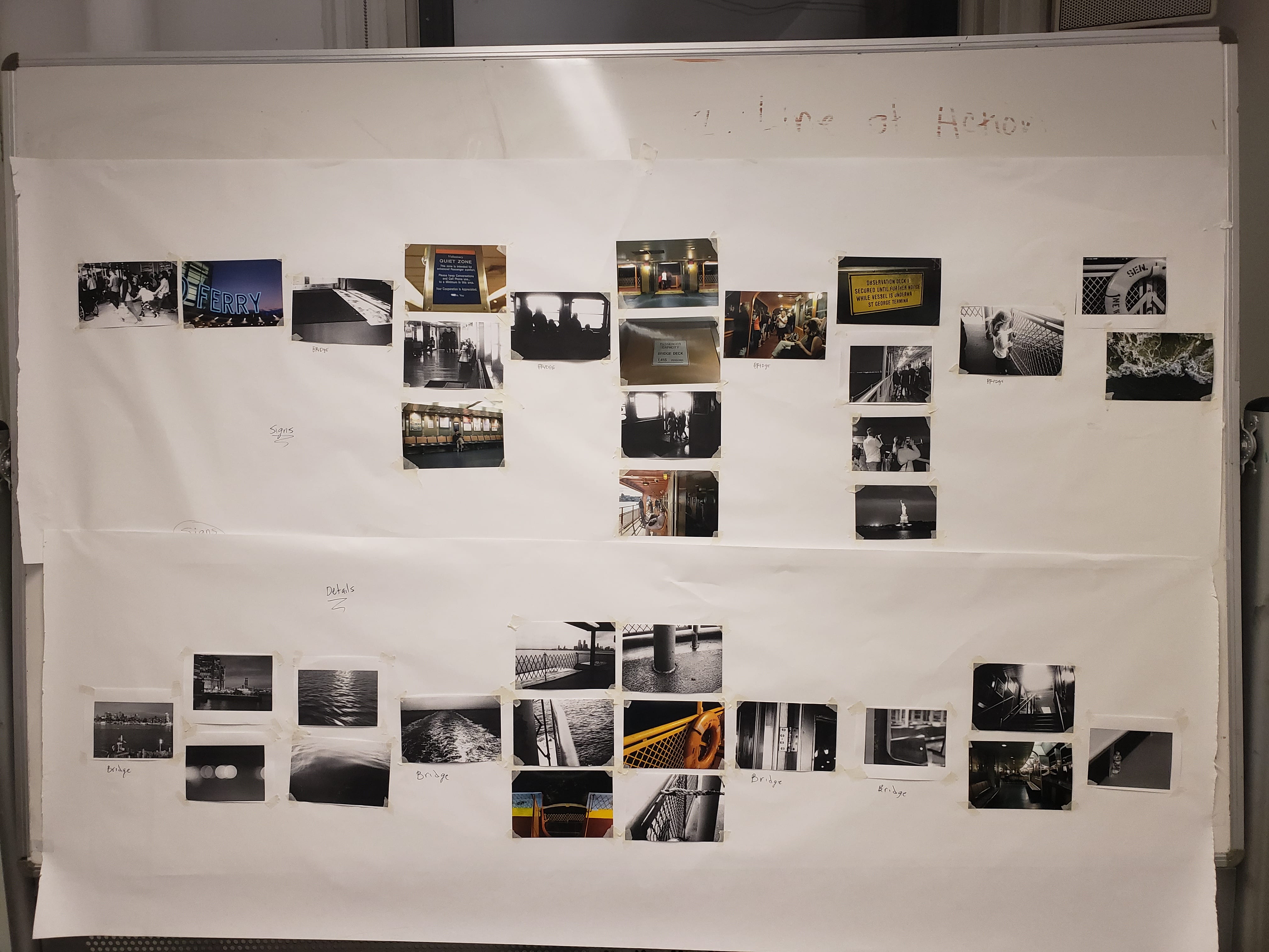
After thinking on this narrative for a bit longer, we found that perhaps this idea was a bit too on the nose– very self explanatory.
To take this signage idea further, we decided to address Maria’s research, which focused heavily on sign theory, and the color theory associated with signs.
In this rendition of our original idea, we decided to take aspects of each other’s research that related to the emotions that sign color conveys– The growth of the Staten Island and the area around it matched with green and blue, which represent growth, fertility, and calmness; The design of the boat and its iterations throughout history matched up with orange, which represents ambition and endurance; tourism and commuters’ opinion on tourism matched up with red, whcih represent anger, caution, and intensity; and sign theory itself matched up with yellow, one of the most eye-catching sign colors.
Our final product was kept purposefully simple, save for the black and white photos we placed in the background of three of our color sections, to show context and examples of what we saw while aboard the ferry. We intended for our pamphlet to be easy to view, and to be highly factual.

Map (Click for fullsize)
Key
Notes from after the walk:
*white, yellow, like i was in space,
ground feels like it moves, warping changing
the feeling of the walls, bumpy, cool
white, white, white, grey, black
* standing still at the elevator, floor moving, the button, reaching out
move to common area yellow, head swimming
yellow yellow yellow, cold, swimming, going straight
* the feeling of metal and the color gray
sound of whirring, air conditioner, clang
turning around, gray white
waiting at elevator, curve of the door
*being in elevator
floor is sturdier
cold elevator walls
the next floor.
* swimming, yellow and green and pink
the room. felt open but narrow
cool, fragrant smell. sweet
bright, yellow, blue
* constricted in a big space, the stool, the pole? bar on the wall
* smooth door, cold
the next elevator small, open
*the first floor, open, bright. white
the stairs, turning right
the sirens screeching loud, the brightness, chatter people talking
* the slope of the ground
* hitting the pole on the way up
yellow
* the wind hitting my back, pushing me foreqard
the smell of food, people talking
* wind hitting my right side
people talking yellow. pink
* the floor is sturdier, heavier. hitting the plant. heart jumping
water, the sound of rushing water. choppiness, clang clang
blue blue, construction, screech of the saw or drill or whatever
the sound of the truck, loud, air release
wind. warm from the street
turning right, tighter a lot of people, yellow
yellow
blue
warm air
* no wind
turning right, yellow, white, grey, grey ,grey solid ground
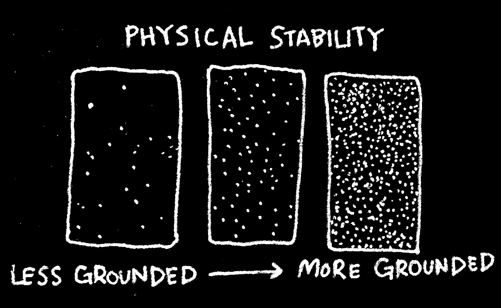
In my map I decided to describe the sensation of being “grounded” by adjusting the desnity of a series of small, white dots on black paper. The higher the concentration of dots, the more grounded I felt in a given space– whether it was due to touch– the floor beneath my feet, the feeling of metal lockers, or sound– the whirring of an air conditioner, or chatter around me. I wanted to play with the idea of space– and I felt that making my map, or timeline, mimic the stars in the sky would be interesting word-play. When I was initially walking through the halls of the building, it felt like I was floating above the ground. The tiles seemed to swell beneath me, and there was little sound, other than the distant hum of that a/c. I felt like I was in space. When I finally got outside, I felt instantly grounded, due to the noise and most importantly, the solid foundation of concrete beneath my feet. Each measured out section of my timeline represents the most poignant memory I have of a single space.
The first three sections are somewhat indistinguishable from each other, due to the lack of sensation I felt in these spaces. It’s not until the fourth section that I felt more grounding sensations. It was here where I touched the cold elevator walls, and felt sturdier ground beneath my feet. The lightest sections of this piece, with the highest concentration of dots, are where I first saw the bright light of outside on the first floor, and then left the building.
I felt like dots could desribe touch in a really successful way because I associate these sort of patterns with television static, and the sensation of static electricity. When I was inside the building, there was very little sensation to ground me– no wind, no noise– therefore the static, buzzing, felt a lot lower. Once I got outside the sound just grew, and I my body felt more connected to the space it was in.
Sketchbook


In-Progress


Finished Pieces


Reflection
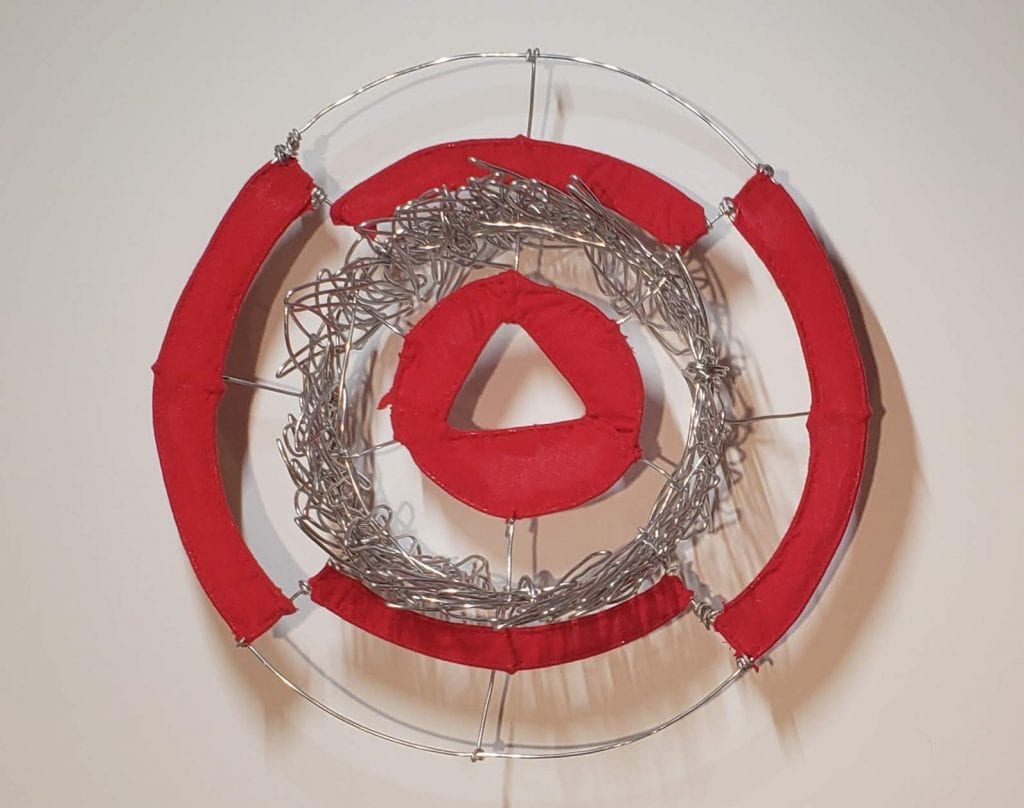
The emotion I was tasked with capturing was “panic.” The composition that came to mind first was the asymmetrical one– the concept of an explosion of ideas, scattered thoughts, and the inability to hold them together really resonated with me. I wanted to capture the difficulty of making sense of things when you’re panicking, and the feelings that lead to panic. The symmetrical composition took a lot longer for me to think of– I tend to feel like panic is an asymmetrical emotion– messy and all over the place. In the symmetrical composition I chose to play around with waves of emotion in the first ring– a messy and overwhelming shape made from tangling pieces of wire that were manipulated to create the same shape– waves. Here I wanted to describe the way panic effects me– in surges at a time. I wanted the center triangle to represent self, and the piece overall to desribe panic that is more deeply imbedded within, rather than necesarily effecting those around us (that aspect being represented by the red circle on the outside.)
In the asymmetrical composition, line was less integral to the overall composition– instead the wire and lines were used to support each plane, and offer a less significant connection between each. I kept the wire thin to lead the viewer’s eye more toward each plane. By doing this I wanted to support the idea of confusion and disorientation. I made the use of wire more significant in my symmetrical composition, most notably in the wave pattern in the center circle. Here, I wanted the wire, rather than the plane, to represent disorientation and instability. In a way, the wave pattern is an extremely condesned version of my asymmetrical composition– ideas meld and crash into each other, creating that sensation of panic.
For this project, we were assigned to take an object that holds a deep importance to us, and list 32 memories that we have experienced with (or in my case, through) that object. From there, we were assigned to create 32 seperate gestures to represent the emotions we wrote down.

The object I chose for this project were my glasses– a pair that I’ve had for more than 8 years. They previously belonged to my grandmother, and ever since I found them, I’ve worn them.


The piece I created is an amalgamation of the emotions I experienced through my child, and the things I’ve seen through its lenses for the past 8 years. The shape of the glasses themself is hinted at in this composition, with the white spaces representing the glass. While the glasses themselves don’t harbor negativity (or positivity, for that matter), I wanted to represent the emotions that surrounded me when I wore them.

Part 2: Future Portrait


In my future portrait I wanted to capture the mania of the unknown, as well as the hope I have for the future. I kept certain parts of the piece blank/open to represent the lenses of my glasses (surrounded by the world I hope to experience while looking through them.) Like the previous piece, gestures spill into each other to represent overlapping memories, and the unpredictability of both each line, and the future.

In the face of institutionalized segregation, Grace Paley acted as a white ally who utilized her white privelage to defend the personage of the black Americans she saw and was surrounded by. Paley wrote about her attempt to rerender the scene of her mother refusing to get up (much to her sister’s dissent): her mother’s actions to stand her ground and remain seated in the back rows of the bus were purposeful— her mother was not confused by the practice of segregation, however she would not stand (or sit) for it. This idea of almost familial ties and defense of those who are treated unjustly is visited again when Paley offered her seat to a black woman. Upon looking back on the scene, Paley recognized explicitly the community she shares/d with black Americans– she saw her own family within those around her.