Demo B: Basic Automaton


box interior: added some supporting cardboard panels for the dowels supporting the frogs.

sketch of the dowels i glued for the frog mechanism.

Soft Sculpture Demo A/B

This week I decided to sew a little guy! I have really basic sewing experience but this was my first time working from a pattern/making a plush and it was about as difficult as I anticipated, but overall I’m happy with the result!


scrapped body


The pattern I created initially included a body;  to come up with the basic shape I referenced a stuffed toy that I have and worked backward. I ended up scrapping the body as the other pieces came together because I thought the final result would look cuter if the limbs came directly from the star.


Most of this project was machine sewn, but the hand sewing part certainly took the longest. (…along with turning the arms and legs inside out…) Becuase I edited my design as I went, I didn’t plan ahead in adding the gusset or limbs before closing up the edges of my star. Sewing those pieces and making sure that everything was going to fit in the end was a little daunting, and as you can probably tell the gusset was a.) sewn in wrong  and b.) not the right size.

Pop-Up Demo A


For this week I chose to experiment with pop-up mechanics and I had so much fun! I love working with paper so I was really excited to jump into this project, but of course actually making something that A.) looks nice and B.) actually closes was a little bit easier said than done. My process was mostly guided by trial and error, including my work on the final, and instead of working from a sketch I just tested my ideas on a different sheet of paper as I worked through what components I wanted to display in my pop-up.


The biggest difficulty I had (which I’m sure was the same for most) was making sure that my parts weren’t inhibiting eachothers’ movement, and a lot of it had to do with which direction I was having pieces fold. I definitely had to compromise parts of my scene because they were folding into each other. The trial and error process was often frustrating, especially because I was working as I went (obviously not ideal); I ended up having to cut parts of my base in order to fit the foreground in.


Bridge 4 Reflection

The focal point of my research about Polyester was the extremely positive reception it recieved when it began being mass-produced in the 1950s. It was hailed as a ‘wonder-fiber’ due to its extreme durability and its ability to be washed and dried without damaging the material. As time passed, however, the material’s image shifted, and many viewed it as cheap and unfashionable. It’s strong point was its convenience, but as style and concern for the enviroment hailed, Polyester became less appealing.

With the posters I created, I aimed to create fun and almost childish images, in order to reference my object (a stuffed toy). I wanted to play around with the concept of manmade and handmade, hence the collage. The posters can be viewed almost as propoganda for a material that really is the opposite of “safe” and “sustainable.”

The critique was helpful, and aided me in realizing that certain themes I wished to express did not really come out in these posters, such as the ones mentioned earlier. As the creator, I understand that polyester isn’t sustainable, and is often dangerous to create due to the chemicals involved (many of which are pollutants.) The posters themselves view polyester in a mostly positive light, except for the on the far left. I think that I would make my design choices more intentional in the future, as well as conduct more clear research in order to create a more impactful and compelling design. Ultimately these posters seemed shallow at best, and while I believe their aesthetic was cohesive, I feel that they fail to deliver a delibrate or clear message.

(Instead I could have created a hierarchy of information– starting with the appeal of polyester to the consumer, and moving inward to the cost of polyester on the environment, perhaps going ahead more to talk about the guise of sustainability in regard to the “recycling” of polyester.)

Bridge 2 Reflection


The artist that I researched was Wolfgang Tillmans, a german photographer known for his photographs of the german club scene in the 80s. Much of his work breaks the norm as far as composition and subject matter goes. My artist, Alice Neel was an American portrait artist, whose works revolved a great deal around local new yorkers, ranging from the everyday person to actors, writers and politicians. In their own ways, each artist was a documentarian.

Realizing the similarities between Neel and Tillmans was very interesting to me, considering the differences in their lives– Tillmans was born in 1968 in West Germany, while Neel was born in 1900 in Pennsylvania. 

The concept that Adrian and I came up with drew inspiration from the documentarian aspect of each of our artists– we wanted to show student life through a series of portraits and still lives. I chose to paint the figures in the portraits in a style reminiscent of Alice Neel’s, while adopting some of the strangeness seen in Tillmans’ work.

I really like the emotion that came out in the painted pieces I made, but I would have liked to created clearer cohesion between my portraits and Adrian’s still lives.

Adrian took all the photographers for this project, while I waited and drew over the files he sent me. This process worked, but was slightly stressful because I had to rely on Adrian to finish his part of the piece before I could begin mine. Ultimately, I’m proud of what we made together and fortunate that we were able to get it all done.

Bridge 1 Reflection

Original Mock-up


New Mock-up

Wall Didactic

Kara Walker’s piece, “A Subtlety”, focuses on the tie between the sugar trade and its root in slavery and hard labor. Walker is able to utilize the size and state of her space to create a piece that is harmonious with its surroundings, ultimately highlighting the power of her central figure, Sugar Baby, and playing with percieved stereotypes and flipping them on their head. 

Our piece attempts to comment on a seperate issue, climate change. We wanted to keep the scale and tie to social media present in the display of our piece, so the location is key– the project must be seen and experienced as it melts away. The temporary aspect of the ice sculpture is an important homage to the decay of sugar in Walker’s original piece, and like Walker, we wanted to memorialize the piece in photos that viewers would take. 

This slideshow requires JavaScript.

Through my research, I found that Kara Walker was asked by Creative Time to create an installation for the Domino Sugar Factory specifically– in other words, she was asked to create a piece for a specific space. She was enamoured by the state of the sugar factory, with pools of molasses around the floor of the building, dripping from the walls etc. She speaks in greate length about her creative process, and about how the basis of her ideas revolved around certain specific concepts: 1. The idea of ruins (ancient, egyption, and the space itself) 2. A socially “accepted” idea of white=good, and black-bad. 3. The reclamation and of a space. The piece represents the sugar trade and its integral tie to slavery, all while utilizing the size of the space and and the temporary nature of the scultpure to drive viewers to engage with the piece through pictures posted on social media, ultimately creating a related, more performative piece, of racism in action.

Reflection
The research itself went more smoothly than I expected, due to the wealth of what’s written about Walker and this piece specifically. Having access to videos of Walker herself speaking about her piece was very helpful to me in researching her creative process, especially due to the popularity of this project specifically. Of course, there was some difficulty in researching more specific details of her inspiration for this piece, because it is so different from her usual work.

Working in a group was overall interesting in the rehashing of ideas and creation of our final mock-up. My group and I specifically lacked some communication throughout this assignment, but that showed mainly in our Seminar presentation. In discussing our final project, I initially had mixed feelings about our message, unsure if a polar bear being as a vessel to communicate a message about global warming was either original or the clear “successor” to Walker’s piece. And while some of these feelings still remain, it was interesting to hear from other people that felt differently.

I personally have always been very interested in Kara Walker’s artwork, seeing it for the first time when I was around 7 years old. However, I had never done any in-depth research on her work, so this assignment was eye-opening in regard to some of her developmental processes, as well as for my interpretation and apprecieation of her other pieces.

Our proposed alternative artwork, in its initial conception, ultimately seems underwhelming compared to Walker’s piece. I think that the message itself may be a bit overdone, but the comments from our critique were very helpful in creating the idea for a more successful piece. In our original mock-up, we had our piece sitatued somewhere near the river at Chelsea Piers. While this location is public, it’s not nearly as in-your-face as Times Square, where the sculpture could even become an inconvenience (and ultimately force people to feel the uncomfortable impact of climate change, an issue that many ignore because it “doesn’t directly affect them”.) Having the piece ultimately discuss enrionmental racism and its effects on people rather than the image of a polar bear would have, perhaps, been a more powerful initial approach.

Momument Reflection

The site I chose is an area called the Stone Living Room, in my hometown West Milford, NJ. I felt like it would be the perfect spot for this monument, which represents personal isolation, because of the isolation I felt in my hometown, as well as the alienation I experienced. The Stone Living room is located off of marked hiking paths, meaning that one has to go out of their way to find it (and people have gotten lost looking– officials urge people not to go looking for the spot because it is not actually apart of an official trail.) I thought the location was a good embodiment of loneliness and seperation.
My monument has more human characteristics, while also being slightly abstract– a figure sits inside a cave-like structure that is covered in opened eyes. The eyes are supposed to represent judgement on an individual, and its placement inside an almost cell-like wooden structure represents feigned isolation– it looks like a cell, but one could still walk in.
I had a lot of trouble with both the wood and plaster aspects of this project but I feel that I struggled more with the wood. I had a lot of trouble making perfect cuts, even when I remeasured, and it took a lot for me to get the courage to actually make cuts in the wood because I was worried about making a mistake.
The plaster was troubling for the same reason– It took a lot to just make the first cut, though once I did I found it easy to continue and just work with the material.
For both aspects of this project, I learned a lot about planning before jumping into a project, in order to conserve material and try to be as accurate as possible. With the last two projects we did, I learned a lot more from trial and error, and having the ability to re-cut or re-bend pieces of material. This project was a lot more limiting, which was helpful, in a way. It was the first time I had used either material, and I honestly found the experience very stressful.
Overall, I feel like I could have done a better job of creating a very clean looking piece, as well as a better job measuring properly. While I like the way the box ultimately came out, throughout the process it felt like I was counting a lot on luck to make sure the end result looked good. Also, I wish I better incorporated the two halves of my plaster in creating a very cohesive, singular monument. I tried my best on both parts of the piece, and I’m happy with how they both look paired together.
I think the strongest aspect of this piece is the concept, and its tie to the location I envision it in.

Monument Proposal


This slideshow requires JavaScript.


The Stone Living Room is a site that is located in my hometown, West Milford, NJ. It’s a grouping of rocks that is located away from some of the designated hiking trails in the area, and who exactly created the “living room” is somewhat of a mystery– there is no confirmed creator (though most speculate that it was just created by some teenagers,  however long ago.) It is not located on any official trail, and as a result one has to go off the beaten path to find it. I feel that this location would be perfect for my sculpture, which is meant to capture isolation– I felt very isolated in my hometown, being mixed race, gay, and a democrat– its population its about 92% caucasian (of ~25,000 citizens) and many of the people living there are conservative (the confederate flag is visible all throughout my town, in the windows of pick-up trucks, on people’s hats, in the form of handkerchiefs, bandanas, and as flags at my highschool graduation.) Having this monument in a place that someone has to work to get to, a location that in and of itself is isolated, would bring a deeper and more personal experience to the work itself.

Project #2- Body Extensions


Platonic Solids– I used wire and tabs, thread, and carpet tacks to close these shapes.

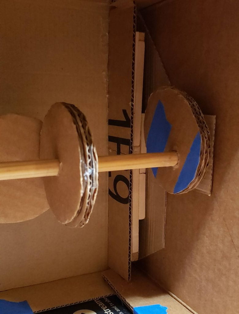
The inner mechanism– I actually came up with this mechanism before I came up with the structure of the body extension. Long pieces of string attach to both my finger and the piece of metal. When I bend my finger, the sheet moves downward, and flashes through the slats cut out of the front. When I relax my hand, the sheet metal retracts upward because of the rubber band.

My maquette– This design is warped, due to the time I spent manipulating parts of the design to render it in chipboard. This design is fairly similar to the final product, however as you can see it is in two seperate pieces. I originally intended for part of the project to go all the way up to my shoulder, and leave an open gap for my elbow. This design ultimately had to be tweaked due the easily pliable nature of paper– when I attempted to copy this design vertbatum in chipboard, it was tight and difficult to fit the machanism inside.


Reflection


My intention with his piece was to make a defensive object– a gauntlet-like piece from a suit of armor. The concept of blinking, flashing light came to me first, an image that I feel represents caution (e.g. taillights). The stripes were inspired by the patterning on zebras that, when running as a herd, confuses and disorients potential predators.
My original idea was to cover this gauntlet in eye-like shapes, to more explicitly represent blinking. I really wanted to encompass fear and defense with this piece, and I wanted to key in on closing my eyes in the face of trouble. When I watch a scary movie, I’ll close my eyes. When I get a response to an email I had anxiety sending, I’ll close my eyes. When someone texts me something long and out of the blue, I’ll close my eyes. In a broader sense, I tend to avoid problems when I’m first met with them, whether the problem is something as simple as a horror movie, or as complex as recognizing a mistake I’ve made, or an event I’m ashamed of.
The movement of this piece was very important to me, both in its final look, and in its representative meaning. While I could have simply attached metal sheets behind the chipboard slats, and left the piece static, the movement of metal was important as an indication of choice and active defense. Had I left the metal stagnant, the blinking aspect of the piece would be missing, and the interaction of the piece with both the wearer and onlookers would have been stunted. Actually wearing the piece, and truly interacting it by moving parts of it is essential to this idea of active, rather than passive defense.
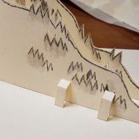
I used the triangles from a deconstructed icosahedron/tetrahedron/octohedron to create the gauntlet. When I was viewing the nets of these shapes, I realized I could easily make a structure that could wrap around by arm, and also cover a lot of me with a fewer number of shapes. Furthermore, each rung, or layer of the gauntlet, was able to fit evenly in rows, unlike if I had based the final piece on pentagons. I avoided referencing the cube because I felt like that would have made the gauntlet look very rigid and straight– the triangles followed a more organic path as I lengthened the piece, as you can see in the area that holds my hand.
The brads that hold the piece together remind of studs, which I feel brings the idea of defense with it– the surface isnt smooth. I also threaded string through holes in various parts of the piece to represent more striped patterning.
I’m grateful that I was able to make a piece that looks clean and finished– I think I was successful in making sure it looks neat. I think that is the strongest aspect of this piece, as well as the concept of the mechanism working in conjunction with the overarching meaning of the piece.
I feel that I could have incorporated the metal sheets in a more successful way by adding more– perhaps I could have inverted parts of the design and made the outer shell metal, and the moving inner piece chipboard. Additionally I feel like I could have tweaked the design of the mechanism a bit more in order to make the movement more noticable.
Overall, I feel satisfied with the way I executed this project, and think that I did my best to incorporate the mechanism into the design, as well as to make a piece that myself and others can interact with– that functions and is visually clean.