Demo A: Sculpting with Clay


after painting with acrylic paint, i added details in colored pencil and ballpoint pen

Demo A: Carving

Edit 10/1: I added some more details; a wooden dowel for the stem & I replaced the armature supporting the head with a dowel as well. I also cut out some felt details and attached them with hot glue, and instead of making arms I finished this off with a cape. 


Original 9/30:

I left this guy armless because I was running out of felting time ^^;;


In order to attach all the pieces to each other i used armature wire & spray adhesive for a stronger bond. For the legs (and the worm) I also felted into the base (after they were glued) to make the pieces slightly more cohesive.


I originally was going to use styrofoam, but it was difficult to carve without being fairly careful & I didn’t trust its resilience. I also opted not to use floral foam because it isn’t feltable (at least not easily?) and I felt like it was breakable. I ended up using polyethylene foam which was a nice surface to felt into– the final product is a sculpture that is soft to the touch but not posable.

Soft Sculpture Demo A/B

This week I decided to sew a little guy! I have really basic sewing experience but this was my first time working from a pattern/making a plush and it was about as difficult as I anticipated, but overall I’m happy with the result!


scrapped body


The pattern I created initially included a body;  to come up with the basic shape I referenced a stuffed toy that I have and worked backward. I ended up scrapping the body as the other pieces came together because I thought the final result would look cuter if the limbs came directly from the star.


Most of this project was machine sewn, but the hand sewing part certainly took the longest. (…along with turning the arms and legs inside out…) Becuase I edited my design as I went, I didn’t plan ahead in adding the gusset or limbs before closing up the edges of my star. Sewing those pieces and making sure that everything was going to fit in the end was a little daunting, and as you can probably tell the gusset was a.) sewn in wrong  and b.) not the right size.

Pop-Up Demo A


For this week I chose to experiment with pop-up mechanics and I had so much fun! I love working with paper so I was really excited to jump into this project, but of course actually making something that A.) looks nice and B.) actually closes was a little bit easier said than done. My process was mostly guided by trial and error, including my work on the final, and instead of working from a sketch I just tested my ideas on a different sheet of paper as I worked through what components I wanted to display in my pop-up.


The biggest difficulty I had (which I’m sure was the same for most) was making sure that my parts weren’t inhibiting eachothers’ movement, and a lot of it had to do with which direction I was having pieces fold. I definitely had to compromise parts of my scene because they were folding into each other. The trial and error process was often frustrating, especially because I was working as I went (obviously not ideal); I ended up having to cut parts of my base in order to fit the foreground in.


Blender Demo C

yayyyy


the artwork i used for my planes:


For this demo I focused on the relationship between my planes and the camera– I really love the effect that adjusting the depth of field gives but my initial set up wasn’t giving me as dramatic of an effect as I wanted.  After figuring out that I had to change the render engine to see a change in the dof, I played around with the distance between each plane, the distance from the camera, and the aperture.


knife tool

My next point of experimentation was to adjust the topography of my planes… I only happened upon the knife tool when I was trying to figure out how/if I could cut a plane into two (still unsure how to do that, but I’m sure that I can!) I decided to put some folds in this plane to make it more grass like, but it’s not very noticeable in the final render.


The final step was to animate the camera zooming (and panning slightly) to show that my planes exist in a 3D space. I used the auto-keying feature for this which made the process indcredibly simple.

animating the camera

My first hour or so in blender was pretty rough (most of it spent really desperately trying to get my shadows to work) but after a couple of youtube tutorials I’m really excited to work more in this program. This tiny taste was a lot of fun :o)

Bridge 1 ABC


This slideshow requires JavaScript.

In this abecedarian, I chose to focus on a myriad of different obsessions, ranging from very mundane and tangible (such as high-fives) to more serious (like isolation). The comments I received during critique affirmed certain parts of my work, such as whether or not the images I used to represent each obsession were successful. For the most part I got positive feedback, but looking back I wish I had asked why certain images worked, or if any were unclear.

If I had another week to work on this, I probably would have picked my materials with more intentionality– one of the questions I got was why I chose the colors I did, and the answer was simply “Those were the colors I owned.” Furthermore, I would have spent more time choosing certain obsessions, because I only really had one day to mull over what I think I’m obsessed with. Being able to make a list and then look at it again over a day or two would have allowed me to pick themes with more certainty. Additionally I would have considered my format more closely. I chose to make a book because I like the way it looks, but the finished product wasn’t more designed than that. In other words, the book feels like a means of presenting the image, rather than an integral piece of the artwork itself– the work could exist in a grid. If I had more time I could have designed a better cover, considered page format, or try to push the possibilites granted by this medium.

Hee Eun’s piece really stood out to me– I was surprised that someone would choose to design a website, and the way that they presented their work felt very intentional (the design of the website perfectly captured the aesthetic of childhood– highly saturated, bright colors– and I really enjoyed the audio that they added). The juxtaposition of color and sound with their more serious obsessions was really successful and ironic.

I also enjoyed Laura’s cats– I thought that presenting obsessions in this way was very interesting and completely different than what I expected. The format was visually appealing, despite its lack of alphabetical order, and to design entire characters around personal obsessions was a unique and refreshing take– pushing the limits of the project’s requirements.

The obsessions I’m most curious about in my work are those tied to memory, procrastination and isolation. These themes came up in various obsessions that I listed (embers, memories, yesterday– baking, giving up, video games– nighttime, the ocean, quiet) and they seem like themes that are always dancing around my subconscious, and it was intriguing to see that of 26 “different” obsessions, most fall under one of those three categories.

Excavated Ecologies; Bridge 4 Project

With this final piece, I intended on making a composition that draws attention to the plastic materiality of the center, original lamp, and juxtaposes that with twine, a more biodegradable alternative. The two twine sculptures work to hone in on the idea of mass production, versus the nuance seen in hand made things. I wanted to play with the way the center lamp looked– decaying, despite plastic actually lasting nearly a millenia in reality.

Presentation Link

Psychogeography; Unsighted Map

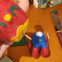
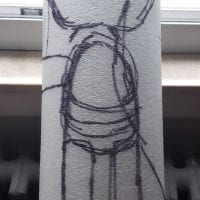
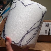
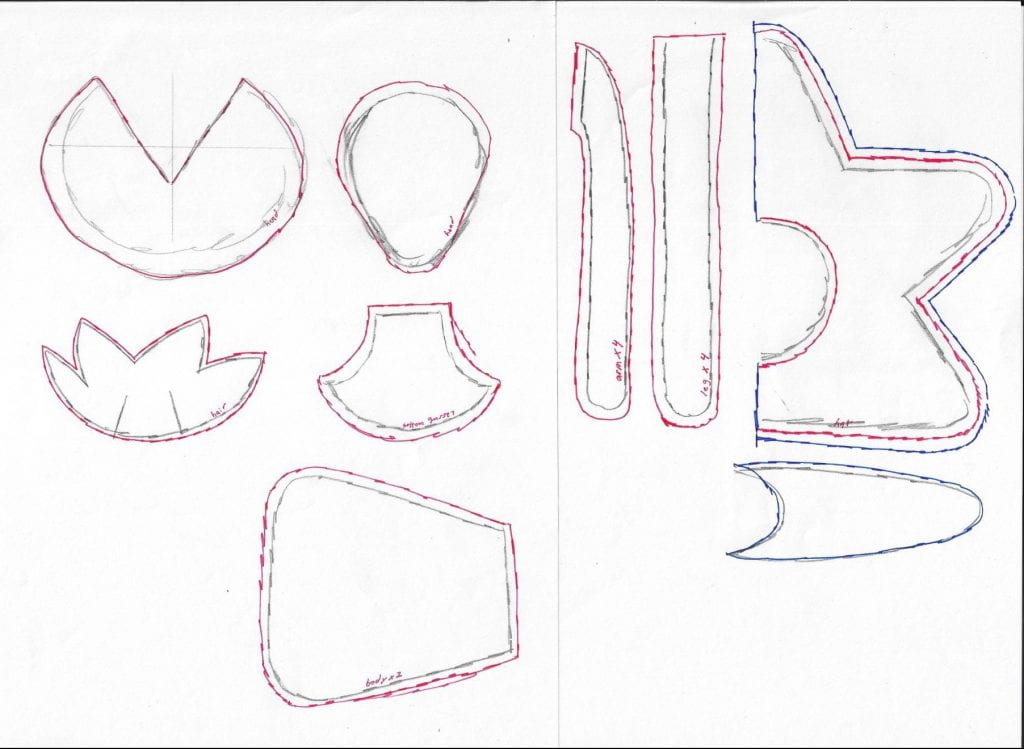
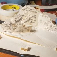
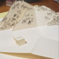
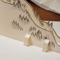
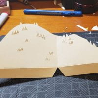
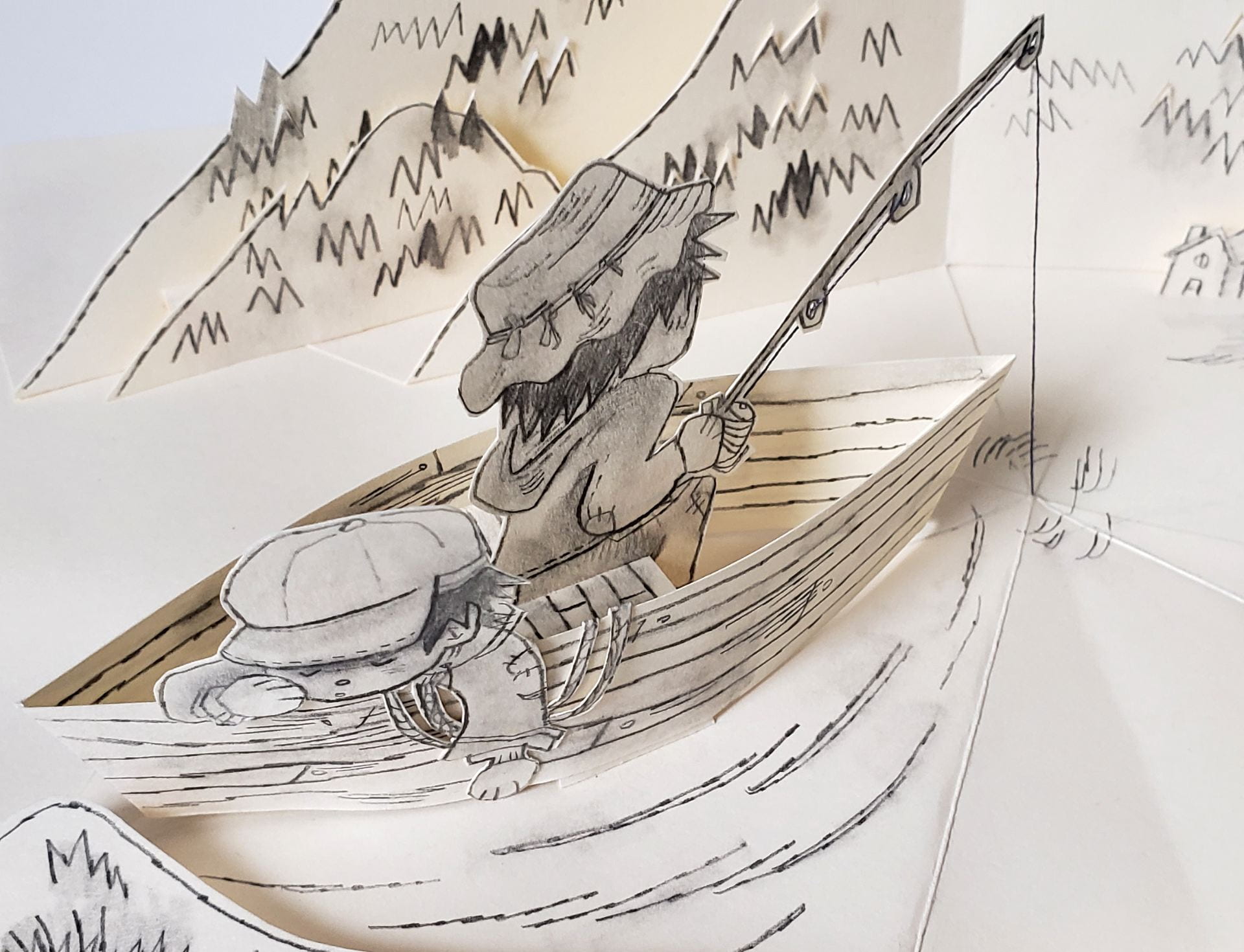
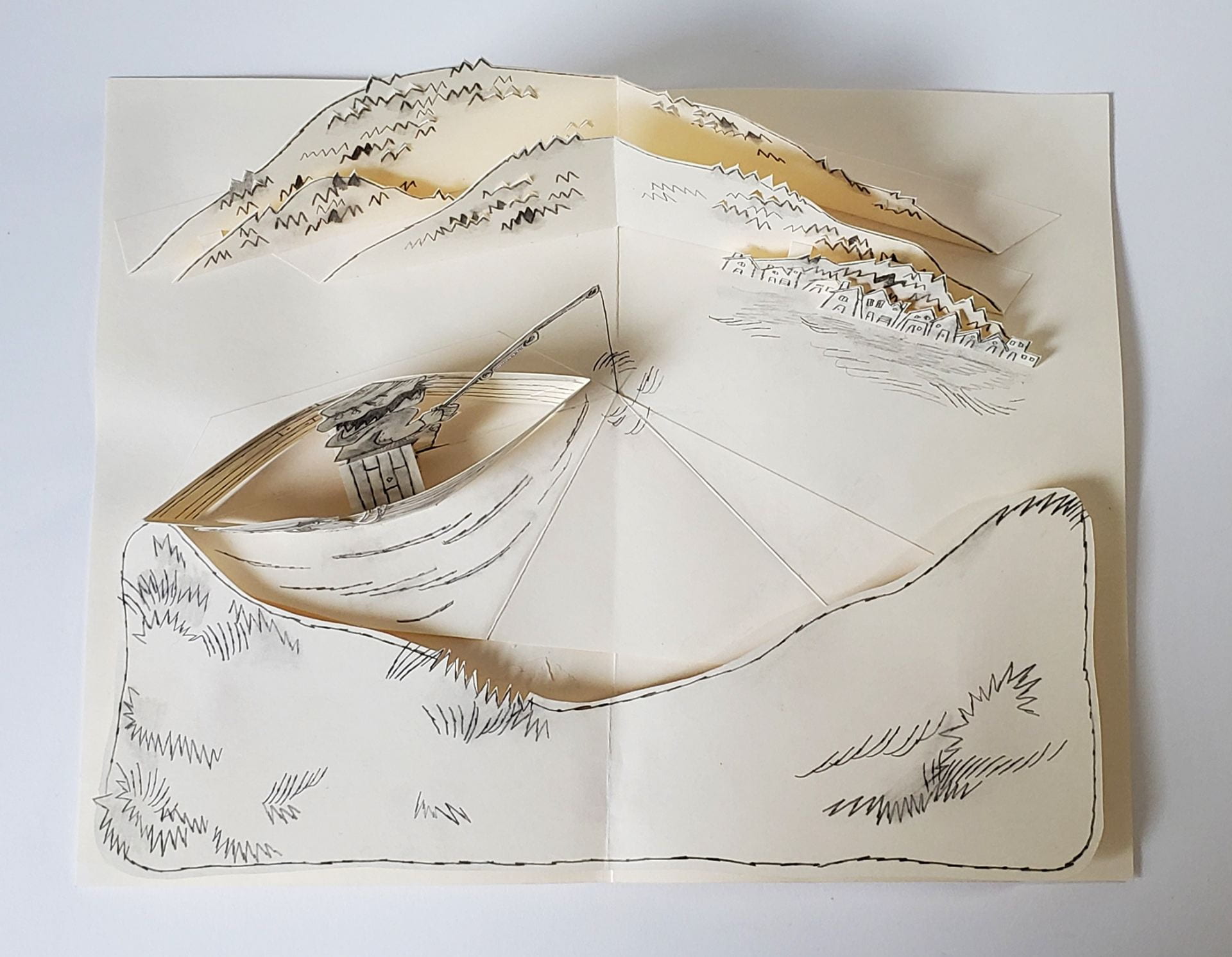
Map (Click for fullsize)

Key

Notes from after the walk:

*white, yellow, like i was in space,
ground feels like it moves, warping changing

the feeling of the walls, bumpy, cool

white, white, white, grey, black

* standing still at the elevator, floor moving, the button, reaching out

move to common area yellow, head swimming

yellow yellow yellow, cold, swimming, going straight

* the feeling of metal and the color gray

sound of whirring, air conditioner, clang

turning around, gray white

waiting at elevator, curve of the door

*being in elevator

floor is sturdier

cold elevator walls

the next floor.

* swimming, yellow and green and pink

the room. felt open but narrow

cool, fragrant smell. sweet

bright, yellow, blue

* constricted in a big space, the stool, the pole? bar on the wall

* smooth door, cold 

the next elevator small, open

*the first floor, open, bright. white

the stairs, turning right

the sirens screeching loud, the brightness, chatter people talking

* the slope of the ground

* hitting the pole on the way up

yellow

* the wind hitting my back, pushing me foreqard

the smell of food, people talking

* wind hitting my right side

people talking yellow. pink

* the floor is sturdier, heavier. hitting the plant. heart jumping

water, the sound of rushing water. choppiness, clang clang

blue blue, construction, screech of the saw or drill or whatever

the sound of the truck, loud, air release

wind. warm from the street

turning right, tighter a lot of people, yellow

yellow

blue

warm air

* no wind

turning right, yellow, white, grey, grey ,grey solid ground


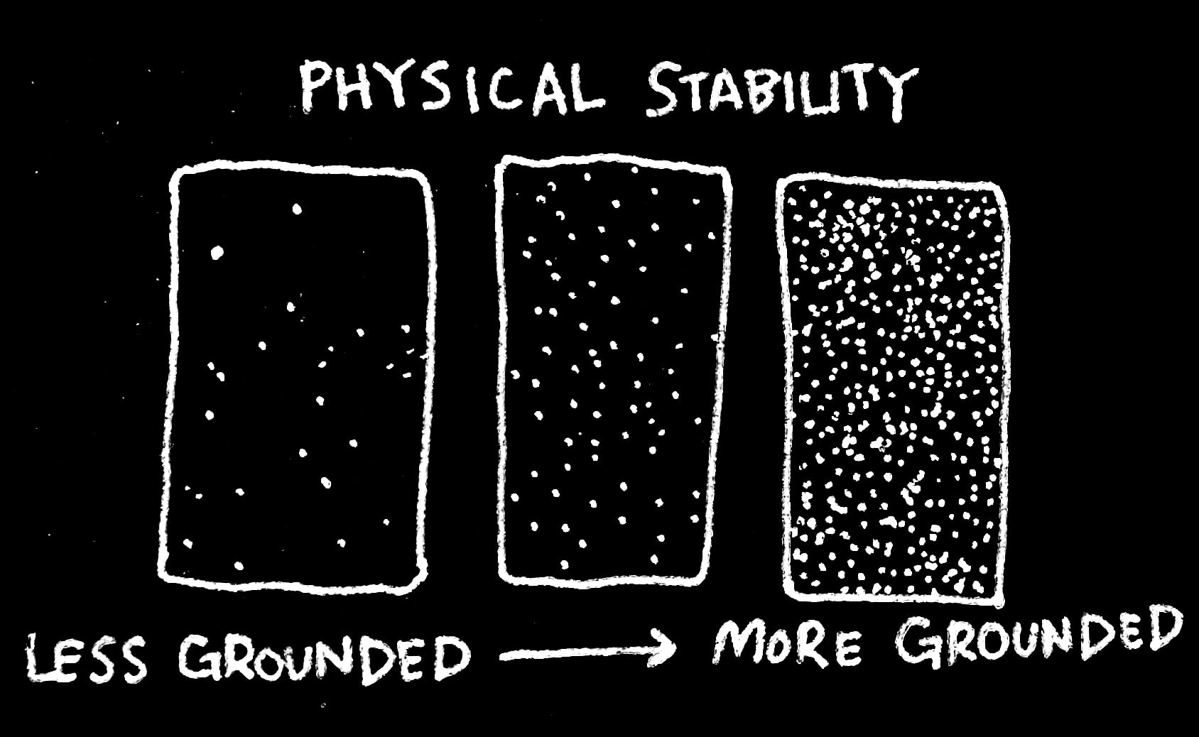
In my map I decided to describe the sensation of being “grounded” by adjusting the desnity of a series of small, white dots on black paper. The higher the concentration of dots, the more grounded I felt in a given space– whether it was due to touch– the floor beneath my feet, the feeling of metal lockers, or sound– the whirring of an air conditioner, or chatter around me. I wanted to play with the idea of space– and I felt that making my map, or timeline, mimic the stars in the sky would be interesting word-play. When I was initially walking through the halls of the building, it felt like I was floating above the ground. The tiles seemed to swell beneath me, and there was little sound, other than the distant hum of that a/c. I felt like I was in space. When I finally got outside, I felt instantly grounded, due to the noise and most importantly, the solid foundation of concrete beneath my feet. Each measured out section of my timeline represents the most poignant memory I have of a single space.

The first three sections are somewhat indistinguishable from each other, due to the lack of sensation I felt in these spaces. It’s not until the fourth section that I felt more grounding sensations. It was here where I touched the cold elevator walls, and felt sturdier ground beneath my feet. The lightest sections of this piece, with the highest concentration of dots, are where I first saw the bright light of outside on the first floor, and then left the building.

I felt like dots could desribe touch in a really successful way because I associate these sort of patterns with television static, and the sensation of static electricity. When I was inside the building, there was very little sensation to ground me– no wind, no noise– therefore the static, buzzing, felt a lot lower. Once I got outside the sound just grew, and I my body felt more connected to the space it was in.

Space & Materiality: Project #1: Linear Planar Abstraction: Panic (Finished)

Sketchbook


In-Progress


Finished Pieces


Reflection

The emotion I was tasked with capturing was “panic.” The composition that came to mind first was the asymmetrical one– the concept of an explosion of ideas, scattered thoughts, and the inability to hold them together really resonated with me. I wanted to capture the difficulty of making sense of things when you’re panicking, and the feelings that lead to panic. The symmetrical composition took a lot longer for me to think of– I tend to feel like panic is an asymmetrical emotion– messy and all over the place. In the symmetrical composition I chose to play around with waves of emotion in the first ring– a messy and overwhelming shape made from tangling pieces of wire that were manipulated to create the same shape– waves. Here I wanted to describe the way panic effects me– in surges at a time. I wanted the center triangle to represent self, and the piece overall to desribe panic that is more deeply imbedded within, rather than necesarily effecting those around us (that aspect being represented by the red circle on the outside.)

In the asymmetrical composition, line was less integral to the overall composition– instead the wire and lines were used to support each plane, and offer a less significant connection between each. I kept the wire thin to lead the viewer’s eye more toward each plane. By doing this I wanted to support the idea of confusion and disorientation. I made the use of wire more significant in my symmetrical composition, most notably in the wave pattern in the center circle. Here, I wanted the wire, rather than the plane, to represent disorientation and instability. In a way, the wave pattern is an extremely condesned version of my asymmetrical composition– ideas meld and crash into each other, creating that sensation of panic.

For my asymmetrical piece, I wanted to have constant shapes that were similar but not exactly the same (triangular planes). I wanted to wholly embody the idea of asymmetry, and I felt that make each shape slightly irregular contributed to their representing different ideas, scattered throughout the mind. In the same breath, I wanted to keep the shapes the same as to not overwhelm the viewer and make the symbols I chose overly confusing. I wanted the chaos of ‘panic’ to develop in the form and quantity of symbols, rather than by sheer confusion and melding of icons and symbols. Furthermore, I wanted the overall piece to have a more open volume, so that the viwer could feel as though the object is ingrained within the space, rather than drastically contrasting/challenging it. I wanted to capture the energy of panic, utilizing asymmetry as much as I could.
I felt similarly about my symmetrical piece; here I wanted each shape and symbol to contribute directly to the meaning. I wanted the form to be symmetrical, but I wanted to, at the same time, create that sense of confusion an instability present in the asymmetrical piece. I wanted to achieve a more stable and clear balance in these piece, but I wanted to challenge this balance by introducing intertwining wire and clashing lines. I used planes to balance out the piece, while the wire forms I developed contrasted with that. I wanted to create indefinitie forms, that (when tangled together) created a singular, symmetrical entity.

Bridge Project 1: Past & Future Self-Portraits; Glasses

For this project, we were assigned to take an object that holds a deep importance to us, and list 32 memories that we have experienced with (or in my case, through) that object. From there, we were assigned to create 32 seperate gestures to represent the emotions we wrote down. 

The object I chose for this project were my glasses– a pair that I’ve had for more than 8 years. They previously belonged to my grandmother, and ever since I found them, I’ve worn them.

The piece I created is an amalgamation of the emotions I experienced through my child, and the things I’ve seen through its lenses for the past 8 years. The shape of the glasses themself is hinted at in this composition, with the white spaces representing the glass. While the glasses themselves don’t harbor negativity (or positivity, for that matter), I wanted to represent the emotions that surrounded me when I wore them.

Part 2: Future Portrait

In my future portrait I wanted to capture the mania of the unknown, as well as the hope I have for the future. I kept certain parts of the piece blank/open to represent the lenses of my glasses (surrounded by the world I hope to experience while looking through them.) Like the previous piece, gestures spill into each other to represent overlapping memories, and the unpredictability of both each line, and the future.