MoMA Visit
-
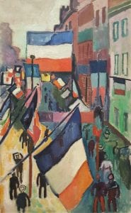
- Raoul Dufy, The 14th of July at Le Havre (1907), Oil on Canvas
-
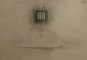
- Robert Gober, Untitled (2000), Lithograph with screen print, embossing, and pencil additions
-
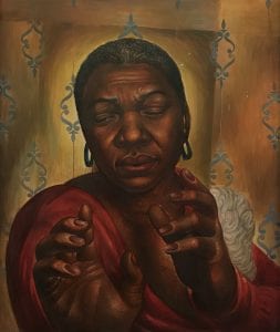
- Charles White, Bessie Smith (1950), Tempera on Panel
Dufy creates a one-point perspective in this piece, as seen by the leading lines in the architecture of the street. The larger flags in the foreground in comparison to the smaller background flags also assist in creating pictorial depth. The saturation also becomes less vibrant as the eye travels down the street. I was inspired by the use of lightly saturated colors and the vast variety of hues made me think about choosing a narrower range to bring unity to my piece.
In this piece by Gober, a line and value are used to emphasize pictorial depth. The horizontal line across the floor creates the environment inside the room along with the gradual adding of value closer to the window. Within the window frame, the perspective is created by seeing only the top inner portion of the window, creating the sense of looking up at the window. The cool blue also fades into the background, making the black and white interior the foreground. The piece inspired me to use color to make my foreground pop out from the pale blue sky in the back. The simplicity of the piece as well inspired me to create interesting shapes within my buildings, rather than just floating cubes.
This piece by White is very vivid with its use of color. White uses the method of scale in order to create deep pictorial space as the hands of the subject appear much larger than the face. This depth of field is used alongside color as the warm subject pops in the image. I was inspired by this painting to play with the scale of both my buildings and additional subjects later added onto the drawing in order to create deep pictorial space.
Visiting Times Square

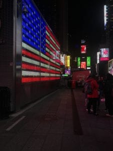
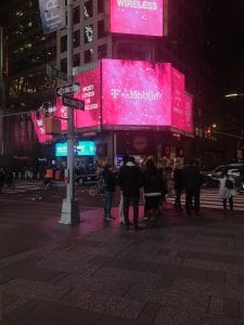
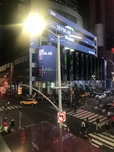

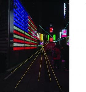
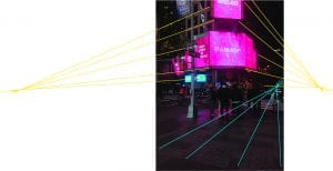
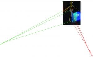
I don’t really enjoy going to Times Square. At all. So when I was forced to visit in order to observe the angles present, I was just there to get the task done. Reflecting on the visit, looking at my captured images, I couldn’t help but wonder why people would want to visit this place! These photos all illustrate scenes of Times Square, and not a single one contains zero billboards, interesting! Why would tourists come to this intersection in order to take in the sights, when most of the sights were just advertising products, services, and entertainment? If you look closely at each photo, the billboards, while placed on building surfaces, don’t always follow the original shapes of buildings. The complex shapes created by all of these lines reformat the buildings in a sense. Buildings are layered beneath these angled, three-dimensional illuminated screens, creating a very deep and interesting sight. The complexity and depth of these shapes are more interesting than simple angular buildings. Perhaps this is what draws tourists in.
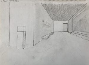
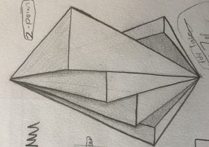
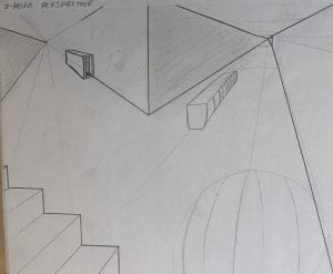
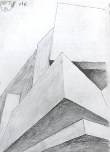
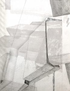
Perspective Sketches
These sketches helped me get a sense of how to use lines to create interesting spaces. I was intrigued by the second sketch and the concept of creating space that overlaps and floats.
Perspective Analysis
-
- 1-Point Perspective
-
- 2-Point Perspective
-
- 3-Point Perspective
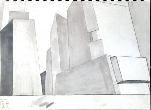
Formulating my Ideas
-
- Perspective Sketching (1)
-
- Perspective Sketching (2)
-
- Perspective Sketching (3)
-
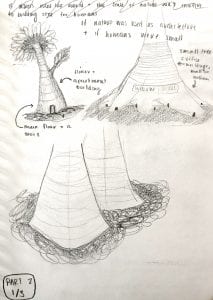
- Idea 1
-
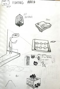
- Idea 2
-
- Idea 3
I decided to choose my second concept, a Floating Times Square, as I thought it held the greatest potential for interesting perspective lines and creative thought behind making interesting shapes. I wanted to pose a future where buildings were floating high in the sky, where the horizon lies where humans reside. Once I settled on this idea, I began sketching up the general landscape I could create and follow for my final piece. I wanted to add more details to my initial sketch to show my thought behind some potential ways of living humans could follow in this future. I added interesting details like garages underneath buildings, which would be the primary way of entering a building as you could no longer walk up to a door, picturing miniature lobbies in the buildings and parking spaces eradicated by automatic flying cars which could fly empty to pick you up in minutes. I added green roofs to the surfaces of buildings, creating oxygen for a civilization so far from the Earth’s surface and adding greenery to the otherwise plain infrastructure.

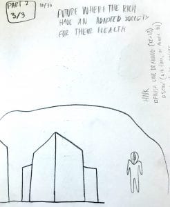
Sketch of Potential Space to Work With
Final Line Drawing
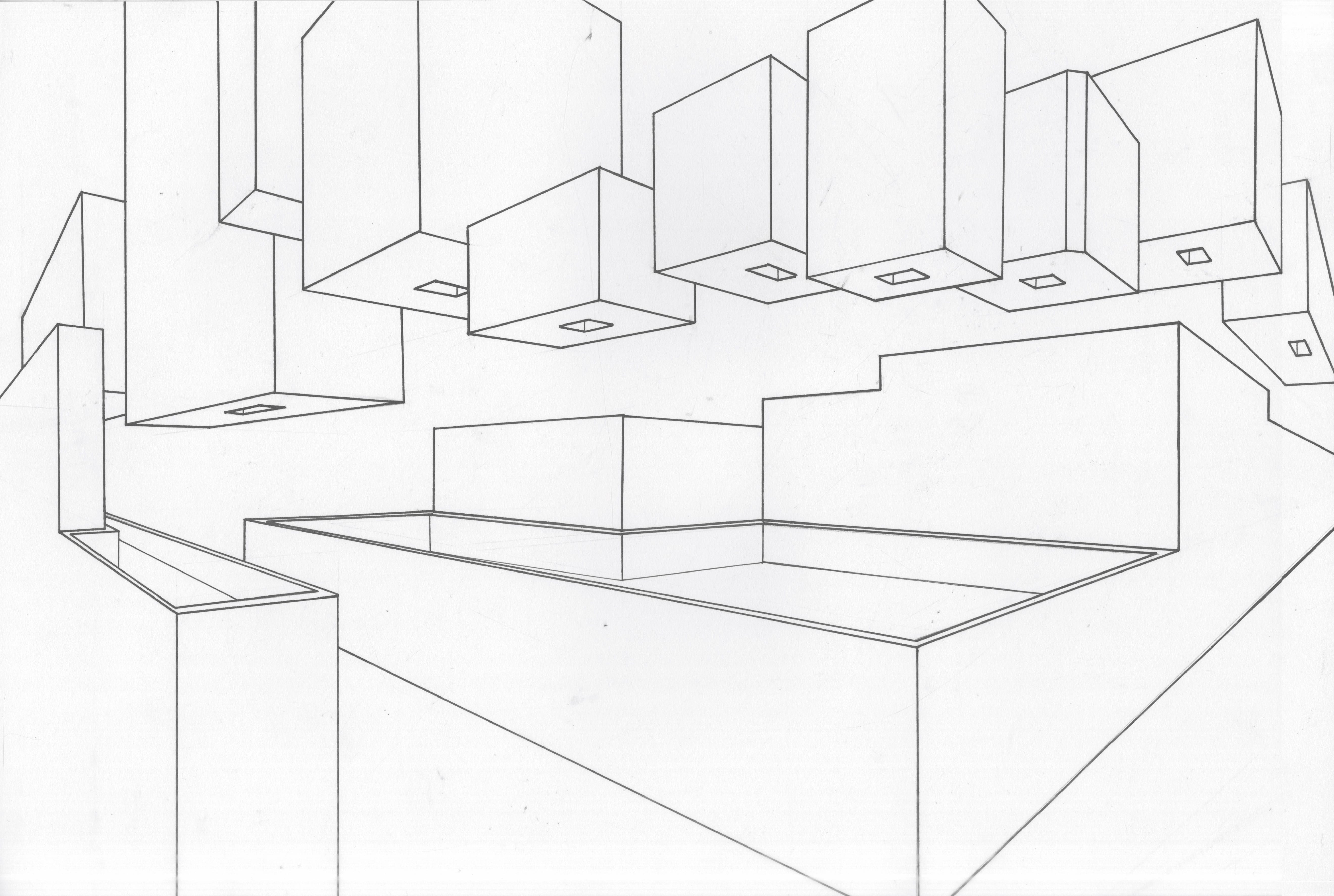
Final Line Drawing
Illustrator Work
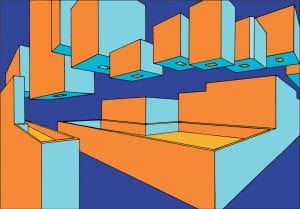
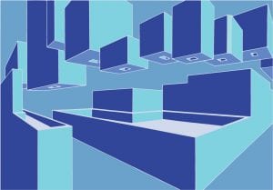
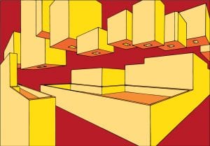
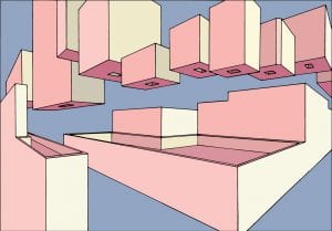
On Illustrator, I took my initial line drawing, and once I had turned it into easy-to-fill paths, I was able to play with color. I had a lot of fun creating several combinations, but once I had created so many, I had to settle on one to work with for my final. My last piece, the pink and blue piece, had the most promise as it would help make the most realistic piece in the end with a blue sky that holds up the floating architecture. The blue background also helped the warmer-toned buildings to pop forward interestingly.
Final Work

Final Piece
My goals in my piece were to bring to life my very detailed ideas for a floating future. I wanted my garages and green roofs and floating space to make sense to a viewer, and I think that this piece accomplishes that. I was able to use lines to create interesting architecture, use texture with photos to create the illusion of windows and metal, and use images of people and flying cars to create a logical scale to fathom. Originally, I wouldn’t have chosen this colour scheme, but it works in order to create a realistic landscape.