Exploring…
St. Patrick’s Cathedral
- Wide variety of people passing through
- Felt very safe and guarded
- Clean, organized, cared for space
- Welcoming


Diamond District
- Felt out of place
- Eager salesmen on the street luring you into their stores
- Strange contrast of high-end products on a not-so-nice street
- Shops were either thriving or for sale/abandoned


I preferred the Diamond District as it was a more interesting location conceptually. There was some kind of push and pull, a tension within the mood of this street. Though there were real, quality diamonds being sold, the whole thing felt like a hoax. After being asked to go into pawn shops or browse diamonds many times by people on the street with signs, I felt as if I did not belong. The only people shopping around were older couples or people looking at jewelry. Some stores and areas were bustling and bright, complete with neon signs and infinite lights refracting through each diamond. Other stores were completely devoid of people and life, boasting ‘for sale’ signs and sticky notes pinned to store windows. Visually, the location had the motif of a diamond, on many store signs, floor tiles within the sidewalks, and even the streetlights were diamond shaped. The geometric fragmentation motif interested me and posed many thoughts for future compositions profiling the location. The concept of fragmentation ties back in with the division of moods within the Diamond District.
Sketches from the Diamond District


Mockups of Final Piece


Final Work
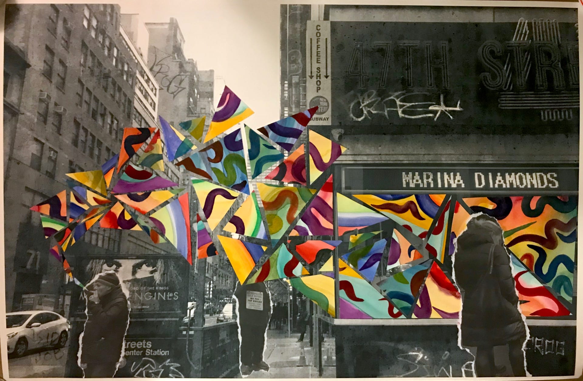
For my final piece, I was inspired by the duality of the Diamond District, encouraged to explore the relationship between the energetic, bright stores and the streets which are bleak, dirty, and devoid of energy. In terms of my goals, I was aiming to achieve a strong juxtaposition between the joyous world of diamond shopping and the concrete world that houses the diamond shops. I used multiple aspects to convey this theme and believe that my final piece revealed this duality.
First I edited the original image. I desaturated it, representing how cold and isolated the street felt. It was very gray the day I visited and the buildings all had the same dull energy to me. Adding a gritty texture and graffiti to the image allowed me to convey the sense of griminess that the location had.
Again inspired by the fragmentation element, I wanted to add onto the pre-existing image, bringing the light side of the Diamond District: the diamonds themselves. The storefront seemed fitting as a place for the bright, colourful energy to be housed. The colour and brightness represent the only saving grace of this otherwise boring street: the gems. The energy and light from the storefronts spill some joy and wonder onto the streets, so I decided to have this cluster of geometric fragments continue past the window. They originate from the man on the left’s (a salesman on a break) cigarette. This symbolizes how people like him who work hard all day persuading customers inside and into a purchase live: they work hard every day to feed themselves and to some, the Diamond District is all they have that keeps them employed.
The people added to the image were ripped along the edges as they are only temporary. The Diamond District had constant movement, window shoppers and people commuting through the area. These people placed here look temporary or recently stuck down due to the ripped edges. The two men lie beneath the layer of fragmented colour whereas the female customer lies atop the layer. This is because the two workers live within this world and aren’t only captivated by the products their employers sell. The female customer is placed atom the fragmented world as she is only observing, shopping around. She isn’t familiar with the truth of the Diamond District and instead is just window shopping.
An artist who inspired me was Iva Gueorguieva. Her work uses abstract, geometric masses and shapes to form busy pieces. She often uses a wide range of colours. I was inspired to be sporadic with my colourful shapes and just go with how it turns out.