PROCESS
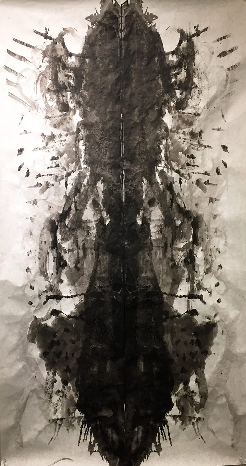
1. Symmetrical Ink Blot: On a 36” X 54” paper my partner and I used both accidental and intentional methods to create an abstract shape by folding said paper in half vertically. We used black India ink – diluted with water – paintbrushes, and plastic cups to create this long shape, alternating between who added to ink. By diluting the water we gained depth in the composition, however our excitement lead to a darker blot than expected. Our goal was to create a myriad of ink intensities while exploring composition, as well as learn a new skill.
2. Asymmetrical Ink Compositions: After completing the blot we were asked to find balanced asymmetry within our almost symmetrical shape. With the assistance of our phones’ cameras we attempted to create a balanced composition – personally I used a square frame to enhance a the balance of the images.
WORKFLOW
My partner and I would take turns adding ink and folding the piece of paper across a vertical axis. Before the ink would dry we would fold the paper together as to transfer ink and therefore create symmetry. We discussed throughout this process what we believed would create the effect we were looking for: a composition with depth where the center is the most intense. We began by creating a larger shape, one where we felt satisfied us both, after which we spent time on small details such as dots and lines around the edges.
TECHNIQUE
We experimented with dropping ink, blotting with extra paper, painting, putting a lot in one area and spreading it, diluting it, and using pure ink; we wanted to create a variety of different textures.
REFLECTION
Our original goal was to create a myriad of ink intensities while exploring composition, as well as learn a new skill – this was to some extent achieved. Although our shape is not to my personal taste (as I would’ve liked it to have been lighter overall) it does contain lots of texture and intensities. Although absolute symmetry was not achieved (as it is impossible) balance was created by the almost symmetrical sides. The blot did achieve the aim of the project. However, since the image of the figure is rather low-quality due to lighting, the piece appears to be one giant blob – this is not the case in person. Because of this, the piece appears more bottom heavy than it truly is, where in truth it is balanced, creating a shape resembling an hourglass. If we were to repeat this project I would begin with a very diluted solution of ink starting from the sides rather than the center, working my way up in intensity. Additionally, I would consult my partner about small compositional addition that would create greater balance throughout the image, rather than dragging all attention to the center.
COMPOSSITIONS
Asymmetry 1

Asymmetry 2

Asymmetry 3

Asymmetry 4

Asymmetry 5

Asymmetry 6
