IS2: Bridge 2 Final
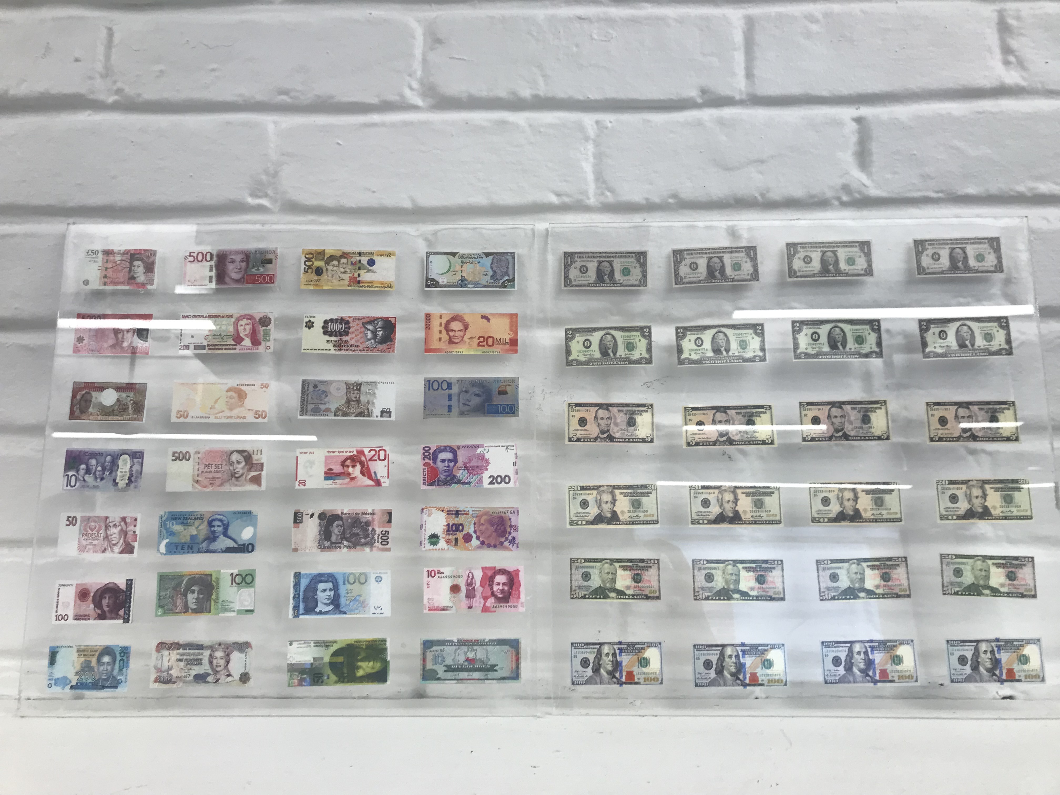

- My topic is gender and power. I began my diptychs working with a single image of the Queen. I then created a larger series featuring the Queen, but this time it was the UK banknotes which feature her. After these diptychs I decided to expand on the idea of gender and power. I liked my idea about money and the faces on it as well therefore I combined the two. The final outcome was 2 diptychs, one plexi, one mirror. These diptychs each had one panel featuring the US currency which all feature only men on them. The other panel had a collection of banknotes from all around the world that feature women. Through these iterations my topic evolved into a larger discussion about gender, power and misogyny in the US.
- I explored materials such as marker, paint, gold leaf and plastic. I also attempted to explore silk screen. The material I found was most successful in supporting my work was the mirrored plastic as it added another dimension to the piece making it an installation piece. The gold leaf was also successful as it exaggerated the idea of power, opulence and wealth in my diptychs featuring the Queen
- The markers were not successful at supporting my topic as it added no other meaning to the piece.
My topic touches upon a large variety of contexts. While the majority of the content in my diptychs is an exploration of history specifically monarchy. It can also be interpreted as an exploration of pop culture as the Queen has been used as almost a kitschy symbol in punk music, she has been painted by pop artists such as Andy Warhol and her life has been made into a TV series. I also explored politics through my use of banknotes in my pieces. Through the use of currency I also explored economics. By using banknotes, a daily object in the life of most people, I connected my topic to contemporary culture and consumerism. It is difficult for me to point out exactly what context my topic as a part of as it connects to such a variety of issues.
Bridge 2

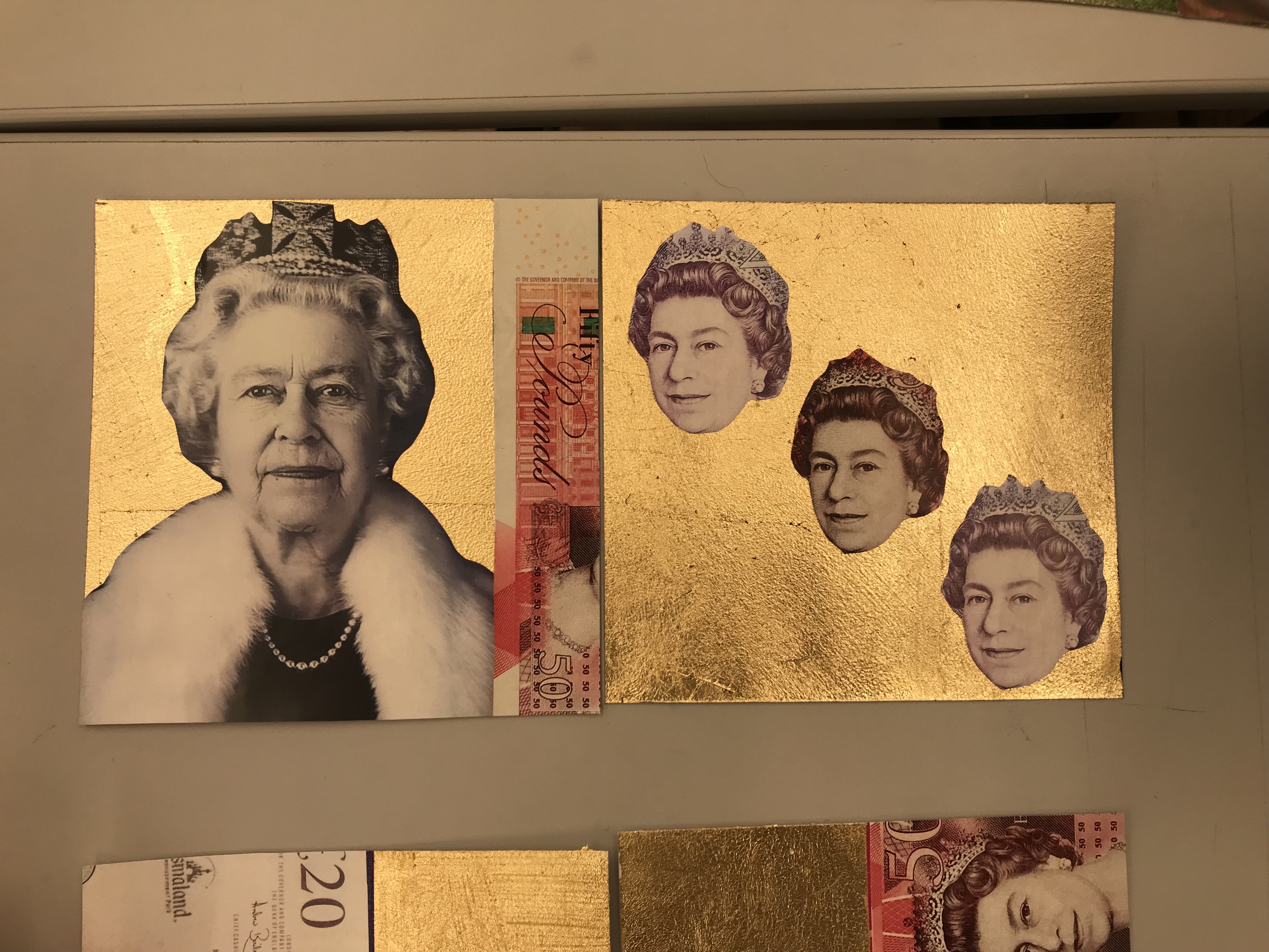

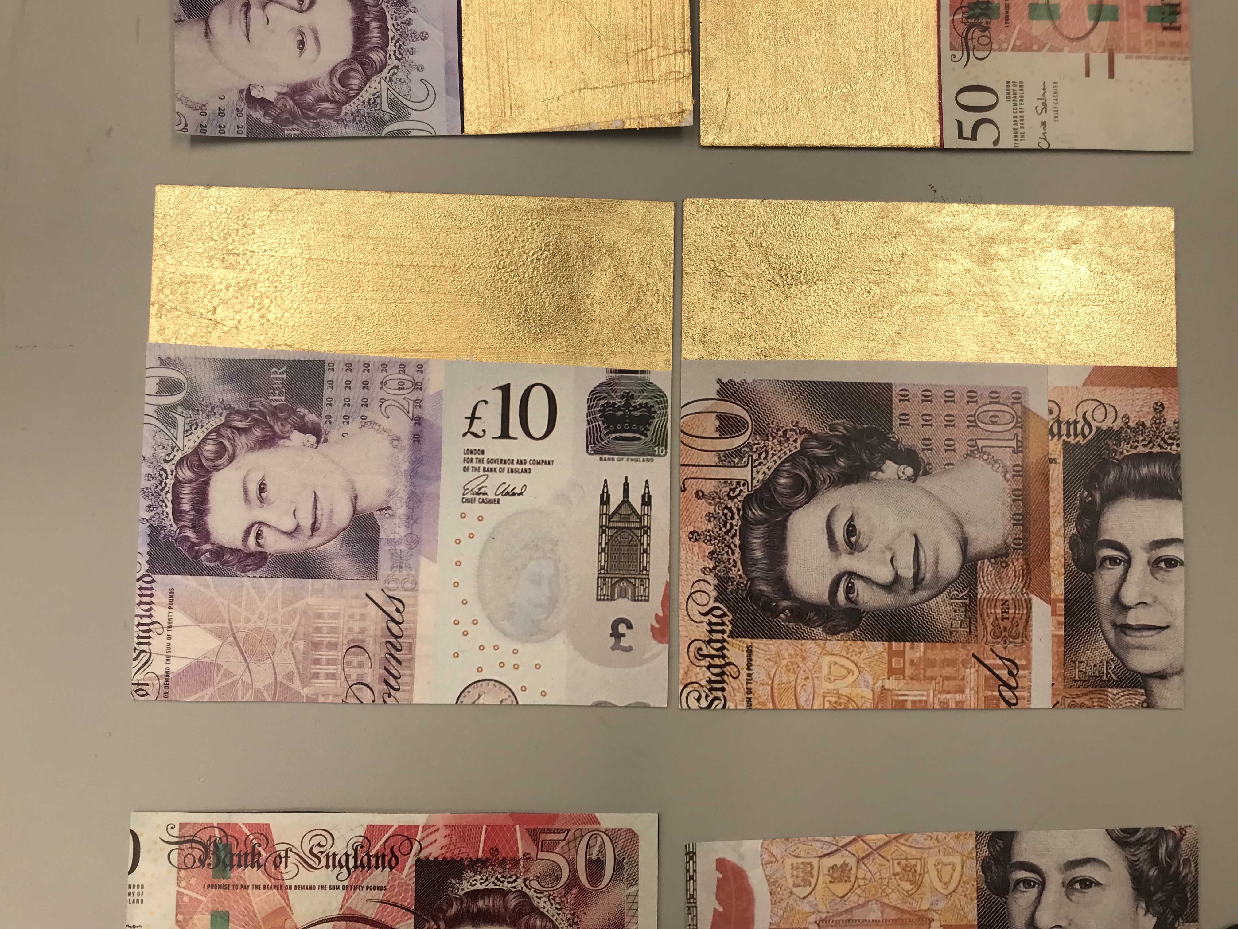


The final outcome of my bridge 2 was a series of square diptychs featuring UK money and Queen Elizabeth II. I used the money as a way to convey her status and power. My goal was to create a series of gendered art that empowers women.
I also attached one of my original diptychs to show my process and how my ideas developed.
Site Investigation

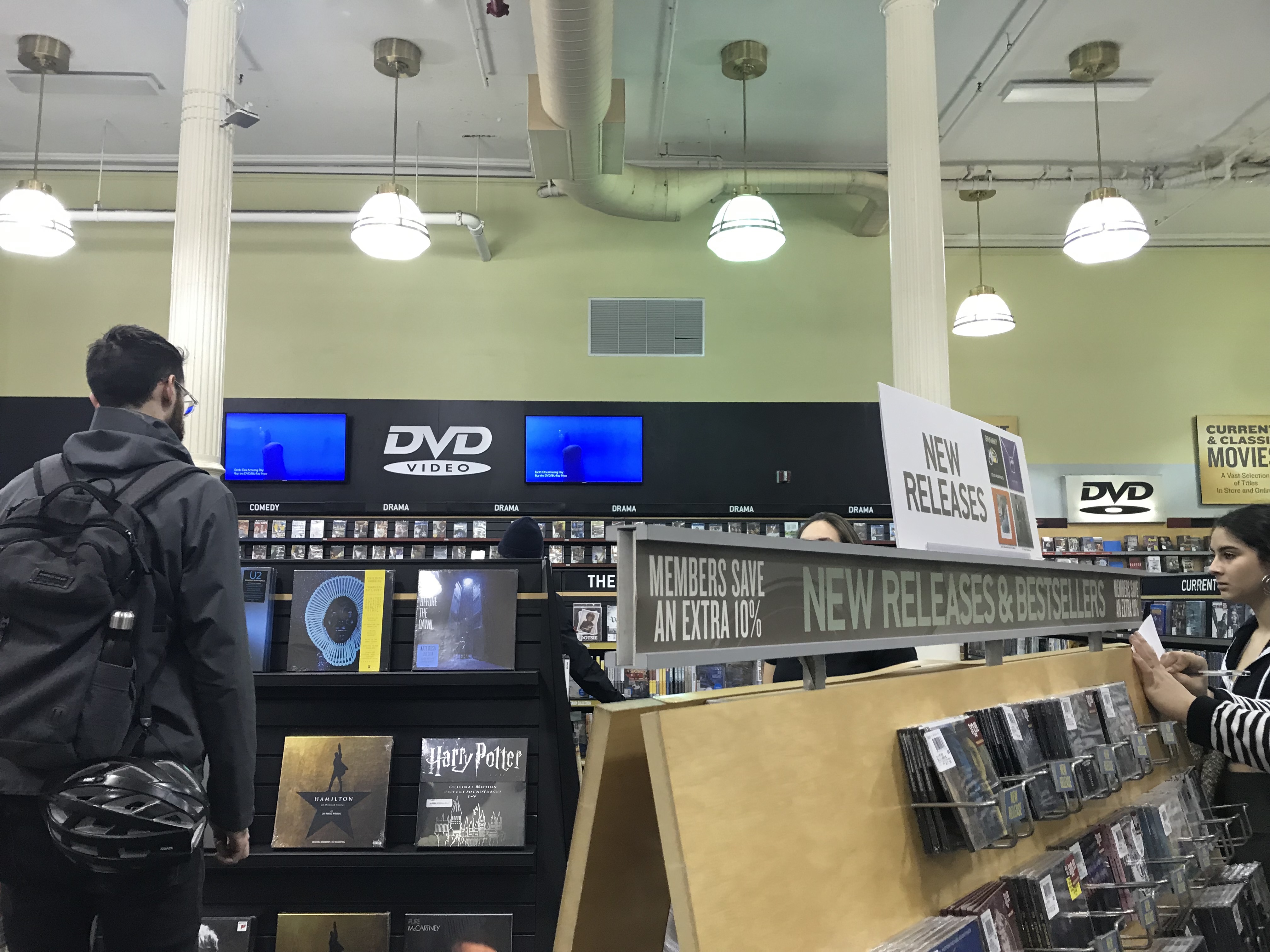

My message is that Barnes and Noble has monopolized “the market of reading”
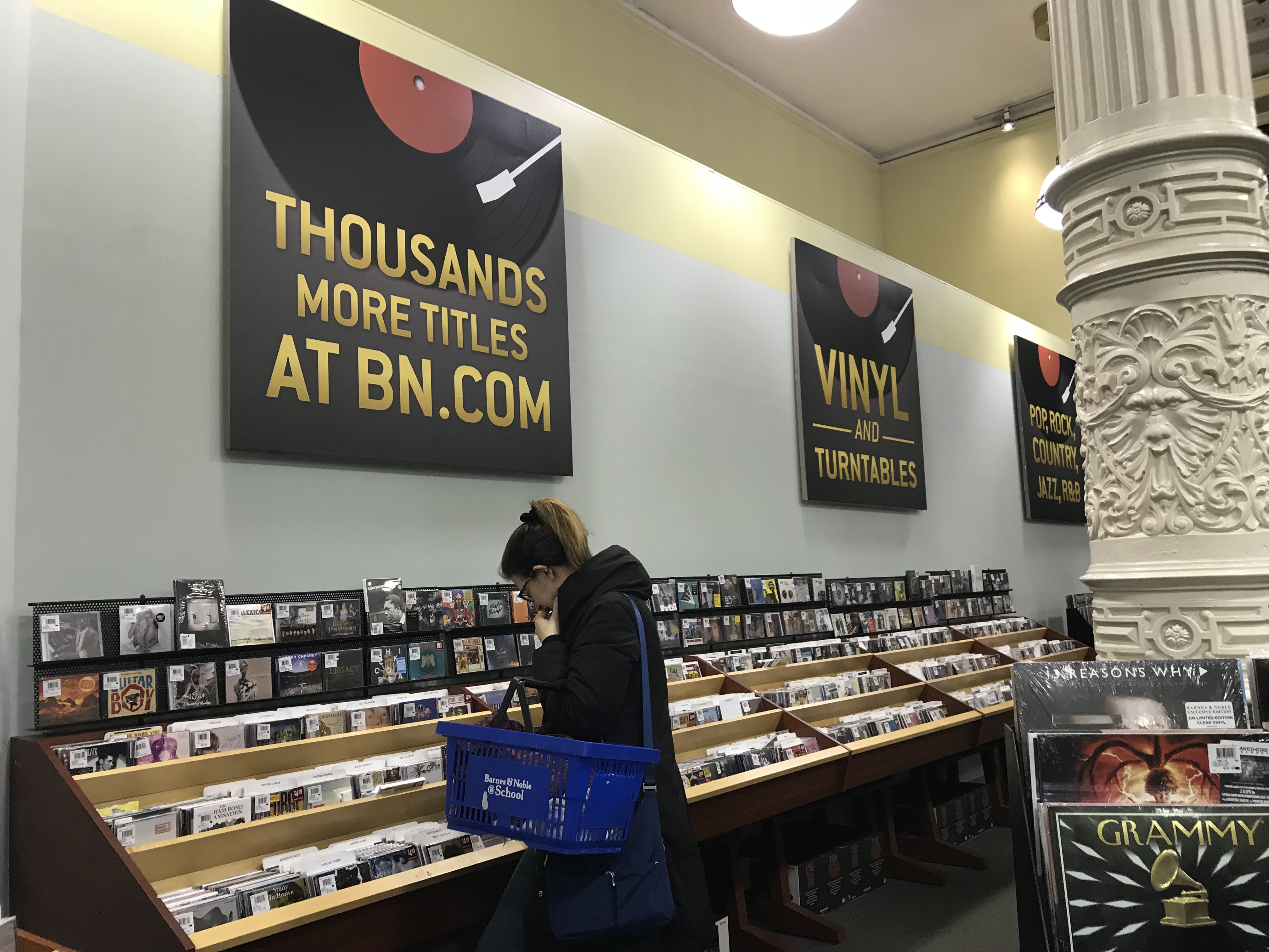
As I walked around Barnes and Noble all I could think about was how much “stuff” there was. On my way there I expected it to be a typical bookstore, what I realized during the investigation is that Barnes and Noble is essentially the Walmart of bookstores. What I found interesting was the amount of products that at first I was confused as to why they were even there. As I roamed the floors of Barnes and Noble what I realized is that they are selling every possible item related to reading. On the first floor they were selling backpacks and reading glasses. They were also selling DVDs and vinyls which are really other ways of reading as we “read” the sounds and images to create a message. There were also e-books on the first floor, this shows how Barnes and Noble goes far beyond the typical bookstore as it provides readers with a immense variety of reading material as well as products to make reading more comfortable, for example the reading glasses. The amount of “reading aid” in the store is fascinating as it shows how methodical the people behind the store are.
Because of the large range of products readers do not have to go anywhere else but Barnes and Noble to get the supplies they need. All of this shows how Barnes and Noble has monopolized the market of reading. Barnes and Noble in fact goes even further as they have a cafe upstairs where people can enjoy the magazines and books they just bought as long as they buy something from the cafe. Everything in Barnes and Noble is methodical. All the products have been placed carefully so that the person shopping does not even need to think too much about what else they need to buy. Everything is a system and is strategic. As a result Barnes and Noble have successfully taken over the reading market.
Mind Mapping + Context Research


https://www.vogue.com/fashion-shows/spring-2014-ready-to-wear/libertine
https://www.metmuseum.org/blogs/teen-blog/renaissance-portrait/blog/symbols-of-power
https://www.theguardian.com/music/gallery/2010/aug/29/punk-poster-design
Bridge 1 part 2
Digitized version of Rene Magritte’s Art of Living
 What is the content of your artwork and how does it relate to your theme?
My art work is a digitized version of a painting by Rene Magritte. This piece relates to my theme of gender due to the highly masculine symbolism behind the suit, a symbol of male authority and status. While the suit tells us that this is a man in the piece the face on the circle is somewhat more feminine in my opinion which creates an interesting dialogue about gender.
How does the material you used reinforce or strengthen the thematic content of your artwork?
I chose to make my piece digitally. This allowed me to have a wider selection of colors which I carefully selected. These colors in my opinion are typically considered more feminine which I used as a way to create contrast between the masculine imagery. I believe making the piece digitally also made the work more modern which as a result comments on contemporary perception of gender.
If your artwork is to be placed into the general circulation of Visual Culture, where would it go, what would it do, who would see it and where might it end up?
I think this piece would be interesting if it was printed on a large billboard like Felix Gonzales. Because it is digital this allows for the work to be printed or placed in a large variety of locations including online.
RDA Part 1: Ecological Heritage


Project Deconstruction


During the first semester for Studio I was assigned by Frank Holliday to create a self portrait. The focus of the project was to create a work of art the reflected me as person and accurately portrayed how I see myself. The intention of the project was to make us think of how we wanted ourselves to be viewed. The guidelines were broad therefore I wanted to create a portrait as unconventional as possible.
I began thinking about the possible ways I could create this self portrait as I wanted to create a three dimensional piece. My goal was to create a work that portrays me not only in the physical sense, but also who I am on the inside. After sketching out my ideas I decided I was going to create something similar to a time capsule, containing objects personal to me. I have always collected small objects that I thought were sentimental and reminded me of small events in my life that have in some way influenced who I am today. These objects are typically receipts, tickets, photographs, notes and letters.
For this piece I used objects that I felt helped describe me and show what is important to me as a person. For the piece I used a hospital band as it contained information about my identity, for example my name, age and gender. I used a caviar tin to show my cultural background. I used family photo of me, my grandparents, parents, siblings, aunts, uncles and cousins as my family has played an integral role in my life and having a large family has strongly influenced my personality. I used a small drawing I did of myself to show how I see myself and contrast it with the way others see me by looking at the piece. I also used cutouts from postcards I’ve received as I have a personal attachment to each sender.
Once I collected the objects I constructed a box using plexiglass and a mirror as the bottom. The mirror is meant to further the idea of “self reflection”. I used thread to hang the objects inside the box to create an illusion that they are floating. The natural movement that occurs from this has made this piece more of an installation, than simply a 3D self portrait.
This project was meaningful to me as I was able to explore the idea of identity and self. It helped me figure out what is actually important to me and how I would describe myself. This project also thought me more about working in 3D as my previous work is mostly two dimensional.
Visual Culture Bridge 1

Sigmar Polke “Bikini Frauen
I got this image from the internet and chose it because it features women in lingerie printed on to a piece of fabric. I found this to be a good discussion image for gender roles.
Takashi Murakami Toys
This is a photograph I took of a Murakami exhibition in Moscow. The reason I chose this is because I wanted to further my investigation of gender, its perception and gender roles. This image I felt worked as children toys are typically heavily gendered and this is a good example of that as there is such a large selection and variety. This piece was about 2m long.

Rene Magritte “Menaced Assasin”
This was a painting I saw at the MoMa. I chose it in relation to gender because of the high contrast between the depiction of the men and the woman in the piece.

Fernand Leger “Three Women”
This painting from the MoMa I thought was an excellent work to use in my discussion and investigation of gender. The reason I chose it was because I wanted to further my research on how women are portrayed in art and contrast it to my previous images.
David Salle “Sextant in Dogtown”
This painting I found on the internet I thought provided an interesting angle to my research. The women in the piece are placed below the presumably “male” figures. The women also do not have an identity, are in black and white and their figures are sexualized. I thought this was a good example of misogyny in art that is still present.

Chris Levine photograph of Queen Elizabeth II
This is a photograph of Queen Elizabeth II that I found on the internet. I chose this piece because while it is still very gendered it is empowering for women which creates a contrast with my previously selected images by Magritte and Salle.
Picture from the Blond
This was a photograph I took at the Blond in the 11 Howard hotel. I chose this because of the woman depicted on the coaster. I found this interesting from a gender perspective as it is to a certain degree sexist as it is using an image of a woman as an everyday object.
Drawing and Imaging Final
This a series of posters I made on my great-grandfather Stanley Marcus.