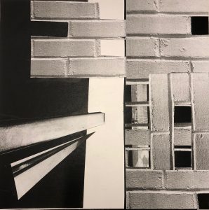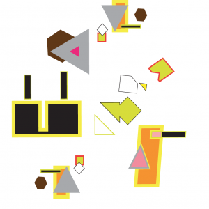
The first day of class was very eye-opening for me coming from a fine-arts background. I realized how design is focused on breaking down image into basic elements such as line, shape and color in order to build a convincing composition. Like in fine-arts, design relies heavily on relationship (object to object as well as object to negative space). The shape studies helped me see that one doesn’t need a lot to get an idea or feeling across. Simple shapes after-all do make up more complicated images. As we moved into our collage squares I had a harder time applying what I had learned about the “skeleton of a square”. I think I was more concerned with the narrative story than the square within a square parameter my group had agreed upon. Both of the above projects were helpful for moving into the text work because I became more aware of treating the letters as shapes and not necessarily comprehensible words. However, the critique for my final print of Les Fleur du Mal (the vase of flowers) was that the words got lost in the illustration and that it was important to re-incorporate them in a more evident way. The most satisfying project for me was the text painting mostly because of the color manipulation we did to make the illusion of transparency. The biggest adjustment for me has been working on a screen to create and not being able to pick things up with my hands and move things around. The computer is finally beginning to feel comfortable and no longer super intimidating and overwhelming. My biggest question still has to do with applying Graphic Design to my future career. I wonder wether I will feel free enough in a graphic design setting.