Intro to Fashion LP Post #5

What is Fashion?

My definition of Fashion is “outward appearance”. Fashion can be in any shape, silhouette, color, texture or material. It is how one looks whether it is true to their appearance or fabricated. As such is the case, Fashion can morph into anything and everything, and however one defines or sees Fashion can be true and real. Thus, whilst in the past, there was a strict guideline as to what Fashion was and what it could be, now we know that there is no real right or wrong in Fashion. It can practically be anything that lays over our body, simply acting like a second skin that we want to see ourselves in or show others.

Intro to Fashion LP Post #4

The exaggerated red cape, reminiscent of the cape from the Little Red Ridding Hood covers the entire body both silhouette wise and surface wise. As the look so directly implies the imagery of the Little Red Ridding Hood, the viewers may assume that the designer’s intention was to create a child like depiction by hiding all the curves of a grown adult and the silhouette via the large pleat-like seams using still fabric treated with a plastic overlay. Using an identically oversized and hood using puffer that starts over the shoulders and covers the wearer’s face completely, the designer once again hides the wearer’s gender, age, identity, to embed the childlike image only through the dominant red oversized cape.

“[P]erhaps the most obvious and important of all the variations of fashion is that which concerns the part of the body that is most accentuated. Fashion, in its more exuberant moments is seldom content with the silhouette that Nature has provided, but usually seeks to lay particular stress upon some single part or feature, which is then treated as a special centre of erotic charm. ” (Excerpt From: Susan B. Kaiser. “Fashion and Cultural Studies.”)

Like the excerpt from our reading implies, the silhouette is one of the most dominant ways of exposing one’s identity in terms of gender, age and style. Thus, like mentioned in the quote above, some features of the body are accentuated to create erotic charm. This idea of enhancing a silhouette is less visible in children’s wear, and thus children can be classified more into the gender neutral area than the solid men or women region, therefore, possibly be more naive towards the idea of sexuality. The oversized pattern of the cape and the stiff fabric treated with plastic therefore seemed like the designers intention to cover the wearer’s silhouette and sexuality and create a naive girl like impression just like the girl from the Little Red Ridding Hood.

The purpose and meaning behind this look may be different to what I felt but the above description was the impression I felt when viewing and examining this Comme Des Garcons runway look.

Intro to Fashion LP Post #3

The themes that emerged from my dress practice interview was the organization of the wardrobe, the types and the weight of the external influences (culture, age, environment, event, gender, etc) my interviewee received when buying garments and dressing up. I noticed that she has so much more garments than what she wears (more of her wardrobe was inactive). I also found garments in the style that she normally would not wear which was interesting because these garments contrasted with her style completely. Her dress practice is similar in that we both have a vague idea of what we would wear the day before but we decide on the garments the next day depending on the weather, the activities of the day, the type of people we would meet. Also, the way we dress around different people are very different depending on the culture, class, age and gender of the people.

“How does one represent the formation of national, as well as transnational, subjectivities? Let’s consider a rather extreme example. Before being crowned as Miss Universe in 2010, Miss Mexico (Ximena Navarrete) explains the significance of her choice of a red gown for the evening gown competition: “I chose red to represent the 200th anniversary of Mexico.” (The year 1810 marked the beginning of Mexico’s war for independence from Spanish colonial rule.) For the Best National Costume competition, Miss Mexico wore an elaborate gown and headdress that celebrates the Kukulcán Pyramids of Yucután (see Figure 3.1). In these two garment choices, Navarrete not only consciously represents her national subject position; she also expresses her subjectivity through a link between her own body and the larger “body politic” (Parkins 2002). After she is crowned, she says in an interview that she wants “the whole world to know about my country and my people.”

Kaiser, Susan B. Fashion and Cultural Studies. London: Berg Publisher, 2012.


The interview confirmed my understanding of the relationship between clothing and the body in that people wear different clothings depending on the 5Ws (Who, what, where, when, why), and whilst comfort plays a factor in the way we dress, the fit and the overall look is so much more important than ultimate comfort in general.


Intro to Fashion LP Post #2

Femininity in this advertisement for Dior’s signature Lady Dior bag is expressed as seductive and powerful. I personally do not believe there is such thing as “traditional gender norms” because the role and the idealistic image or representation of women has always been different within time and culture. “In a later analysis, fashion/performance studies scholar Tania Hammidi and I suggested that beauty has often been theorized as a singular image, system, or narrative.”(Excerpt From: Susan B. Kaiser. “Fashion and Cultural Studies.”). Therefore, to answer the question “Does the advertisement reinforce traditional gender norms?, the answer would be: the ad does reflect and reinforce one of the generalized idealistic image of a women. The women conveys Independence, seductiveness and power through her gesture, pose and facial expression. Her right arm on her hip reflects the feminine curves whilst the straight left arm on an angled platform reflects independence and power. Her facial expression, especially her gazing down emphasizes the seductive element along with the red and purple colored lighting shining from her right.

Intro to Fashion Studies LP Post #1

The two aphorisms I chose from Christopher Breward’s list are “Fashion can be about confirmation,  of self and others. But it is also about anxiety, ambiguity and worry. As an aid to understanding psychological complexities it is unsurpassed.” And “Fashion does not define. It is instead a term that demands definition.”

My interpretation of the first aphorism I chose is that fashion, when taken into the aspect of garments and items worn on body, has a meaning or purpose beyond covering or exposing the wearer’s body. It is used as an identifier that can show or hide the wearer’s identity depending on how the wearer wants to be portrayed publicly, and ultimately create a real or false sense of belonging that the wearer potentially desires from the viewer. It is a visual method of classification that includes people who wear a similar type of clothing and exclude those who dress differently. Like the quote identifies fashion as a great tool to understand the psychological complexities, I believe that every small or large aspect of fashion can be meaningful and purposeful both intentionally and unconsciously.

The second aphorism I chose to my interpretation, means that because fashion lies in such varied spectrum within the field of studies from social sciences, economics, arts, mathematics, politics, only to name a few, the meaning is so metamorphic that any meaning given to the term is a generalization of the whole that it lacks clarity. Therefore, Fashion it is a term that needs further research in order to have a proper definition that fulfills every aspect of its character.

Final Paper Proposal

Date: 1972-1974

Context: Photograph of my mom and grandma in South Korea during the early 1970s wearing pink garments.

Explanation for my choice: I chose this image because I found it interesting how the silhouette and style of garments I am studying was apparent not only to the western culture but also within the eastern culture. The garments worn in the image are not only interesting to explore due to its origin of influence (France), but also because it is reminiscent of Jeanne Lanvin’s notable collections of garments designed to be worn as a set by the mother and daughter. Additionally, the garments worn by my mom and my grandma more than 40 years ago does not seem outdated even today, which explores the concept of cyclical fashion which is a topic I have always been interested. Furthermore, because it is a family photo, it has greater significance and originality thus making it more meaningful and interesting to explore.

Relationship to my design work: There are no direct correlations with my personal work and the garments worn in the image shown above. However, through learning about Jeanne Lanvin (the idea of clothing created to be worn together) and the shifts in the female garments over the last 100 years due to various designers helped me gain interest in the changes in the fashion styles and garments through the liberation of female body. Therefore, the styles of the garments within this image will definitely become an influence for my upcoming designs.
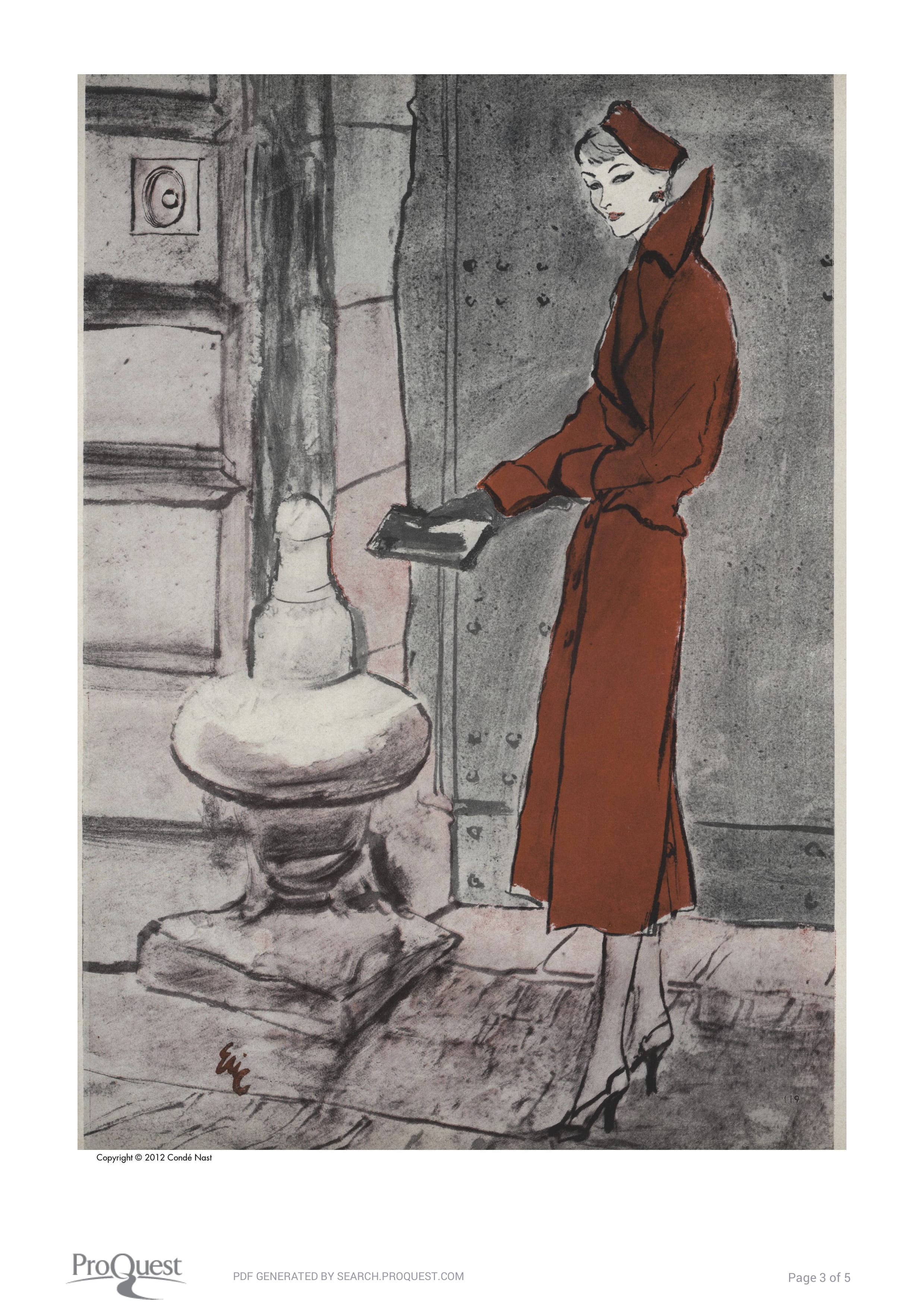
 

Date: 1955

Designer: Chanel

Image: Vogue Illustration of Chanel-red redingote from volume 125, issue 1, page 119.

Explanation for my choice: I like the design of the garment, and the modern chic aura it gives of within the picture.

Relationship to my design: The idea of modern chic and cold vibe is the style of design I have always been trying to incorporate into my design, and as every aspect of the garment reflects modern chicness, the garment pin points the desired outlook of my past and current designs.

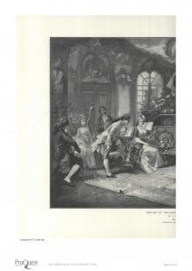
Date: Painting painted (1890-1900s) Image published on 1906

Artist: V. de Paredes Mezzotint

Image: Vogue Illustration of Mozart at the Court of Marie Antoinette from volume 28, issue 2, page 36-37.

Explanation for my choice: I like how the image not only depicts the type of attire necessary to enjoy leisurely times during Marie Antoinette’s time period, but also the atmosphere that creates a setting for where these luxurious garments should be worn. The garments not only inform us about the strict dressing of both men and women to achieve the desired outlook, but also reflects on their lifestyles as royals and nobles.

Relationship to my design: These garments depicted above in the painting by Mezzotint does not reflect on my personal designs. However, exploring garments from this time period and of those depicted on the painting will influence the future garments that I will design.

Drawing the Imagination: In Conversation With An Artist. part 1


‘Portrait of Mother III’ 1985

Artist: David Hockney born 1937

Medium: Lithograph on paper

Dimensions: 512 x 435 mm

Collection: Tate Gallery

Presented by artist: 1993


David Hockney, a British artist known for his paintings and printmaking, is considered one of the more influential artist of the 20th century and the pop art movement of the 1960s. This earlier works were influences of expressionism, especially of Francis Bacon’s works. The more famous acrylic paintings of swimming pools came later when he moved to Los Angeles in 1964 where this style of work changed along with the new medium. What is interesting is that Hockney continues to explore portraits throughout his career, however, his portrait paintings re very different in style to many of his prints. While his paintings are incorporation of realistic color and pop colors, his prints consist of more expressive mark makings with no blocks of colors but more etching and contour lines.


The portrait depicted above is one of the many portraits of Laura Hockney, David Hockney’s mother. The portrait is printed using lithography, a method of printing using ball grained stone or a metal surface with oil and water. Lithography is drawn with oil onto an acid treated limestone plate where etching the surface of the limestone would attract the oil into the scratched surface of the stone which ultimately will absorb the oil based ink when applied for printing.


The ‘Portrait of Mother III’ is a limited color palette lithograph print on paper consisting of two colors: blue and red. The portrait has a simple central composition, and like his signature style, the work is dominated by his bold contour mark making with some light shadings. His lines are limited yet his strokes capture the flow and movement of the woman effectively; and like the curator of the Tate Gallery wrote, “the artist portrays her with great psychological insight (Tate. “‘Portrait of Mother III’, David Hockney, 1985.” Tate. Accessed February 20, 2018. http://www.tate.org.uk/art/artworks/hockney-portrait-of-mother-iii-p20119.)”.

Drawing The Imagination Final Project

Like the project description, I decided to focus on the things that I find difficult and something that I love and gives me pleasure which I did not have enough time to do. As seen cohesively throughout my drawings and sometimes in other fields of work, I like making repetitive lines and patterns when drawing. At first, I did not know why I liked doing this, but now that I think about it, I feel like this may be because I like and believe in the idea of smaller things building up to form something far greater. This was interesting because the concept of small things building up to a larger form was something that I was very much interested and explored when I was in high school, and it was amusing for me to see how I am carrying on with building the same idea today.

The second idea I incorporated in this piece was portrait drawing. Ever since I was forced to do self portraits and portraits of other people in art classes, I disliked drawing portraits especially capturing people’s faces. I disliked the idea of capturing spending the time to examine my models’ faces and creating lines and shapes to fill in the details of their faces the way I see and interpret them. I did not like the fact that I had to determine how they looked to me, how I looked at them, felt about them, and ultimately  tracing my views of my subjects on my work. I thought it would be an interesting blend of subject and idea to create a work that combined the style of art that I liked with the genre of art that I disliked. To show how I dislike drawing portraits, I covered the face I drew with the consecutive lines which made it seem like she was being engulfed by the repetitive lines. Due to time constraints and limitation in freedom and guidelines set for projects, I was unable to create work that included repetitive mark making, I was very exited when making this work and had a lot of fun working on it.

Electronic Learning Portfolio