Category Archives: Uncategorized

Intro to Fashion LP Post #5

What is Fashion?

My definition of Fashion is “outward appearance”. Fashion can be in any shape, silhouette, color, texture or material. It is how one looks whether it is true to their appearance or fabricated. As such is the case, Fashion can morph into anything and everything, and however one defines or sees Fashion can be true and real. Thus, whilst in the past, there was a strict guideline as to what Fashion was and what it could be, now we know that there is no real right or wrong in Fashion. It can practically be anything that lays over our body, simply acting like a second skin that we want to see ourselves in or show others.

Intro to Fashion LP Post #4

The exaggerated red cape, reminiscent of the cape from the Little Red Ridding Hood covers the entire body both silhouette wise and surface wise. As the look so directly implies the imagery of the Little Red Ridding Hood, the viewers may assume that the designer’s intention was to create a child like depiction by hiding all the curves of a grown adult and the silhouette via the large pleat-like seams using still fabric treated with a plastic overlay. Using an identically oversized and hood using puffer that starts over the shoulders and covers the wearer’s face completely, the designer once again hides the wearer’s gender, age, identity, to embed the childlike image only through the dominant red oversized cape.

“[P]erhaps the most obvious and important of all the variations of fashion is that which concerns the part of the body that is most accentuated. Fashion, in its more exuberant moments is seldom content with the silhouette that Nature has provided, but usually seeks to lay particular stress upon some single part or feature, which is then treated as a special centre of erotic charm. ” (Excerpt From: Susan B. Kaiser. “Fashion and Cultural Studies.”)

Like the excerpt from our reading implies, the silhouette is one of the most dominant ways of exposing one’s identity in terms of gender, age and style. Thus, like mentioned in the quote above, some features of the body are accentuated to create erotic charm. This idea of enhancing a silhouette is less visible in children’s wear, and thus children can be classified more into the gender neutral area than the solid men or women region, therefore, possibly be more naive towards the idea of sexuality. The oversized pattern of the cape and the stiff fabric treated with plastic therefore seemed like the designers intention to cover the wearer’s silhouette and sexuality and create a naive girl like impression just like the girl from the Little Red Ridding Hood.

The purpose and meaning behind this look may be different to what I felt but the above description was the impression I felt when viewing and examining this Comme Des Garcons runway look.

Intro to Fashion LP Post #3

The themes that emerged from my dress practice interview was the organization of the wardrobe, the types and the weight of the external influences (culture, age, environment, event, gender, etc) my interviewee received when buying garments and dressing up. I noticed that she has so much more garments than what she wears (more of her wardrobe was inactive). I also found garments in the style that she normally would not wear which was interesting because these garments contrasted with her style completely. Her dress practice is similar in that we both have a vague idea of what we would wear the day before but we decide on the garments the next day depending on the weather, the activities of the day, the type of people we would meet. Also, the way we dress around different people are very different depending on the culture, class, age and gender of the people.

“How does one represent the formation of national, as well as transnational, subjectivities? Let’s consider a rather extreme example. Before being crowned as Miss Universe in 2010, Miss Mexico (Ximena Navarrete) explains the significance of her choice of a red gown for the evening gown competition: “I chose red to represent the 200th anniversary of Mexico.” (The year 1810 marked the beginning of Mexico’s war for independence from Spanish colonial rule.) For the Best National Costume competition, Miss Mexico wore an elaborate gown and headdress that celebrates the Kukulcán Pyramids of Yucután (see Figure 3.1). In these two garment choices, Navarrete not only consciously represents her national subject position; she also expresses her subjectivity through a link between her own body and the larger “body politic” (Parkins 2002). After she is crowned, she says in an interview that she wants “the whole world to know about my country and my people.”

Kaiser, Susan B. Fashion and Cultural Studies. London: Berg Publisher, 2012.


The interview confirmed my understanding of the relationship between clothing and the body in that people wear different clothings depending on the 5Ws (Who, what, where, when, why), and whilst comfort plays a factor in the way we dress, the fit and the overall look is so much more important than ultimate comfort in general.


Intro to Fashion LP Post #2

Femininity in this advertisement for Dior’s signature Lady Dior bag is expressed as seductive and powerful. I personally do not believe there is such thing as “traditional gender norms” because the role and the idealistic image or representation of women has always been different within time and culture. “In a later analysis, fashion/performance studies scholar Tania Hammidi and I suggested that beauty has often been theorized as a singular image, system, or narrative.”(Excerpt From: Susan B. Kaiser. “Fashion and Cultural Studies.”). Therefore, to answer the question “Does the advertisement reinforce traditional gender norms?, the answer would be: the ad does reflect and reinforce one of the generalized idealistic image of a women. The women conveys Independence, seductiveness and power through her gesture, pose and facial expression. Her right arm on her hip reflects the feminine curves whilst the straight left arm on an angled platform reflects independence and power. Her facial expression, especially her gazing down emphasizes the seductive element along with the red and purple colored lighting shining from her right.

Intro to Fashion Studies LP Post #1

The two aphorisms I chose from Christopher Breward’s list are “Fashion can be about confirmation,  of self and others. But it is also about anxiety, ambiguity and worry. As an aid to understanding psychological complexities it is unsurpassed.” And “Fashion does not define. It is instead a term that demands definition.”

My interpretation of the first aphorism I chose is that fashion, when taken into the aspect of garments and items worn on body, has a meaning or purpose beyond covering or exposing the wearer’s body. It is used as an identifier that can show or hide the wearer’s identity depending on how the wearer wants to be portrayed publicly, and ultimately create a real or false sense of belonging that the wearer potentially desires from the viewer. It is a visual method of classification that includes people who wear a similar type of clothing and exclude those who dress differently. Like the quote identifies fashion as a great tool to understand the psychological complexities, I believe that every small or large aspect of fashion can be meaningful and purposeful both intentionally and unconsciously.

The second aphorism I chose to my interpretation, means that because fashion lies in such varied spectrum within the field of studies from social sciences, economics, arts, mathematics, politics, only to name a few, the meaning is so metamorphic that any meaning given to the term is a generalization of the whole that it lacks clarity. Therefore, Fashion it is a term that needs further research in order to have a proper definition that fulfills every aspect of its character.

Drawing the Imagination: In Conversation With An Artist. part 1


‘Portrait of Mother III’ 1985

Artist: David Hockney born 1937

Medium: Lithograph on paper

Dimensions: 512 x 435 mm

Collection: Tate Gallery

Presented by artist: 1993


David Hockney, a British artist known for his paintings and printmaking, is considered one of the more influential artist of the 20th century and the pop art movement of the 1960s. This earlier works were influences of expressionism, especially of Francis Bacon’s works. The more famous acrylic paintings of swimming pools came later when he moved to Los Angeles in 1964 where this style of work changed along with the new medium. What is interesting is that Hockney continues to explore portraits throughout his career, however, his portrait paintings re very different in style to many of his prints. While his paintings are incorporation of realistic color and pop colors, his prints consist of more expressive mark makings with no blocks of colors but more etching and contour lines.


The portrait depicted above is one of the many portraits of Laura Hockney, David Hockney’s mother. The portrait is printed using lithography, a method of printing using ball grained stone or a metal surface with oil and water. Lithography is drawn with oil onto an acid treated limestone plate where etching the surface of the limestone would attract the oil into the scratched surface of the stone which ultimately will absorb the oil based ink when applied for printing.


The ‘Portrait of Mother III’ is a limited color palette lithograph print on paper consisting of two colors: blue and red. The portrait has a simple central composition, and like his signature style, the work is dominated by his bold contour mark making with some light shadings. His lines are limited yet his strokes capture the flow and movement of the woman effectively; and like the curator of the Tate Gallery wrote, “the artist portrays her with great psychological insight (Tate. “‘Portrait of Mother III’, David Hockney, 1985.” Tate. Accessed February 20, 2018. http://www.tate.org.uk/art/artworks/hockney-portrait-of-mother-iii-p20119.)”.

Planar: Mobile

    The project began with an introduction of what the golden ratio and the golden section is and how it is applied both passively and explicitly around us. We were then introduced to an instrument called the caliper which is a tool used commonly when measuring the golden section. Upon learning about the functions and methods of using the caliper, we created a caliper model using card board and clips. After some trials and errors whilst making, we were able to apply the same proportions and methods in making the calipers using wood and dowels. Making the calipers was not a difficult exercise, as I had experience in working with wood through prior projects, and the process of making the caliper did not take long. However, I did have to take more cautious measures when adjusting the calipers in order to keep the proportions and the measurements accurate.

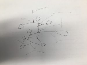
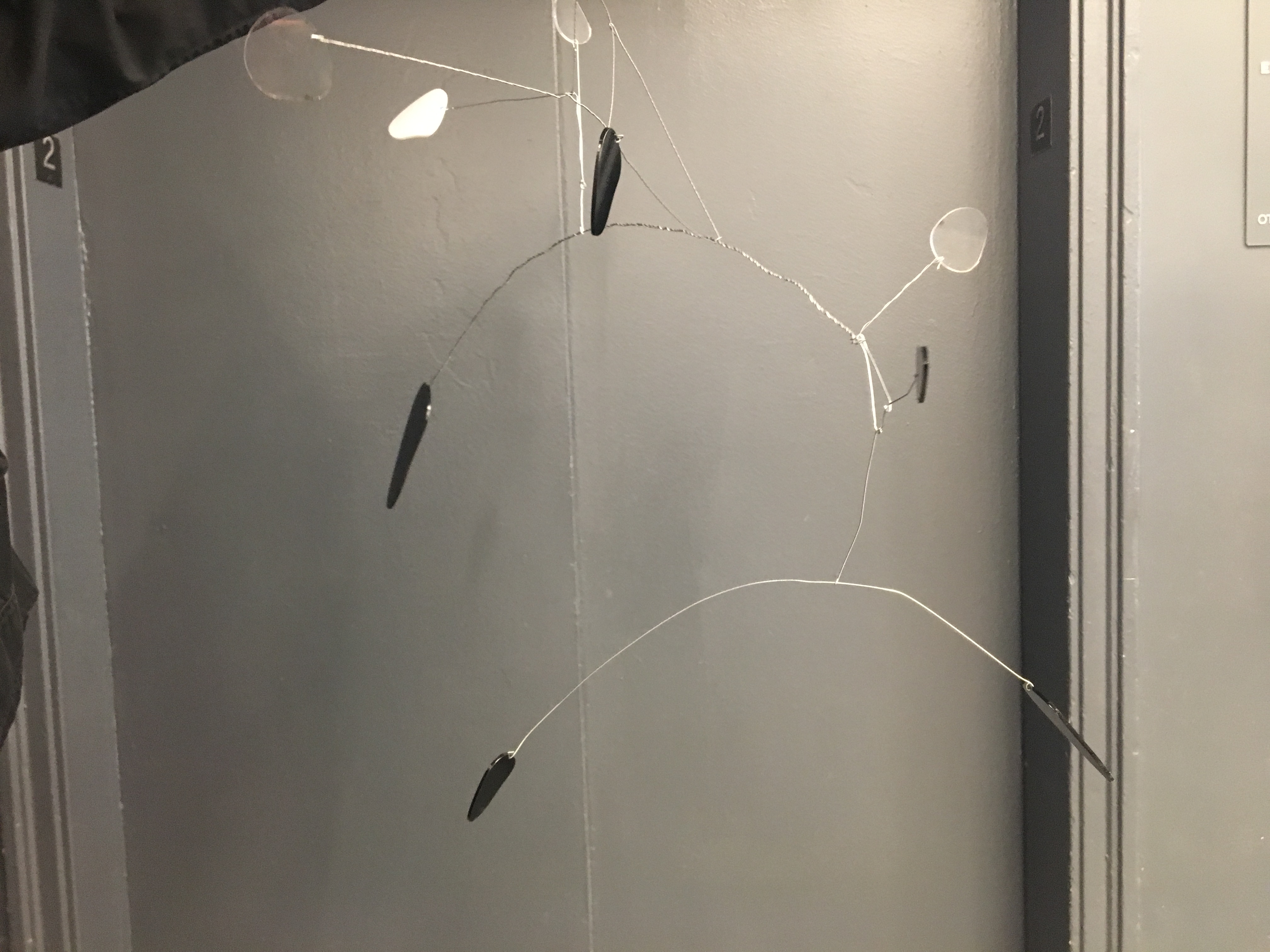
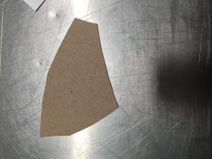
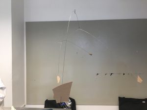
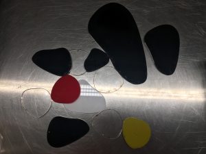
Once the calipers were made, we used it to draw out random shapes in a large sheet of Bristol paper. Multiple shapes were then picked out within the shapes drawn using the calipers as shapes used in the final section of the planar project; to create a mobile or a stabile in the style of Alexander Calder. These choses shapes were then transferred into cardboard paper using the tracing paper, and then enlarged or reduced using the multiples of Phi (1.618). With these shapes, I began building a mobile using wires and swivels, working from the base and up. This was a difficult and  laborious process that required multiple trials and error to make the model stable, reflect the golden segment yet remain interesting and comfortable for the eye to follow. After I was set with the composition of the model and the sizes of the shapes used in the model, I recreated the shapes in Adobe Illustrator and adjusted the template settings ready for the laser printer.


The process of laser cutting went relatively smoothly, as my shapes were relatively simple and the black and white plexiglass I used was easy to work with. However, the colored plexiglass had a different density with the black and white plexiglass which could not be cut according to my needs. Therefore, I decided to use the white plexiglass I found within the scrap shelf as a replacement.

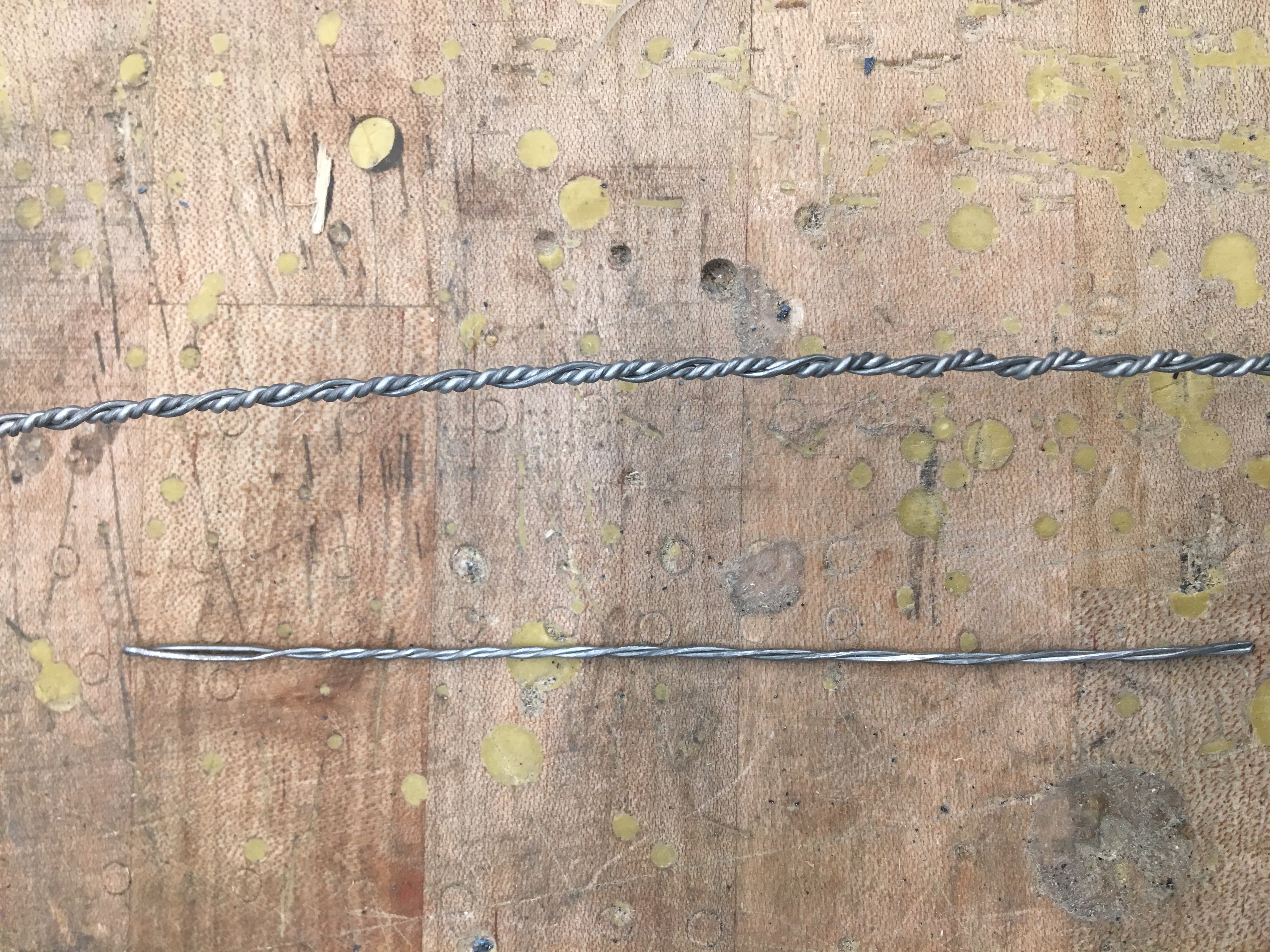
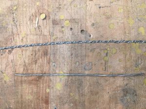
What I found difficult was the assembling of the final model. Building the mobile with plexiglass was completely different from building it with cardboard. Plexiglass was a much denser material and had much greater mass than cardboard, and whilst building the mobile, the wire became too weak and thin to hold the larger shapes in place. Thus, I used wires of multiple thickness through twisting wires using a drill and replaced some of the thin wires with these twisted wires. However, the largest shape was still too heavy and the wires could not hold it in place. Therefore, I had to rewind the wire using the third strand of stainless wire which made made the wire irregular.

What I found out after building the mobile was that once the shapes were all balanced and in position, the length of each side of the wire was in sync with the golden ratio. Also, the movement of each mobile segments were most fluid and in sync when each part was complying with the rule of the golden ratio.

As it was my first time using plexiglass and the first time using wires as the main part of the sculpture, I found it difficult to get used to handling the materials. However with multiple practices and trials, I was able to use use the materials in the form I wanted with relative execution.

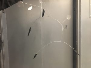
This project was undoubtedly one of the more difficult projects with multiple obstacles which set limitations to the assembling of the mobile. However, whilst it was the most demanding project, I did learn one of the most important aspect of designing which is to use the golden ratio; and the golden ratio appears naturally without having to force it if your design is good. If I have a chance to redo this project, I would use more swivels and use a wire using dense metal to prevent having to twist the wires to create thicker wire to hold the mobile shapes in place.

For this project I used $4 which was used to purchase the colored plexiglass, and the remaining plexiglass was recycled plexiglass i got from my friend who took Space Materiality in the previous semester or from the scrap box in the laser lab. I feel like this project was limited in being a sustainable project, as we needed to use plexiglass that was not sustainably sourced or from recycled plastic. However, if we use remaining plastic scraps found around school, we could make this project more sustainable.

Drawing the Imagination:Take a Book

The book I chose to explore is a short story “The Ones Who Walked Away From Omelas” by an American writer Ursula K. Le Guin. The story begins with an Utopian society celebrating their annual Summer Festival. Under this happiness however, is a child locked up in a cage and forced to live in filth. The child’s suffering is the result of the city’s lasting happiness and teach the people the cruel justice of Omelas as well as reminding the people how precious happiness is. People soon learn about the child’s existence and is taught about the meaning of suffering. Disgusted and shocked, people began walking away from Omelas and never return.

I chose this book because I liked the images that I could depict in my mind when reading this book. I also liked how the general rule of the society that there has to be a consequence to anything in life, is the foundation of the story. Like the book 1984, it is a book that is predicting the future of our society and I thought it would be nice to create a visual representation of the message Ursula K. Le Guin wanted to convey.

I used gold on black as the main color of this book because I wanted to show the contrast of the dark and the bright aspect of the city (our society).  I also used hints of silver on the last image to express the idea of the “silver lining”, denoting the message that the future will be bright because of those who walked away from the wrong.