Drawing the Imagination: In Conversation With An Artist. part 1


‘Portrait of Mother III’ 1985

Artist: David Hockney born 1937

Medium: Lithograph on paper

Dimensions: 512 x 435 mm

Collection: Tate Gallery

Presented by artist: 1993


David Hockney, a British artist known for his paintings and printmaking, is considered one of the more influential artist of the 20th century and the pop art movement of the 1960s. This earlier works were influences of expressionism, especially of Francis Bacon’s works. The more famous acrylic paintings of swimming pools came later when he moved to Los Angeles in 1964 where this style of work changed along with the new medium. What is interesting is that Hockney continues to explore portraits throughout his career, however, his portrait paintings re very different in style to many of his prints. While his paintings are incorporation of realistic color and pop colors, his prints consist of more expressive mark makings with no blocks of colors but more etching and contour lines.


The portrait depicted above is one of the many portraits of Laura Hockney, David Hockney’s mother. The portrait is printed using lithography, a method of printing using ball grained stone or a metal surface with oil and water. Lithography is drawn with oil onto an acid treated limestone plate where etching the surface of the limestone would attract the oil into the scratched surface of the stone which ultimately will absorb the oil based ink when applied for printing.


The ‘Portrait of Mother III’ is a limited color palette lithograph print on paper consisting of two colors: blue and red. The portrait has a simple central composition, and like his signature style, the work is dominated by his bold contour mark making with some light shadings. His lines are limited yet his strokes capture the flow and movement of the woman effectively; and like the curator of the Tate Gallery wrote, “the artist portrays her with great psychological insight (Tate. “‘Portrait of Mother III’, David Hockney, 1985.” Tate. Accessed February 20, 2018. http://www.tate.org.uk/art/artworks/hockney-portrait-of-mother-iii-p20119.)”.

Drawing The Imagination Final Project

Like the project description, I decided to focus on the things that I find difficult and something that I love and gives me pleasure which I did not have enough time to do. As seen cohesively throughout my drawings and sometimes in other fields of work, I like making repetitive lines and patterns when drawing. At first, I did not know why I liked doing this, but now that I think about it, I feel like this may be because I like and believe in the idea of smaller things building up to form something far greater. This was interesting because the concept of small things building up to a larger form was something that I was very much interested and explored when I was in high school, and it was amusing for me to see how I am carrying on with building the same idea today.

The second idea I incorporated in this piece was portrait drawing. Ever since I was forced to do self portraits and portraits of other people in art classes, I disliked drawing portraits especially capturing people’s faces. I disliked the idea of capturing spending the time to examine my models’ faces and creating lines and shapes to fill in the details of their faces the way I see and interpret them. I did not like the fact that I had to determine how they looked to me, how I looked at them, felt about them, and ultimately  tracing my views of my subjects on my work. I thought it would be an interesting blend of subject and idea to create a work that combined the style of art that I liked with the genre of art that I disliked. To show how I dislike drawing portraits, I covered the face I drew with the consecutive lines which made it seem like she was being engulfed by the repetitive lines. Due to time constraints and limitation in freedom and guidelines set for projects, I was unable to create work that included repetitive mark making, I was very exited when making this work and had a lot of fun working on it.

Planar: Mobile

    The project began with an introduction of what the golden ratio and the golden section is and how it is applied both passively and explicitly around us. We were then introduced to an instrument called the caliper which is a tool used commonly when measuring the golden section. Upon learning about the functions and methods of using the caliper, we created a caliper model using card board and clips. After some trials and errors whilst making, we were able to apply the same proportions and methods in making the calipers using wood and dowels. Making the calipers was not a difficult exercise, as I had experience in working with wood through prior projects, and the process of making the caliper did not take long. However, I did have to take more cautious measures when adjusting the calipers in order to keep the proportions and the measurements accurate.
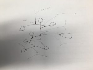
Once the calipers were made, we used it to draw out random shapes in a large sheet of Bristol paper. Multiple shapes were then picked out within the shapes drawn using the calipers as shapes used in the final section of the planar project; to create a mobile or a stabile in the style of Alexander Calder. These choses shapes were then transferred into cardboard paper using the tracing paper, and then enlarged or reduced using the multiples of Phi (1.618). With these shapes, I began building a mobile using wires and swivels, working from the base and up. This was a difficult and  laborious process that required multiple trials and error to make the model stable, reflect the golden segment yet remain interesting and comfortable for the eye to follow. After I was set with the composition of the model and the sizes of the shapes used in the model, I recreated the shapes in Adobe Illustrator and adjusted the template settings ready for the laser printer.
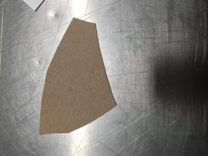
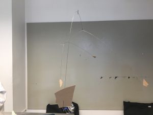
 

The process of laser cutting went relatively smoothly, as my shapes were relatively simple and the black and white plexiglass I used was easy to work with. However, the colored plexiglass had a different density with the black and white plexiglass which could not be cut according to my needs. Therefore, I decided to use the white plexiglass I found within the scrap shelf as a replacement.
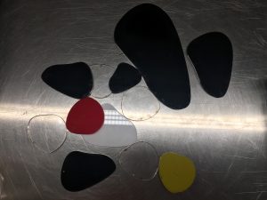
What I found difficult was the assembling of the final model. Building the mobile with plexiglass was completely different from building it with cardboard. Plexiglass was a much denser material and had much greater mass than cardboard, and whilst building the mobile, the wire became too weak and thin to hold the larger shapes in place. Thus, I used wires of multiple thickness through twisting wires using a drill and replaced some of the thin wires with these twisted wires. However, the largest shape was still too heavy and the wires could not hold it in place. Therefore, I had to rewind the wire using the third strand of stainless wire which made made the wire irregular.
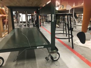
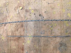
What I found out after building the mobile was that once the shapes were all balanced and in position, the length of each side of the wire was in sync with the golden ratio. Also, the movement of each mobile segments were most fluid and in sync when each part was complying with the rule of the golden ratio.

As it was my first time using plexiglass and the first time using wires as the main part of the sculpture, I found it difficult to get used to handling the materials. However with multiple practices and trials, I was able to use use the materials in the form I wanted with relative execution.
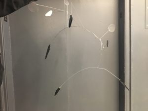
This project was undoubtedly one of the more difficult projects with multiple obstacles which set limitations to the assembling of the mobile. However, whilst it was the most demanding project, I did learn one of the most important aspect of designing which is to use the golden ratio; and the golden ratio appears naturally without having to force it if your design is good. If I have a chance to redo this project, I would use more swivels and use a wire using dense metal to prevent having to twist the wires to create thicker wire to hold the mobile shapes in place.

For this project I used $4 which was used to purchase the colored plexiglass, and the remaining plexiglass was recycled plexiglass i got from my friend who took Space Materiality in the previous semester or from the scrap box in the laser lab. I feel like this project was limited in being a sustainable project, as we needed to use plexiglass that was not sustainably sourced or from recycled plastic. However, if we use remaining plastic scraps found around school, we could make this project more sustainable.

Drawing the Imagination:Take a Book

The book I chose to explore is a short story “The Ones Who Walked Away From Omelas” by an American writer Ursula K. Le Guin. The story begins with an Utopian society celebrating their annual Summer Festival. Under this happiness however, is a child locked up in a cage and forced to live in filth. The child’s suffering is the result of the city’s lasting happiness and teach the people the cruel justice of Omelas as well as reminding the people how precious happiness is. People soon learn about the child’s existence and is taught about the meaning of suffering. Disgusted and shocked, people began walking away from Omelas and never return.

I chose this book because I liked the images that I could depict in my mind when reading this book. I also liked how the general rule of the society that there has to be a consequence to anything in life, is the foundation of the story. Like the book 1984, it is a book that is predicting the future of our society and I thought it would be nice to create a visual representation of the message Ursula K. Le Guin wanted to convey.

I used gold on black as the main color of this book because I wanted to show the contrast of the dark and the bright aspect of the city (our society).  I also used hints of silver on the last image to express the idea of the “silver lining”, denoting the message that the future will be bright because of those who walked away from the wrong.

Cross-Course Reflection

I am Serin Hwang from Fashion Design Major. I am South Korean by nationality, but geographically from Singapore. When I first arrived in Parsons, I had no solid idea about what I wanted to learn for the next four years of my life which ultimately will contribute to the field I will be working in in the near future.


Keeping an online record of some of my works I have made since the beginning of my freshman year made it clear about the values and preferences I have when making art. Although different in subject matter and the purpose, there is a consistent emphasis of social issues that is addressed in my works. Whilst the thematic idea of my works remained relatively similar, the skills used were very different. Materials used ranged from pencil to paint, wire, ceramics, fabric and many more. The technical skills used and learnt did however get transferred from one to the other, as skills used were broad and relevant to many mediums.


Space and Materiality, like its name, was a class that needed broad range of skills that I was unfamiliar to. It was through this class I was able to gain knowledge and experience of using materials unique to my prior works such as ceramics, plexiglass, plastic, etc. These skills were then transferred into many of my studio works, allowing my projects to be diverse in range of materials used.


Seminar on the other hand was a very academic heavy subject unlike the rest of the classes I took in freshman year. Whilst it was academically based, it remained relevant in evoking my creativity within the spectrum of writing, as well as supporting my studio works with applied knowledge. Thus, making them a successful merge of classes that strengthen my development as a creative thinker and writer. I enjoyed writing the final research paper the most because of the level of freedom I had in deciding the genre, style and approach of writing I was able to take. I enjoyed being able to express ideas and concepts that only lived in my mind into writing them down on paper and solidifying them to become stronger stances. Further research on the history of fashion would have helped, as I lack prior knowledge of fashion and fashion trends that are recurring in a cyclical cycle.


The two highlights from first year is producing garments for fashion studio classes and taking photoshoots of these garments. Constructing garments from scratch first as idea sketches into pattern making and choosing the material was tiring yet meaningful and fun, and I have never felt the same level of excitement and joy doing art in the last few years. Also, prior to fashion studio, I was never interested in photography, however, having to photograph the garment I produced was extremely fun and the outcome, in my opinion, was great too. Fashion studio helped me realize what I liked doing and ultimately helped me in declaring my major.


When I first arrived in Parsons, I had no confidence in what I wanted to do, learn and be. I constantly questioned my choice in coming to Parsons and compared myself to all the students around me, asking whether I was as skilled as them, as creative as them, as passionate as them and as crazy as them. My answer was and will always be “no”. I was and never will be as skilled, creative, passionate and crazy as everyone around me. However, I will with no doubt enjoy learning and making fashion like every other students around me.