Part#1
-

- Mine_TimesSquare
-

- Mine_BubbleGun
-

- Moma_Campbell’sSoupCans_Warhol_1962
-

- Moma_IShopThereforeIAm_BarbaraKruger_1990
-

- Online_Coupon
-

- Online_Sorry_Banksy
-

- Online_BuyMoreStuff
Note on notes:
yellow: design elements and principles
purple: narrative elements
The reason I choose these image:
- I took this photo in Wall Street where the advertisements are most concentrated. I found a cookie monster (actually a human disguised making a living by asking tourists to take photo together) standing at the curb. I found this ironic how this figure of naive is also looking at ads. Is it like even the children of this generation can only see the products?
- I took this one in Canal street, I think there is ironic for the person selling such fancy thing to children (bubble gun) to look so bored of everything. No one sells bubble gun for love of children, it is for making a living, for him to be able to eat in the restaurant across the street.
- Andy Warhol’s Soup Cans are great representation of Consumerism. Being one of the first generation to experience the mass production and the sharing of identical products, I think he reveals the boredom in this system successfully through this work.
- I think Bruger’s “I shop therefore I exist”, printed on a one-use paper bag perfectly states out the mindset of individuals driven by Consumerism. The red slogan and open end showing the anxiety in wanting more. I think the background hand image is also referring to the fetishism.
- This is a advertisement I found online of this app that provides more and more coupons. Coupon is a strategy that keeps Consumerism running. When you get a coupon from one purchase you are driven to spend more in order to use this coupon. I think this image shows clear design strategies which are commonly used in advertising, to make itself more appealing. I think it’s ironic, pointing out the difference between design and art.
- This is one of Banksy’s early work. It shows some people’s belief in material. Materials define them, maintain their existence, and keep them living their daily life. These people believe that they purchase a certain kind of lifestyle, not just the objects.
- A young lady protesting during black Friday in front of a mall before its opening in front of the queue. The slogan states the appearance of Consumerism: to buy more stuff.
-

- #1
-

- #2
-

- #3
-

- #4
-

- #5
-

- #6
-

- #7
Part#2
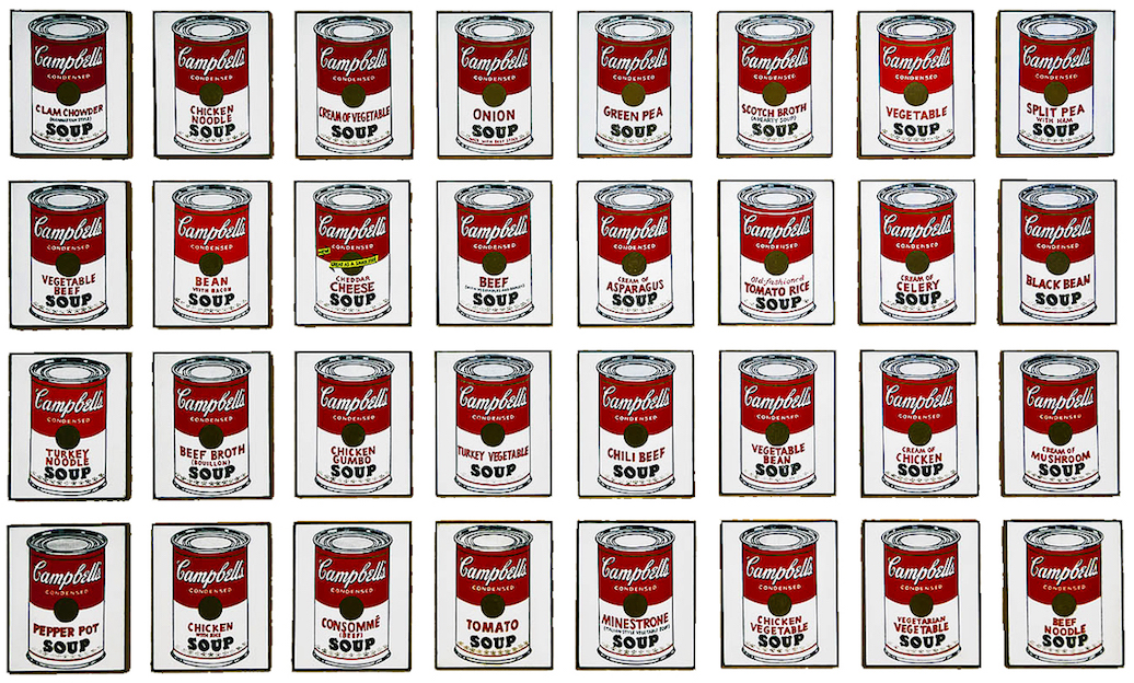
Moma_Campbell’sSoupCans_Warhol_1962
The famous Andy Warhol screen printing, “Campbell’s Soup Cans”, was created in 1962, a year representing the climax in the “Pop Art” movement, a year when the Beatles can be heard in every radio channel, but also a year Kennedy escalated the Vietnam War, and a year when the American began to mass use the word “Consumerism”.
The work is generally screen printings of the 32 flattened imagery of the Campbell’s soup cans which looks identical to each other except the printing of the flavours. Due to the consistency, the process of production was made systematic.
The non-originality, repetition in the appearance, and the way the prints are arrayed in exhibitions all reveal Warhol’s intention to challenge the society’s idea towards “Art”.
What if this image transforms to 3D? What if there are other consumption goods in the image rather than coup cans? What if you see this image in a supermarket?