Brainstorming and Data Collection:
I thought of the different garments I’ve seen that color felt significant in and did some research on them. I first thought of Maison Margiela’s Fall RDW 2013 collection, the main color palette of the show was quite neutral however a pop of electric color was added to every garment. Another example I think of is Balenciaga’s Spring RDW 2017 collection, it felt like the color wheel was studied and there was great emphasis on contrasting and analogous colors even down to the accessories. A final example would be Moschino’s Spring RDW 2019 collection, color felt quite important and emphasized on since Jeremy Scott started with a plain white fabric and literally ‘colored’ it in.
References:
- https://www.vogue.com/fashion-shows/spring-2019-ready-to-wear/moschino
- https://www.vogue.com/fashion-shows/spring-2017-ready-to-wear/balenciaga
- https://www.vogue.com/fashion-shows/fall-2013-ready-to-wear/maison-martin-margiela
Possible Ideas and Sketches:
When thinking of this project I knew I wanted it to be almost like a record of what going through COVID-19 was like. My best friend and I have been complaining about the media not putting enough emphasis on the impact this all has had on mental health, and how the media’s approach might be causing more harm than good. I acknowledge that my ability to design is a platform that I can freely voice my feelings on, so I though the best way to handle this project is to emphasize on what has COVID-19 done to people’s mental health. I asked a few of my friends honestly how they have been feeling, most of them told me they’ve been feeling isolated, disconnected, anxious, scared, and lonely. I decided to work around these words for this project.
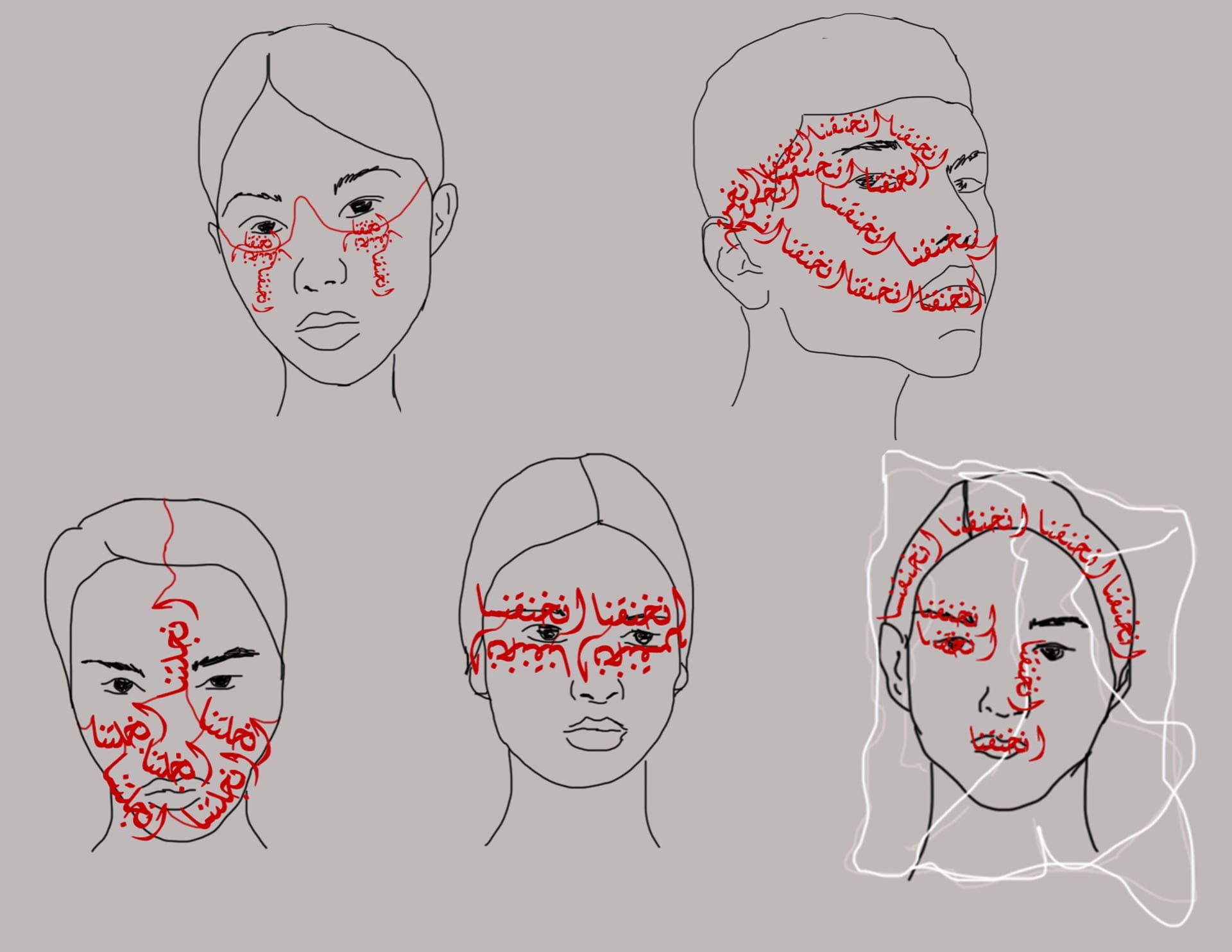
The main word I decided to work with was the word “انخنقنا” which translates into we’ve become suffocated, I felt like it would be a proper term to describe how people struggling with mental illnesses have been feeling especially since they’re not given proper care or attention (especially back home where a full lockdown is implemented). I decided to create a jewelry piece that also acts as a mask, in this way it further emphasizes on the visual of suffocation. The color I wanted to work with is red, as it is alerting and in a way is symbolic to a call to action towards this issue.
Iterations:
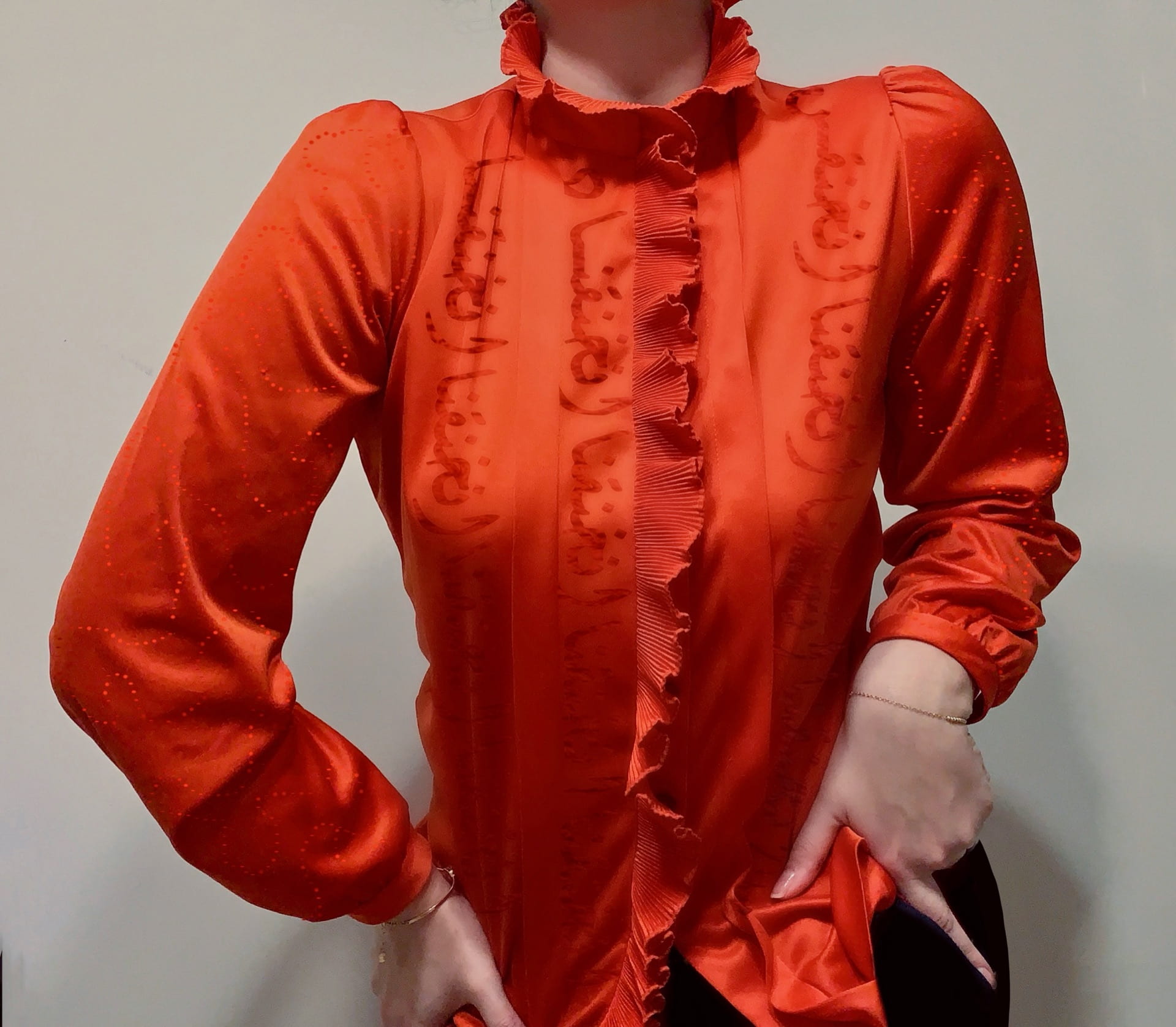
I was told that for this project it would be better to explore garments rather than accessories, so I decided to rethink my idea. I was still a fan of the word I chose and the colors that I chose as they were important for my intention. I looked for something to flip in my closet and I found this red high neck blouse that I have thrifted. I decided on the use of red lettering as it won’t be immediately obvious to the eye, which feeds into my intention as the issue of mental illness during this pandemic is not obvious to most. I was told to make use of big lettering so I did a couple variations with small and large lettering.
Final Piece:
This garment explores the impact COVID-19 has had on mental health, and the media’s response to it. The garment emphasizes on the word انخنقنا which translates to a feeling of choking, this aims to demonstrate how many have felt at such a time especially with the mass hysteria that the media is spreading. The word is embodied on in a shade of red close to that of the garment as it is difficult to spot, which emphasizes on how the issue of mental illness during this pandemic is not obvious to most. In addition, the details on the sleeves are embroidered in circular shapes that aim to mimic the peaks that are present on the virus’s original shape. (Please note, I do not currently have the material to actually embroider this garment so I photoshopped how I imagine it to look.)